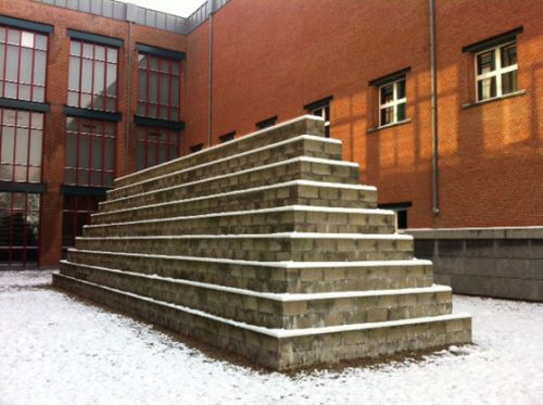
Bonnefanten Museum
Introduction
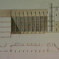
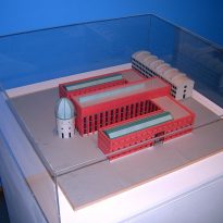
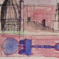
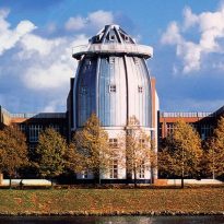
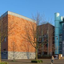
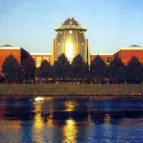
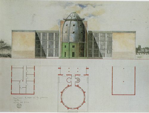
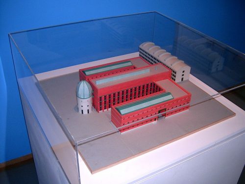
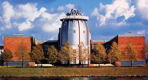
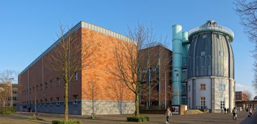
For Bonnefanten Museum, the architect Aldo Rossi designed a building with a symmetrical E-shaped and a 28m tower that rises above the Maas River in the central wing extension. The design leaves much to the imagination of the viewer, but the notion of the museum as a cultural symbol, with strong connections between past and present, is incorporated in the building, with its familiar references and strange elements that are both reassuring and disconcerting. Rossi’s work is sober and whimsical, classic and modern.
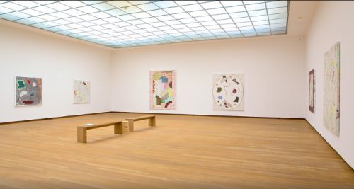
The project is built, as usual in his work, using traditional materials, but the most natural factor of the building is daylight penetrating through the cover of the stairs, people feel almost as if they were outdoors. On the second floor, daylight interacts with artworks.

The new building was commissioned by the government of the Province of Limburg, which booked € 40 million for the project. The museum was opened in March 1995.
Location
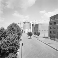
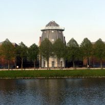
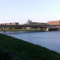
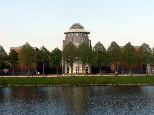
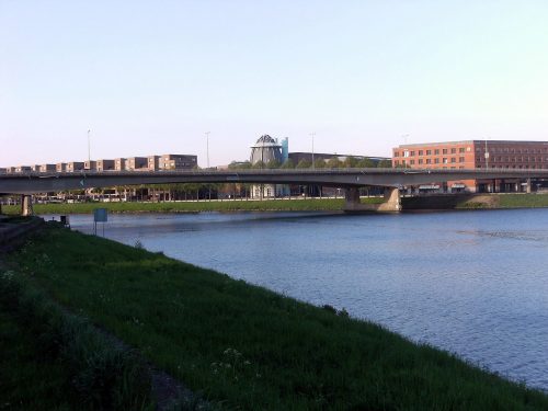
The Bonnefanten Museum was built on Avenue Ceramique 250, a land belonging to a former industrial area along the Maas River, facing the old city center of Maastricht, Netherlands. With its unique location the museum and its dome has become a landmark of the city.
The building occupies the site where was the pottery factory Sphinx/Societe Ceramique. In 1990 a number of industrial buildings were demolished to make way for a new residential development called the “Projet Ceramique”, designed by Dutch architect Jo Coenen, which includes a library, a theater, a school, offices, shops, restaurants and several apartment complexes. The Bonnefanten Museum adds to the redevelopment of the neighborhood, while serving as custodian of the rich past of the region.
- Wiebengahal
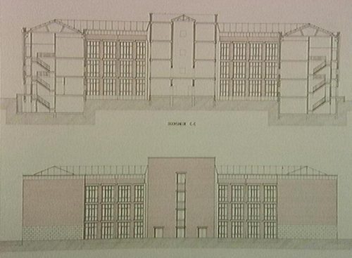
A former industrial shed, the ‘Wiebengahal’ is parallel to the transept of Bonnefanten Museum. This room of 56 x 15 meters and 4 stories high was the first reinforced concrete building in the Netherlands. This building, built in 1910-1911, has received the status of ‘monument’. The Municipality of Maastricht and the Province of Limburg are currently considering whether to reappoint the Wiebengahal as an archaeological museum, which would be managed and operated by the Municipality of Maastricht.
Concept
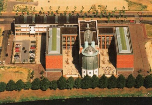
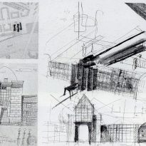
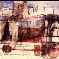
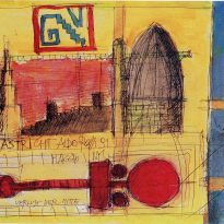
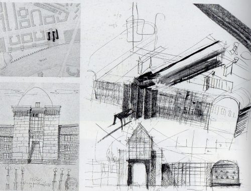
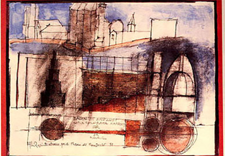
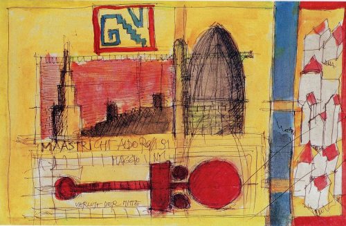
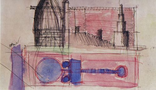
Around 1990 the opportunity arose to build a new building for the Bonnefantenmuseum (Good Children’s Museum). For the realization of a unique construction the institution contacted the Italian architect Aldo Rossi, who was, in the words of Van Grevenstein, director of the museum, “a great expressive inventiveness coupled with a quiet visual language”. The new museum would be a distinctive building that would do justice to the works of art. the best solution for this was an original variation of classical buildings designed for this purpose, a series of galleries, illuminated from the top and sides, in a clearly arranged structure of wings. around a central for Rossi, the museum staircase has demonstrated the importance of public buildings for the identity of the city “… there is a long deck with wood staircase in the building,. this and other features are the very essence of this architecture reminiscent of the seafaring tradition of Dutch cities, like the great river that flows through Europe and through Maastricht… “(Aldo Rossi). Together with her research on typological basis of this building, the architect shaped the idea of some pictures and the text Verlust der Mitte. The cultural philosopher Guido Goossens wrote about the philosophical and symbolic significance of the building in his book ‘Het Bonnefantenmuseum gebouw’ (2007).
The museum architecture is fashionable, perhaps to the point subtracting the functional requirements for the building to fulfill its purpose. In this case the museum is primarily a means to display collections and exhibitions. Instead of redefining the fundamental concept of what a museum, Bonnefantenmuseum has been realigned with the classical museum studies focusing on the innovative application of existing, but with effective architectural elements such as the incidence of natural light and the use of a monumental staircase that forms the axis of the path that visitors follow, with clear articulation of spaces.
Aldo Rossi was invited to design a powerful framework, but subdued, in which works of art can be judged on its own merits. Apparently, he was also able to create a poetic value. He transformed classical museum in a composition that is familiar architectural approaches and yet completely new.
Planimetry
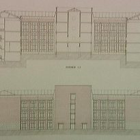
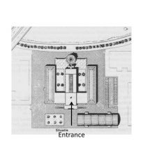
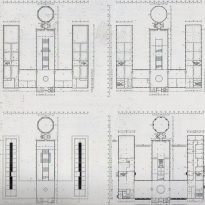
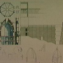
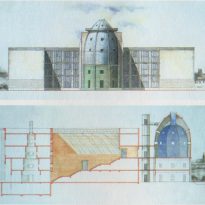
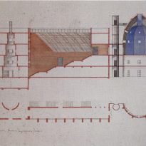
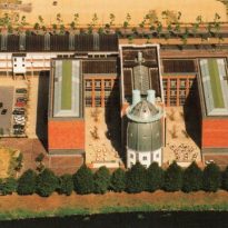
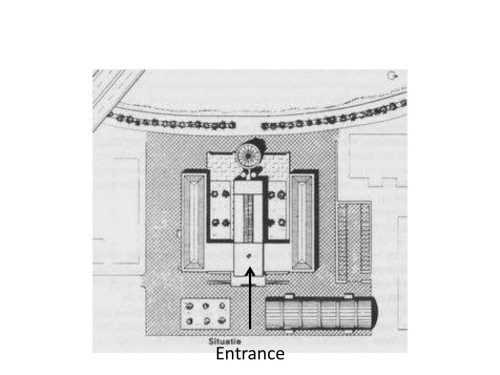
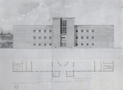
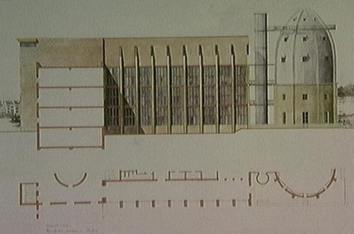
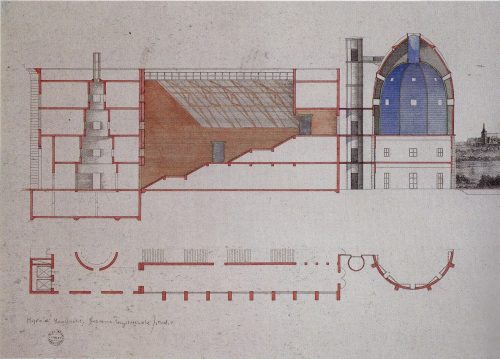
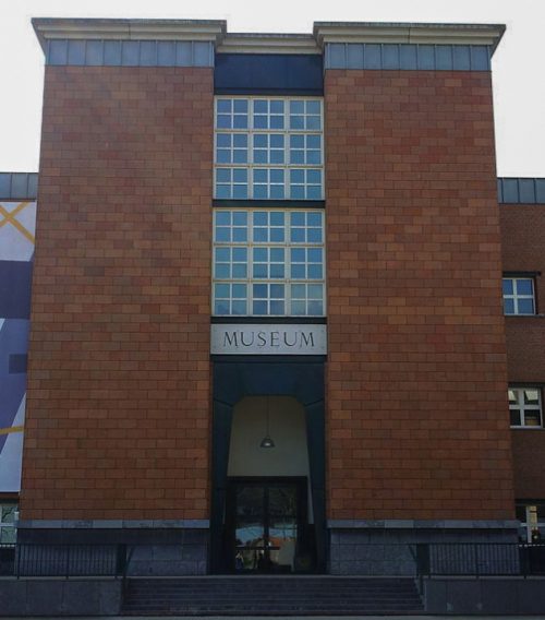
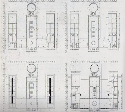
The planimetry used by Rossi is simple, three longitudinal cross bodies joined by another, (E), in the center of which is the main entrance. The three parts of the building can be defined as three vertical lines whose structure results a symmetric and smooth building which confirm the predilection of Aldo Rossi for the simplicity of the forms derived from engineering and building static laws.
Spaces
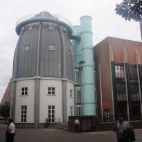
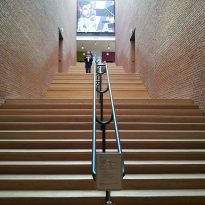
Its structure offers very characteristic details such as the monumental stairs, “Treppenstraße”, leading to the showrooms, but undoubtedly its most characteristic feature is the dome, the distinctive round tower on the banks of the river. Rossi sees the museum as a “factory display.”
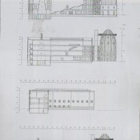
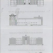
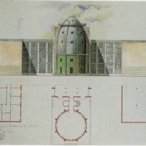
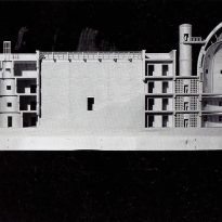
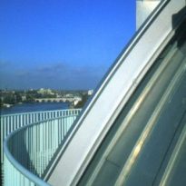
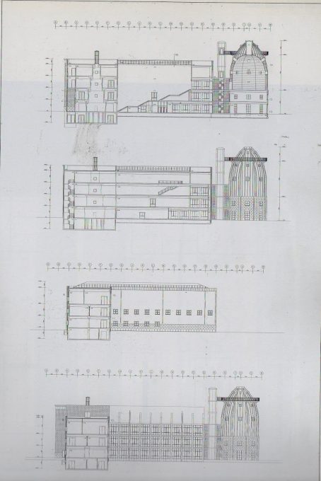
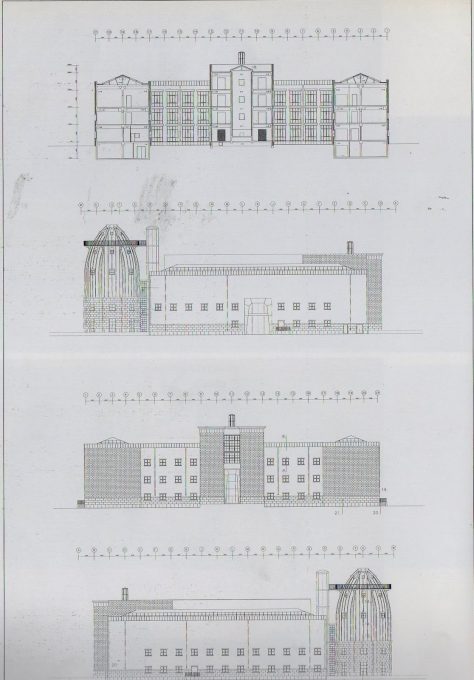
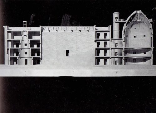
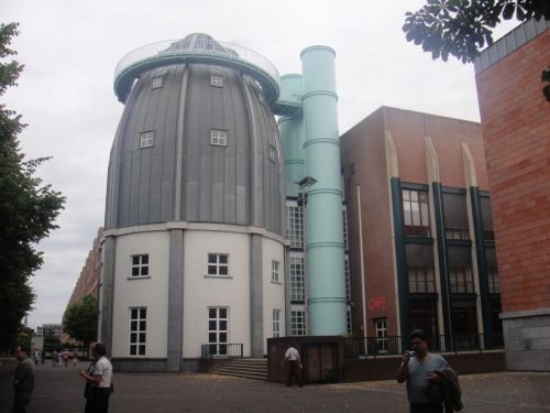
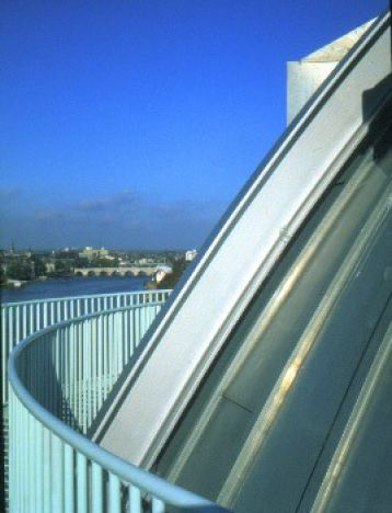
The museum consists of three buildings, the central is flanked by a cylindrical body covered by a dome crowned with a viewpoint from which you can see the river and the city on the opposite bank. The Bonnefanten is built in the form of E, with four floors.
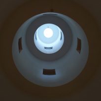
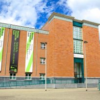
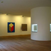
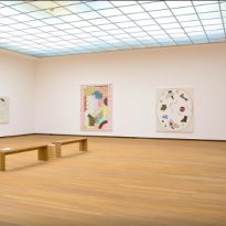
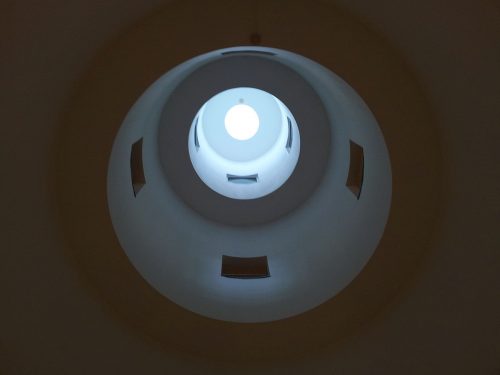
The main entrance is on Ceramique Avenue and there is a second entry for Café Ipanema. Most public areas are situated on the ground floor: entrance hall is the first room on the visitor arrives, it has the distinctive shape of a telescope slimming as it rises, the museum store, auditorium, the cafeteria with two terraces and the tower room. The exhibition halls, with over 4,000 m², are on upper floors, with the collections on the first floor and temporary exhibitions in the second and third. At the top of the central wing is a ‘living impressions’
- Central staircase
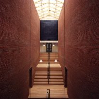
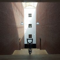
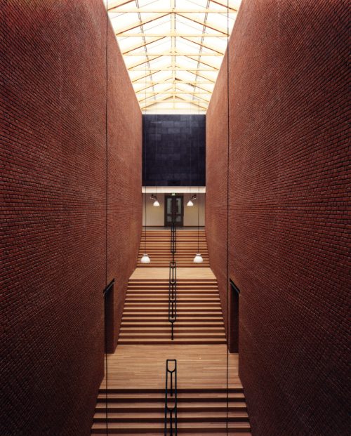
The central staircase leading to the showrooms is really a covered glass street which makes it the most naturally lit space of building, making visitors feel they are outdoors.
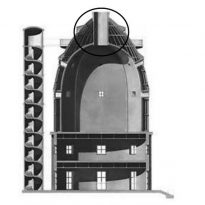
Since the beginning of the stairs visitors have access to the tower of the “Dome” and smaller up an iron stairs can reach print galleries on the upper floor of the main wing.
Central Wing
The central block of four floors, including a basement level, rises above the rest of the building with the dome.
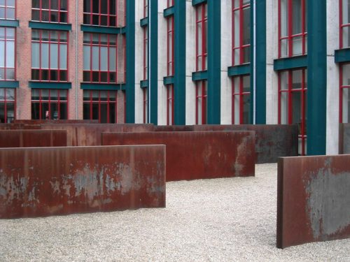
On both sides of the ladder side decks from which you can see the interior gardens, located between the three bodies of the building extend. Each hallway leads visitors to the space above the lobby, recognizable by the tower in a telescope. By going through the intermediate aisles, visitors arrive in the side wings, each consisting of 5-7 galleries and a main room of 14 x 16 meters.
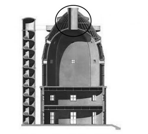
- Dome
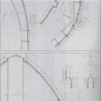
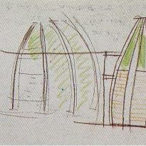
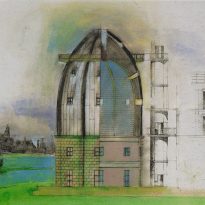
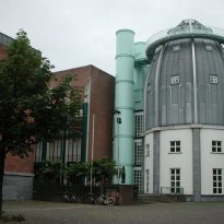
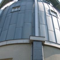
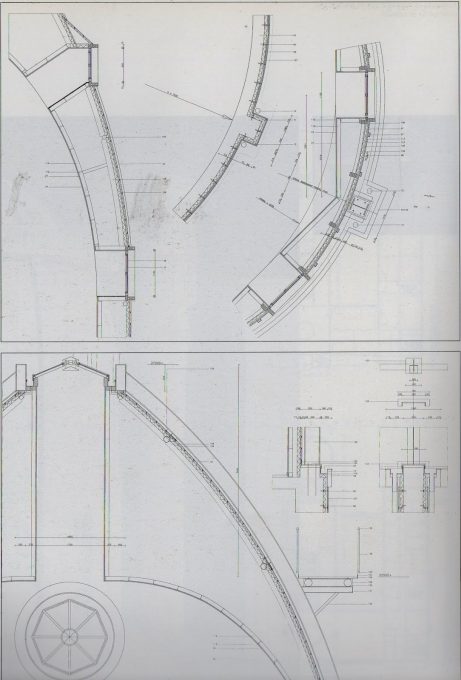
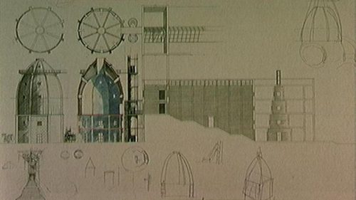
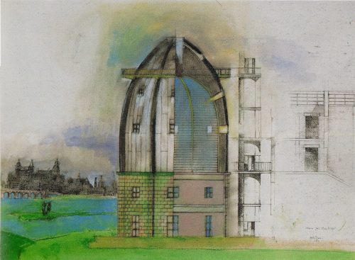
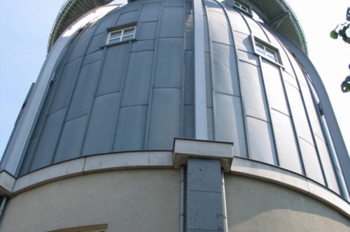
The dome is at one end of the central body, near the river. Zinc coated sheet is bullet shaped and symmetrical. Almost at the tip surrounding a runner outdoors lookouts and has square windows that decrease in size as they approach the top of the dome, the latter being highlighted with small ledges. These types of windows available and resemble those used in the typical buildings of the Dutch countryside.
“… There are two main reasons for the magnificence of the dome: the first is your link to the architectural tradition of the classical world, tight to the nineteenth century Turin architect Alessandro Antonelli; the second is that between the river and the sea the terrain in that country boldly states… “(Aldo Rossi, July 1991)
Structure and materials
The building is constructed with traditional materials such as iron, brick, natural stone and zinc, around a skeleton of concrete and steel. Inside the floors are made mostly of wood Keruing, like the central staircase.
Lighting
Natural light penetrates mainly the cover central staircase, interacting with art works on the second floor. In making its route, the visitor passes alternately through the halls of the north and south of the central staircase where the lighting effect is provided by the contrast between the openings and closings that dominate the building. High side walls of the staircase are of red brick from floor to ceiling. The rooms on the first floor lateral combine natural light with indirect lighting panels. The hallways of the upper floors are lit with adjustable lights on the ceiling.
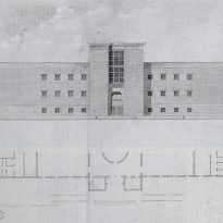
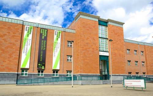
The facades on the front and sides are closed, and the facades of the central wing, which forms the axis of the building are open. This interplay of light and routing by horizontal and vertical openings that make the visit a “architecturale promenade” (architectural promenade) stands
Finishes
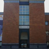
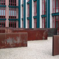
The facades of this symmetrical complex are finished in red brick, red trachyte and Irish limestone ashlar. The roof of the tower is covered with pieces of zinc, and with glass in the galeries.
