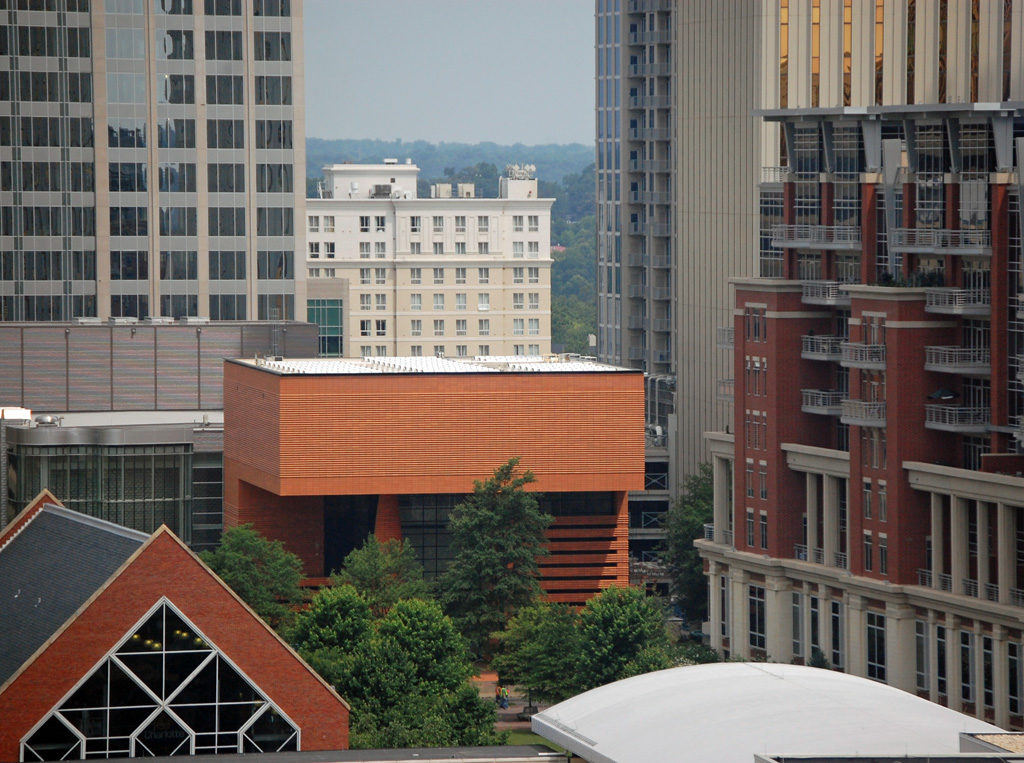
Bechtler Museum of Modern Art

Introduction
Designed by the architect Mario Botta, the Bechtler Museum of Modern Art shows an architecture with sculptural power that connects with the dynamic art of its interior.
This is the architect’s second project in the United States, both are art museums. The first was the Museum of Modern Art in San Francisco in 1995. This second is named after his benefactor, the Swiss Andreas Bechler. Although its construction was completed in 2009, it was inaugurated on January 2, 2010.
History
In 1970, Swiss-born industrialist Andreas Bechtler settled in Charlotte. Heir, together with his sister, of his parents’ large art collection and wishing it was accessible to the public, he donated approximately 1,400 works to the city of Charlotte, including important pieces of the 20th century that include works by Andy Warhol, Alberto Giacometti and Jean Tinguely, as well as Picasso, Jasper Johns, Max Ernst, Paul Klee, Le Corbusier, Joan Miró, Alexander Calder and Ben Nicholson.
The museum was built by the city and the district of Charlotte on a budget of $ 17 million financed by the Wachova / Wells Fargo bank. Bechtler contributed an additional $ 3 million. As for the architect’s choice, the benefactor seems to have had the right to choose it. “… I received the commission from the city of Charlotte on Bechtler’s recommendation …,” Botta explained.
Location
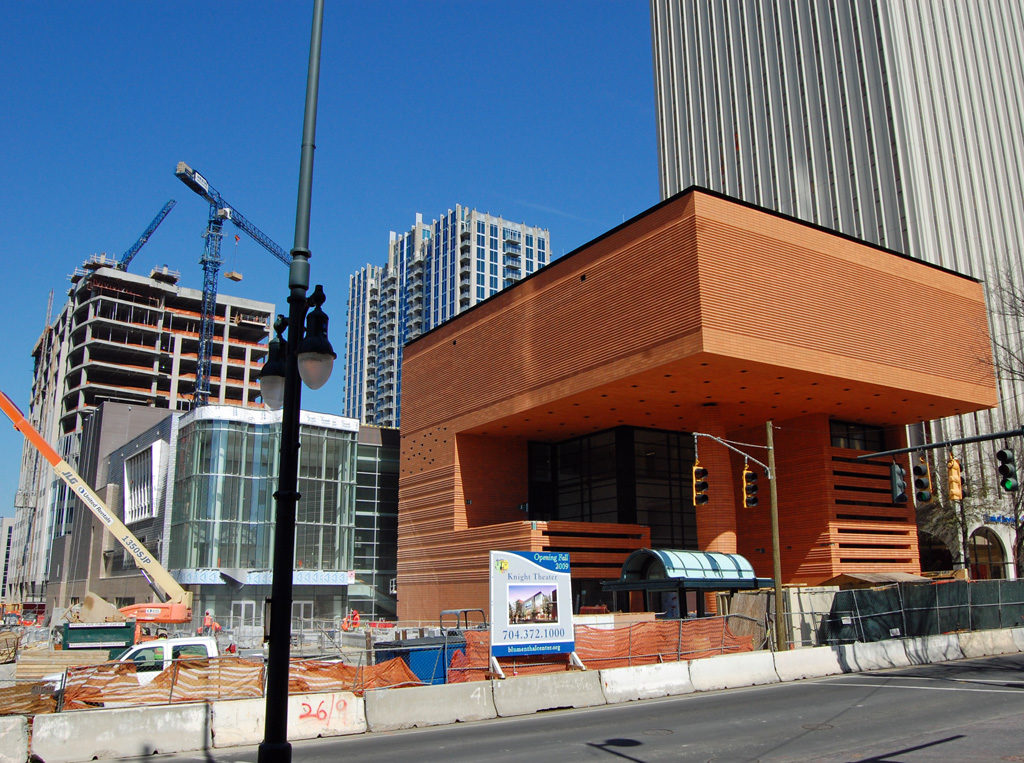
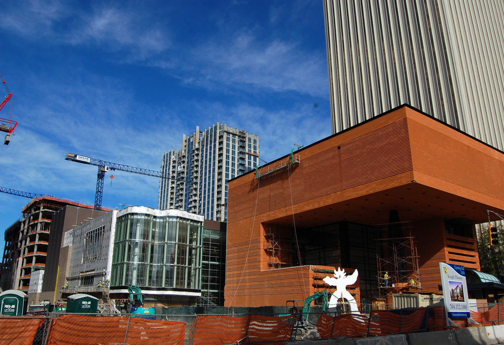
The museum was built in the city of Charlotte, 420 South Tryon Street, in the state of North Carolina, United States. It is part of the new Levine Center for the Arts in the city center. This Center also includes the Bechtler Museum of Modern Art, the Harvey B. Gantt Center for African American Art and Culture, the Knight Theater and the Mint Uptown Museum. The main north-south road passes directly through the new building.
Concept
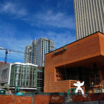
The Bechtler Museum of Modern Art reflects Mario Botta‘s style with strong and contemporary structures that combine colors, textures and materials. Exercising his modernist point of view, Botta designed the Bechtler so that it not only stands out as a unique contribution to the urban landscape, but also serves as a strong aesthetic partner among a group of individual design statements.
According to European standards, it is an imposing building. But by American standards it is quite modest. “It’s an intimate space,” said Botta. That is clear when you see the building from a distance surrounded by skyscrapers.
Spaces
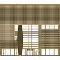
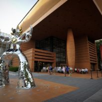
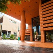
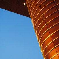
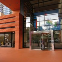
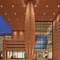
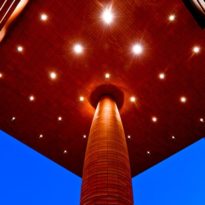
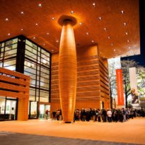
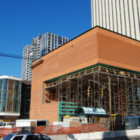
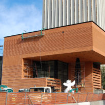
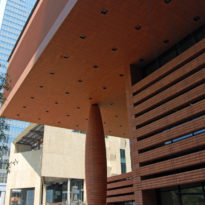
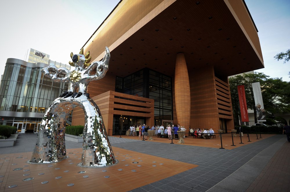
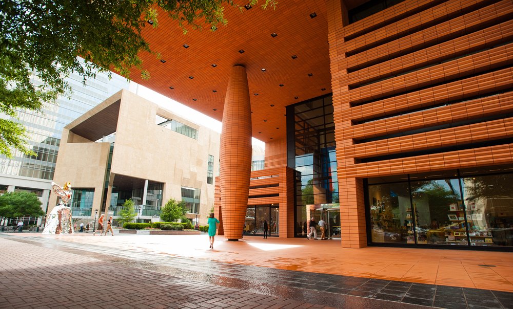
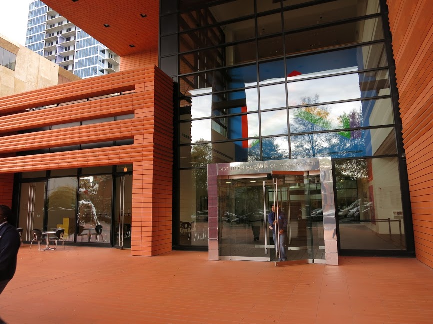
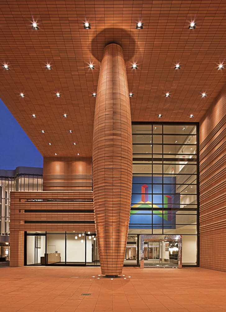
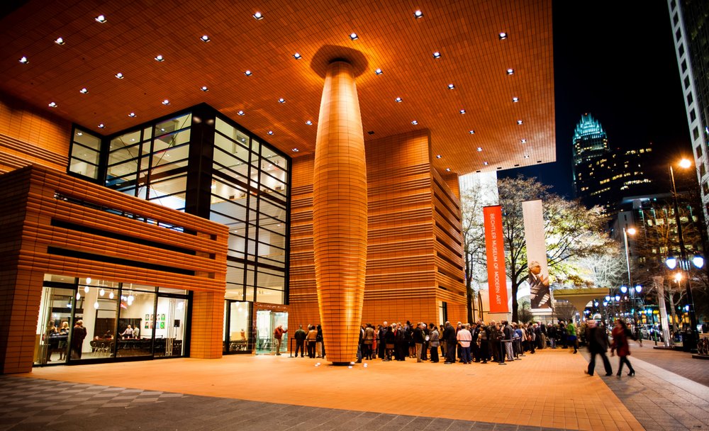
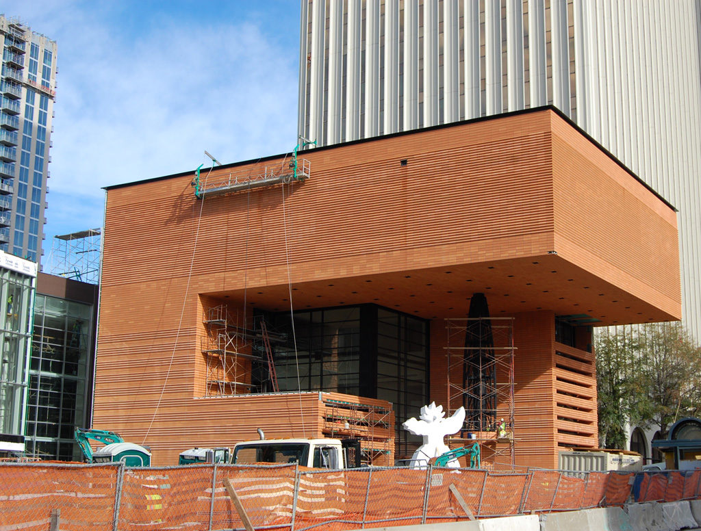
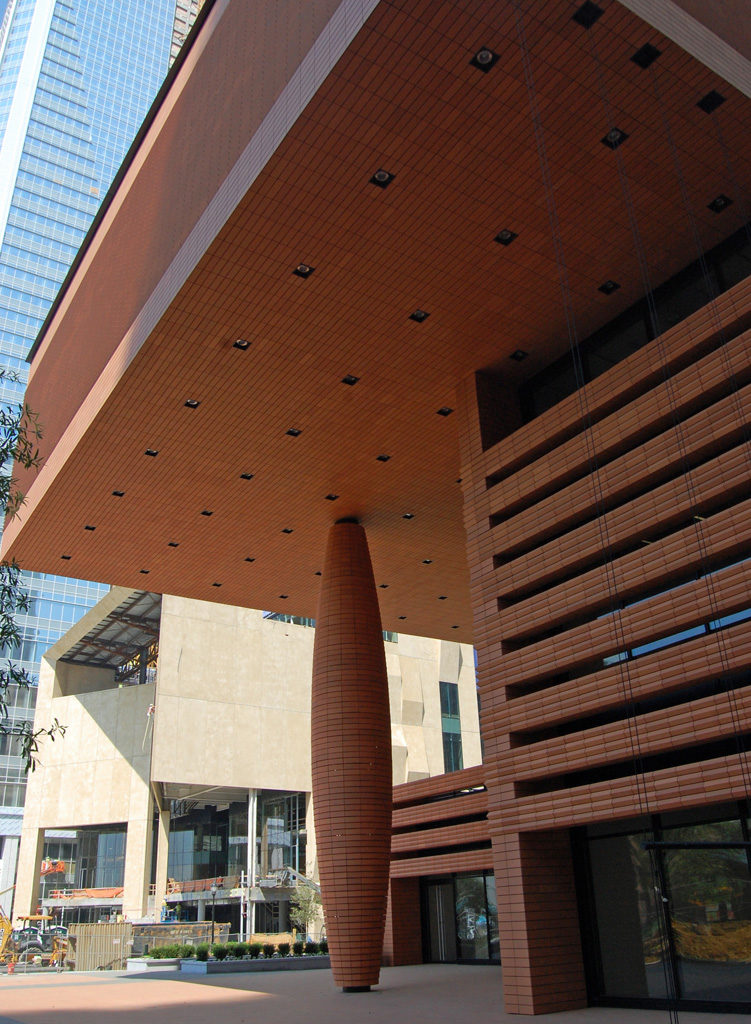
The exterior of the cube-shaped building attracts attention due to its terracotta color, its geometric shapes and a single convex column almost 15m (14.33m) high, interrupting the game of solids and voids. The ceiling of this entrance area is the floor of the exhibition space of the last floor.
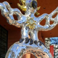
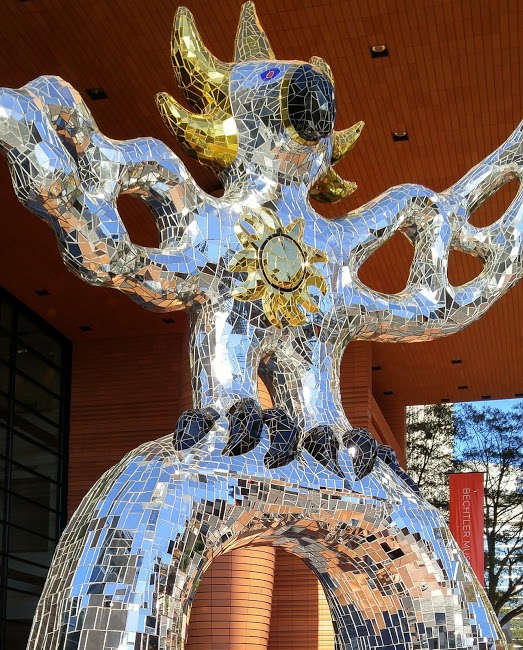
In the outer square, under the large overhang, is the great Firebird sculpture by Franco-American artist Niki de Saint Phalle dating back to 1991. Bechtler was convinced that this rounded sculpture would be the perfect counterweight to the geometric and linear shapes of the building .
Atrium
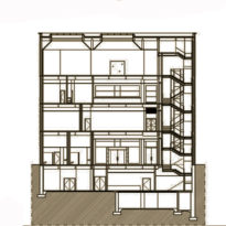
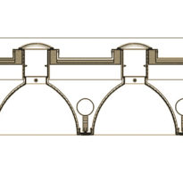
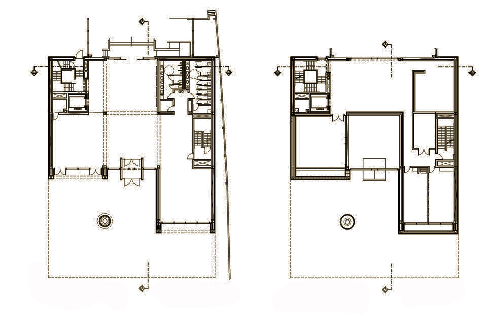
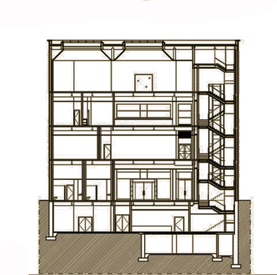
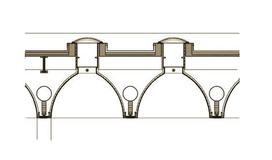
A key element in the four-story structure is the glass atrium that extends through the core of the museum and diffuses natural light throughout the building through a system of vaulted skylights. The open atrium, with three levels of height, allows visual interaction between spaces. In this area is the installation on the artist Sol LeWitt who is credited with creating the conceptual and minimalist art.
Galleries
2nd and 3rd floors
On these floors there are small exhibition spaces that on one side look towards the Knight Theater and on the other they open towards the different places of the Cultural Center.
4th floor
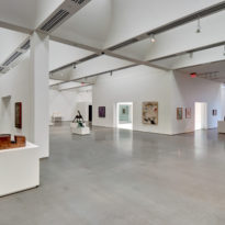
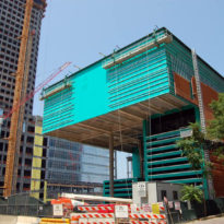
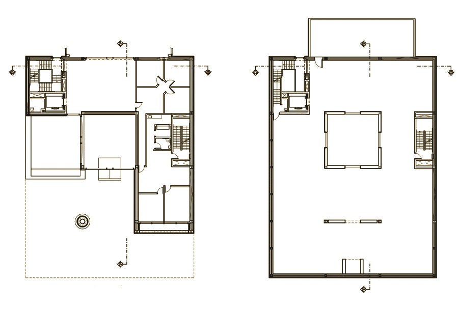
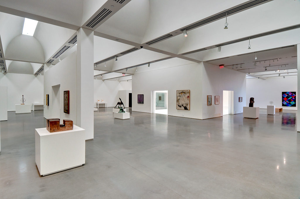
The dominant feature of the building is the gallery of the fourth floor that makes a bold and dramatic statement when it leaves the nucleus and moves in a cantilever creating the roof of the open square below. This cantilever is supported by a single column that rises from the square. This exhibition area with its 1000m2 dominates the construction. Illuminated from above by skylights, the space is mostly open and without windows, except for those that overlook the main atrium. From the outside the lack of windows on the facade of this area accentuates the deep opening it covers.
Structure
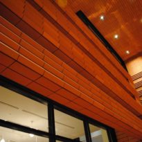
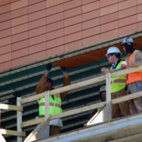
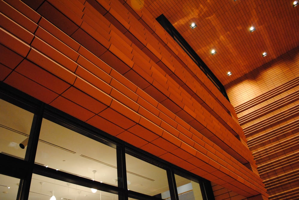
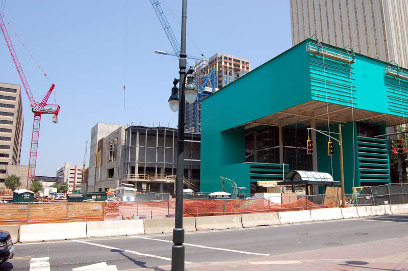
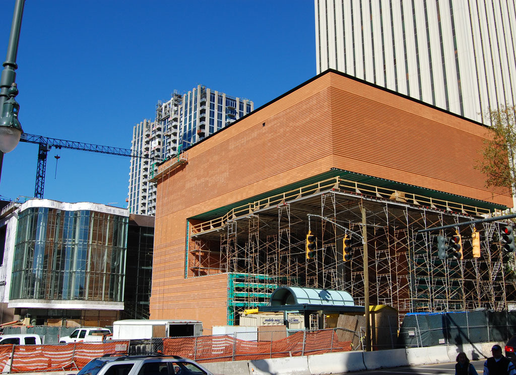
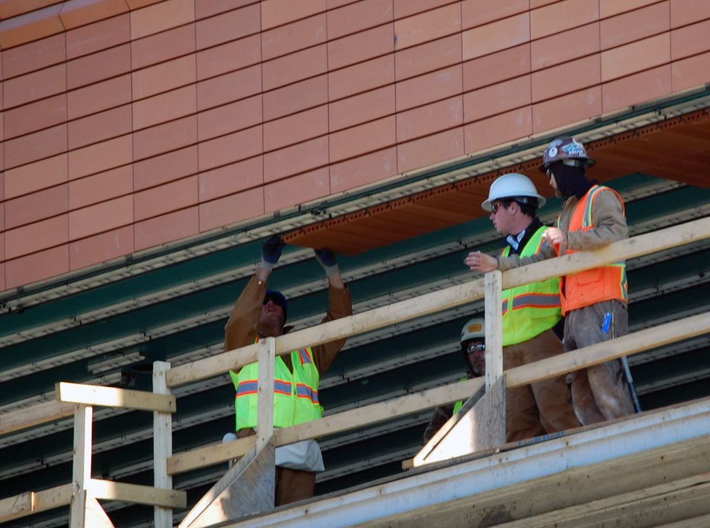
Steel poles used as a channel rail system where terracotta tiles were fixed were thrown on the exterior wall of the building. The glass structure of the atrium is strengthened with crossed reinforcement cables.
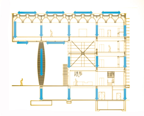
The cantilever of the building is supported by wide-flanged steel beams W40x362 installed in the roof structure and the fourth floor. The metal covers are fixed to the steel beams by cutting bolts. Above and below each wall in the overhang is a transverse beam. Loads from the top are transferred down through the load transfer walls to the foundation of the base. The coffered skylight design is used to lighten the weight of the roof while hiding large steel beams and mechanical structures.
Pillars
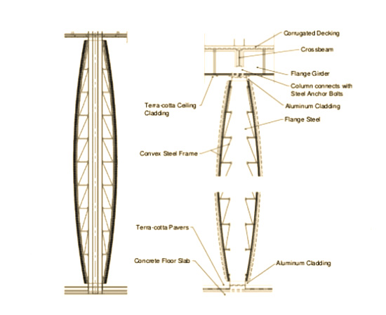
The outer column is an important part of the structure to support the fourth floor. To transfer the load more effectively it is placed in the middle of the overhang and directly under the steel beams.
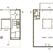
This swollen column belongs to the regular column of columns of the 8.84×8.84m building, only that all the other columns are hidden inside the walls leaving six of the 20 points of the grid empty. At one point the option was considered that this column did not exist, but the structure to support a 27.43m overhang would have been so large that the usable interior space would have been significantly reduced.
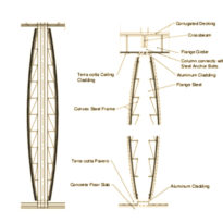
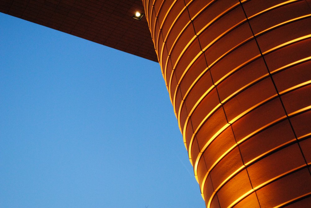
Having accepted the need for the column, Mario Botta assigned him primary symbolic duties, as well as loading tasks. “It’s not just something structural,” says Tobia Botta son of Mario Botta, “… because we could have made it thinner, but it has to represent the entire weight of the building …” The only visible column of the building bulges in the middle, like if it were compressed by the weight of the gallery on it, its diameter in the center is 2.44 meters, twice the one at the ends.
However, the capacity of the column is anything but ethereal. According to structural engineers, its resistance is 2.5 times greater than that of a standard column. Its 4.42m square foot is hidden underground, below the basement level. Gravity is not the only stress that acts on it, the huge overhang must withstand the possible wind loads from below, as well as from the side. The column structure is made with standard reinforced concrete and the cladding of the plates mounted on a convex steel reinforcement. The builders used the technique of “column éntasis”, of gradual decrease.
Materials
The outer envelope is terracotta commissioned from an architectural terracotta manufacturer located south of Buffalo. The plates are composed of fire clays with dyes that were taken to a specific cooking curve so that they are resistant to frost and high temperatures.
Inside, Botta maintained a rigorous but elegant simplicity in the palette of materials including steel, glass, terracotta, black granite, polished concrete and wood. On the floors black granite was used on metal roofs, insulation, steel beams, C-channels and metal studs.
The architect also designed select furniture for the museum, including the reception desk, the cafeteria bar, the gallery benches and the hanging globe lights.
The sculptural column that rises 3 floors was built with hot dipped galvanized fittings instead of stainless steel fasteners inside the structure. It was made with reinforced concrete so that with a thin frame it could withstand greater loads and then coated.
Although the museum did not seek LEED certification, the building has some sustainable features, such as natural lighting and long-lasting terracotta cladding, which wears out over time and includes recycled content.
The museum also shares resources with its neighbors. It combines heating and cooling systems with the recently built Knight Theater and a joint auditorium was built under the square for the use of all the facilities of the Cultural Campus. There is also a shared space, prior to the event, with large glass doors that open between the Bechtler’s lobby and the theater.
