Asakusa Culture Tourist Information Center

Introduction
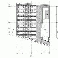
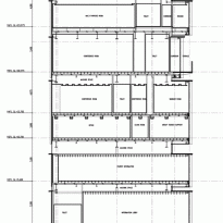
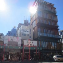
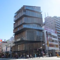
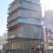
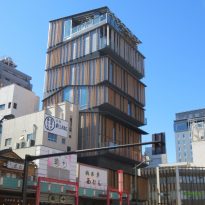
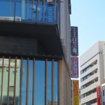
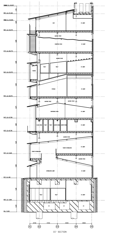
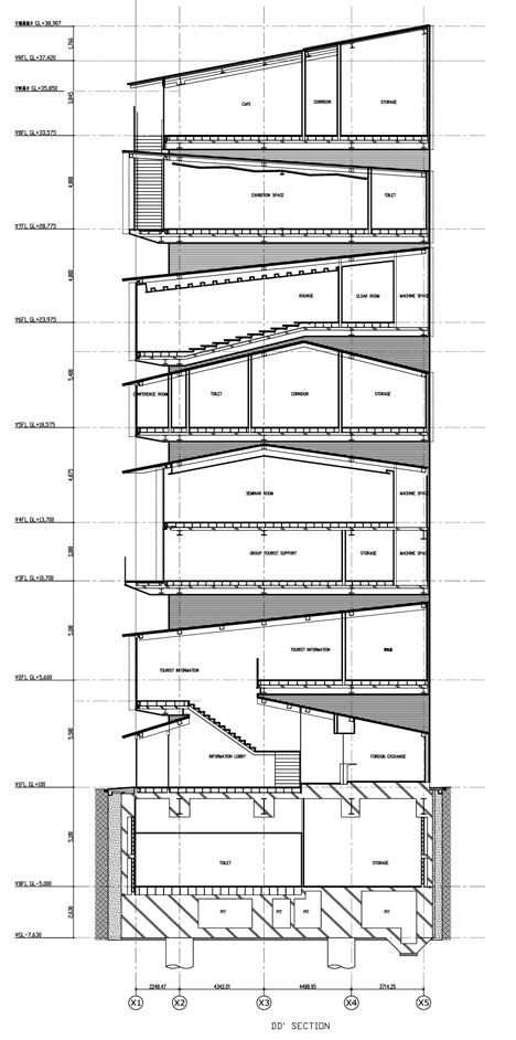
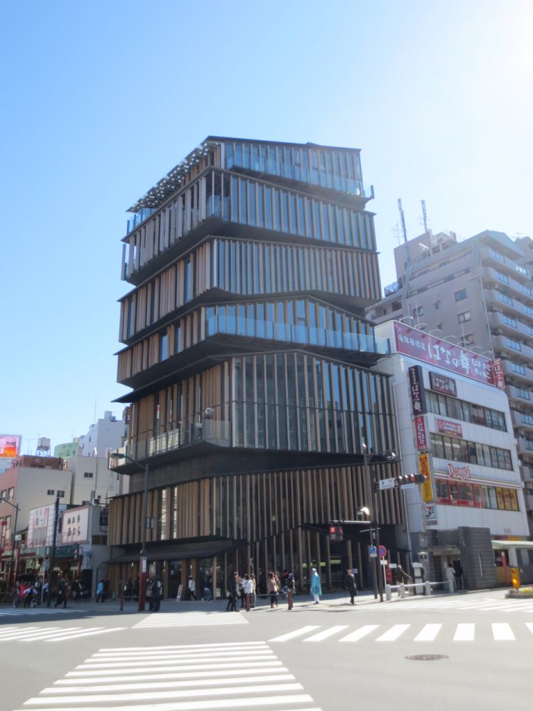
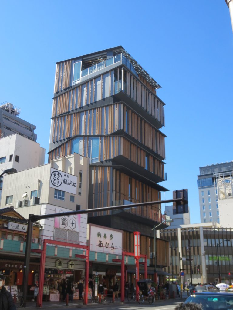
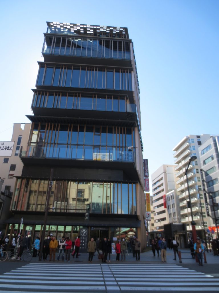
On a plot of 326m2 on the corner Kaminari-mon Gate, which deal 234.13m2, the project called for a plural program that included a tourist information center, a conference hall, a multipurpose hall would accommodate and an exhibition space. The proposed Kengo Kuma & Associates is a tourist information center that looks like a stack of small houses with sloping roofs rising horizontally.
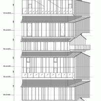
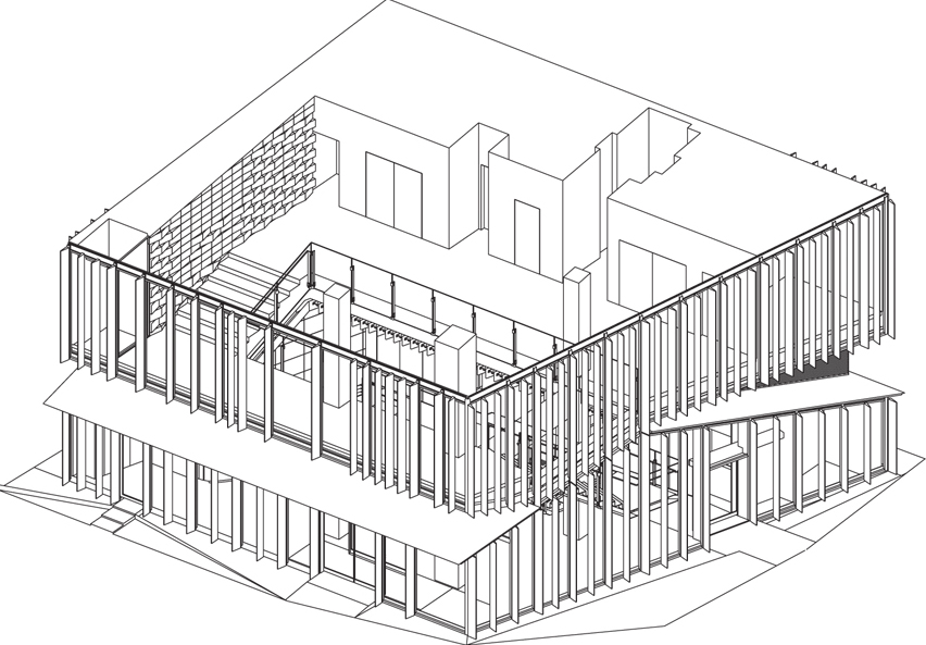
Eight bunk houses form the building surprises with the invention of motion obtained by the dichotomy between structure and facade, highlighted by the materials used to emphasize the visual impact on the urban environment.
Situation
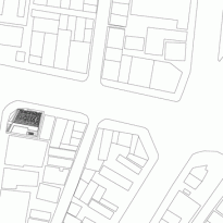
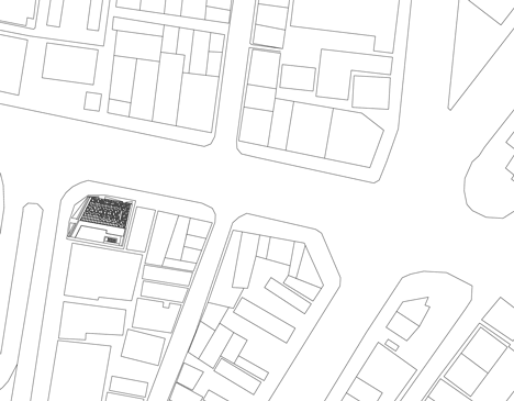
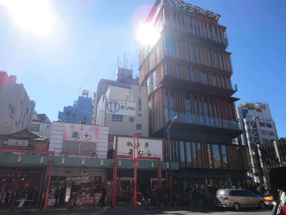
The Center of Culture and Tourism Information was built near the outer gate of the ancient Buddhist temple Senso-ji, built in the sixth century in the lively Asakusa. Your e 2-18-9 Kaminarimon, Taito-ku, Tokyo, Japan.
Unlike many other districts of the metropolis of Tokyo, Asakusa still retains traces of its history, with buildings dating from before the Second War Mundial.Durante over a century, from the 1840s to the 1940s, Asakusa district incubated unique local culture, Edo / Tokyo within coalescence unrestricted commercial interests and entertainment. Perhaps in ACTIC, Asakusa Culture Tourist Information Centre is the flagship regeneration get back to this district, so the nobel prize for literature Yasunari Kawabata described as “fertile mix of past and present, a mix of high culture and popular ”
Concept
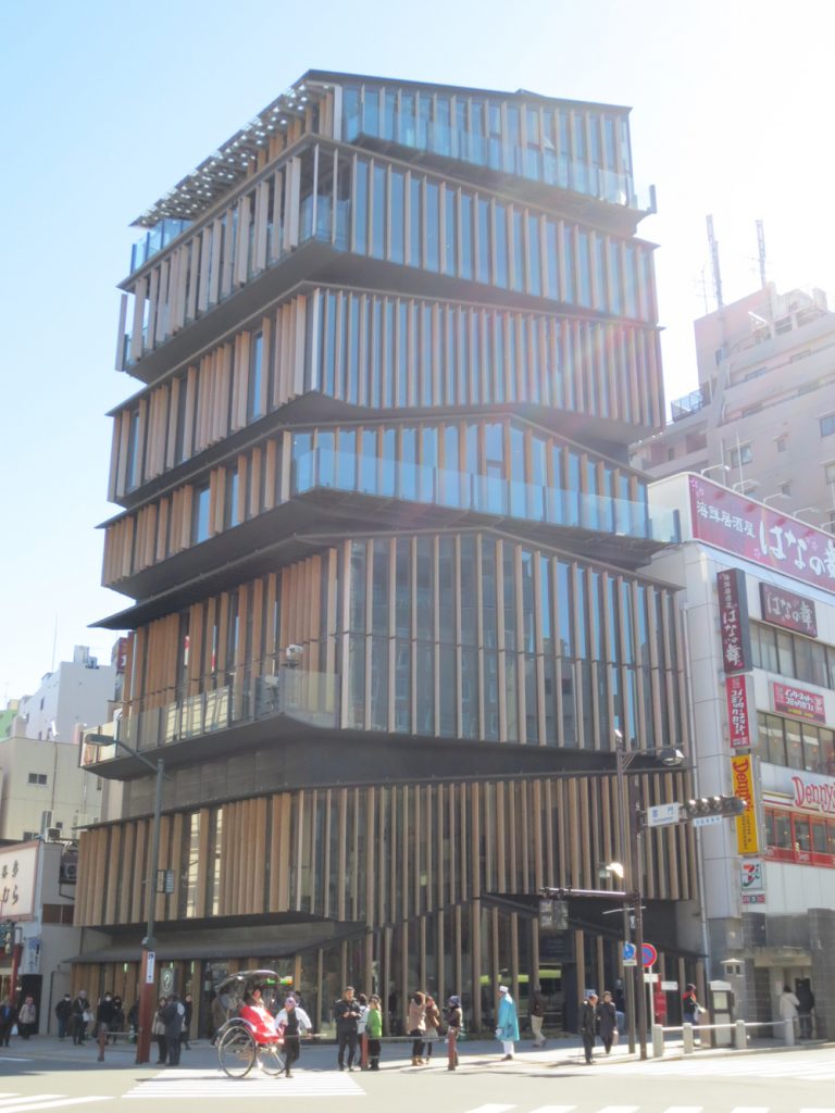
Kuma Kengo design seems to be the result of superimposing a series of traditional houses. Wood is the material defining the facades, referring to the traditional Japanese construction but done in a contemporary way.
Inside the Center reinterprets the Japanese aesthetic sensibility, but the whole stack, emptied and refilled with historical forms itself speaks of a sensitivity Kengo Kuma
Description
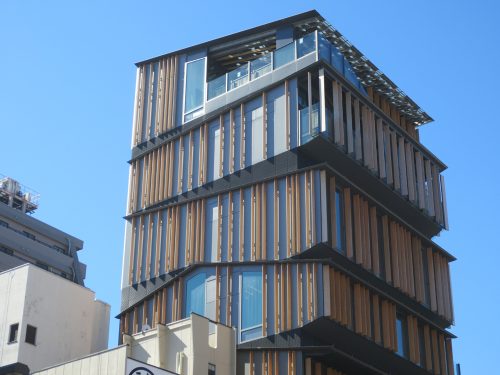
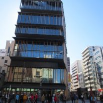
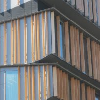
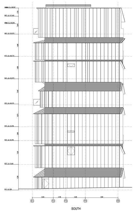
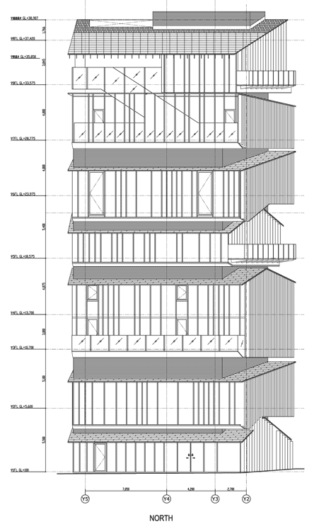
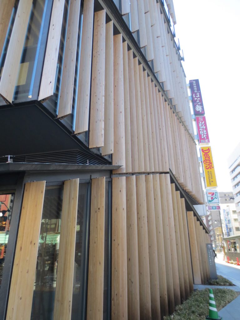
In one corner measuring only 326m2, Kengo Kuma designed a tower with geometric structure formed by the intersection of different planes projecting, creating asymmetric perspectives from every point of view. With a similar buildings surrounding vertical orientation, the Centre for Tourism and Cultural Information reduces vertical impact thanks to the movement of their facades, accompanying his eyes from the ground up, encouraging the viewer to observe the characteristics unique to each floor.
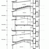
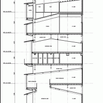
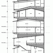
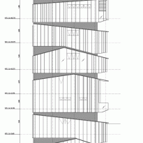
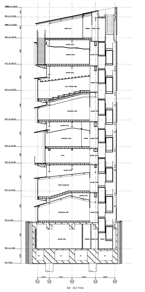
The building roof vertically accumulates involving different activities below, creating a “new section” nonexistent so far, in the conventional layered architecture. As the angles of the tilted Kaminari-mon ceilings and heights from the street vary from one plant to another, each floor is related differently to the outside, giving a unique character to each corner.
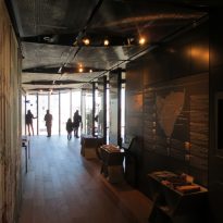
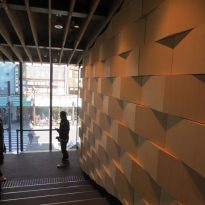
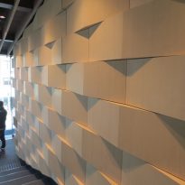
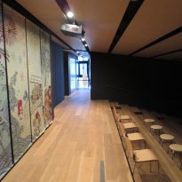
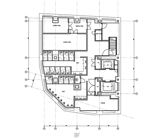
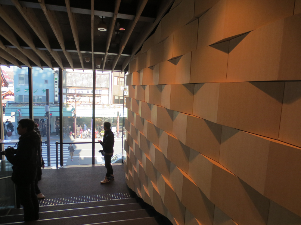
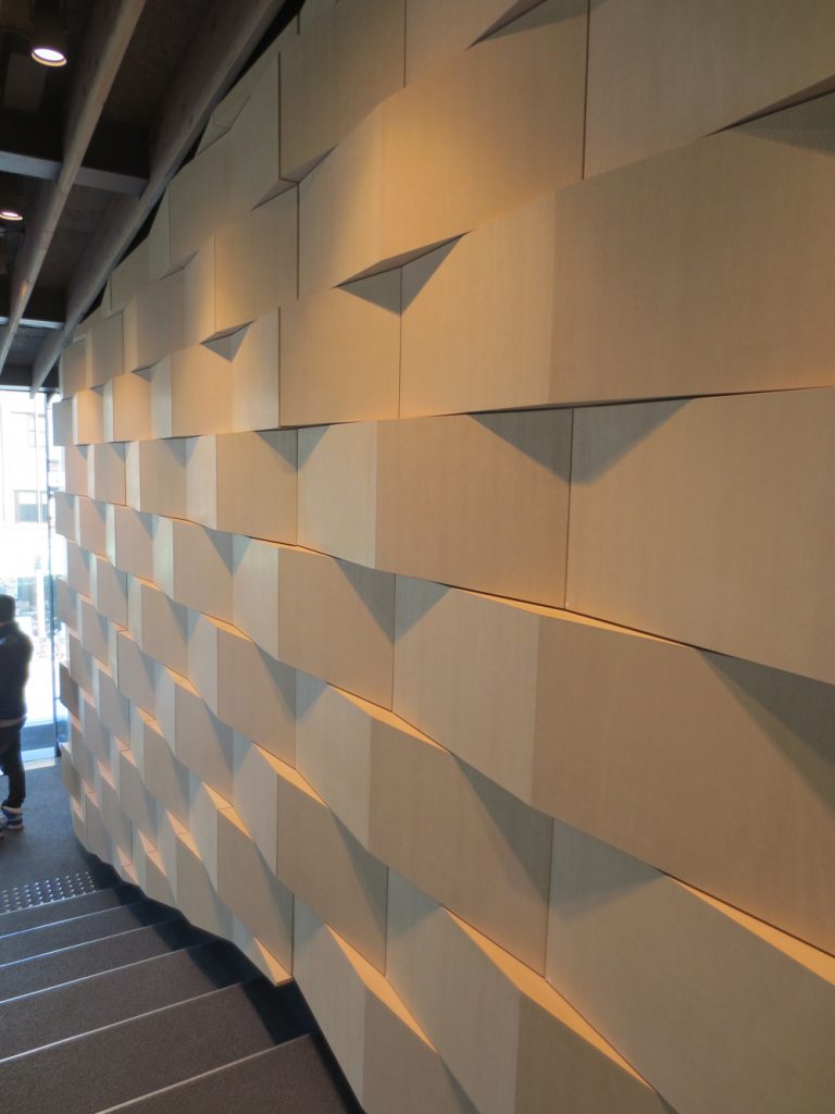
Walking inside appear moments of delicate process, as the black curtains of the windows designed by Yoko Ando, who also designed the curtains of the Tama Art University Library of Toyo Ito, undulating wood paneling on the east wall of the second floor, staying drawers to hide stocks of printed material and in the basement, glass panels backlit, decorated with art motifs printed on different types of wood, known as Edo Chiyogami, dating back to the Edo period of Japan, 1603-1867 although originally made of paper.
Spaces
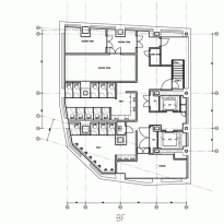
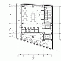
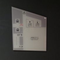
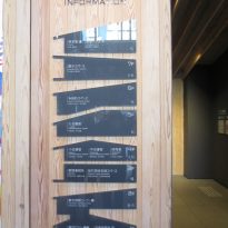
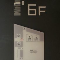
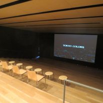
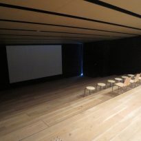
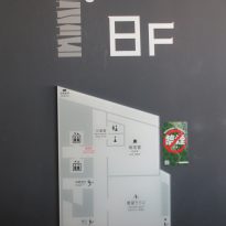
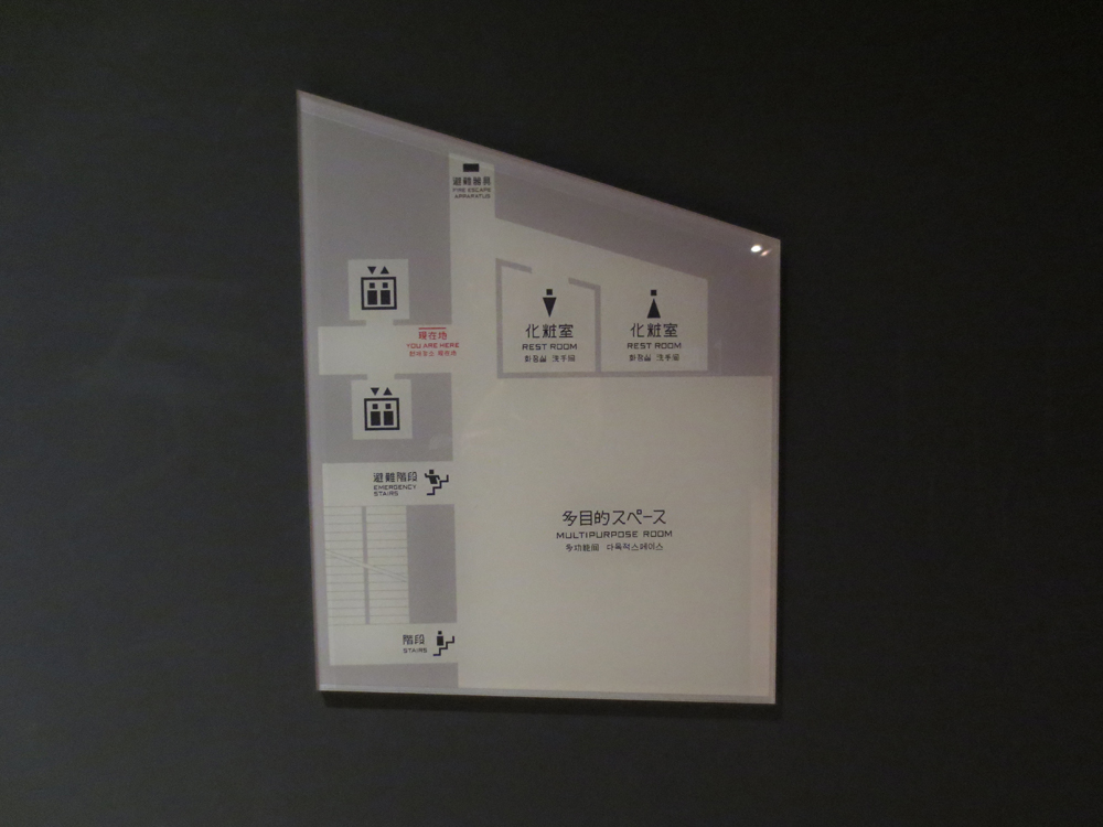
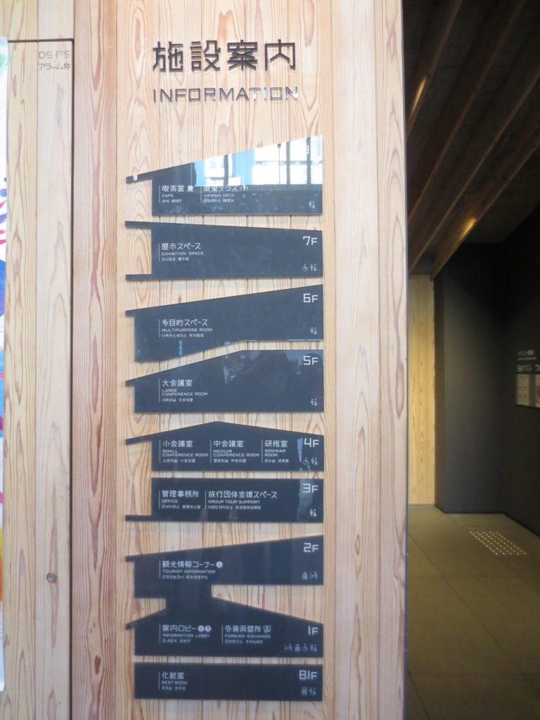
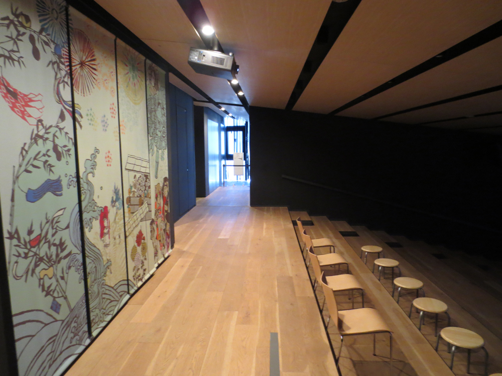
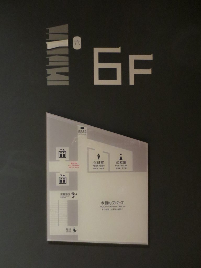
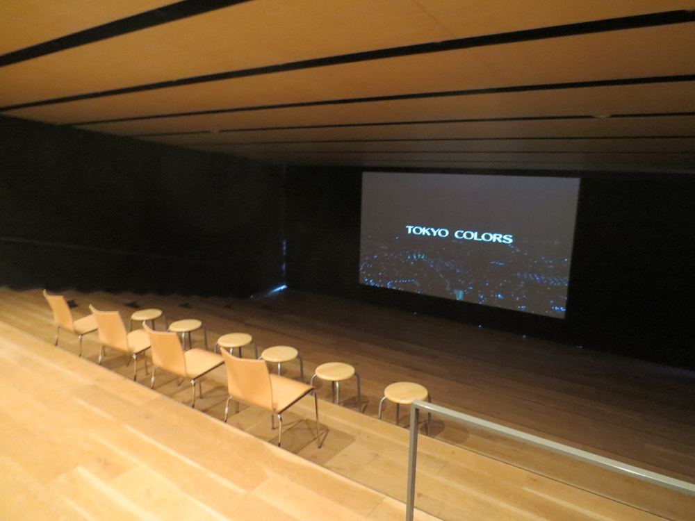
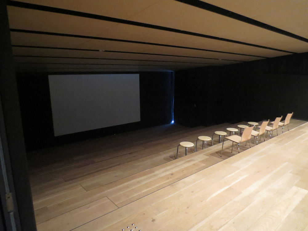
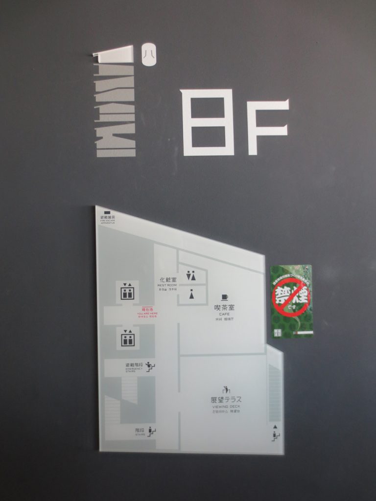
Inside this complex compact, the visitor is directed to different spaces, marked by a “wayfinding” created by graphic designer Kensaku Kato, an exhibition hall, meeting or conference or a theater with informal steps that rise from the ground.
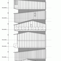
Roofs not only divide the housing structure in a plant 8, but determine the role of each. The shape of the building reveals stratification levels and functions, giving the city a landmark, a building for culture and entertainment, which stands out among its environment without breaking them and maintaining continuity with the soul site.
Plants
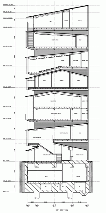
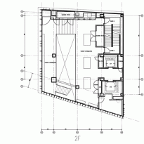
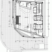
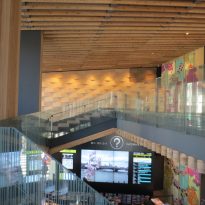
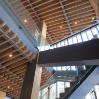
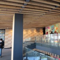
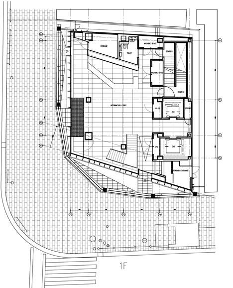
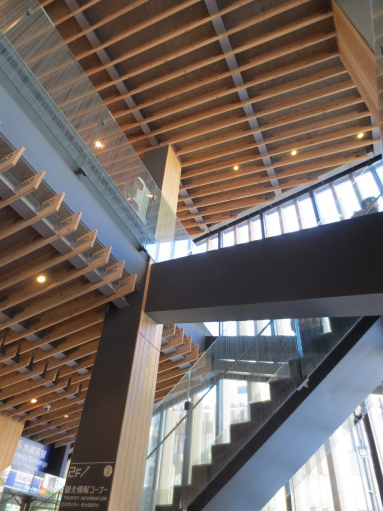
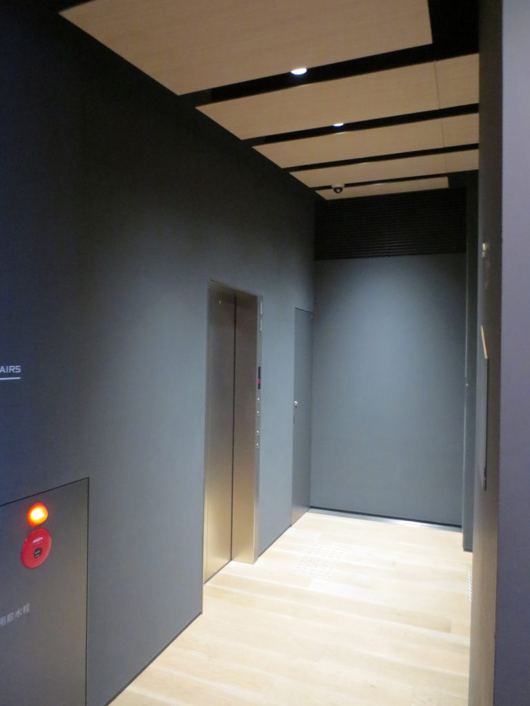
The first and second floor have an atrium and indoor stairs, creating a sequence in which you can feel the inclination of the two roofs. On the landing between these two plants, Kuma has placed a wooden platform where free WiFi and a resting place is offered.
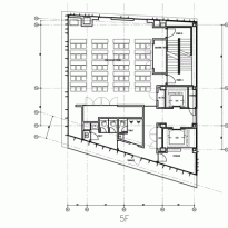
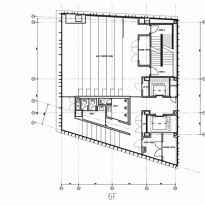
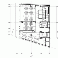
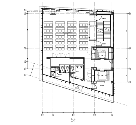
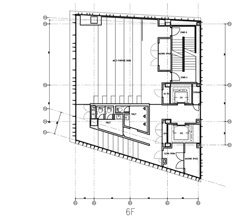
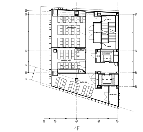
On the sixth floor, taking advantage of the sloping roof, has attached a mansard mezzanine that allows all the space to fulfill the functions of theater, conference or exhibition space. In other plants have been added steps inside the room for various uses.
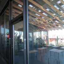
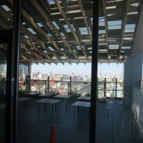
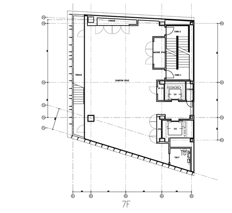
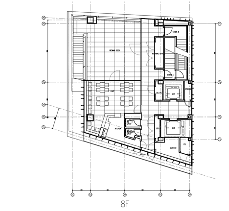
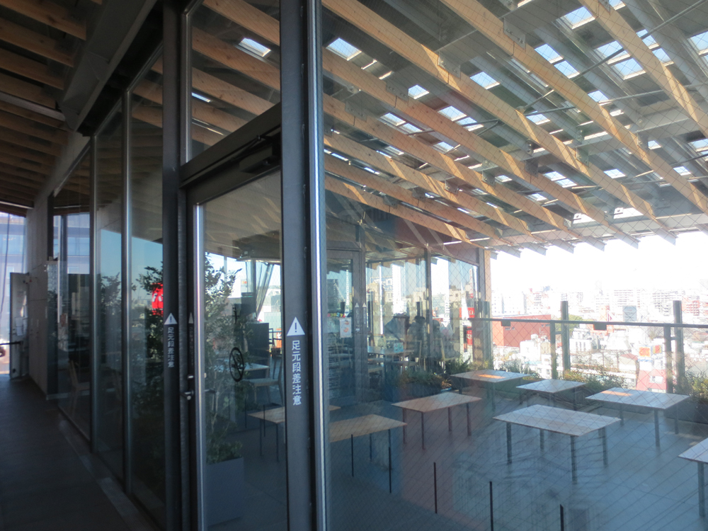
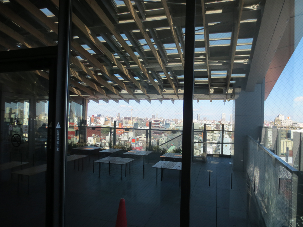
On the eighth floor of the building at a small cafe and an observation deck opened, creating an important moment in construction, for within its panoramic view, you have a clear view to the east beyond the Sumida River to Tokyo Skytree, recent radio broadcast tower.
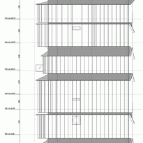
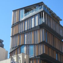
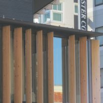
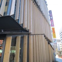
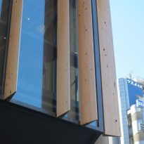
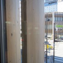
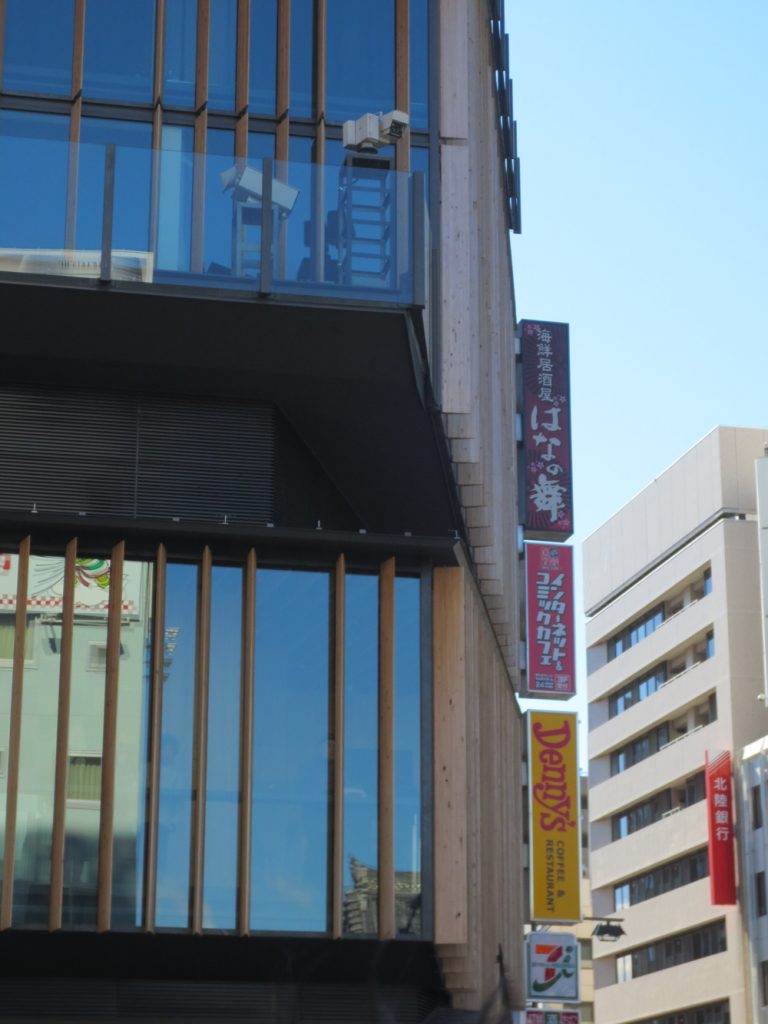
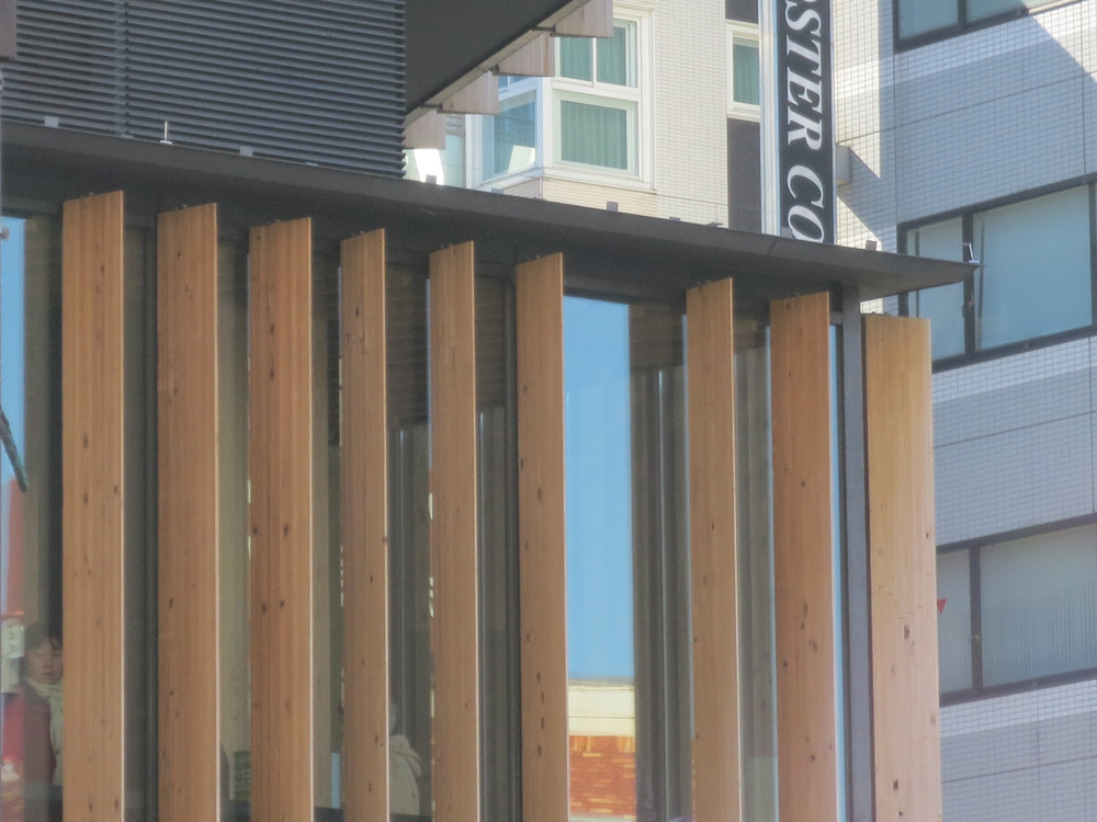
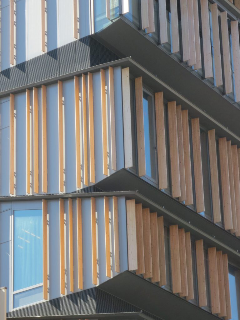
The windows, with regular rhythm of vertical sunshades, create a different perspective on every floor, accentuating the impression that the architect stacked a few old houses in the suburbs to build their skyscrapers in the city.
- Equipments
The equipment is stored in the diagonal spaces born between the ceiling and the floor of each of the plants, and this treatment could get a big airy volume, despite its high altitude, as if it were a lower construction.
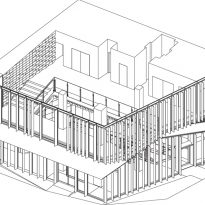
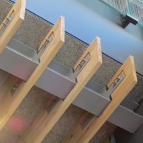
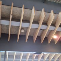
Wood Design, vertically marking the space occupied by the plant, aa help find the hole formed by the intersection between the ceiling and the floor of the plant that is above, where the architect ingeniously hidden all technical services and systems used in the different rooms, auditorium, multipurpose areas and exhibition spaces, which, thus, can use as much bandwidth available. This technical solution is noticeable on the facade, becoming a compositional innovation and revealing more about interior design, as in the conference hall or auditorium whose roofs with a steep slope is reflected on the floor upstairs.
Structure
Within the eight-story building, one can distinguish elevational permutations of silhouettes of vernacular dwellings Japan: Machiya (house), the Ageya (home entertainment) and the row of houses called Nagaya, to name a few. As a composition of stacked layers, Kuma takes what would otherwise be a fragmented accumulation and its facade conceals long vertical members, a reinterpretation of the traditional lattice facades. This does not only provide a concise picture of construction in general, but gently illuminates the way.
Materials
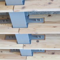
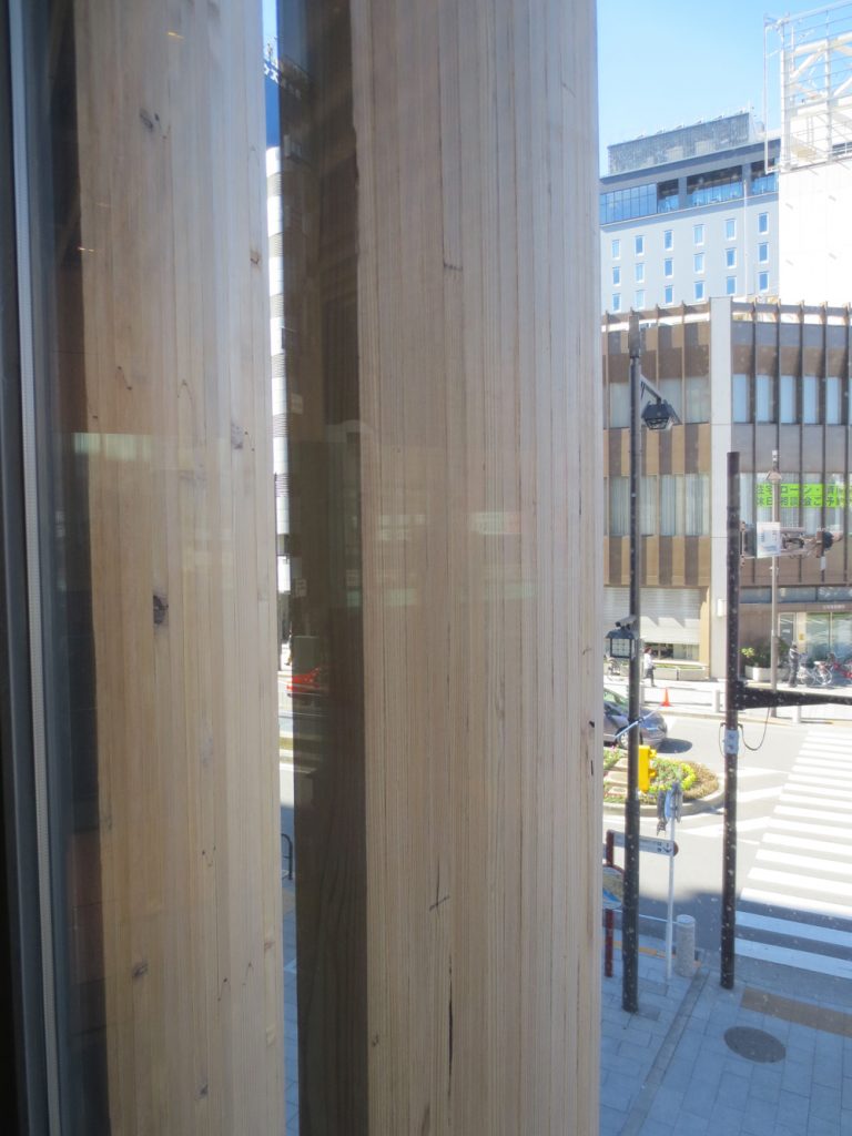
Its construction is basically a mixture of steel, wood and glass. Lamas cedar shade each of the four double glazed curtain walls of plants, spaced differently, depending on the shading or privacy required by the interior rooms.
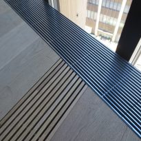
The inner surfaces of the building are also coated with various woods, wavy, horizontal on the east wall of the second floor, hiding drawers, or oak boards in soils.
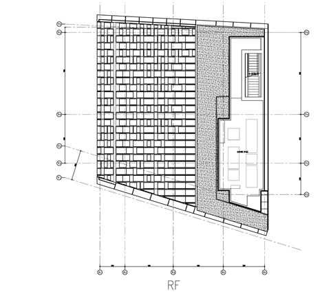
In each of the sloping roofs covering different levels steel plate was used.
Video
