Amsterdam Stedelijk Museum

Introduction
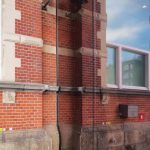
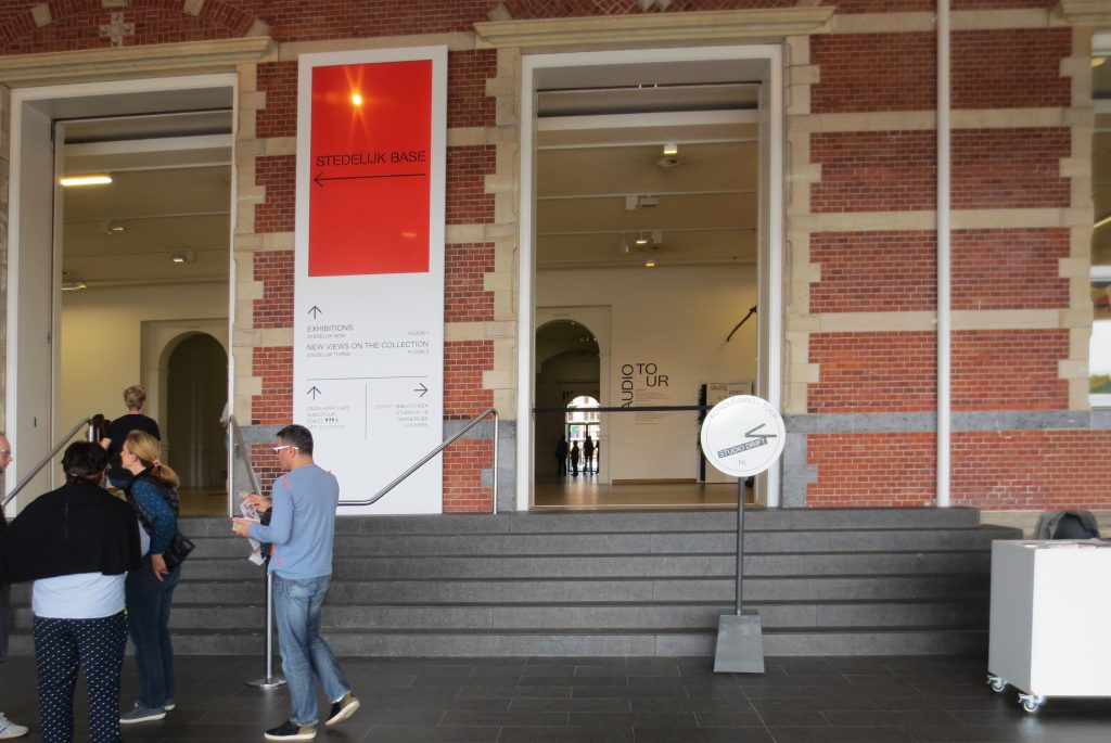
The Stedelijk has a long history of being “the museum” of Amsterdam in regard to modern and contemporary art. Founded in 1895, the Stedelijk has been in a neo-Renaissance building, designed by Adriaan Willem Weissman, since its inauguration. In 1938 Willem Sandberg, the director of the museum then, decided to remove all interior decorations and paint all rooms white to create one of the first exhibition galleries of “white boxes” in a historic building. After almost a century of uninterrupted activity, in the early 1990s the old building proved to be increasingly obsolete in terms of the requirements and functions of a modern museum, lacking the necessary fire protection and conservation works of art.
After a rather problematic process, in 2004 a design by Benthem Crouwel Architekten was selected for renovation and expansion, these works were completed in 2012.
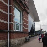
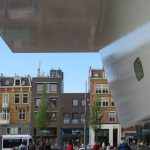
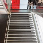
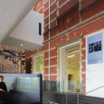
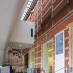
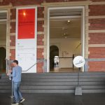
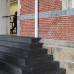
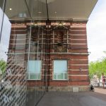
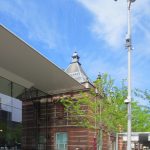
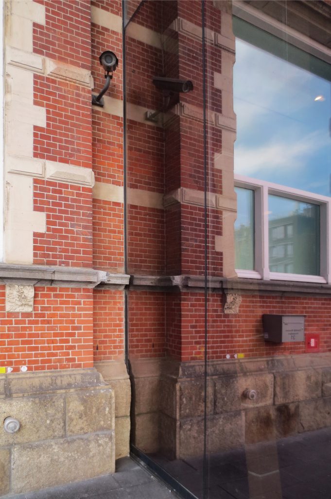
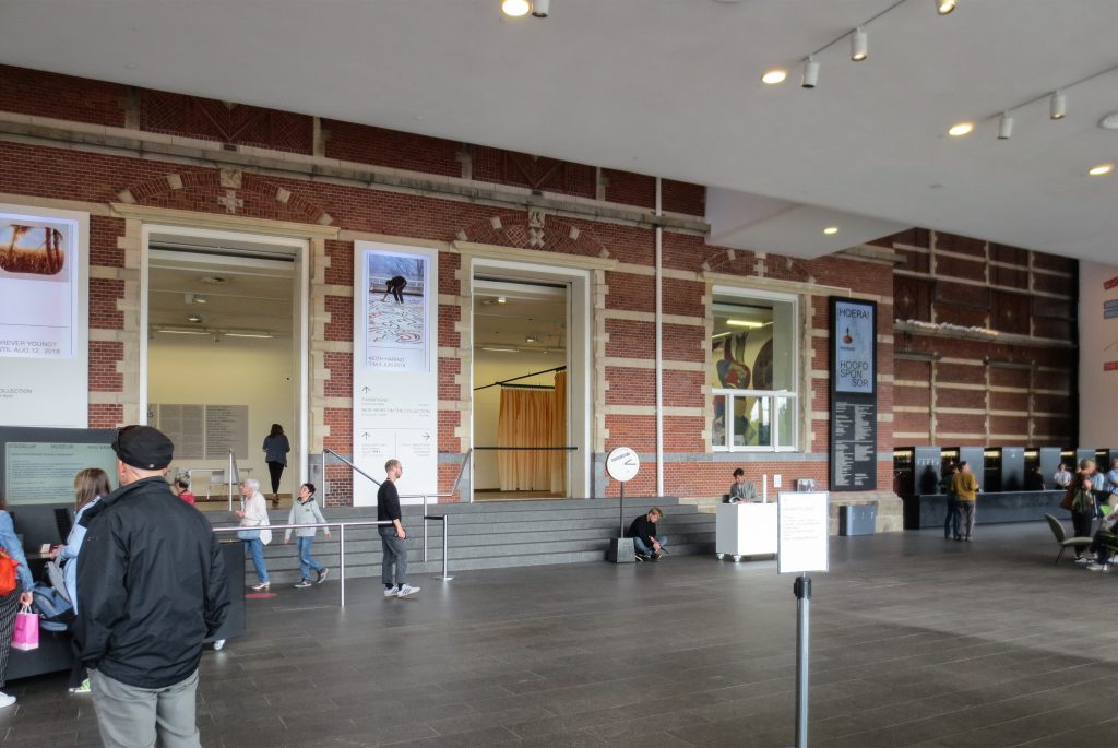
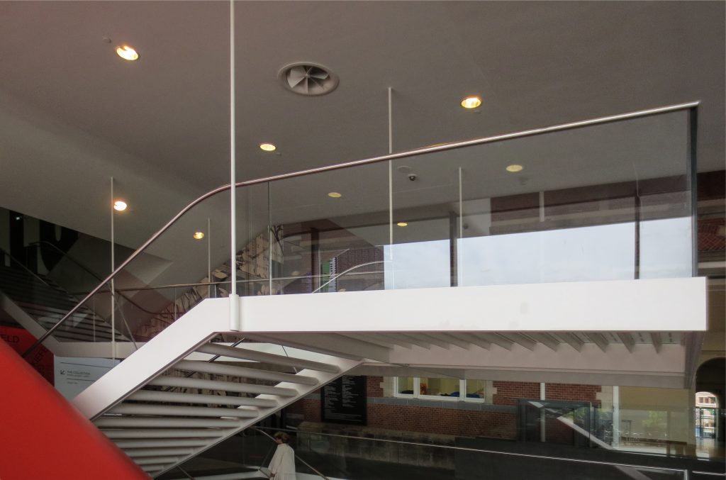
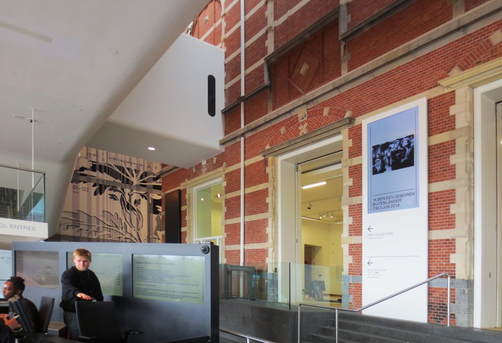
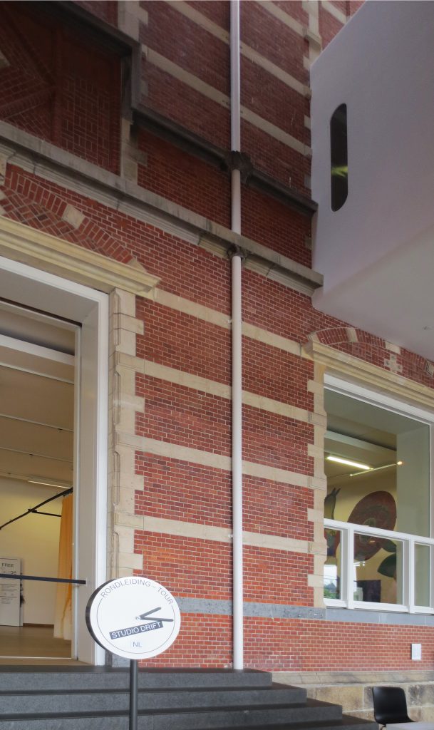
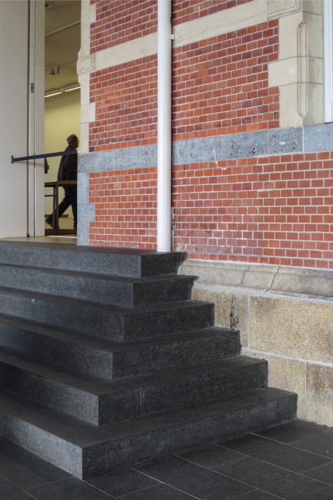
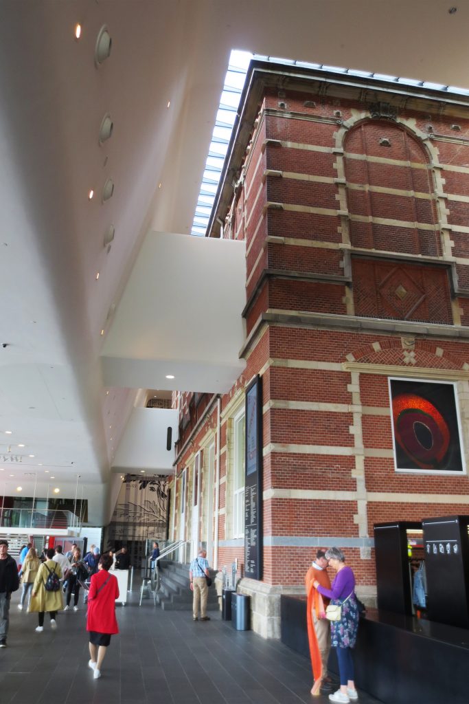
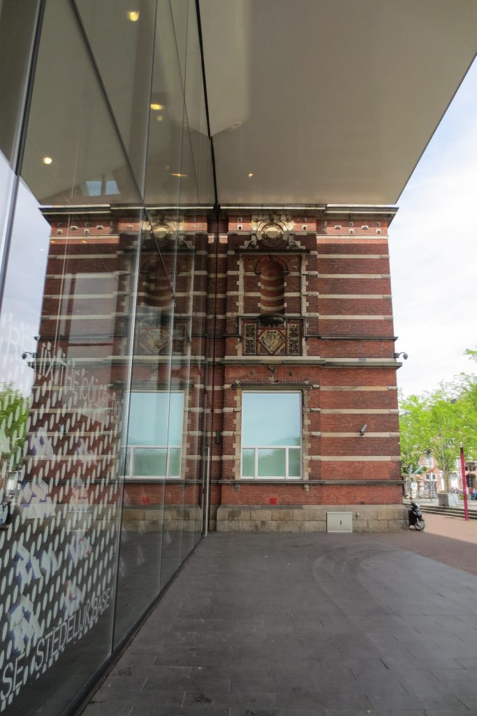
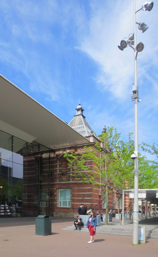
The original red brick building stands out for its majestic staircase, large rooms and natural lighting. These strengths have been preserved in the new design along with the white color introduced throughout the museum by the former director. The existing building is left almost intact and part of the new volume rises without hiding it, the rest develops underground.
Location
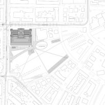
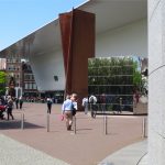
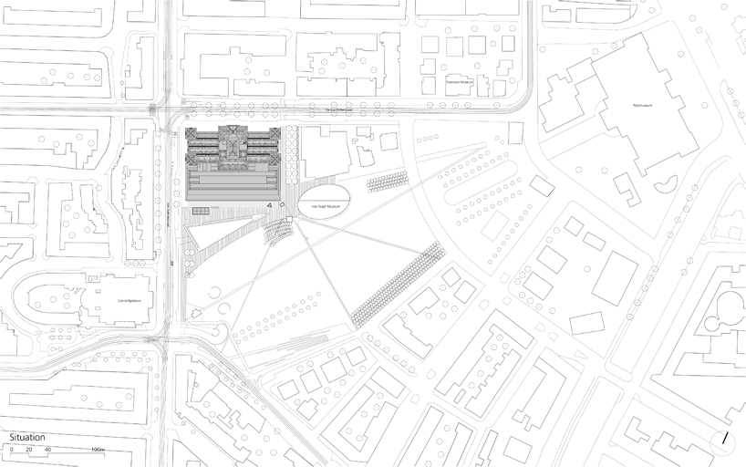
The new building located at Museumplein 10, 1071, Amsterdam, Holland, creates an improved relationship between the museum and the surrounding urban space. In fact, the Stedelijk, together with the RIJksmuseum, the Van Gogh museum and the Concertgebouw concert hall, dominates the Museumplein Park, creating one of the most interesting cultural poles in Europe.
Concept
The starting point for the restoration was to show the character of the original building, a neo-Renaissance design by architect A.W. Weismann. The renovation involved the elimination of some of the floors that had been added to the building and the creation of new connections between the exhibition spaces, contributing with the new design as much natural light as possible to these spaces, due to the limitations derived from the conservation of art works.
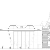
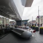
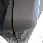
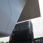
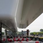
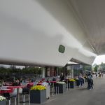
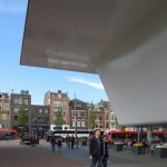
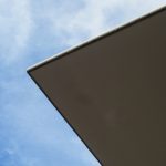
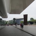
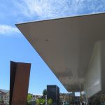
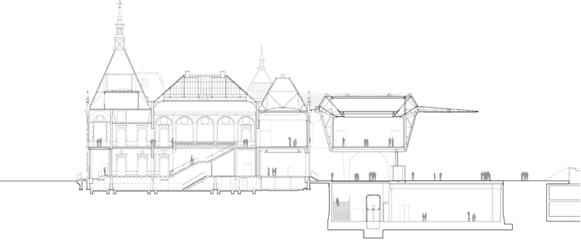
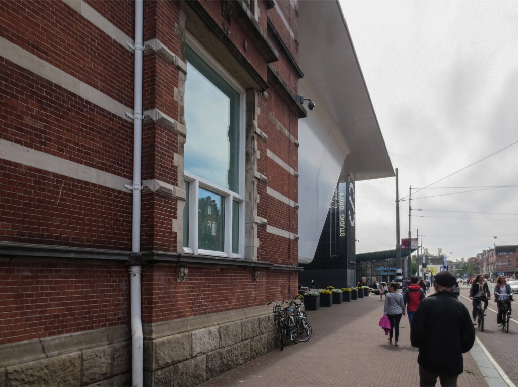
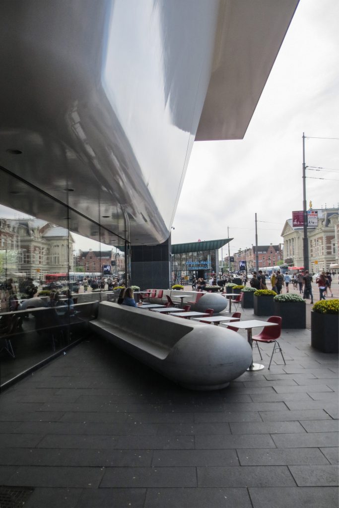
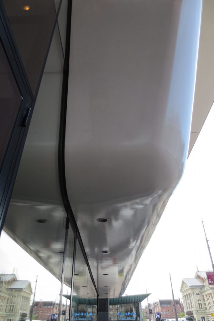
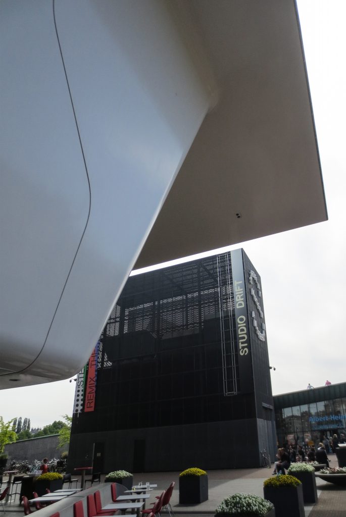
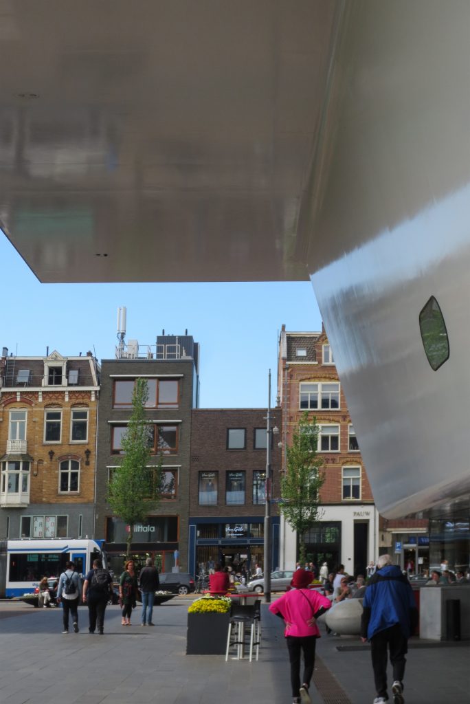
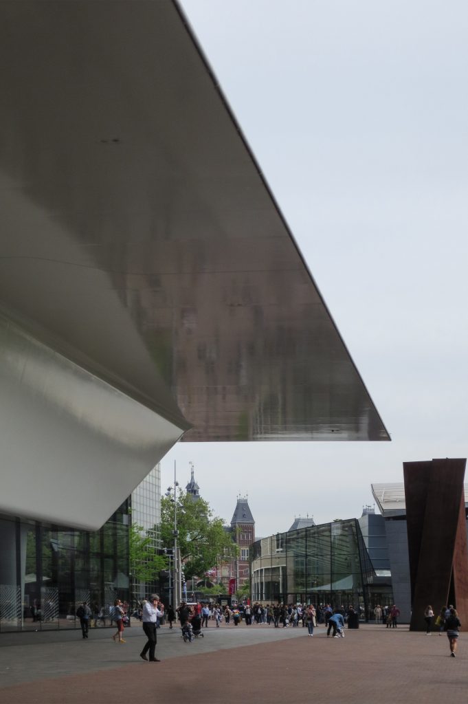
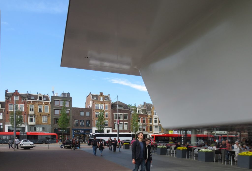
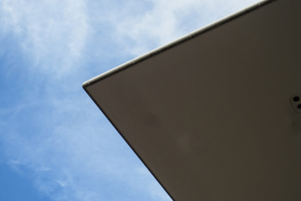
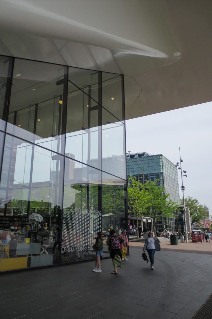
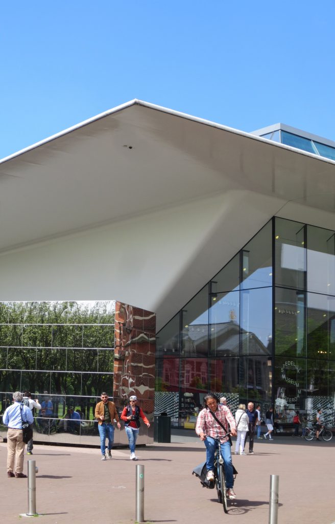
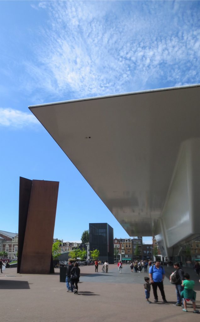
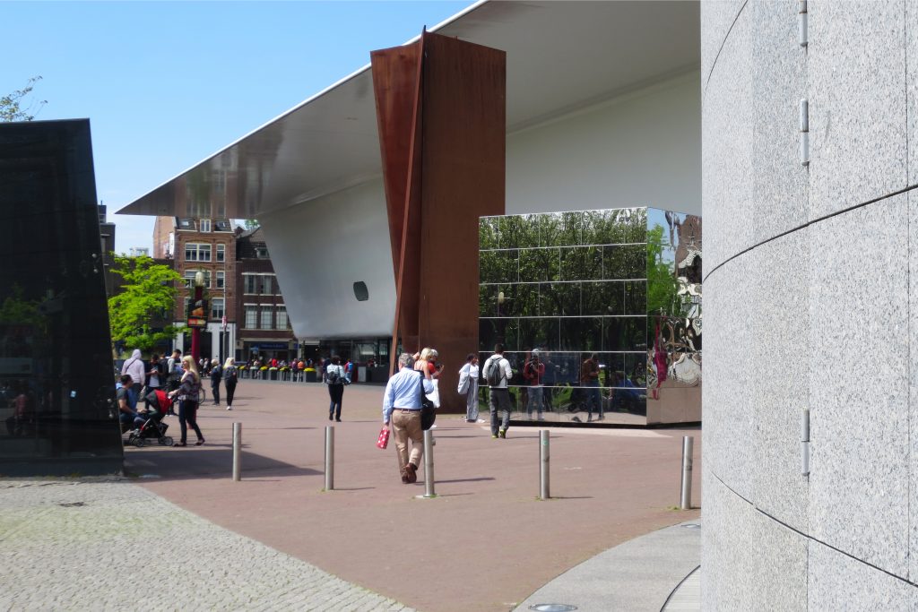
The new wing of the museum is conceived clearly different from that of the adjacent brick palace. However, its dimensions, and particularly its height, are carefully tuned to the Weismann building. While with a rectangular footprint, the addition presents a peculiar form in the elevation, which gave the building its nickname of “the bathtub”, it expands progressively upon rising, ending with a large flat roof that stands out, intended to provide a space protected outdoors, projected towards the park.
Spaces
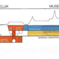
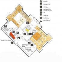
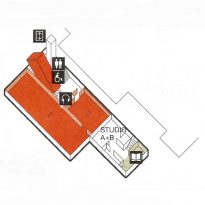
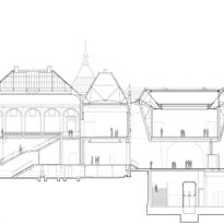
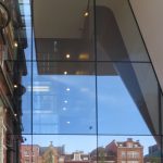
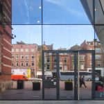
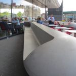
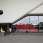
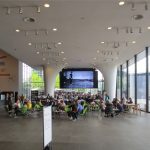
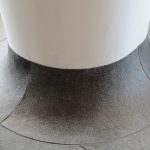
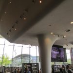
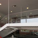
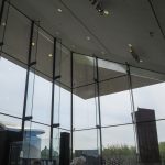
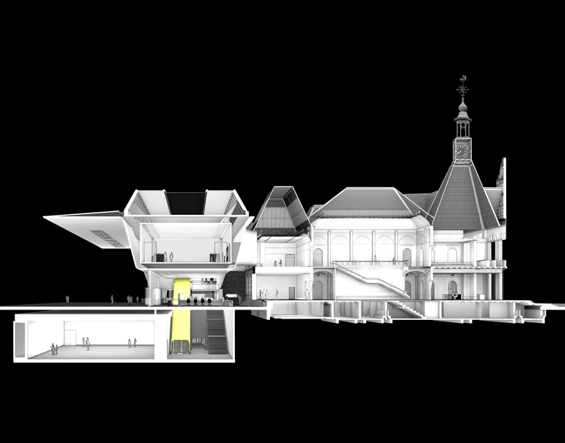
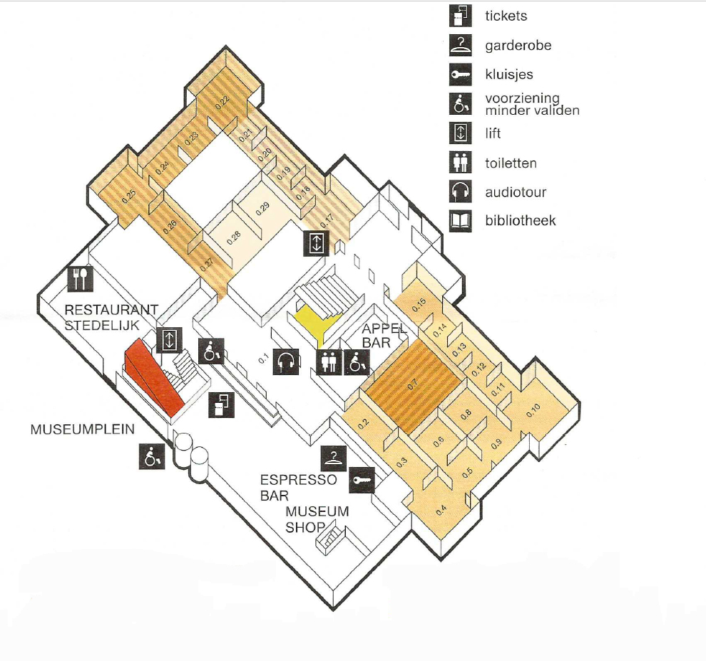
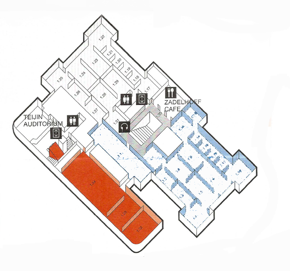
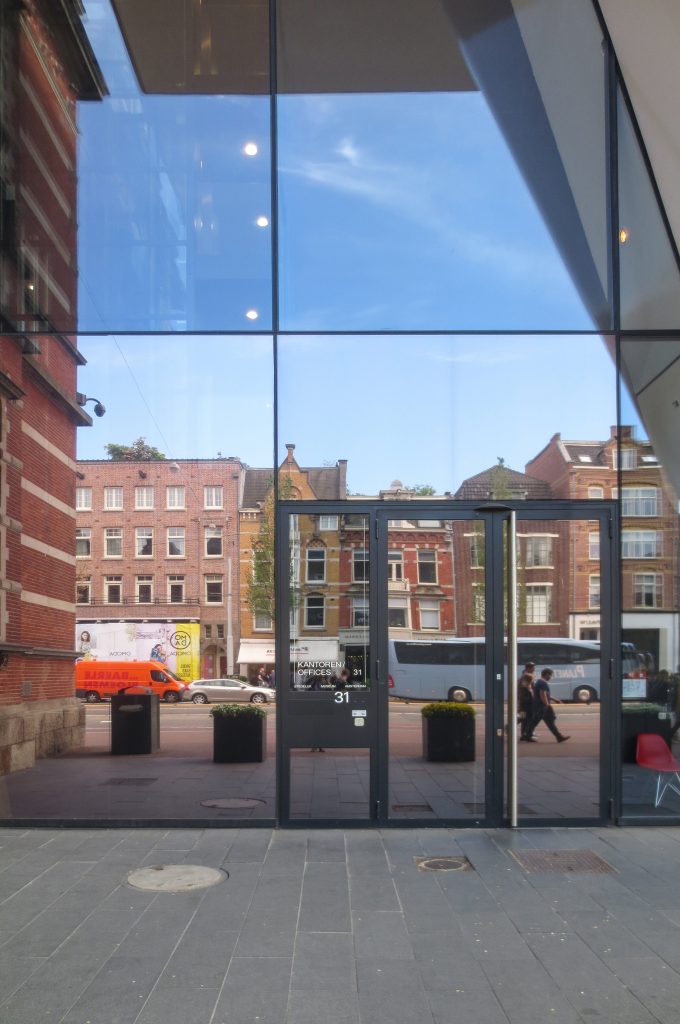
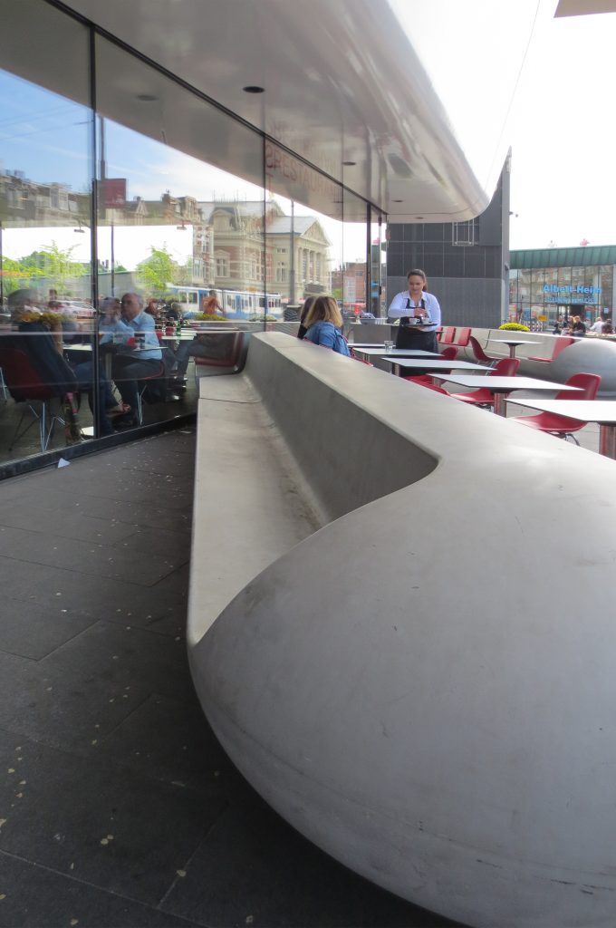
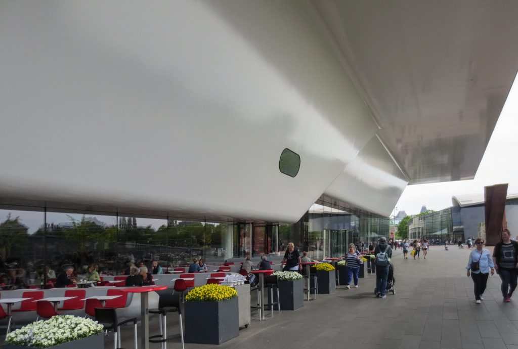
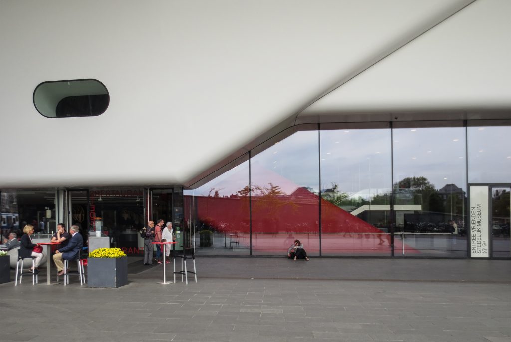
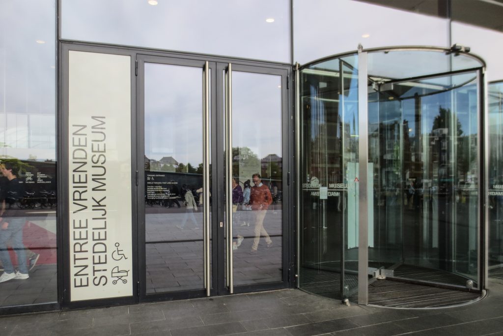
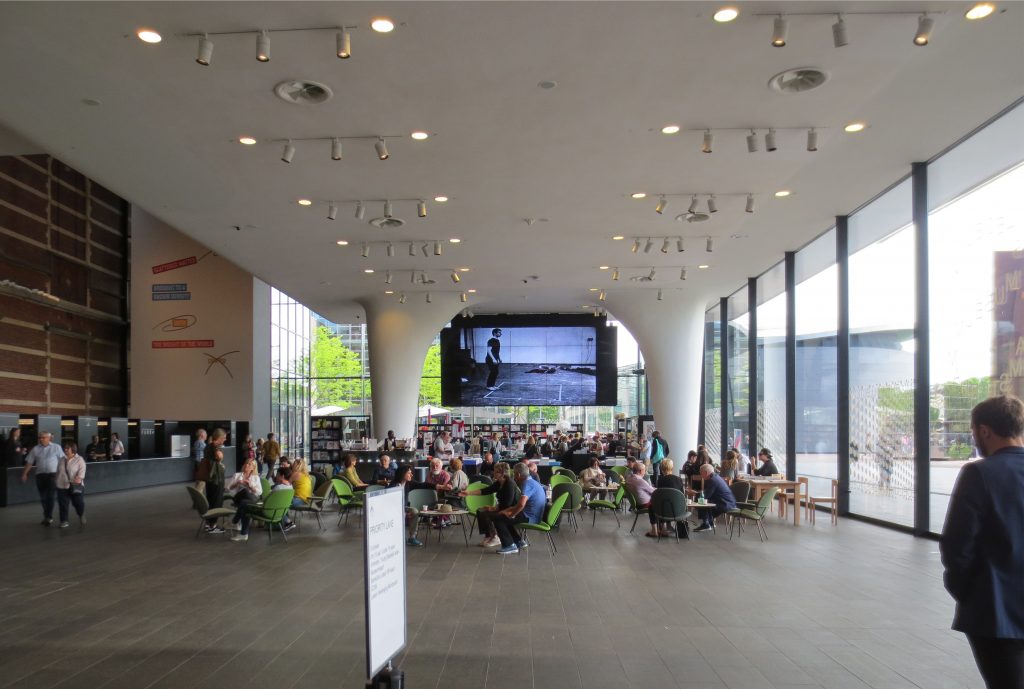
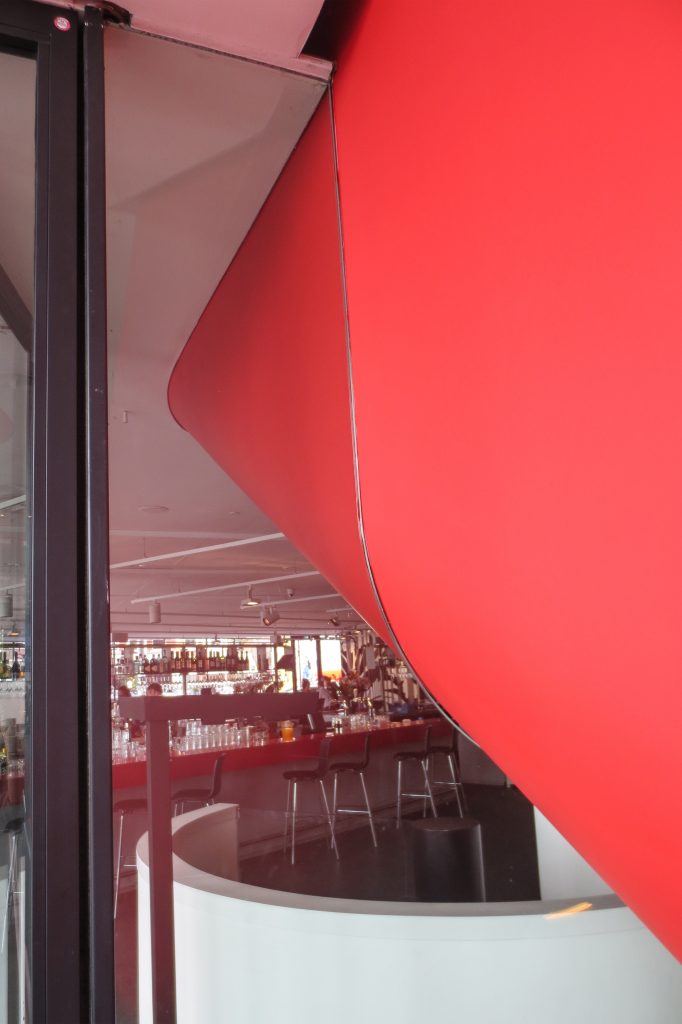
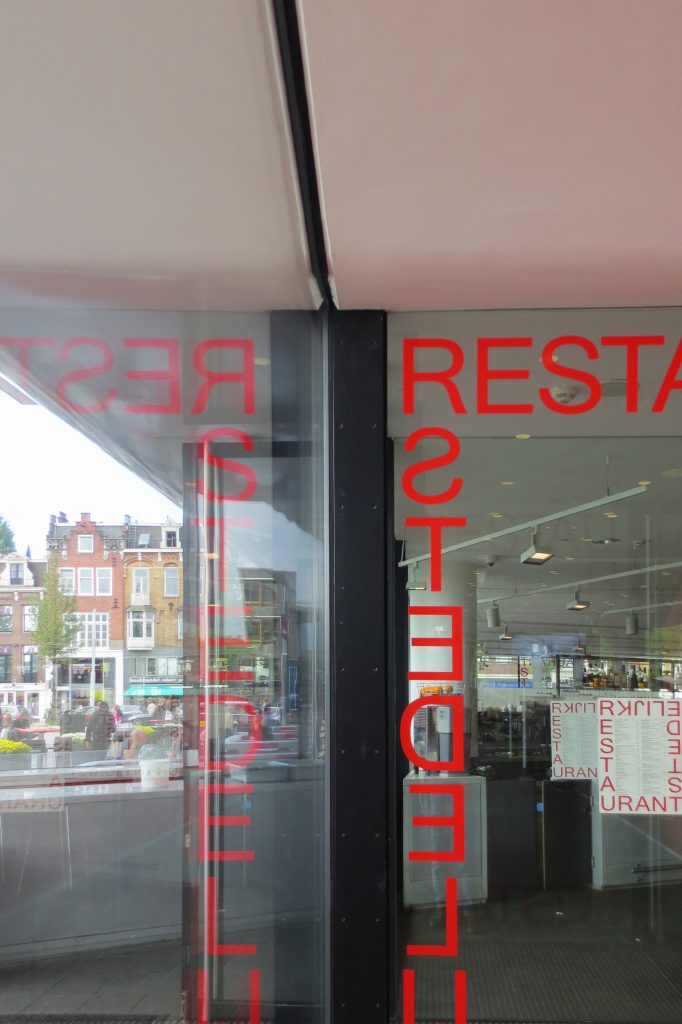
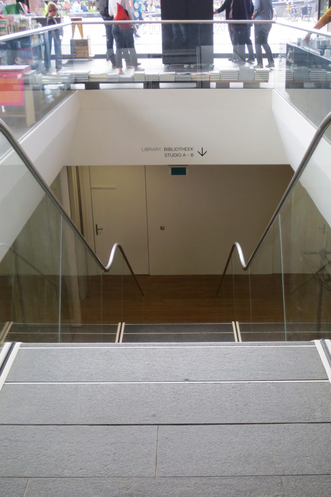
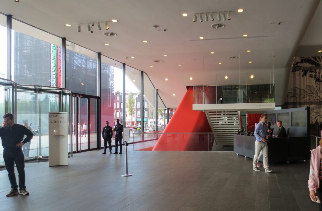
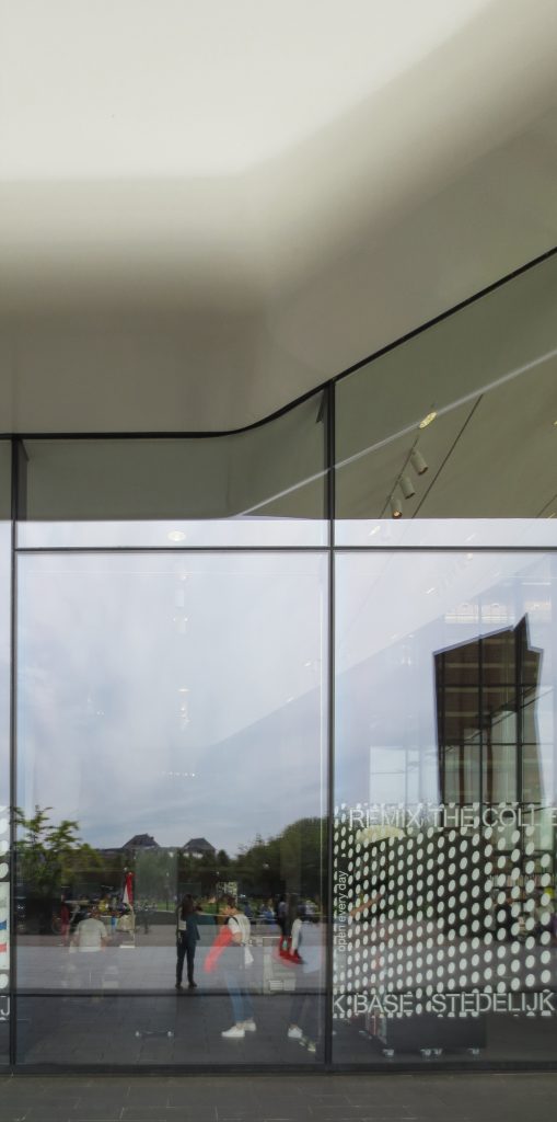
A white extension with curves, part of which is underground, has been added yo the old building. The building has three floors, two above level and one underground. The transparent level of the entrance contains the lobby, a library and a restaurant. On the same floor and through the connections with the old building you have access to certain exhibition galleries. The new entry has been moved to the open extension of Museumplein, where it occupies the spacious transparent extension. The white and smooth volume above the entrance, also known as “the bathtub” has a seamless construction, reinforced fiber and a roof that stands out in the space. With this change of orientation and the roof that stands out, the museum is linked to a covered square that belongs to both the building and Museumplein. With the old building as a backdrop, the white synthetic volume is the powerful new image of the Stedelijk Museum.
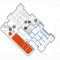
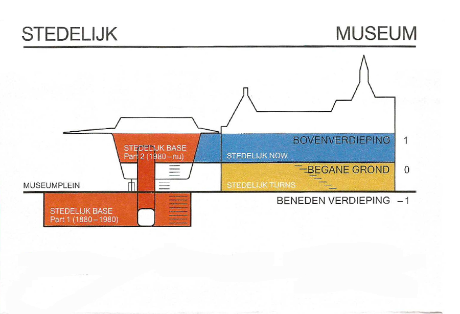
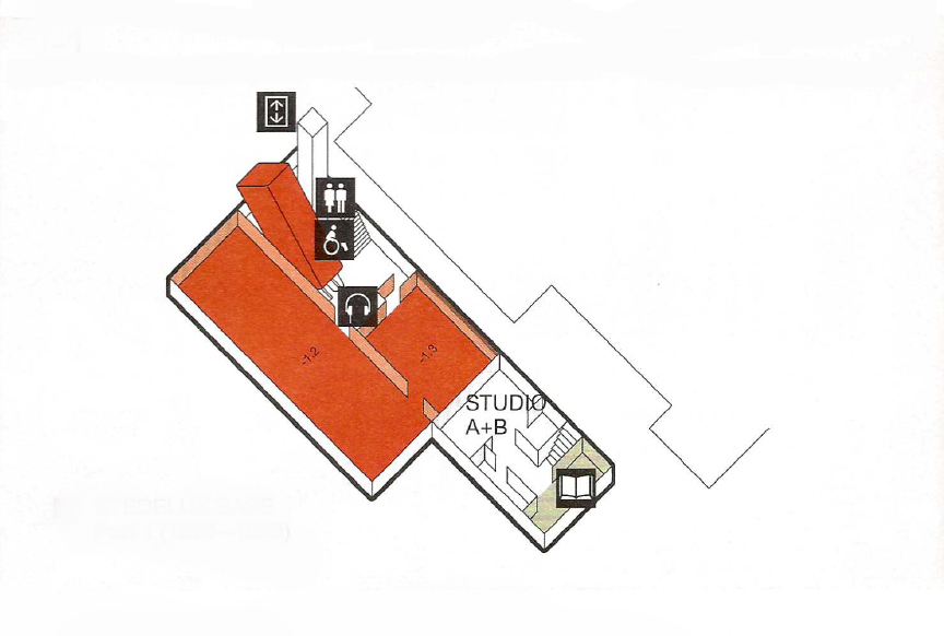
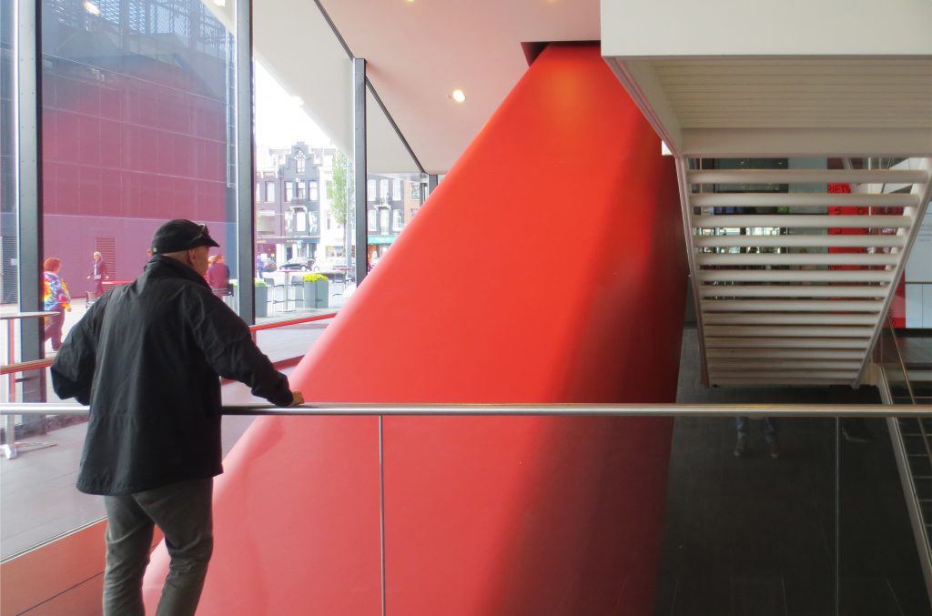
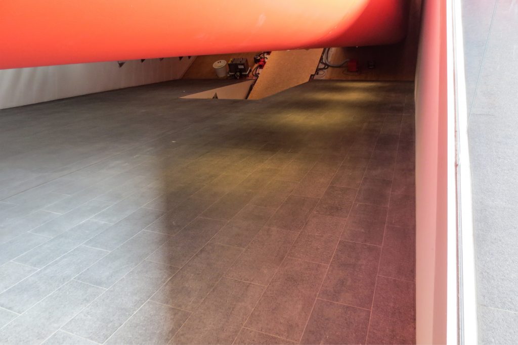
The underground floor houses a free exhibition space, 1,100m2, the largest in the Netherlands and a small theater and representation space. From the underground level, visitors can go directly to the last level where other exhibition areas are located, through a “tube” that encloses two escalators, so that all exhibition spaces at different levels are interconnected without interruptions or distractions, without leaving the exhibition route and without being distracted by public functions, visitors remain in the museum’s atmosphere.
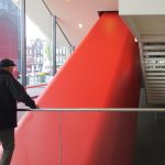
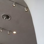
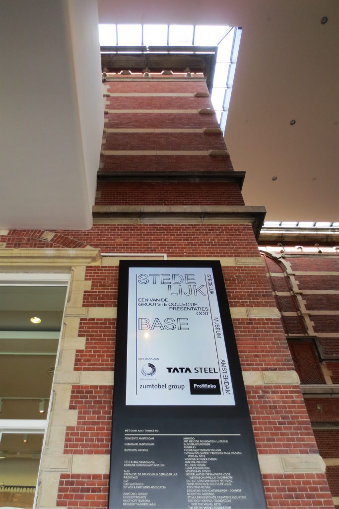
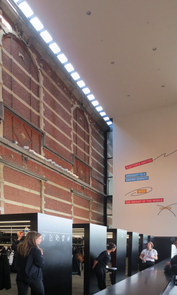
The exhibition galleries, approximately 3,400m2, are quite neutral, white in color, clearly inspired by the principles of exhibition presented by Sandberg in the thirties. The spaces on the top floor also have natural lighting through a series of roof windows. From the inside, the distinction between the old and the new building, so evident externally, almost disappears and barely shows. The details and color inside the buildings, both in the old and the new, are aligned, which makes the explicit contrast between the two hardly noticeable when walking through the museum.
Along with the construction of the extension, the nineteenth-century building was also completely renovated, thus establishing the Stedelijk, with a total area of 26,000 square meters, the new extension adds more than 12,000 square meters to the existing one, as one of the most notable and updated modern and contemporary art centers in Europe. The Weissman building is restored to its former splendor when it embarks on a new life, in front of Museumplein, under one roof with the new addition.
Structure
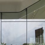
The extension of the museum consists of a basement with a solid superstructure built on top. This structure seems to be suspended above ground level, with the old building visible through the ground floor covered with glass.
Large steel trusses on the façade allow the tub-shaped superstructure to be supported in only six points of support: five columns and a concrete wall that supports a steel frame covered by plates of a synthetic compound. This made it possible to create a large open space for exhibitions. The optimization of the structure, defining details such as the location of the support points and the frames was a collaboration between the engineers of Arup and Benthem Crouwel.
Materials
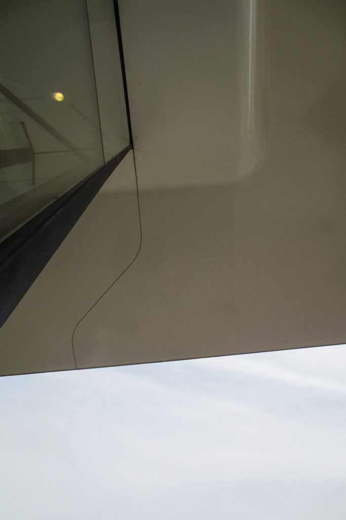
The architects proposed an extension whose construction was light, with a load bearing structure made mainly of steel and a highly innovative external cladding. This cladding consists of 271 panels of 3 mx 11m connected by a steel frame. It was finally painted seamlessly, like a ship or a plane. Mels Crouwel: “… We used a material from the aviation industry to make sure the facade still shone after ten years …”
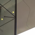
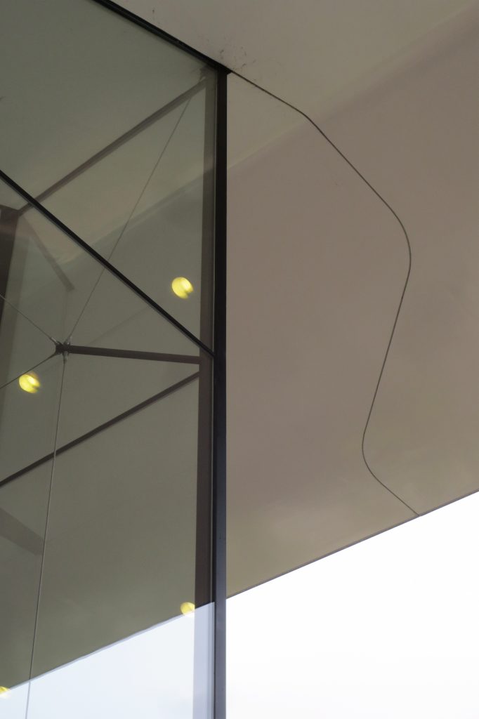
The panels were made with a composite material based on Twaron®, a polyamide fiber produced by the Dutch-Japanese company Teijin and generally adopted in the construction of boats, airplanes and bulletproof vests. The use of a composite material allowed the construction of a seamless, lightweight, fire-resistant and durable construction skin. With 100m wide, it is the first time that this material is used in an architectural context, resulting in half the weight of a conventional wall.
Resin and fibers
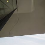
The facade, designed by Benthem Crouwel Architects, consists of a single surface and covers an area of approximately 3,000m2, is smooth and shines in the sun. A solution that minimized the thermal expansion of the material was required to obtain a seamless effect. The design, development and production of the facade required creativity and input from several experts. Finally, the key to the solution was found in the Twaron and Tenax fibers.
An analysis provided by the engineering firm Solico showed that an optimal solution consisted of a sandwich construction. This consists of an inner skin and an outer layer of a resin laminated compound, reinforced by Twaron and Tenax fibers. When the resin expands as the temperature rises, both Twaron and Tenax fibers, due to their negative longitudinal thermal expansion coefficient, behave in the opposite way. The result is a composite panel with minimal thermal expansion. The 100m joint-free facade compound expands by only 1mm for each Celsius degree of temperature rise. The same facade based on a fiberglass or aluminum compound would expand almost two and a half times more.
In total, the facade consists of 271 loose elements containing 4850 kg of Twaron and 4050 kg of Tenax. The panels are mounted on site and glued using a connection laminate so that the facade forms a single unit.
Inside the buildings, both the old and new parts have the same oak floors and all the walls are white, according to the legendary Stedelijk director, Willem Sandberg, who turned the house into a “white cube” between 1945 and 1962.
