Sydney Opera House

Introduction
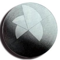
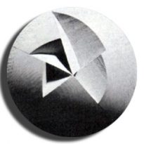
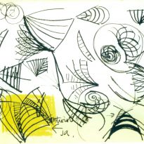
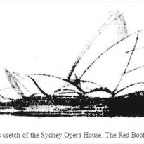
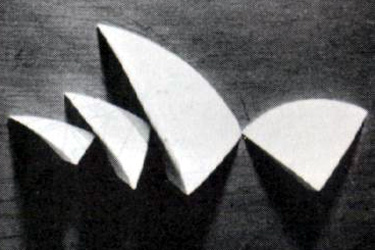
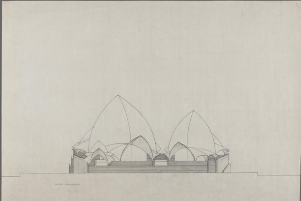
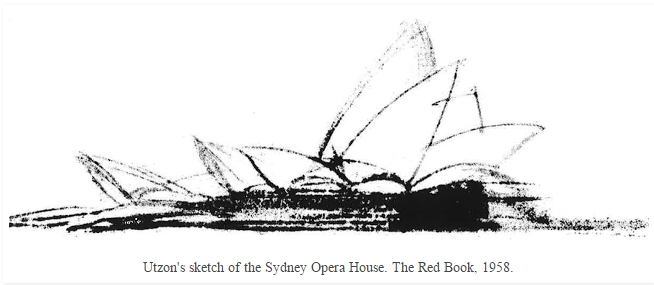
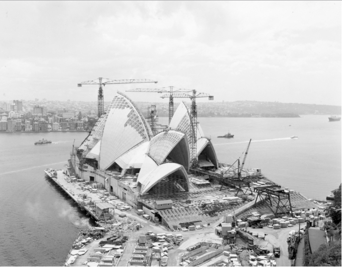
After winning the international competition to build the Sydney Opera House Jørn Utzon’s controversial project broke ground in 1959 at Bennelong Point. Utzon himself defined the building’s concept as a combination of “slices of oranges”.
The project was supposed to be completed in three years at a cost of 3 million Australian dollars. However the complexity of the engineering of the building delayed the works over and over until the project was finally completed 14 years later with a total cost of 102 million Australian dollars. By that time Utzon had been forced to abandon the project by a new government
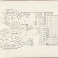
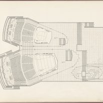
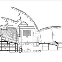
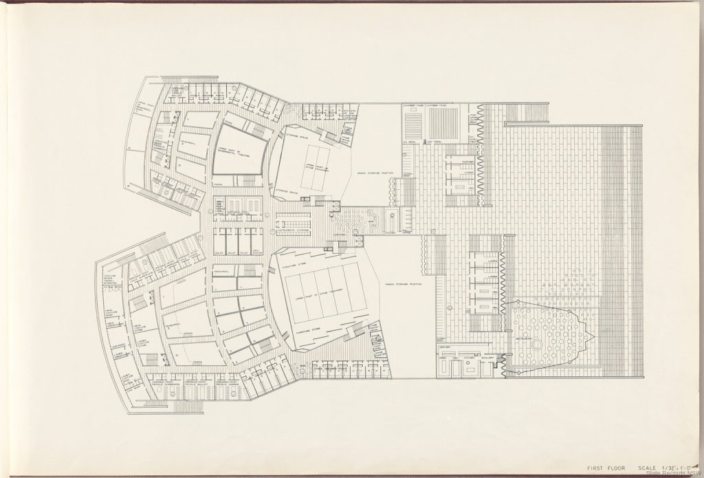
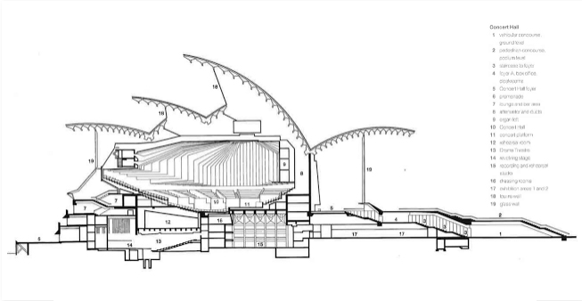
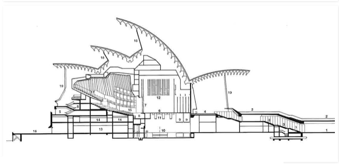
The building is structured under a series of “shells” which give cover to several theater complexes organized on two main axis. Overall there are more than 1000 rooms, most of them dedicated to music studios, with a capacity to host over 5000 people comfortably seated.
Events
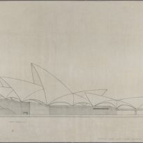
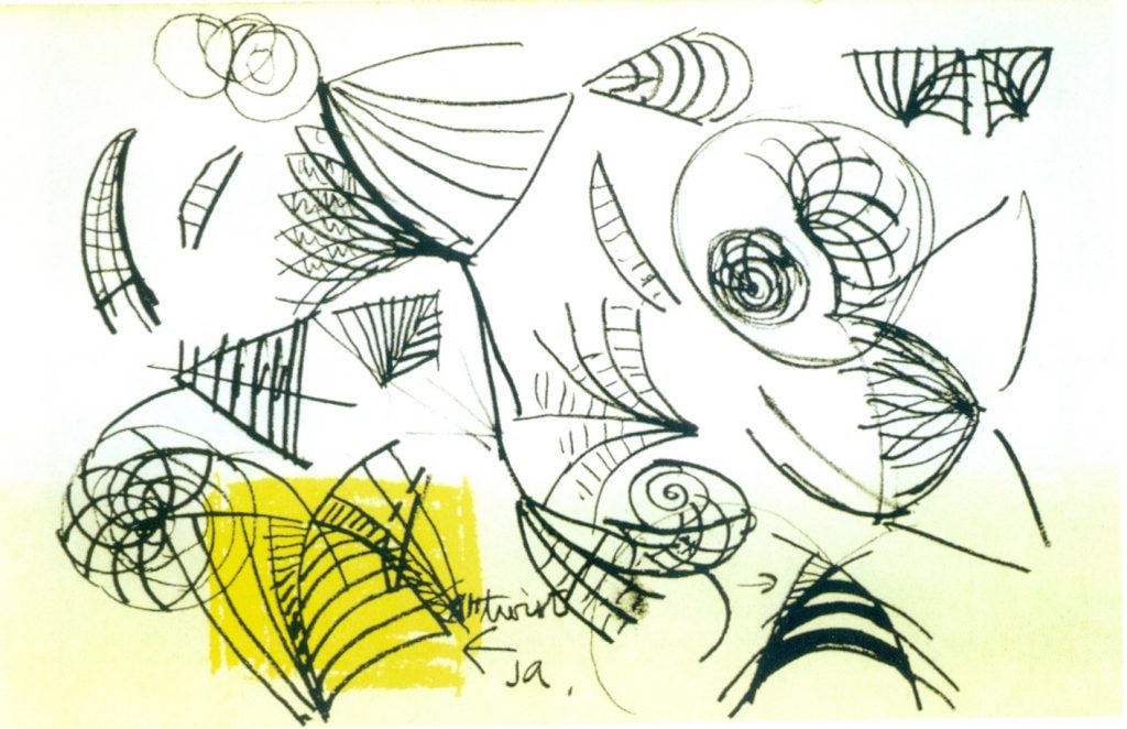
When Utzon presented his idea to the competition in 1957 he barely showed a few schematics explaining the concept behind his project. Even though his presentation was lacking in many areas and was little more than a few sketched it catch the eye of who was considered to be a very prominent judge, Eero Saarinen, so the project went through despite its lack of information and Joseph Cahill, prime minister at that time, quickly announced that the works would start in just two years.
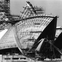
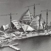
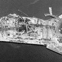
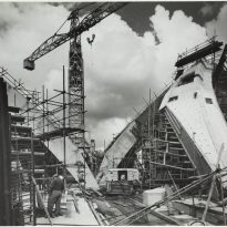
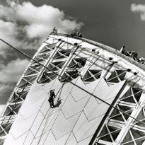
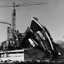
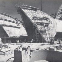
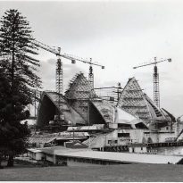
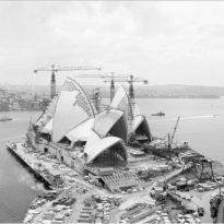
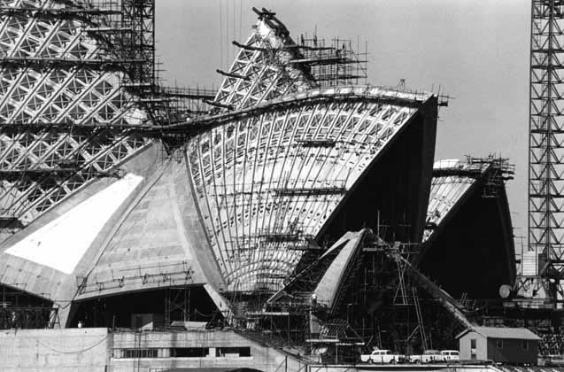
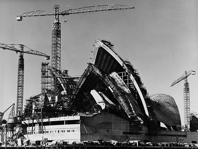
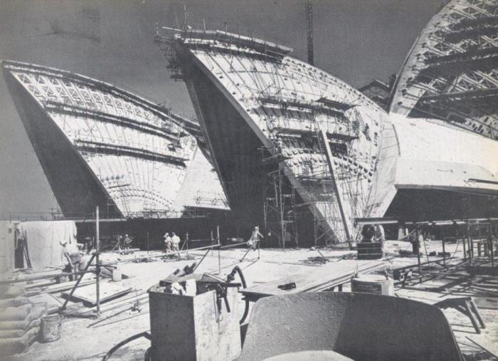
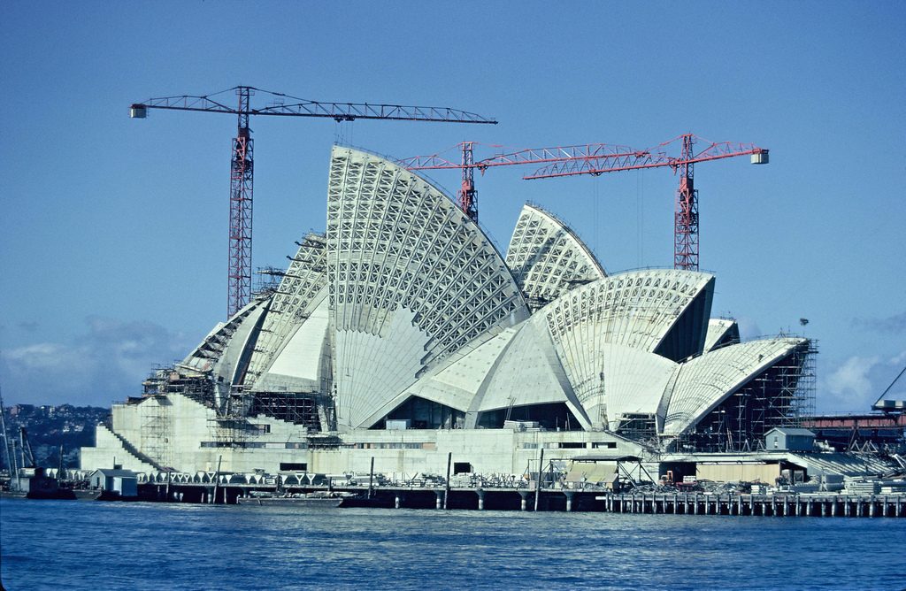
After numerous tests, Utzon, together with the engineering firm Ove Arup, developed a full design based on the complex sections from a sphere. The prefabricated ribbed vaults started taking shape and the podium was finally completed in 1964. Despite the project being well advanced Utzon had not yet finalized the interior designs at that point. By mid-1965 a new government took over and started questioning Utzon’s design which was already delayed and way over its initial 3 million (Australian dollars) budget. Utzon was then replaced by a group of architects selected by the minister of Public Works of New South Wales, including Ted Farmer, who was in charge of completing the glass walls and interiors.
When Utzon was ceased payment and was forced to retire as chief architect he left Australia and never came back until 1999 when he saw the finished building for the first time. He wasn’t even present at the inauguration ceremony in 1973. When he finally came back the Sydney Opera House was already an internationally renowned landmark and Utzon was asked to become the official architect once again and develop a set of design principles that reflected his original vision that could act as a sort of manual for future changes in the building.
Even though Utzon accepted it was clear that he wasn’t completely happy with the end result. As he said himself “If I had finished the building I would’ve taken it through a sense of movement. The treatment of space as music hardly exists in today’s architecture…”
Situation
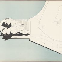
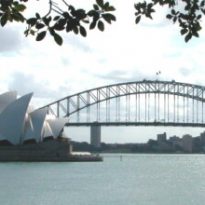
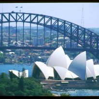
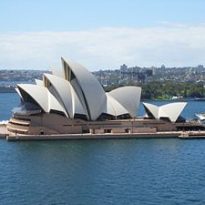
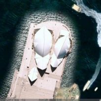
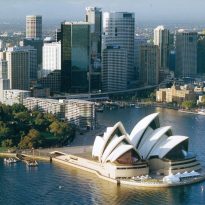
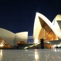
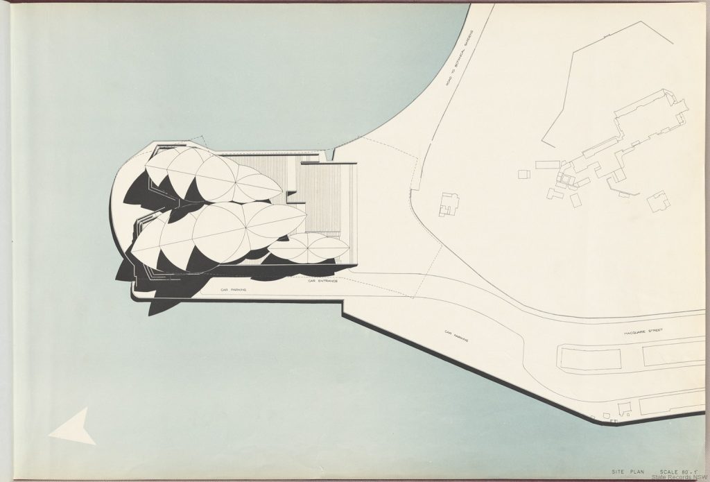
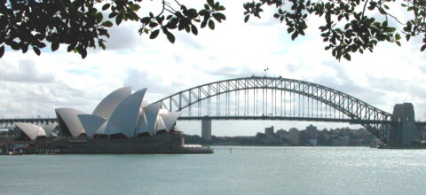
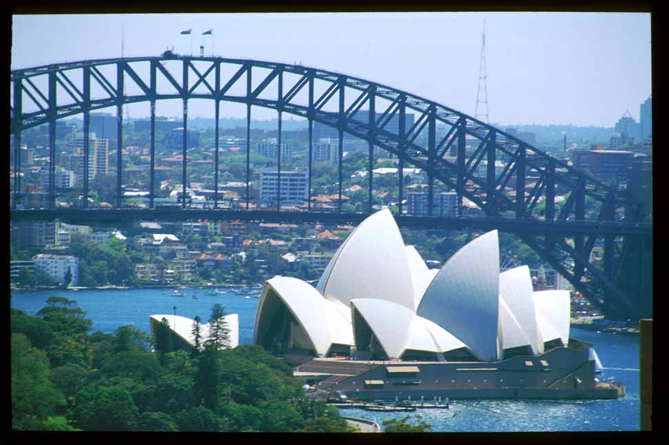
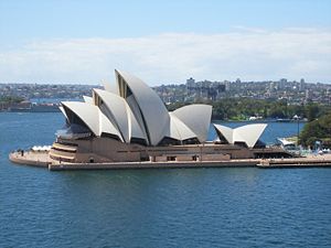
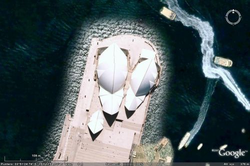
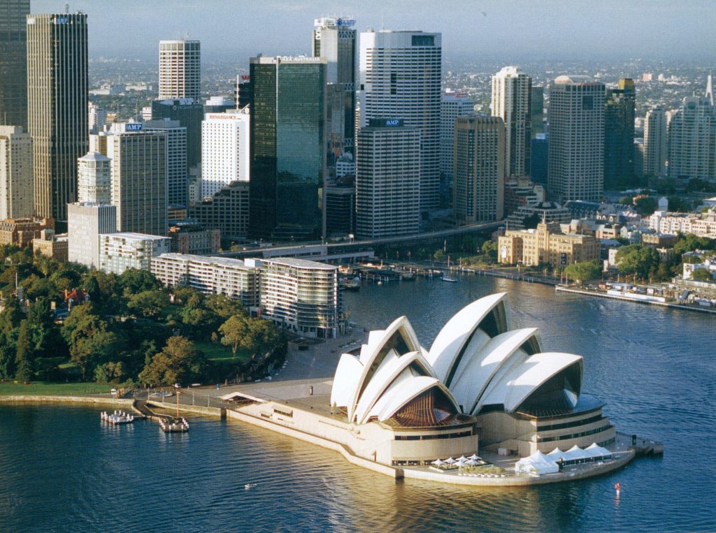
The Sydney Opera House is set on a small pensinsula at Bennlog Point, on the south side of the Sydney bay. It’s located on the northeaster border of the Sydney Business District and surrounded by the harbor on three of its sides and the Royal Botanic Garden on the other.
When asked about the site Utzon said “…This was a dream project for an architect… first because the site is absolutely lovely with an amazing view, and second because the program wasn’t set in advance…”
Concept
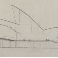
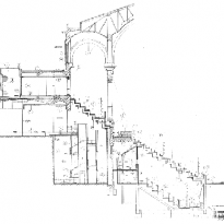
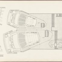
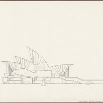
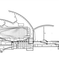
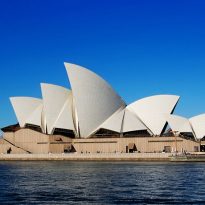
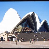
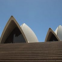
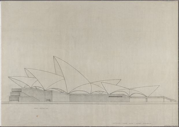
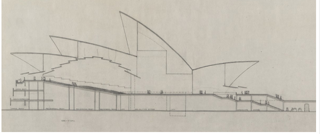
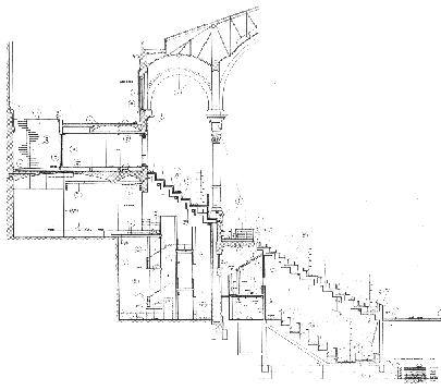
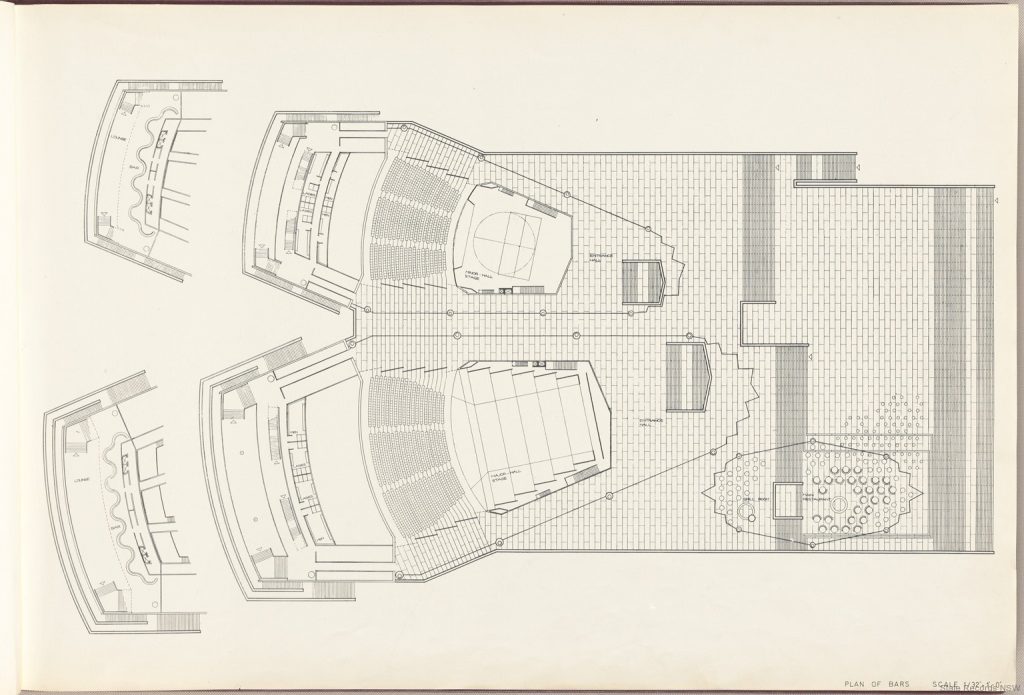
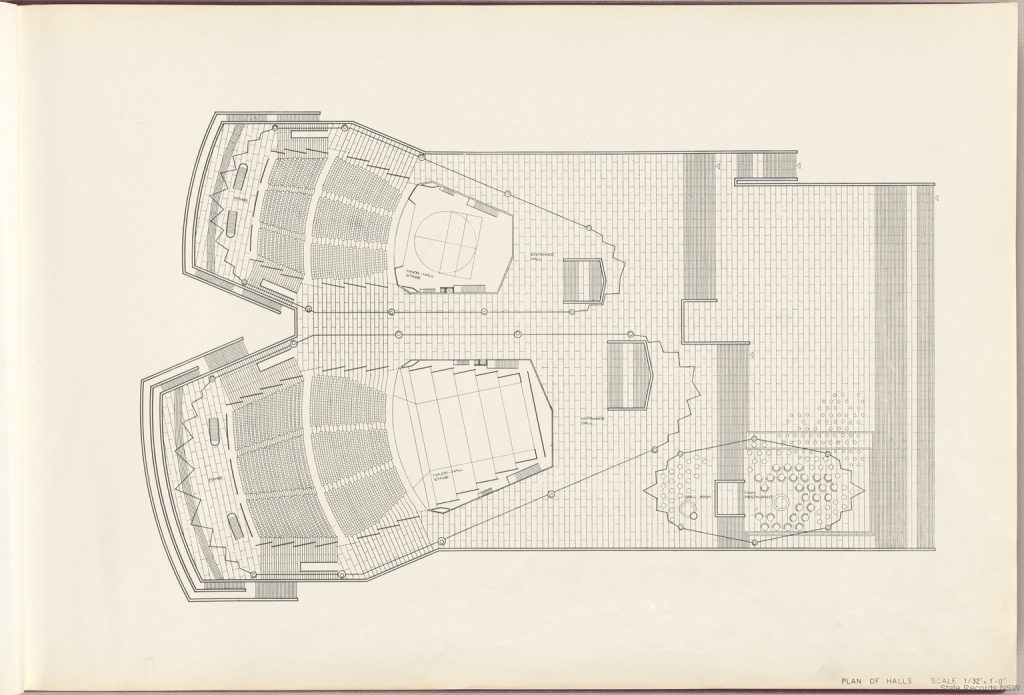
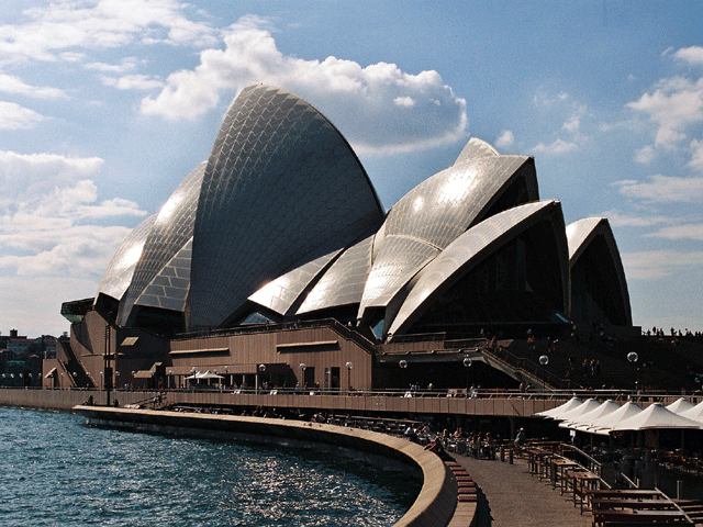
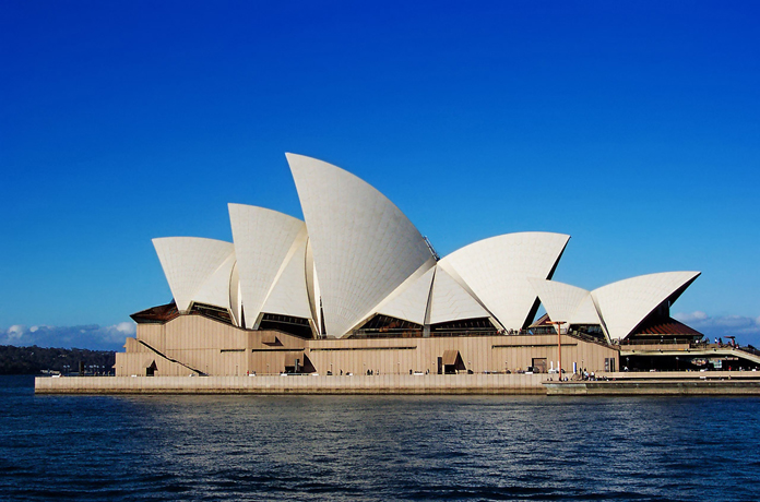
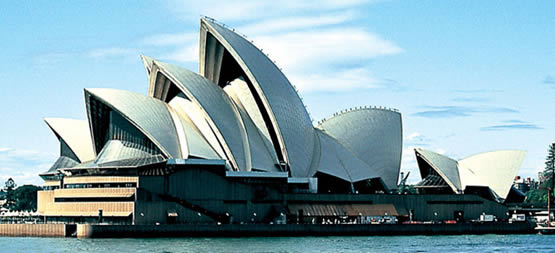
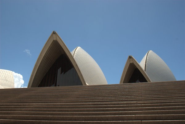
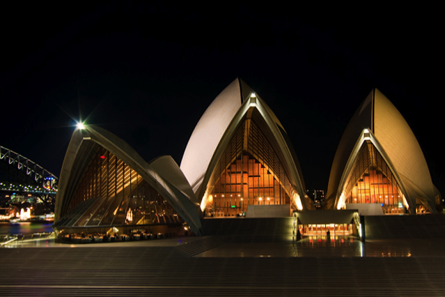
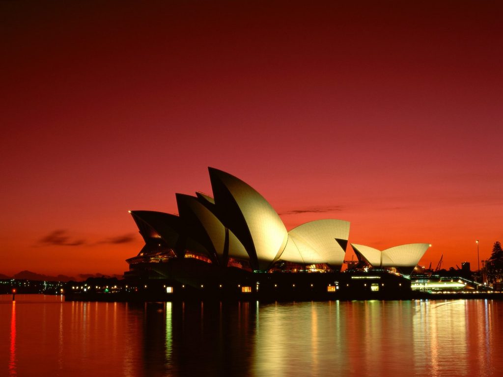
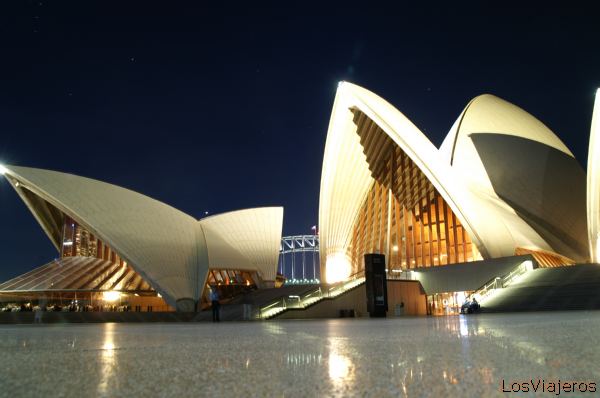
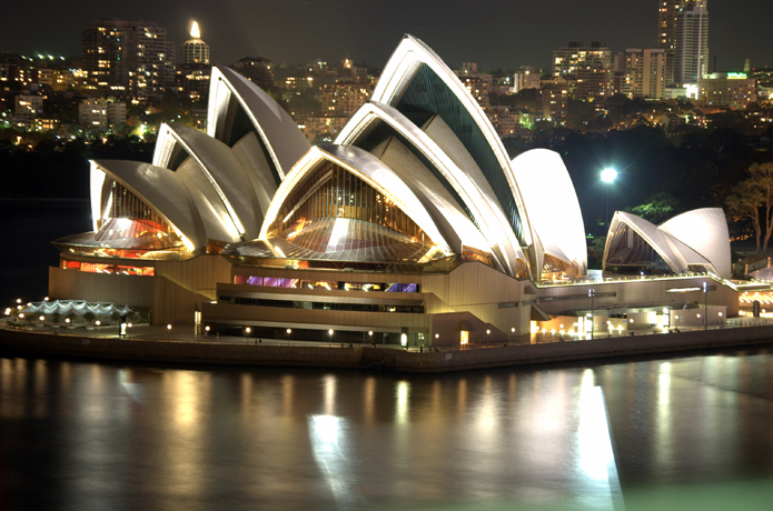
The building is made up by two very distinctive elements; a solid base and a series of light, organically shaped roofs. The first is actually the building itself and houses all the service areas, including dressing rooms, rehearsal areas, warehouses, offices and library. It was conceived to serve as a base for the upper deck, a completely horizontal plane which shape is only broken to give space to the stands of the two main auditoriums, one for opera, the other for concerts, and sporadically to allow the staircases from below to emerge to the surface. When reaching the street side the whole plane folds to create a monumental staircase as wide as the building itself. This base building is very angular and covered in dark stone, giving it a very solid tectonic image. Even the openings on its façade appear to have been made after it was completed, using the same stone that should otherwise cover the opening as a visor to the window.
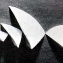
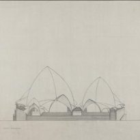
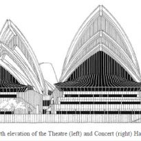
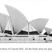
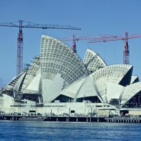
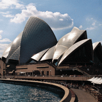
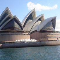
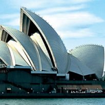
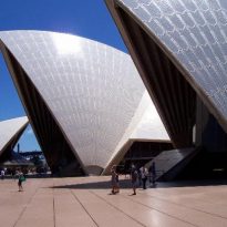
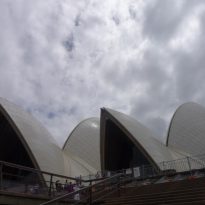
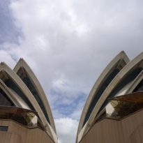
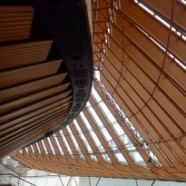
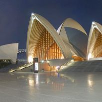
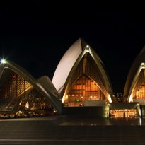
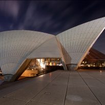
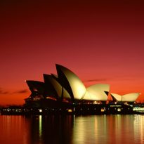
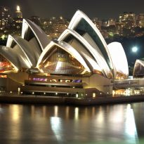
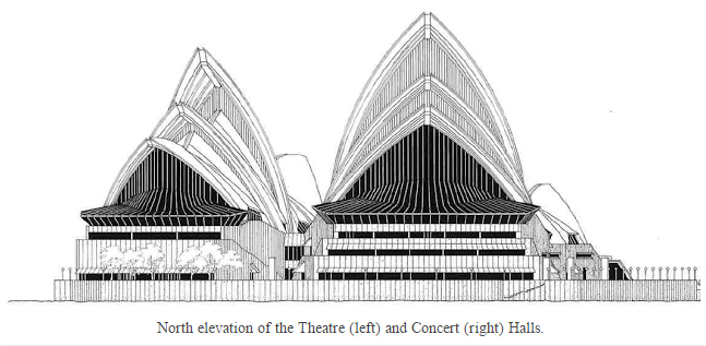
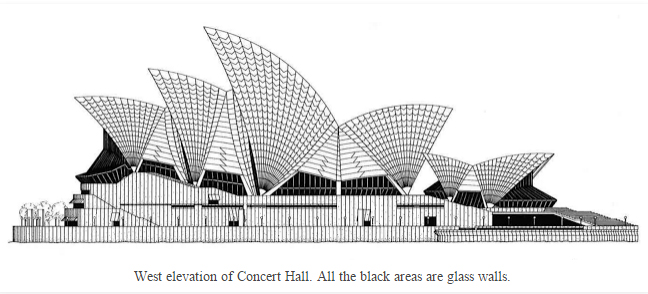
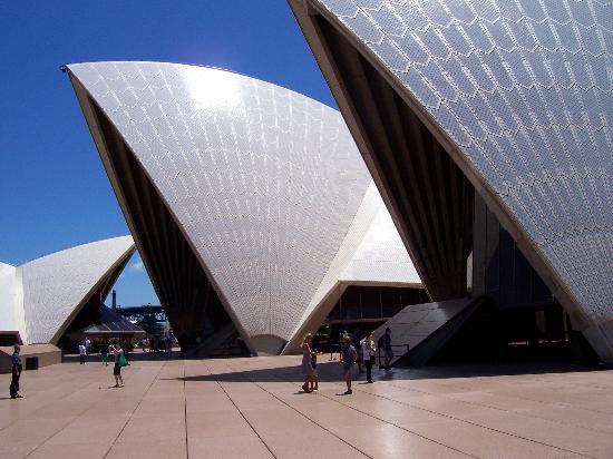
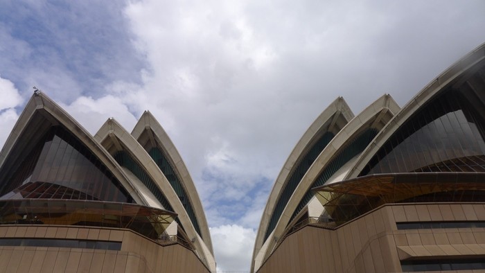
The other part of the building, the roofs, are made by a series of triangular shells supported on their corners and facing upwards as if challenging the laws of physics. These shells cover the three main spaces, the opera theater, the concert theater and the restaurant. Each of these spaces is covered by four pairs of shells, except for the restaurant which only has two pair.
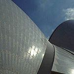
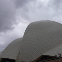
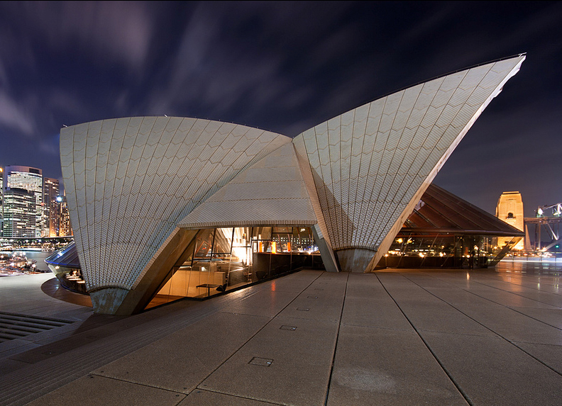
The visual approach to the shells is opposed to the one for the base building. The shells are white, shiny and fragmented curved surfaces that contradict the sense of darkness and unity form the base.
These conceptual ideas were clear on Utzon’s project from the very beginning. However during construction he found it hard to stay true to his original vision as he needed to transform the organic gesture that came out of his imagination into rational shapes that engineers could calculate and work with.
As Utzon himself admitted “… the planning includes even the smallest detail in a very unorthodox way. We build and rely on numerous models and prototypes to ensure that nothing goes into production before we have carefully researched and proved that it will work and is indeed the best solution to the problem”.
Influence shipbuilding design
A lot has been said about where did Utzon get his inspiration for the iconic shape of the Opera House, however the architect himself was very clear about it when he said:
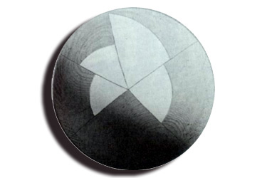
“Many people insist in saying that my design has been inspired by the sales of the boats or sea shells. That however is not true. My design is like an orange. If you peel an orange you’ll get these segments with shapes very much like what you see here. Those were the origin of my models, not the sales of boats, it just happened that the two are similarly shaped. I had never seen the Sydney Harbor when I worked on the concept for the building, although I was familiar with it through photographs and naval charts”.
Spaces
Each design element of the building was conceived to make the visitors feel welcome and relaxed. All the way from the building’s placement and orientation, the different point of views from where it would be observed, the 100 meter wide staircase that gives access to the podium’s roof, etc.
The project development was divided into three stages. First came the base-podium building, then the roof shells and last the windows and interiors.
Even though Utzon argued that he had yet to finish the designs for the structure the government forced the construction works to start and then even changed the design requirements during development. The brief went from two theaters to five which forced Utzon to revise his plans and readjust them along the way.
The three main building that inhabit the podium are the concert hall, the opera house and the restaurant, however there whole complex counts with five theaters, five rehearsal studios, two main rooms, four restaurants, six bars and numerous gift shots.
The five theaters have the following characteristics:
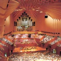
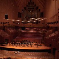
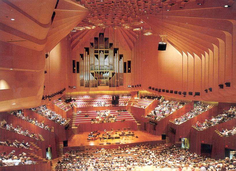
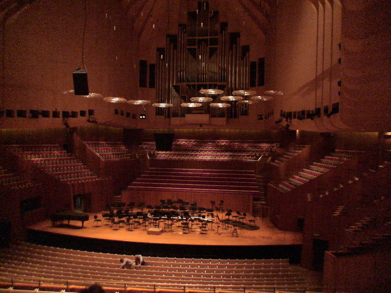
- The Concert Hall has 2679 seats and has the world’s largest mechanic organ with over 10.000 tubes.
- The Opera House has 1547 seats and is the home to both the Australian opera and the Australian ballet company.
- The Drama Theater with capacity for 544 spectators.
- The Music Room with capacity for 398 spectators.
- The Studio Theater with capacity for 364 spectators.
Structure
The shape of the shells was not geometrically defined initially, however the engineering team quickly started translating Utzon’s drawings to a series of vaults formed by parabolas. They had to find a way to minimize the cost of building these vaults of site and then bring the structure in for final assembly as building a custom formwork on site would have skyrocketed the cost even more.
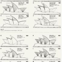
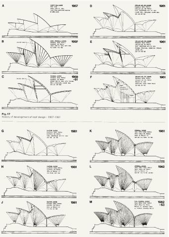
From 1957 to 1963 the design team went over a dozen different shapes for the shells before finally setting for one. Some of their approaches including parabolas of different widths and ellipses to shape the iconic shells.
The complexity of the work at hand called for one of the earliest applications of computers to structural analysis in order to better understand the forces that these shells would have to support.
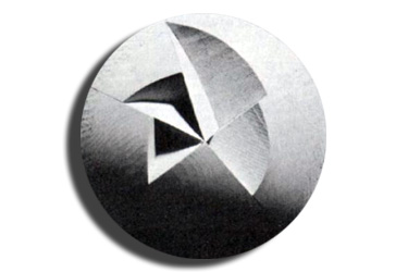
It was in 1961 when the team found a solution that would solve most of their problems. They came up with the idea to build the shells out of the sections of a sphere. The sphere is the simplest three-dimensional curve and there for was relatively easy to work with since the angle of its curvature remains the same at any given point. In the end this was the solution chosen by the design team to move forward.
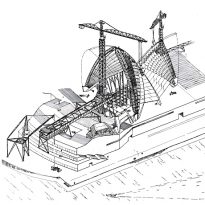
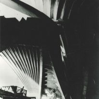
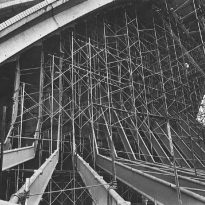
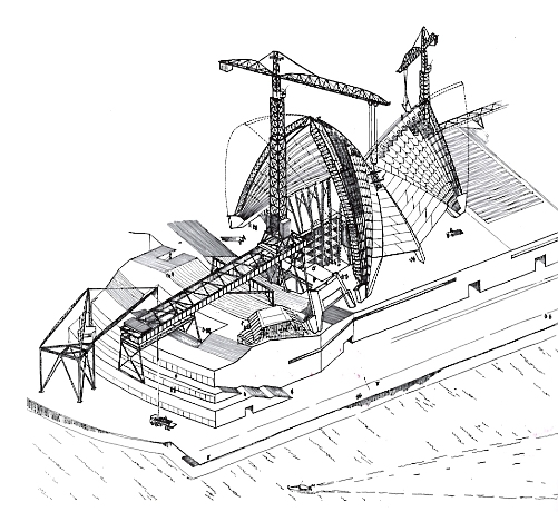
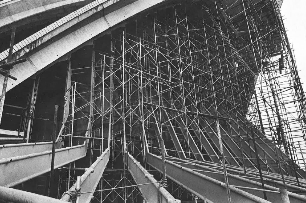
This elegant solution allowed for the structure of the shells to be built off site and removed the need for the super expensive onsite formwork. The Ove Arup and partners team developed a cutting edge construction system to mount all the pieces together, using what they called a “construction arch” to support all the pieces before they were finally all together and ready to support their own weight.
Even though each piece of the puzzle was unique and unswitchable the fact that they all belonged to the geometry of a sphere meant they all were curved to the same radius of 460 feet, which really simplified and cheapened the construction and calculation processes.
You may find more information regarding the structure of the Sydney Opera in the following article.
Materials
The structure of the building is made from reinforced concrete and the facades from polarized glass with steel frames.
The shells are covered by white and cream mate tiles made in Sweden, although from a distance they all look white to the eye.
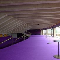
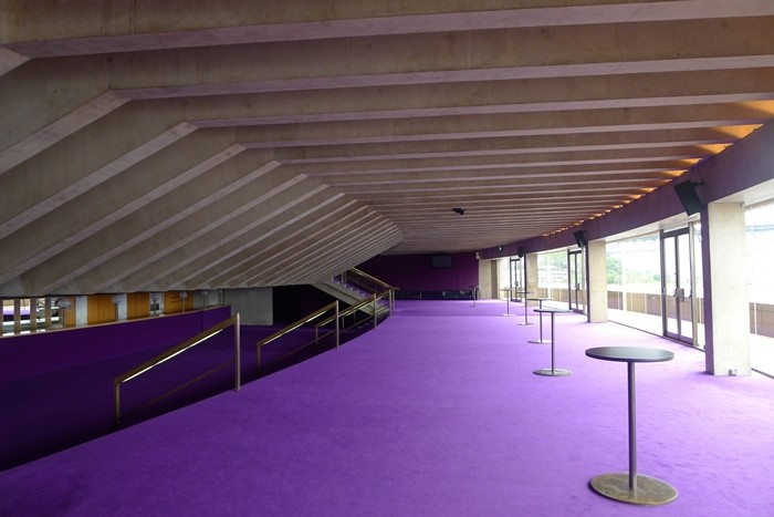
In the interiors the predominant materials are pink granite brought from Tarana and plywood from New South Wales.
Technical Details
- The building is 183 meters long and 120 meters wide.
- The roof is made up by 2194 prefabricated concrete pieces.
- Some of those pieces weight up to 15 tones.
- Keeping those pieces together are 350 kilometers of steel wire.
- Over one million tiles were needed to cover the roof shells.
- All the glass walls together have an area of 6225 m2.
- Inside the building 645 kilometers of electrical wire were used.
Glass facades
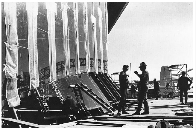
Peter Hall, from Hall, Todd & Littlemore was put in charge of coming up with a solution for the glass walls in 1967. It was clear that the initial wooden frames would not do the job and that they should be replaced for steel instead. These however brought a whole new set of challenges in order to ensure the durability of the frames, especially on the outside, as they were going to be exposed to a highly corrosive seaside atmosphere . He even experimented with concrete but the aesthetics of this solution were unacceptable.
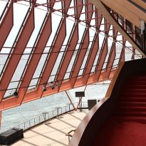
When Utzon drafted his proposal for the competition he had a very clear idea of what he wanted for his design. A base building with three main buildings on top, one for each theater and a third, smaller one for the restaurant, all of them covered by layers of concrete shaped as the segments of an orange. He didn’t pay much attention to lightning as he assumed that all shows would happened at night when it was already dark, so he decided that the privileged views both to the bay and the city should be highlighted by making all vertical walls out of glass. Utzon had never visited Australia when he came up with this concept and when he finally did he started changing the arrangements of these glass walls continuously. Unfortunately he didn’t have final plans for them one he left the project so we would never know what those might have looked like if he had been around until the end.
He did however he did leave a clear idea of what he had in mind which he summarized in the following points.
- All glass walls should look as they belong to the same family, with a similar structural design
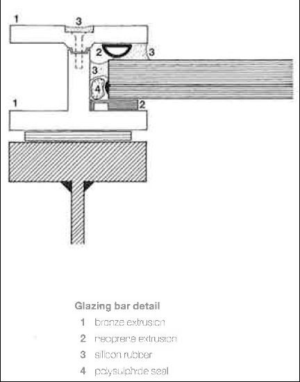
- The structure must be as minimal as possible. Frames should be reduced to a minimum and even removed when possible.
- The frames should never act as a support for the shells. The glass walls should appear as if they were hanging from the shells.
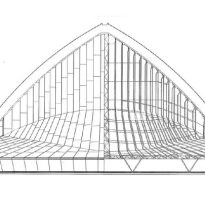
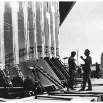
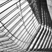
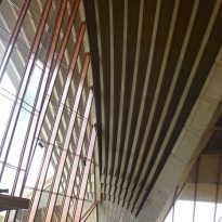
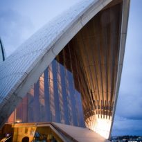
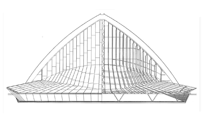
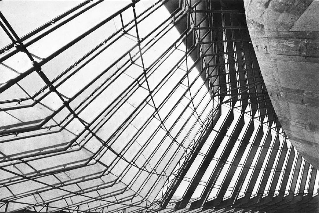
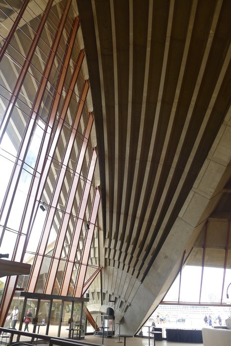
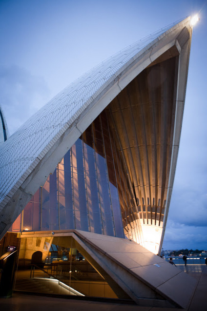
Making the glass walls appear as if they were hanging from the shells was the key challenge to solve. Because of the different geometries between the base building and the shells the window uprights had to be bend towards the outside in order to get a usable bottom edge.
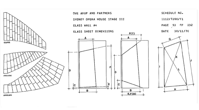
The two walls facing the bay were by far the most complex. In those spaces the glass walls are a combination of several geometrical shapes, a cylinder and two cones to be precise, all of them aligned on the same vertical axis. Starting from the top the wall has the shape of a cylinder, halfway down it crosses with a tilted cone which then crosses with yet another cone towards the bottom.
Glass
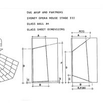
Choosing the right glass for the walls was a very important step. Safety was a must but the glass also needed to be cut on site, so tempered glass was discarded and instead replaced with laminated glass. Because there was so little information about laminated glass back in the day a whole series of test had to be done to ensure that the glass would meet all the requirements and expectations.
In the end the glass chosen was made up by a 12mm layer of transparent glass and a 6mm layer of polarized glass in bronze tones glued together by a 0,76mm layer of clear polyvinyl butyral. The color was chosen in order to avoid the greenish shade that two layer of transparent glass would’ve created and had the added bonus of providing a much needed sun protection, especially on the highly exposed north facades. The largest sheet of glass required for the project was 4×2.1 meters.
Uprights
The uprights that give strength to the glass walls were made from steel. This material was finally chosen because of its stiffness and strength.
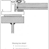
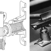
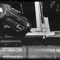
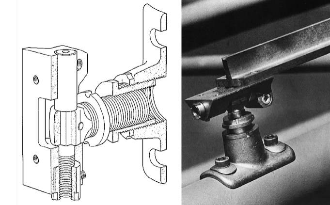
The uprights were custom made by welding together two tubes of 90mm diameter each and a 6mm lattice plate. The resulting geometry had the advantage of allowing standard connecting pieces to be used along its full length and in any possible orientation.
Video
