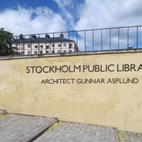
Stockholm Public Library

Introduction
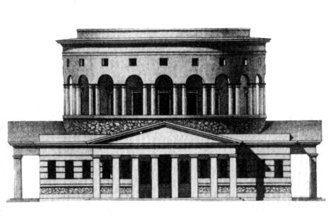
Analyzed by the Board of the Public Library, which Asplund part, the project presented in 1922 was approved and construction began in 1924. Asplund abandoned earlier ideas and changed, for structural reasons, economic and formal, the dome designed Originally, in favor of a roundabout, a cylinder whose height granted to certain foreign monumental building. During planning, Asplund, precursor of the modern movement in Sweden, rejudo classic elements to their most abstract, mostly by removing architectural decoration geometric shapes order.
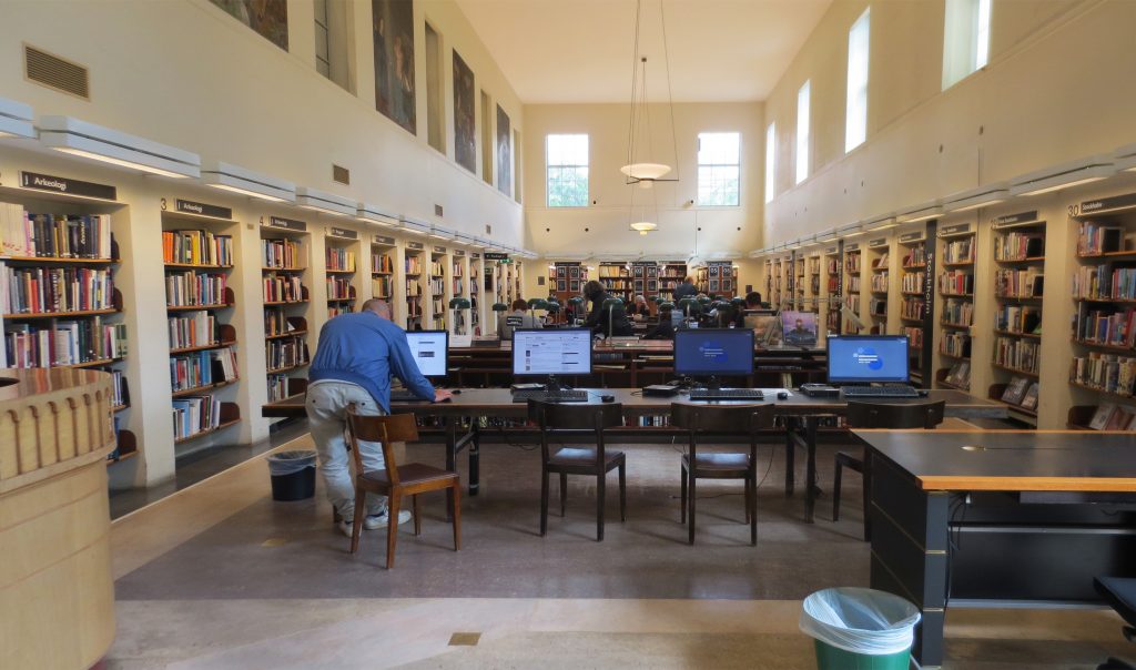
The Stockholm Public Library was the first library in Sweden to implement the principle of open shelves where visitors could access books without seeking assistance from library staff, a concept that the architect observed in libraries United States.
Extension
In 2006 he was called to international competition for an extension of the library, a new structure next to the main building Asplund using the site occupied by the three outbuildings, whose fate, ie demolition or integration, was deliberately left open on the bases.
In 2007 he was declared winner German architect Heike Hanada, with its proposal Delphinium, which includes a glass building high-rise, spatially away from the main body of the library, but connected by a low structure, a semicircular podium. Hanada developed preliminary plans for its realization, but in late 2009, due to a change of government in the city and many local campaigns against, who saw the project to perform as an unacceptable impact on the original complex Asplund, extension has been put on hold.
Situation

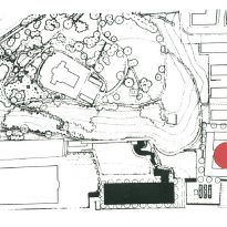
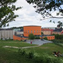
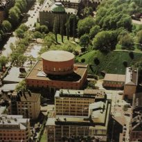
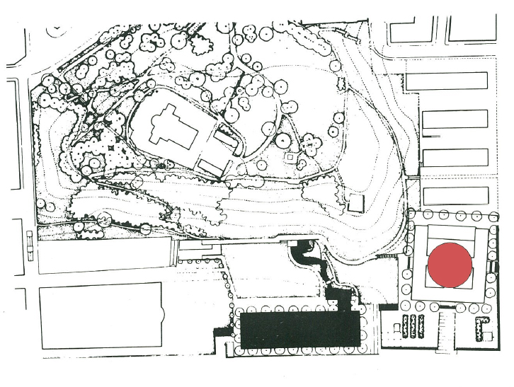
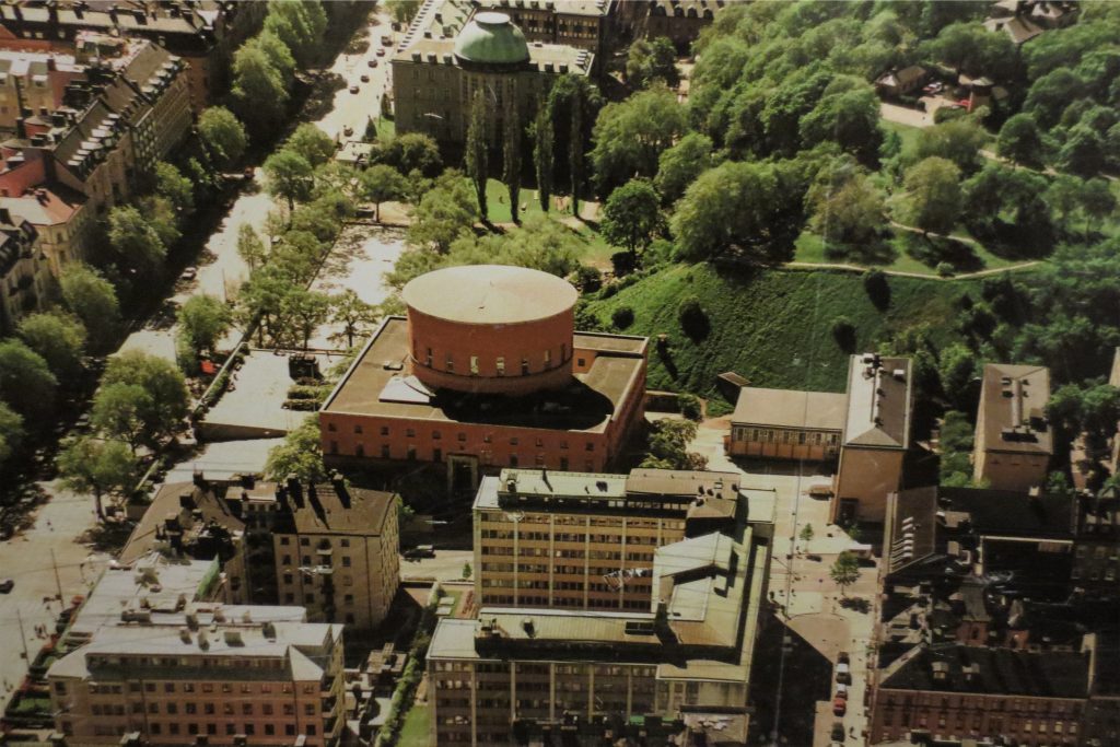
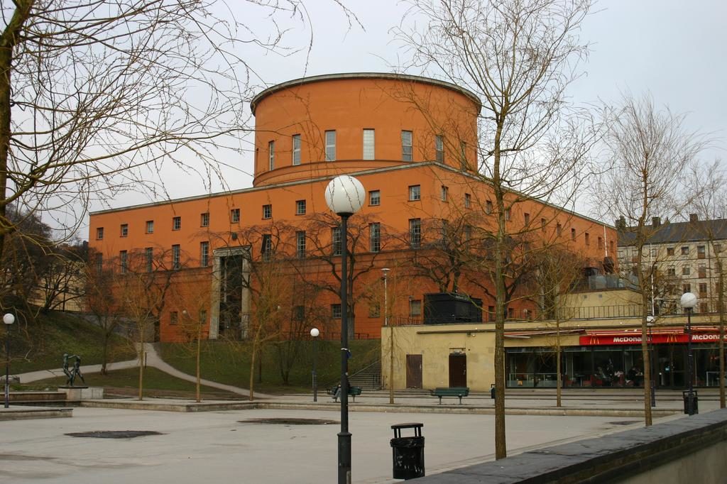
The library building, three annexes and the park are in the urban area of Stockholm, Sweden, in Odengatan and Sveavägen streets, although displaced vertex meeting between the two streets and in the lower part of the hill where it is also located the Observatory. In the nearby neighborhoods are several buildings of high architectural range dedicated to teaching, the Technical High-school and the University of Stockholm. In this context the Public Library of the city means “knowledge for everyone.”
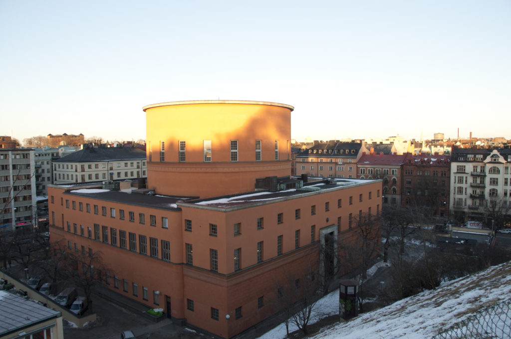
The area designated for construction is located squarely within the Swedish capital, however Asplund took the large plot of land, L-shaped, placing the building on the corner and creating a natural area around the library for three sides, increasing the view of the building from the center of Stockholm, which is why the architect also paid special attention to the relationship between the building and the sky with respect to the environment.
Concept
Initially and after a long journey by United States, Asplund decided on the outline of a building with a large central space, lit from above, surrounded by reading rooms and courtyards with skylights. Subsequently, the maturation of the project reveals some architectural changes, going from classical schemes to the simplicity of the result and illustrates the gradual shift from classicism to functionalism.
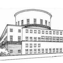
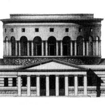
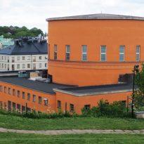
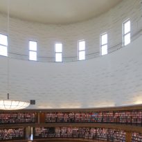
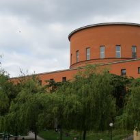
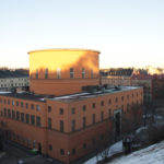
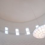
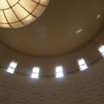
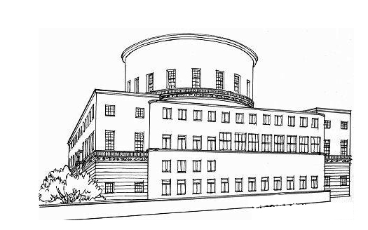
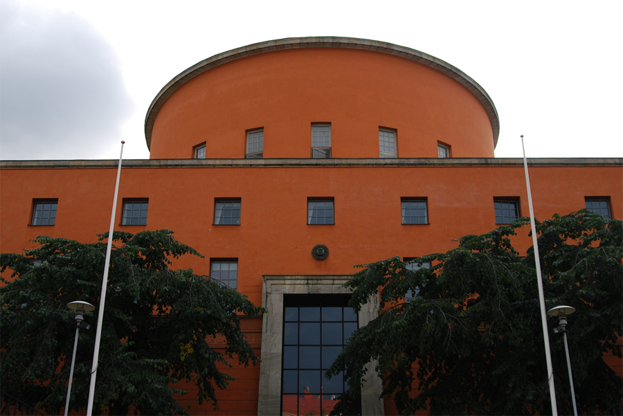
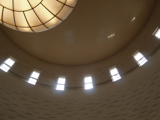
The first sketches, 1921, show a domed room later, inspired in part by the Barriere Saint-Martin de Paris (Rotonda de la Villette) Claude Nicolas Ledoux, was replaced by a cylindrical shape that gives grandeur to the room and the external image of the building, while allowing light to enter through the windows of the walls rather than by a skylight windows, which are obscured over time.
Asplund concentrated deep into the role of the library, hoping to create an environment in which people feel encouraged to learn. Influenced by research and new ideas of the time, created a fascinating piece of architecture for the city of Stockholm.
Description
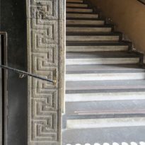
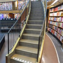
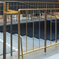
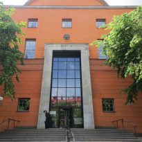
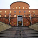
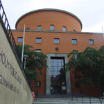
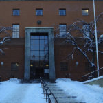
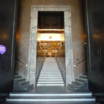
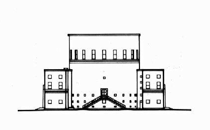
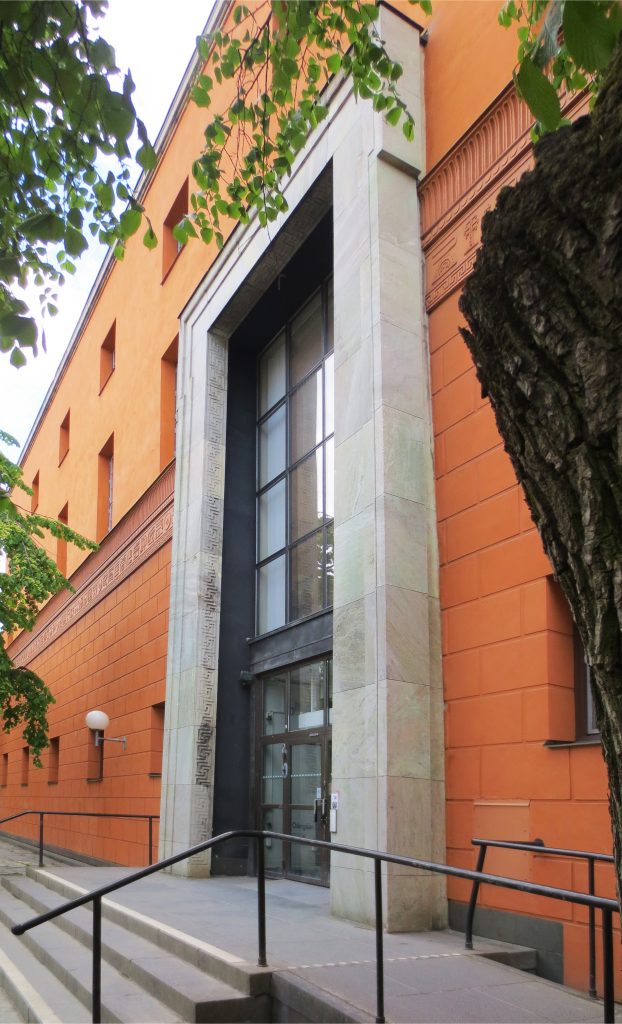
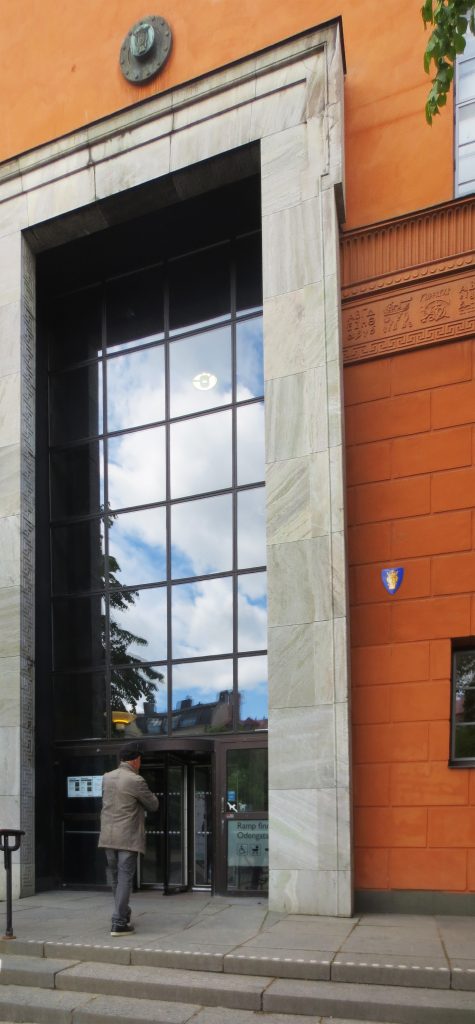
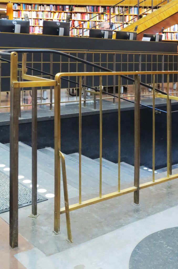
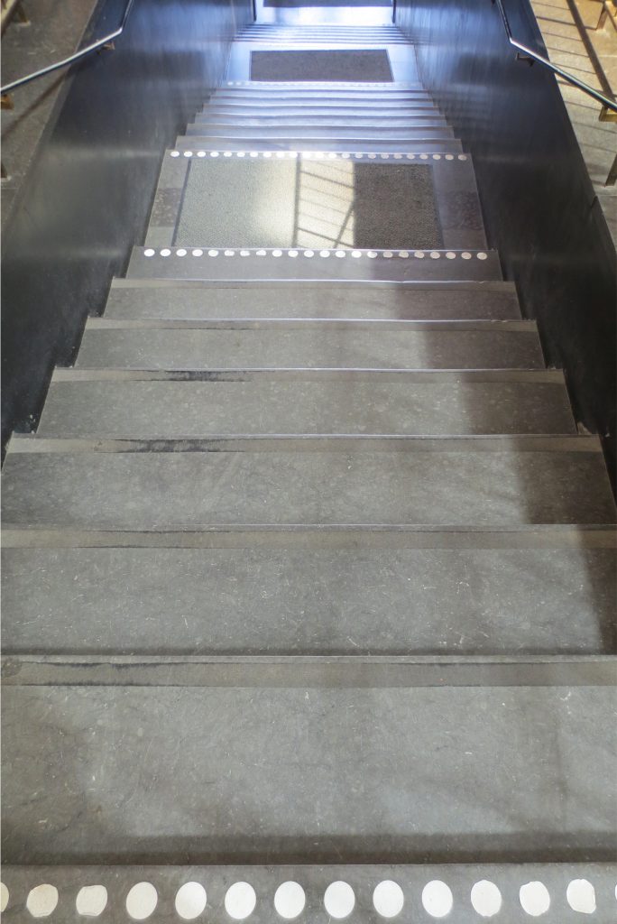
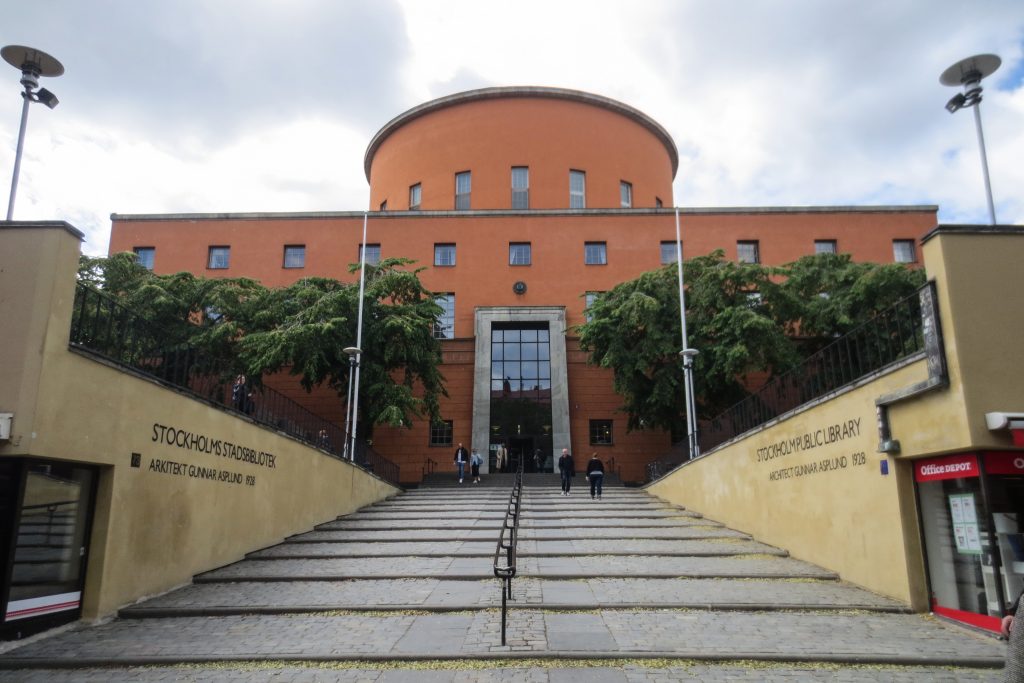
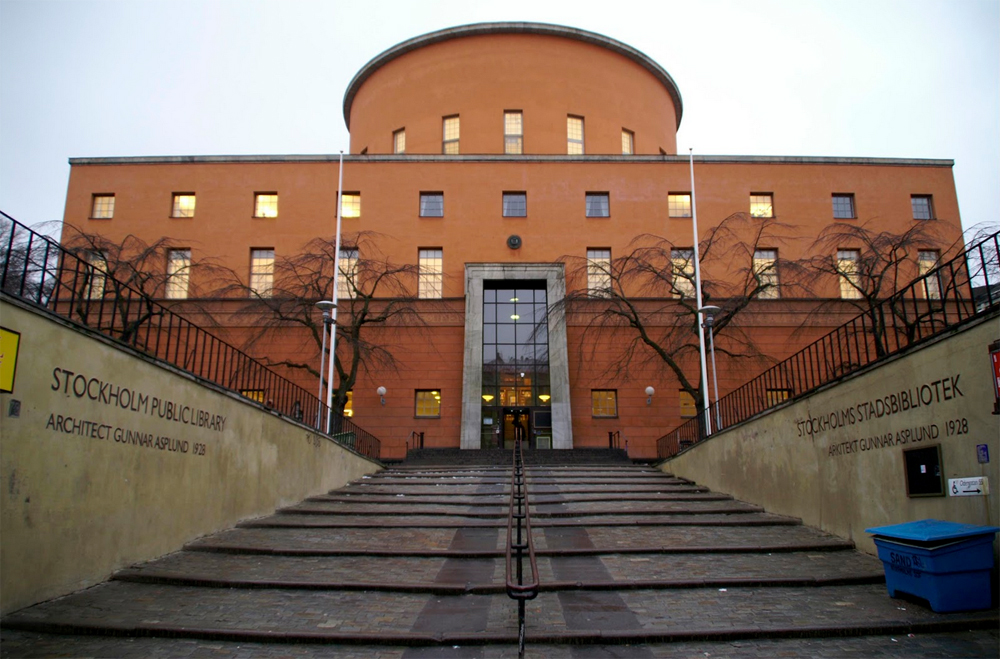
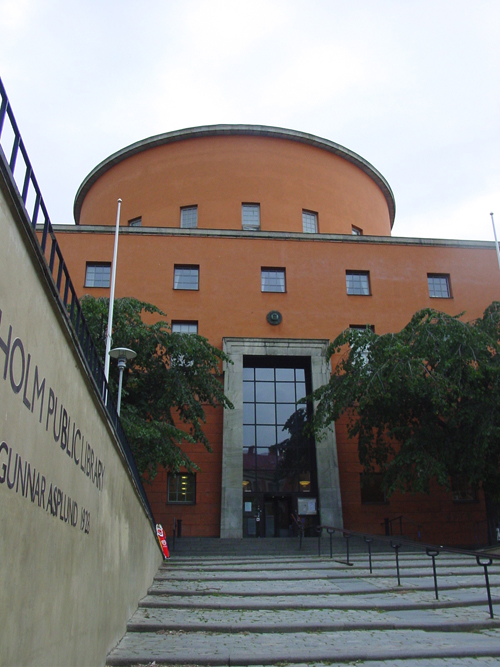
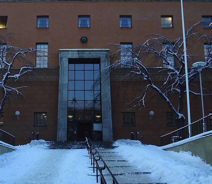
The successful integration of classicism and modernism, created a unique design for library building. The impressive main entrance with a high staircase is of particular importance for the design concept Asplund, since it leads to the central hall solemn.
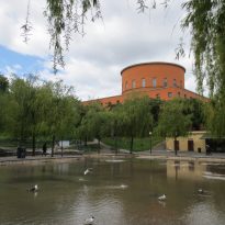
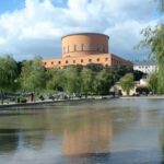
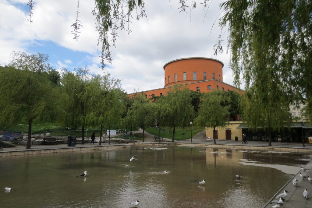
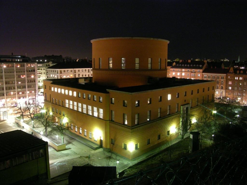
The three annexes, strict classical design one and modernist others, create a fitting home to the main building. The park, with its reflecting pool, with sculptures and plants a welcoming oasis. The assembly formed by the library, the park and annexes are a good example of the unique design of the architect Erik Gunnar Asplund.
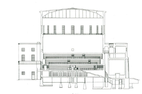
The architect aware of the great role of the library, used his reflections on American libraries had known and observed. With this knowledge, he made sure that the building will house a unique atmosphere for both visitors and employees, to facilitate the work of the latter and improve usability for visitors.
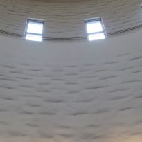
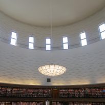
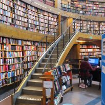
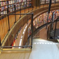
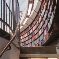
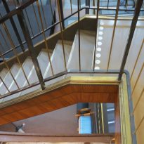
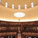
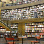
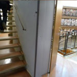
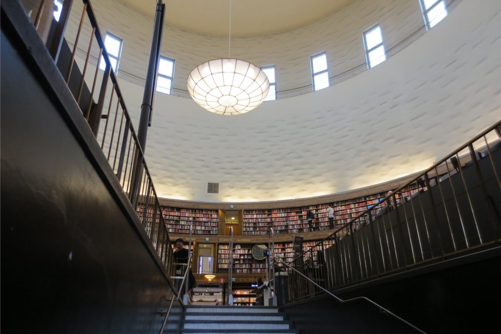
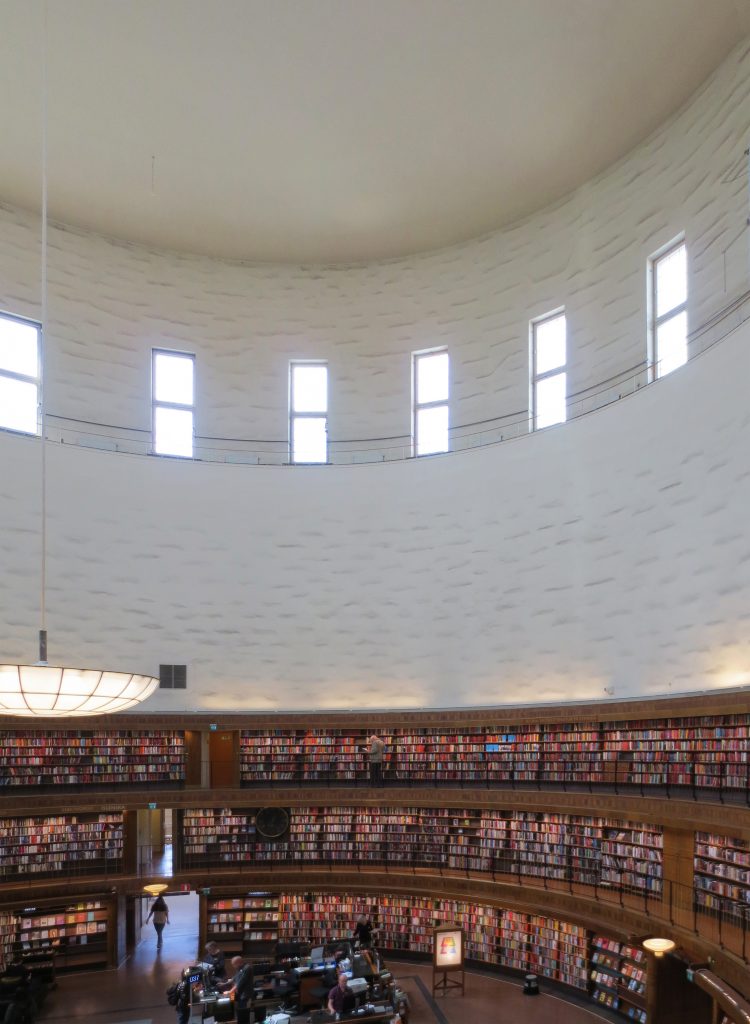
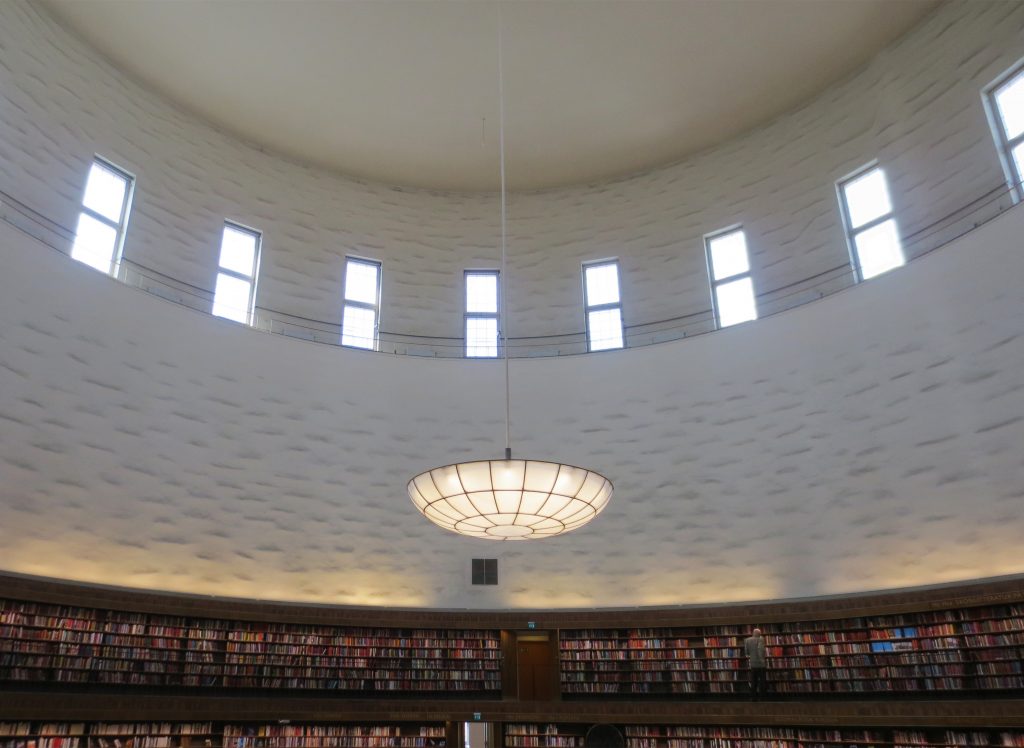
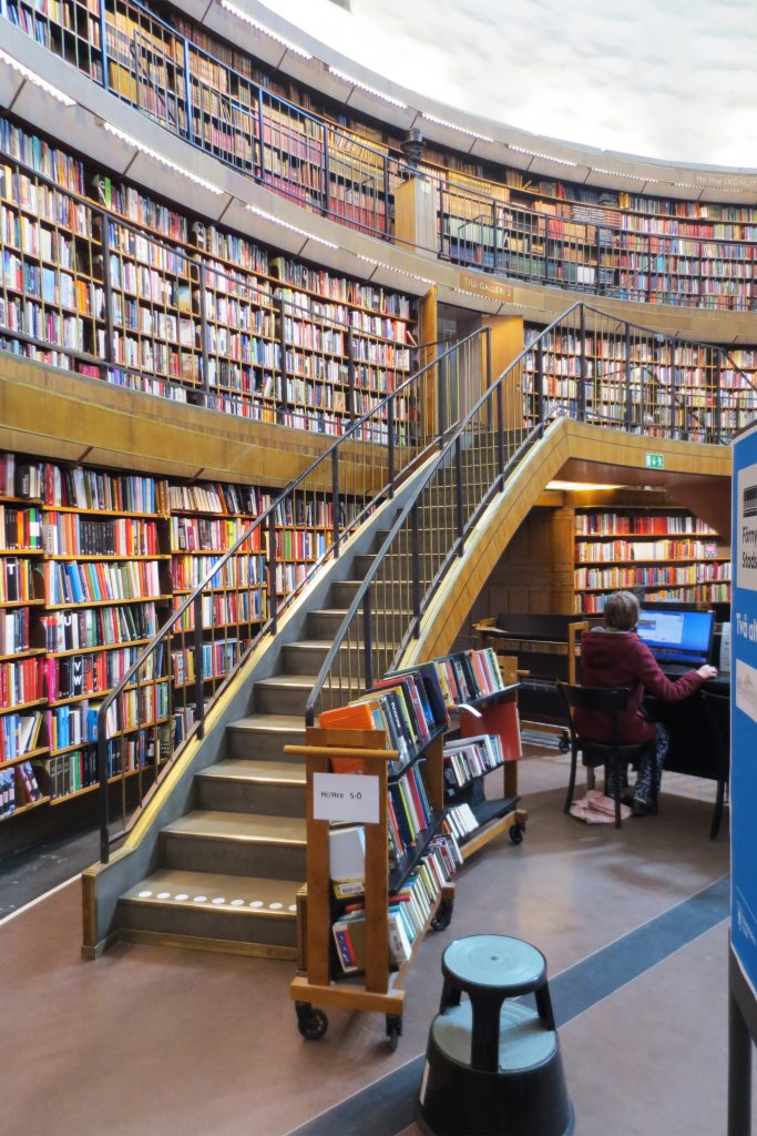
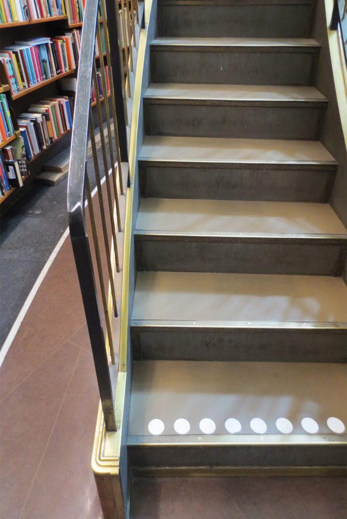
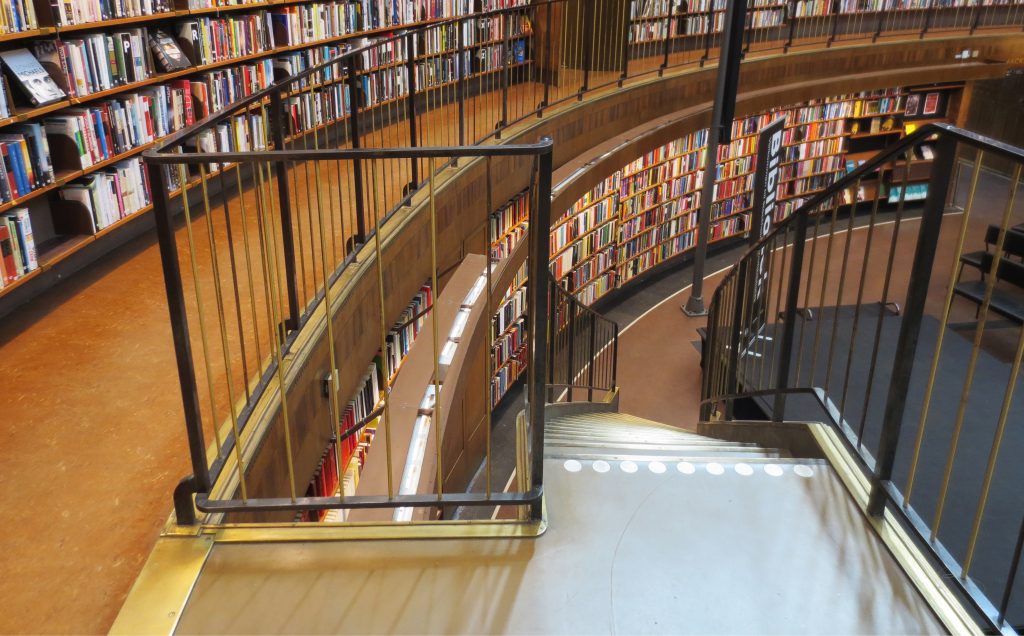
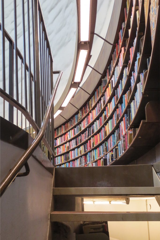
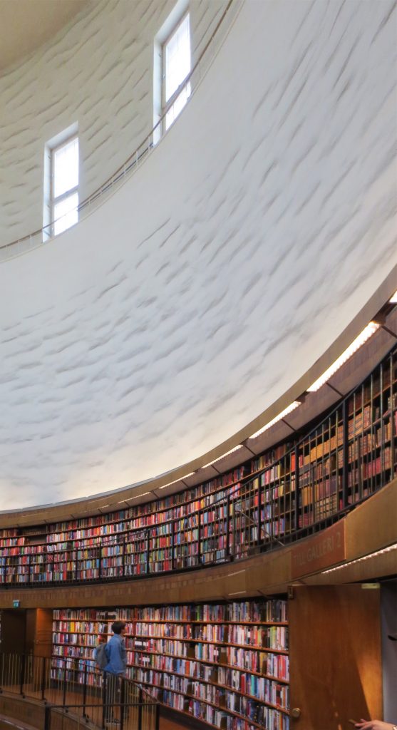
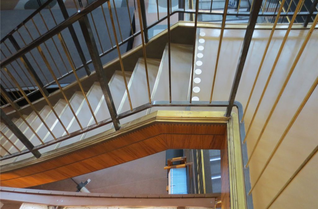
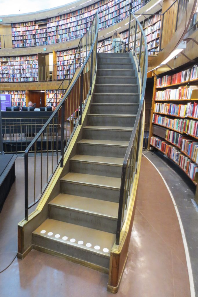
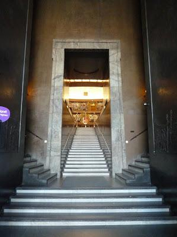
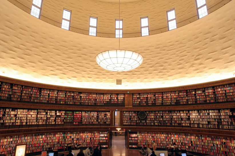
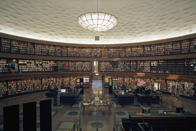
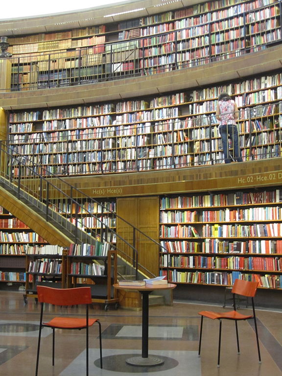
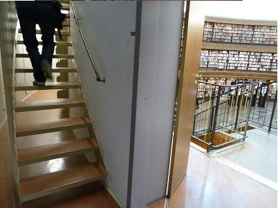
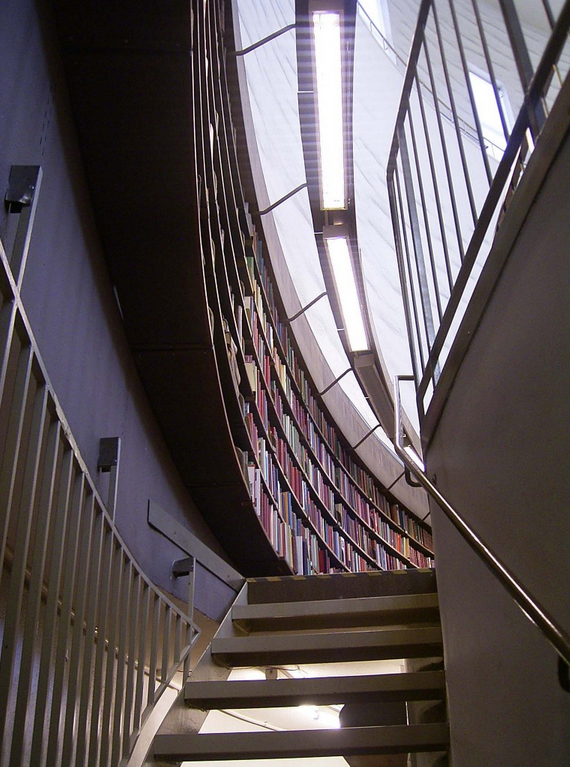
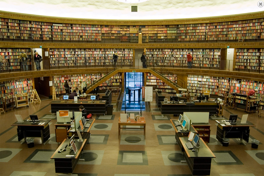
Once in the central chamber striking the texture contrast between the books and the clear wall of the top of the cylinder. The stairs to the upper walkways are not visible unless that leads to the first level, are hidden behind the doors of emergency.
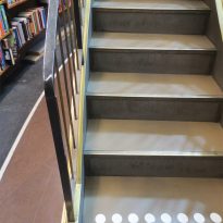
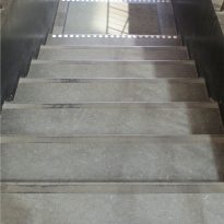
Contrast the low heights of the steps between the cylindrical space with adjoining rooms, detail that highlights the differences in height between the levels of the main room.
Asplund began designing the Public Library at a time which proliferated new ideas. Europe was recovering from the horrors of the First World War and lived revival of classical and modernist movements. Asplund was not affected by these movements and their design varies considerably during the construction phases. The library began as an unmistakable imitation of Greco-Roman architecture with columns at the entrance and a large dome in the center. As time passed, the design of the library progressed to a more functionalist and modern work, the great central dome design eliminated to leave the “drum” center of a roundabout.
Spaces
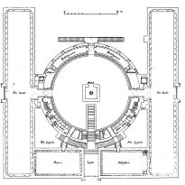
Inaugurated in 1928, due to financial constraints was left unfinished its west wing, which was added in 1932, as the bazaars of Sveavägen, completing almost square base around the roundabout at the main reading room.
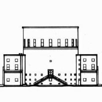
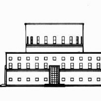
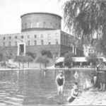
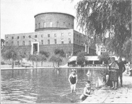
Also designed by Asplund and completed in 1931 is the park to the south, with its large rectangular pond and shops along Sveavägen. The three simple annexes west, buildings were also part of the original concept of Asplund, but were designed by other architects, Erik Lallerstedt designed the two farthest west, from 1929 to 1930 and 1932 and from 1952 to 1953 Paul Hedqvist the third block.
Following the original plans were constructed in 1973-74 Asplund 3 of the four courtyards. Between 1979-81 elevators and restrooms were added in one of the courtyards, together with stairs to the galleries of the central hall.
Design
- Main building

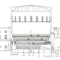
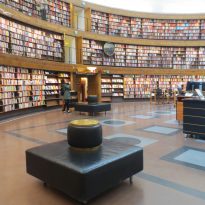
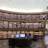
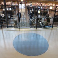
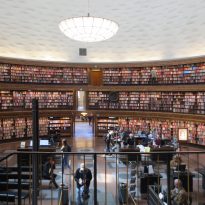
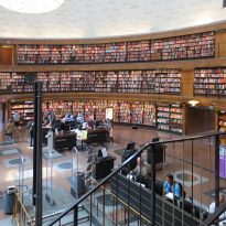
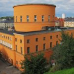
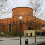
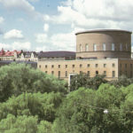
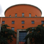
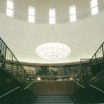
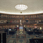
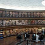
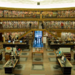
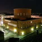
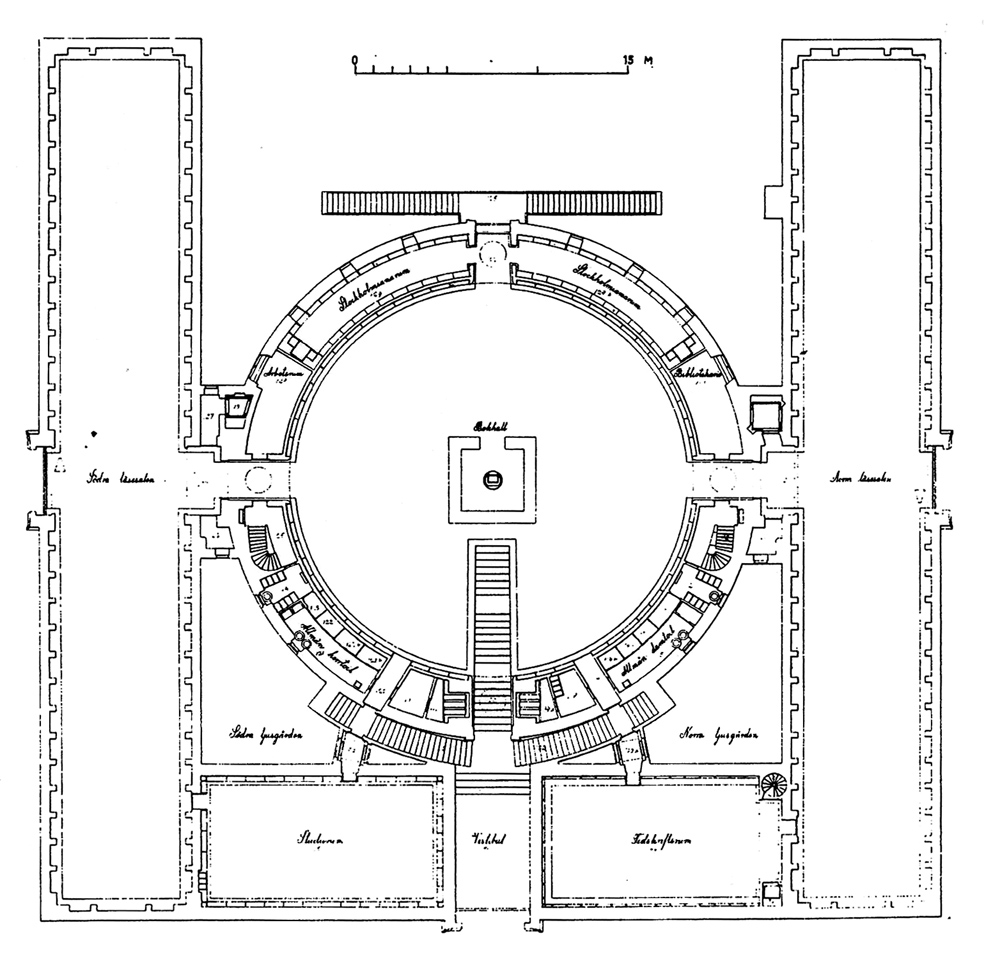
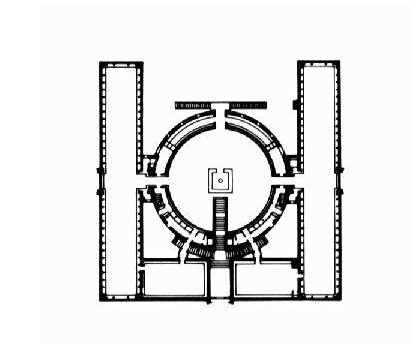
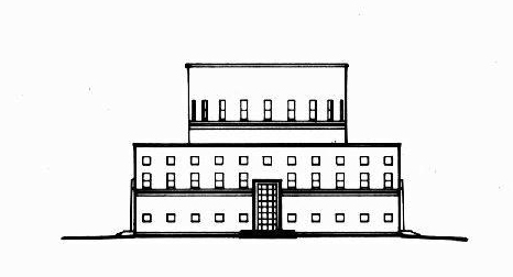
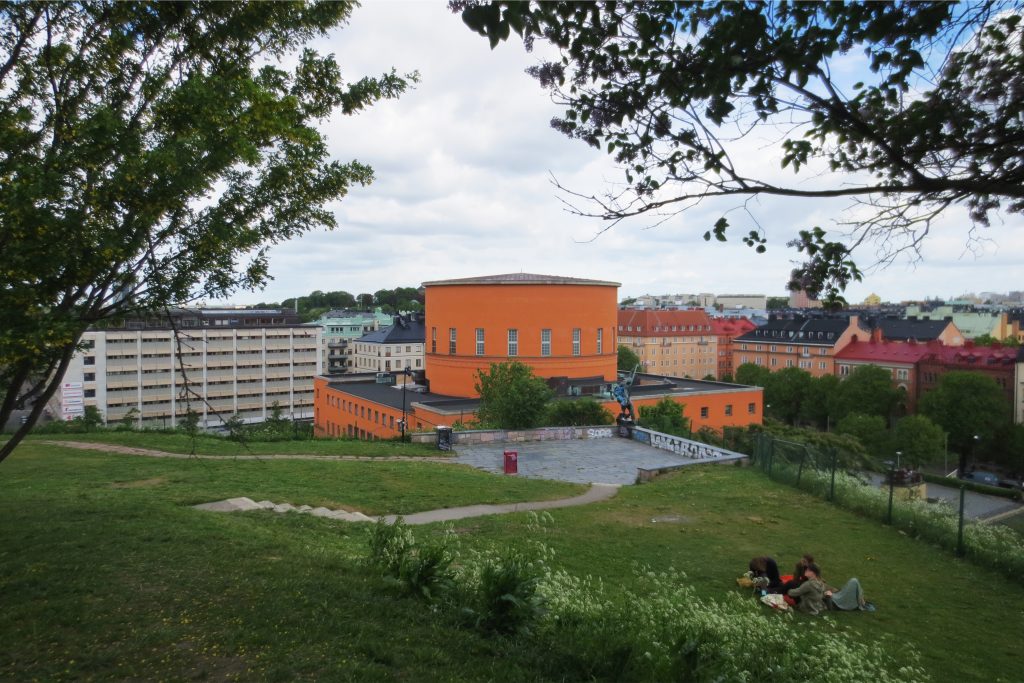
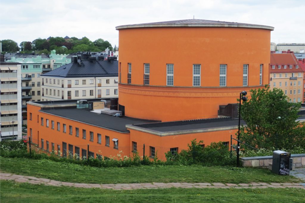
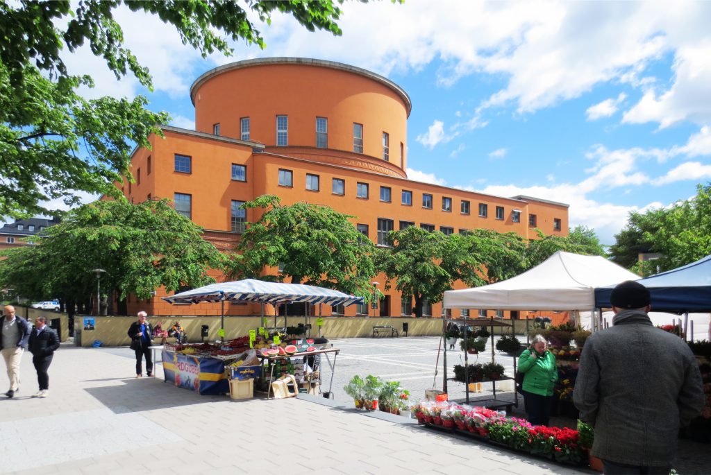
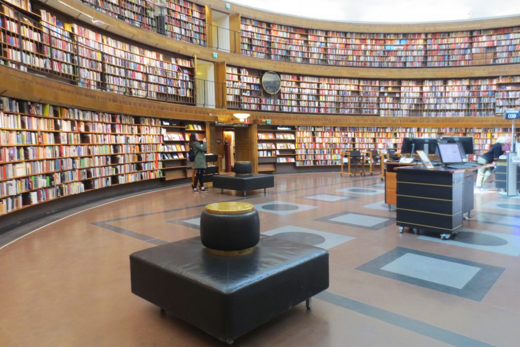
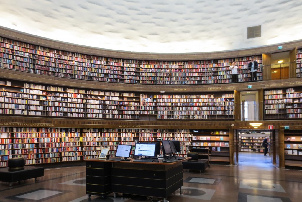
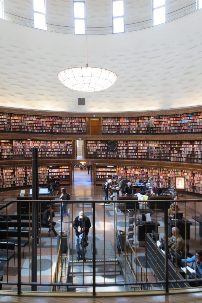
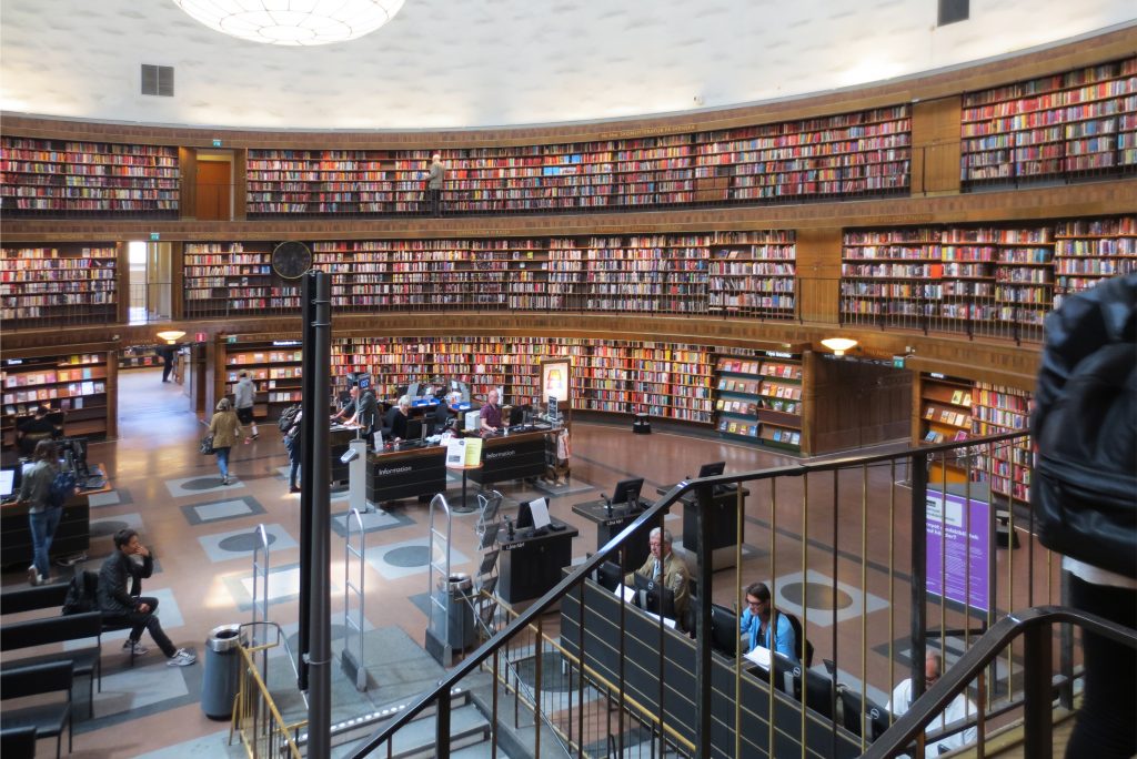
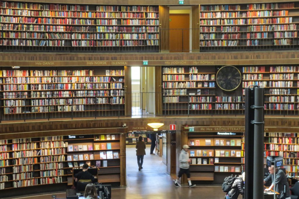
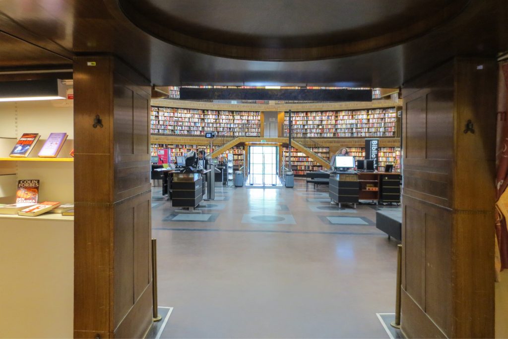
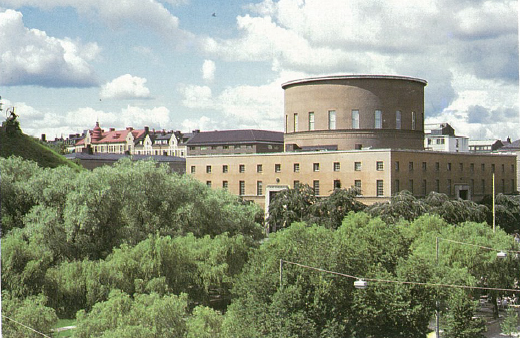
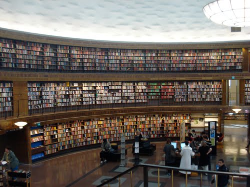
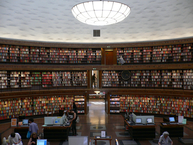
The library building has a strict geometric design with a square base and a central cylindrical volume, which contains the main hall of the library, an open courtyard in the center of the cylinder rises three levels whose first level is occupied almost living entirely by borrowing. The only points of access to the central area of the library are in the four tangent points. The combination of spherical and cubic forms was a frequent motif, which can be found at Asplund projects such as the oval hall on the top floor of the Villa Snellman in Djursholm.
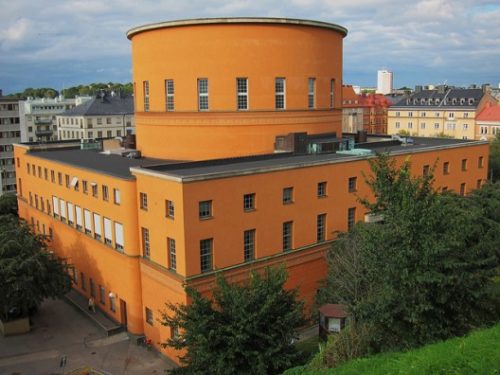
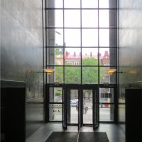
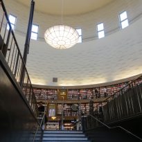
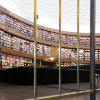
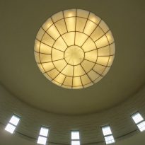
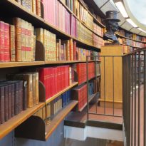
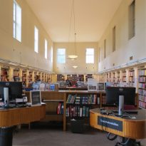
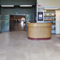
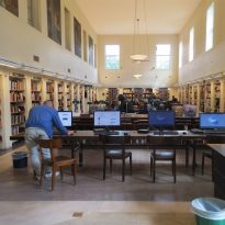
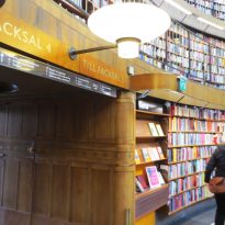
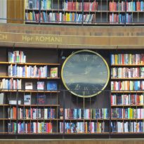
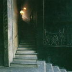
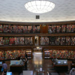
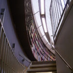
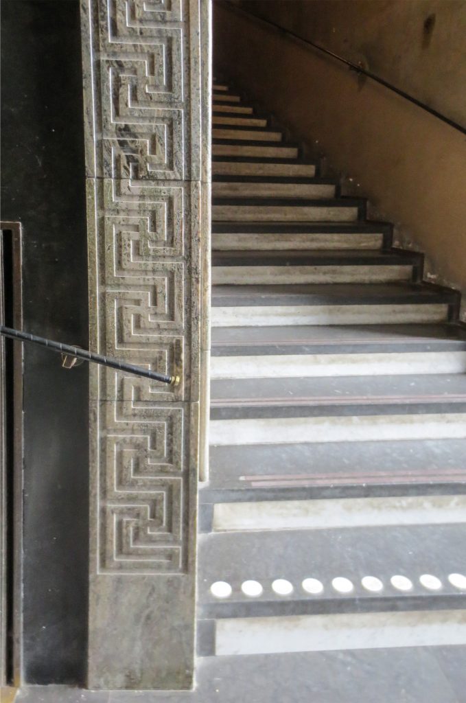
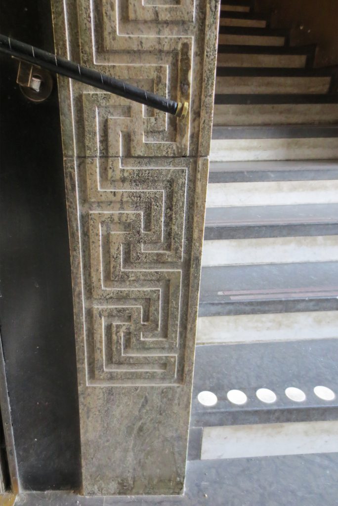
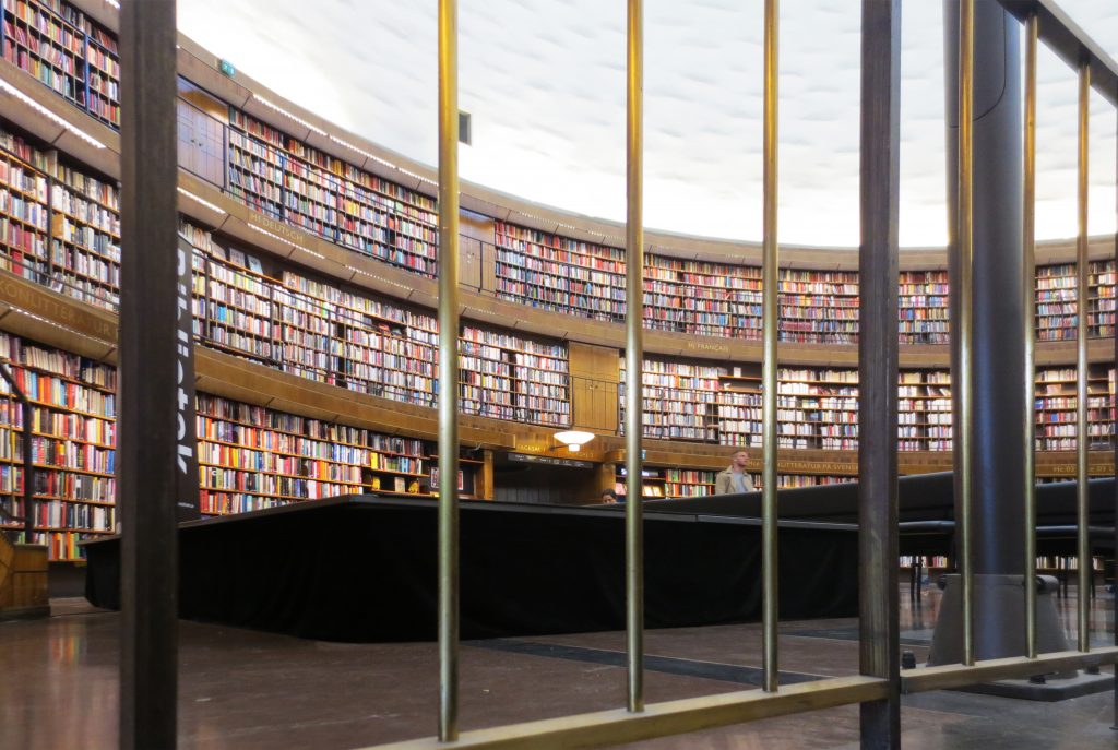
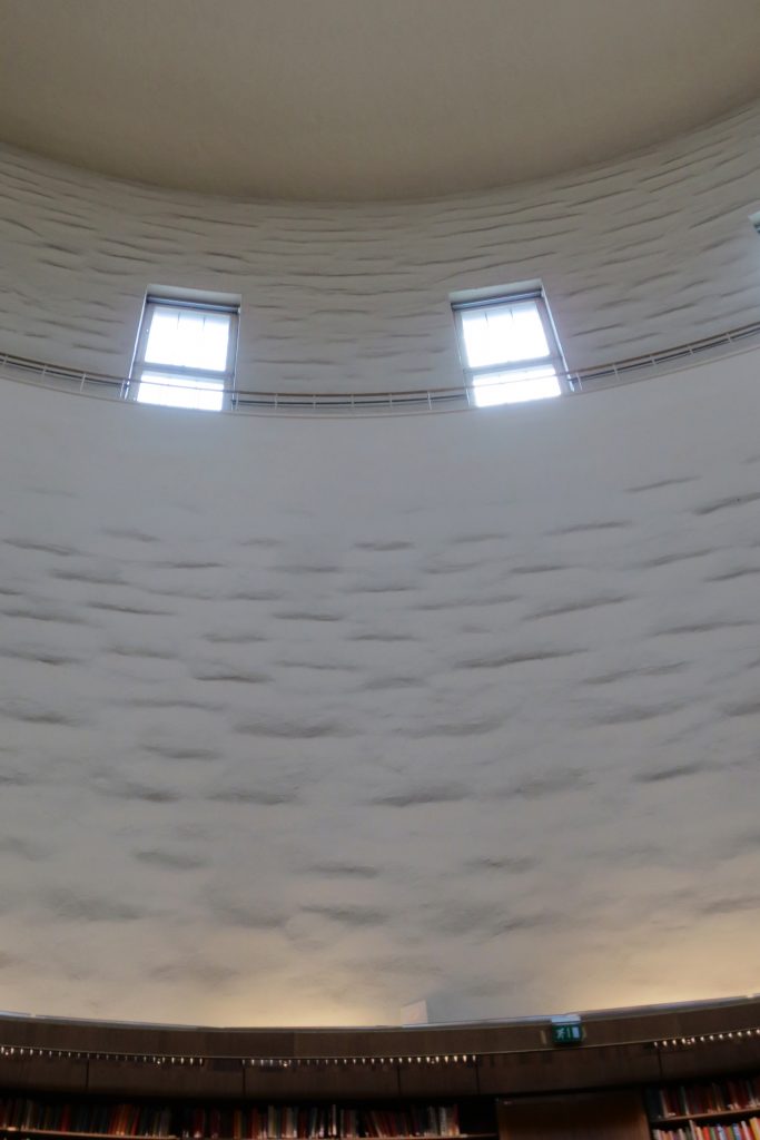
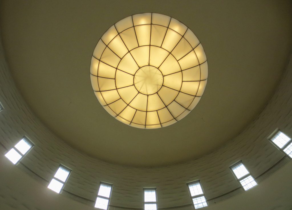
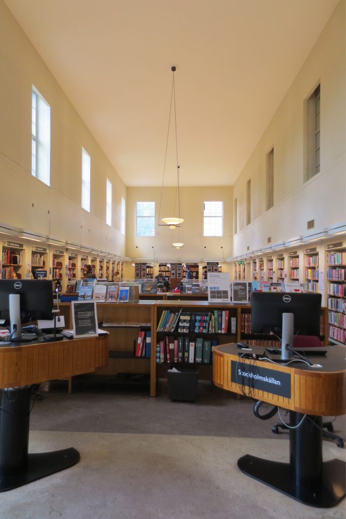
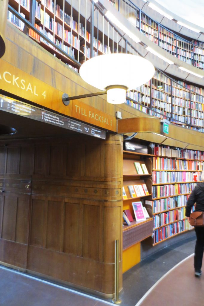
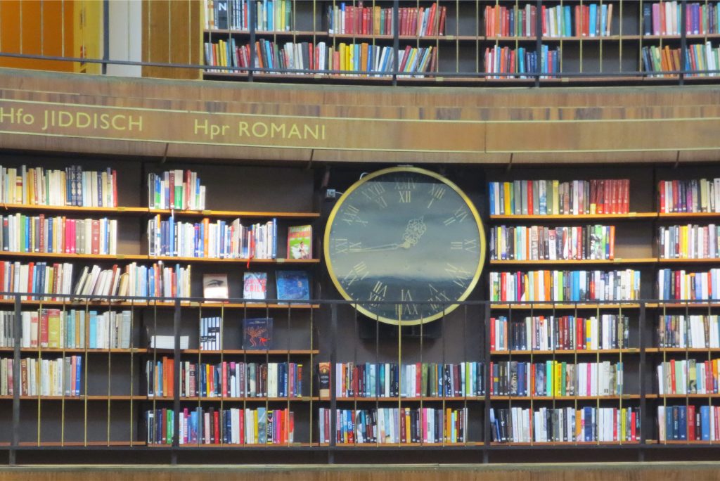
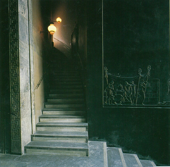
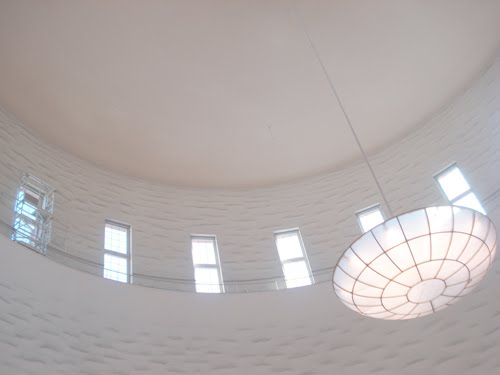
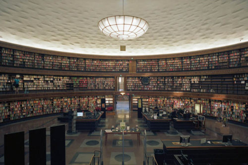
The main entrance to the library, located at the end of a dramatic staircase that rises in the lobby, is marked by high walls of polished black stucco. All the walls surrounding the central circular courtyard are covered with wooden shelves containing books. Looking up the cylinder a rough stucco walls rise towards the top of the cylinder, where the room is filled with light passing through the high clerestory windows. The pendant lamp white opalescent glass is placed upward concave, allowing you to capture the light from the windows and acquire a high gloss, as it becomes a focal point in the large open space.
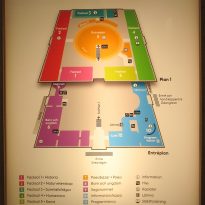
The four corners of the square base containing different rooms dedicated to literature, children’s literature, periodicals room, study rooms and offices. Low construction, along Sveavägen containing shops and restaurants.
- Children’s library
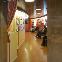
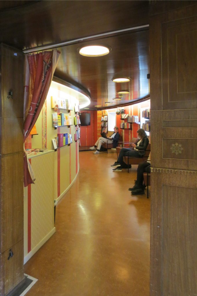
The children’s library is located on the ground floor in one of the side wings, next to a room specifically designed for storytelling. Here, Asplund commissioned the painter Nils Dardel a mural on discoveries, adventures and fantasies located in the niche of reading.
- Park
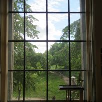
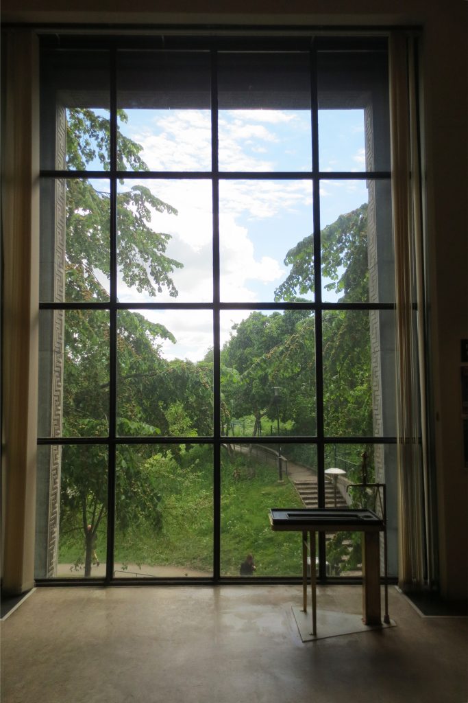
The park is located on the south side of the library and is framed by Sveavägen, School of Economics and the hill on which the Centre is situated. The park is characterized by its small waterfall, terraces into the hillside, the reflecting pond and sculptures.
- Outbuildings
The three outbuildings, are classical and modernist style. Annex 1 closest to the library was built between 1952-53 Annex 2, inbetween the other in 1932 and annex 3, visible from the library 1929-30
Decoration
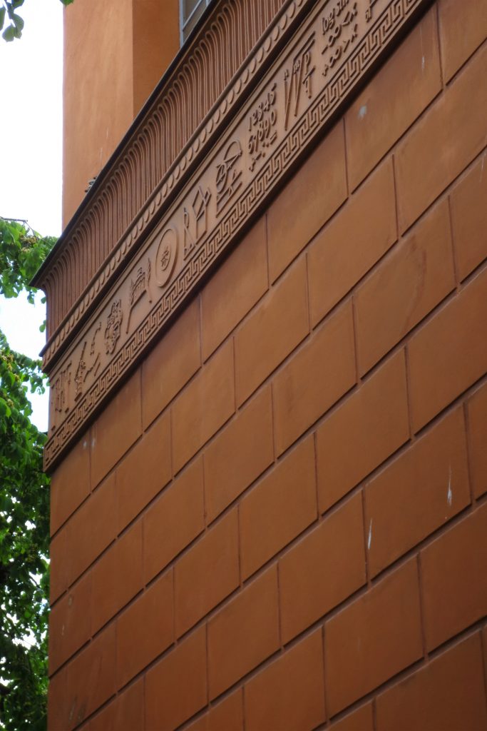
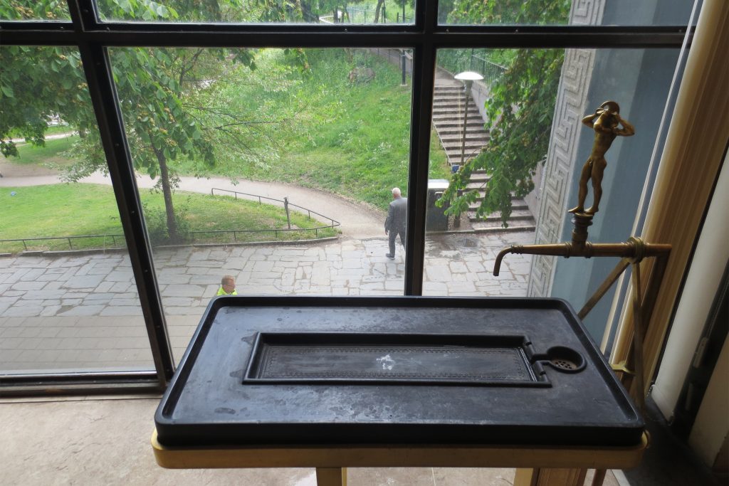
Both the interior and exterior of the building is richly decorated with different types of artwork.
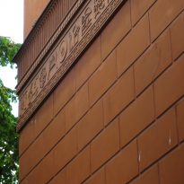
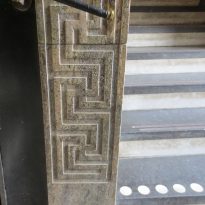
The ornamentation is replaced by reliefs, making an appearance the presence of a base of functionalist character as the stucco with scenes from the Iliad that decorate the lobby, designed by Ivar Johnson. All furniture in all rooms were designed for their positions and specific purposes.
Materials
Construction System
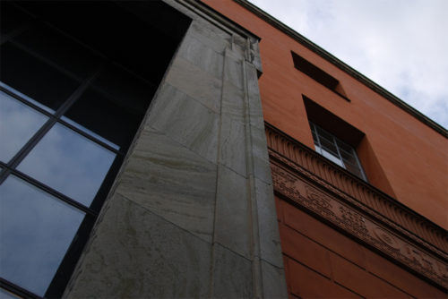
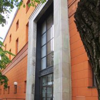
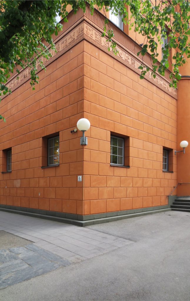
The main building was built on a foundation of concrete blocks, on which the brick walls covered with stucco orange and ocher rose. In its structure beams and joists iron and concrete were used. The ceilings are covered with tar board at the roundabout reinforced with copper sheets.
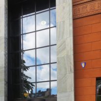
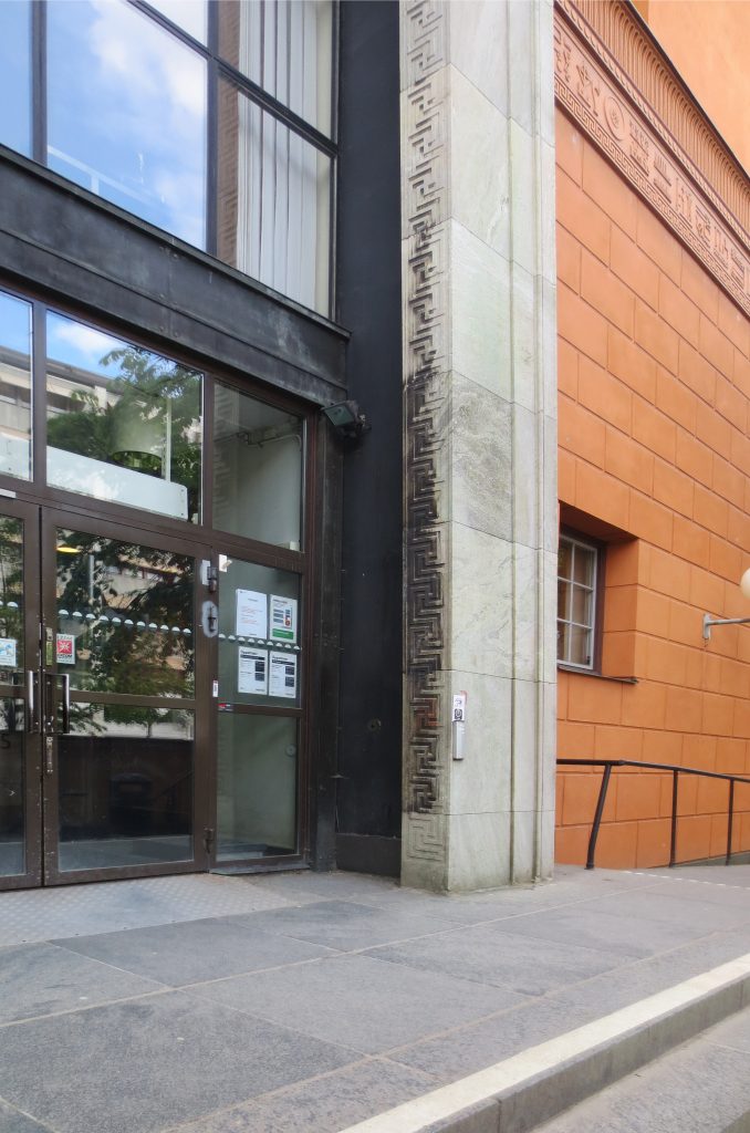
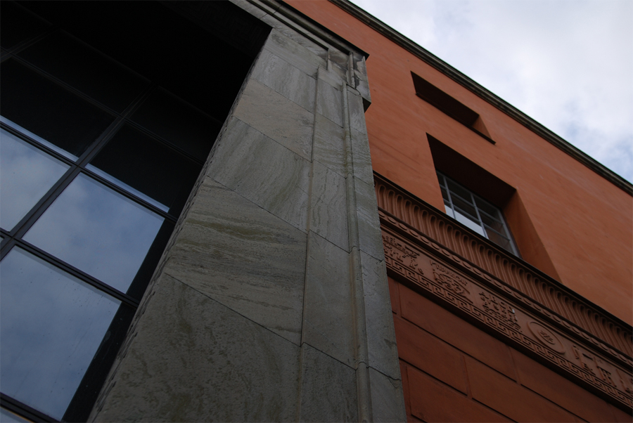
The brick facades were originally coated with lime plaster, granite steps, different construction details as ceiling cornices and marble porticos Grottorp.
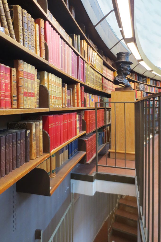
Inside, on the walls of the common areas friezes hardwoods were placed and the others were painted with bright colors like red, green and yellow. The decorative paintings on the walls and ceilings were originally executed, but currently only be seen in some places. Most furniture and bookshelves were designed by Asplund and Nordiska Kompaniet made in Stockholm.
Annex 1, closest to the library, stucco facades are pale yellow, with details of granite and metal roofs. The interior has changed but the main staircase is still the original.
Annex 2, the central, lemon yellow plaster reliefs sculpted limestone surround the entrance, the roofs are made of metal. This annex inside also has changed, remaining intact the main staircase.
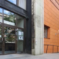
Annex 3, visible from the library, has yellow walls with ashlar rustic stucco and black granite pillars at the entrance, the roof is metal. Its interior has changed and the main staircase is preserved.
Video
