SONY Building in New York
Introduction
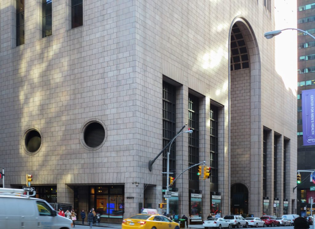
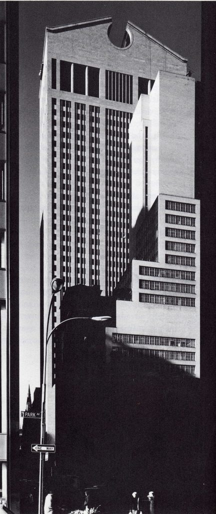
With 37 stories and a height of 197.32 meters, the SONY building, originally known as the AT&T building, is regarded as the first postmodern skyscraper. This stands in contrast to Philip Johnson‘s years of advocating for the International Style, as evidenced by his collaboration with Mies van der Rohe on the Seagram Building, also in New York.
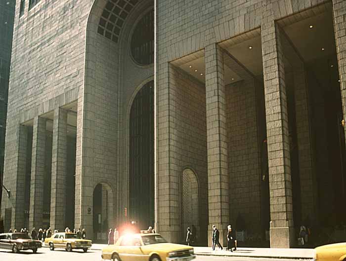
Since its inception, the building has been a focal point of controversy. Critics labeled its Chippendale-style top as excessively “kitsch”. The entrance was critiqued for its lack of protection against the weather and making visitors feel dwarfed. Johnson was also accused of appropriating a design style initiated by others.
Originally constructed for telecommunications company AT&T in 1984, the building has spurred heated debates both for and against its design. The city agreed to its vertical expansion in exchange for a public space within the building, be it an open-air space or gallery, as well as AT&T’s (an iconic American company) commitment to always keep occupying the building. Despite these agreements, the building was acquired by SONY in 1992 and renamed the Sony Building, serving as the company’s U.S. headquarters.
Location
The “Chippendale” building is located at 550 Madison Avenue, nestled between 56th and 57th Streets in Manhattan, New York.
Concept
Designed as the corporate offices for AT&T in New York City, the building was a dramatic departure from the “glass box” design of many high-rise office buildings at the time. Johnson’s design, which married an innovative steel structural system, a series of architectural requirements, and a series of engineering challenges. Later on Johnson himself described the building as the “pinnacle of his career.”
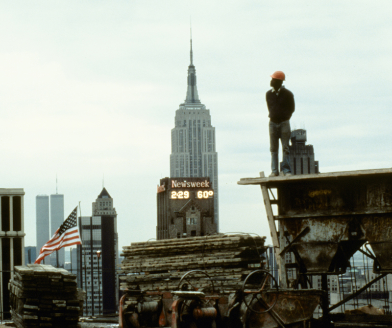
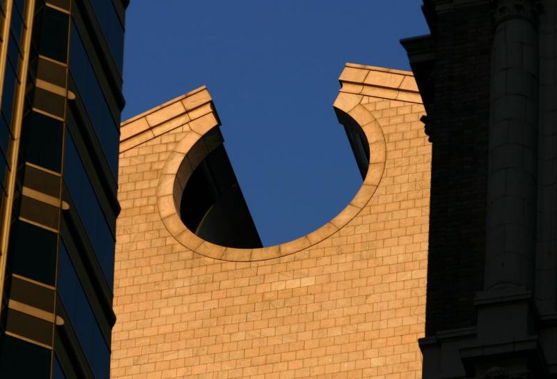
A unique postmodern curve reminiscent of a “Chippendale” dresser topped the building, lending it a monumental presence. Carter Wiseman, an architectural critic, described the building as “a fusion of aesthetic rebellion and corporate commerce… more logo than architecture.”
Spaces
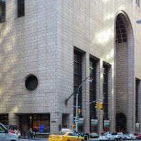
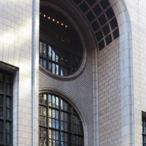
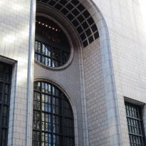
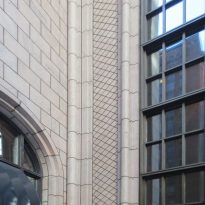
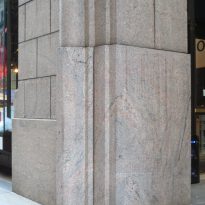
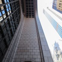
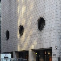
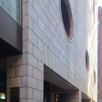
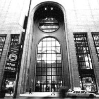
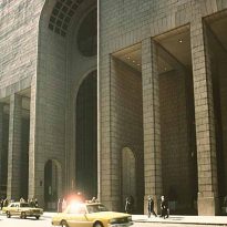
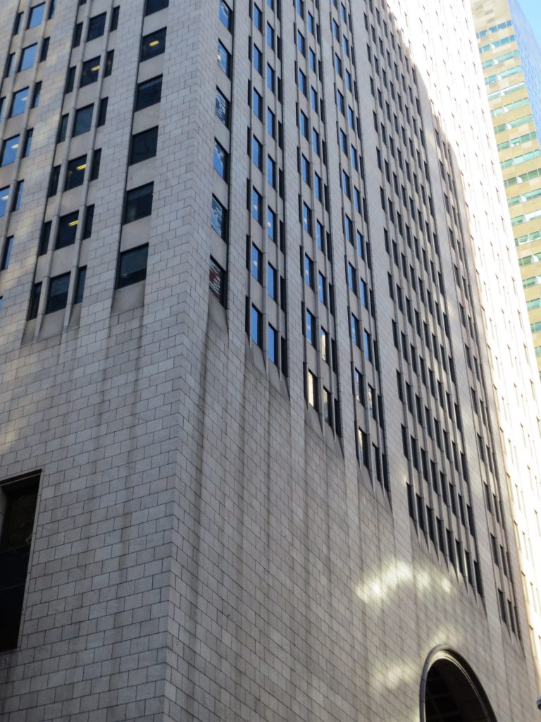
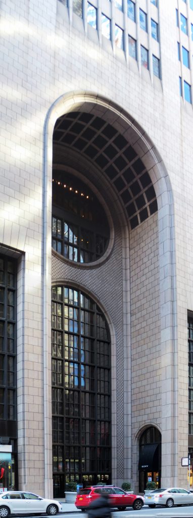
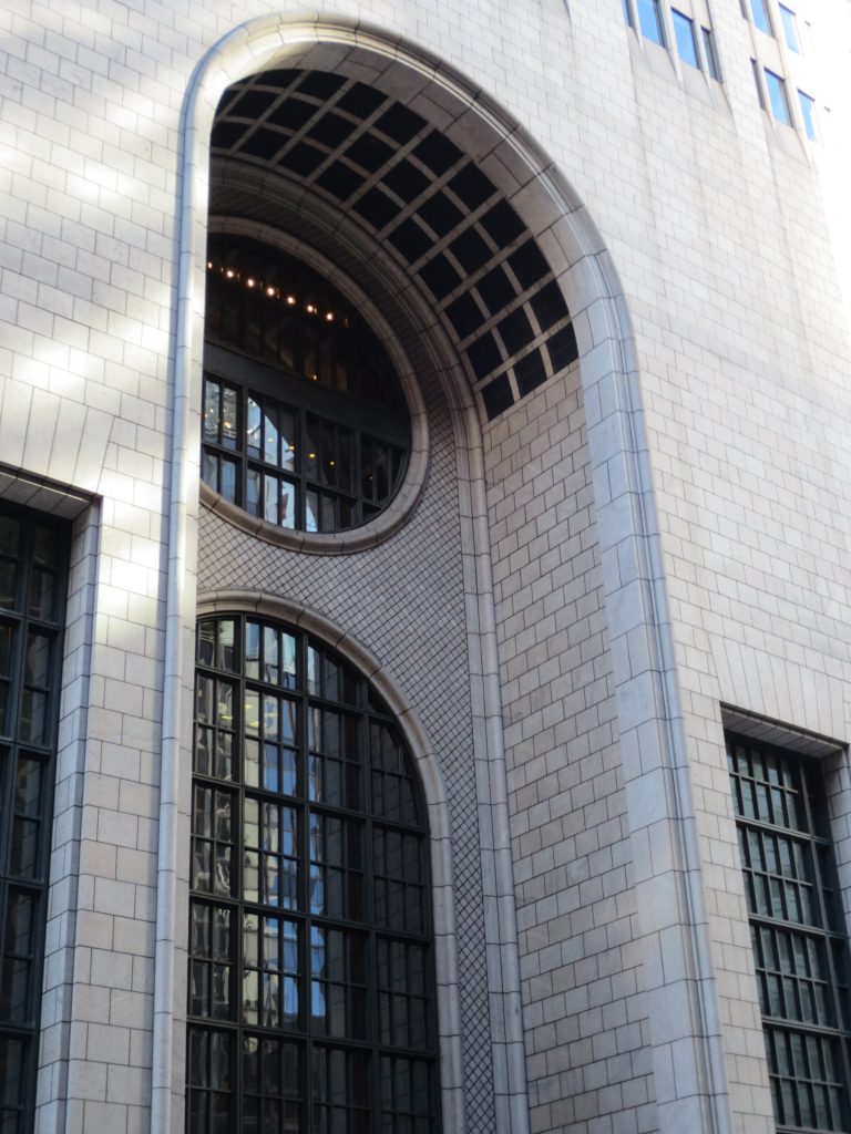
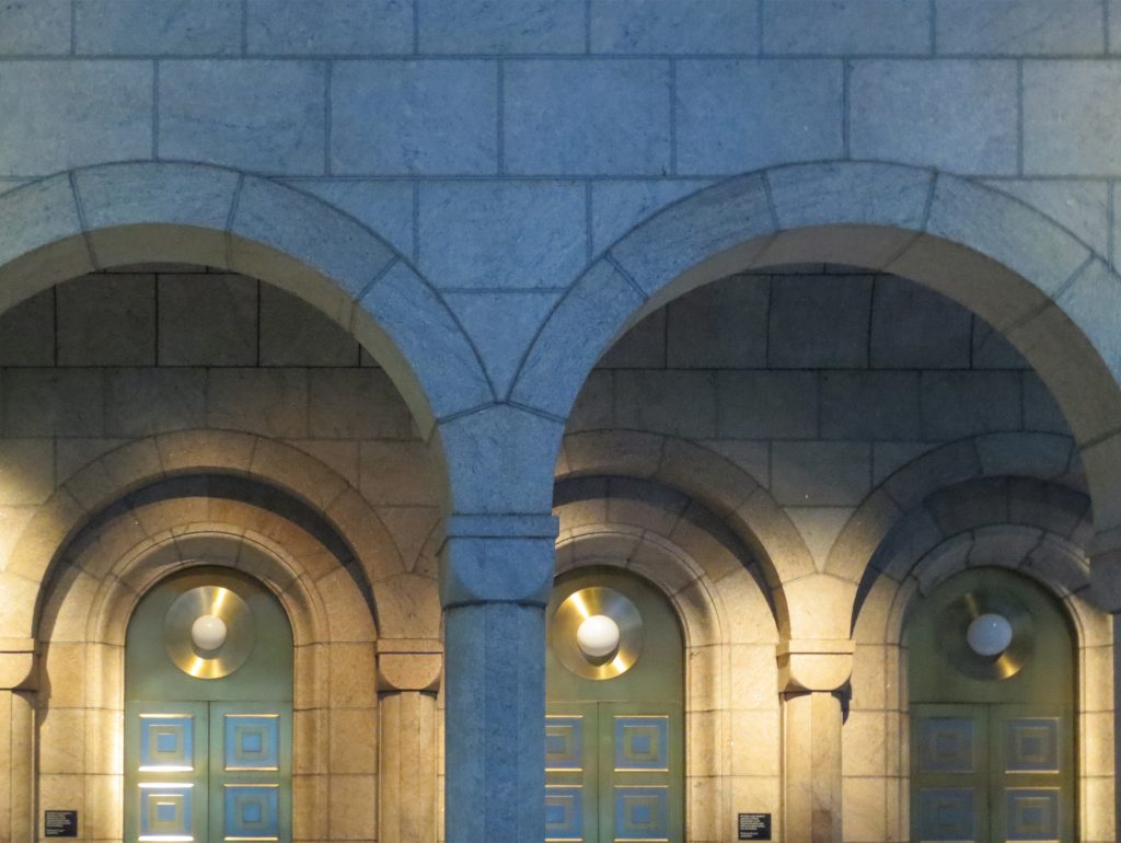
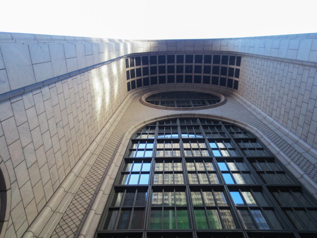
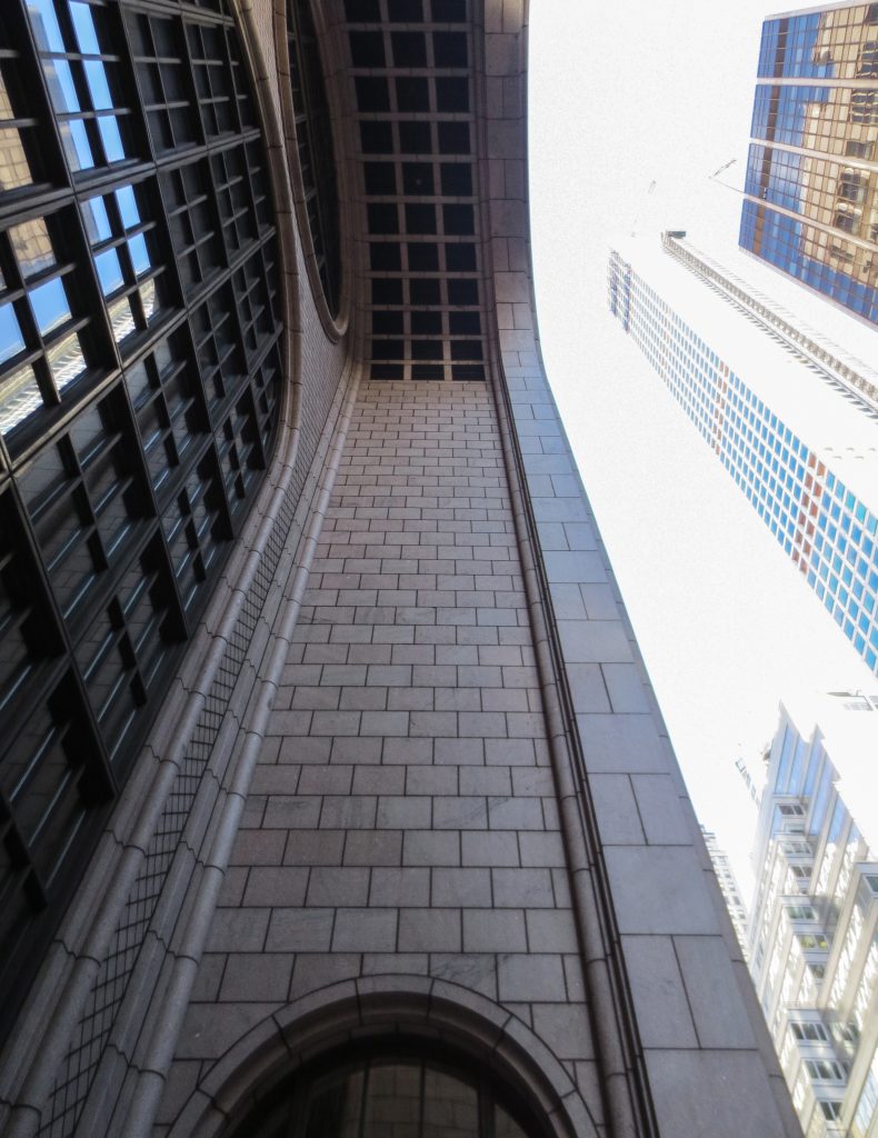
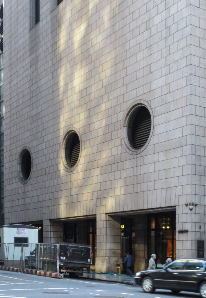
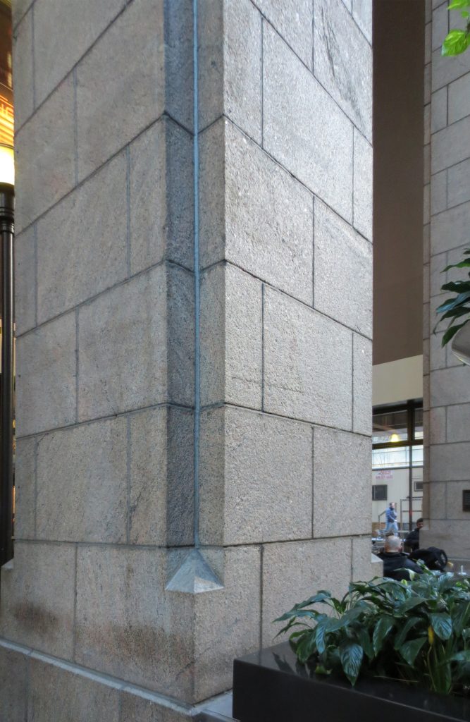
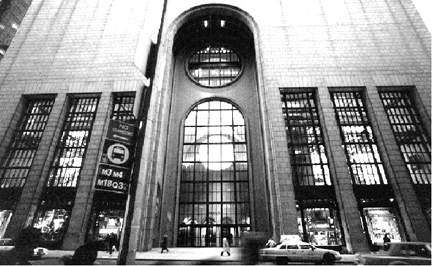
With a rectangular footprint, the building features design elements used in early skyscrapers, such as a tripartite scheme with a base, body and top. Only 30% of the pink granite-clad structure features windows, organized into nine vertical strips. The massive 9.14-meter-tall archway and the Chippendale-style top lend the building its unique identity.
Remodeling
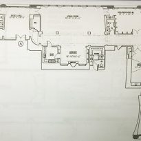
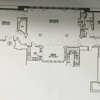
When SONY acquired the famous AT&T building, they commissioned the architectural firm Gwathmey Siegel to transform the original building to serve as the global headquarters for their music and imaging department. To meet these needs, certain modifications to the original design—which was initially planned to accommodate 600 people—were inevitable, as Sony intended to house 1,600.
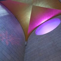
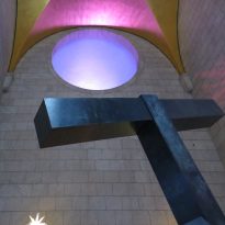
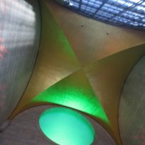
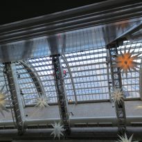
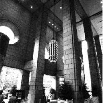
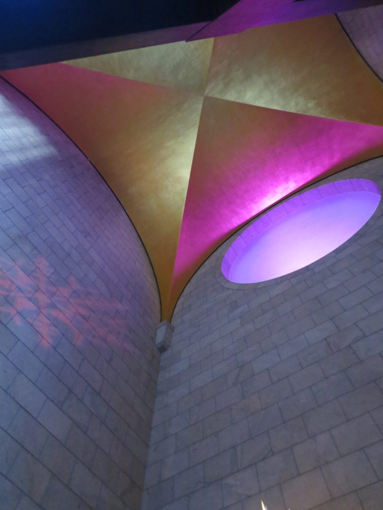
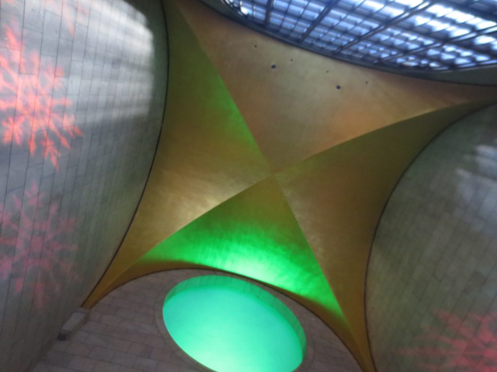
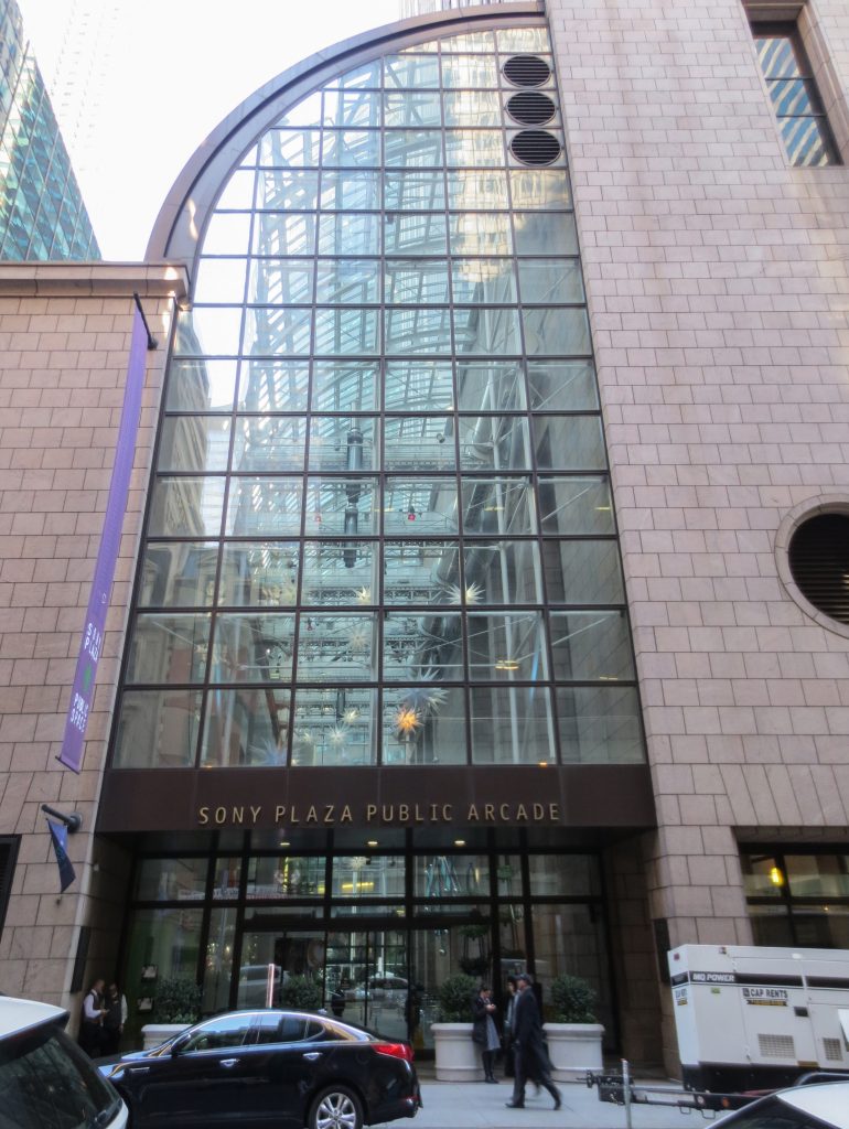
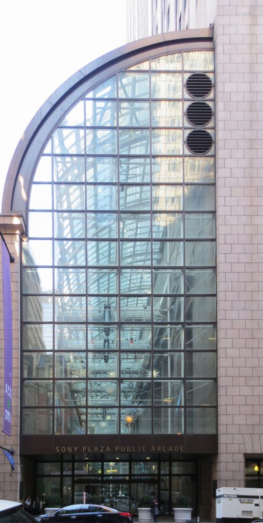
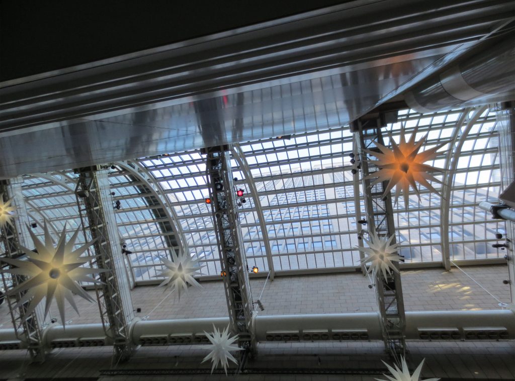
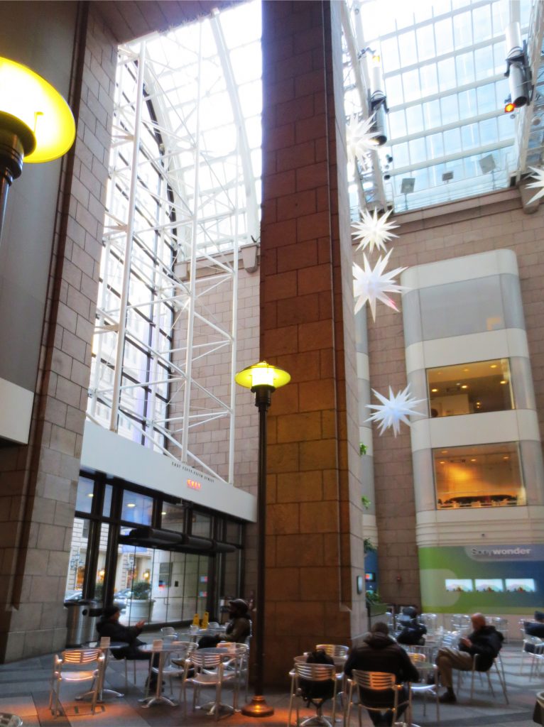
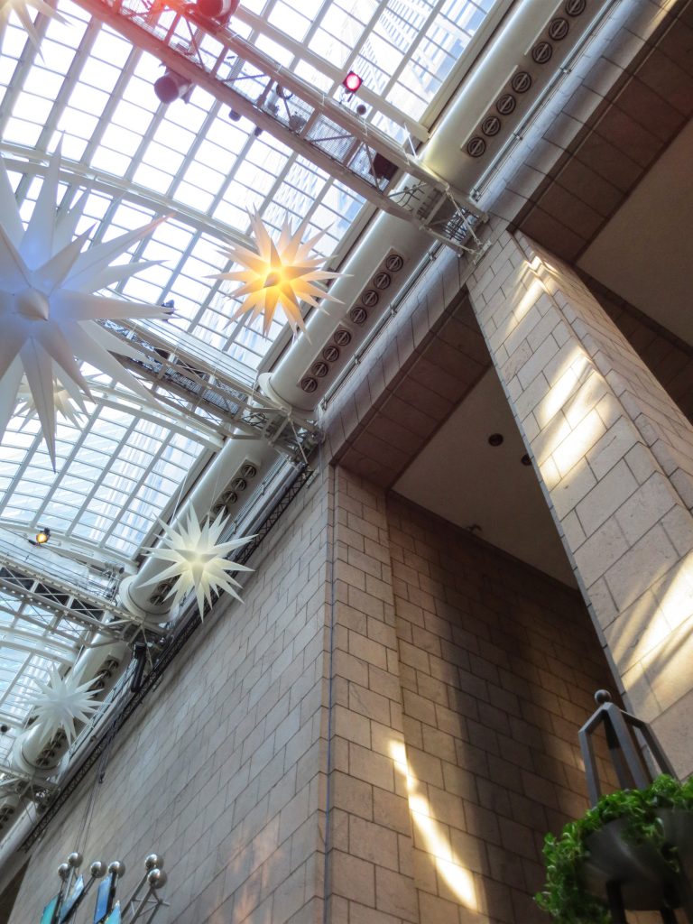
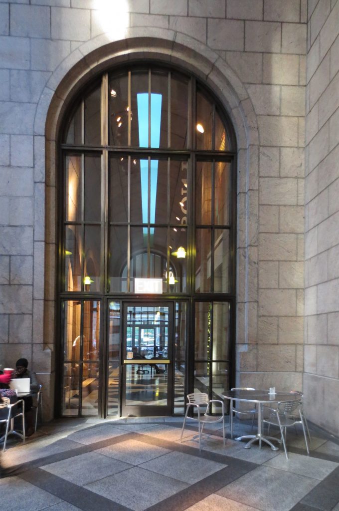
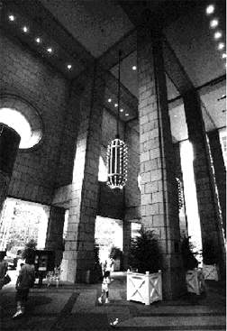
On the street level, the original buildings had open galleries created beneath and behind the building, toped by a curved skylight. All of these spaces had a granite mosaic floor, with a zig-zag pattern in the gallery and squares in other areas. During the renovation, the approximately 1,310 m² of open commercial space was reduced to 980 m²; 560 m² for commercial space and 380 m² for a large covered public area with cafes and relaxation areas.
Atrium
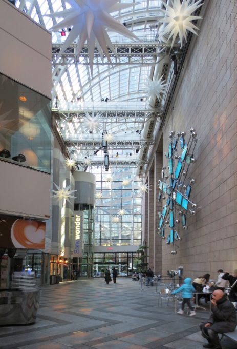
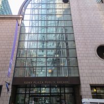
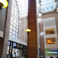
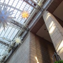
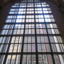
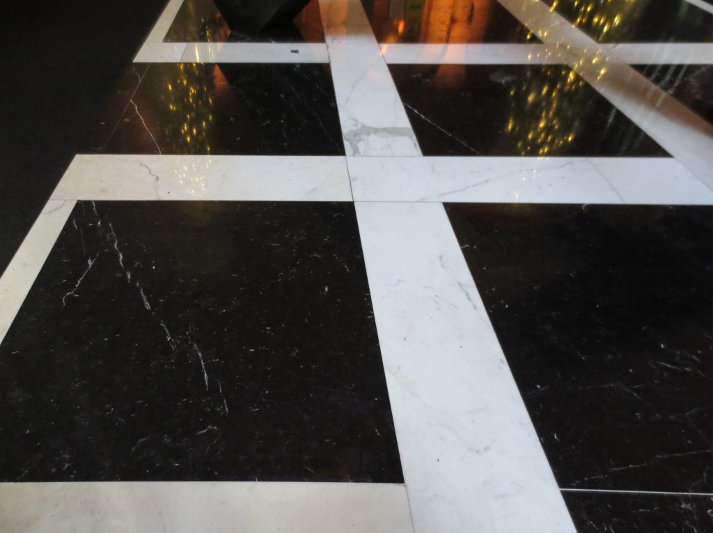
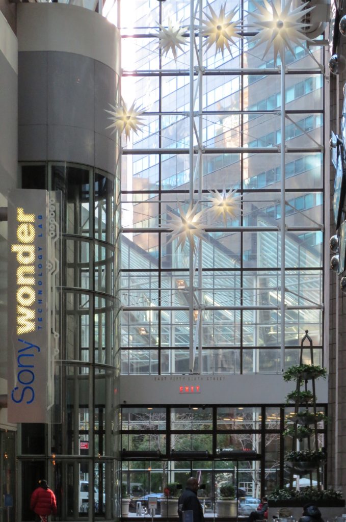
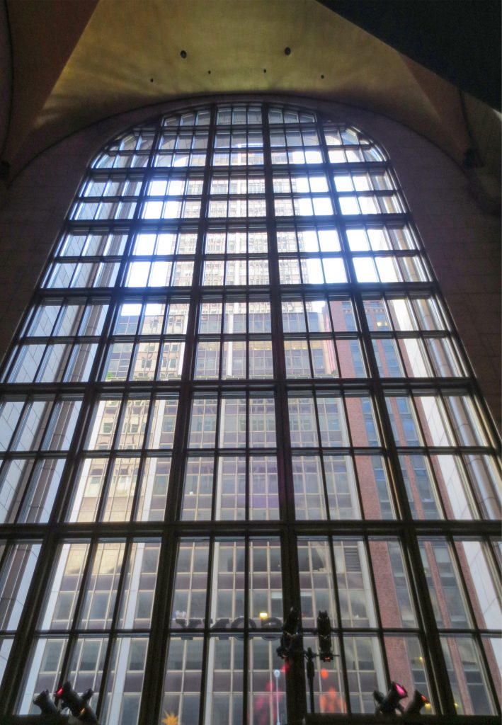
Other changes included the redefinition of the SONY Atrium and the Public Plaza, enhancing their accessibility and presence on Madison Avenue. High 18.29-meter arches on the building’s original northern and southern sides were replaced with aluminum-framed window bays, where retail stores once stood. The floors now feature a zig-zag pattern, combining gray and black granite tones.
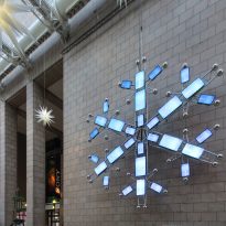
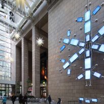
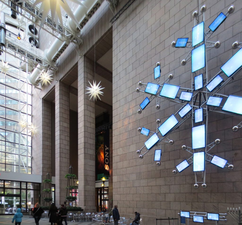
The interior spaces are marked by the incorporation of large-scale images and exhibits, communication media, display systems, as well as banners, flags, neon lights, and music.
Vestibule
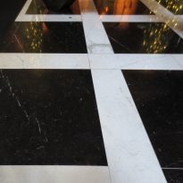
In the ground-floor vestibule, striking black glass panels have been inserted into the arches setbacks, as a way to complement the original granite walls and the Lutyens-style marble floor with inlays.
The combination of black glass with wood decoration is repeated at significant points throughout the building’s floors.
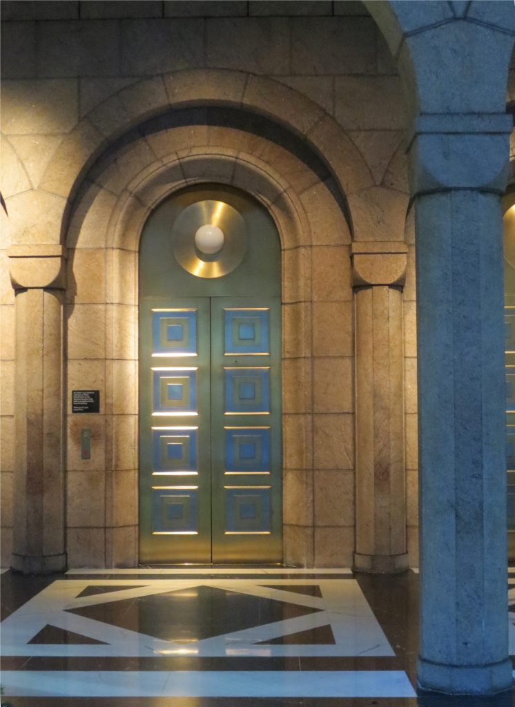
Elevator lobbies feature color codes that clearly represent each of SONY’s divisions. The original metal perforated tray installed by Johnson on the ceiling has been preserved. The basic organization of the communication core remains unchanged, only receiving a new architectural approach when a need for space arises.
Materials & Construction
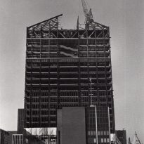
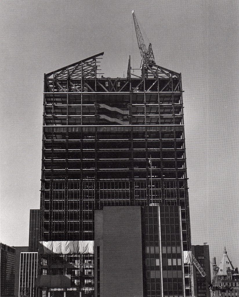
Structurally, the building boasts a tubular frame, with columns connected by trusses both at the top and bottom. The grey-pink granite used for its exterior came from the same quarry that supplied stones for Grand Central Station. The elevator area has a floor mix of white and black marble, with metal plates on the ceilings, inspired by the Chrysler Building‘s elevators.
An iconic 7-meter tall statue from AT&T’s former headquarters, titled “Golden Boy” by artist Evelyn B. Longman, was relocated to AT&T’s New Jersey facilities after the building’s purchase.
