Netherlands Embassy in Berlin
Introduction
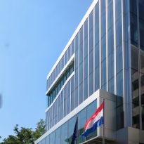
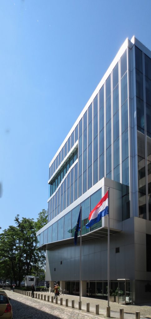
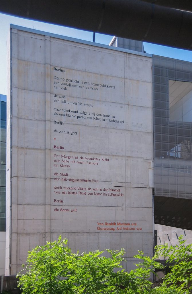
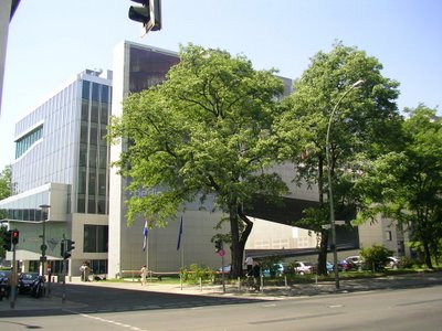
The Dutch embassy in Berlin was designed by Rem Koolhaas and his OMA Studio in 1997 after winning a competition to build it.
After the destruction of the former embassy during the Second World War and after the fall of the wall, building a new diplomatic headquarters in the city for the Dutch Ministry of Foreign Affairs was a great step. The choice of the site along the river Spree, with the intention to emulate the typical landscape and canals of Holland, are a representation of the care with which this work has been done. It is said that with this work, Koolhaas completed sealing the role of architectural chancellor of his country.
In 2005, the Dutch “Mies van der Rohe” won the Prize for Contemporary Architecture of the European Union, displaying a total of 242 projects. Among the 5 finalists were included the Stade Municipal de Braga, project Soto de Moura, the Swiss Re headquarters in London, Norman Foster, the department stores Selfridges & Co. in Birmingham, Jan Kaplicky and the esplanade and photovoltaic plant Forum 2004 in Barcelona, Spain, Lapeña Martinez and Torres Tur.
The jury, among whom was the renowned architect Zaha Hadid, awarded the work to whomever highlighted the close relationship with the environment and the reconceptualization of the notion of an embassy. Koolhaas emphasized that “it is not a spectacular project, but modest, severe, that departs from the assumption that the Netherlands has traditionally been a peaceful country that has lived with the agony of war throughout its history, and now established its embassy in Berlin, a Berlin city so mired in war.” Koolhaas said that “the rigidity of the urban planning authorities of the former West Berlin, would have left the project in a typical neighborhood of embassies, and instead we were fortunate enough to find a depressing, yet full of melancholy site in the former GDR. The perpetrators of the former East Berlin were open to the proposal.
Location
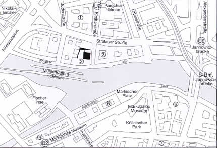
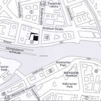
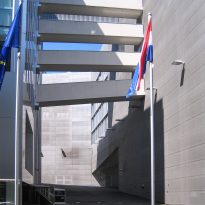
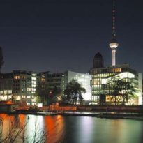
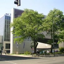
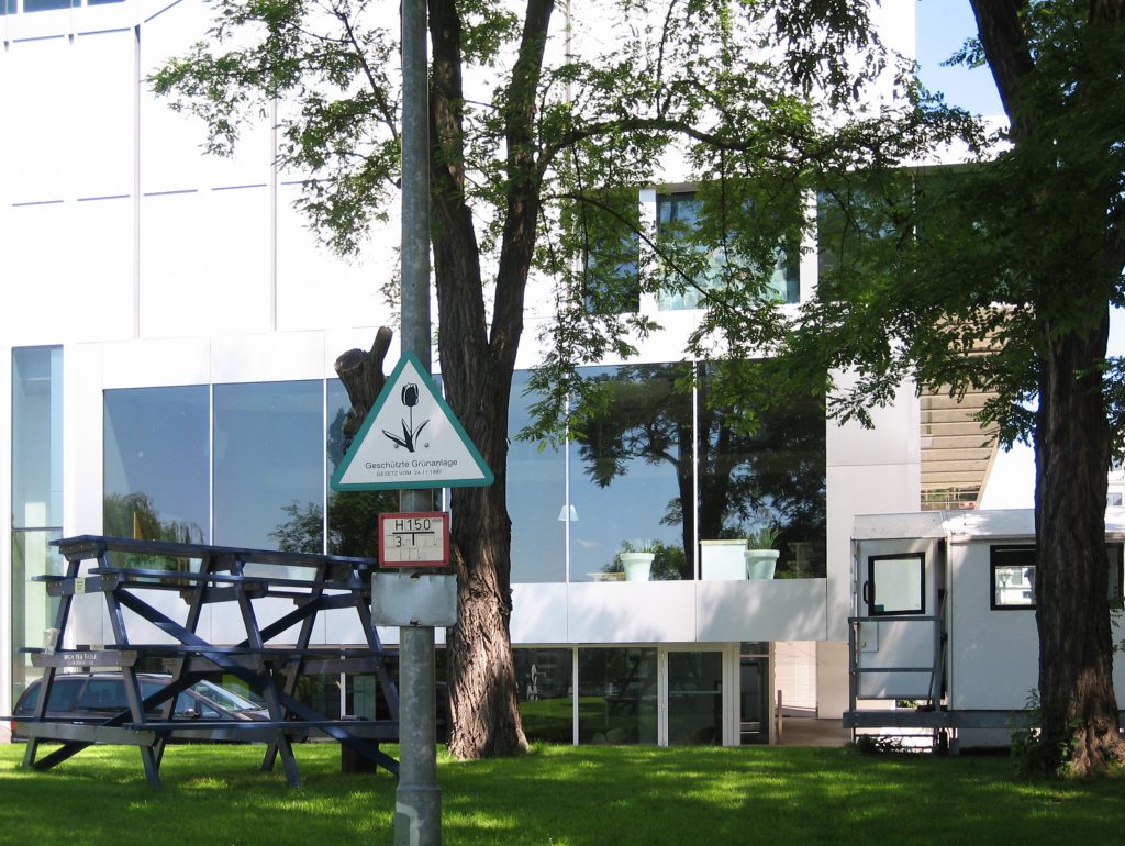
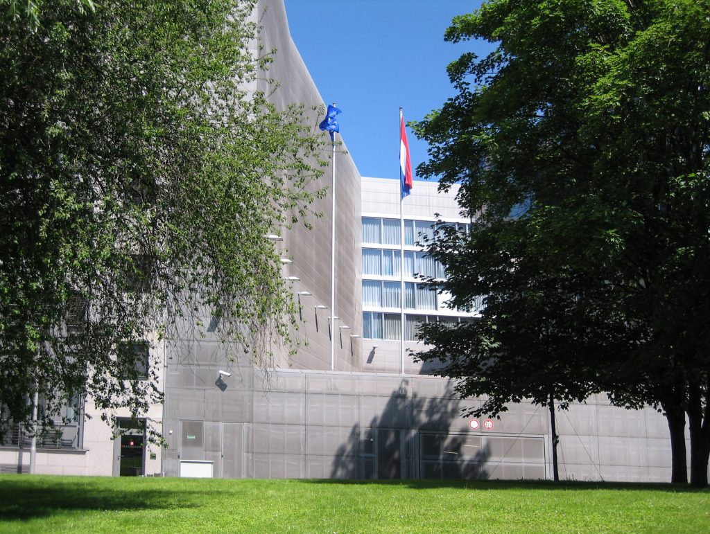
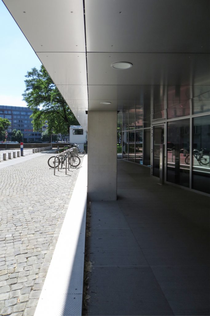
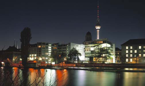
It is located in an area of channels of Berlin, on the banks of the Spree river, in a plot that seems to float searching reflections resemble as closely as possible to water channels and a typical landscape of the Netherlands.
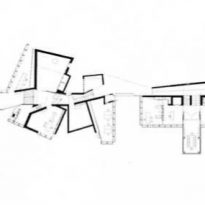
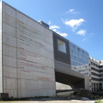
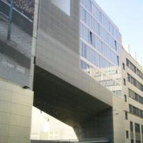
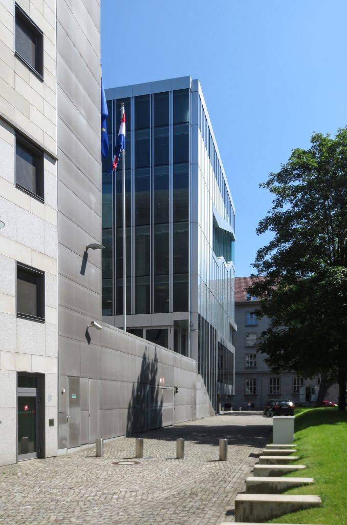
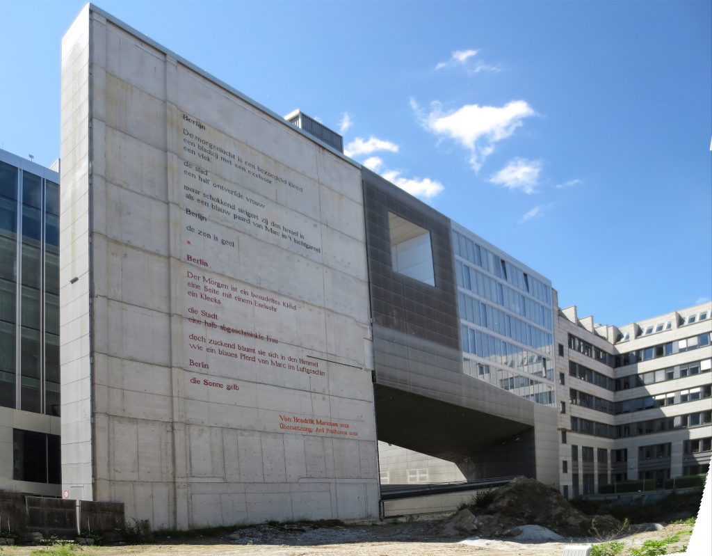
The party made to the building presents a contradiction according to the restrictions in the area. The building code of the city requires the type of building between party. The architect met the requirements by completing the perimeter of the block with a plate and turn off the master volume disobeyed through a passage.
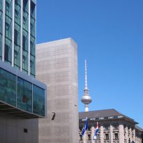
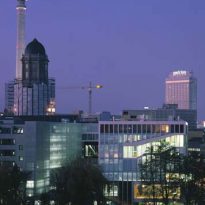
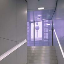
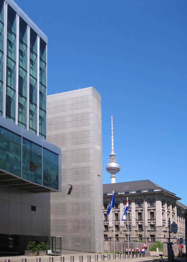
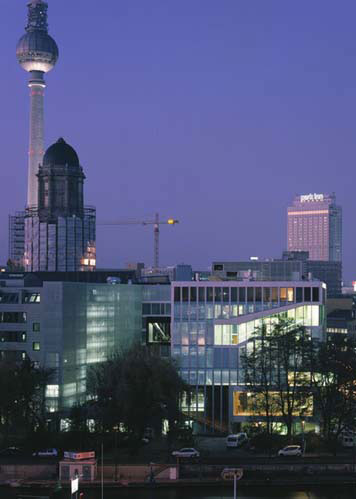
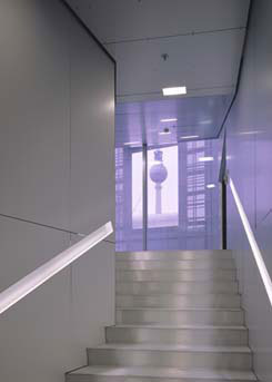
The visuals from the building were an important part in the design. On the way, the visitor is confronted with a choice of urban landscapes. The most symbolic is the German television tower Fernsehsturm in Alexanderplatz, a sign of identity in the city. That view was based on the land in Berlin, which never shall interrupt any building erected between the embassy and the tower.
Concept

The building was conditioned by the modest size of the site and the extensive program required by the client. This became a challenge for the experimental method that works with Rem Koolhaas and OMA. To remedy this, the design was based on the creation of spaces for overlapping functions, the potential for multiple use of specific areas and the installation of technology.
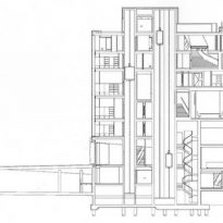
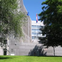
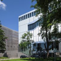
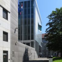
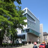
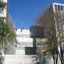
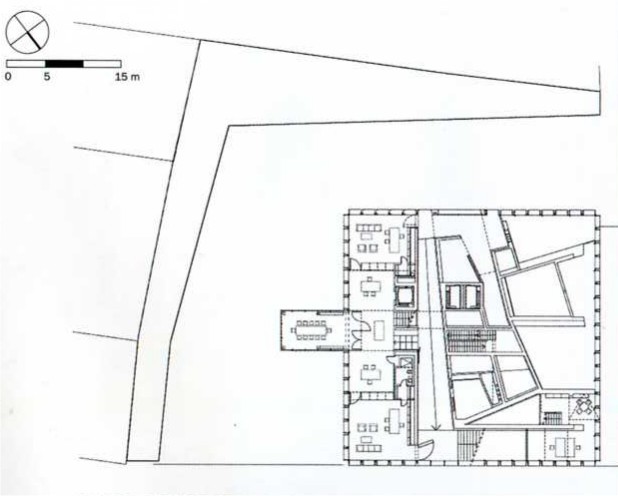
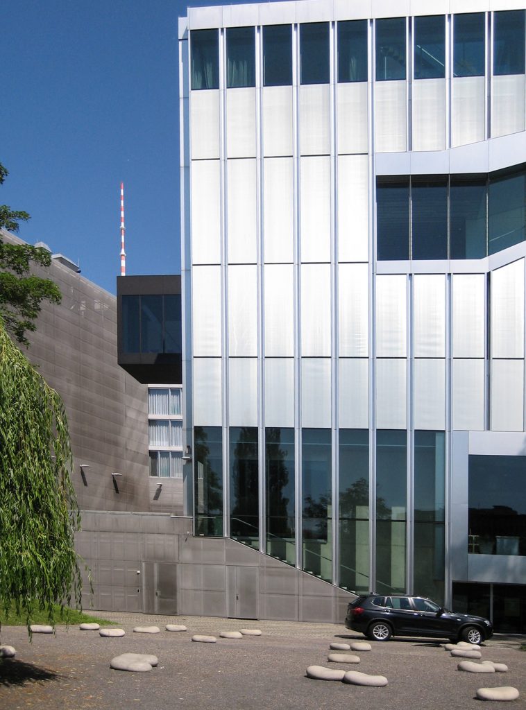
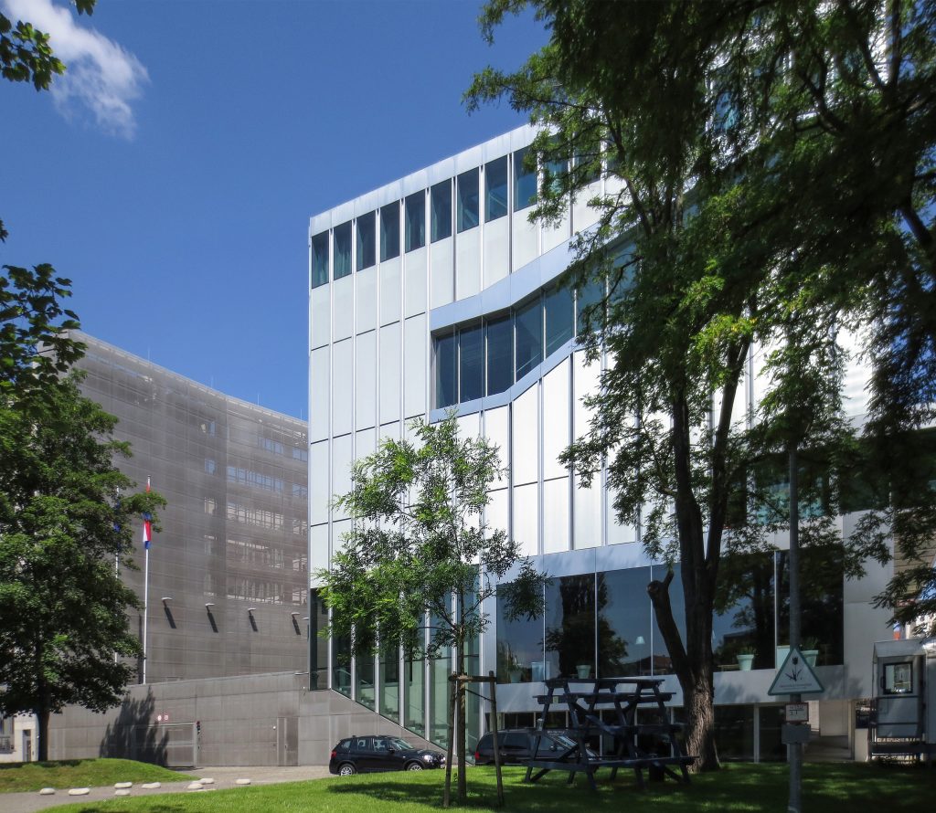
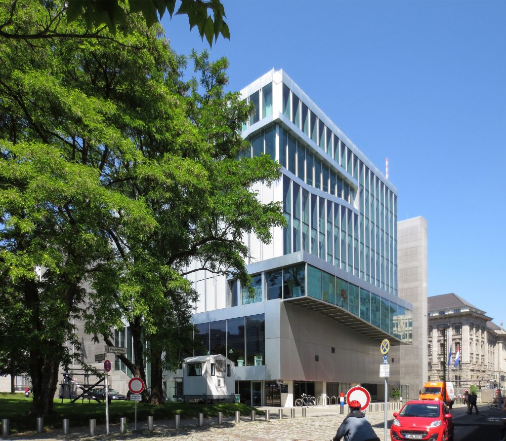
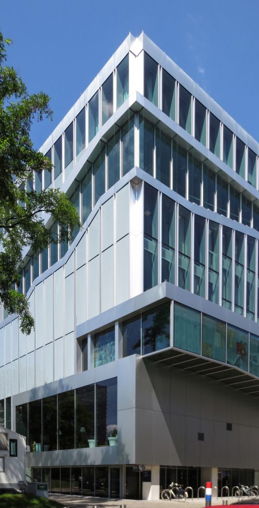
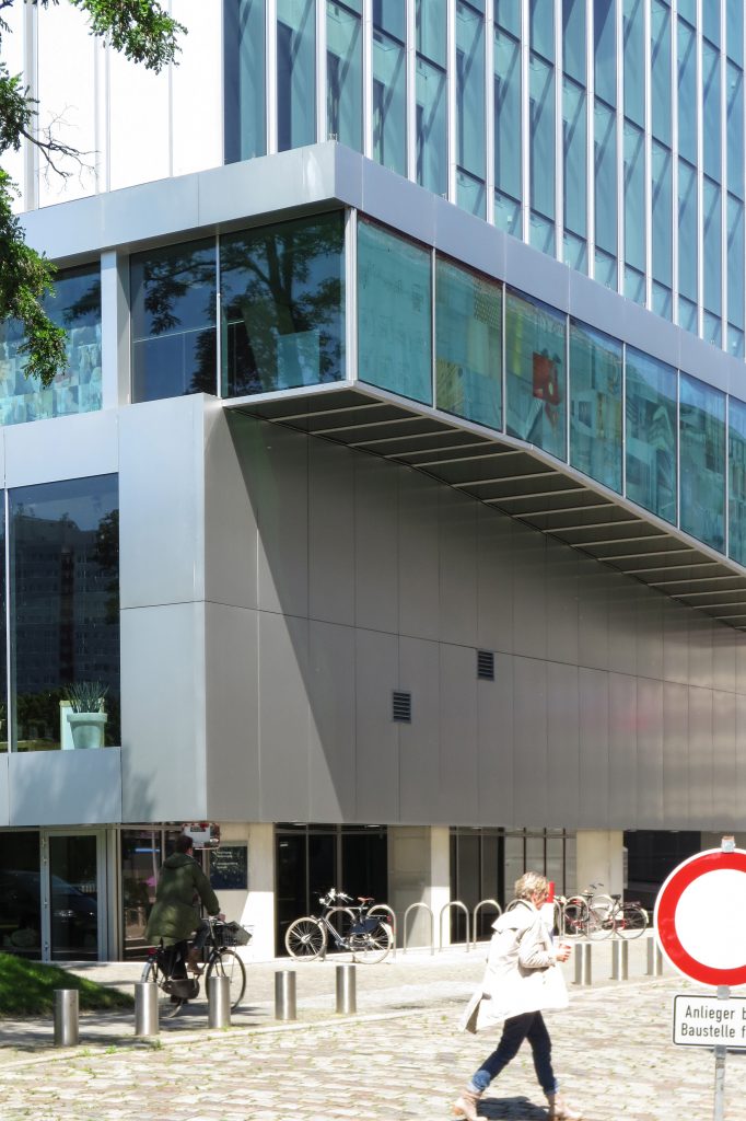
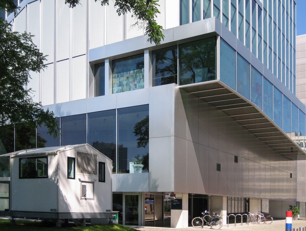
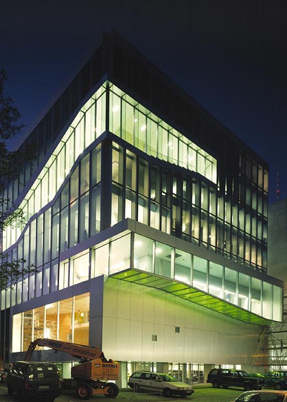
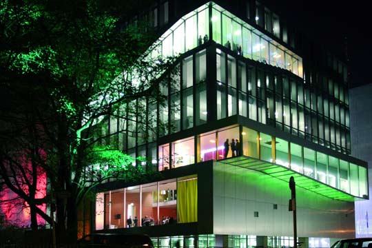
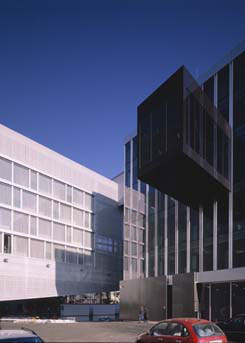
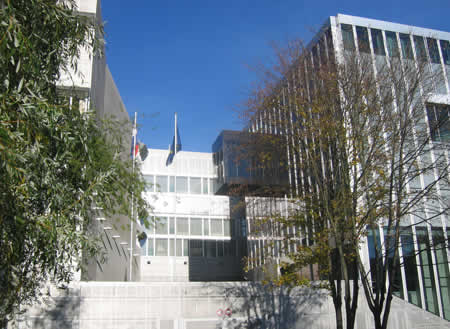
The embassy building was to be a self-sufficient and closed to their environment to enhance the safety of the building. The party chosen by answering this premise was a cube 27 meters autonomous side located in the southeast corner of the site on a podium to complete the block.
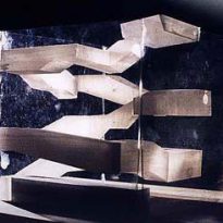
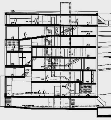
In this space, a continuous spiral movement encompasses eight floors of the embassy and shape the internal communication of the building referring to the Guggenheim Museum in New York. The movement brings the visitor to relate to the context: the Spree River, the famous TV tower Fernsehturm, the park and the walls of the embassy.
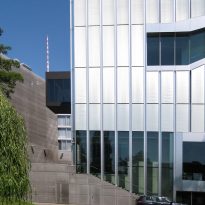
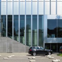
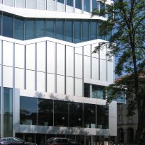
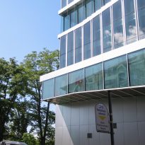
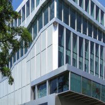
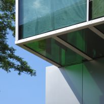
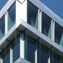
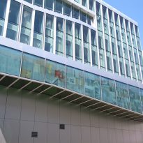
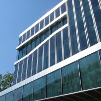
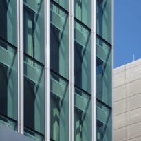
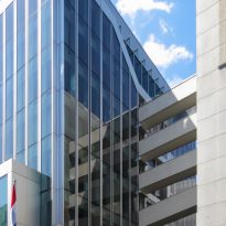
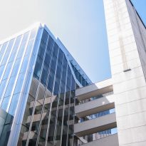
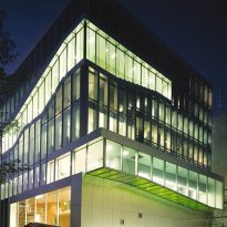
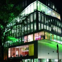
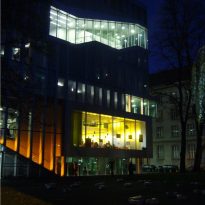
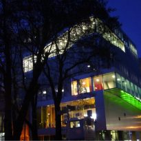
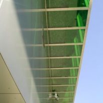
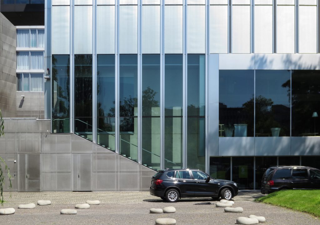
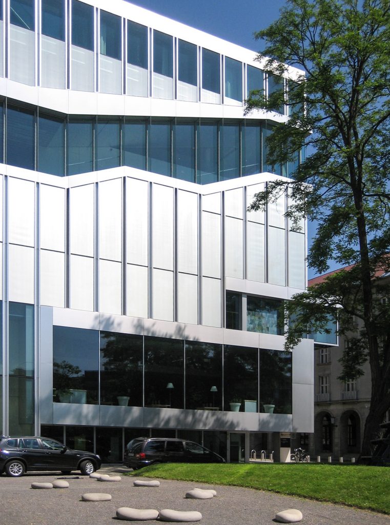
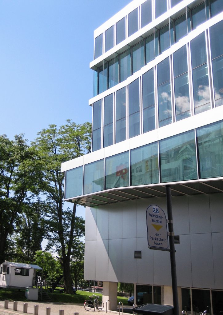
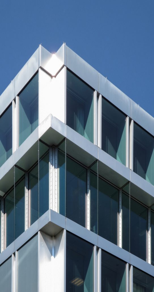
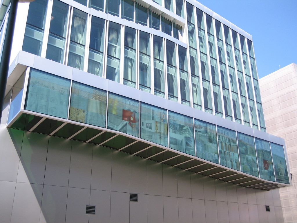
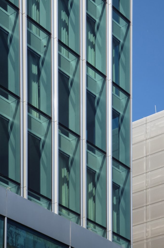
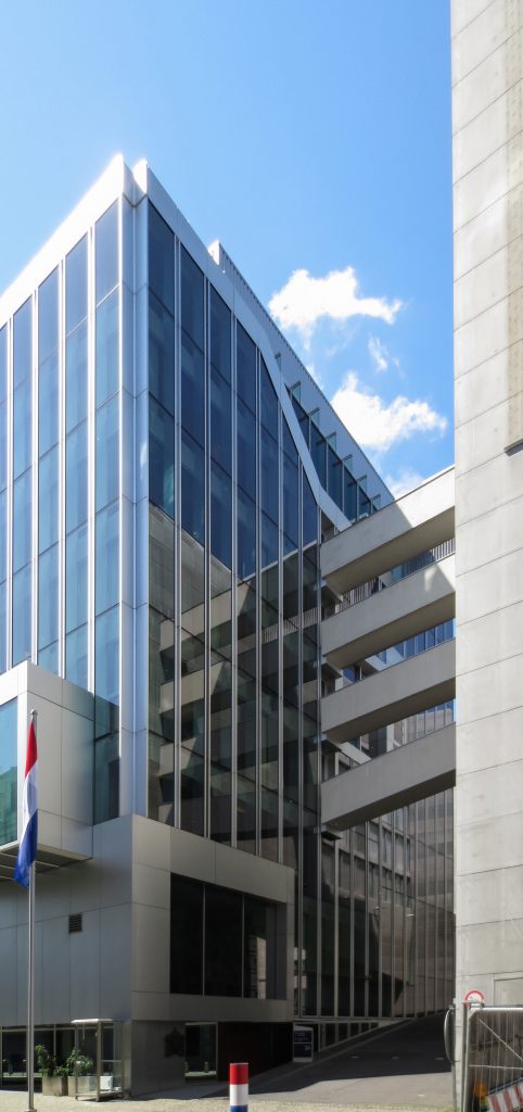
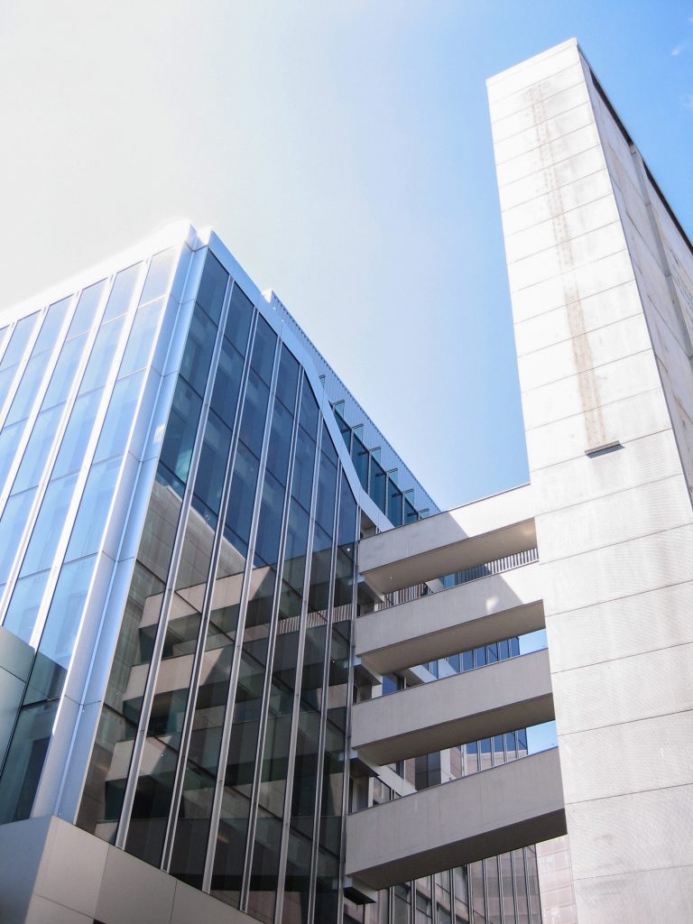
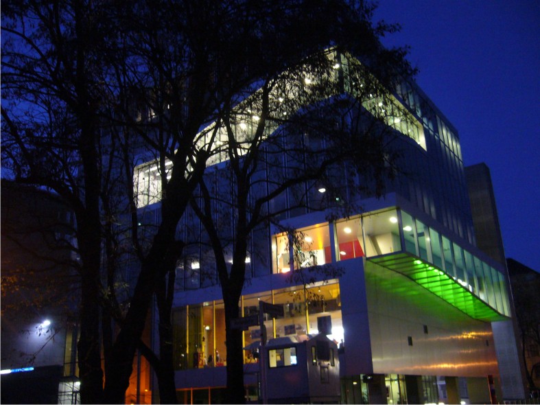
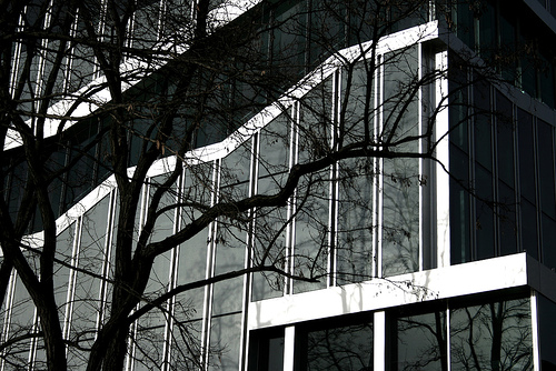
At night, the building can be read out as a ray of light, illuminated interior with its route. Instead of days, the glass facades of aluminum ribs accentuate the edge of the bow, facing the water channel.
Spaces
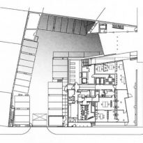
The total program is 8.500m2, distributed as follows: 4.800m2 for offices, 1,500m2 housing and 2.200m2 for parking.
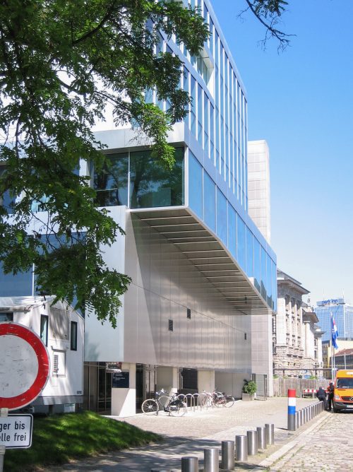
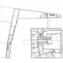
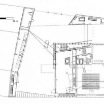
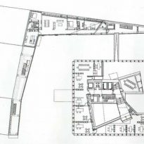
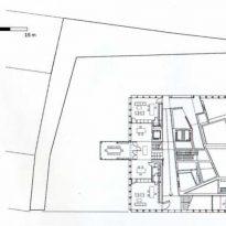
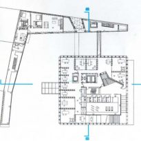
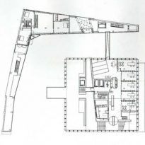
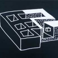
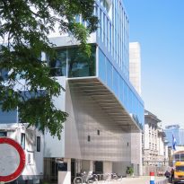
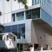
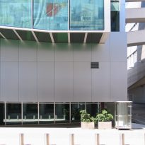
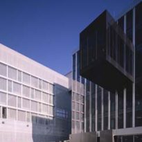
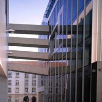
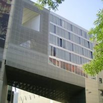
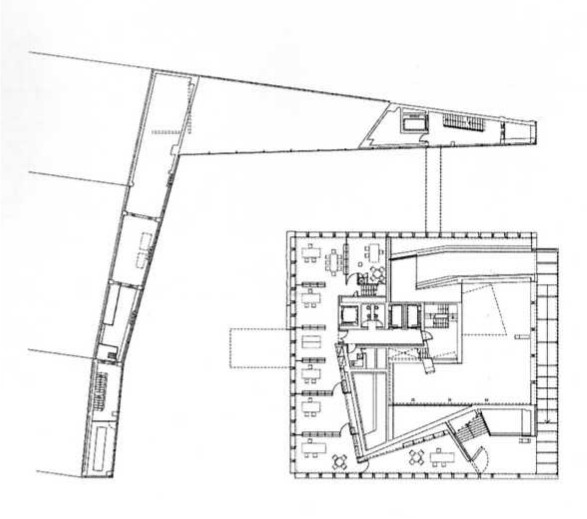
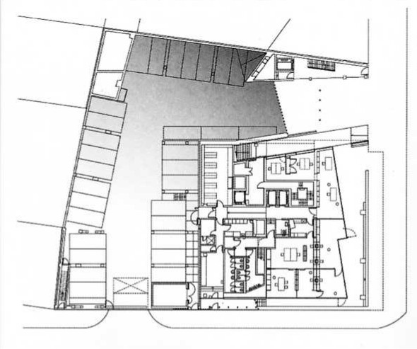
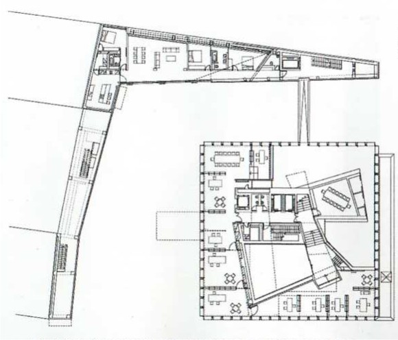
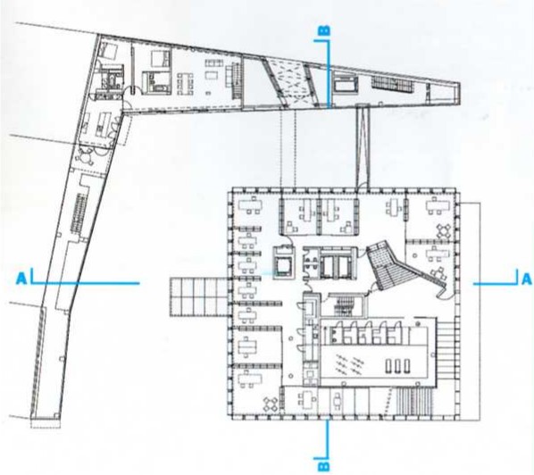
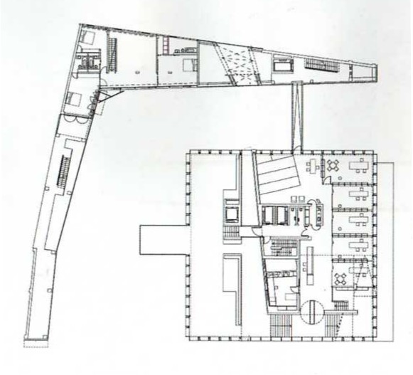
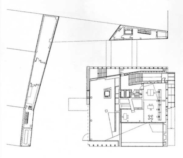
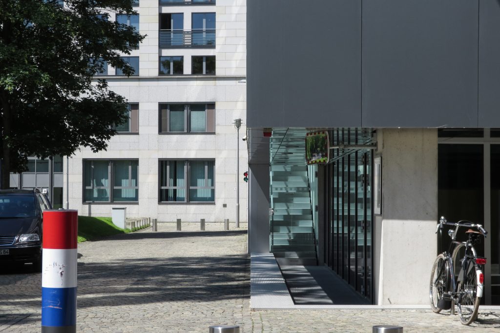
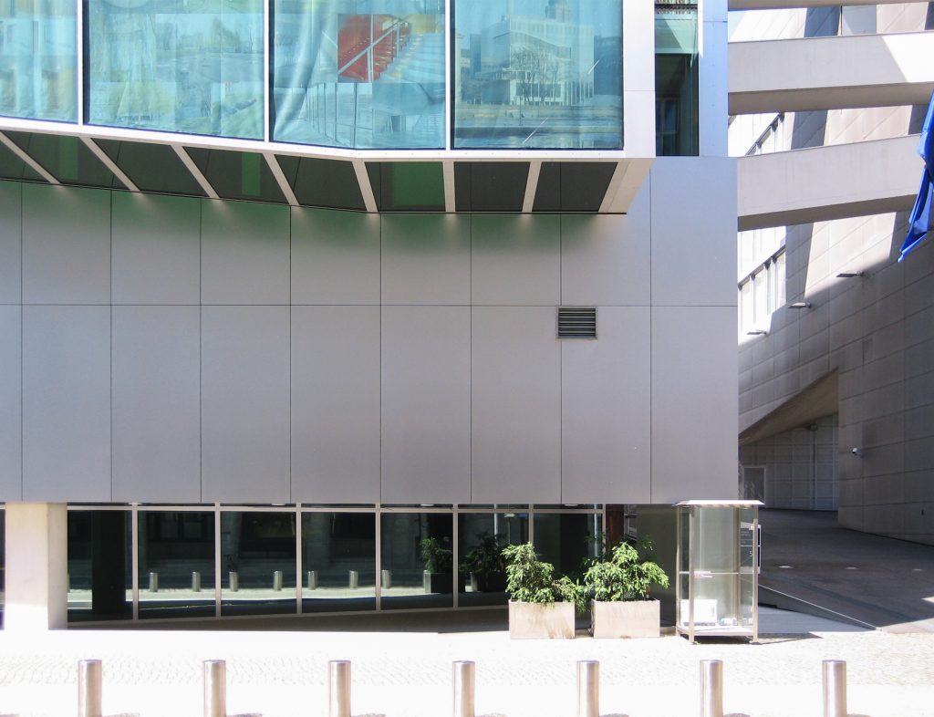
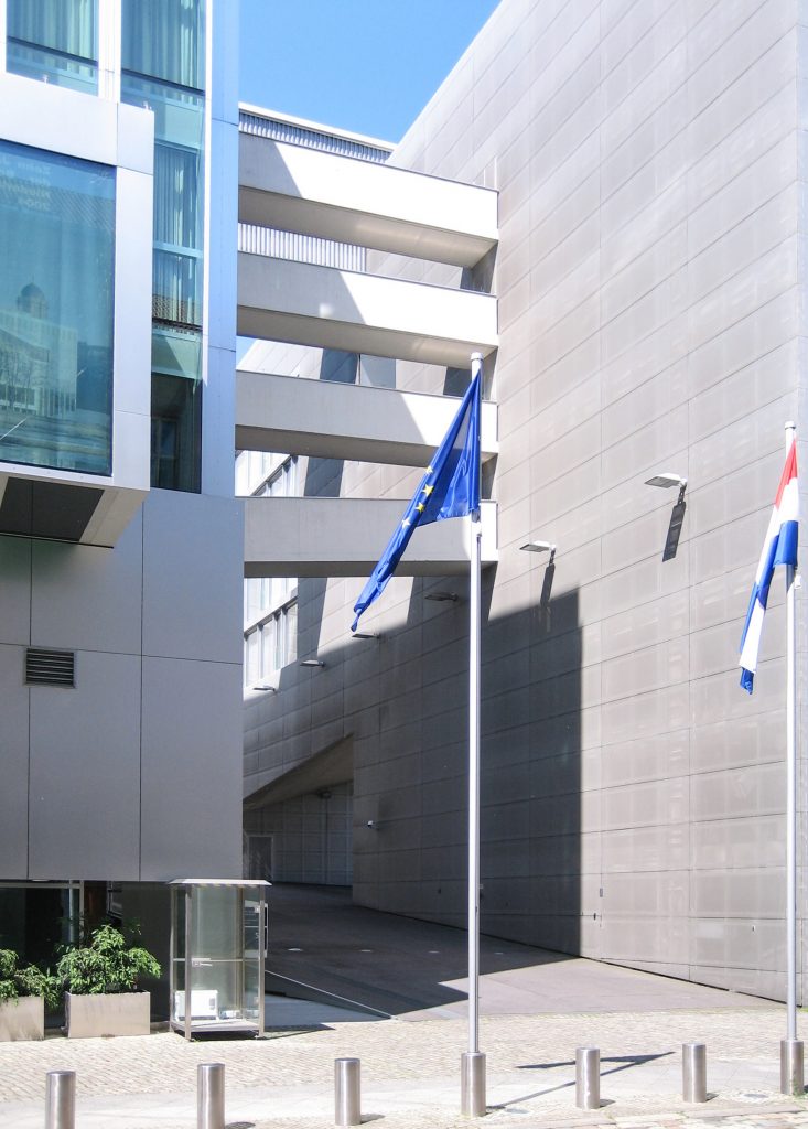
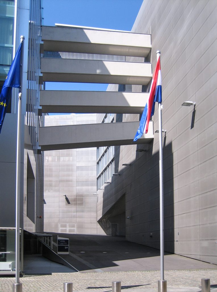
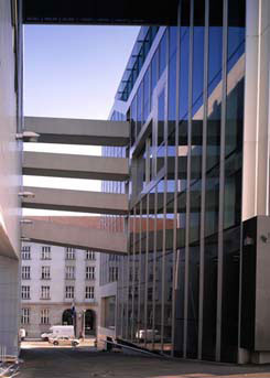
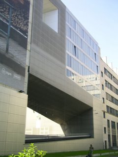
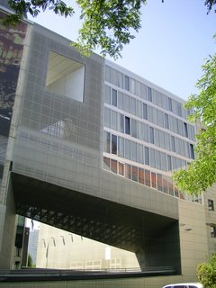
The building consists of a translucent cube and an L-shaped plate that surrounds it on two sides. The ultra flat plate, which departments to locate employees, separated about 10 cubic meters of the structure and joined to it by four airlifts.
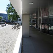
This building is not a facade, but that both sides contain an entry: the street Rolandufer for motorized vehicles and pedestrians from Kloterstrasse.
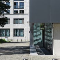
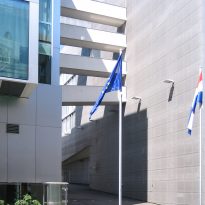
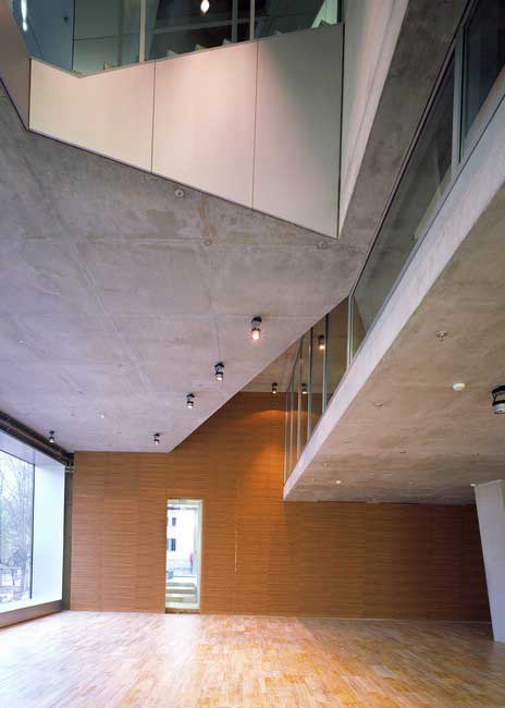
After the pedestrian entrance at street level, a sliding door separating the vast space of the Foyer and the central courtyard. The area known as Prins Clauszaall Hall is a multipurpose space that can be separated into several parts to accommodate different events. The courtyard is located exactly in the gap between the bucket and the L-shaped structure that makes the Mediatrix building and protective screen for the façade of the street Straulerstrasse.
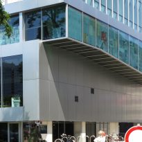
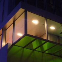
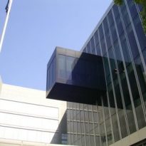
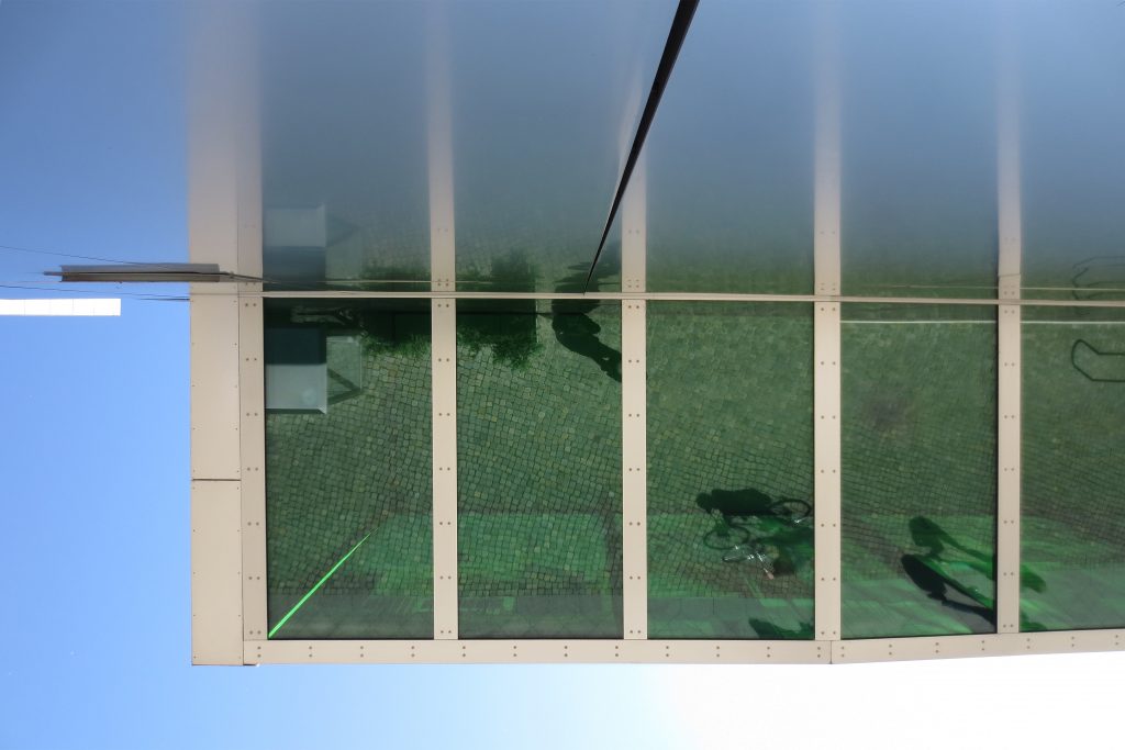
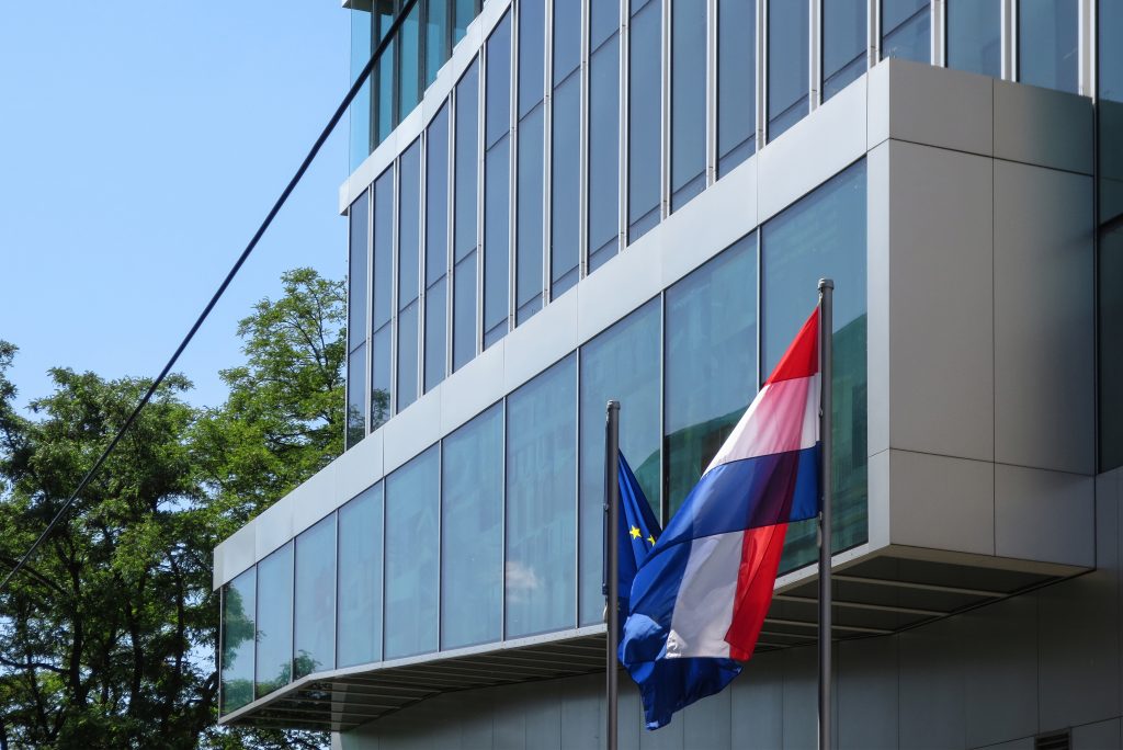
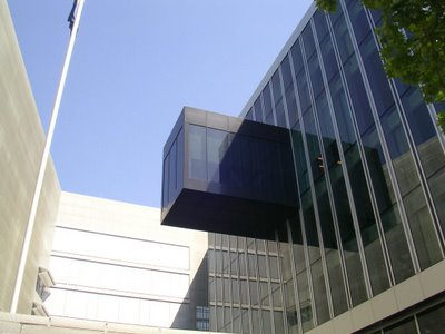
Another element of this composition, which refers to the second currency is known as Dutch skybox. This is a small terrace in the form of a cube that simply emerge from the facade of the main hub. In this open-air space, lies a dining used regularly by the ambassador for important business meals.
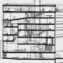
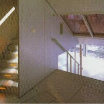
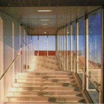
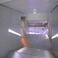
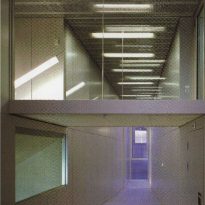
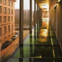
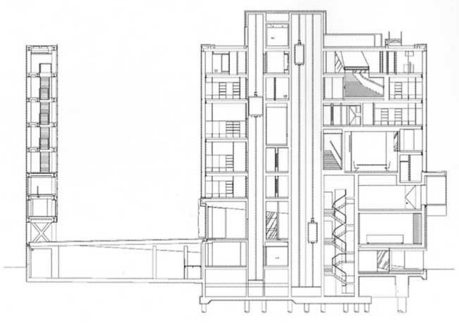
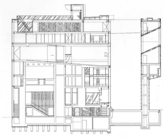
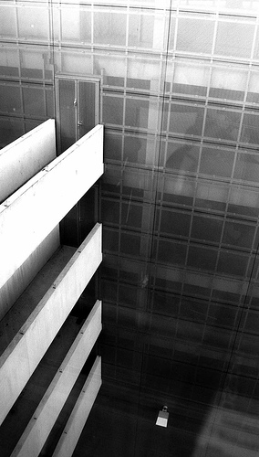
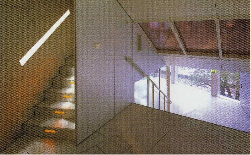
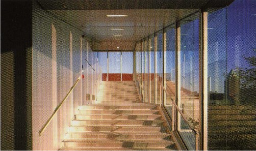
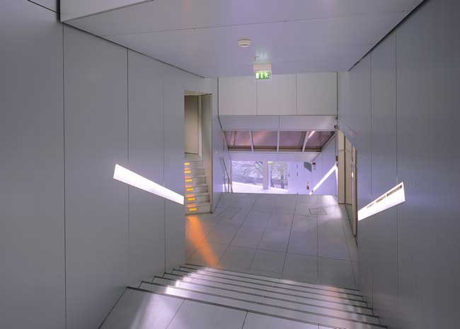
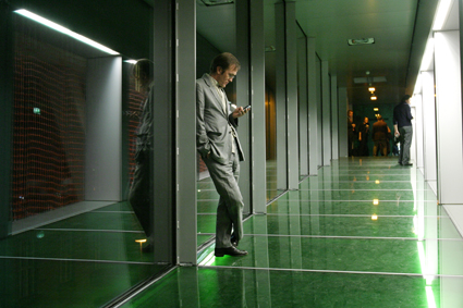
Finally the most important objective of this set is the internal ramp travel hub, which is completely separate from the structure facade. All sections are organized inside the cube along the route of the ramp trying to extend the public space. The spiral movement called Das Trajekt penetrates the box and passes through the eight floors up and down, defining the internal communication, which combines phase with ramps. The path serves as a main conduit for ventilation, resulting in fresh air to the offices.
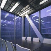
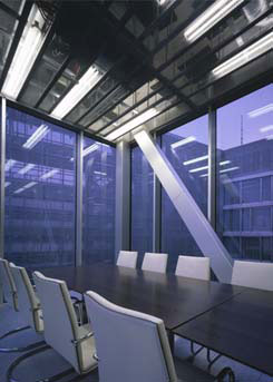
The ride reaches all sections of the embassy and lets you enjoy the landscape of the city. From the entrance, through the library, meeting rooms, auditorium, gym and restaurant, to the terrace. In one of the loops at the end of his movement within a window framing the tower Fernsehsturm.
The property has 2,200 m2 of area used for parking.
Structure and materials
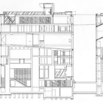
Structural engineers designed transition elements to support and transfer the reinforcing fillers, leading to an extremely complex structural system that resembles a volume of stacked cards.
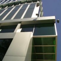
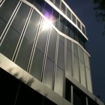
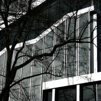
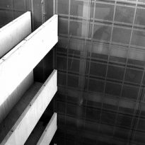
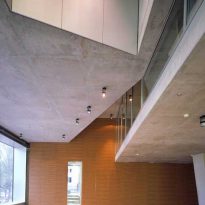
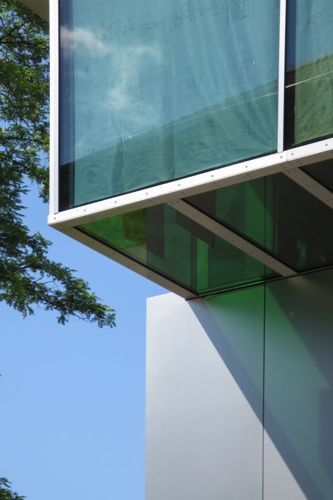
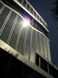
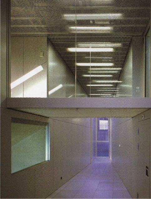
The particular structure of the building facades created with aluminum uprights evenly structured and walls, which serve as support structure inside, resulting in dramatic spaces in public areas within the building. The maze of intersecting walls has been used creatively to further strengthen the building. The structural frame is made of steel and reinforced concrete. Given the complexity, the building represents a unique architectural and structural challenge. The only structural element that runs the entire height of the embassy is the core of elevators, since the tangent beams in the walls of the circulation spaces and against whom these charges do not reach full height. Inside the circulation was provided by a “path” of 200mts zigzag across 8 floors, determining the arrangement of spaces.
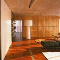
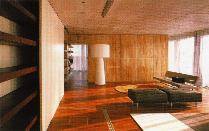
An uneven floor, together with reinforced concrete walls and thick variables, say embassy spaces are distinct from each other, despite the vertical transparency impression.
Related Books
Video
