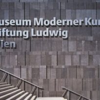
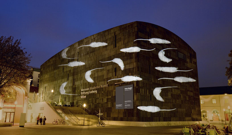
MUMOK Museum of Modern Art Kunst Stiftung Ludwig Wien

Introduction
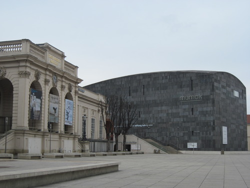
In 1986 he announced a competition to transform the Hofställgebude area of the city, being completed the work of the MuseumsQuartier in 2001. The three new structures that stand out are the home of the most prominent institutions of the new quarter, the Leopold Museum, MUMOK (Museum of Modern Art Kunst Stiftung Ludwig Wien) and Kunsthalle. The rest of the historic buildings were transformed to accommodate numerous cultural and artistic spaces.
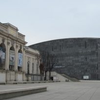
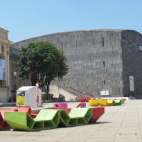
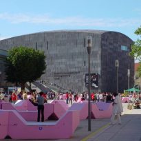
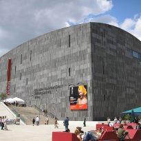
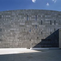
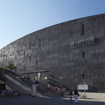
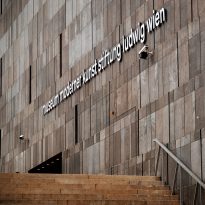
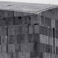
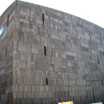
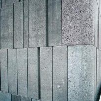
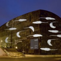
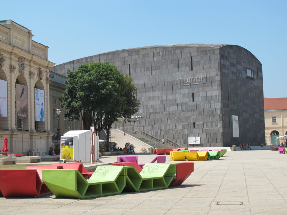
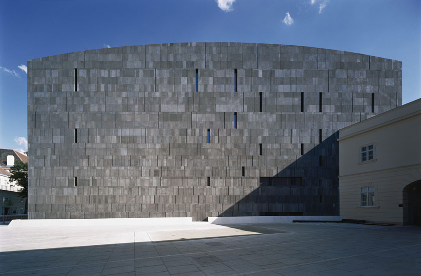
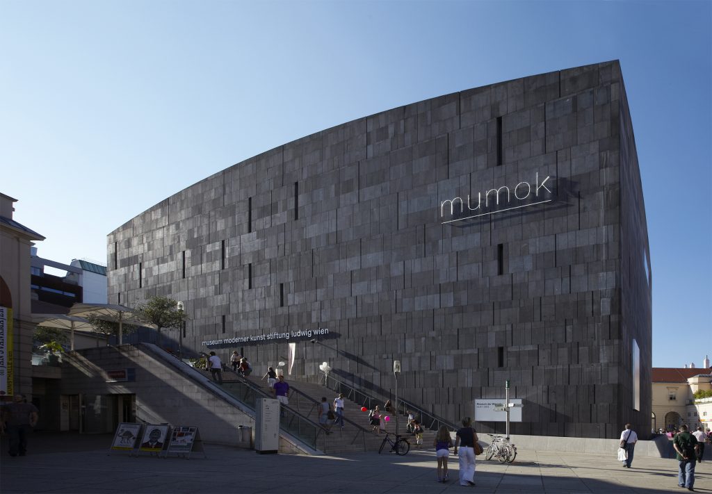
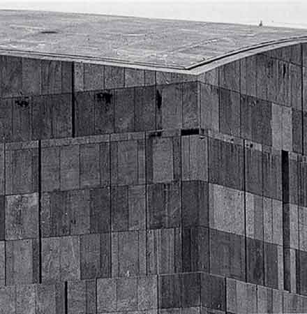
The study Ortner & Ortner architecture has successfully integrated this new building in the multidisciplinary artistic surrounding area, although it retains its own individual character. A dark, closed block, a striking structure with a curved roof that slopes down at the corners and a shell made of 12cm thick basaltic lava stone that enclose the exhibition spaces of the Museum of Modern Art Vienna.
It is the largest museum of Modern Art in Central Europe, making the various aspects of international and Austrian art to all those interested in the arts accessible.
Location

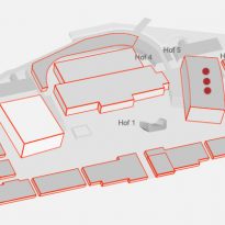
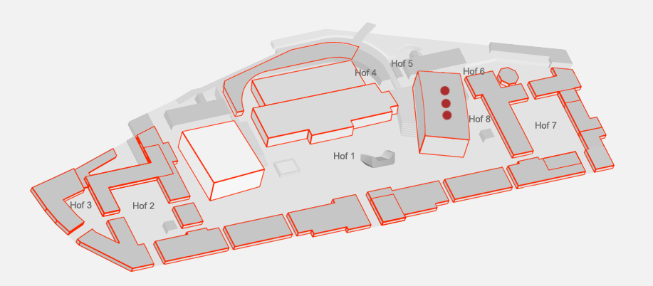
The museum was built in Museumsplatz 1 in the middle of MuseumsQuartiers Wien, the Museum Quarter of Vienna, Austria. This neighborhood (The Museumsquartier) occupies an area of 60,000 sqm, 8th cultural surface area in the world, in the 7th district of the city.
The Museumsquartier
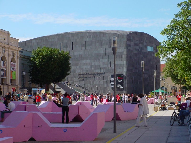
The interaction between historical and contemporary architecture, both outside and inside the buildings defines the MuseumsQuartier Vienna. Buildings coexist eighteenth and twentieth century with contemporary museum architecture creating a unique architectural environment of its kind. The mixture of historic buildings with modern museum architecture is also reflected in the different event spaces that can be rented by the public. The whole complex is characterized by a unique environment that combines technology with Baroque architecture to offer a wide variety of cultural activities throughout the year, both indoors and outdoors, dance outdoor exhibition projects and numerous programs that create a cultural environment and art for anyone who wants to enjoy it.
Concept
The dark lining its walls, made of gray anthracite material also covers the roof surfaces create the appearance that the building emerges from the depths, clearly separated from adjacent level.
The rounded edges of the building, in contrast to the bright distinctive angularity of the nearby Leopold Museum, created the impression that the structure is still in process of formation.
Spaces
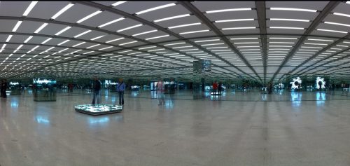
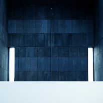
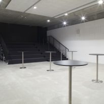
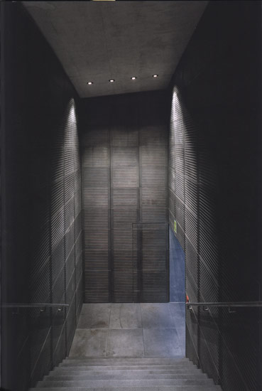
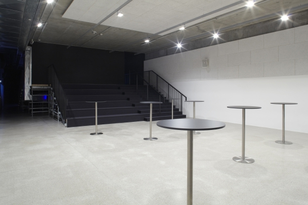
From the square you enter the building with a white exterior staircase, with 10m wide, which leaves the visitor at the entrance, four meters above the courtyard, the center of the building in terms of exhibition space. There are two floors above and below exposure other two. The connection between large indoor units allows maximum flexibility. Under the stairs an area for events, with independent entry and uses the museum is located.
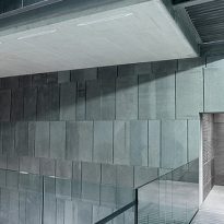
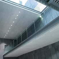
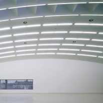
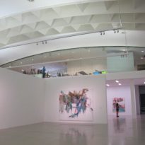
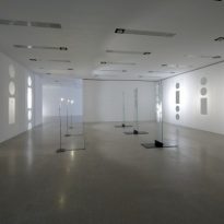
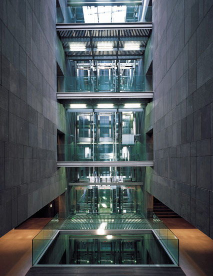
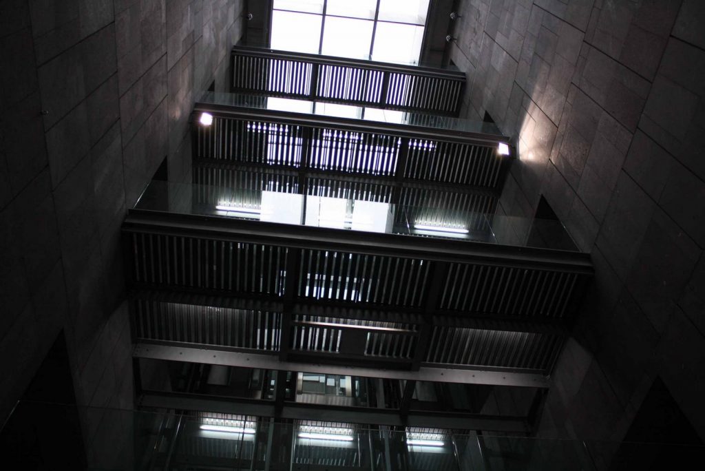
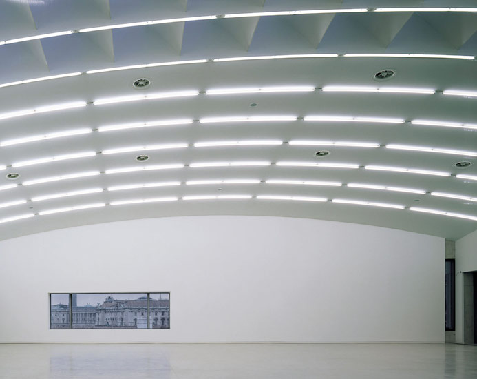
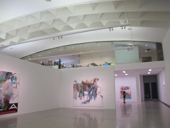
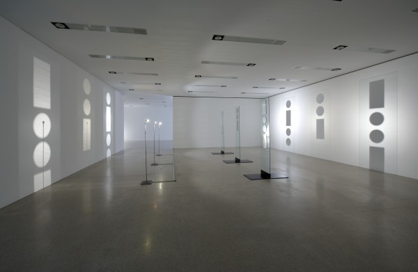
Inside a hall lit from above all levels divided into two groups of rooms, with different surfaces. On one side of the entrance hall, exhibition spaces 5m high, free from columns and 700m2 surfaces each overlap, are the largest exhibition spaces of the museum. These areas can be subdivided flexibly, according to the needs of the samples. Across the hall, spaces are more intimate rooms 250m2 with 3.50m high ceilings. The museum offers 4,800 square meters of exhibition space.
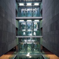
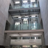
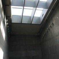
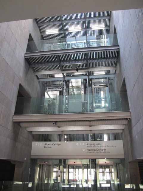
Among the exhibition spaces in the middle of the open foyer with its 35m high, they are located are elevators for visitors and the forklift. In addition to the elevators, different levels are connected by walkways.
On one side of the hall the museum shop and a cafe on the mezzanine floor is located. The administrative offices are in an adjacent wing of the old building, but connected by a skywalk that can be seen from the square, however the delivery areas and workshop areas also located in the old building, in the Ala Oval, connect with the new museum by an underground tunnel. There is another level of basement, 1,800 sqm, which is used as a storage space for building services.
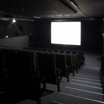
Since 2011, it has also been a movie theater located within 4800 sqm building. It was designed by the artist Heimo Zobernig and presents the many connections between the visual arts and film.
Structure
Description
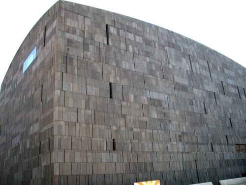
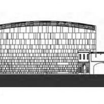
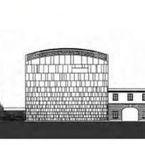
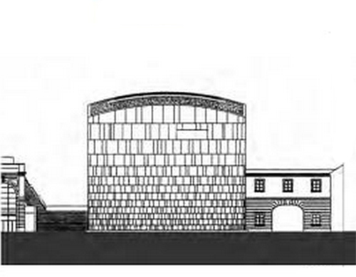
The cuboid volume MUMOK, which occupies an area of 30x50m, has the appearance of a large box pierced by a limited number of openings. Its upper section ends in a kind of candle Dome supported on a roof vaulting. The lower section is “sunk” in the land, separated from the surface patio.
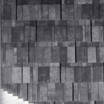
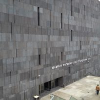
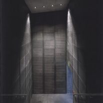
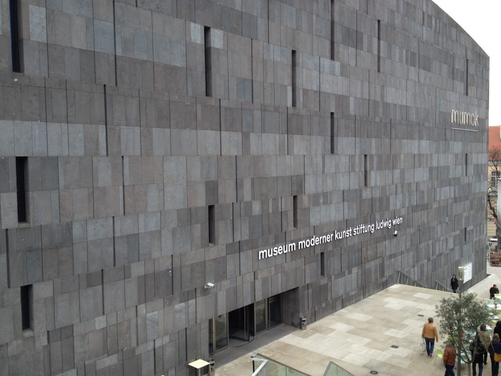
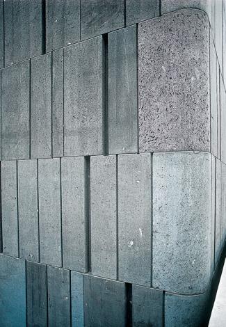
The walls and ceiling that make up the shell of the building form a continuous series with rounded corners in varying degrees, from 30º radio for climbing until it disappears at the top of the building where link to the domed surfaces. The dark coating used by O & O deprives, in a way and at first glance, the dimensional scale of the building, hiding inside space section but in turn recreating to the observer graphic design formed by the own basaltic plates using precise calculations mathematical creates a digital aesthetic interrupted now and then by small slits or openings, joints and tone changes.
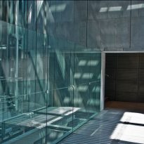
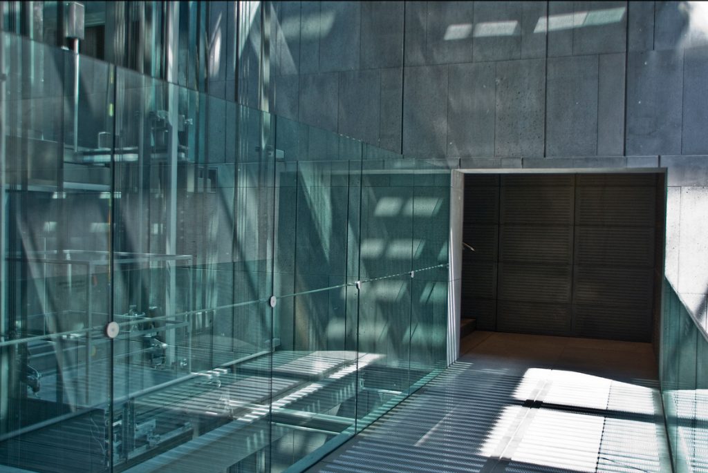
The entrance to the museum has been created retracting a hole in the facade, while the only visual exception in the whole composition is a window flush with the wall, at the top level, through which visitors can view from inside the Kaiserforum exposure. The load bearing frame of the building consists of a series of reinforced concrete walls that divide the volume at different levels and spaces: the exhibition halls, flexible and neutral spaces; two side aisles and scenic area with high ceilings and walls covered with basalt stone combined with pieces of cast iron and tempered glass.
Materials
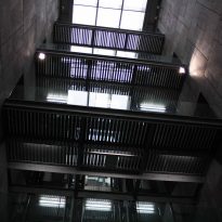
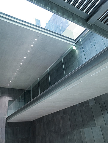
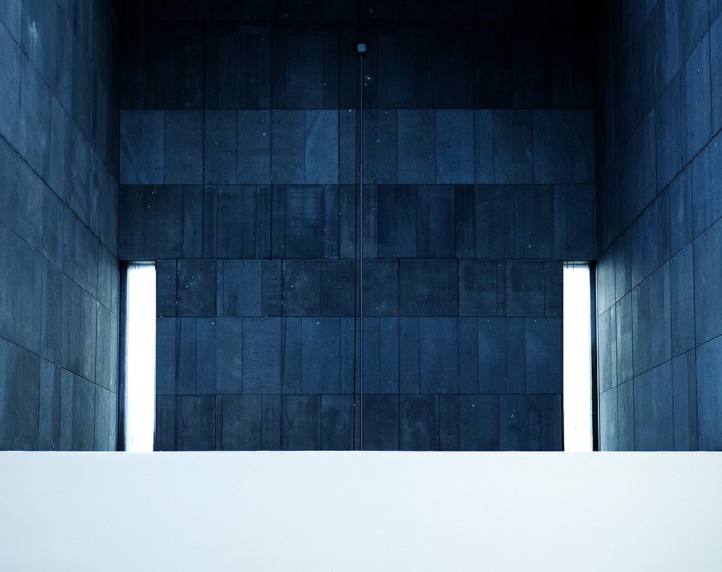
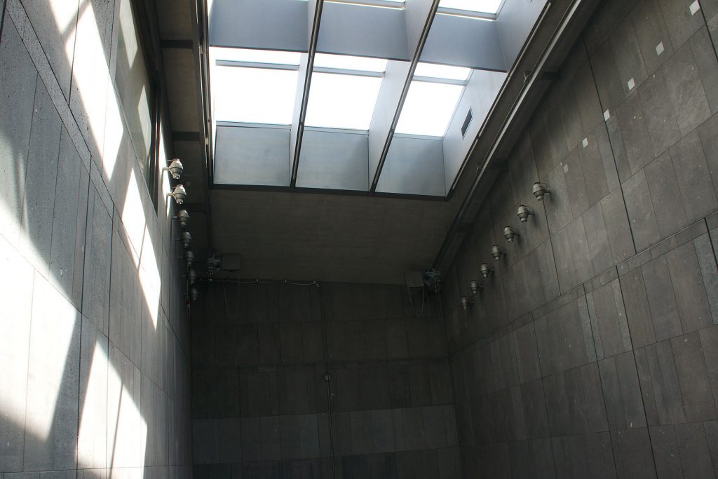
The spaces are equipped with a sophisticated and flexible artificial lighting system that allows you to create the optimum conditions of presentation. The upper room receives natural light through a large opening in the curved roof. The rooms also have openings in the form of slots and a panoramic window on the top floor that allow visitors to observe the outside while providing a sense of direction.
Both on the facades and roof, and the walls and floors of the lobby has been used basaltic lava stone, gray tones. In the exhibition areas are terrazzo floors, as well as in other public areas.
Iron stairs and panels that cover the core melt access to the lobby appears on the catwalk. Railings and barriers are made of tempered glass.
Basaltic flagstones
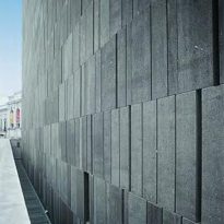
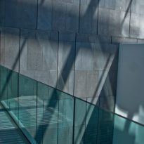
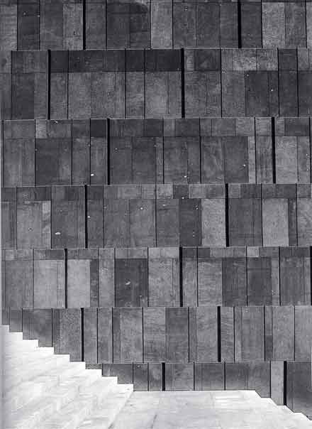
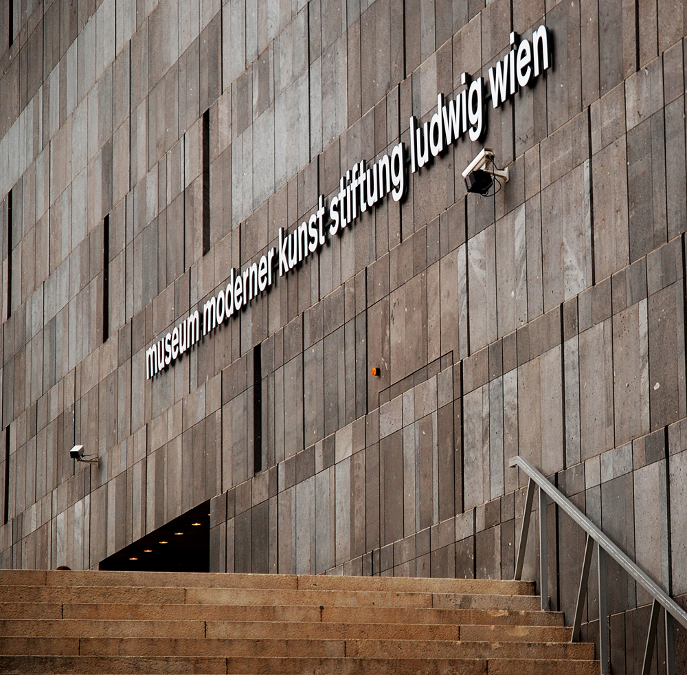
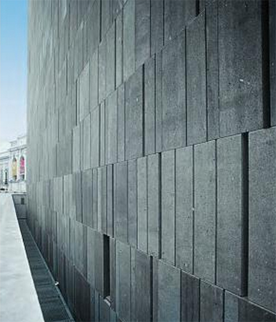
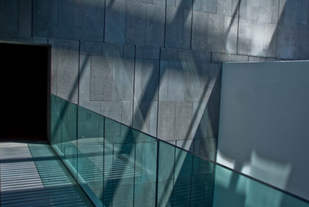
The surfaces of the exterior walls formed by basaltic slabs 12 cm thick obtained using a saw blade diamond tipped, are porous and lackluster. Its glossy anthracite can only be appreciated when the walls are wet.
The pattern of the arrangement of the coating is given by the superposition of different layers of rock, horizontal bands increase in size as you move up the facade, while the vertical joints between the slabs, open on the left side to create a gravure effect claroscuro are two sizes and depths, 10 and 70 mm. This refined “watermark” digitally produced can be seen by the system used for assembly laying the stone slabs of the same size but different tones in a row, giving the surface a vibrant look chiaroscuro, almost like a series of mega-pixels.
The result is a pleasant dynamic effect that gives character to the design of this house of art, this “smart store” in the words of Ortner & Ortner.


