Larkin Building
Introduction
The Larkin Building has, arguably more than any other 20th-century structure, shifted perceptions about not only architecture, but also the future of the workspace and corporate culture.
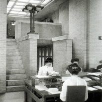
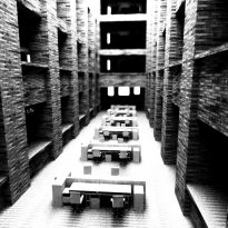
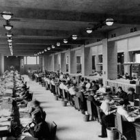
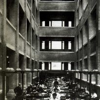
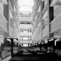
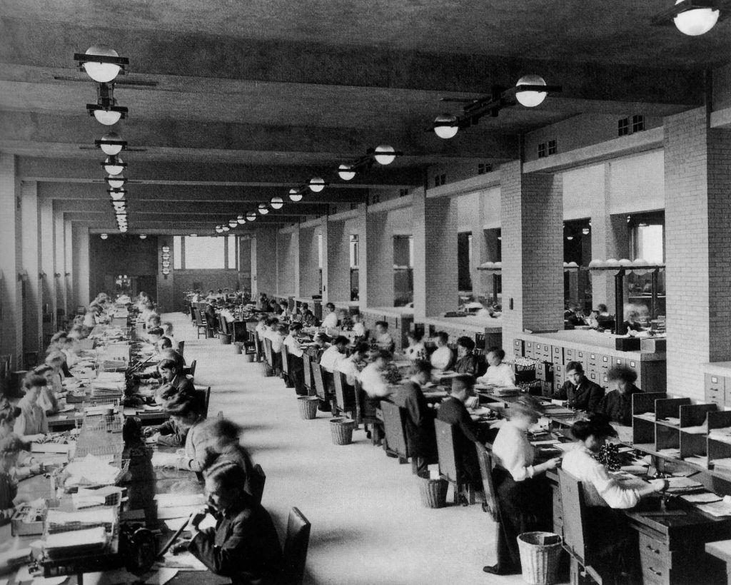
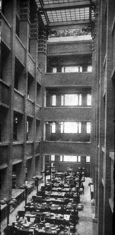
The overall layout, with its open galleries overlooking a well-lit courtyard, imparted a “familial” feeling to the employees. Everyone worked together without private offices or partitioned spaces. This alone was revolutionary in the employment world of the time, where employers typically remained separated from their employees.
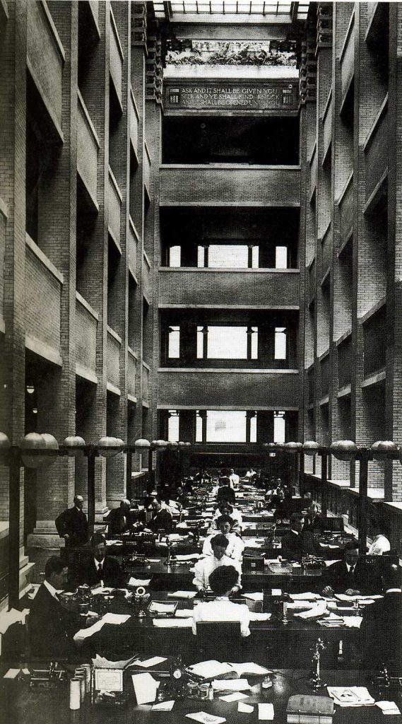
“I believe that with the Larkin Building, for the first time, I consciously started to defeat the box,” Wright expressed years later.
“I found a natural opening to the liberation I sought when, after much struggle, I finally shifted the stair towers to the corners of the main building, making them independent with their own distinct features.” – Frank Lloyd Wright: Architecture and Space by Peter Blake.
Demolition
In 1939, the Larkin Company made alterations inside the main hall and moved its retail operations within the building. By 1943, the company’s decline began, leading to the sale of some of its buildings. The company never recovered from the Great Depression and eventually went bankrupt.
In 1945, the Larkin Building was seized for unpaid city taxes in Buffalo. The administration tried to sell the building for the next five years, during which it fell victim to vandalism, until finally in 1949 it was sold to the Western Trading Corporation, which announced plans for its demolition to make way for a truck stop. Despite protests from the architectural community, it was demolished in 1950. The truck stop never came to fruition.
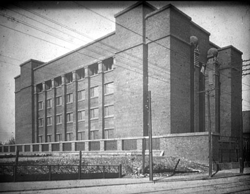
Today, only a brick dock along a railway embankment remains of Wright’s original structure, and the rest of the site is now a parking lot.
Location
The Larkin Administration Building, crafted by Wright for the company dealing in soaps and other household goods, was located at 680 Seneca Street, Buffalo, New York, USA.
Concept
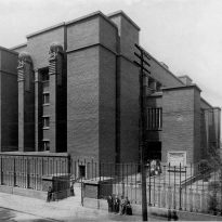
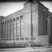
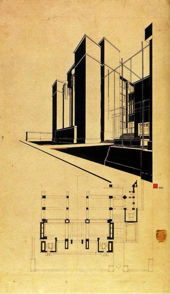
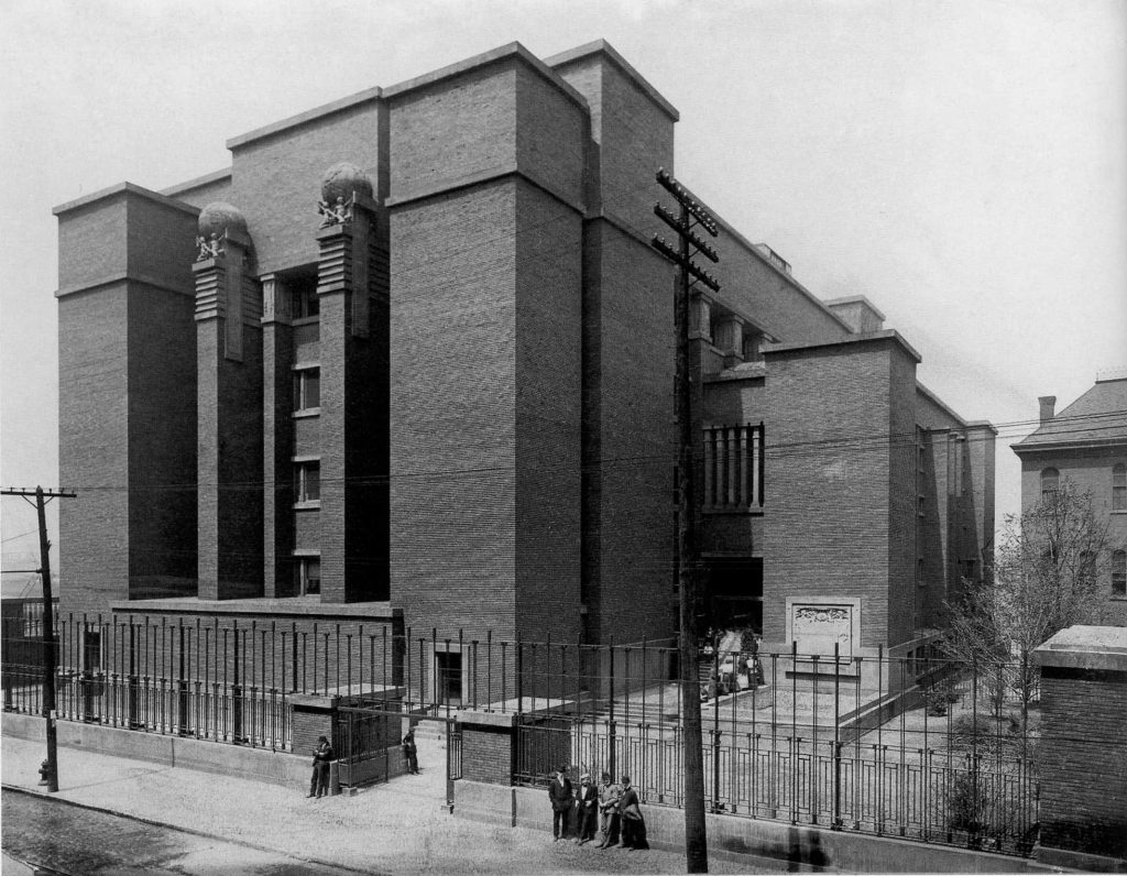
To Wright, the building represented a direct application of power to purpose, with its exterior resembling a solid brick fortress. Its sole ‘ornamentation’ was the external correspondence of the central nave, accentuated by sculpted spirals on both sides of the main body. The building’s ‘serving’ and ‘served’ elements manifested as solid towers and intermediate, almost skeletal walls.
The building’s significance, as the “first of its kind,” is found in its numerous innovative features: steel office furniture, air conditioning, wall-mounted fixtures, and glass doors with top and bottom hinges.
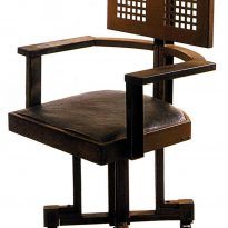
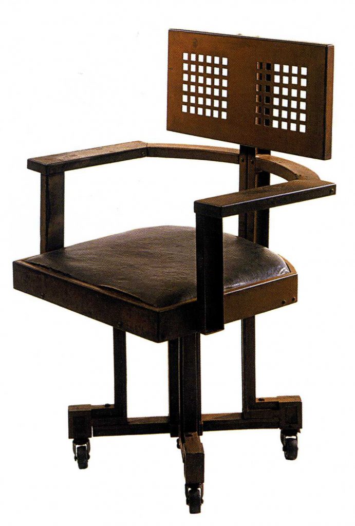
Like in the Prairie Houses, the Larkin Building showcased Wright’s emphasis on the environment, with every constructed aspect and the environment collectively forming a masterpiece. Wright designed desks, chairs, lights, and concrete windows specifically for this building, ensuring each piece eloquently occupied its rightful space within the overall ensemble.
Spaces
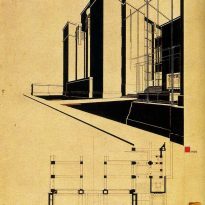
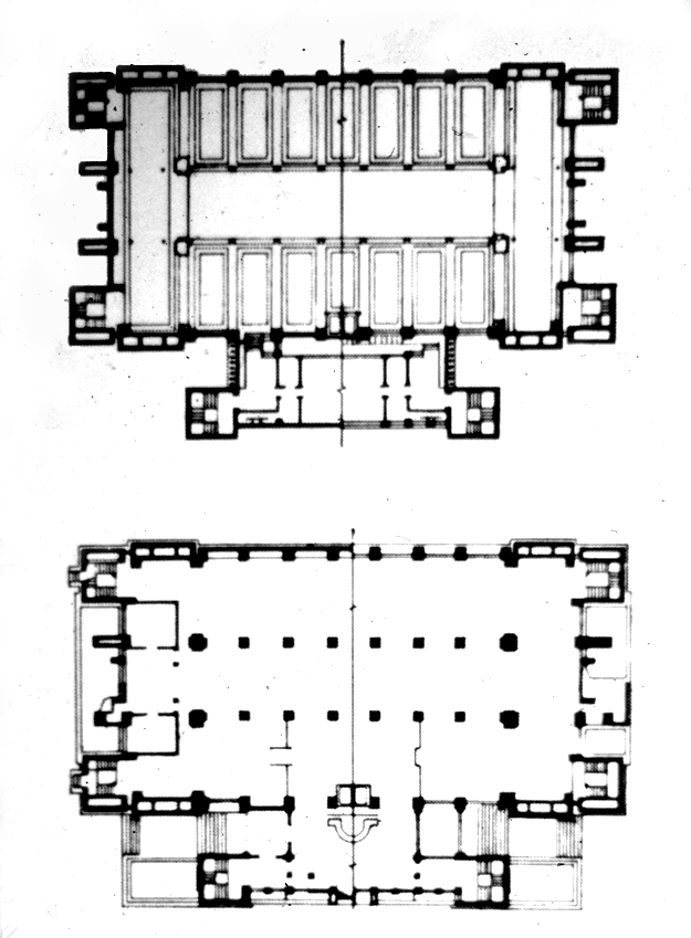
All machinery for various systems, including ventilation and heating ducts, as well as emergency exit staircases, were strategically placed at the building’s exterior corners. This design allowed the entire interior surface to be used for workstations. These exterior staircases were also illuminated from above.
Main Building
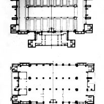
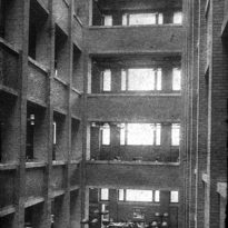
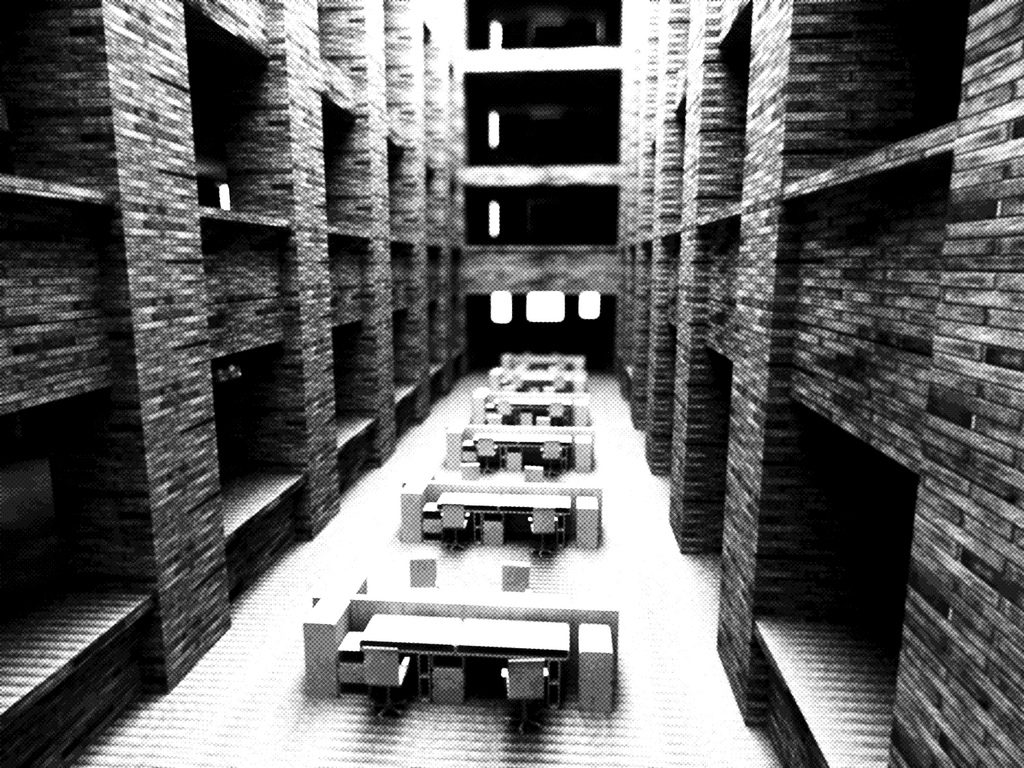
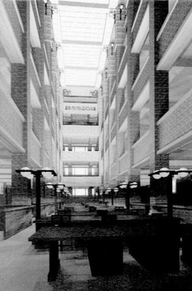
The main building’s interior, spanning six floors, comprised a vast singular nave. Horizontal floors, resembling galleries, opened up to a large interior courtyard, further illuminated by light streaming in from the 23-meter-high ceiling, emphasizing the site’s verticality.
Annex Building
Wright’s innovations extended to the functionality within the building. Secondary functions were relocated to a smaller annex building, separated by a short walkway.
Structure
The building’s steel structure and space-defining walls followed a distinctly unified pattern, both horizontally and vertically. It presented a bi-axial layout concerning its longitudinal and transverse axes.
Rising uninterrupted, the interior vertical pillars supported the horizontal planes of the floors, spanning from the pillars to the external walls, leaving the large interior courtyard open.
Staircases
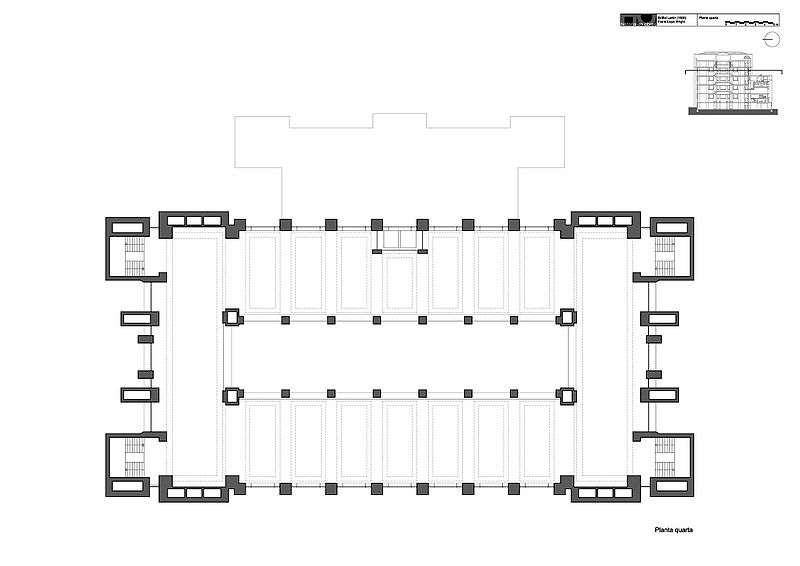
Traditionally, staircases were located at the central nave’s center. Among the innovations that Wright introduced was repositioning them at the building’s corners. These areas, visible from the outside, were enclosures that, along with pillars and horizontal joints, encapsulated the interior space.
Materials
The building’s framework was made of steel, cloaked with dark red bricks bonded with pink mortar. The exterior facades’ details were executed in red sandstone, and the ornamentation was assigned to sculptor Richard Bock.
Among the many groundbreaking features for an office building of its time were the air conditioning, glazed windows, built-in furniture, and suspended toilets.
For enhanced soundproofing, cement was mixed with magnesite, a material that coated parts of the furniture, the main office beams at the main floor’s south end, and the sculpted pillars surrounding the light courtyard. Wood chips were added to the cement mixture for the floor panels, which were then poured over a felt layer for added resilience.
All windows on the various floors or “galleries” are positioned seven feet above the ground level, with the space below being occupied by steel filing cabinets.
The windows are double-glazed, ensuring the building is hermetically sealed against dust, odors, and noise. Fresh air is channeled from ducts situated at ceiling height.
