House in Bordeaux
Introduction
It is a single-family home in which technology is united with architecture to create a universe at once simple and complex. The House in Bordeaux was planned for a family comprising parents and three children, but with a specific purpose. The client, Jean François Lemoine, had been left paralysed as a result of an automotive accident, getting around by means of a wheelchair, and wished for a home which could satisfy his own needs and, at the same time, would be a house for his whole family: a solution which would succeed in combining two parallel lives.
The building would not have to be a home for a disabled person, but an entirely diverse and surprising universe, a creative stage on which most of his daily life would play out.
Location
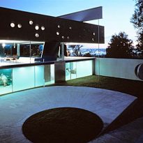
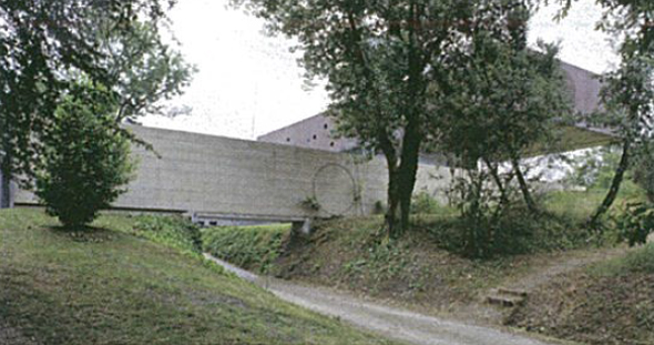
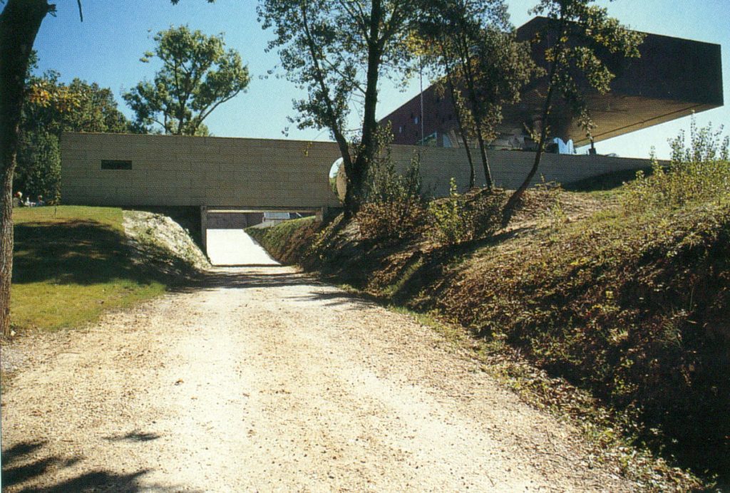
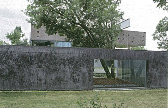
The house is situated in Floirac, on a hill 5km from Bordeaux, France. It is surrounded by an English-style park enjoys a180° view over the city and the river. It is in a privileged area where buildings cannot be stand at more than nine metres above the ground and cannot be painted in bold colours which make them visible from the valley of Bordeaux.
Concept
It is a practical project, intended to more than adequately resolve the functional, physical and psychological requirements of the owner, who was bound to a wheelchair, and those of his family; creating three different worlds, one on each floor, joined by a common axis: an elevator.
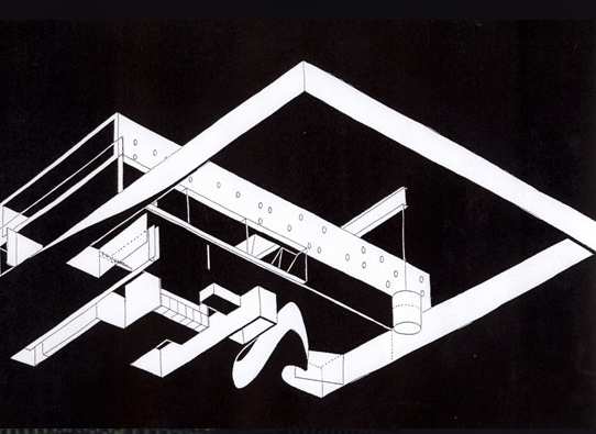
The architect proposed a house, or in reality three houses, one on top of the other. In them, the owner would have his own space, or rather, station: the mobile platform. The movement of the elevator continually changes the architecture of the house. A machine is its heart.
As in the Kunsthal and the house in Holten, collaboration with Balmond allowed Koolhaas to customise structural elements on the basis of their own metaphorical figures. Thus appear in this project the challenges of a difficult synthesis between these figures, the programme and the structure, which are unified in a system that no longer has the degree of freedom allowed by the university, the Tektonik or the Cadavre Exquis (Exquisite Cadaver).
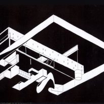
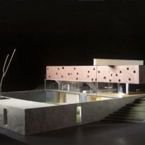
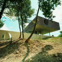
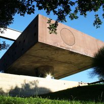
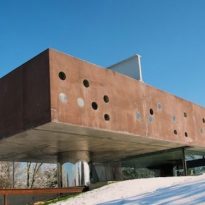
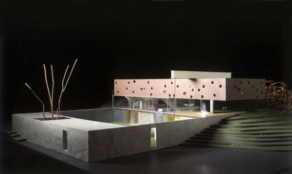
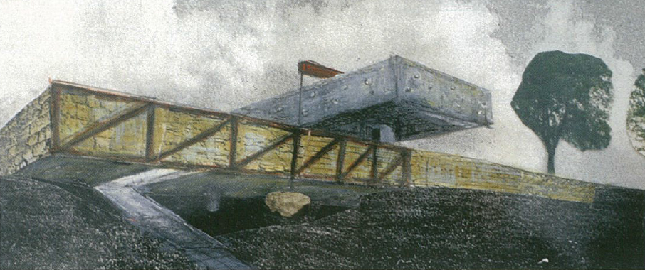
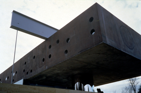
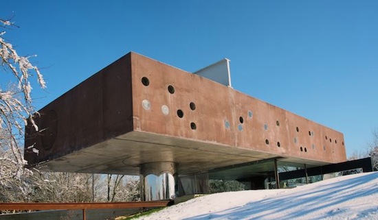
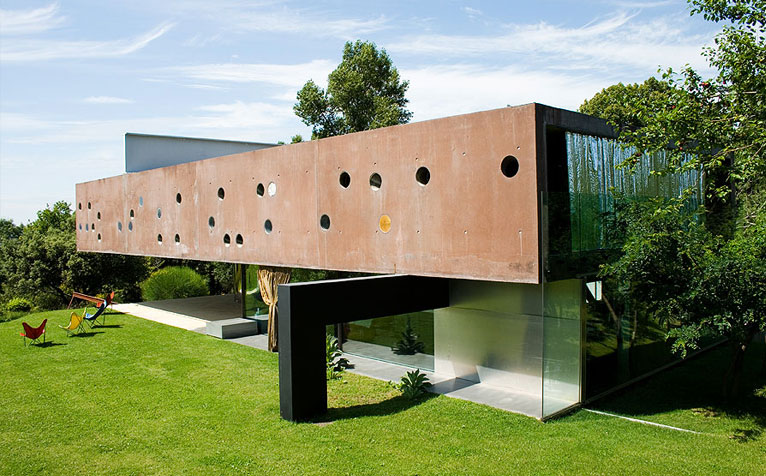
The structures are designed to make the box appear as a solid and heavy block floating in the air, determining the quality of the space and certain design solutions. “… The tectonic principal is to be a box suspended in the air, where the bedrooms will be housed. Below them are the living spaces, surrounded by glass…”; this is how Balmond summed up the ideal scheme provided by OMA: a scheme he shared in imagining a house with the quality of a “magic carpet”.
Spaces
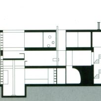
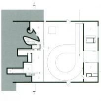
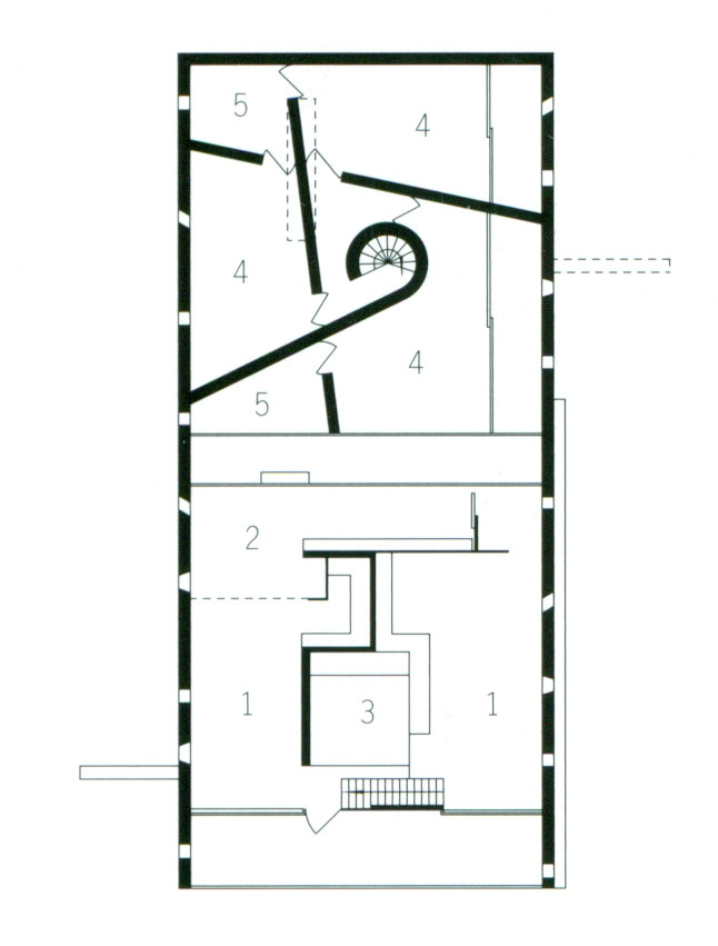
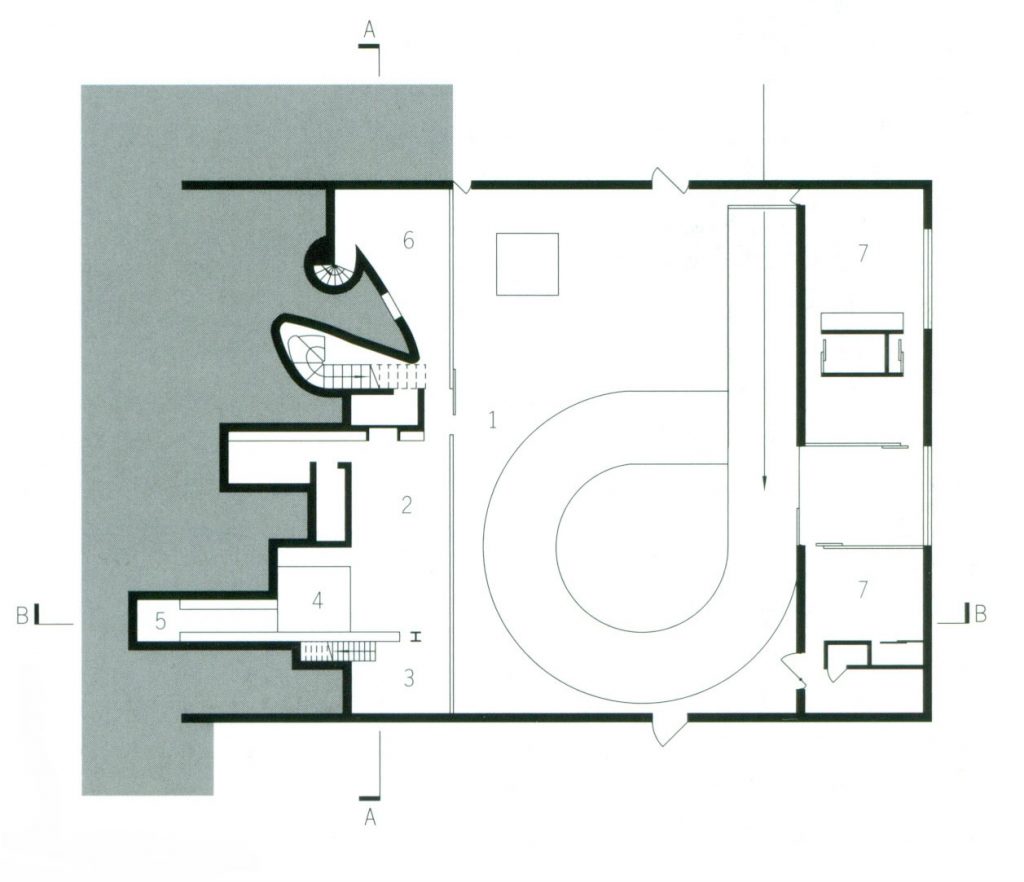
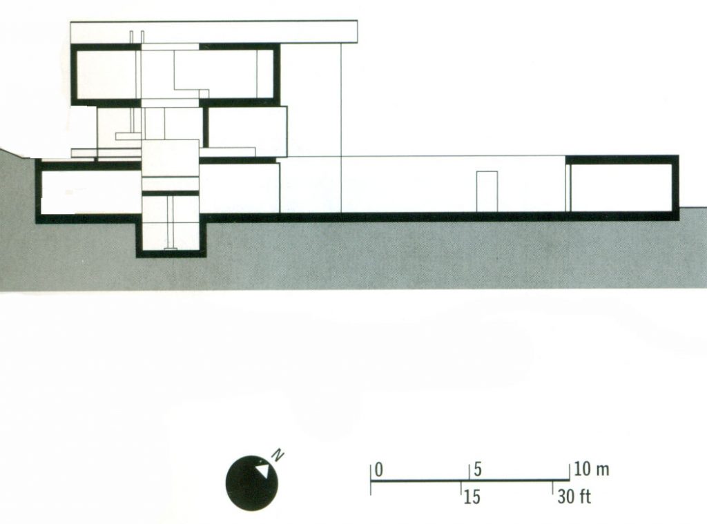
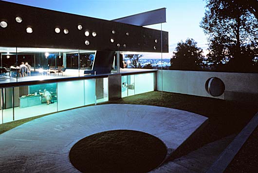
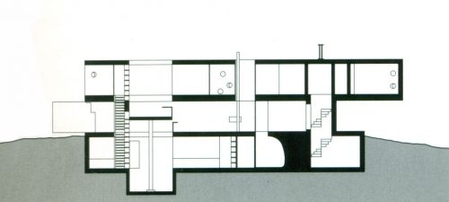
The building is comprised of three houses stacked one on top of each other: three floors of nature, all completely different and in clear visual contrast from the kitchen to the bedrooms, which seems to indicate the traditional stratification of functions, but in reality determines different living conditions. The lowest floor is excavated into the rocky slopes and comprises various caves; the middle floor is glazed and transparent; and the upper floor is divided into various bedrooms. The three levels are divided in two vertical sectors to achieve two independent units on the upper floor, each with their own vertical access and bathrooms: one for the parents and one for the children.
First level
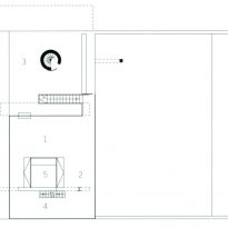
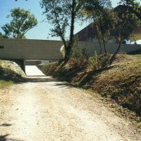
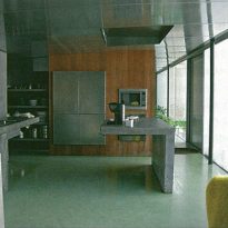
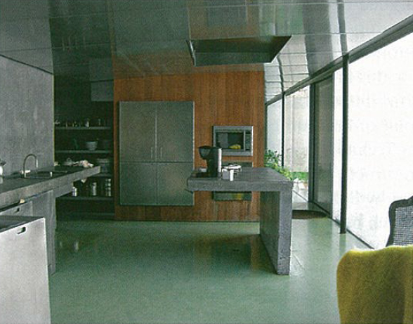
The quadrangular floor situated lowest in the building has been literally excavated out of the hill and consists of a semi-basement, with a glass wall which provides access to the entrance terrace. Each of the rooms is excavated into the ground independently: the main entrance, the kitchen, the laundry, a cellar, the TV room and the utility area.
On this level, there are two living units across just one floor separated by a small patio which leads to the main terrace. A bedroom with bathroom for guests and a bedroom with bathroom, kitchen and dining room for the owners. Principles of simple proportion stipulate the overall size of the spaces.
To ascend to the subsequent levels, there is an elevator and staircase. The staircase leads to the terrace on the ground floor.

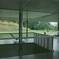
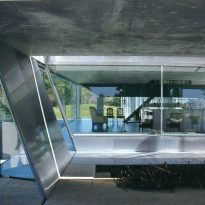
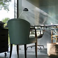
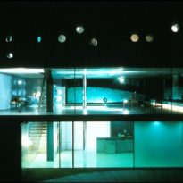
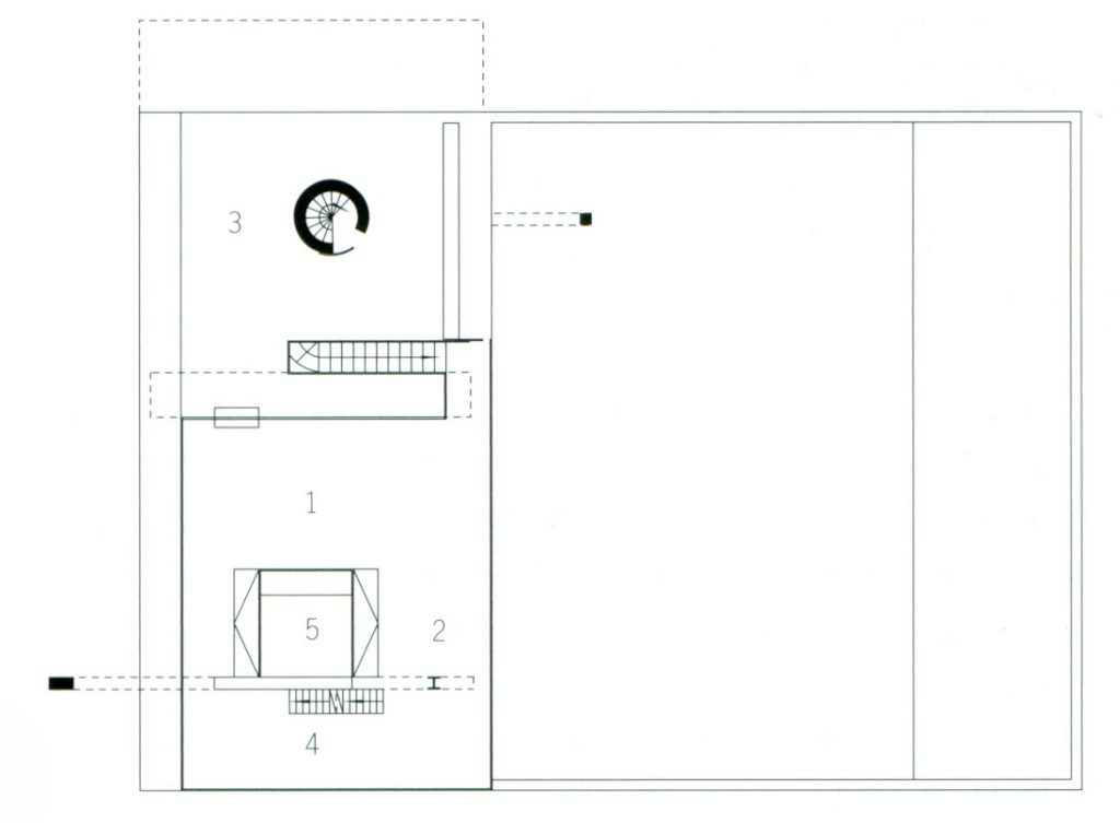
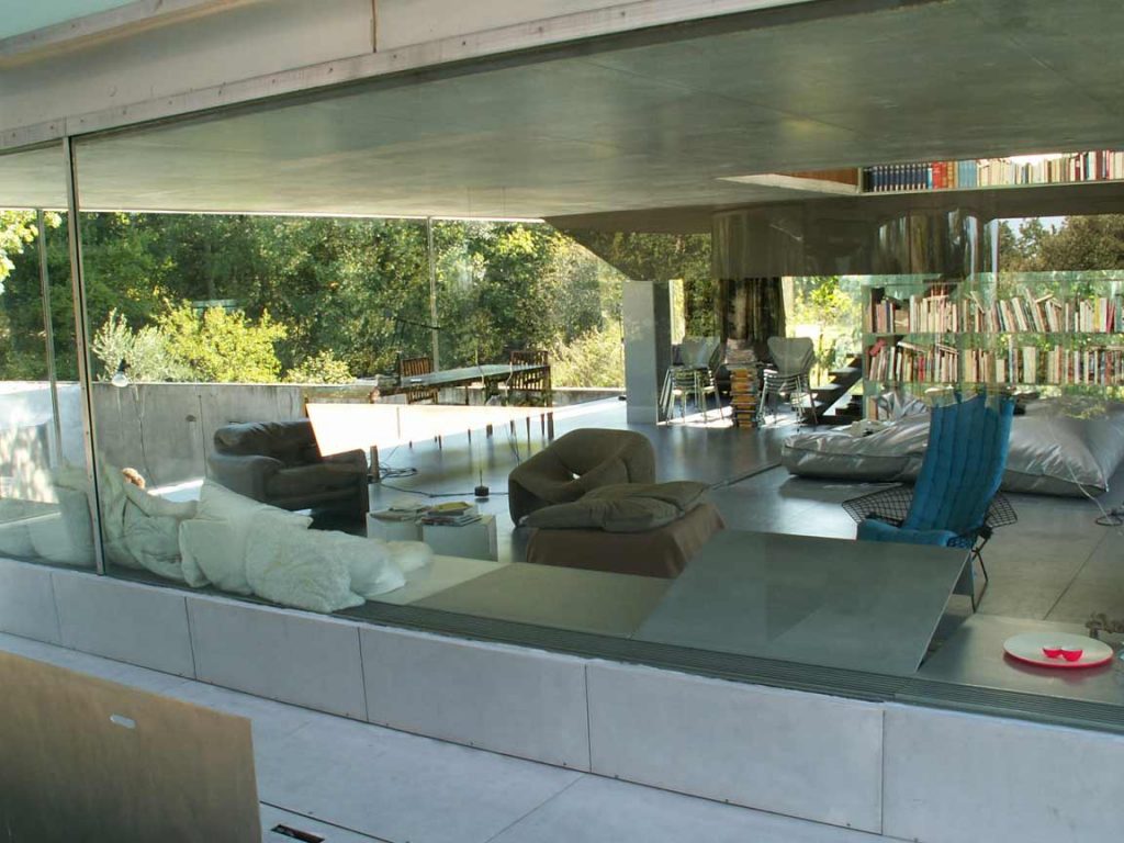
The middle floor commands the majority of one’s attention: dedicated as a daytime zone, it is open on all sides and bounded only by glass walls which exclude the interior, creating a close relationship with the garden. As well as the living room, this level includes a dining room, the terrace, a study and the elevator.
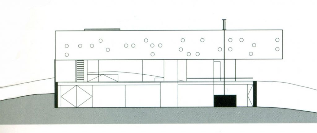
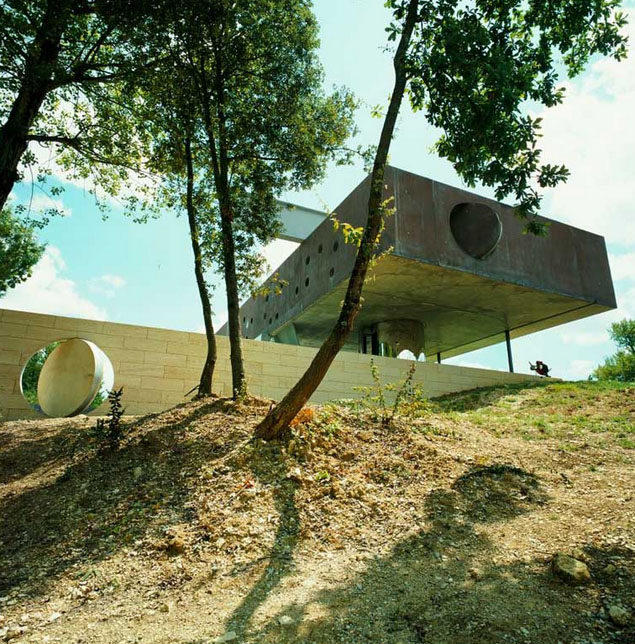
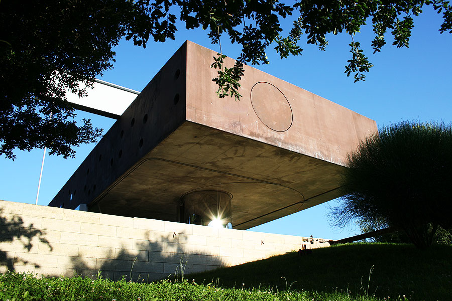
The immateriality of the central level makes the upper level of cement appear to be suspended, levitating in the air. The ground floor, although partly underground, does not give the impression of closing the interior, but opens like a traversable patio from which the main entrance in the heart of the house can be accessed and where the vertical connections are also located.
A sliding glass wall allows the room to be opened up to the terrace, while its position ensures its protection from the elements. All the light that floods the room contrasts with the rustic concrete ceiling, which overwhelmingly defines the space.
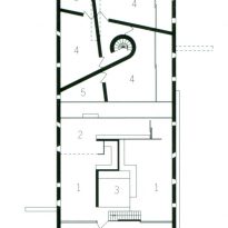
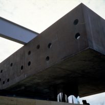
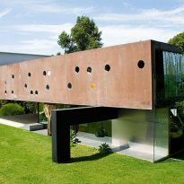
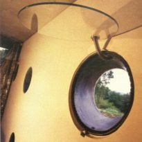
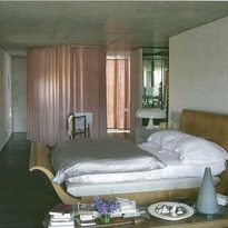
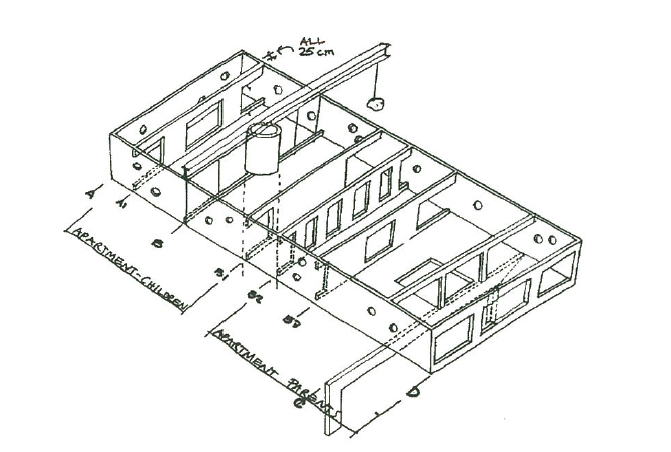
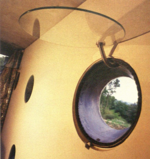
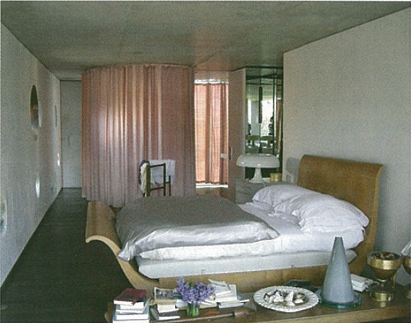
The top floor is divided in two parts, dedicated respectively to the couple and their children. It is a protective concrete box with various interconnected spaces, some of which are open to the sky. The parents’ bedroom opens onto the landscape at the Eastern extreme of the box, and the children’s bedrooms view the landscape from certain points in the rooms, from the bed, the bathroom or the desk, and through small portholes, tapered and oblique, located at specific heights.
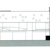
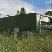
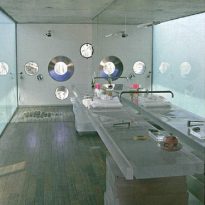
The nocturnal level inverts the philosophy applied to the living space, interiorising the environments that peep at the exterior only through portholes cut in the cement and carefully placed to offer the best views over the panorama that surrounds the house.
The access to the children’s quarter is via a spiral staircase, and to the parents’ via a ramp staircase and a hydraulic platform of 3 by 3.5 metres. Another staircase, situated between the two units, connects the first and the second floors. The undulating shapes of the walls give the impression of a “cave” of shadows en route to the discovery of light and views. This variety of connections was developed to promote independence between the units of the parents and the children in a design characteristic of those applied by OMA in other projects.
Elevator
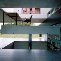
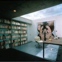
The various levels are traversed by an ingenious platform which moves vertically by means of a hydraulic piston. It is not a simple elevator but truly a room without walls intended as a study for the owner, which allows him to move from the kitchen to the living room to the bedroom, without moving from his desk. The walls which surround the platform are lined with bookshelves, in such a way that Mr. Lemoine can easily reach his books by going up or down in his study.
The elevator is the key space within the house which is open to all its inhabitants, being with or without a wheelchair. In the basement, the elevator opens to the cellar and forms part of the kitchen. On the ground floor, it dominates the living room, and on the top level it converts into an alcove of the master bedroom.
Structure
Preliminary studies
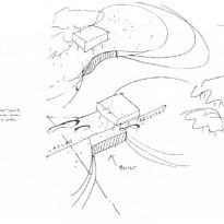
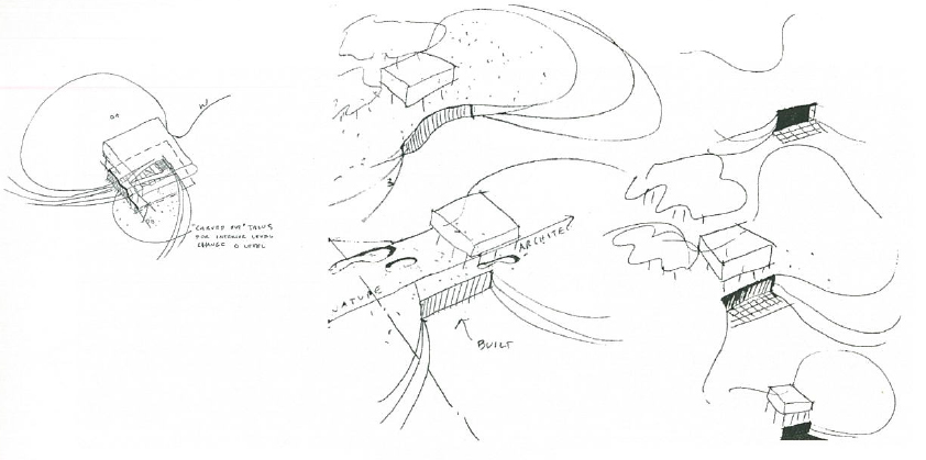
One of the first sketches made shows a square-based prism supported on stilts, as in the Villa Savoye. They examined two basic solutions: one based on the stacking of various tectonic strata, as in the houses of Saint Cloud and Holten; the other using a long ramp resting on adequately prepared ground, “carving out’talus”. Both were designed to facilitate movement in a wheelchair. The development of the ramp, which in some drafts connected all the levels of the house, caused the project to evolve towards a system of bent slabs, similar to that used in the Educatorium. In other drafts, the bases of the box are formed of undulating planes, similar to that used in the project of the Convention Centre for Agadir, put forward to competition by Koolhaas in 1990. The empty space between this element and the base inserted in the ground is defined as “in between/ entre deus”. This led to the choice of a scheme “horizontal with vertical organisation”, in which a large mobile platform is substituted for the ramp, allowing for the creation of three levels, as in the Villa Dall’Ava.
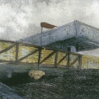
In the versions approaching the definitive design, the underground part of the house was called the “Invisible Plinth”, while the position of the box suspended or resting on the base used the term “Floating Bunker”. The final design is also called the “Patio House”, emphasising the importance of the large terrace at the front of the villa and the annexe for the owners and guests.
Final structure
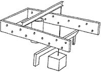
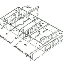
There are three fundamental structural elements in this project: a steel portico, a reinforced concrete frame with a steel beam and brace, and a large, reinforced concrete box which is kept suspended. The area has been divided into three bands: the largest is the terrace, and the other two comprise the first level of the house.
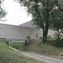
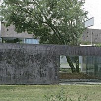
The band for the first level of the house is completely open to the terrace by means of transparent and opaque glass panels. A row of cylindrical, metallic pillars, painted black, serve to support the structure of slabs which lies above and runs the length of the windows. At the side of this band and entering the ground, the wall has recesses and protruding parts, creating natural-looking terraces with wedges and cavities.
Cantilevered platform
Structurally, the cantilevered level is supported on only one of its sides by the steel portico situated below, by a beam above the exterior concrete wall, and by the cylinder clad in stainless steel that encloses the staircase on the floor below. This results in an unusual pillar with respect to the cantilevered beam, as it is balanced by means of a brace anchored to the ground of the patio.
Third level
The third level contains the bedrooms and bathrooms, grouped in two units. Each unit has an almost square floor, closed within just one reinforced concrete box. The units are separated by a cross-section of the floor slabs and the ceiling, creating a narrow space in Koolhaas‘ style which allows the entrance of natural light. Only the continuous lateral walls prevent the house in Floirac from being split in two, as in the case of the Saint Cloud house. Even though it is only a box, the upper level seems unexpectedly comprised of two platforms, each balanced atop a barycentric support. Its archetype is a square, mobile platform on a central support.
Pillars
Apart from the two steel profiles in the basement, there is no element in this construction which could be called an authentic pillar, nor a load-bearing wall. Usually, constructions have solid bases and the upper parts are lighter. In this house the opposite is true: the huge concrete box is suspended above an open space, seemingly without major supports and with glass walls. In general, beams support the loads from below, whereas in this project a huge steel beam, almost one floor in height, rests on the building as if it were nothing, rather than an indispensable element of the structure. This play is seen with all the elements and details of the construction, as if it were a manual game.
Empty and filled, the introverted and extroverted: they enliven both the façades and the interiors along with the desired asymmetry, and are made possible due to ingenious functional and structural solutions.
Materials
The combinations of materials underline the recurrent dualism: the cement contrasts the glass and aluminium, and mixes with the steel, creating a fascinating structural ambiguity.
Exposed cement is painted grey for the ceilings of the living room. Reflective chrome cladding is used for the stairwell, crossing the terrace to confer a disembodied appearance.
In the kitchen, the channelling of the physical floor and the lighting are hung from the upper slab and hidden with a sloping roof of transparent polycarbonate panels. This demonstrated the use of solutions previously used by OMA for public buildings in a residential situation.
The middle floor of the house, at ground level, is placed between two rectangular slabs with a height of 2.4 metres, surrounded by glass and aluminium panels. On the side facing the lawn, a motor controls the movement of two large floor-to-ceiling glass panels, allowing the wall to be opened completely. This large window is cut by a low aluminium cabinet, which contains the hot air outlets and loudspeakers, as well as the fixed windows of the studio. Other guides embedded in the slabs form a complex system, including railway breakers, systems to move the curtains, upholstery, paintings, lamps, doors and even a birdcage of pigeons.
The floor of the moving study and that of the living room are made of aluminium sheets, like those used in public spaces. This extends beyond the windows to the edge of the lawn, giving the surface of the space the character of the Superstudios.
