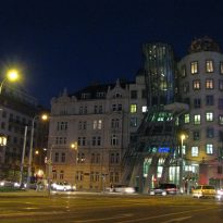
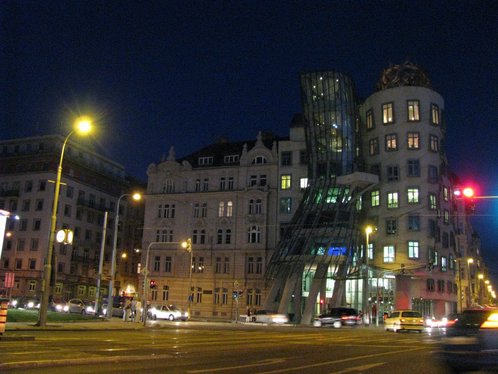
Dancing House
Introduction
With the intention of creating an emblematic building in Prague, the Dutch bank, Nationale-Netherlanden (previously ING), commissioned the architects, Frank Gehry and V. Milunic, to accomplish an innovative architectural project, entrusting them with an almost unlimited budget and complete artistic freedom.
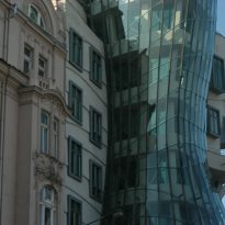
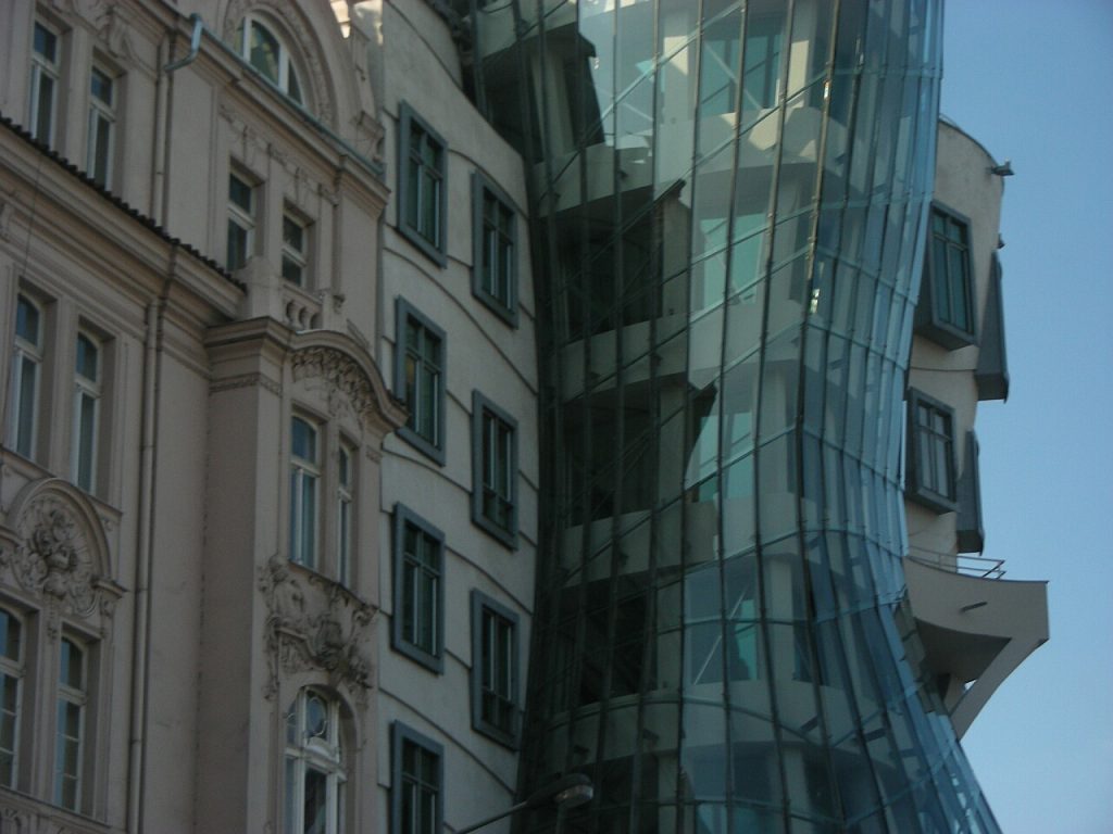
The bank got in touch with the architect, V. Milunic, to ask him to invite a world-famous architect to participate in the project. Milunic first contacted the French architect, Jean Nouvel, who turned down the project due to its small surface area (491m²). The second contact he made was with the architect, Frank Gehry, who accepted the commission. The result was a building surrounded by elements of great plasticity, which in spite of its de-constructed style, harmonises with the environ. It is one of few buildings in the city which inhabits its space in the street in such a dynamic way.
Construction of the Dancing House, whose official name is the Nationale-Nederlanden Building, began in 1994 and finished in 1996. Although it received the design category award from the prestigious American Time magazine in the same year it was completed, the building was very controversial from its beginnings. Not only did it stand out stylistically, it was also asymmetrical and, for many, clearly out of place in a more traditional environment. Amongst its detractors it was known as the Drunk House. Even many years down the line, it continues to to be contentious between the citizens disgusted by the building, considering it out of place in a conservative context, and those who see it as a symbol of freedom, liberation and democratic beliefs after the fall of communism.
Location
The building is found on Resslova Street (Rašínovo nábřeží 80), on the right bank of the Moldaba river (in Czech, Vltava) and close the Karlovo Námestí metro station, in the centre of Prague, Czech Republic.
During the Second World War, an American bomb destroyed the house which was originally where the Dancing House now stands. The land was bought by the insurance firm, Nationale- Nederlanden.
Concept
The principles adopted in the design included the contrast between static and dynamic figures (Yin and Yang). In the first sketches, Gehry envisaged the building as a panel with square shapes similar to pillows, to which Milunic added a tower in the form of a geyser.
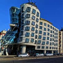
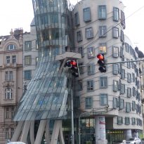
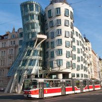
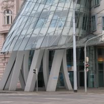
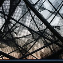
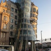
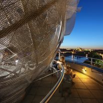
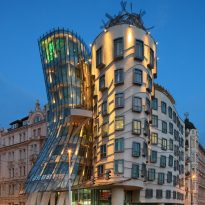
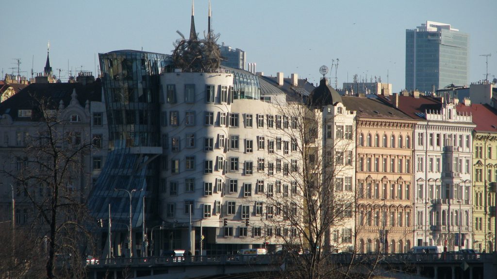
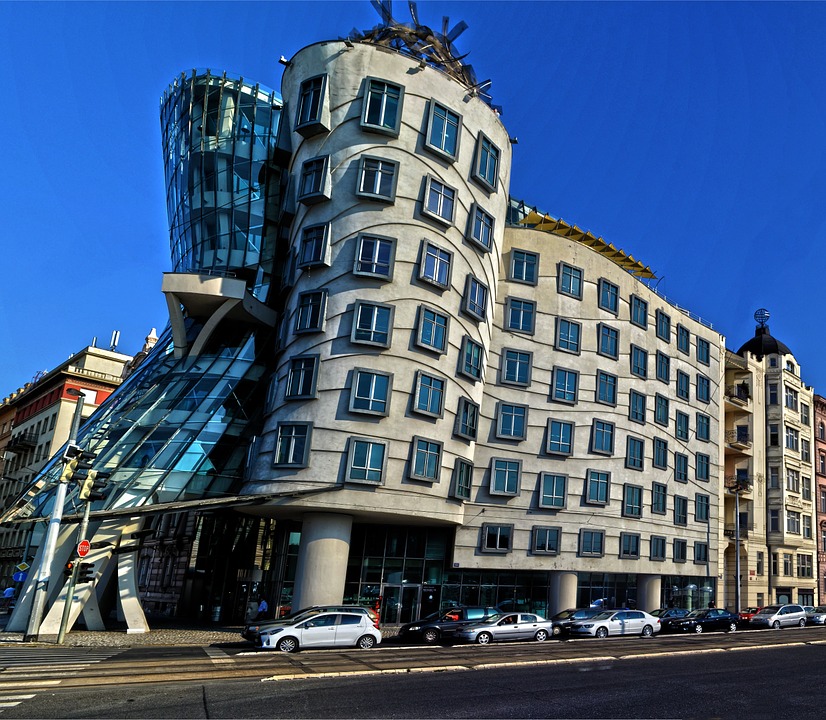
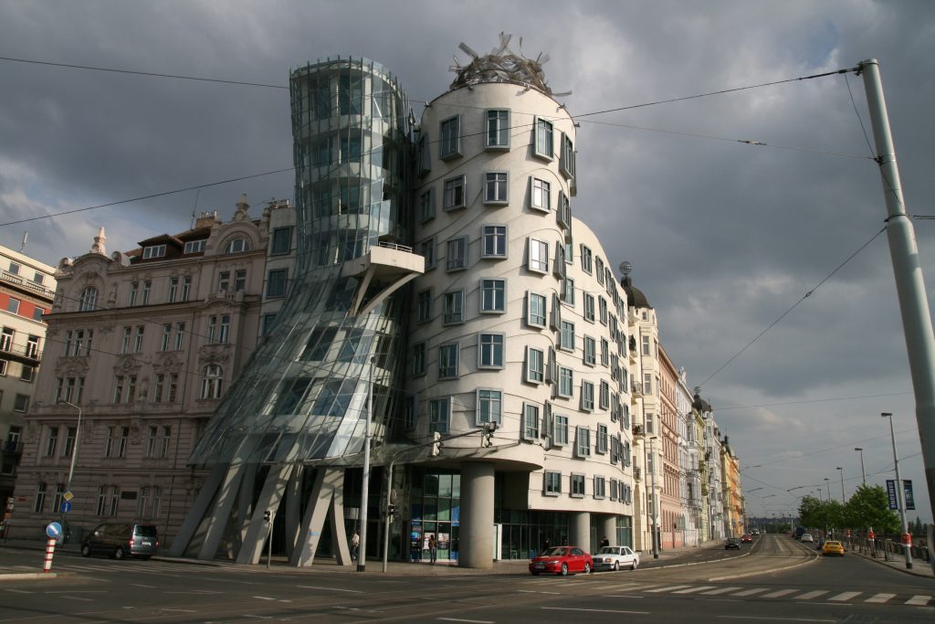
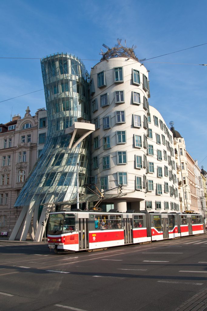
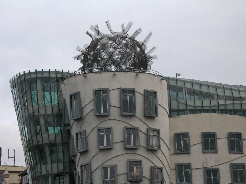
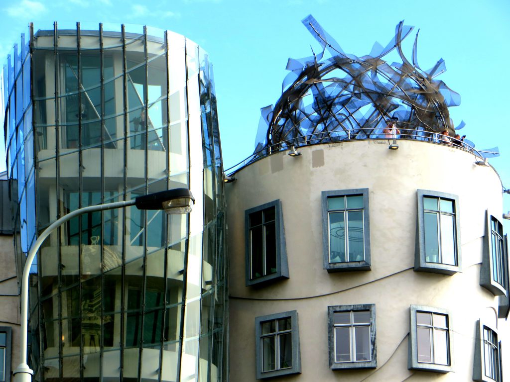
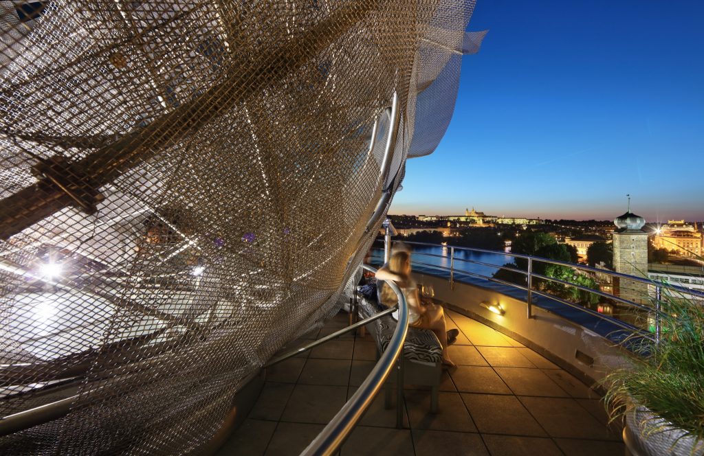
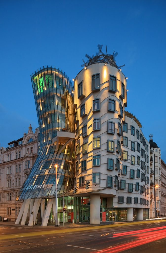
Turning on the corner where the building would be constructed, a pivoted tower was a logical starting point. But Gehry considered a single concrete building to be too “masculine” and was motivated to develop the idea of a feminine counterpoint: a feminine Yin balancing the masculine Yang. This gave rise to the analogy of the dancing couple, whimsically described as “Ginger Rogers and Fred Astair”, the legendary film couple who rallied the entertainment industry in the 1930’s with their dance steps in musical comedies. The masculine part of the dancing couple is represented by the more solid tower, supported on three sturdy pillars and with an imaginary mat of hair made of steel and wire mesh which swings with the breeze atop his head. The feminine half is the glass tower with eight columns at its base, inclined toward her partner with a dress of steel and glass.
With its clear-cut deconstructivism and unusual form, the style of the headquarters of the Nationale-Nederlanden is considered by the designers of architecture to be “new-barroque”.
The design tools and technique used on this building served as a test for future processes that Gehry would use in all his projects, including the Guggenheim Museum in Bilbao. The use of curves in the building imitates the aerodynamic form of planes and sports cars. The software which his company developed was later used to design French aircraft.
Spaces
The Dancing House is located between buildings from the 18th and 19th centuries and articluated in two central bodies. Each of the two towers is essentially a distorted cylinder. The diameter of the solid dominant male tower expands as it extends as it travels skyward, while its glazed female partner is dramatically girdled at the waist.
The glass tower (Ginger)
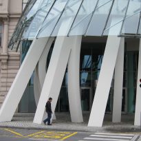
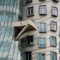
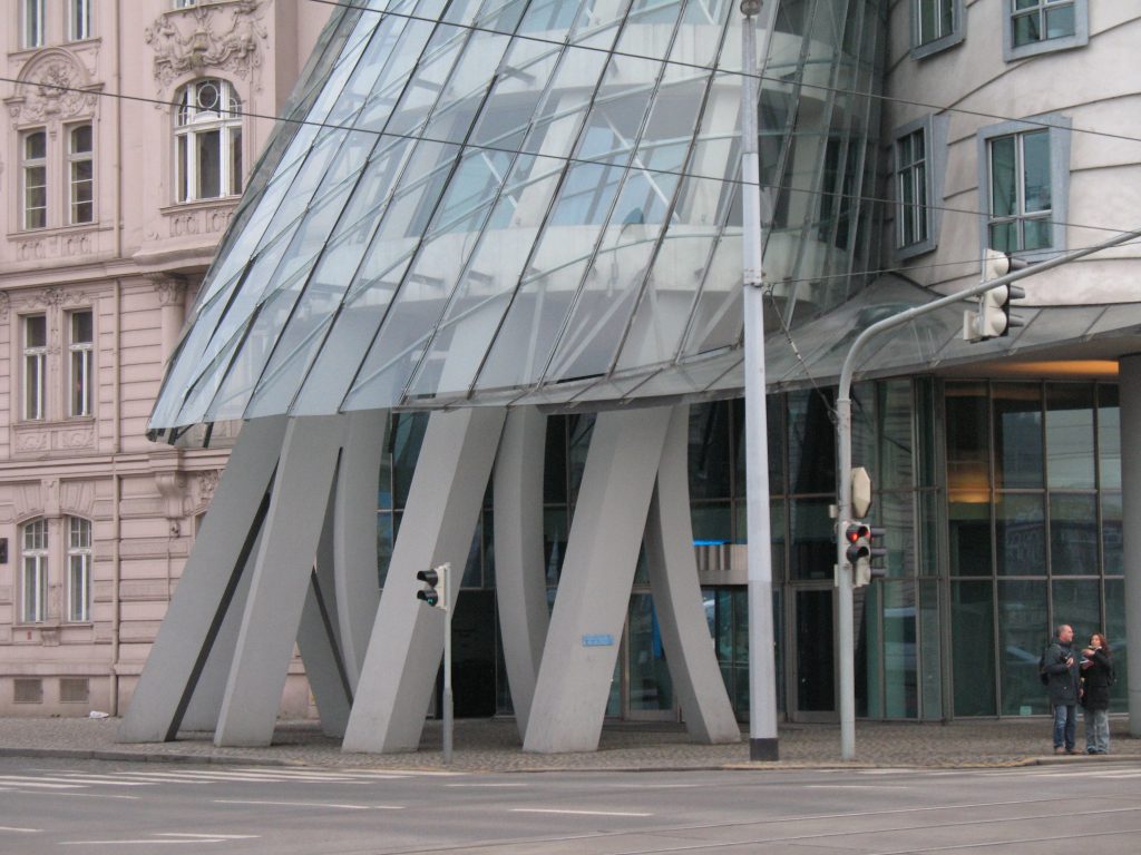
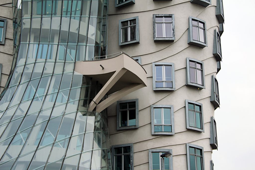
The first volume is a glass tower which narrows halfway up. At that point a single terrace juts out and hangs onto the concrete tower. The volume is supported on a small forest of inclined columns- metaphorical legs which appear from under Ginger’s skirts and mark the entrance to the building.
The concrete volume (Fred)
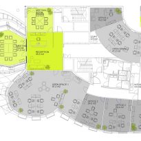
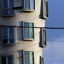
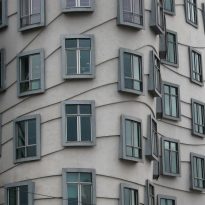
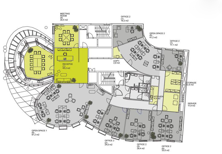
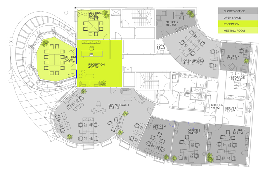
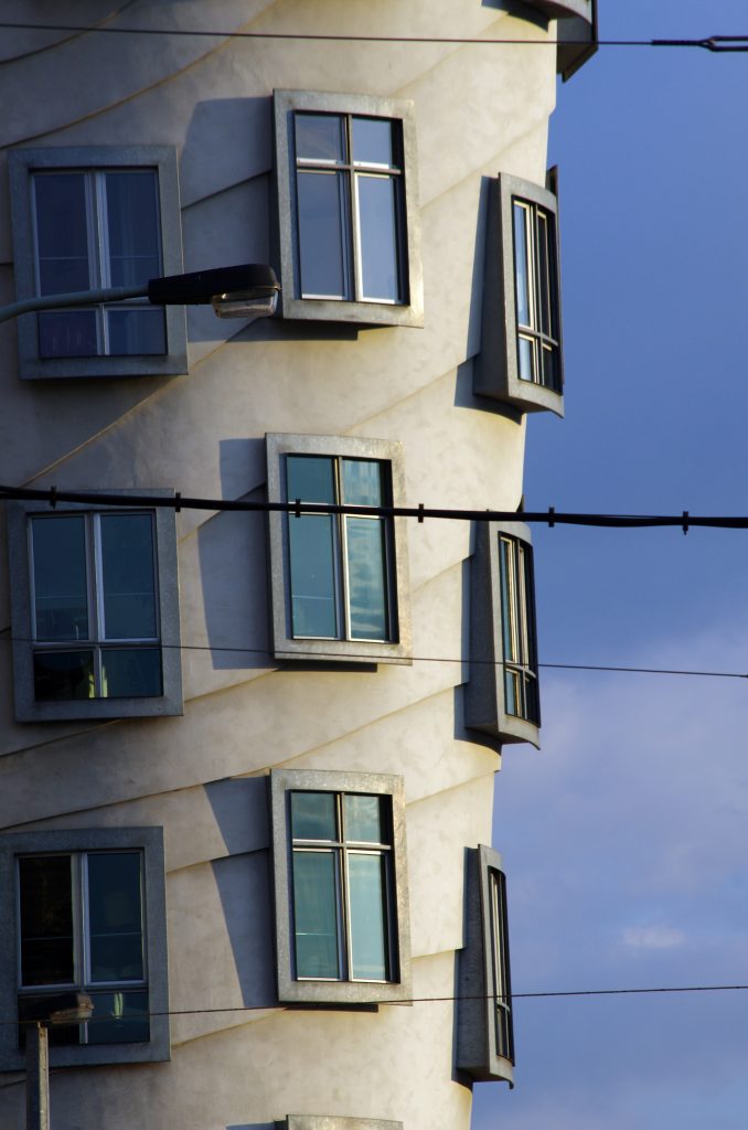
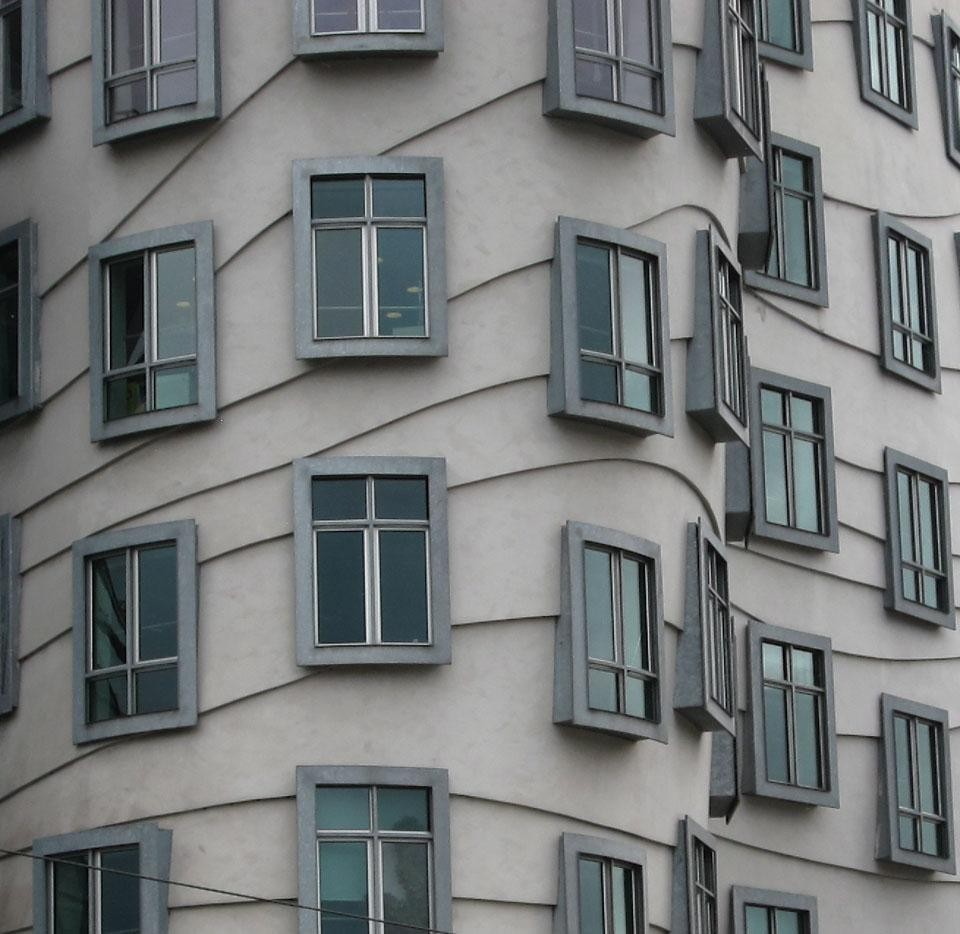
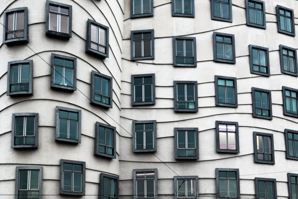
The second structure extends parallel to the river, on three sturdy pillars, and is characterised by the undulating mouldings of its façade and the incoming and outgoing windows distributed non-linearly. This manner of placing the windows corresponded to the architect’s idea that they should not be perceived as simple forms on a flat surface, but achieve the effect of tri-dimensionality, hence the idea of protruding frames, like picture frames. The sinuous mouldings of the façade made the perspective more ambiguous, tempering the contrast with the neighbouring buildings. Behind the twisted façade there are relatively simple floors, based on a conventional connection of leaseable space, organised around a core of circulation in an L-shape.
On the ground floor of the building, between the large circular pillars, there are shops, a hotel and a small cafeteria. This area for public interaction at ground level allows for the building to be much less isolated than traditional office developments.
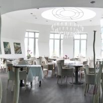
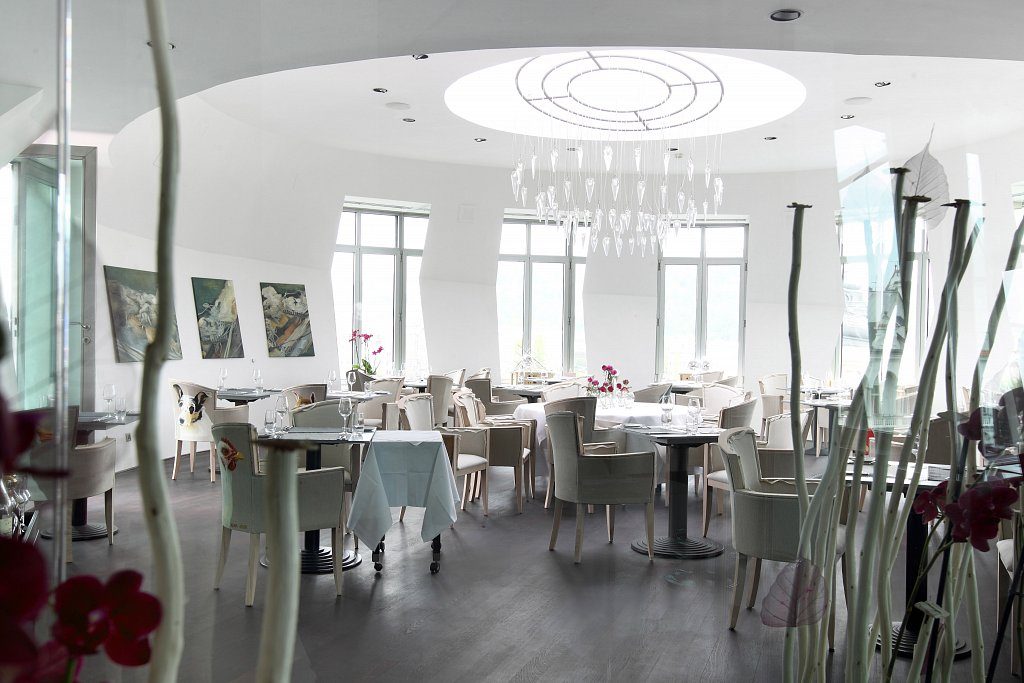
From the second to seventh floor, the building is filled with offices. However on the top level there is a restaurant with panoramic views of the city, the Moldava river and the nearby castle.
Part of the interiors of the building were designed by the British architect of Czech origin, Eva Jiřičná.
Structure
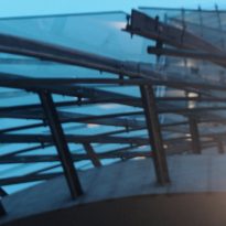
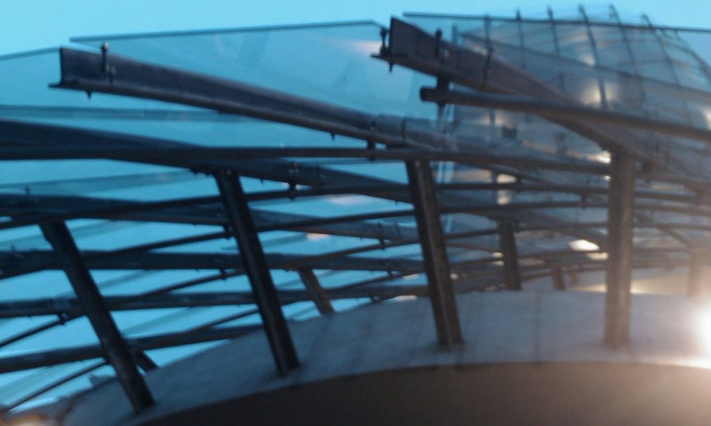
The glass tower has a concrete structure with a conical shape which is supported atop a series of inclined columns which rise from ground level, creating a portico and continuing to the end of the building. The tower is closed by a double curtain wall: an interior one of retracted glass and the second an exterior skin, also glass, supported on a steel frame which separates it from the main body of the building. The supports of the steel structure are fixed to the structure of the building. The vertical profiles are T-sections connected to each other by hollow profile sections.
The building which faces the river rises as a solid cylindrical concrete volume on the corner, where it joins with the steel and glass structure followed by a larger façade which faces the river and is constructed on a base of 99 prefabricated concrete panels and numerous windows.
Materials
The buildings, with a surface of 5842m², were constructed in steel, glass and prefabricated concrete panels, finished with plaster characteristic of the local architecture.
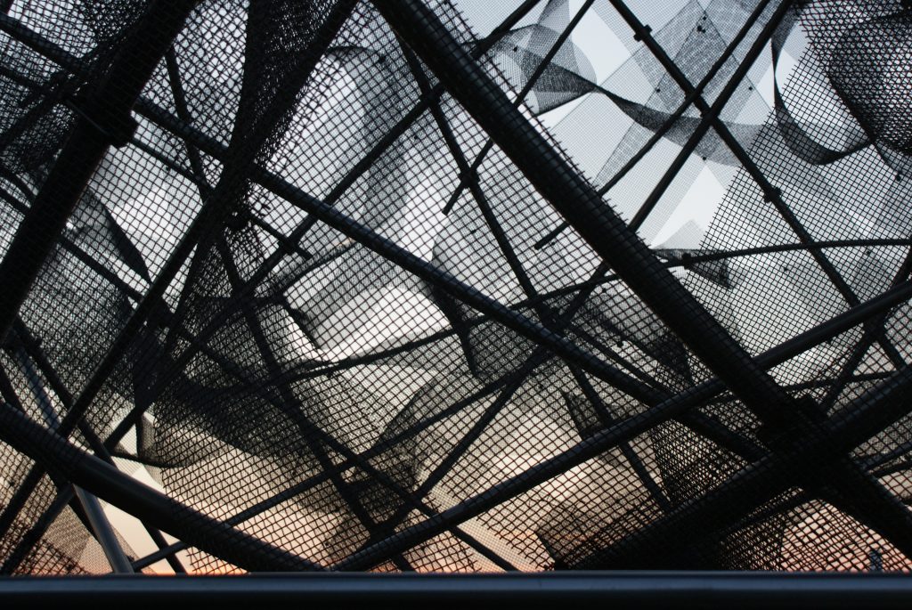
For the building parallel to the river, they used concrete panels in 99 different shapes and dimensions. At the inauguration, a sculpture, Medusa, was placed on top, made of metal tubes and covered with stainless steel wire mesh.
The architects, Gehry and Milunic, decided not to paint the exposed materials, but to display their natural colours: the glass is green, the concrete grey and the steel structure silver.
Video

