Center for Contemporary Art in Cincinnati

Introduction
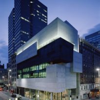
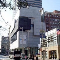
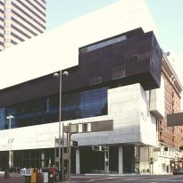
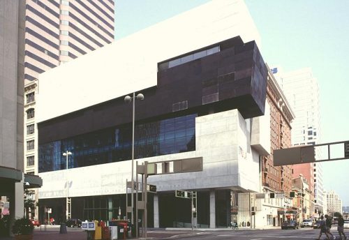
After CAM (Cincinnati Art Museum), inaugurated in 1880, the Center for Contemporary Art Lois & Richard Rosenthal (ACC) is the first new museum in Cincinnati. To achieve them, was called for an international competition which involved 97 studies. The winning project was the Anglo-Iraqi architect Zaha Hadid, who had reached the final selection along with Daniel Libeskind and Bernard Tschumi. This is the first building designed by Zaha Hadid in America.
ACC was projected as a contribution to local Cincinnati, trying to reassert the values of the urban center of the city and establishing a playful game between it and the building.
The center is devoted to developments in painting, sculpture, photography, architecture and new media. You do not have a permanent collection. In addition to significantly expanding the space available to the museum, the new building to organize new activities, especially educational and interactive form, even for children.
Situation
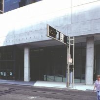
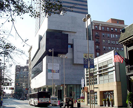
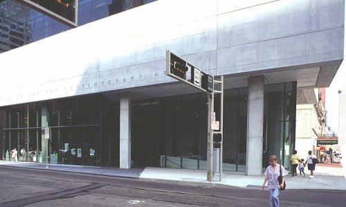
Located in the city center, at the intersection of Walnut Street and Sixth.
Concept
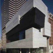
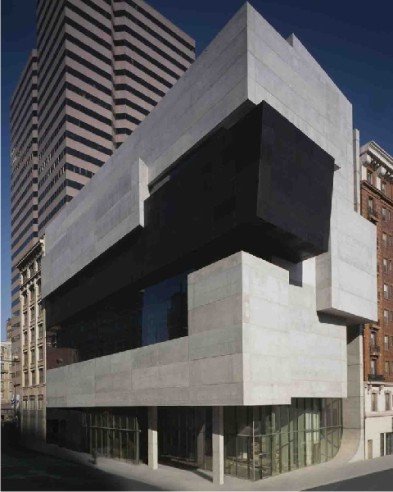
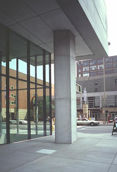
One concept which is based on the design is the contrast between the extremes: the heavy foreign body and the opening of the interior spaces.
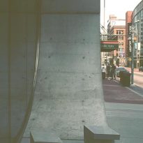
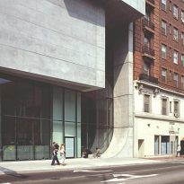
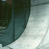
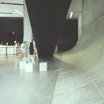
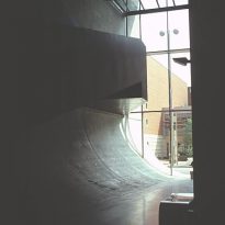
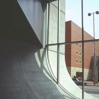
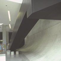
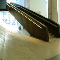
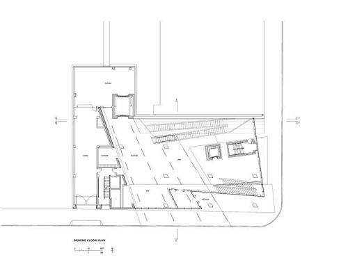
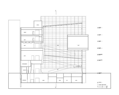
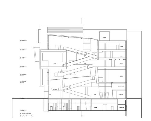
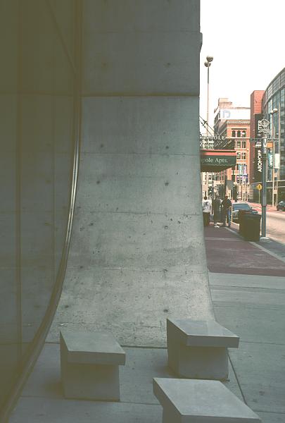
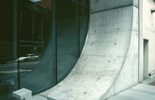
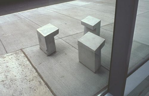
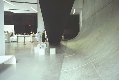
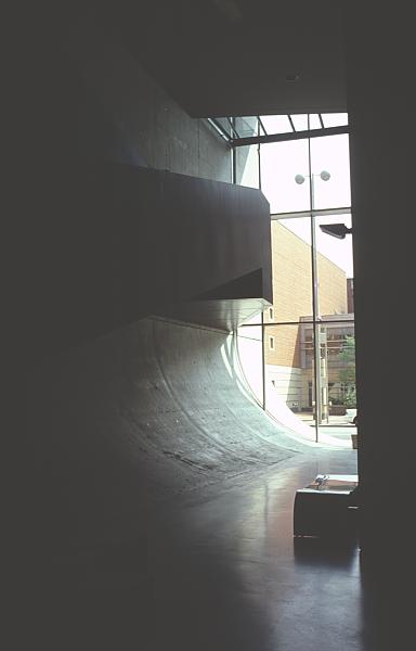
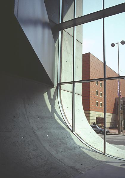
Another of the main concepts presented here is “urban carpet”, which produces a business continuity between the urban street and the building. The surface of the street enters the building and is bent upward movement the idea of creating vertical and urban space.
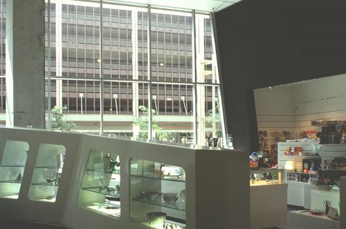
In terms of exhibition spaces have been designed with the idea of adapting to changes in the art, so that may be presented as traditional works such as facilities that take advantage of interactivity and technology.
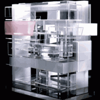
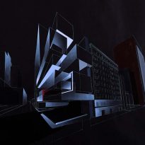
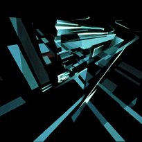
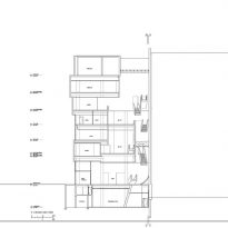
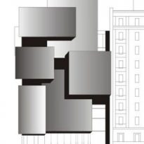
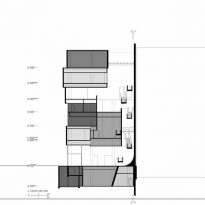
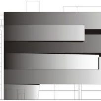
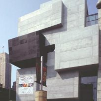
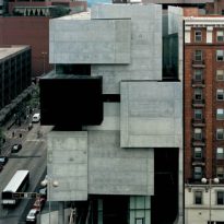
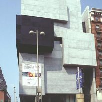
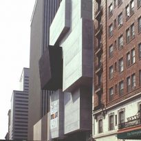
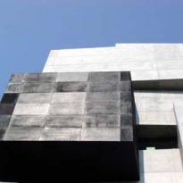
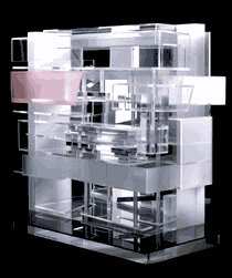
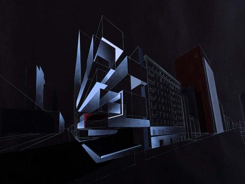
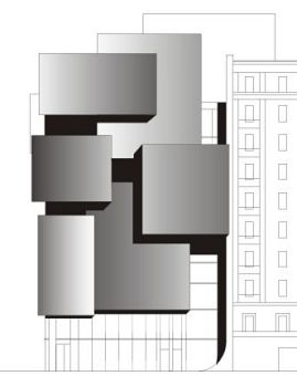
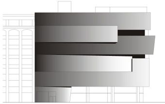
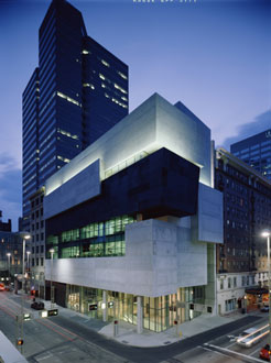
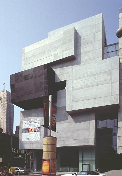
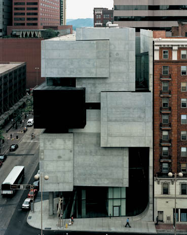
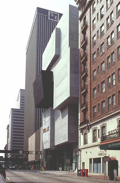
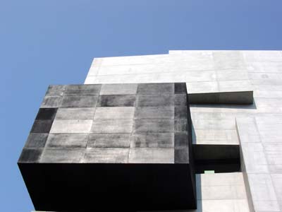
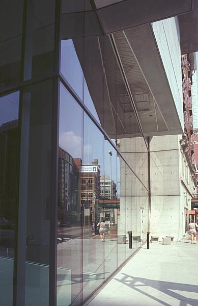
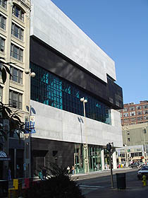
In contrast to the neighboring blocks, this building is embodied in a composition of stacked volumes that stretch the limits of its compressed ground. Between dissolution and dispersion, it imposes density and intensity.
Spaces
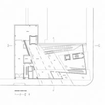
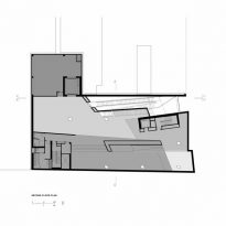
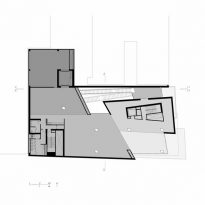
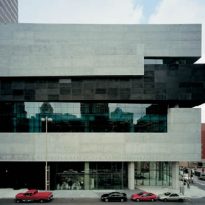
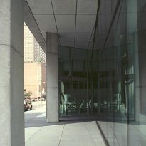
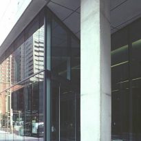
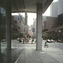
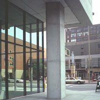
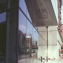
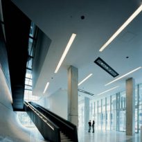
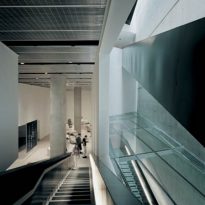
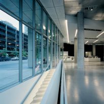
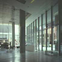
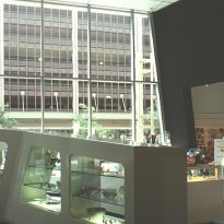
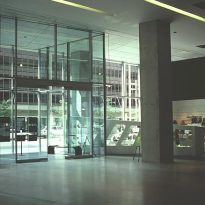
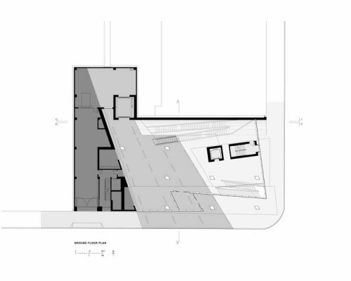
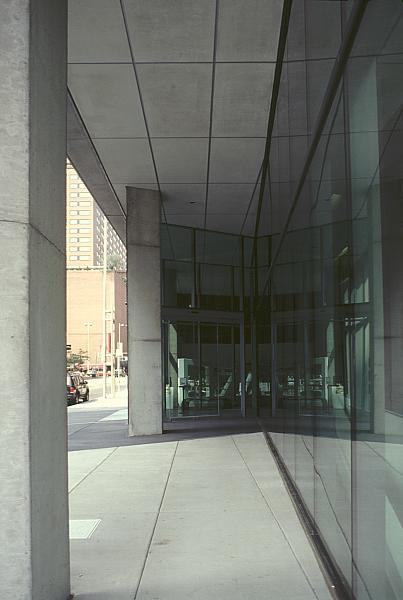
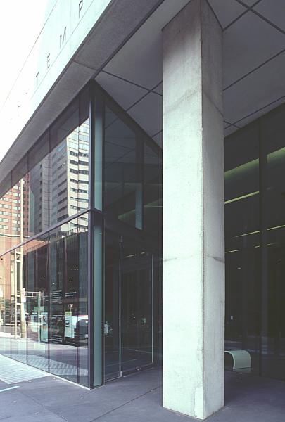
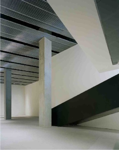
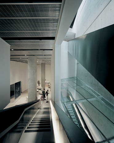
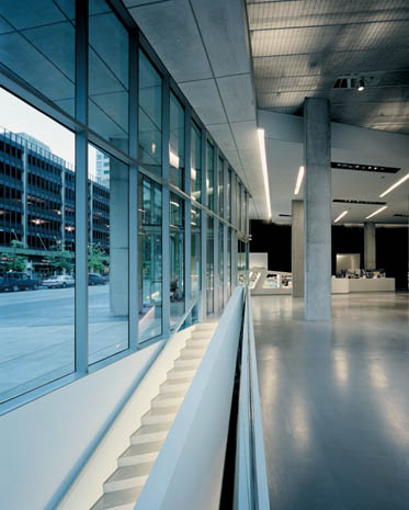
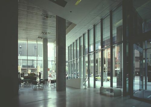
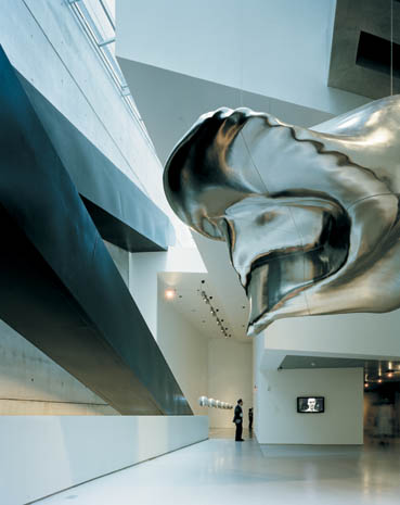
At ground floor of the lobby walls of glass is as open as can be, with a minimum of structure and no change in level between the inside and outside. This is where the idea of urban carpet takes its best. The hall of the building seems to be part of the street, with the city and other buildings across the street. Furthermore, the roof of the hall looks like a large bas be glimpsed on the upper galleries.
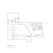
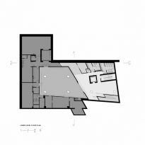
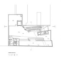
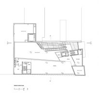
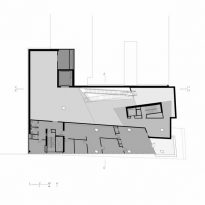
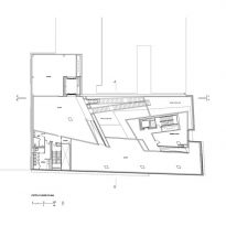
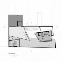
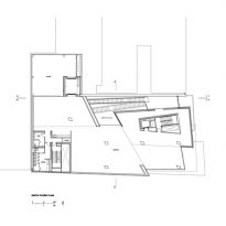
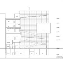
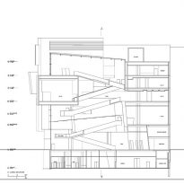
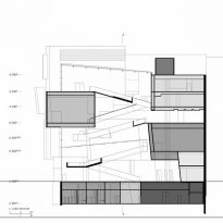
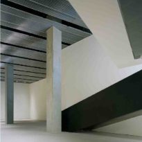
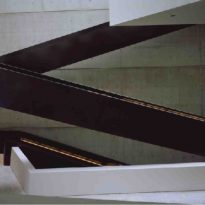
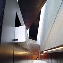
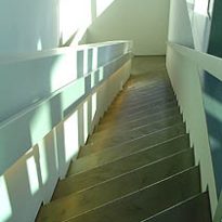
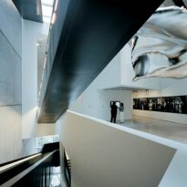
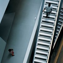
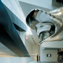
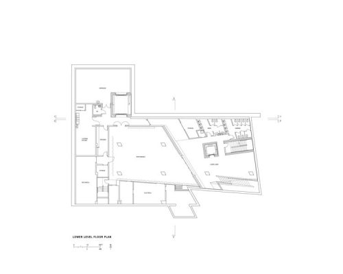
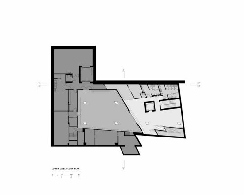
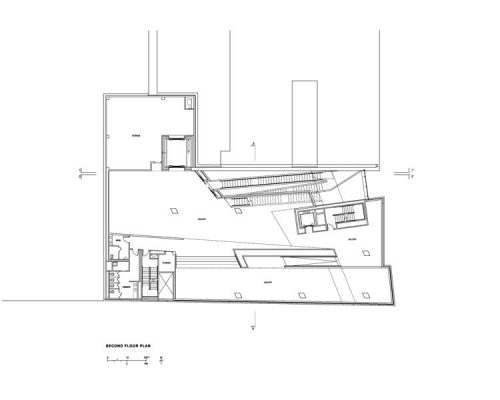
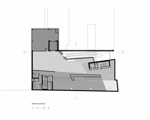
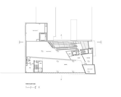
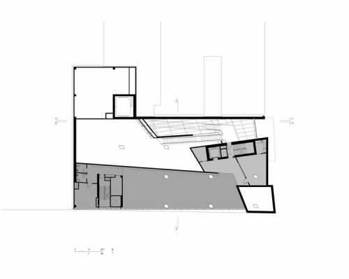
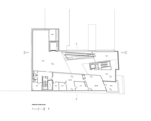
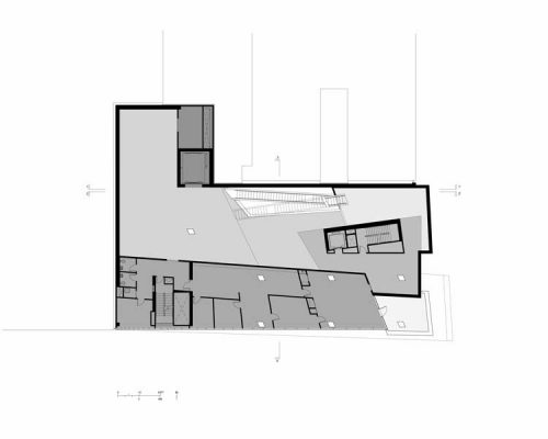
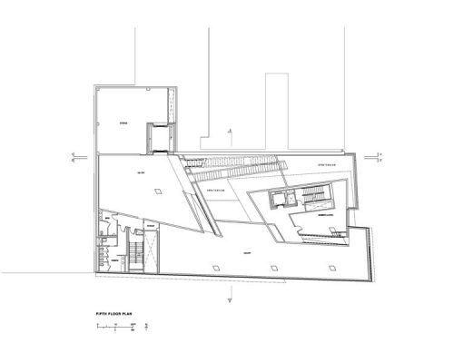
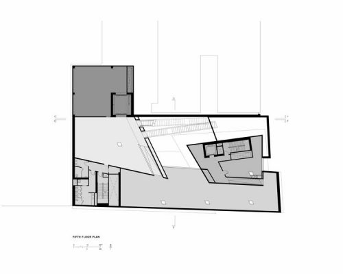
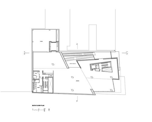
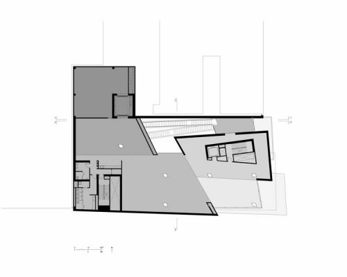
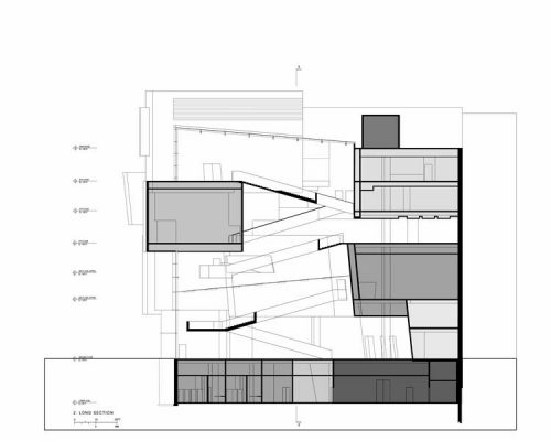
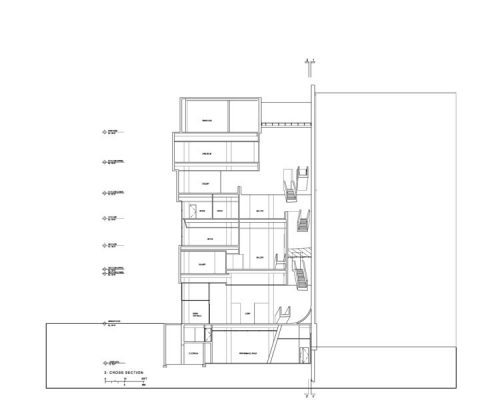
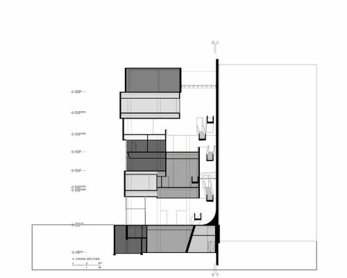
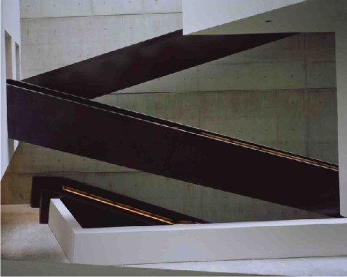
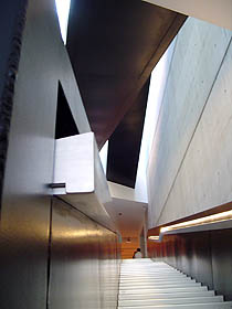
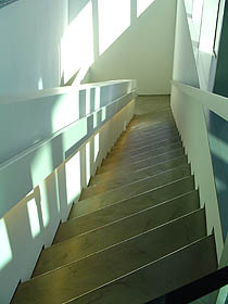
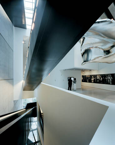
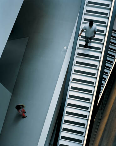
The hall takes all the heights, providing light throughout the building. A grand staircase was suspended throughout the hall, creating a clear sense of movement and dynamism. Flights through a vacuum in unanticipated long stretches and intersections of oblique and acute angles, you reach the top six floors of exhibits, while another staircase that is born of a cut in the ground, leading to the lower floors. It was through her that embodies the concept of inner city. The exhibition spaces are open from space of the staircase and the deep vacuum and watch over him.
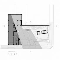
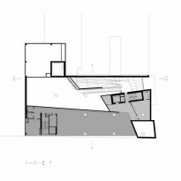
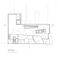
In the exhibition spaces, comprising six storeys high, is the opposite effect to the grand opening of the ground floor. Are closed to the outside and have no windows, just outside walls of concrete.
With the termination of the building and limited simply organizing the exhibition galleries, the spaces can be modified for different exhibitions and installations. The galleries are designed with varying ratios. The variety in the internal functions is expressed in the same way, in the blocks stacked on the outside. In this facade is expressed in a kind of negative stress, and suggests that reproduces the shapes of the interior.
Materials
Built in concrete, glass and steel staircase.
