56 Leonard Street
Introduction
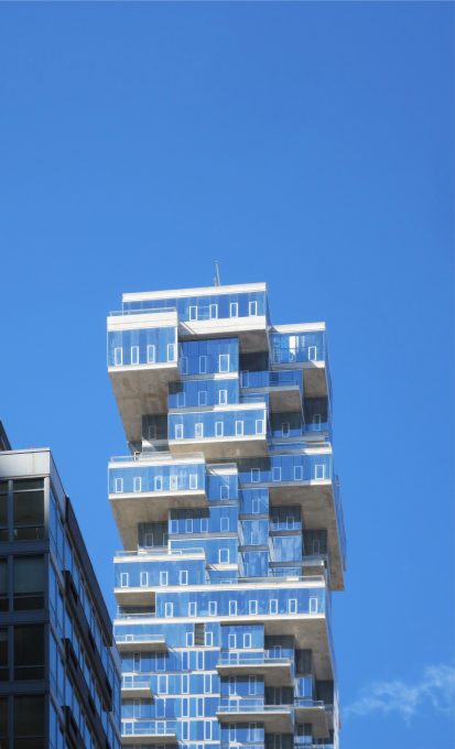
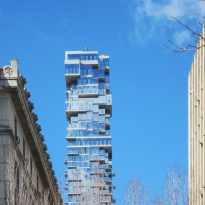
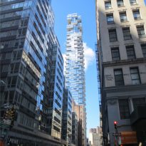
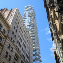
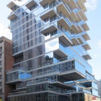
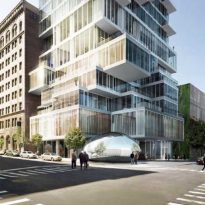
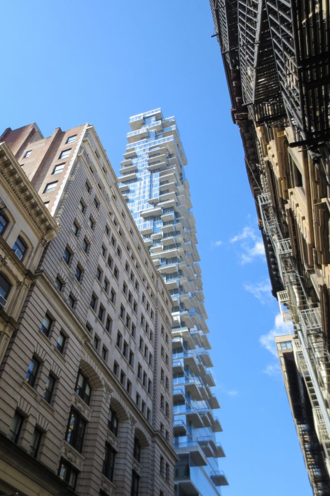
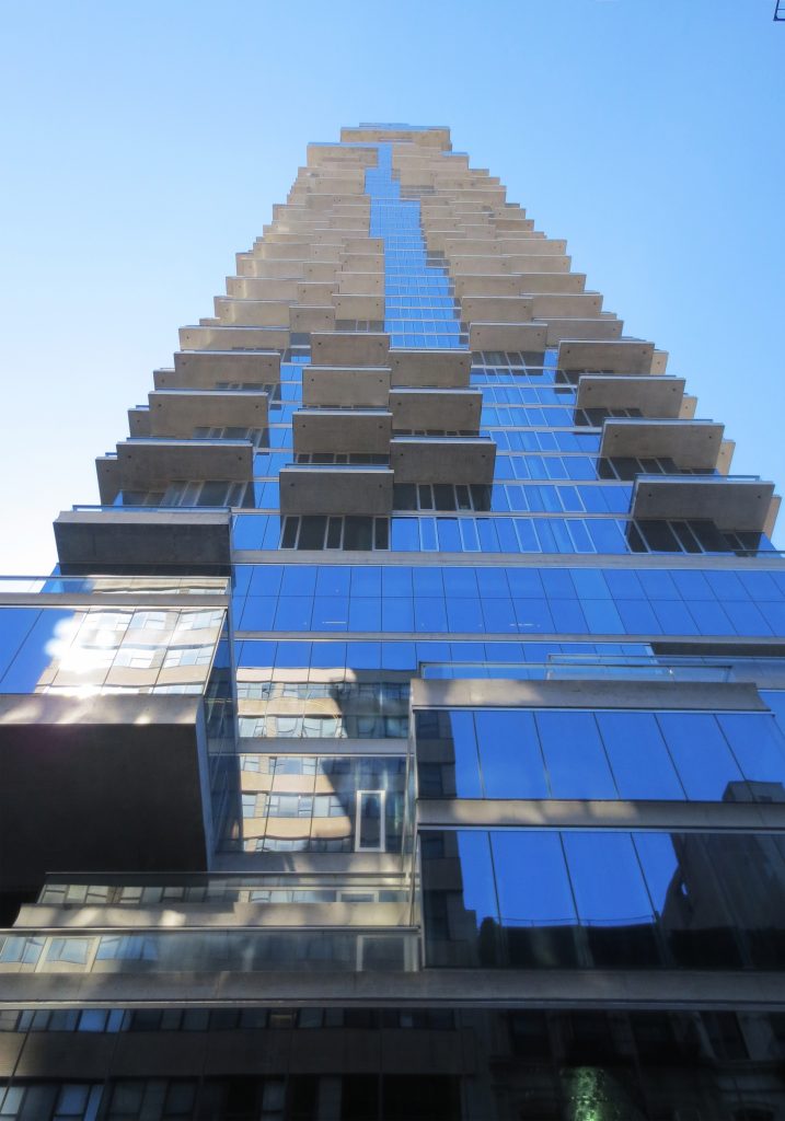
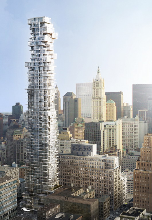
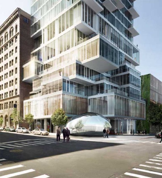
Herzog & de Meuron have erected an iconic tower on the New York skyline. The 56 Leonard Street skyscraper is a vertical expression of sculpted surfaces in glass, overhanging and shining crystals.
This is the first skyscraper built by the Swiss architects, who, although they have already faced larger projects (at least at the urban and social level), have never before had the opportunity to experiment with American construction par excellence, and that better Place for its debut that the city of the skyscrapers.
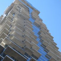
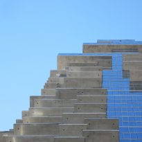
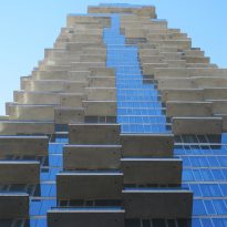
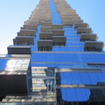
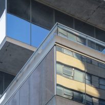
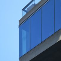
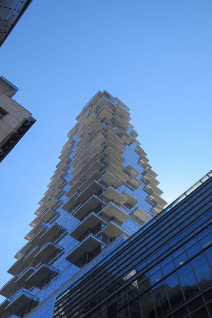
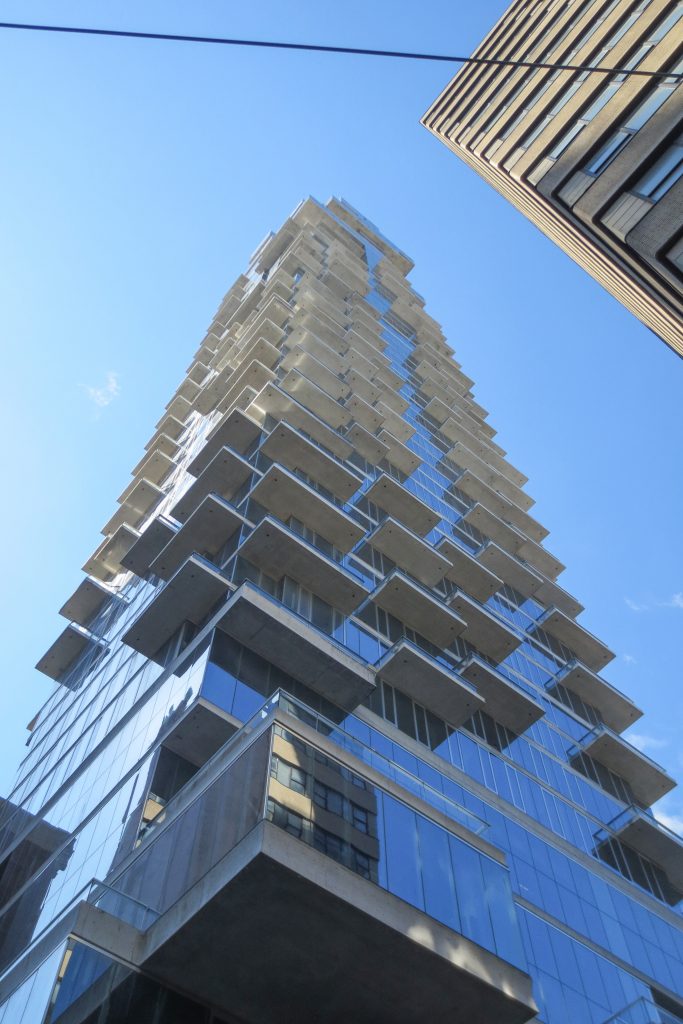
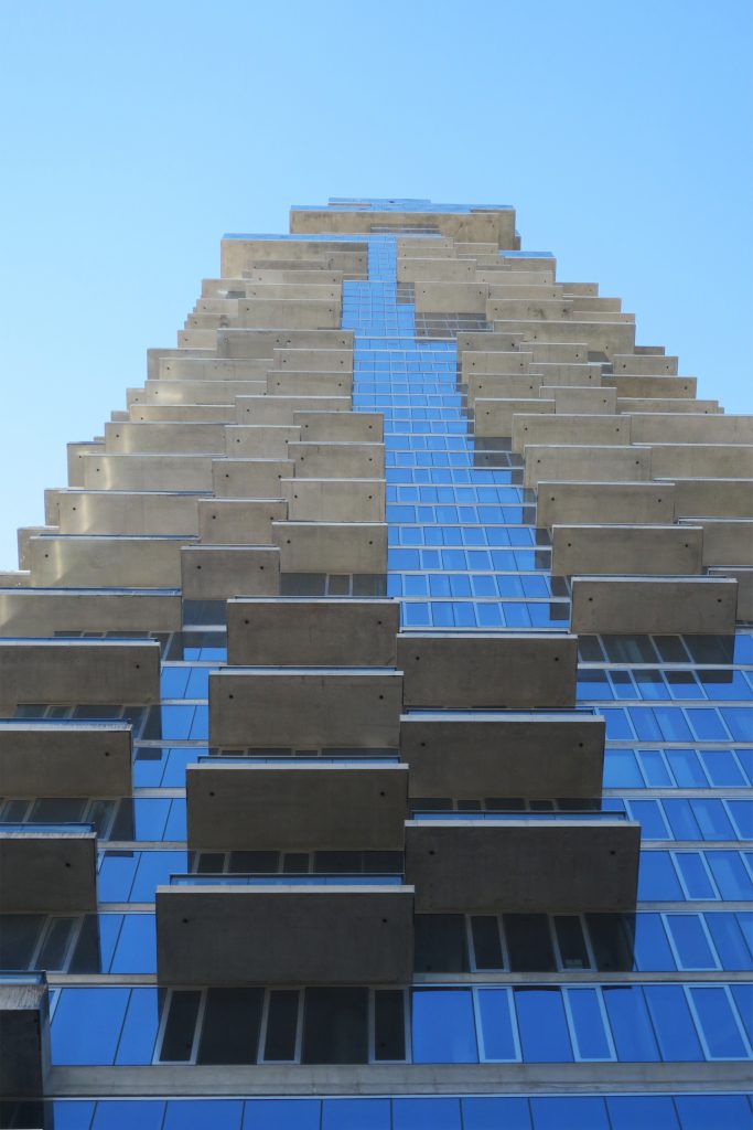
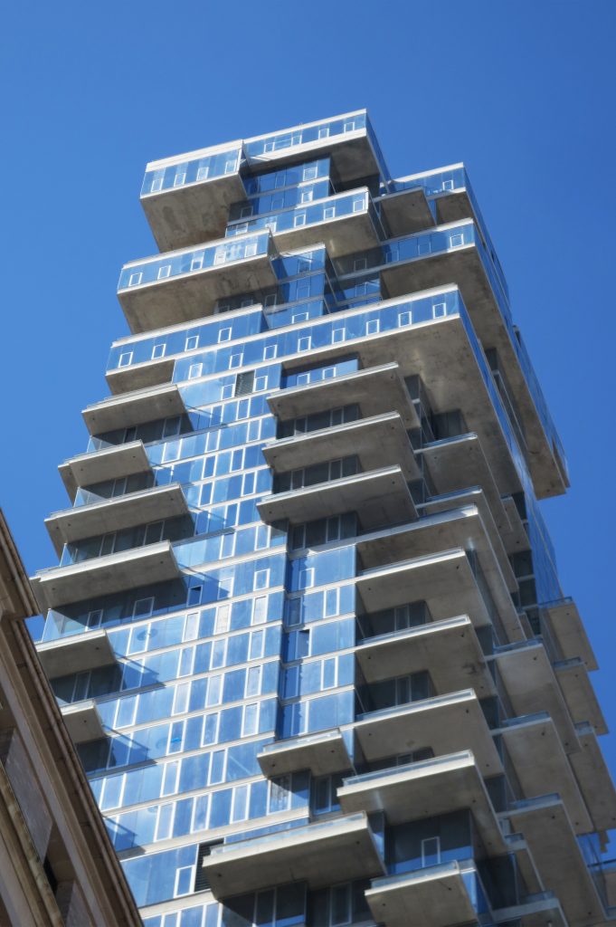
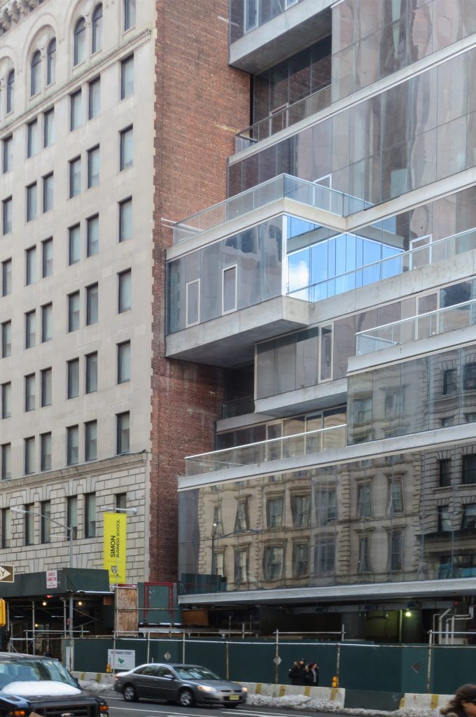
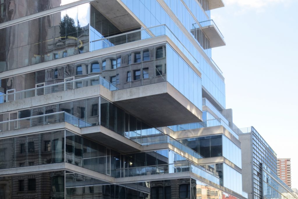
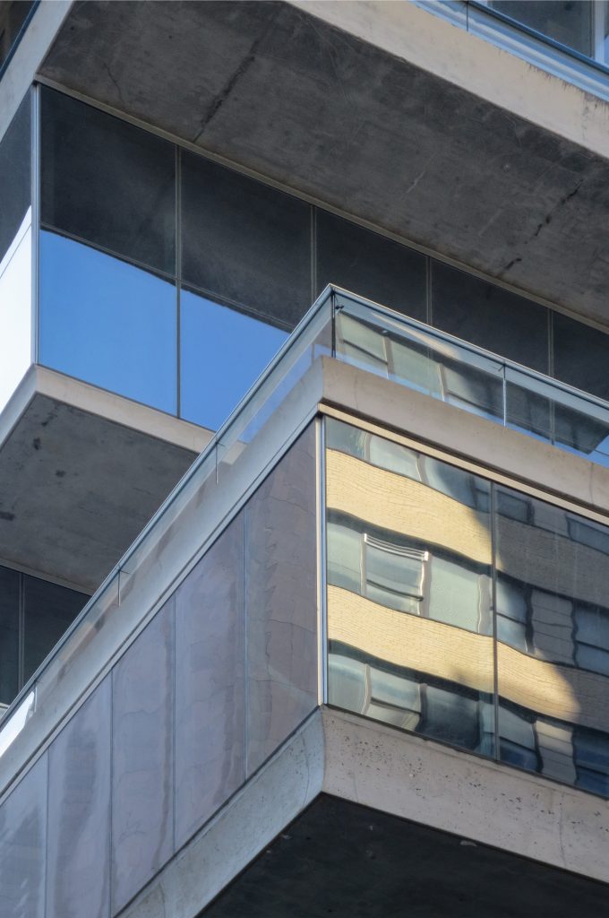
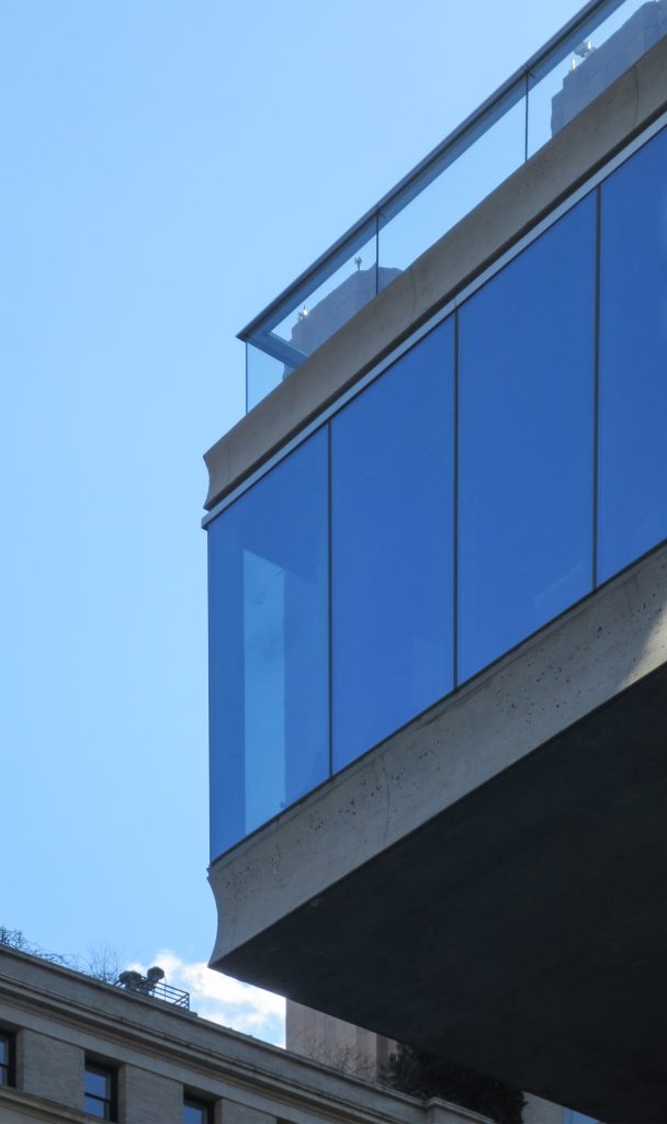
The general appearance of the tower is the result of accepting and pushing to the limit the local and simple methods of construction. As a volume, the building has extreme proportions, at the very edge of what is structurally possible, and given its relatively small surface, it is exceptionally tall and slender. The building also shows its structural “bones” and does not obscure the method of its construction under the cladding layers. The exposed horizontal concrete slabs record the floor-to-floor stacking of the construction process and the exposed concrete columns allow the scale of structural forces to be located at work from the inside. The system of staggering, recoil and pixelation is further encouraged through operable windows in every second or third facade unit. This unusual feature for high-rise buildings also allows occupants to directly control the intake of fresh air.
Although its completion was scheduled for 2010, it was extended until the end of 2016 and in the first months of 2017 there were still details to be completed
Location
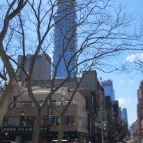
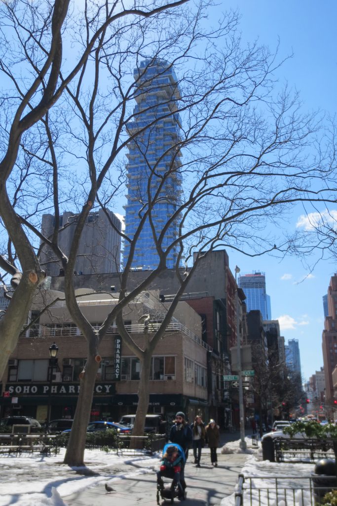
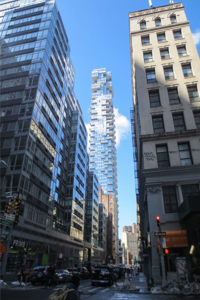
The exact location of the site is found at 56 Leonard Street on the corner of Church St, in New York‘s popular Tribeca neighborhood, the Historic District of Midtown Manhattan, United States, like many others in the image of the revolutionary Soho.
The surface of the ground on which the building is displaced is 12,954 m2 of which this only occupies 3,810 m2 in floor, the ground floor is distributed as follows: 563 m2 for commercial premises, 2,956 m2 for the gym and a room Of projections among other services.
Concept
The high-rise tower is an important ingredient within the contemporary city. However, the towers have come to be defined solely by their height and as category they have become anonymous. Typical residential towers often do not improve in the living environment. The multiplication of units within simple extruded forms produces repetitive and anonymous structures without additional benefits or architectural qualities despite the incredible densities they attain. For those living in these structures, this experience of equality and repetition can be relatively unpleasant. “… Leonard Street acts against this anonymity and repetitiveness, emanating from so many towers of the recent past. Its ambition is to achieve, despite its size, a character that is individual and personal, perhaps even intimate …” (Herzog & Meuron)
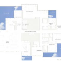
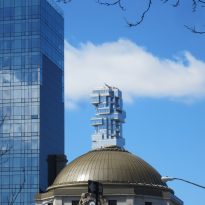
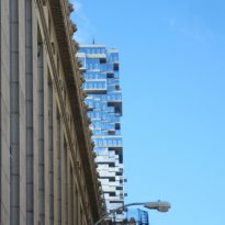
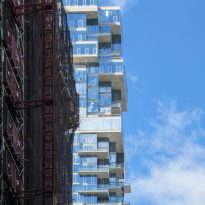
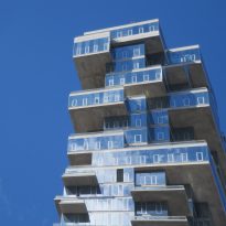
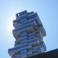
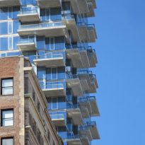
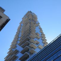
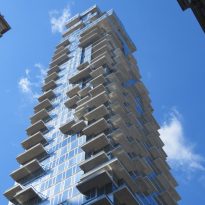
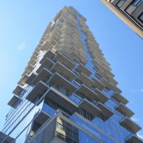
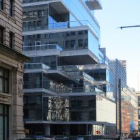
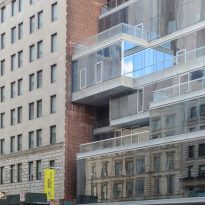
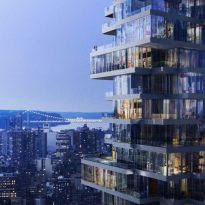
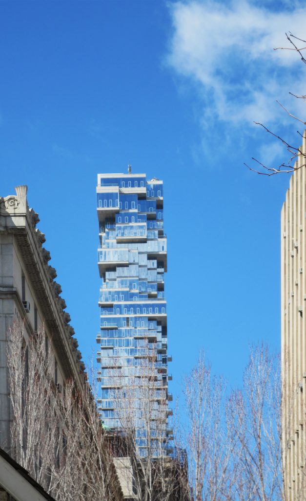
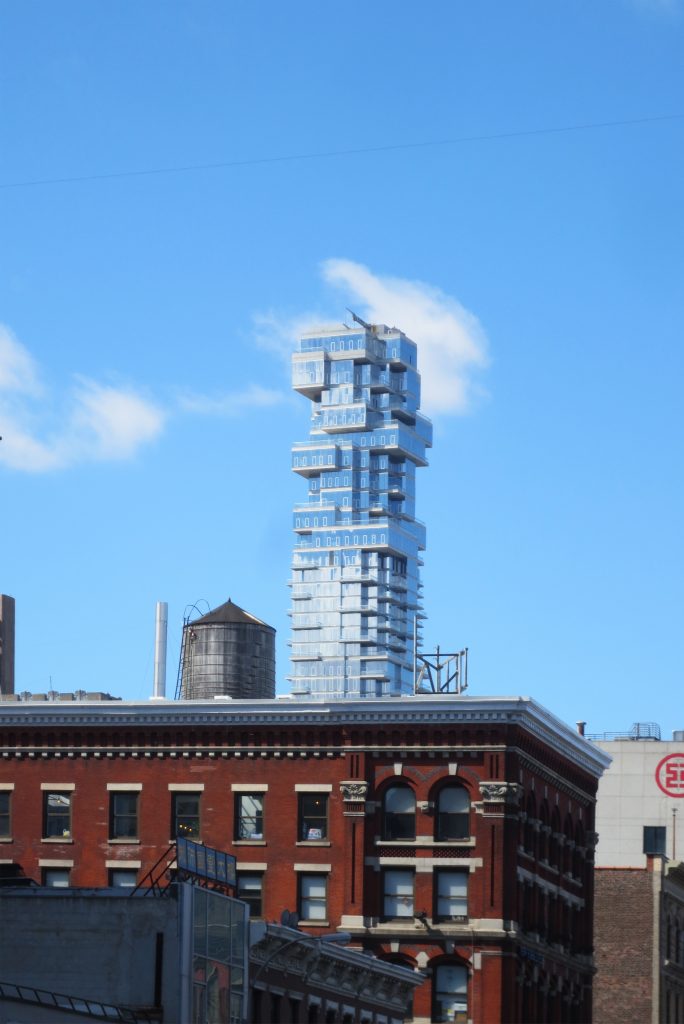
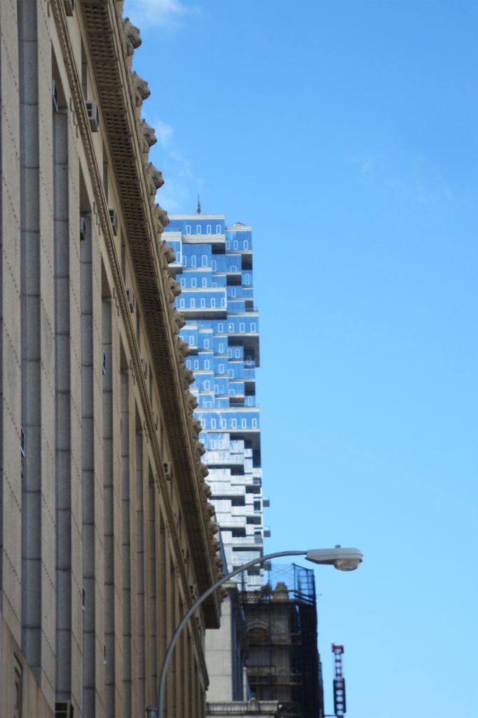
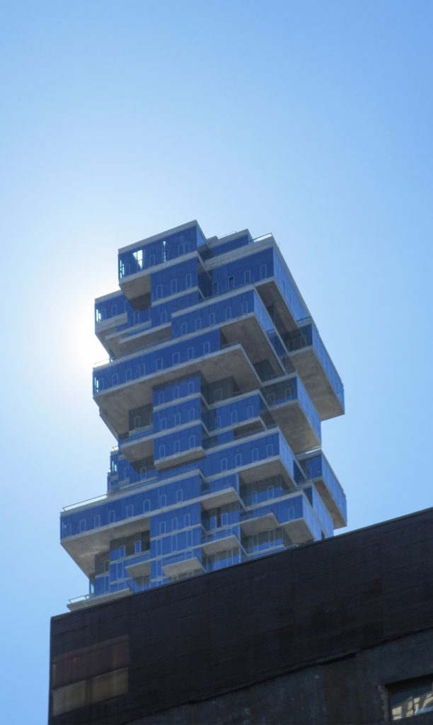
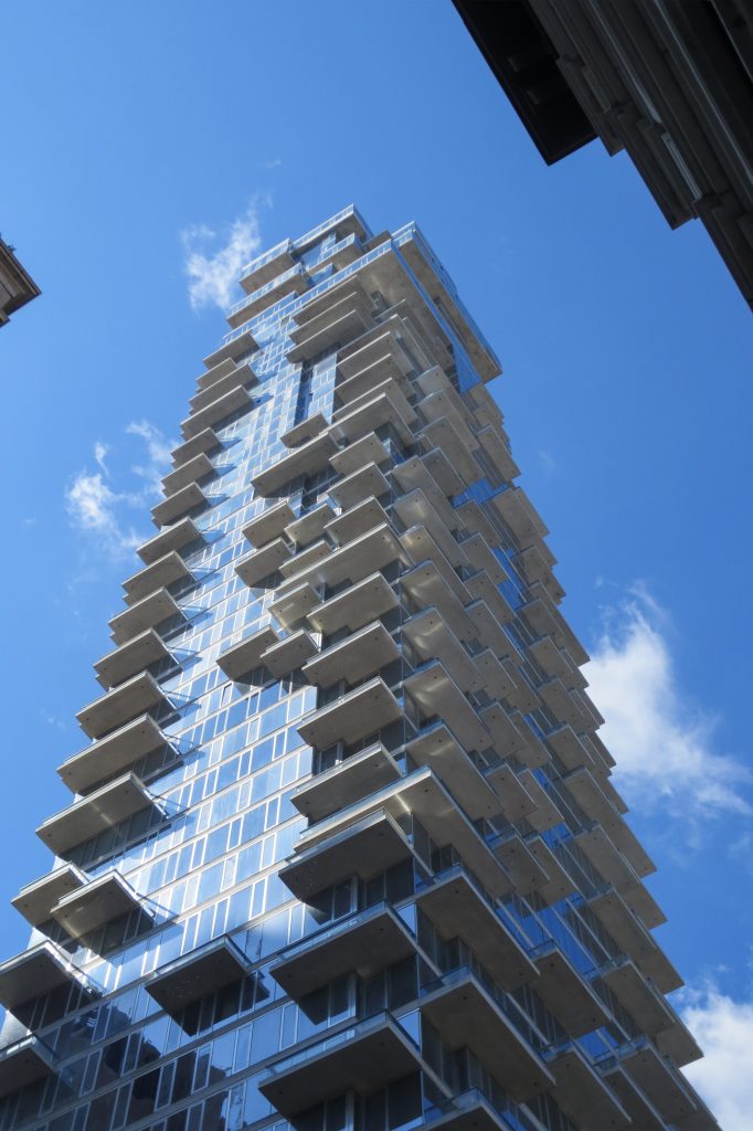
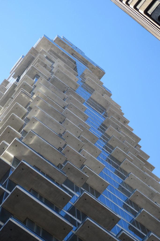
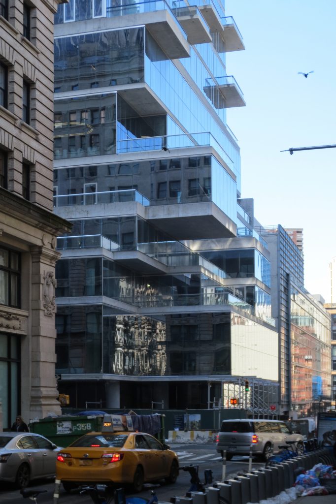
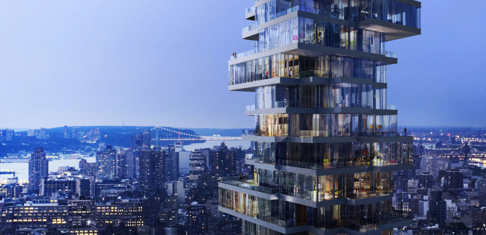
The different levels of the building rotate from the central axis and each one of them is cantilevered with which they generate a series of balconies that appear like a great pile of pieces of “Lego” made of glass. The irregular arrangement of the blocks causes each of the plants to be different.
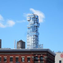
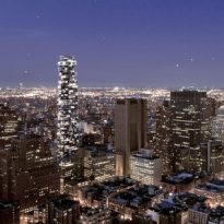
The cantilevers that make up the building offer a jagged silhouette that can be seen for miles around, even in the midst of the large buildings that make up the Tribeca district in Manhattan.
Spaces
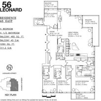
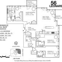
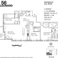
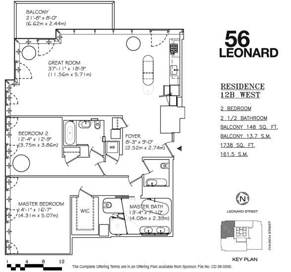
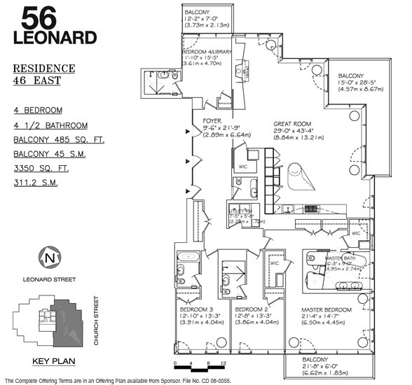
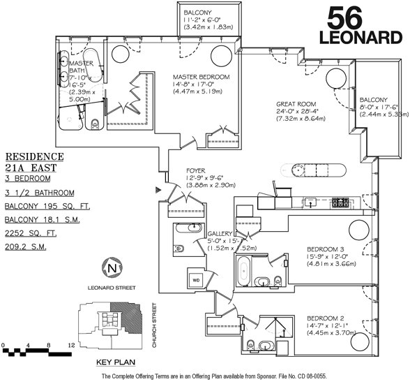
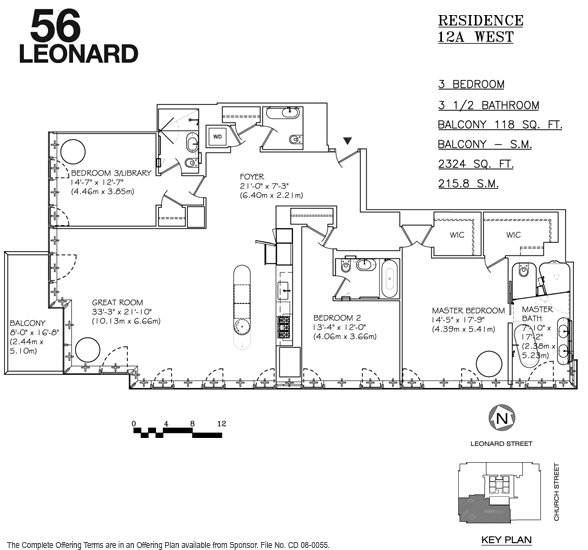
The tower houses 145 residences with a single floor and exterior space whose cost was estimated at the beginning of the project between 3.5 and 33 million dollars. The sum of these apartments stacked upwards, thought as luxury residences, results from a complex shape filled with unique spaces, balconies and views. Only 5 of these residences are repeated.
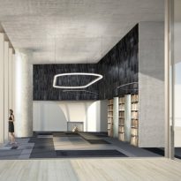
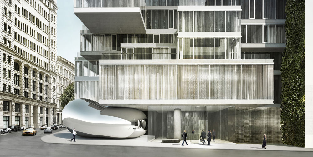
The double height lobby is located at street level between a brilliant sculpture by the artist Anish Kapoory made of stainless steel on the east and a vertical garden in the west. The sculpture resembles a large drop of mercury that tries to sneak into the building. It is the first sculpture of the English artist to be exhibited permanently in New York City.
On the second level of the building is a private parking.
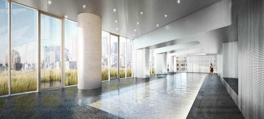
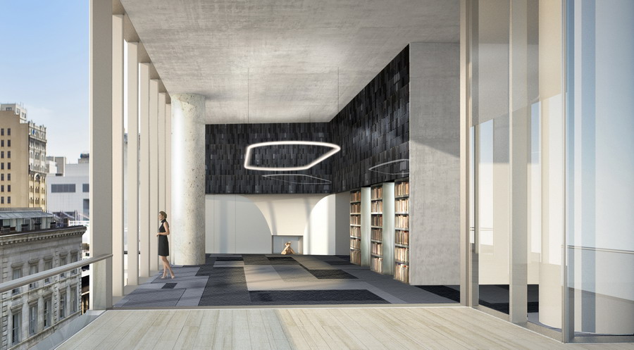
The next four floors of the building, which the architects have termed as “The Townhouses”, are articulated in such a way that they relate to the immediate context as well as the recreational spaces that include a pool and a covered terrace, a movie theater, A conference room and a gym.
Penthouses
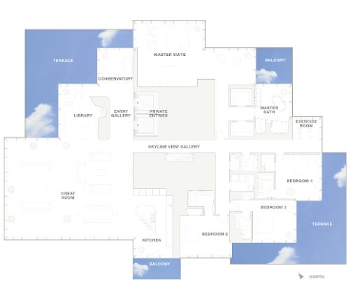
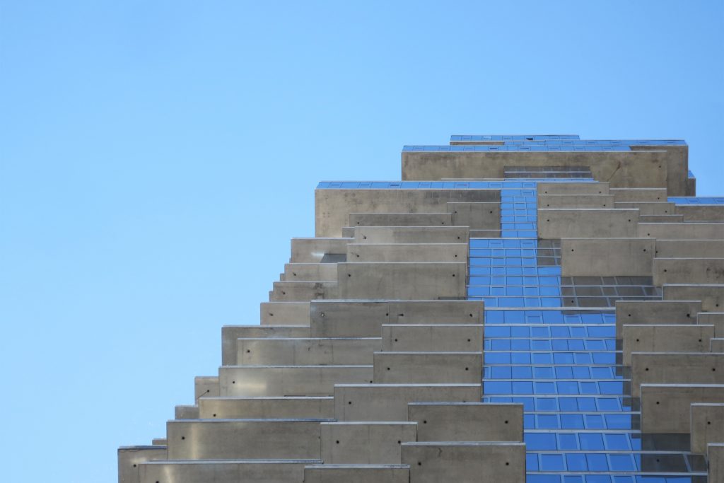
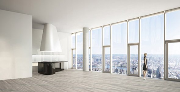
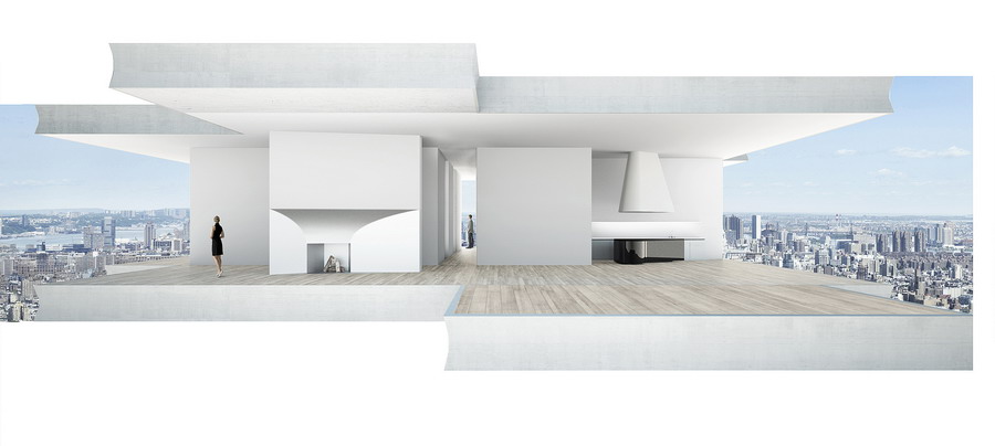
The last 10 levels of the top that give the appearance that they were simply stacked correspond to the 10 Penthouses ranging from 1,112 to 1,944 square meters each. The upper part of the building is the most expressive part of the project. In these Penthouses are the largest overhangs. Each of the top 10 floors, known as “Villas del Cielo”, is occupied by a single apartment, with views on all sides and without knowing who are below or above them.
This expressiveness is driven directly by the demands of the interior, consisting of ten large-scale penthouses with large open spaces and spacious living areas. These large components of the program are recorded on the outside as large-scale, cantilevered and displaced blocks according to internal configurations and the desire to capture specific views, which eventually gives rise to sculptural expression of the upper part.
Herzog & de Meuron has commented that its intention is that with this design, the users of this building can establish a dialogue with the outside, with the small houses and the old buildings. However for many New Yorkers, this structure, like many others that have been designed in recent years will make the city a space similar to the images of Blade Runner.
Structure
Each floor plate has to be able to hold, so we had to treat each one in an innovative and imaginative way(Hezi Mena de WSP)
The project is conceived as a pile of individual houses, where each house is unique and identifiable within the total “pile”. Careful research into local construction methods revealed the possibility of moving and varying slabs to create corners, overhangs and balconies, all strategies were designed to provide individual and different conditions in each apartment. At the base of the tower, the “stack” reacts to scale and specific local conditions in the street, while the top is wobbly and undulating to merge with the sky. In between, the staggering and variation in the middle levels is more controlled and subtle, as in a column axis.
“… Each floor plate has to be able to hold, so we had to treat each one in innovative and imaginative ways …” (Hez Mena of WSP)
The structure apparently chaotic from the outside is very simplified by making the overhangs of some plants perfectly compensate with those of others, keeping the center of gravity in the center of the building.
Structural solutions
The solution of the engineering team is to use a very strong and hidden concrete structure to allow a fully glazed exterior with views from almost every angle. The central core is attached to the outer columns by the stabilizers at mechanical levels 32 and 46. At the top is the “pool”, a buffer filled with 130,000 liters of water to temper the movement of the building by the wind.
That the cantilevers withstood was one of the biggest challenges for the engineering team. For the smallest, the thickness of concrete slabs provides sufficient support. For those of 4.57m there are additional beams, and for the largest, a Vierendeel beam, a perpendicular column that engages on two floors, without obstructing the designs or views. Throughout the structure, there are many “walking columns”, where loads are transferred from one place to another as they progress down the building. In the apartments there is no dividing wall.
Pixelated
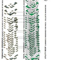
To break the trend toward repetition and anonymity in high-rise buildings, this project developed from the inside out. The project began with individual rooms, treating them as “pixels” grouped floor by floor on a base. These pixels come together to inform the volume directly and shape the exterior of the tower. From the inside the experience of these pixels is like entering a series of large windows.
The strategy of ‘pixelar’ rooms is also repeated in the section, creating a large number of terraces and balconies projected. While avoiding looking directly into a neighboring apartment, these outdoor spaces provide indirect visual links between people, perhaps unknown, who share the building. These houses in the sky, together, form a cohesive pile, a vertical neighborhood, somewhat similar to the specific neighborhoods of New York, with its distinctive blend of proximity and privacy in equal measure.
Materials
The structure will be materialized in reinforced concrete, with glass facade, steel and aluminum. The building completes its exterior cladding with Travertino marble and Thassos marble
Interior elements such as white enameled steel sculptural chimneys accentuate the shape of the floor and the undulating black lacquered kitchens are the counterpoint to the orthogonal geometry of the floors.
Videos
