40 Bond Street

Introduction
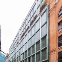
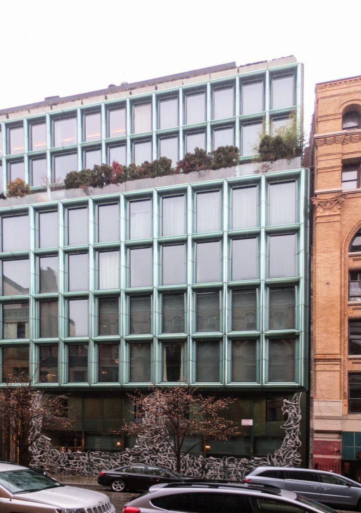
40 Bond Street is the name and address of the first luxury residential project by Herzog & de Meuron and Handel Architects in the NoHo neighborhood of Manhattan.
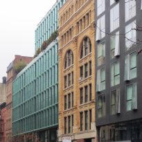
Swiss architects Herzog & de Meuron, are known for their minimalist and modern compositions, but in this project in collaboration with the New York study Handel Architects, delivered a very ornamental design inspired by the buildings of the district, richly ornamented with details cast iron. Since its completion in 2007, the building 40 Bond Street has become one of the most important icons of the current generation architecture of the city of New York.
Location
This striking building is located at 40 Bond Street in historic NoHo (short for North of Houston Street), in New York, United States
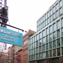
Bond Street in NoHo, extends from Broadway to The Bowery in Lower Manhattan. It is a quiet street paved with cobblestones, and home to a particular architecture. Less than a decade, Bond Street was a small side street today is known for its luxurious and modern condominiums that blend with the architecture of yesteryear. This street fashion has been labeled by real estate agents as the most architecturally significant in Downtown.
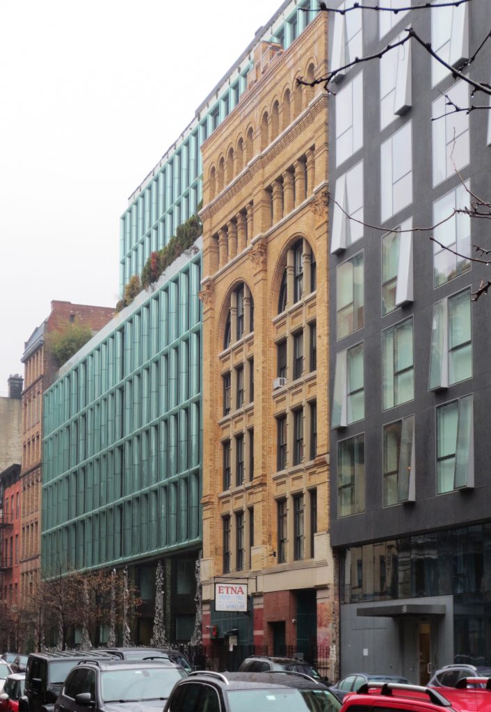
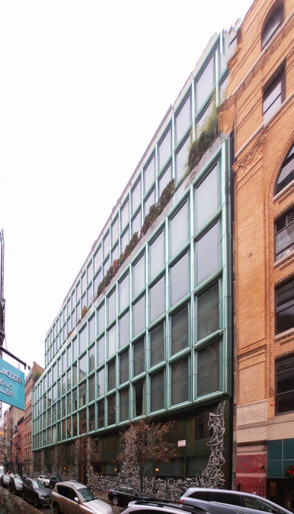
The place was built the building occupies five narrow, typical batch of New York. It is embedded between houses “brownstones”, warehouses and lofts, which vary considerably in scale and proportion.
Concept
The idea of the architects was to stack two different types of spaces for living, the townhouse and apartment block.
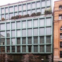
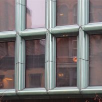
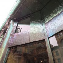
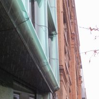
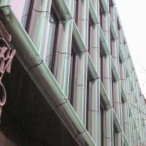
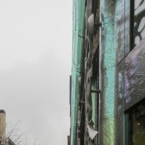
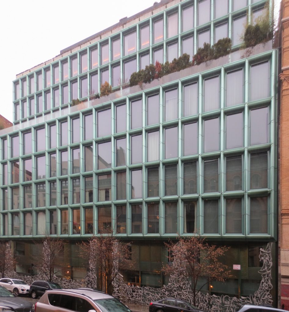
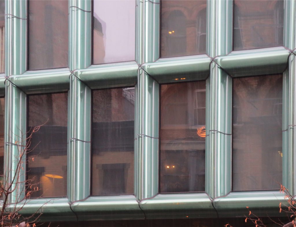
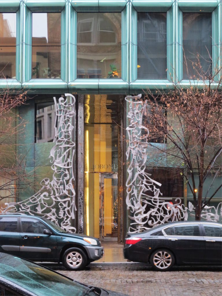
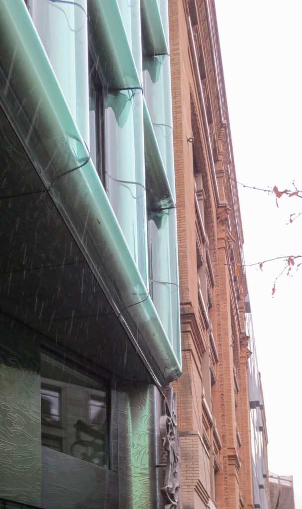
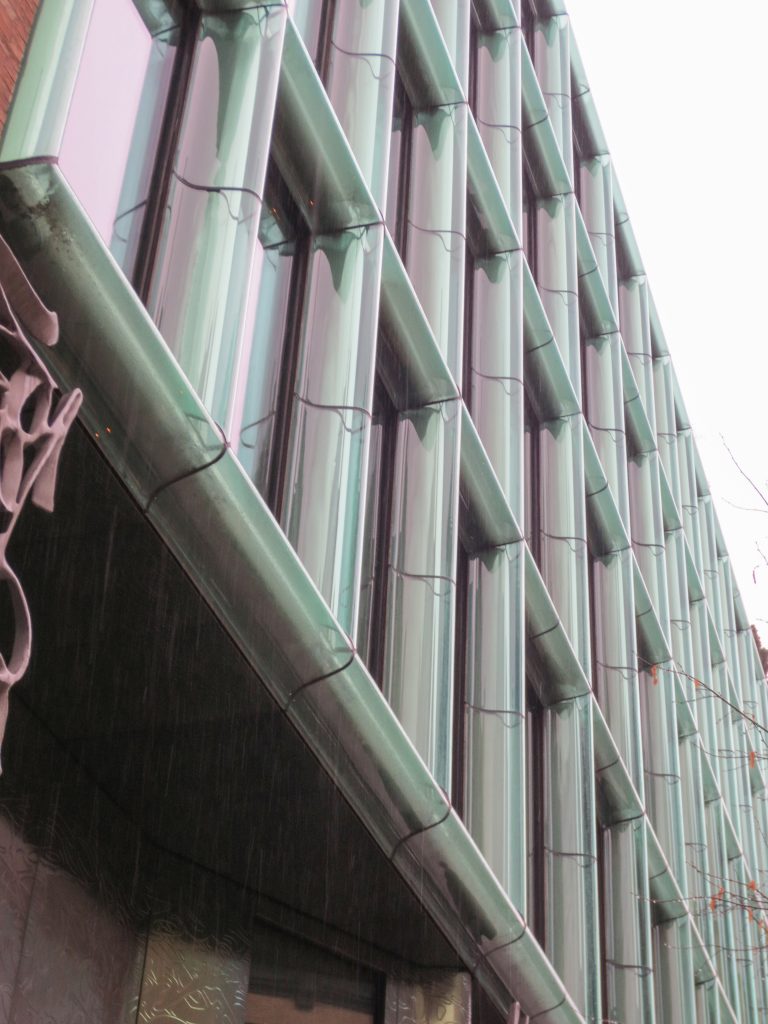
In this design Herzog & de Meuron and Handel Architects undertook a radical reinterpretation of traditional construction with cast iron. Stiles bell shaped glass placed in front facade make a subtle reference to the existing cast iron facades in the neighborhood, hiding the underlying support frame.
The design of 40 Bond Street is based on your environment without trying to imitate, is a reinterpretation of ancient elements in the neighboring facades complex and contemporary forms.
Spaces
The architects divided the 7731m2 built in 28 units located in two different sectors: 5 “townhouses” and 23 departments, including an attic, spread over 11 floors.
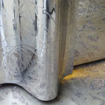
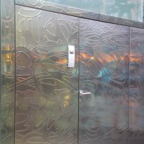
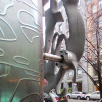
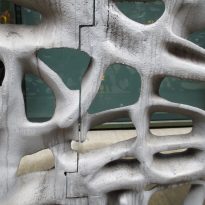
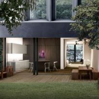
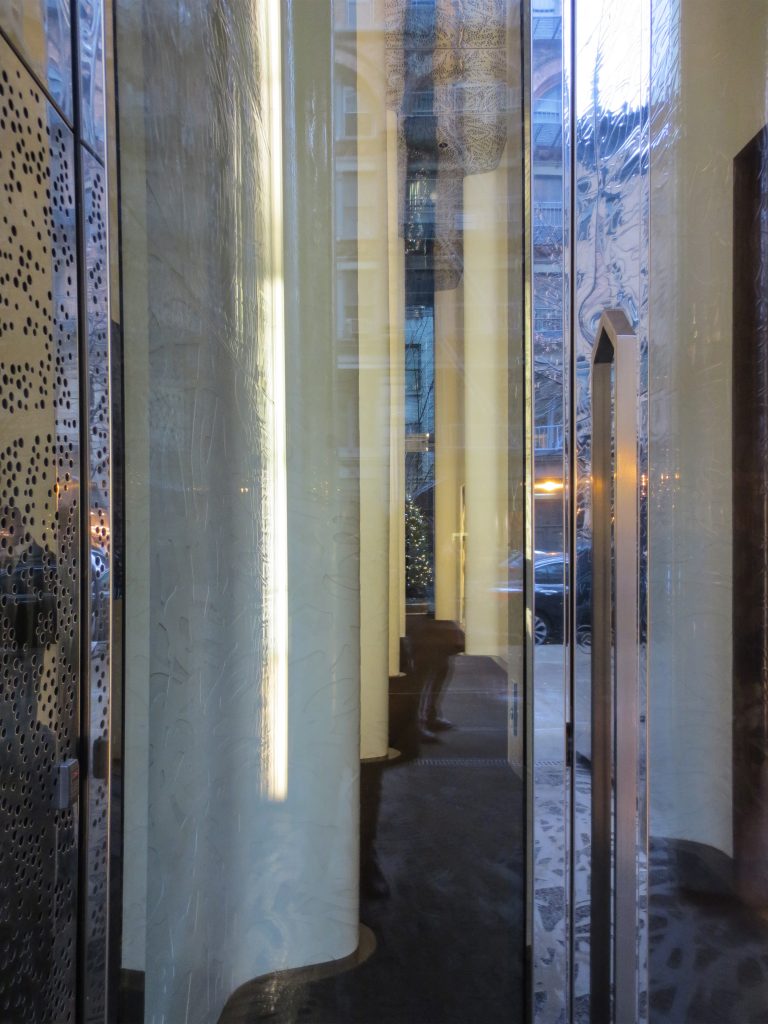
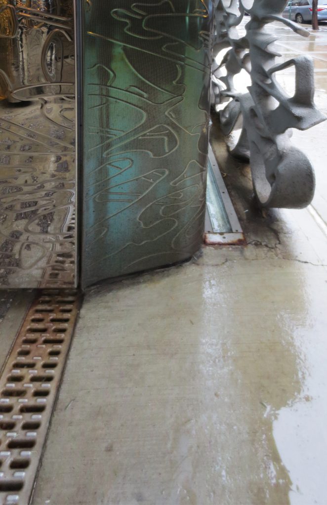
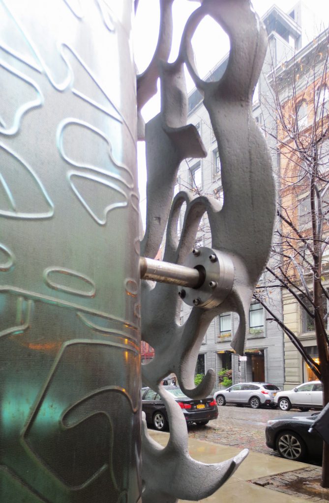
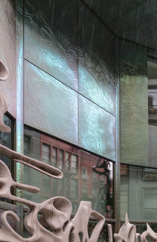
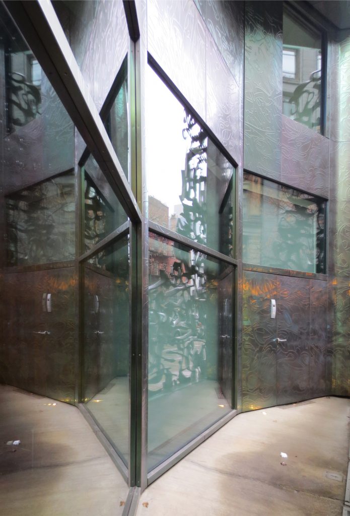
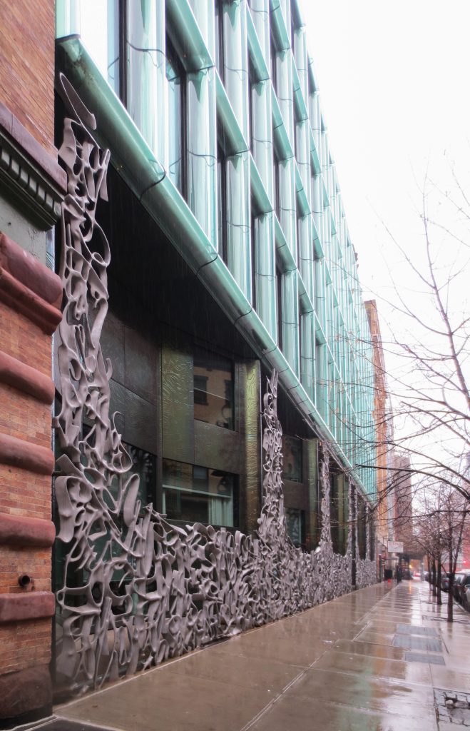
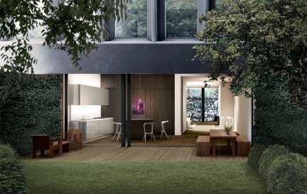
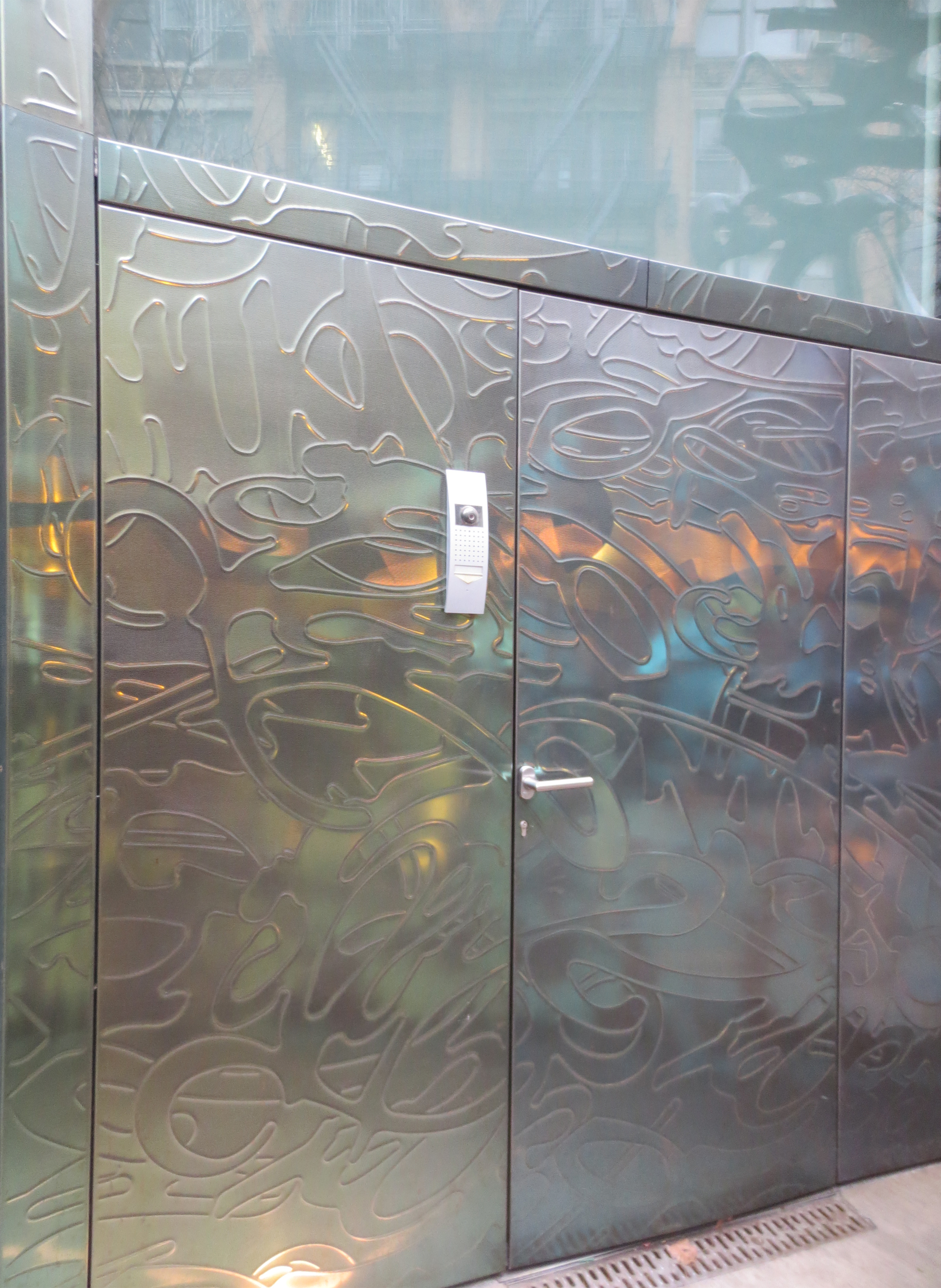
” ‘Townhouses’ ”: This model duplexes occupies the first two floors. Each of the townhouses has a private entrance on Bond Street, as well as individual private front and rear gardens. The architects and engineers worked together to design almost invisibly massive doors of the houses, which enclose 7.62ma bays along the street. For residents, these doors avoid sitting in their duplex and windows. “… The houses are designed to be read as a different part of the building…” said the architect Saheba of Handel Architects. Behind the doors, a concave chamber, paneled stainless steel 0.3cm thick, attached to the building with clips “Z” serves as a small porch area. The same pattern of graffiti general door, was mechanically hammered, using a CNC router in stainless steel panels, giving a pattern of decorative surface with a light volume
The entrance hall to the departments, a narrow, double height cut, is among the Three and Four houses and connects the street with a small community garden in the back.
” ‘Department’ ”: the 23 apartments spread over 8 floors higher.
” ‘Penthouse’ ”: This special piece crown the lower 10 floors.
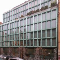
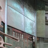
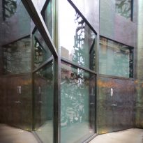
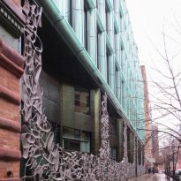
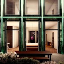
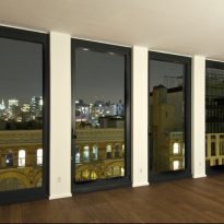
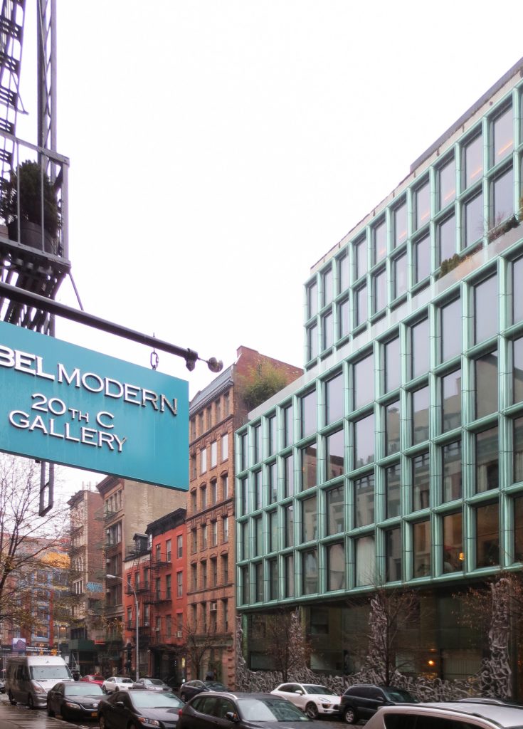
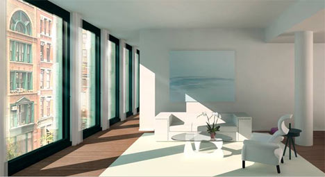
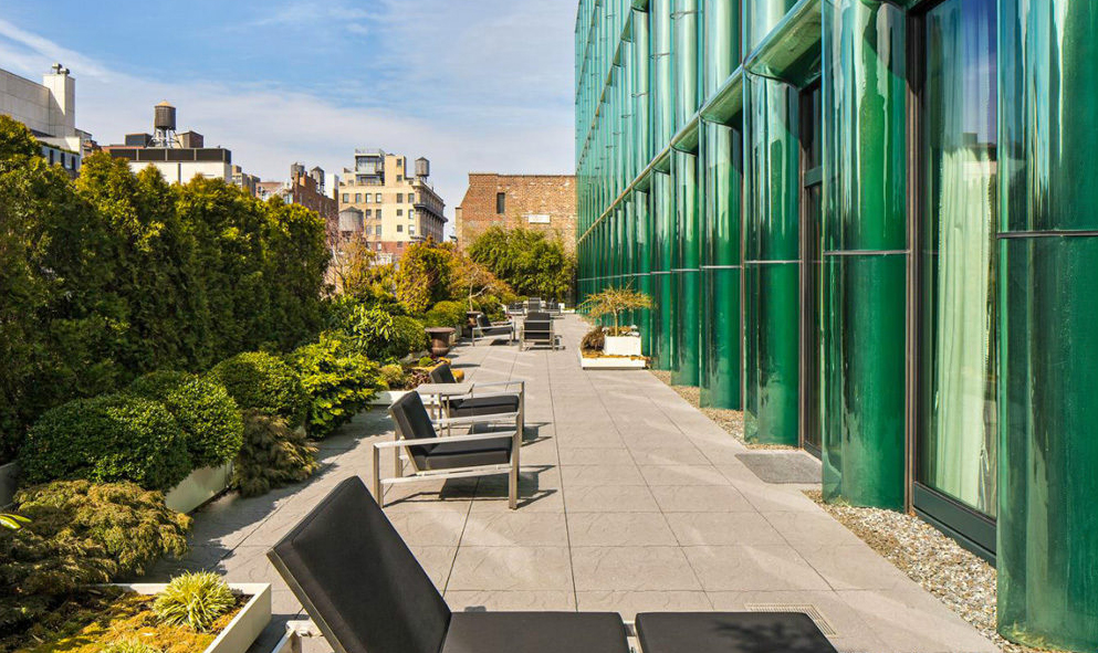
The design of the facade reflects this division in the program. The upper floors are raised from the design of cast iron downstairs, showing windows that go from floor to ceiling in a grid of green glass bottle with flared studs.
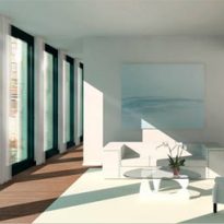
Inside, many of the main bathrooms have large windows to the outside and are organized in narrow and high bays, reminiscent of the city of New York. Sink, shower and tub are partially embedded in the walls, creating intimate and cozy niches. The separation of dry and wet areas and the selection of wood and Corian as a finish for each emphasizes and enhances its specific use.
Facade
All appear to be a monolithic front panel, which is composed of multiple layers, “… a rainscreen wall window on…”
- Doors
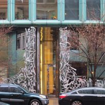
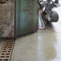
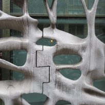
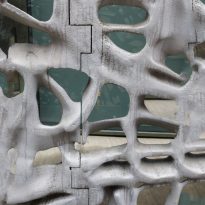
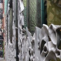
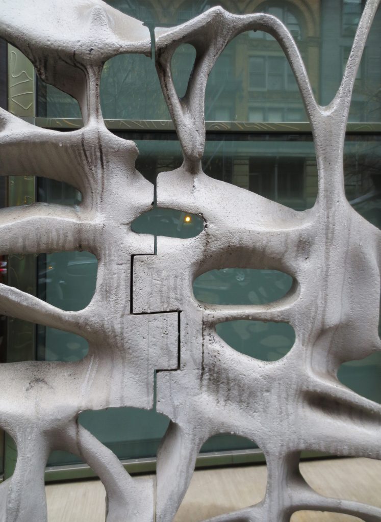
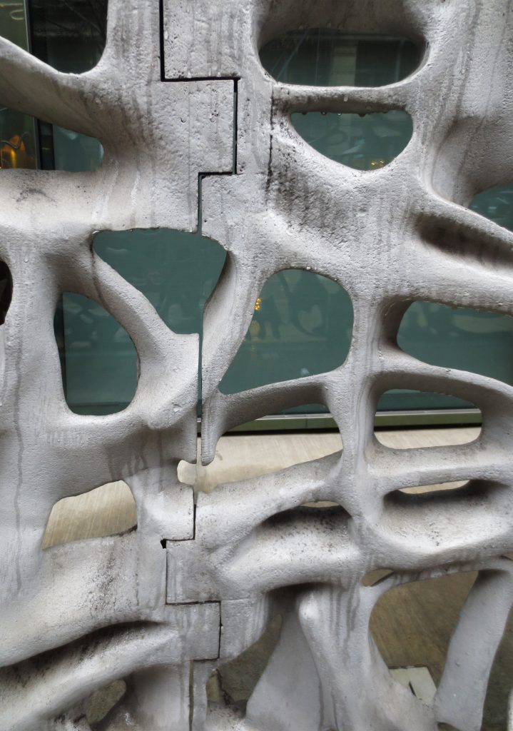
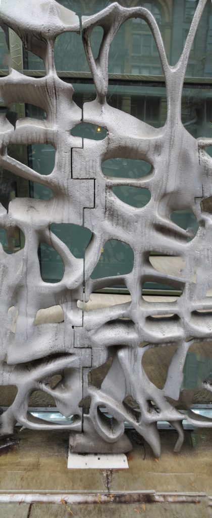
On the ground floor, the facade facing the street, is characterized by huge doors made from cast aluminum 42.62m long inspired graffiti in the city of New York. Rich in details, the doors form a pattern filigree providing privacy and security to the residents of the houses at street level.
Structure
Description
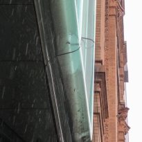
The apartment block is stacked on top of houses and forms a support across the width of the site. Its design is a reinvention of the building cast iron found through NoHo and SoHo. The structure is pushed outwards and follows the grid of the large bays of windows from floor to ceiling. This introduces a depth to the façade on the outside and inside free independent columns. Slabs and columns are coated with smoothly curved glass covers, which wrap about the structure and can be read as a continuation of the crystals.
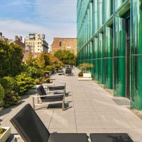
On the one hand the skeleton and bones of the building are expressed, on the other, merge into the glass surface in the bays of windows and dissolved in a game of translucency, light and reflection. The color of the building is the color of crystal, with its many shades of green, depending on the light, the viewing angle, thickness and arrangement of layers of glass.
Materials
Aluminum doors, steel plates, curved bottle-green glass, called by the architects “bells” and blackened copper used in building facades create a rich architectural experience.
Ground floors
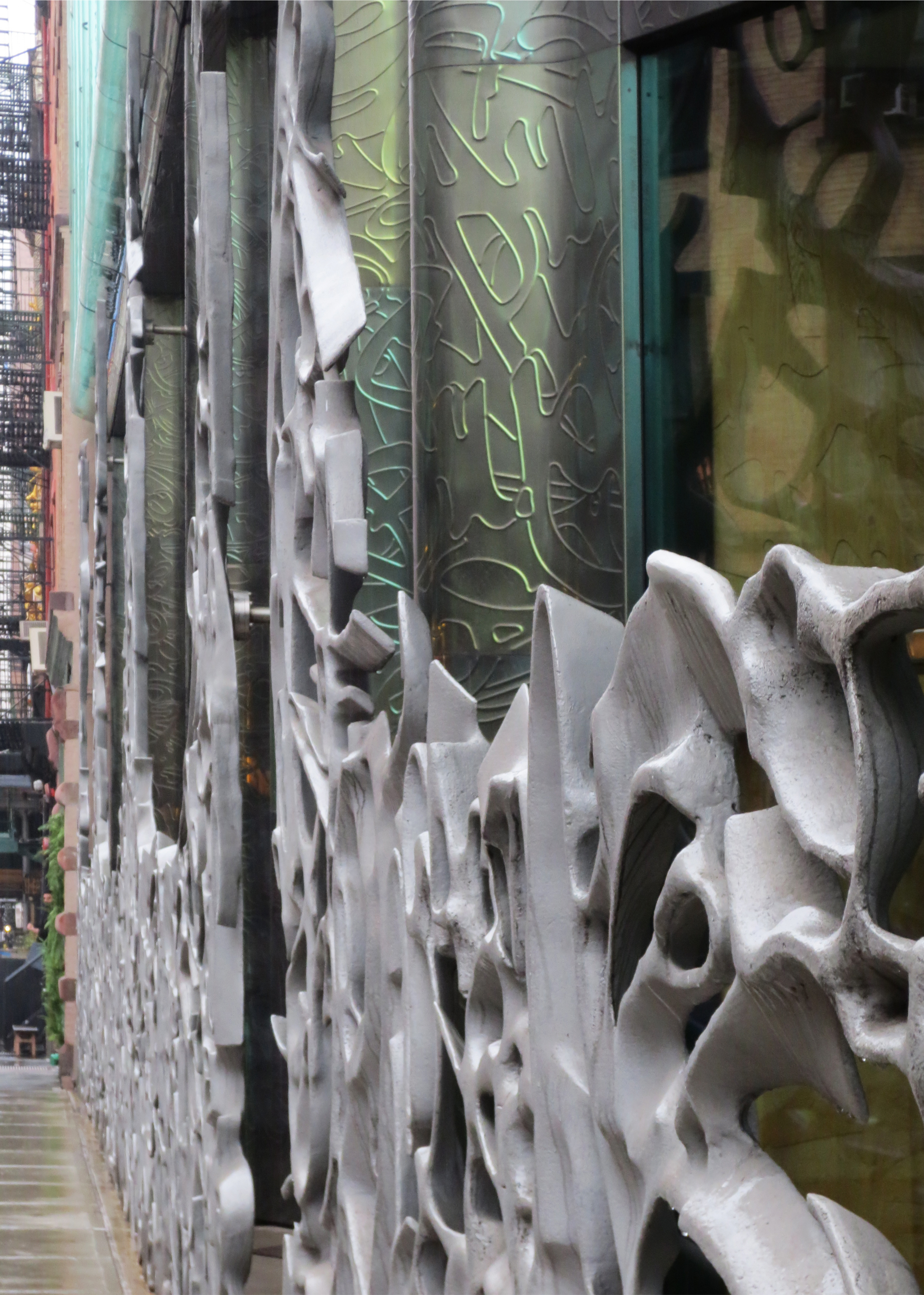
The fronts of the first and second plants are located at the conventional height, in terms of glass coating is concerned. Doors of molten aluminum rich in detail and form a filigree pattern inspired by street graffiti in the city, offering privacy and security for residents with homes at street level, whose front is covered in embossed copper.
- Molten aluminum doors
These doors were performed by architects, in collaboration with the designer and manufacturer EXYD of Munich. Based on photographs of graffiti made on the walls of the city, the architects of scanned and converted into vector files.
EXYD digitally combines the images to create the unique pattern, a kind of controlled chaos swirls of graffiti. Then add depth to the pattern to generate a three-dimensional digital model. A CNC milling was used to transform the digital model in a model-scale foam. Then the foam model was packed into a mold with wet sand where it was pouring molten aluminum, instantly merged with foam model, filling the cavity with what would be the final model.
Tall plants
- Windows
Operable windows are included in the insulating glass panels and forward Viracon, with a green tint to meet the shading coefficient. These glass plates are anchored to the building structure forming a wall window. Rain screen is constructed with aluminum support frames attached to the windows with silicon.
- Glasses “flared”
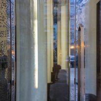
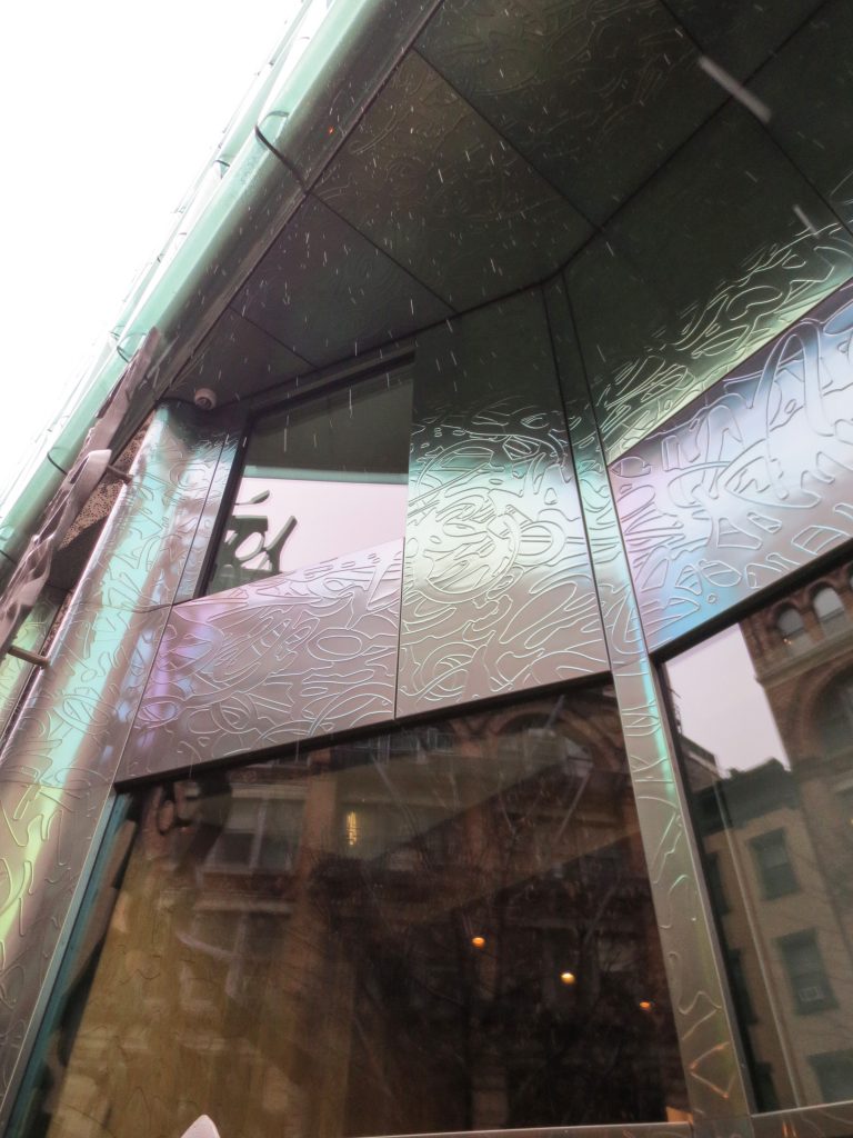
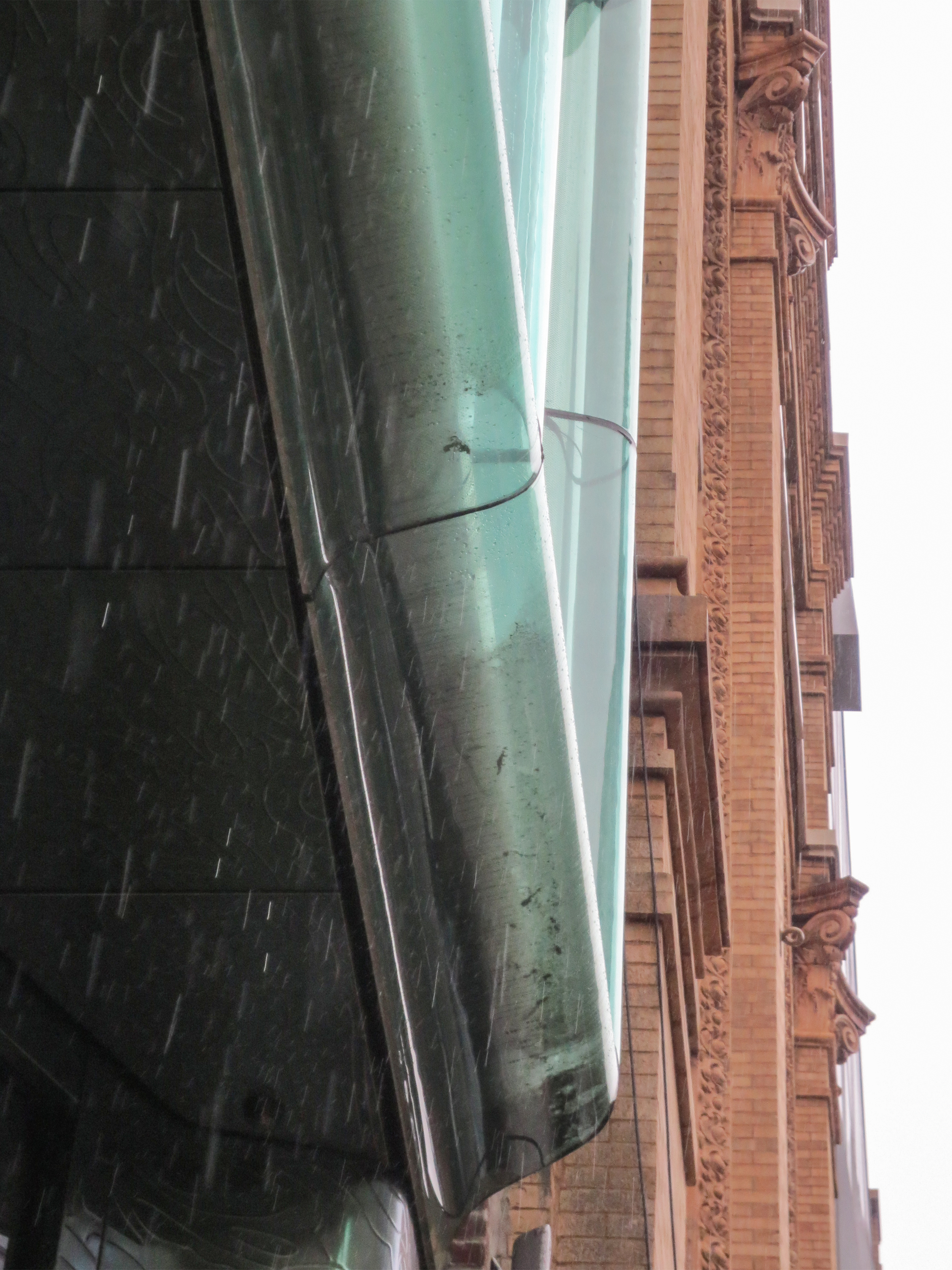
A decorative steel plate with mirror finish, covering the support frame and are crowned by the “bell” green glasses, also attached with silicone to windows. These curved glass have varying thicknesses and hide the frame, are opaque at the edges and become clearer over the apex of the bend. Angle seen from these crystals reflect curved steel plates, making them as reflective as chromium.
From other points of view, the glass is simply reads as glass, which because of its unconventional application is sufficient to attract the stares of passersby. Ashesh Saheba, Handel Architects architect says: “… We wanted the building to have the appearance of being Shrink glass…”
The entire facade was installed piece by piece by ornamental ironworkers using mechanical lifts.
North facade
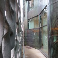
The elevation of the rear facade, north, echo facing the street but uses only the blackened copper, a little cheaper material, instead of flared glass in the “rain screen” is made. Copper, however, will change over time to develop a green patina, bringing it closer to the color of the south facade facing the street.
This tension between the south side bright and dim northern part creates a fascinating contrast that remains in harmony with their environment. In a contemporary design rarely allows for this type of long-term vision.
Video
