21st Century Museum of Contemporary Art, Kanazawa

Introduction
The Museum of Contemporary Art of the 21st Century, Kanazawa, has been established with the mission of generating a new culture and revitalizing its community. Innovative urban planning has become extremely important for our society that faces a historical turning point in the 21st century. Through the spirit of cooperation, the Museum seeks to awaken the creative energy of Kanazawa and become a compelling cultural attraction for the region.
The cost of building the museum was 8.4 billion yen (1.6 million yen per square meter), which could be considered standard for such a project. However, when considering the investment with respect to museum visitors, it is noted that it has provided unprecedented benefits to the city of Kanazawa. The Museum of Contemporary Art of the 21st century, Kanazawa, which has achieved fame as a unique museum for being a bold initiative, has more than two million annual visitors.
Location
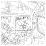
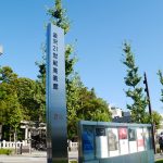
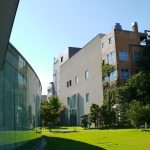
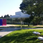
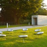
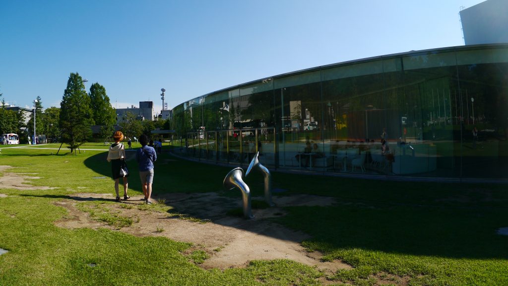
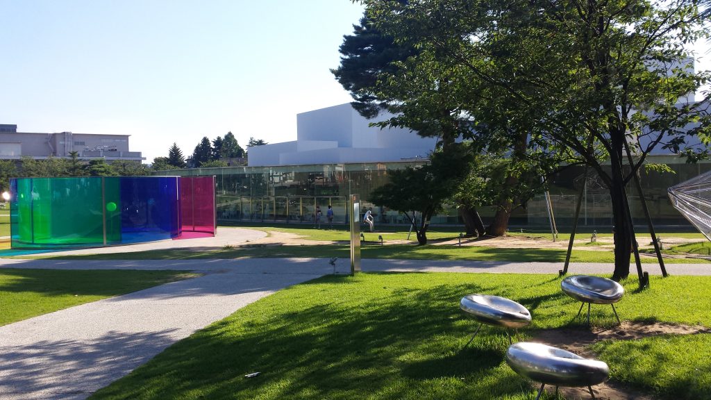
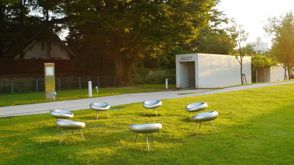
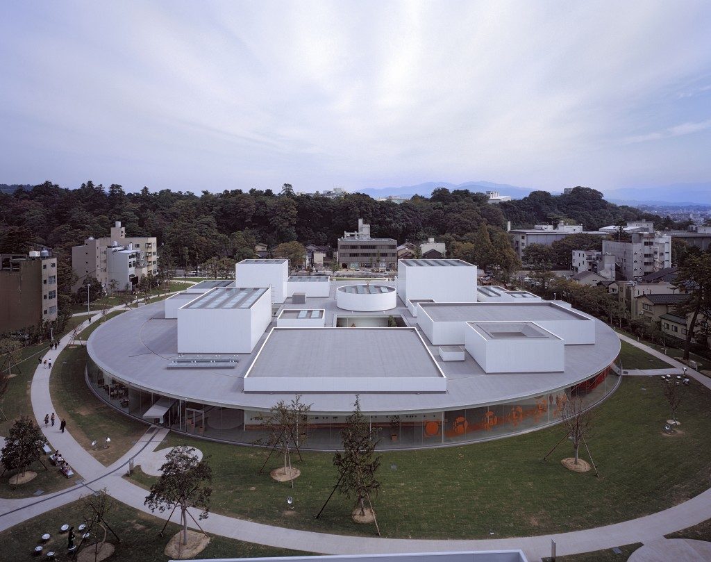
The Museum of Contemporary Art of the 21st century is located in the center of the city of Kanazawa, in Ishikawa Prefecture, Japan, near the Kenroku-en garden, considered one of the three most beautiful gardens in the country, and the Museum of Art from Ishikawa Prefecture. The building is located in an irregularly shaped park that has become an extension of the museum, as some of the works of art have been installed in it.
Concept
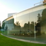
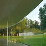
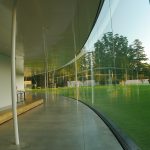
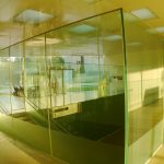
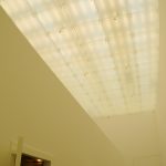
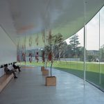
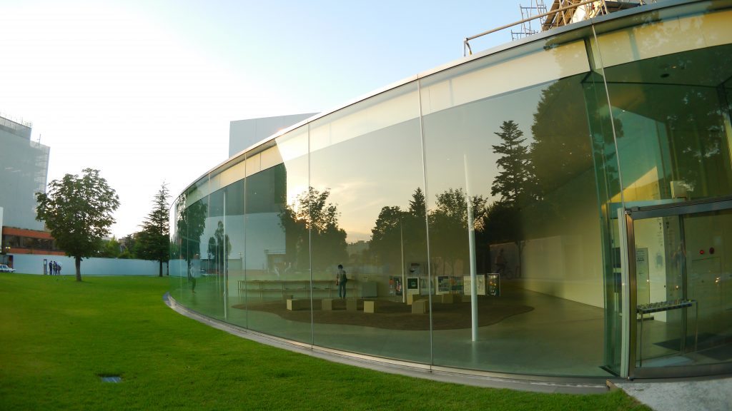
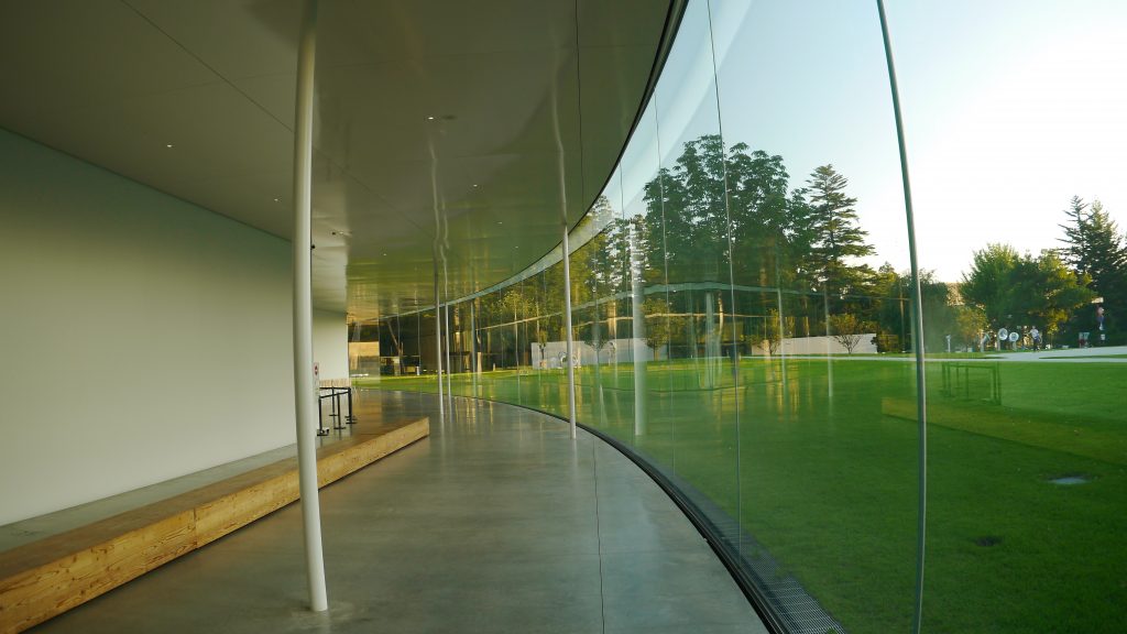
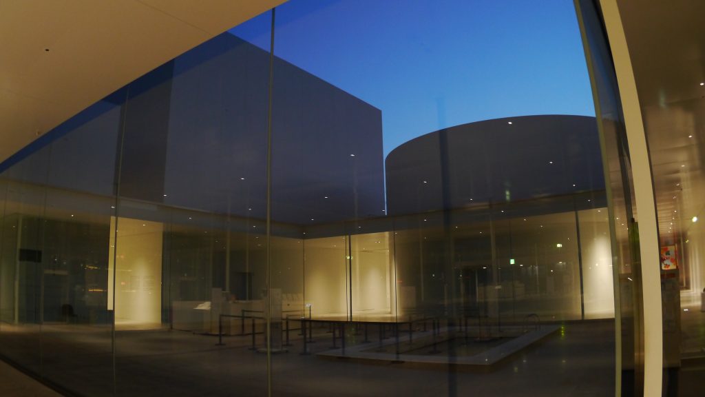
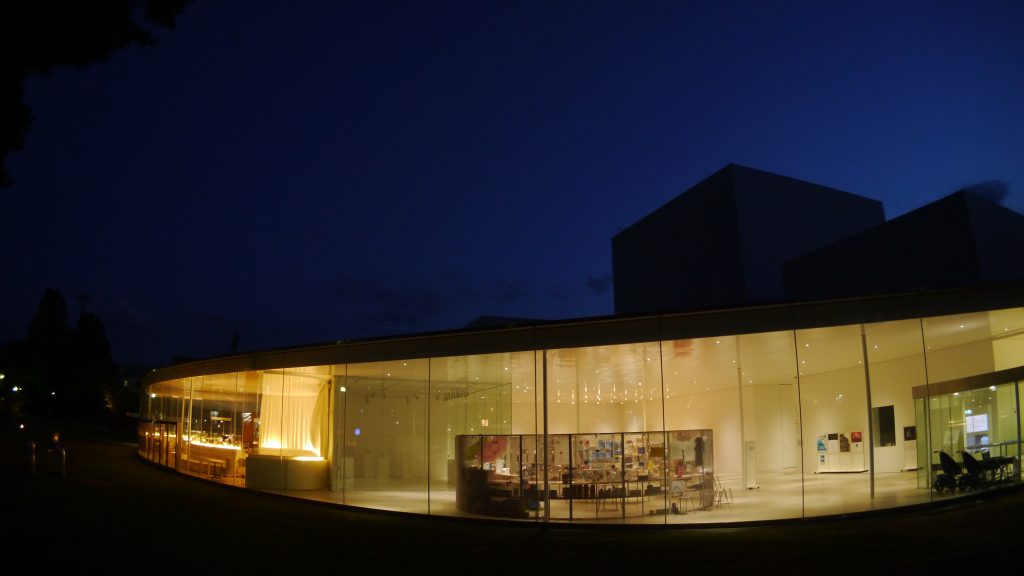
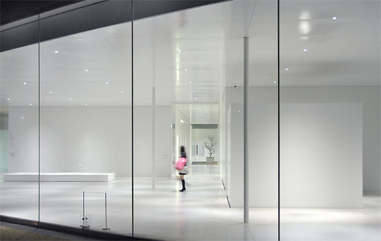
The museum is designed as a park where people can meet at any time. The glass circle results in an ambiguous spatial definition, a kind of reversible membrane, through which visitors can feel the presence of the other. The museum pays special attention to the opening and brightness of the courtyards covered with skylights. The aim of the museum is “chance”, “enjoyment” and “accessibility”. The transparency of the building further manifests the desire to prevent the museum from being perceived as a great introverted mass.
Program
The museum program includes meeting spaces, reading room, library, workshops for children, restaurant, service and exhibition areas. With these benefits the complex had to offer public spaces for the benefit of the local population and payment spaces that would help maintain the facility.
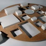
SANAA‘s challenge was to create a balance between these two domains, blurring the boundaries between public and private areas, and for that purpose they proposed a mixed-use design, organized around four courtyards. The interaction with the public space is such that sometimes the circulation acts as an exhibition area.
Spaces
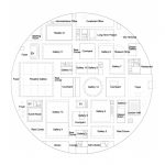
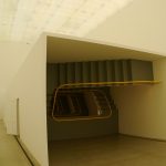
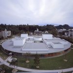
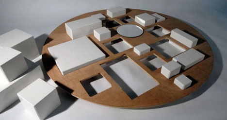
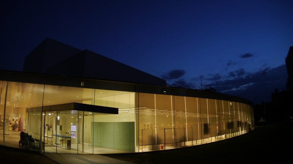
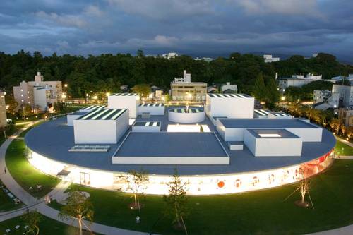
Formally, the museum is created by a series of boxes in different areas, levels of opacity and height, which reach between 4 and 12 meters, and that are inserted in a circular glass lining with a circular cover, joining the external environment. The circular plan of the Museum is 112.50 meters in diameter. This form aims to keep under the aspect of the general volume of the building, mitigate the scale of the project and allow access from multiple points.
The total area of 27,920m² of the complex is divided as follows:
- Museum area 17,069m²
- Parking 10,557m²
- Bicycle parking 53m²
- Project room 241m²
Circulation
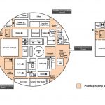
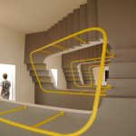
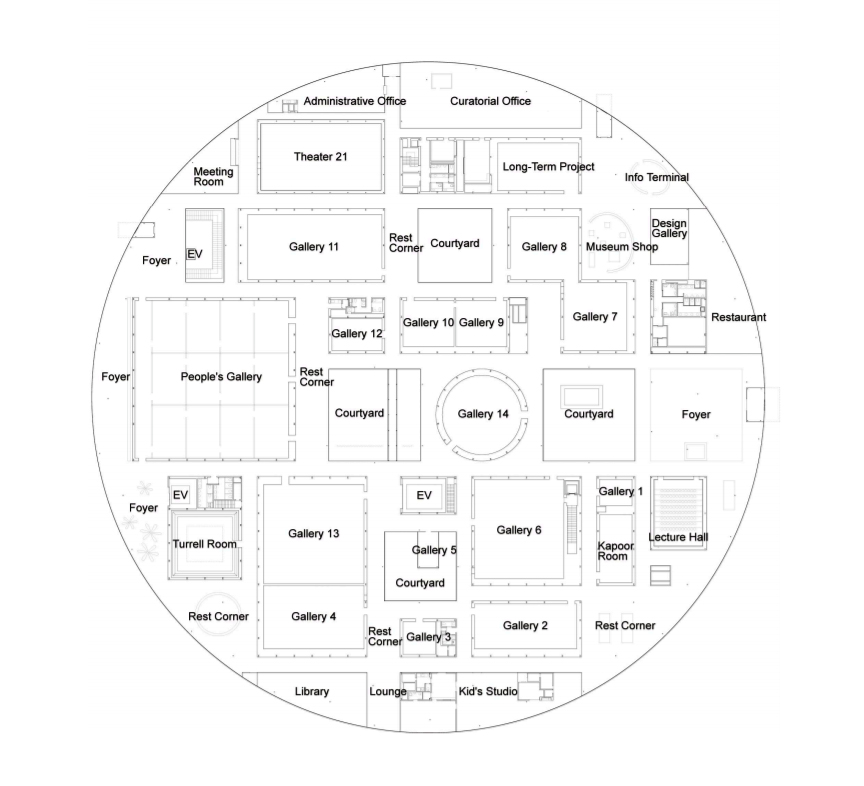
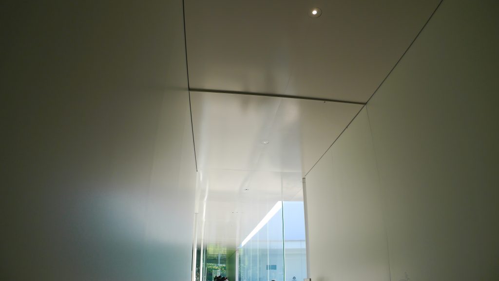
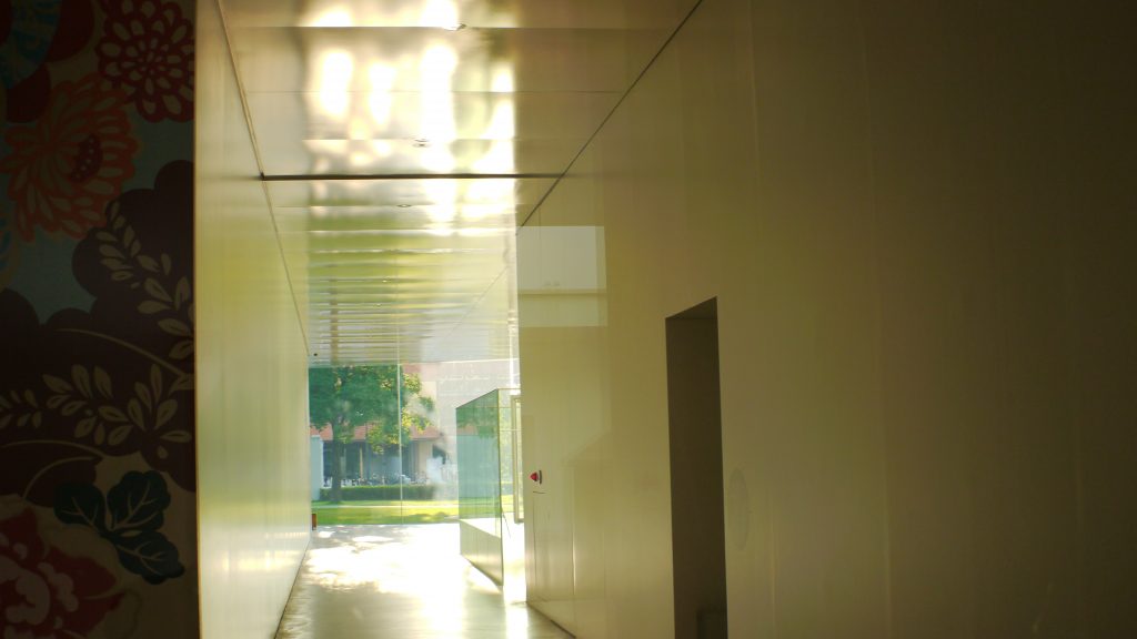
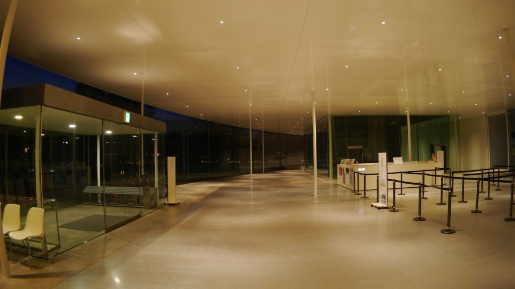
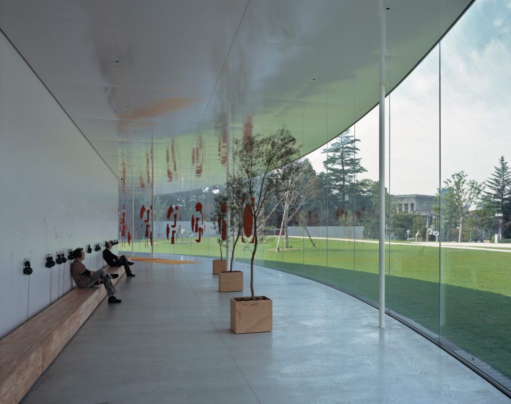
Circulations flow freely, from the outer perimeter, along which the public access elements were placed towards the core of the building, where the museum is located. The 15 exhibition galleries that make up the museum do not communicate directly with each other. By implementing an intermediate space, corridor, patio or garden, SANAA sought to encourage visitors to move through the galleries without a predetermined itinerary. Visitors make their own way from one gallery to another, from a gallery to one of the gardens or to one of the four inner courtyards.
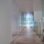
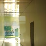
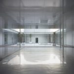
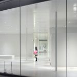
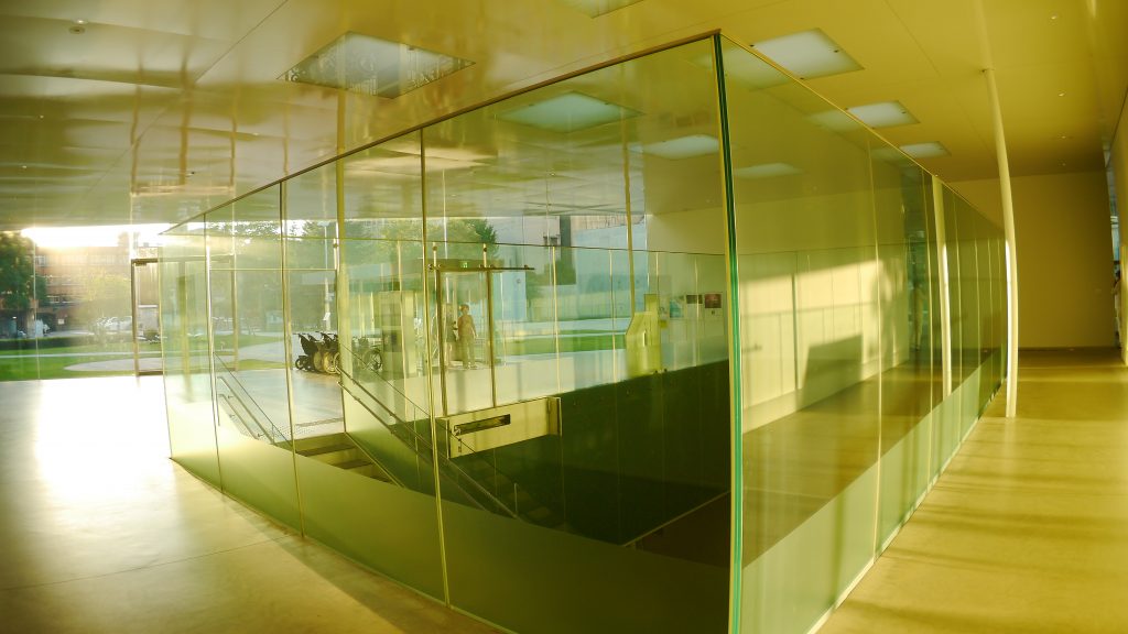
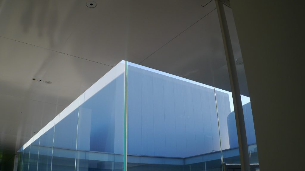
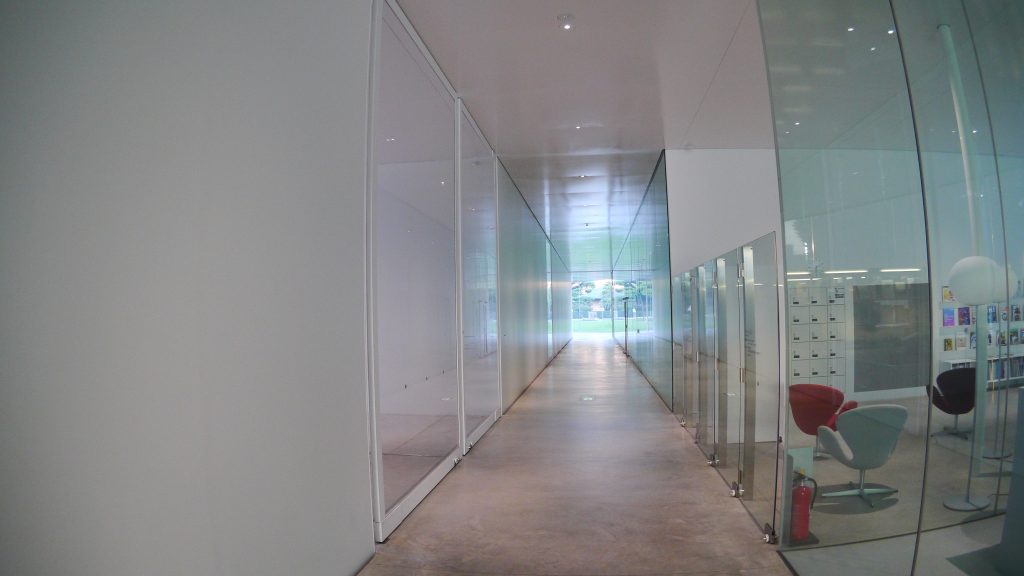
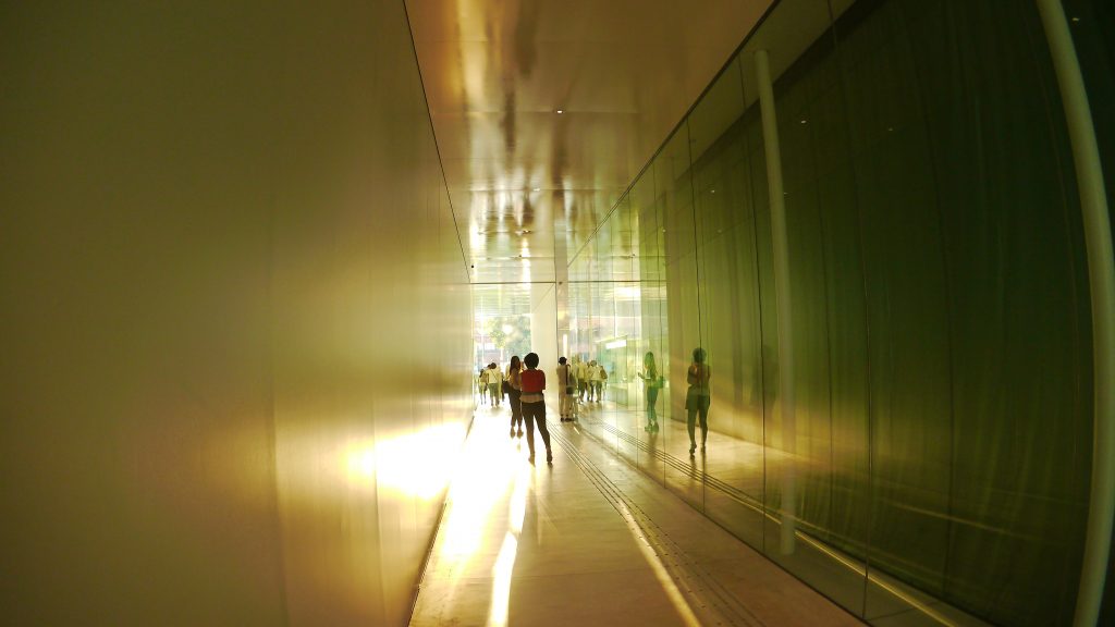
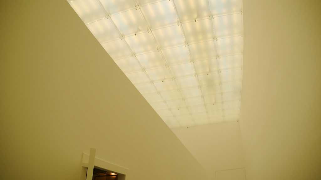
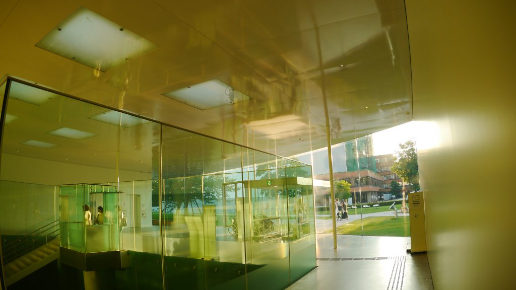
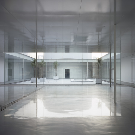
While museum spaces and areas dedicated to public functions are clearly identified, a visual link is constantly maintained through the presence of automated translucent acrylic doors. Natural light also contributes to the cohesion of spaces and the whole. The total transparency of the peripheral bays allows the landscape and light to penetrate to the center of the building, while the skylights of the exhibition galleries ensure contact with the outside through the perception of natural variations. Finally, the four courtyards serve as windows that open space to the sky.
Circularity
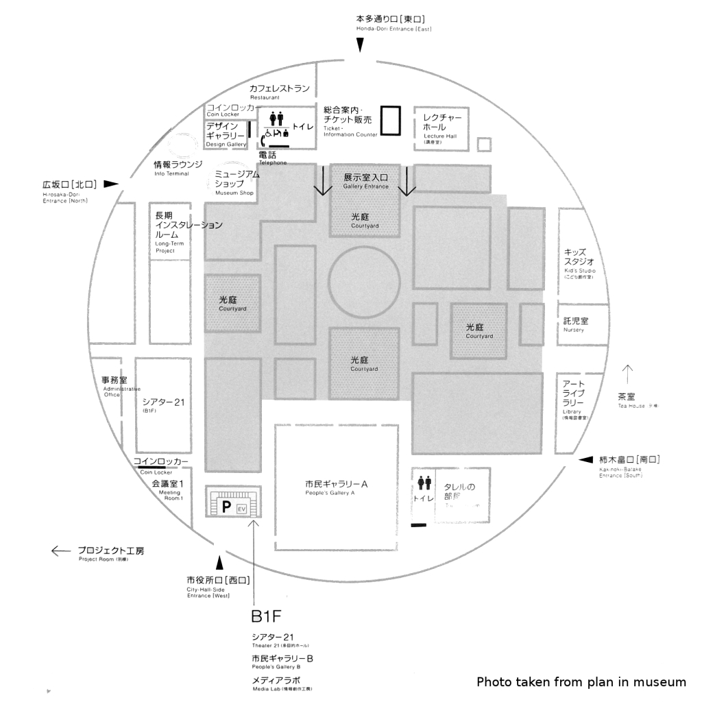
The most visible feature of this museum is its unusual shape. The site, surrounded by three streets, is accessible from multiple directions, which led to the plane of circularity. Anyone can enter the Museum through any entrance, which helps facilitate access and the feeling of closeness between the building and the city.
The building includes community meeting spaces, such as a library, a conference room and a children’s workshop, located on the periphery, and the exhibition halls in the middle.
Exhibition halls
These include numerous galleries with multiple division, expansion or concentration options. The galleries are of different proportions, ranging from 18 to 324 m², with a height ranging from 4-12m, and various lighting conditions: from daylight through glass ceilings to spaces without light source natural. Its design follows the guidelines of the “white cube” illuminated and transparent.
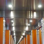
The circulation spaces are designed to be usable as additional exhibition areas. Four fully glazed internal courtyards, each unique in nature, provide abundant natural light to the center of the building and a fluid border between community spaces and museum spaces.
The exhibition halls, the restaurant and the art library are located in a horizontal place, so that the museum looks as if the visitors were in an urban area. The natural flow of the Museum allows visitors to easily see each area.
Blue Planet Sky
In one of the exhibition halls a rectangular hole in the ceiling directs the view towards a section of the same. This hole that captures the light and acts on the sensory experiences of the visitor is a work of the artist James Turrell called Blue Planet Sky.
Through his question, “How do we perceive light?” Turrell seeks to wake us up to the perceptions we are not normally aware of.
Swimming pool
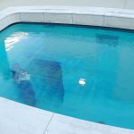
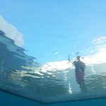
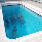
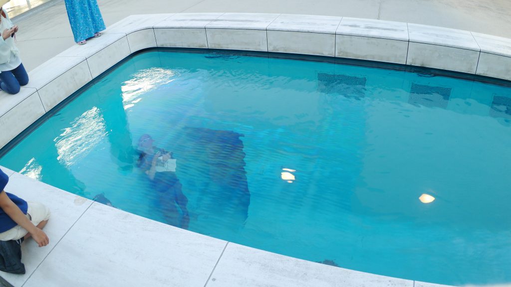
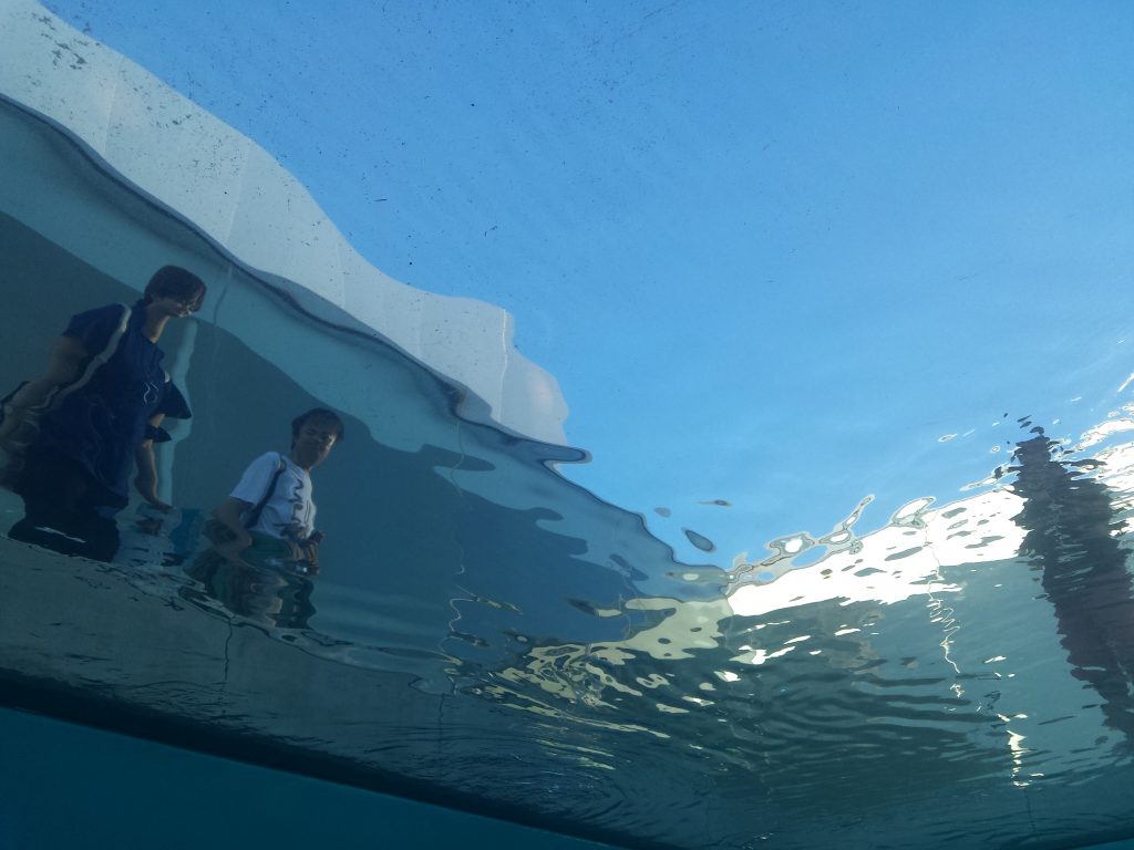
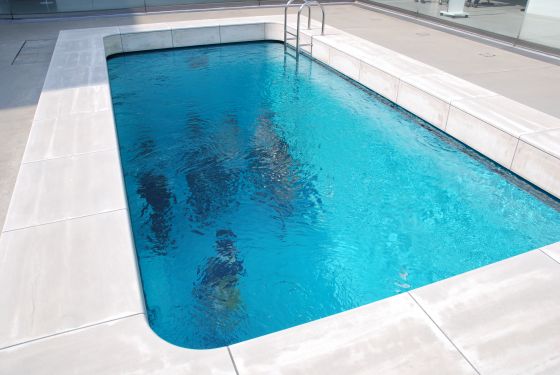
One of the most striking works is that of Leandro Erlich, which, as the name implies, “Swimming Pool”, is a swimming pool in the middle of the Museum. When a person approaches, visitors who are on the ground floor see through the water and when they enter the basement exhibition areas, people who are at the top can be seen through the water.
This work is achieved by placing two acrylic plates with a separation between them of 30cm that is filled with water. To achieve a more realistic effect, another 10cm layer of water was poured over the upper acrylic.
Basement
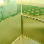
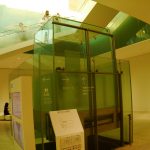
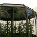
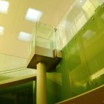
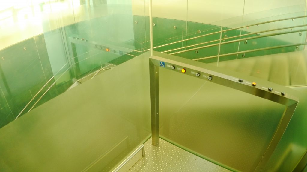
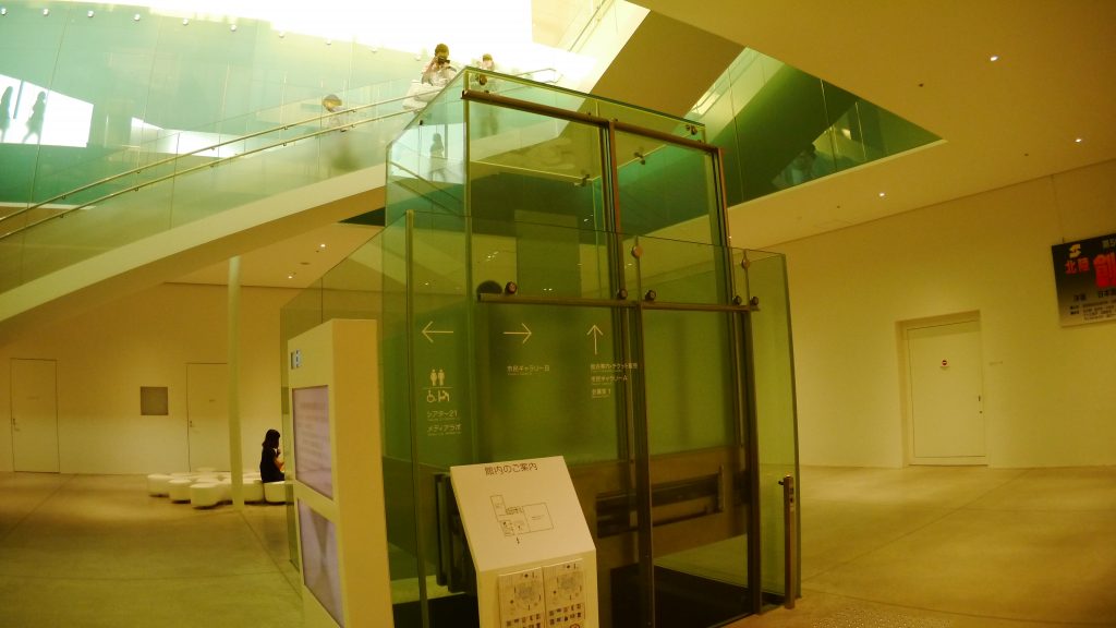
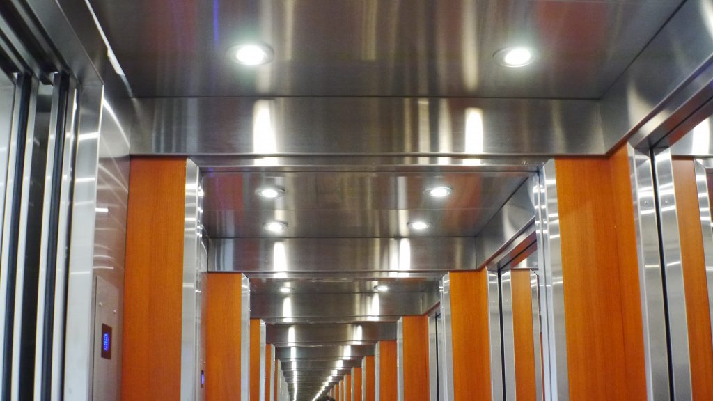
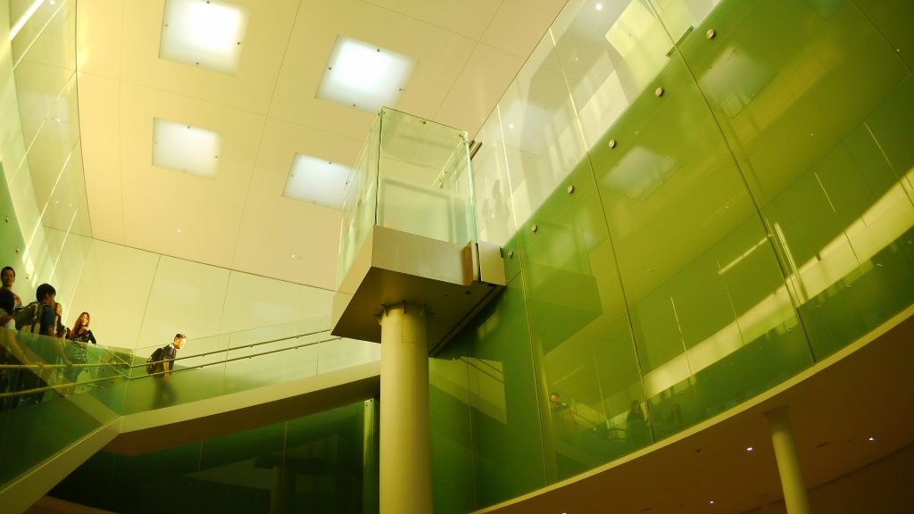
The museum has a special exhibition area in the basement which is accessed by a glazed elevator that is raised by a cylindrical piston. These forms evoke the primary forms used in the design and refer to the concepts of lightness, permeability and simplicity found throughout the building.
Transparency
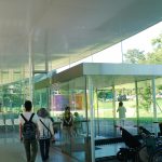
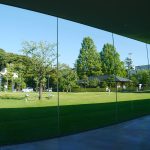
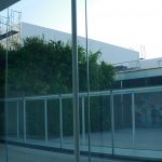
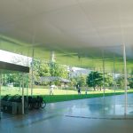
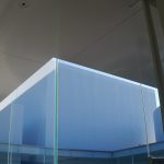
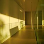
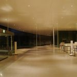
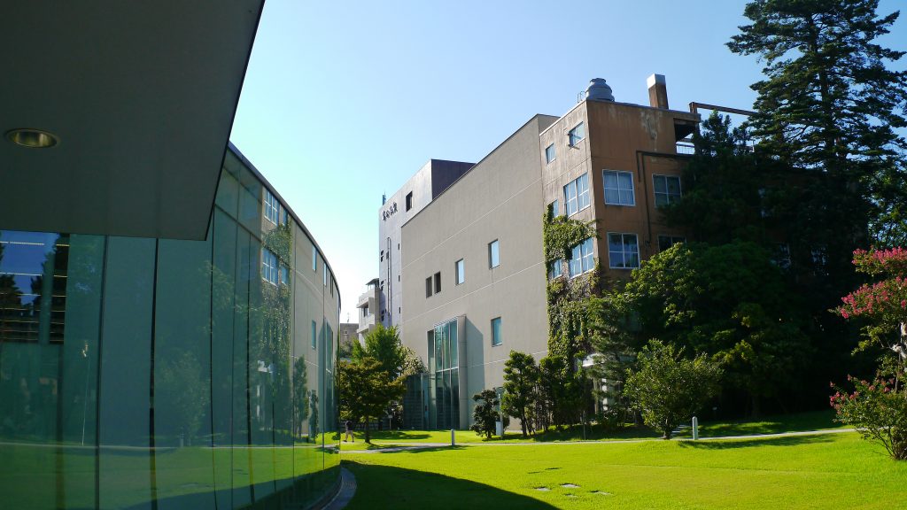
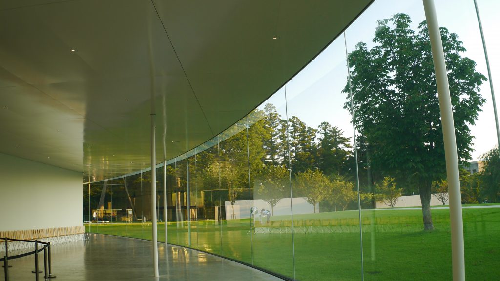
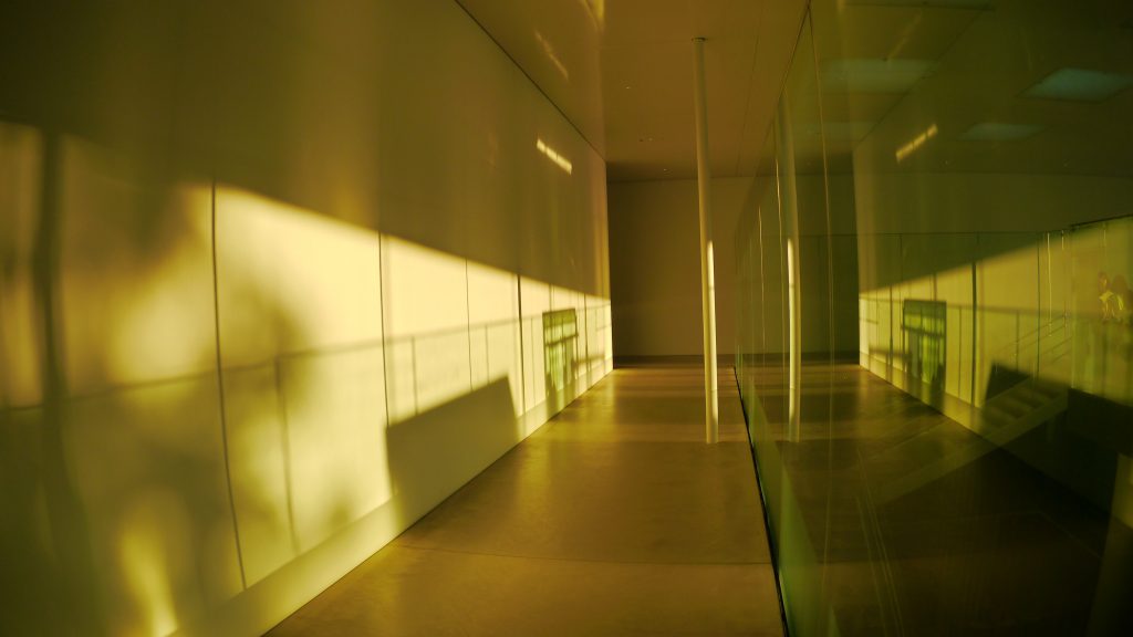
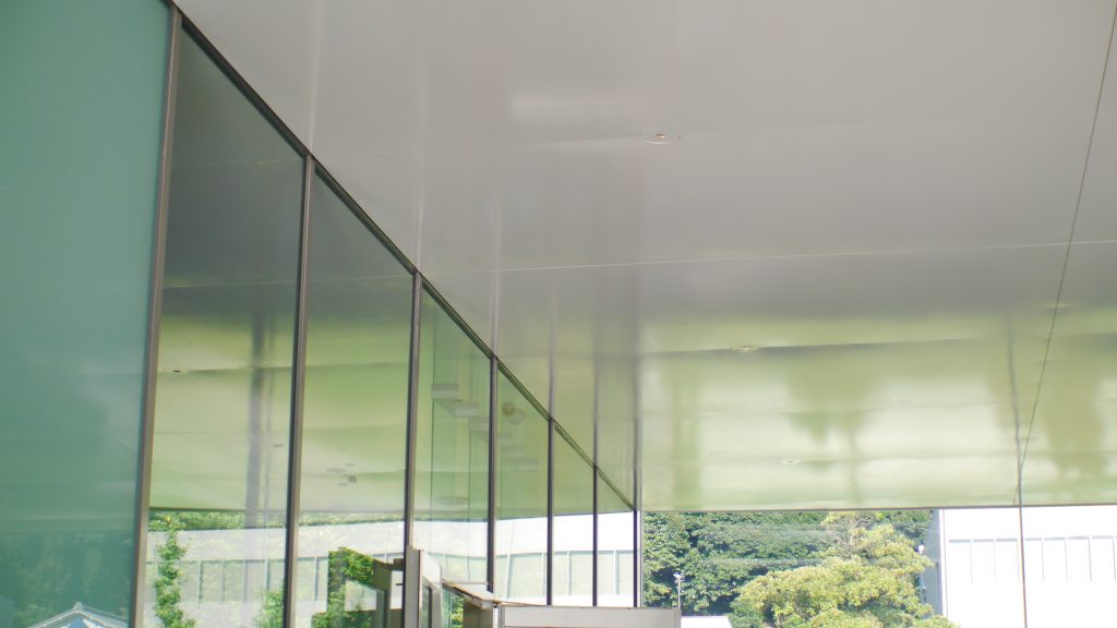
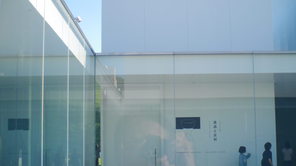
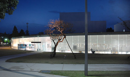
The use of glass walls, inside and out, produces transparency and brightness in the environments. It also improves the sense of encounter, awareness of the presence of each one and the unity among visitors, whether inside or outside the building.
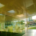
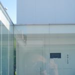
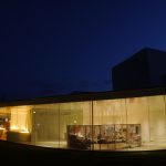
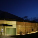
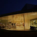
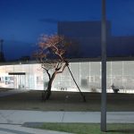
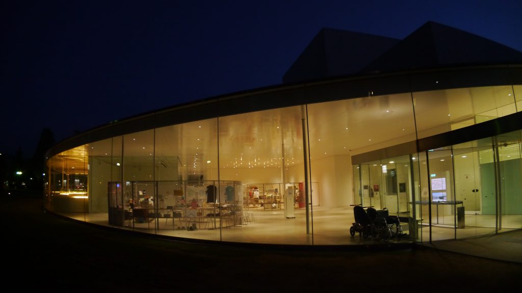
The curved glass facade allows visitors to appreciate part of the works exhibited without the need to access the interior, at the same time that due to the changes of light and reflections throughout the day it becomes a work of art. On this facade the access doors go unnoticed.
To meet the diverse needs of visitors, the Museum has a shop and restaurant open until night.
Structure and materials
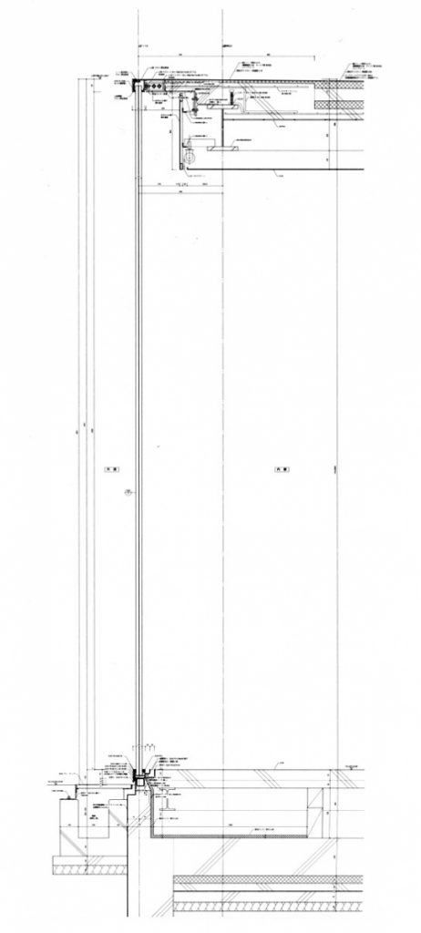
In this project the presence of the structure is reduced to a minimum, creating a perfect link from the inside to the outside reinforced by two parallel planes: the ceiling and the floor. Between these two planes there are only some very thin steel columns that make it really difficult to think that they bear any load.
With 2 floors above ground level and two underground, its structure was made with steel beams and 12.5cm tubular columns that support a reinforced concrete roof, surrounded by a glass facade. Its interior divisions or “boxes” are supported by cutting walls of steel beams. A steel structure for the basement and basement supports the ground floor.
Materials
The Museum was built mainly with steel, concrete and glass. The concrete besides being used in the structure appears in the completion of the floors, this time polished.
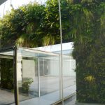
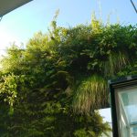
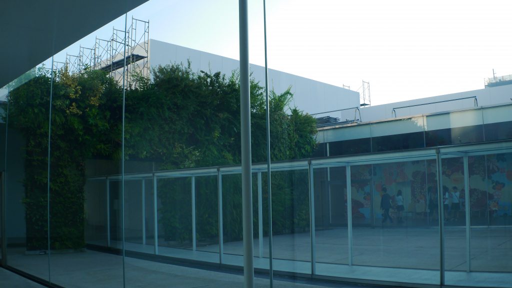
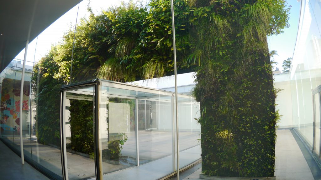
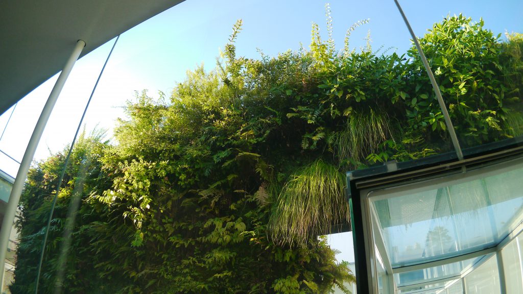
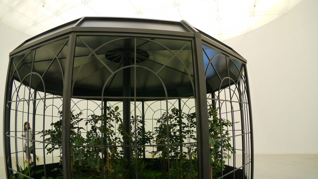
In one of the interior courtyards, a work by Patrick Berger was made with more than 100 varieties of plants, a vertical garden that is part of the museum’s permanent collection.
A large part of the trees that were replanted in the garden surrounding the Museum were rescued from the school that previously occupied the site.
Video
Drawings
Photos
Fotos Yoshihide Urushihara
Otras fotos
-
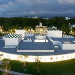
- KANAZAWA, JAPAN – OCTOBER 11: Museum building of 21st Centry Museum of Contemporary Art, Kanazawa is seen in the evening on October 11, 2004 in Kanazawa, Japan. The museum building, designed by architects Kazuyo Sejima and Ryue Nishizawa, in circular form, with a diameter of 112.5 meters with transparent wall all around, has no front or back, leaving it free to be explored from all directions with the accessibility of the site from multiple points of entry. The museum opened on October 9. (Photo by Junko Kimura/Getty Images for Newsweek)
