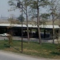
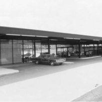
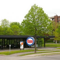
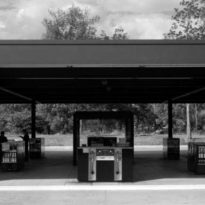
Mies van der Rohe Gas Station

Introduction
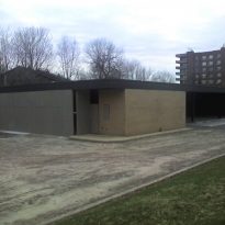
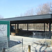
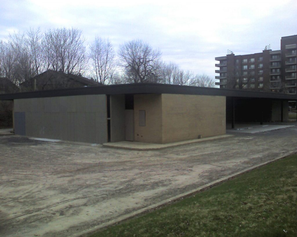
Built in the characteristic of the work of international Classic Mies van der Rohe, the gas station was operated by the company Esso until its closure in 2008, the year in which the Imperial Oil Company built a new station self-service car wash in the commercial district of the island. Since then, the masterpiece remained boarded up and abandoned, with the inevitable graffiti and crumbling brick wall.
Not far from the complex Westmount Square in Montreal, also project architect including residential, office and retail space, the gas station was commissioned Mies in 1966 by Imperial Oil, the first of the island and the first design Mies in The Nuns’ Island, Nun’s Island in English, which also designed three apartment buildings. In its construction he worked with local architect Paul H. Lapointe.
When he was hired Mies to the draft petrol station in Nuns’ Island, great excitement rose, for no one knew what to expect. The architect presented a simple, simple and functional design, as well as their previous projects in Montreal and on the same island. He designed a year before his death, was one of the last works of Mies van der Rohe.
Location
Designed by Mies gas station it is located in the suburbs of the island of Nun (Nun’s Island), at 201 rue Berlioz, Montreal, Quebec, Canada.
Nun’s Island, officially Île des Soeurs, is part of the Hochelaga Archipelago, on the St. Lawrence River, southwest of Montreal.
Concept
“… Our practical purposes only measure our material progress. The values we profess reveal the level of our culture… We must make clear, step by step, that things are possible, it is necessary and important…. “And probably Mies has the best definition of architecture that can be found anywhere: “… Architecture is the will of an epoch translated into space, alive, changing, again…” These theories, which has been implemented for a long life, have now been translated into the likely station. most beautiful in the world (Part of the article in The Montreal Gazette – Sep 20, 1968, on the occasion of the inauguration of the service station)..
Once the service station stopped working several projects for the conversion of space and safeguarding the architectural value were presented, including one proposed by a member of the Bronfman family, who had hired Van der Rohe to design flower market the Seagram Building at New York. But it was in 2009 when the city of Verdun declared historical monument work and decided he would become a “Maison des generations”
Description
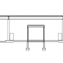
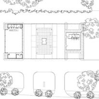
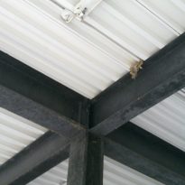
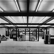
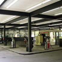
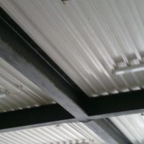
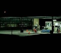
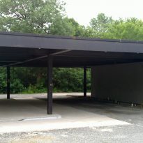
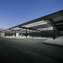
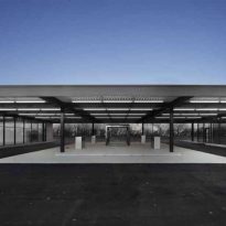
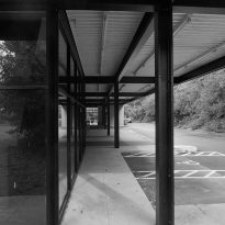
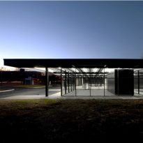
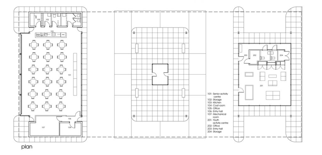
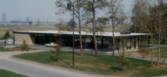
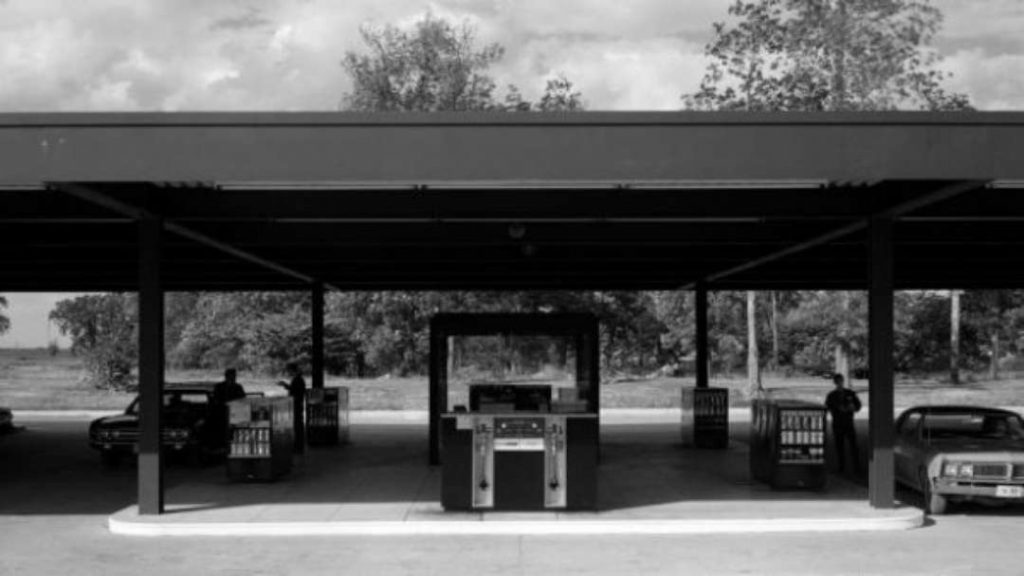
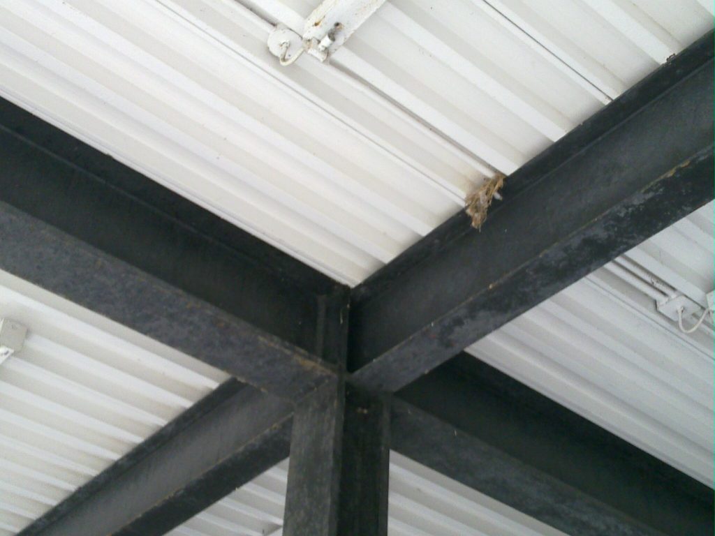
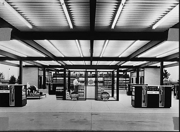
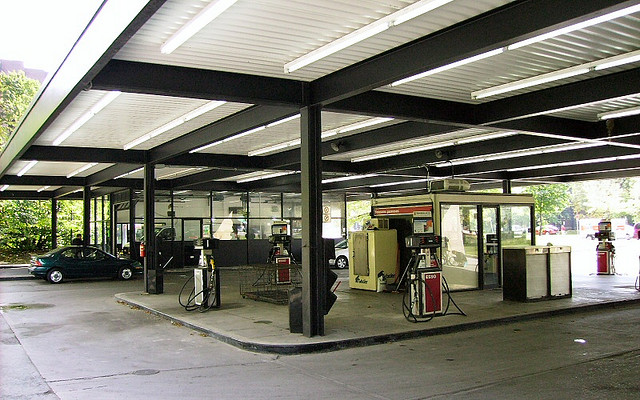
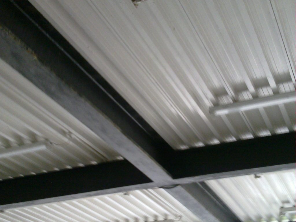
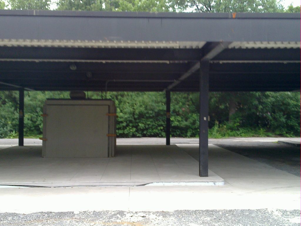
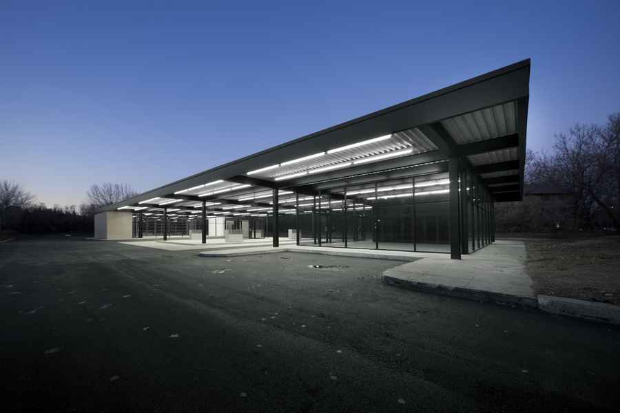
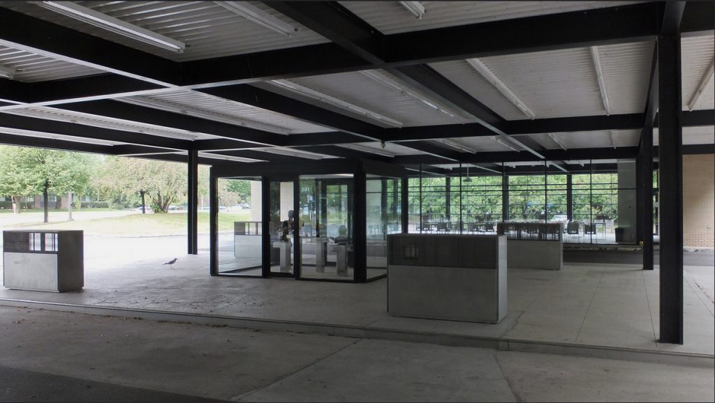
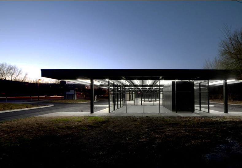
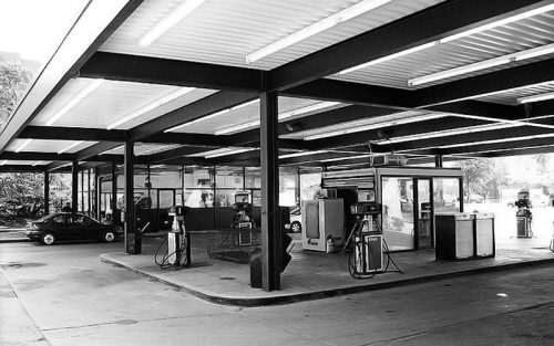
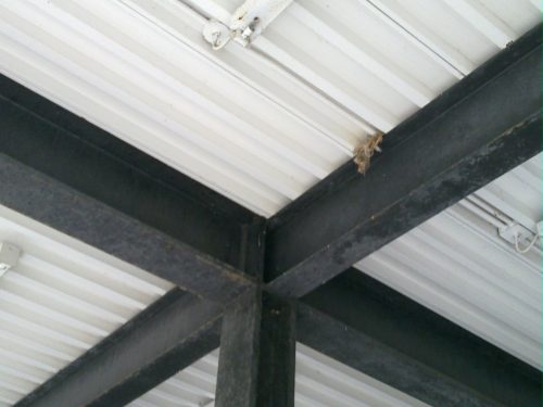
The service station was composed of two volumes that worked as service area for cars and as a selling point, between a central island with 6 petrol pumps, which pumps and hoses were hidden from view and shed glass for charge. The two volumes are connected by a low ceiling in white enamelled steel structure linking and flies on the side. The beams and columns were made with steel plates welded and painted black, creating a stark contrast to the clear covering in which fluorescent tubes were placed. In one wing a rest area for customers was located, including some of the chairs by Mies van der Rohe.
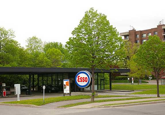
Gas Station Van der Rohe had so little in common with striking existing stations and whose gaudy accustomed motorists that the company had to put forward a great logo to clarify that it was “dark sculpture” that was underneath.
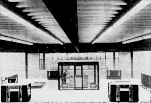
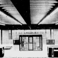
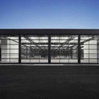
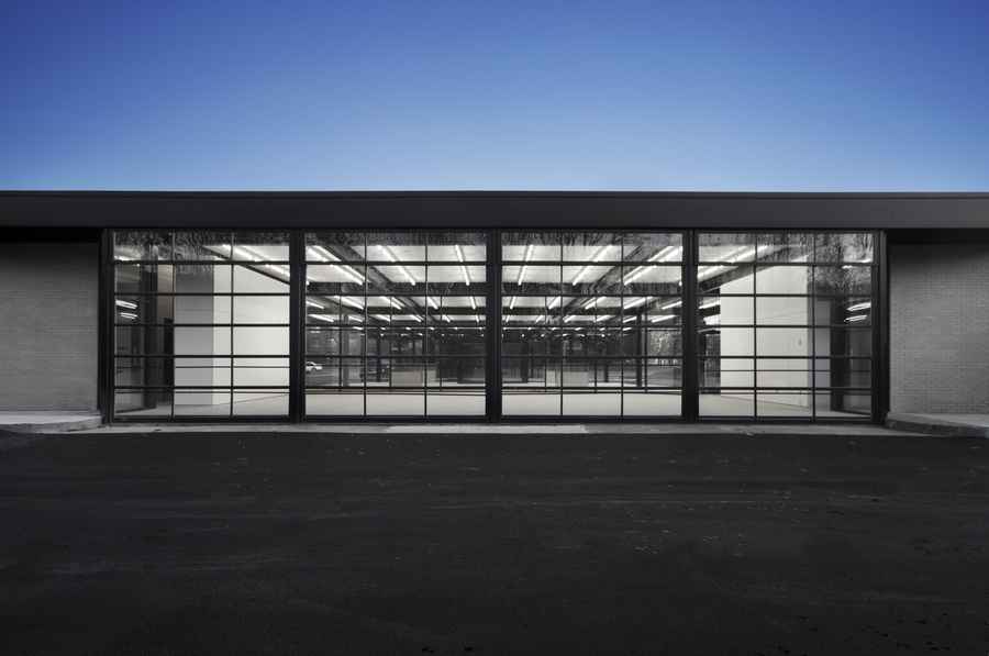
Over the years its interiors were modified, the furnishings and finishes were replaced and suppliers eliminated. When the service station was put into operation became one of the best examples of modern architecture in Montreal. Unlike several narrow islands that until then were used at gas stations, Mies design consisted of a single square island with retailers on both sides and a central glass booth operator. On one side a large office and shop with glass walls and on the opposite side walls of a garage with yellow brick, glass and steel doors painted black from floor to ceiling.
Structure
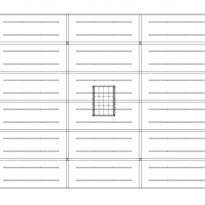
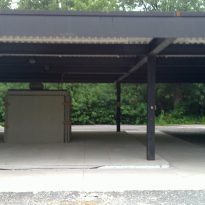
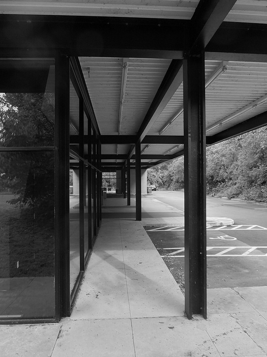
The structure of the pump rests on a concrete base that supports the 12 steel columns painted in black on a grid of steel beams also on which rests the long white painted metal canopy that forms the roof rests.
The pillars were made with steel plates welded in the flat metal roof supports. Glass and brick are primarily used on the ends and in the center to create structural elements assembly.
Materials
The main materials used in its construction were steel, glass, yellow brick and concrete, the only white and black.
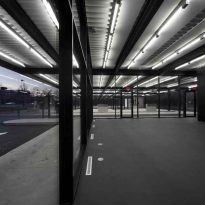
All the square was lit up at night with fluorescent tubes mounted on the ceiling, creating a modern oasis of light.
Rationalization
The architect Éric Gauthier, the study FABG Architectes, has converted the place, making it the Community Center “The Station” which allows activities to both young and old people.
Architectural tasks
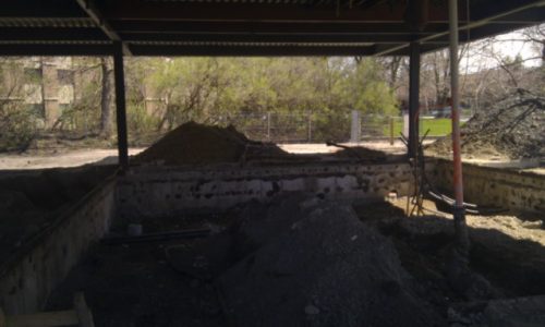
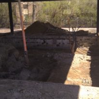
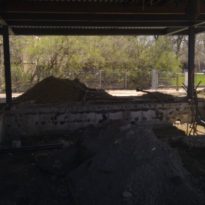
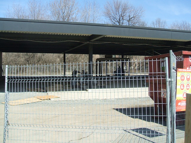
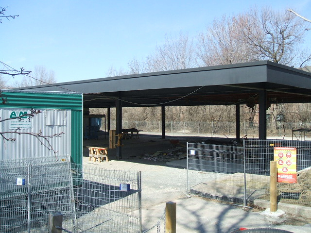
Work began with the work to decontaminate the soil under the oil company.
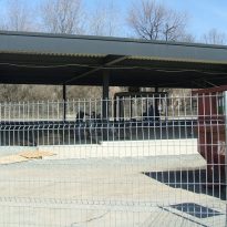
Heavy machinery and crews began digging foundations to underpin and replace sewer, drainage and water pipes and underground communications and electric cables.
- The first architectural work was meticulously restored the building envelope. It was dismantled and repaired the curtain wall of glass and metal, corroded by time and lack of maintenance, masonry was restored and repainted the structure.
- The second architectural task was to develop strategies for new mechanical and electrical requirements do not affect the integrity of the assets.
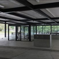
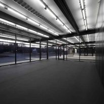
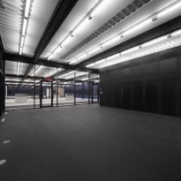
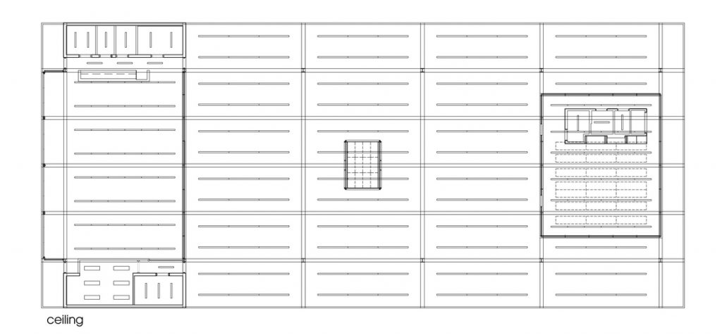
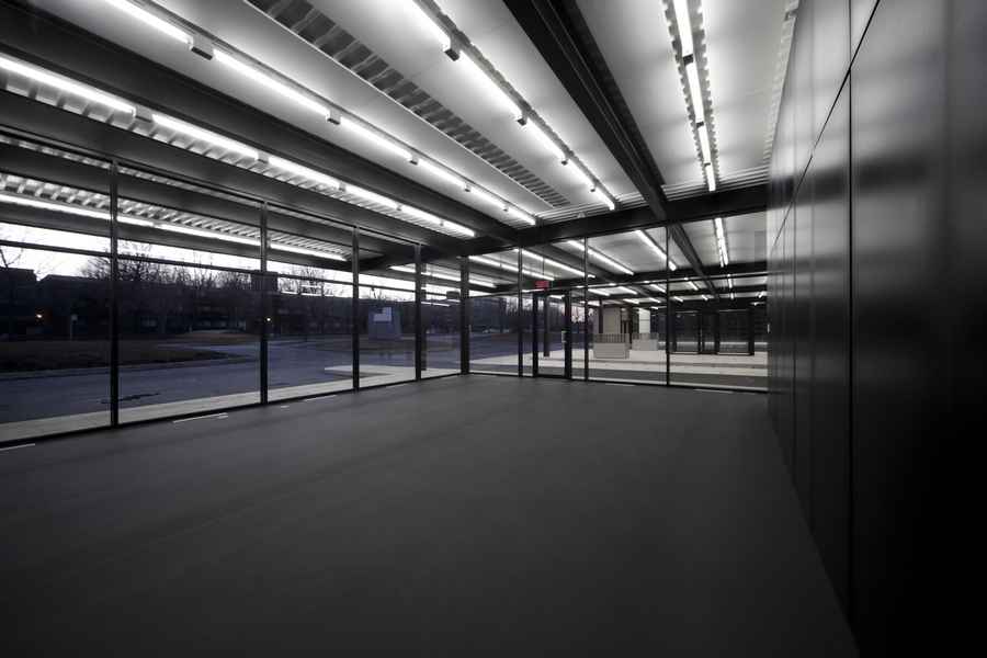
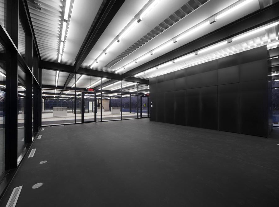
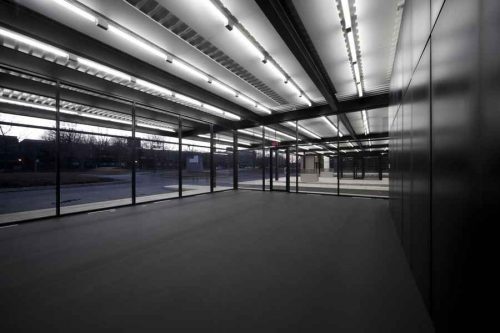
- The third task was to radicalize the building with new interventions in order to highlight its inherent qualities and core values it represents. The formal unity and simplicity are enhanced by the black tone in the adolescent side and white on the side of seniors. The strength of the cover as a unifying device is reinforced by using linear fluorescent lighting in interior spaces, following the rhythm of it. Transparency is enhanced by the full aperture, from end to end, in the long axis and by using glass with low iron content.
Concept
This conversion has no similarity with the restoration of a monument. It is an interpretation that tries to touch and communicate the essence of an artistic vision made by another person, in response to a world that is no longer the same.
Spaces
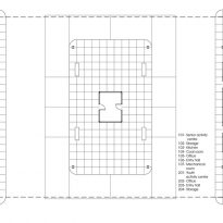
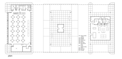
The volume with more surface area, 278.70m2, was intended to “senior” group, who play bridge, organize communal meals, dances or on speakers. To maximize space all the furniture is stackable, allowing various configurations.
The youngest group occupies the smallest volume 92,90m2. Teenagers gather there every day to listen to music, organizing parties and events under the supervision of teachers.
The new rooms have been named “White Room” and “Black Room”, according to the color of soil. The original office manager in the middle of the middle and glass-enclosed island, has been restored as a showcase where some sketches of Mies and the building’s history are exhibited. In the place occupied by the old fuel dispensers they are located outputs of ventilation shafts.
In one corner of the site it has installed a geothermal heat pump, heating pipes which have been buried and incorporated into the new spaces.
