Vodafone Building in Oporto

Introduction
This project is the result of a competition organized by the telecommunications company Vodafone for its Portuguese headquarters in the city of Porto.
Situation
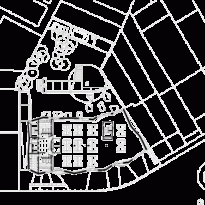
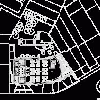
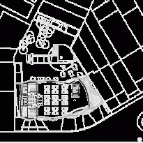
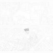
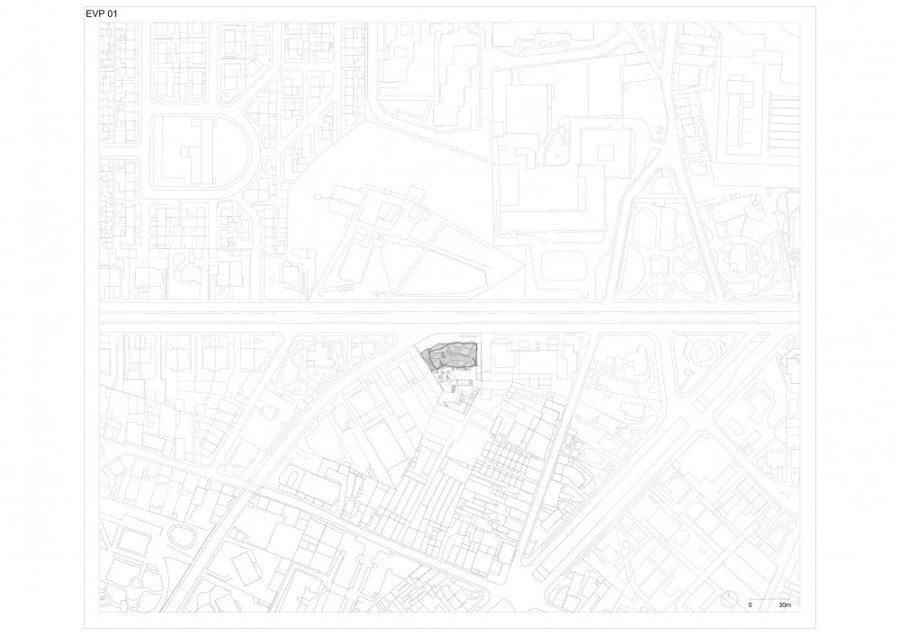
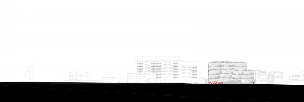
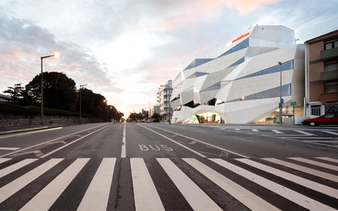
The project is located northwest of the city of Porto, Portugal, on Avenida da Boavista at the height of R. Correia de Sá.
Concept
The concept for the project came directly from the company motto; “Vodafone Life, Life in Motion”.
The whole building tries to be faithful to this slogan, from outside to inside through operation of spaces and relationships.
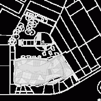
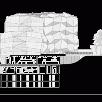
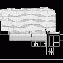
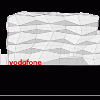
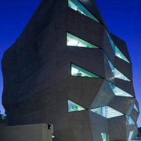
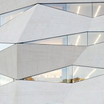
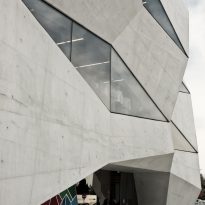
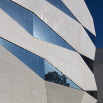
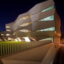
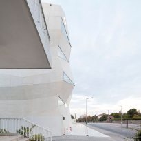
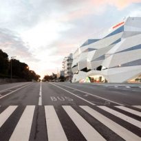
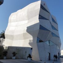
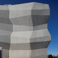
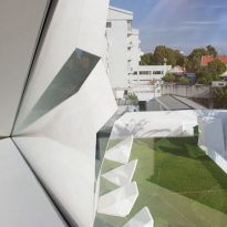
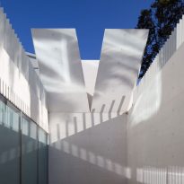
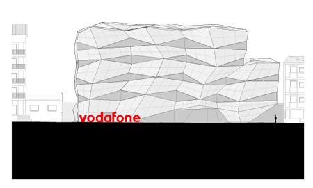
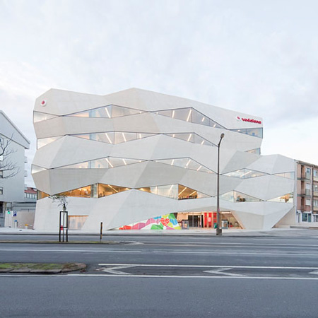
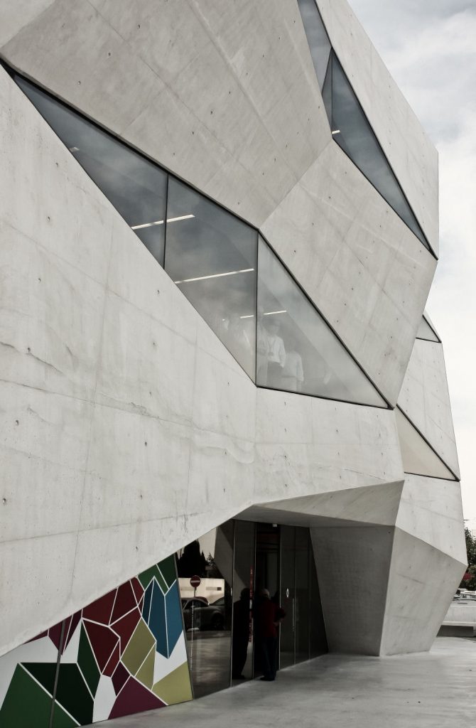
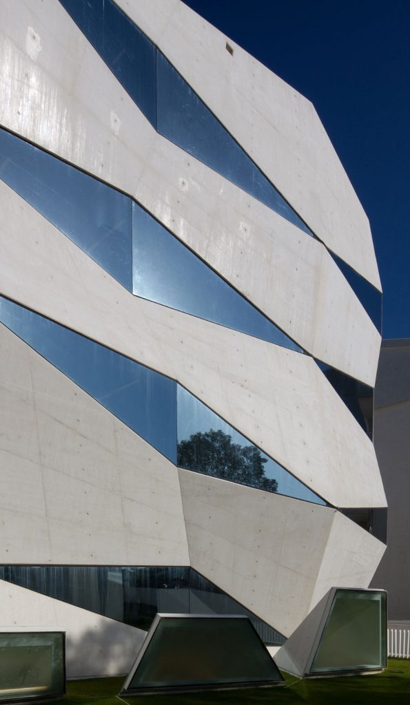
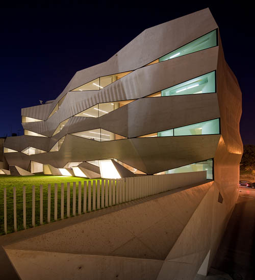
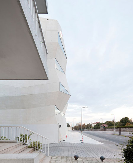
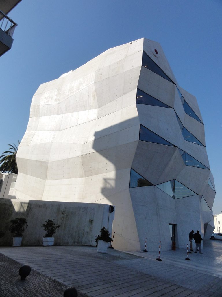
From the exterior design dynamic jumps to the visa through their lines and planes inclined at different angles to generate that feeling of movement and dynamism that characterizes the building.
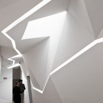
Inside however the project remains true to its image abroad, generating large open spaces that can be easily divided and re-divided, assigning different uses each time as needed. Here you can also find several flat wall breaking its continuity to copy geometries and exposed on the exterior facade.
Lighting
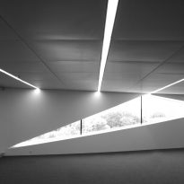
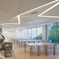
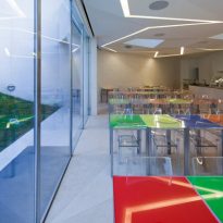
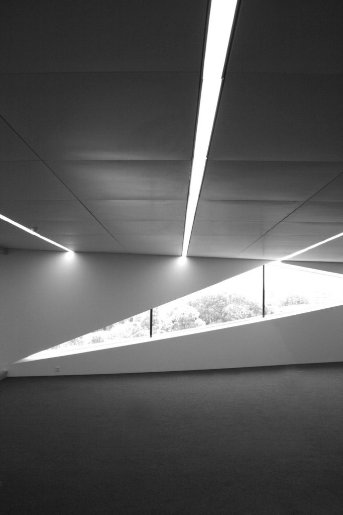
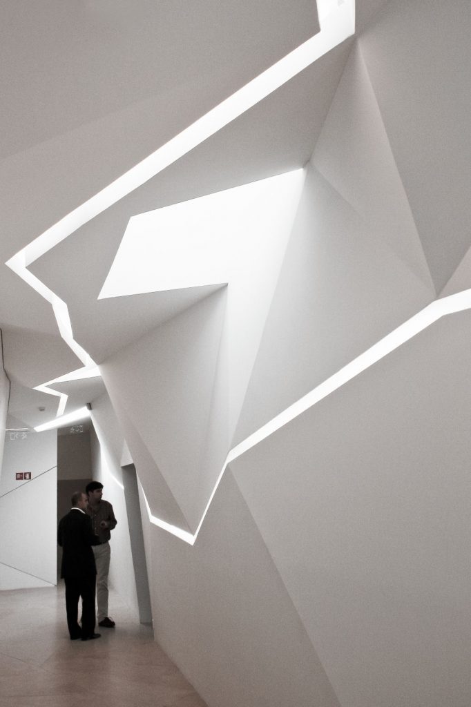
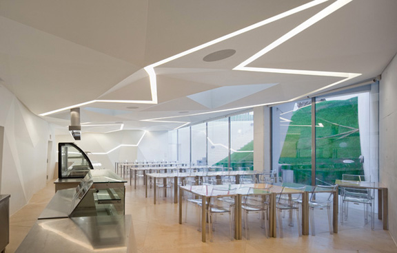
Following the concept of dynamism, fluidity and movement, the lighting was not raised as a point light points but as solid bars on the roofs.
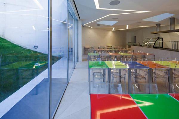
In public spaces such bands follow one angular and broken geometries continue coming to the geometry of the lines that make up the facade.
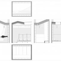
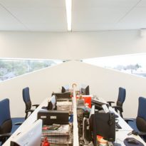
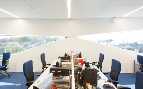
In office areas however took advantage separations between the modular panels of the false ceiling to generate light rectilinear strips help to virtually turn a physically continuous modular space in which various applications to be performed.
Spaces
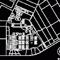
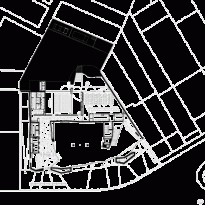
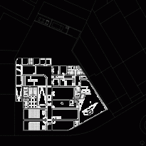
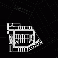
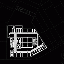
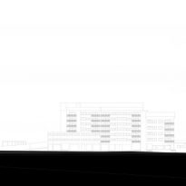
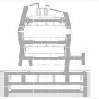
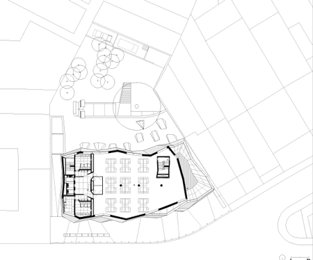
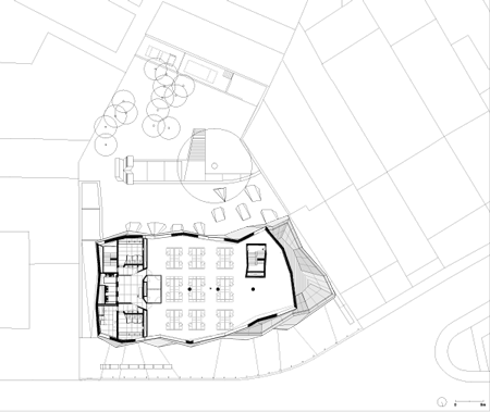
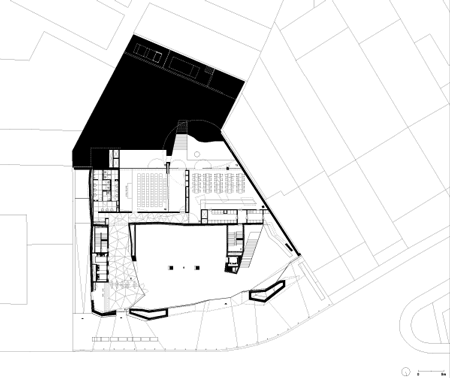
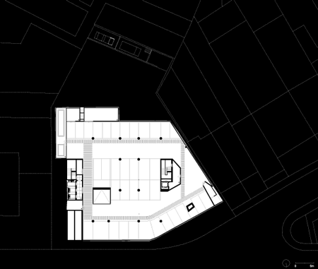
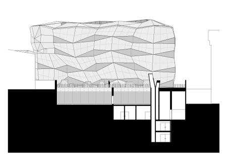
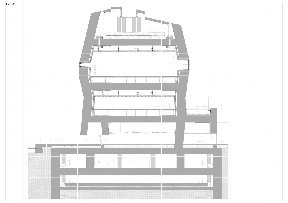
The building consists of a total of 8 floors, 3 underground and 5 on the street level.
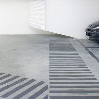
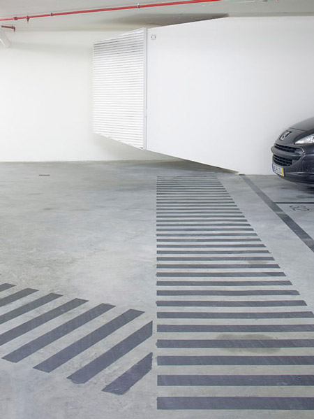
Underground cellars -2 and -3 correspond to the parking while level -1 is reserved for technical, equipment, practices and dining areas.
On the street level we find a first floor dedicated to the more public activities, such as a store brand items, cafeteria or auditorium which serves both internal presentations of company and public events or press.
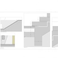
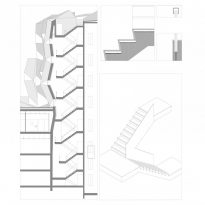
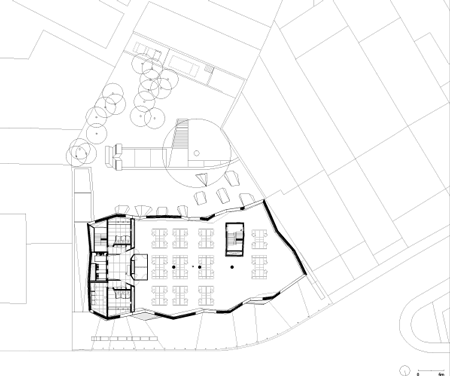
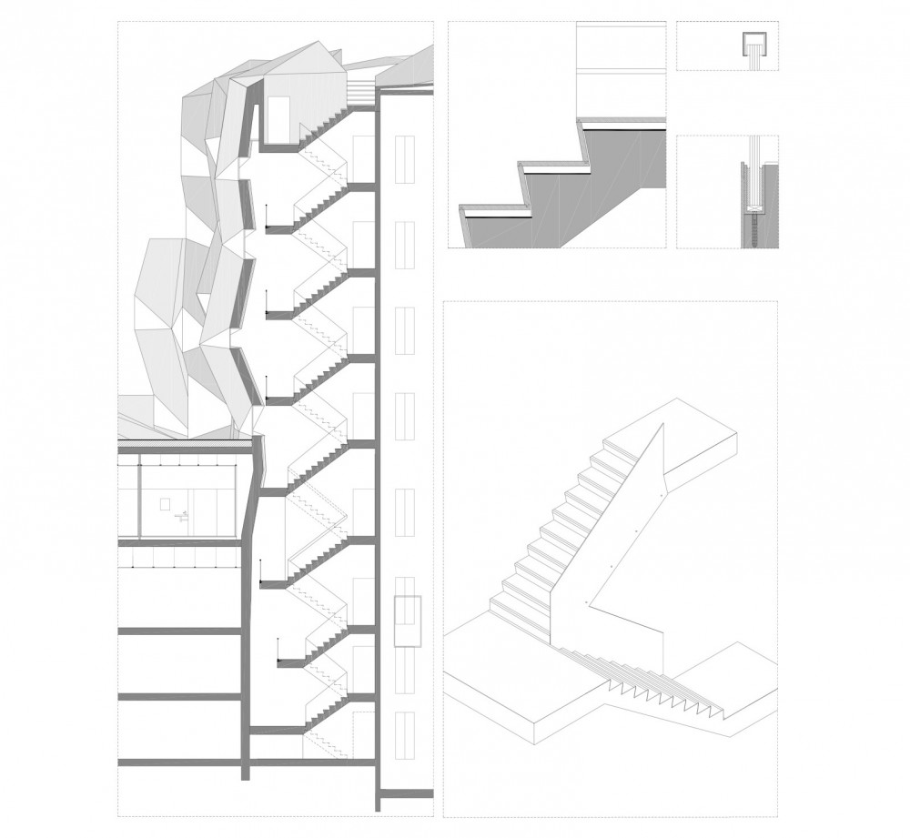
The remaining four floors are reserved for office use, though, or have some fixed distribution more services and two stairways.
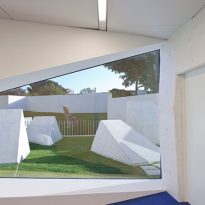
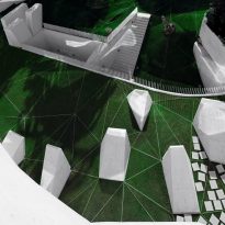
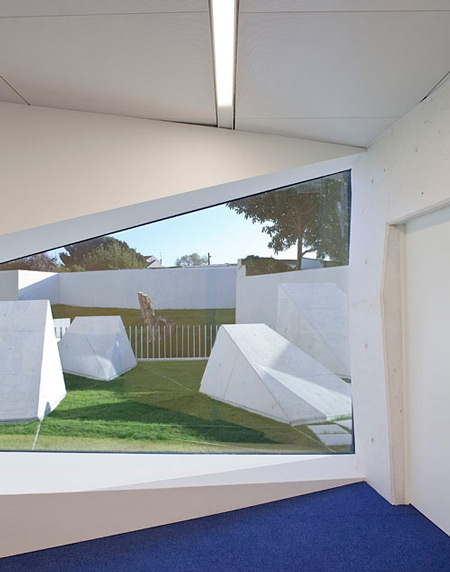
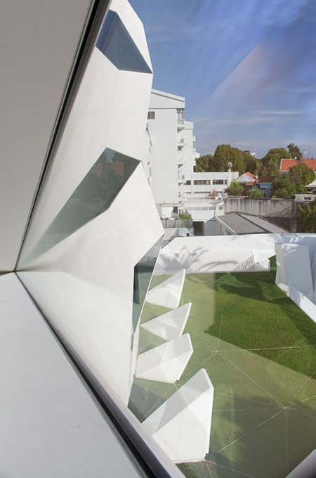
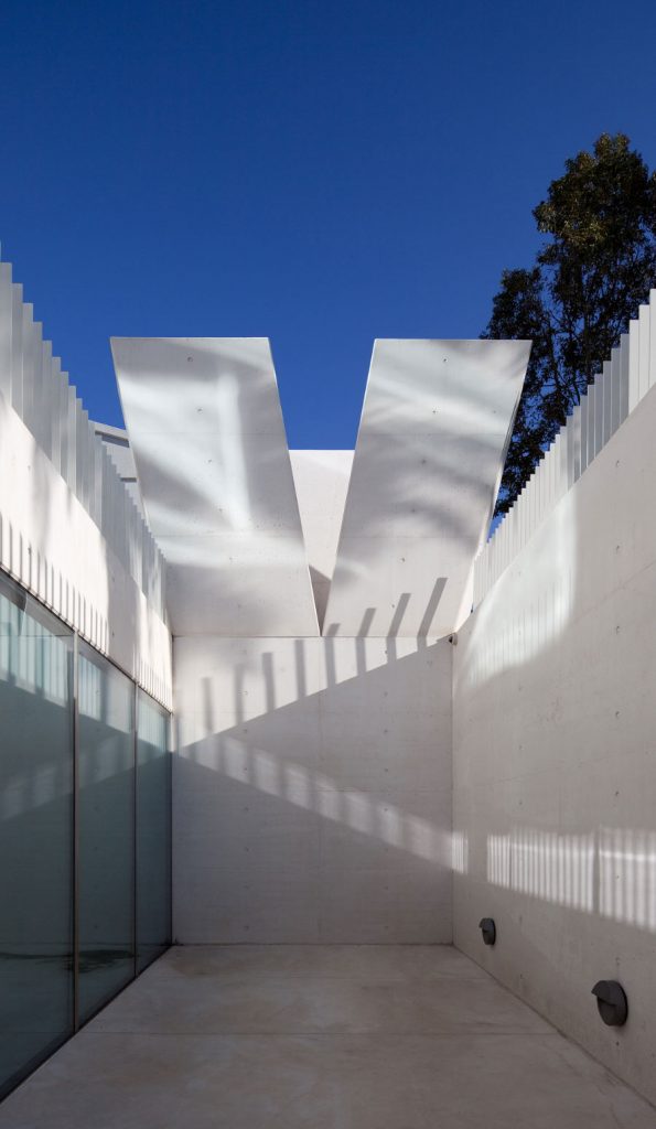
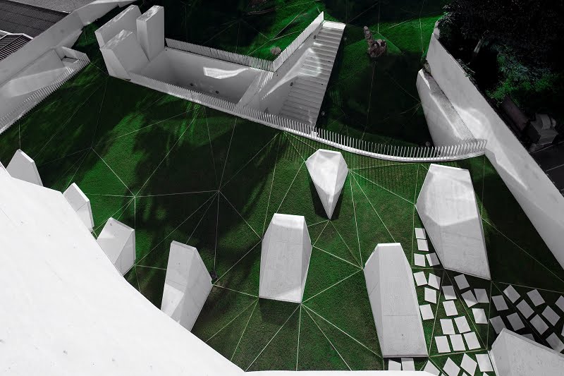
The building has a landscaped rear area accessible both from the ground and from the first underground level. Here the white planes leaving from the building with green grass planes intermingle. Here a series of skylights that serve almost like a sculpture and provide a certain level of natural lighting to the underground floors are also located.
Structure
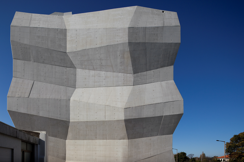
The structure is undoubtedly the centerpiece of the whole project, since it is the structure itself that shapes the facades and thus generates the characteristic image of the project.
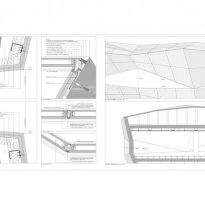
The concrete facades function as perimeter structural element as if it were an egg shell, allowing the interior supports can be minimized as two stairways and three central pillars.
Materials
The reinforced concrete finishing seen is the predominant element of the project. It is thanks to the visual characteristics of concrete that the project can take complex forms it takes, so the architects decided to be faithful to the logic of the project and maintain the main materials in sight.
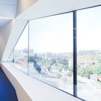
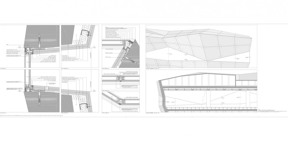
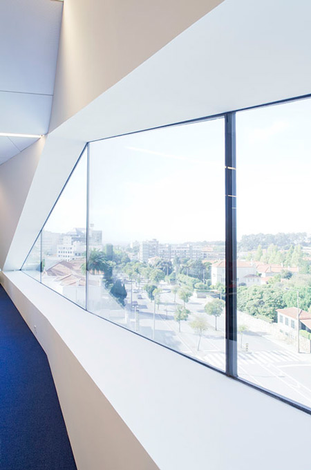
Glass cloths finish composing the facade are unique pieces that had to be made to measure due to their non-standard geometries. There will equal parts across the front glass.
Inside both floors of public spaces such as stairs are finished with a polished finish white cement without sockets, creating a sense of continuity between the horizontal and vertical planes. The office floors are finished with blue carpet.
