National Library of the Czech Republic
Introduction
Future Systems, the British team headed by the Czech architect Jan Kaplicky and English architect Amanda Levet, won the international competition to choose the design of the new National Library of the Czech Republic, which involved 355 studios. The jury was composed of outstanding professionals, who were among the architects of the caliber of Zaha Hadid.
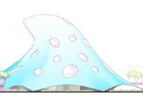
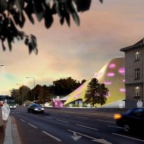
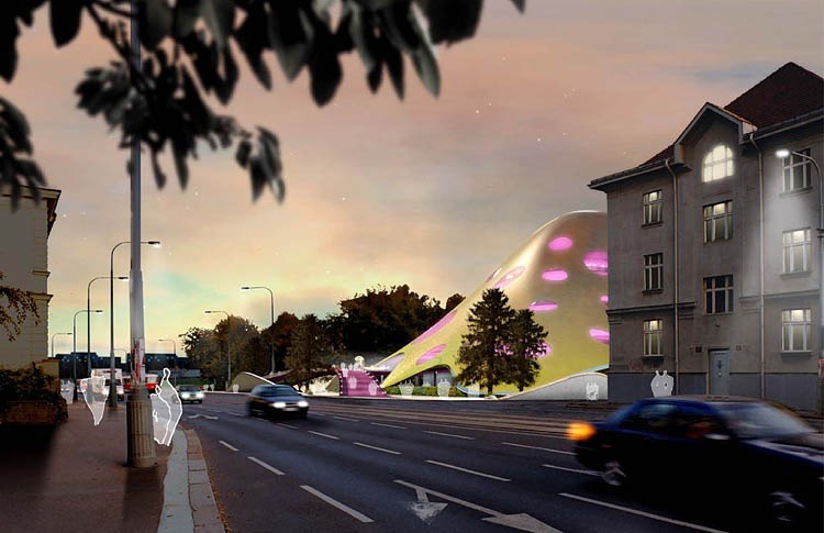
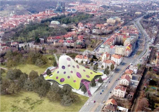
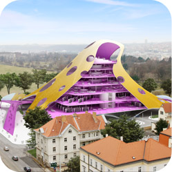
The controversial project, reminiscent of squid and jellyfish to some others, has collided head on with the conservatism of the Czech Republic and its classic capital; the design of Kaplicky was not welcomed for its break with the typical cityscape of Prague.
In its modern facilities, the library will be home to nearly 10 million volumes. This deposit library is currently in the historical building of the Jesuit College Klementinum, which formed part of the University of Prague since 1556, and now requires a reconstruction, to enable adequate space for researchers and support the weight of books and documents.
Completion is estimated for 2011.
Situation
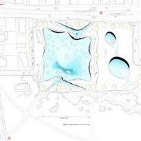
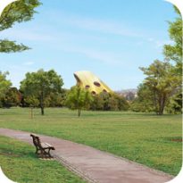
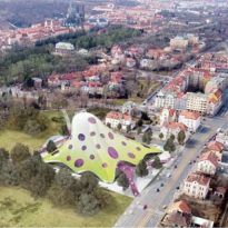
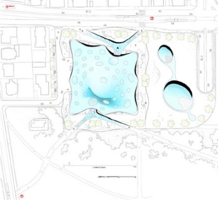
The New National Library of the Czech Republic is in a large green area – the park Letna Prague – near the Spanish Embassy.
Concept
The project is a high visual impact, an architectural landmark where plasticity and color prevail.
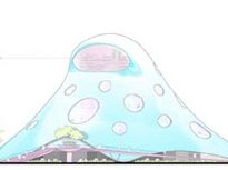
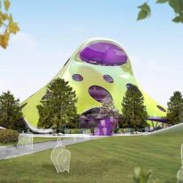
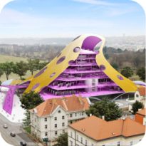
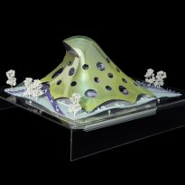
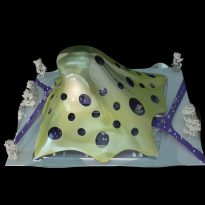
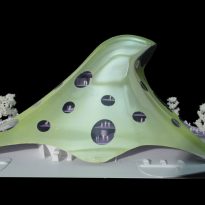
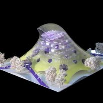
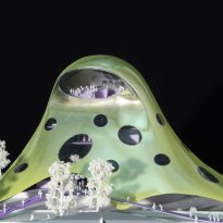
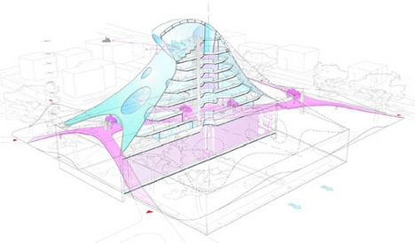
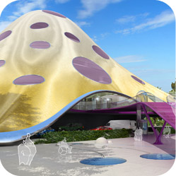
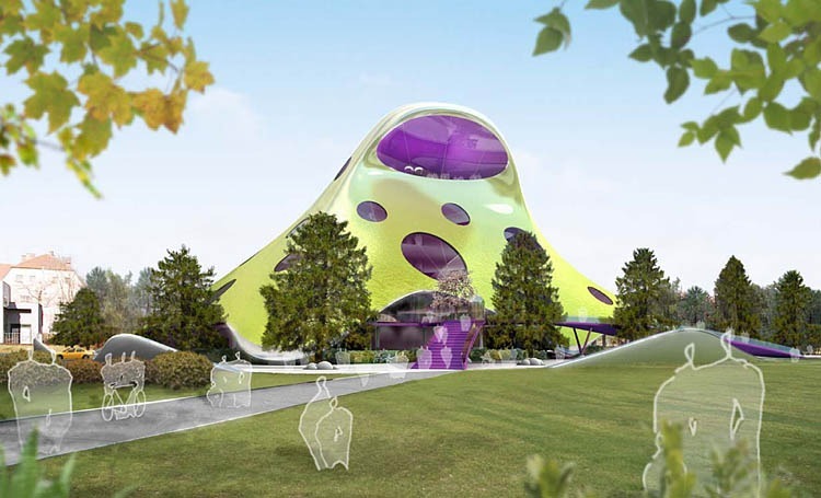
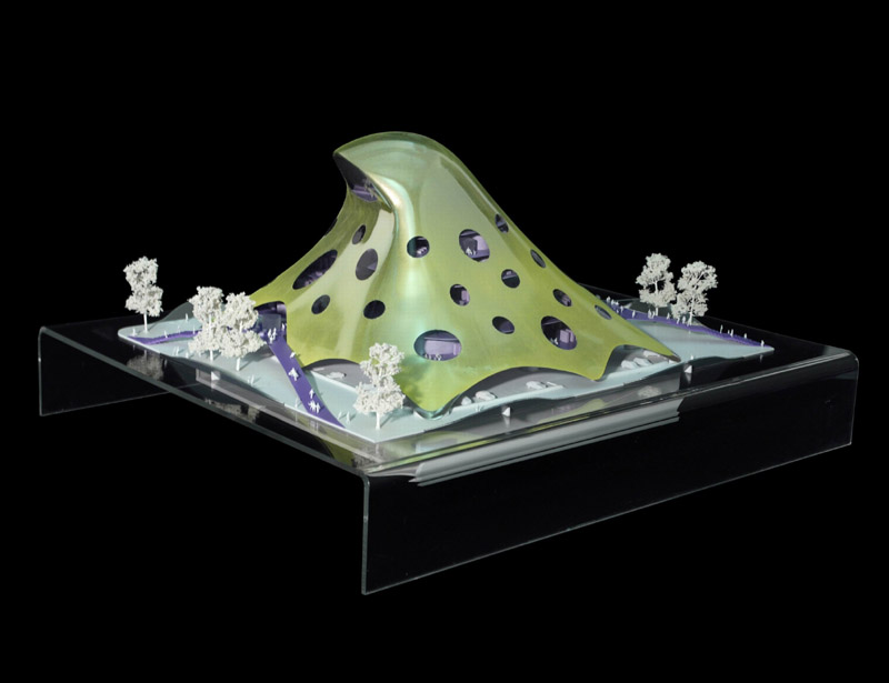
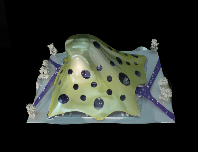
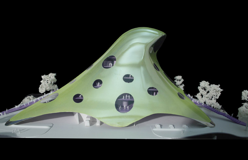
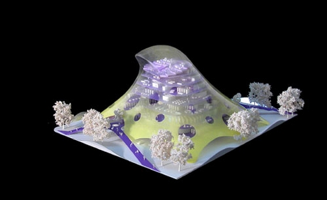
The three-dimensional object minimizes the voilume used. The building is covered by a pyramidal skin envelope of undulating and morbid forms, with a widened base and rounded edges giving impressions of octopus, mushrooms or jellyfish.
The work was prepared as a public space.
Spaces
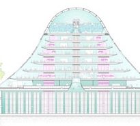
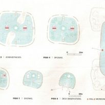
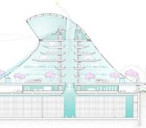
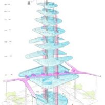
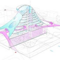
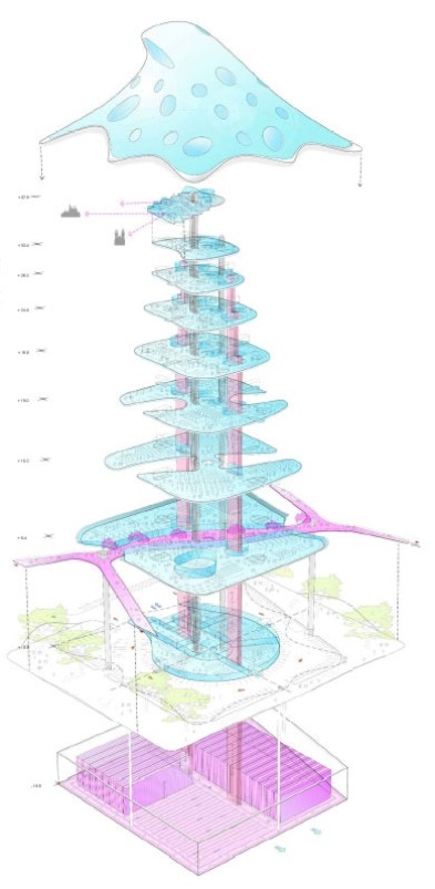
The building has 9 floors and reaches 50 meters in height. Its positioned on a platform, with sectors of the perimeter on raised edges to reflect the building from different angles.
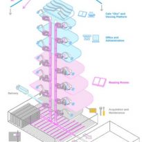
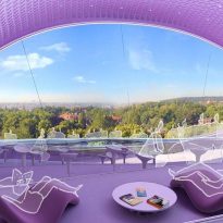
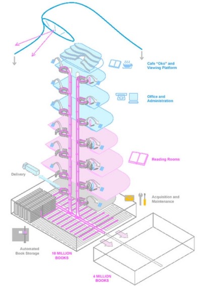
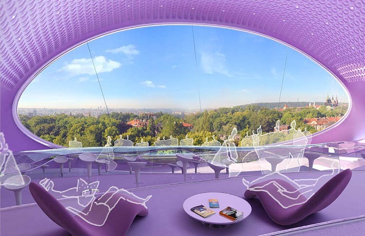
The reading rooms are the most important project. Located on a street entrance prepared as public space, they have controlled natural light, soft furniture, table lamps and shelves for books easily accessible.
This walkway runs on the first level and is meant as a direct connection to the park. There is a new green area and a row of public buildings as part of the new urban plan for the area. This architectural element is used as a link between internal and external. Along this walkway will be coffee tables, reading rooms, libraries and exhibitions, with a privileged view of the automatic storage of books.
The estimated volume of 10 million books will be stored underground. The books are distributed through an automated storage and retrieval, providing the reader with the desired tome in less than 5 minutes. The project envisages the possibility of extension for more than 4 million books.
The platform at ground level has a garden, docks for loading and unloading cargo, and ramps and stairs of many colors.
At 30 meters in height one will find the “Space Eye”, envisaged as a dynamic place designed for three functions: viewpoint for visual observation of the city, coffee and reading room of recent publications as well as an area equipped with materials and samples for kids.
One of the highlights is its unusual colors. The facade is evolving from a greenish yellow at the base, up to an almost white tone at the top. The windows are violet tones.
The skin envelope with circular openings provides natural light during more than 70% of the operating hours of the library. However, the amount of glass openings is just 15% of the area of the skin.
Materials
The skin is covered with champagne-colored anodized aluminum. The platform is unpolished marble with stainless steel finishes.
Structure
The structure is designed as a skeleton of steel columns with an internal grid of 12 by 9 meters which supports forged steel beams and slabs of concrete.
The skin envelope is hung, supported by a ring-shaped beam located at Level 7.
