Marqués de Riscal Winery

Introduction
Marques de Riscal winery is the oldest and most traditional of the Rioja. Opens for business in 1860 and is notable for its pioneering, innovative, nonconformist, and introduces the techniques of French wine elavoración.
Always a step ahead of the rest, opens the way but without forgetting the traditions. In this framework that combines tradition and future, and born the idea of building a revolutionary, able to symbolize the innovative spirit of the company. In 1998 Marques de Riscal becomes pioneered the idea of combining the production space with a space for leisure, and takes a step forward to create the City of Wine, which aims to raise awareness of the wine, its history, culture and philosophy, will include an area of vinotherapy, a museum of wine, a research and training wine, plus all the infrastructure as a Marques de Riscal winery.
The interior of this complex is the main axis, the hotel designed by Frank O. Gehry.
Gehry and the project
Gehry decided to visit the place, as a preliminary step towards the acceptance of the assignment. Months after he spent a weekend at the winery and sample some of their wines, including a year of his birth, 1929. At this time, and after learning addition, the place, its people and the program needs, and wagered believed in the project, imbuing entirely on the spirit of this centuries-cellar.
To launch the project after the success of the Guggenheim Museum Bilbao in cooperation with IDOM as a study partner in architecture, Gehry has again with their support for this new poryecto, expanding the functions of architectural and engineering work with the drafting of the proposed architecture and engineering.
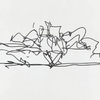
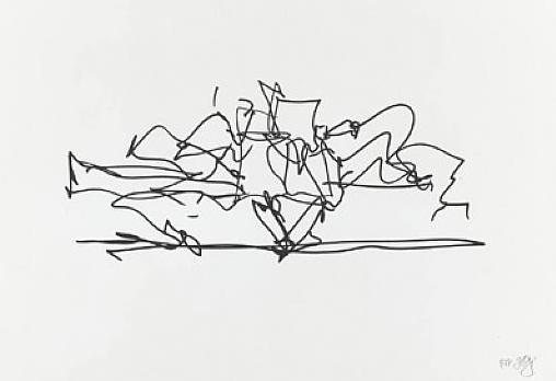
The architecture of Gehry follows a sculptural style and a personal vision of architecture, creating functional sculptures. It combines sensuous curves with complex forms masses, breaks new ground and creating new architectural language to achieve thus important and new results.
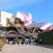
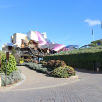
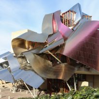
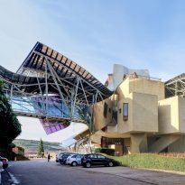
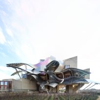
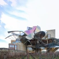
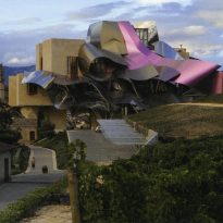
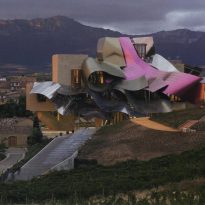
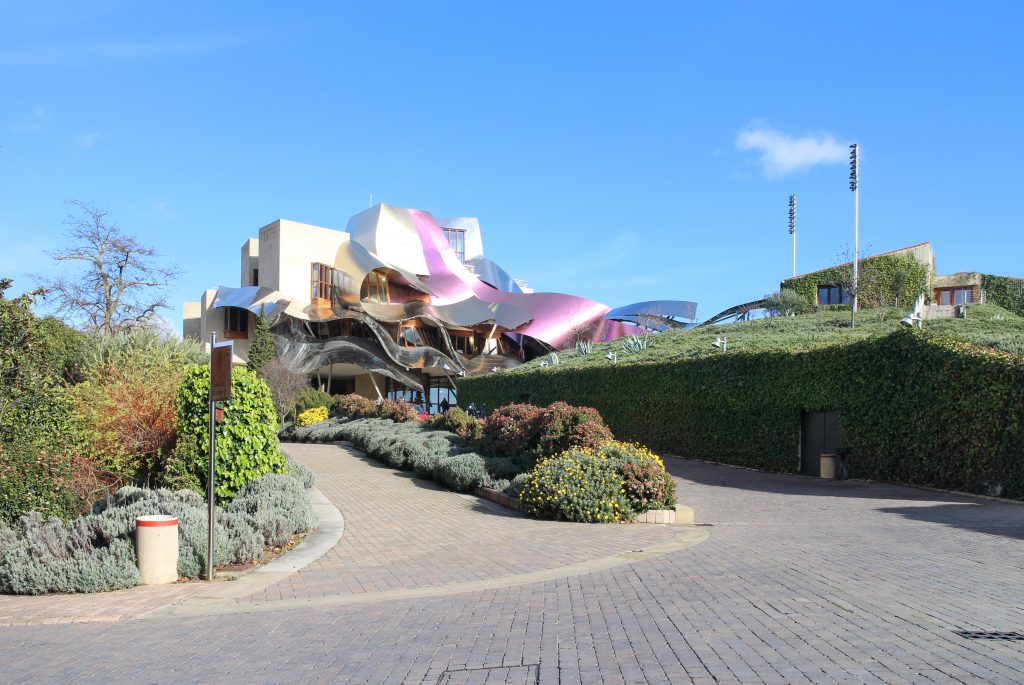
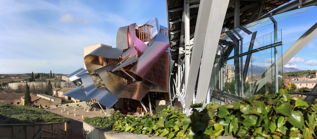
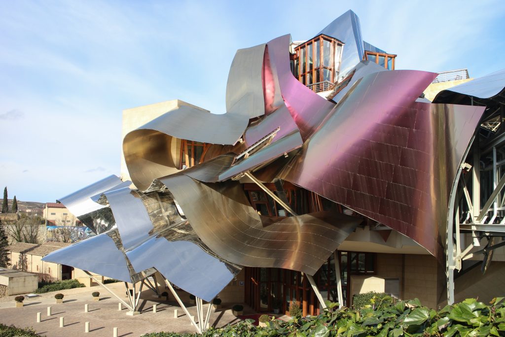
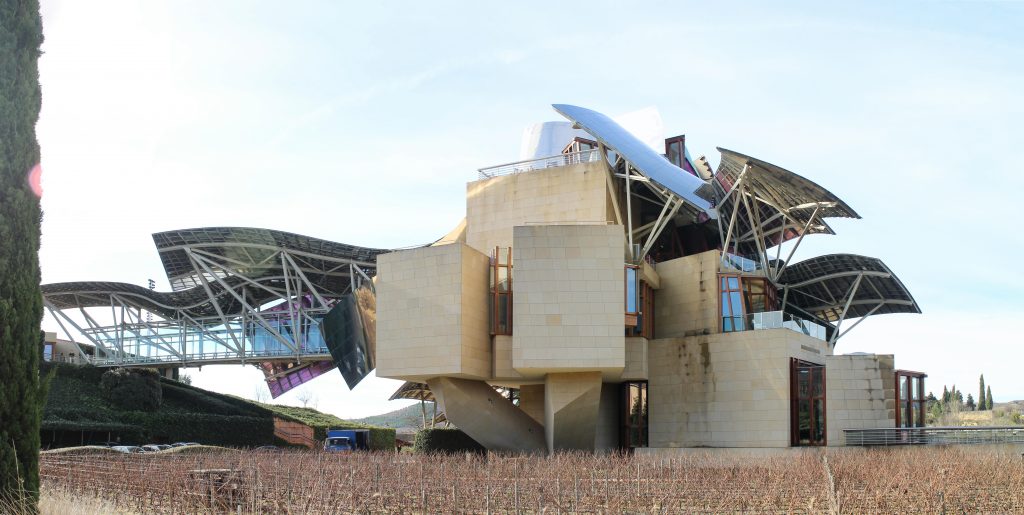
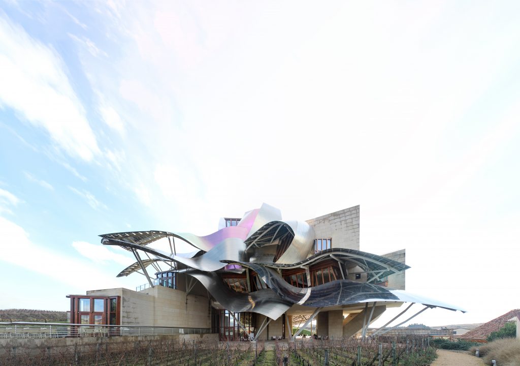
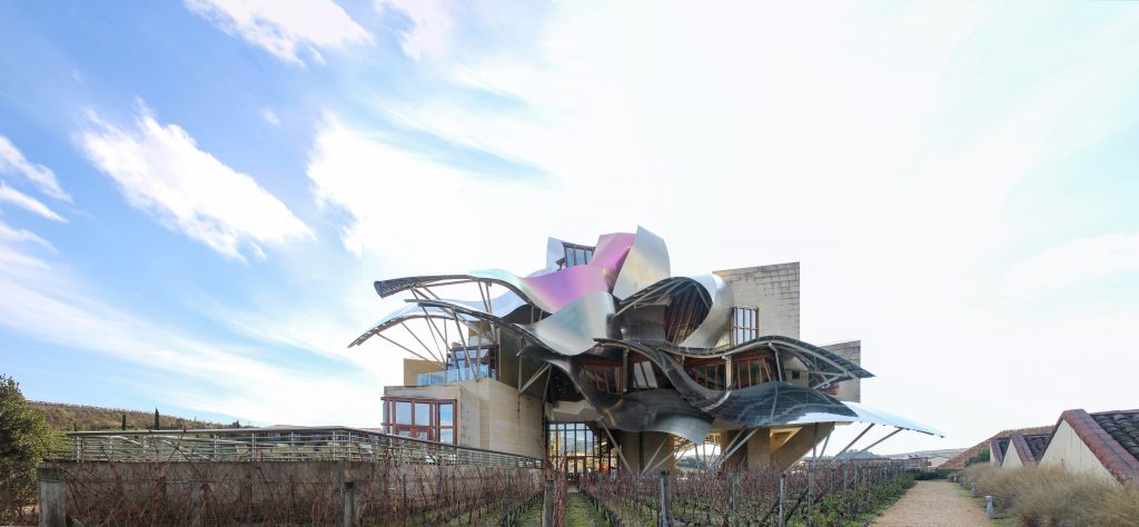
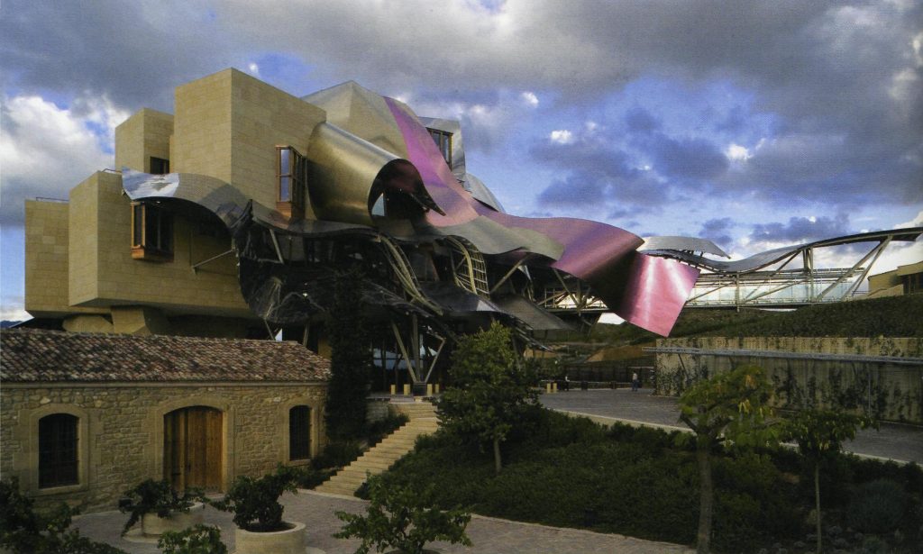
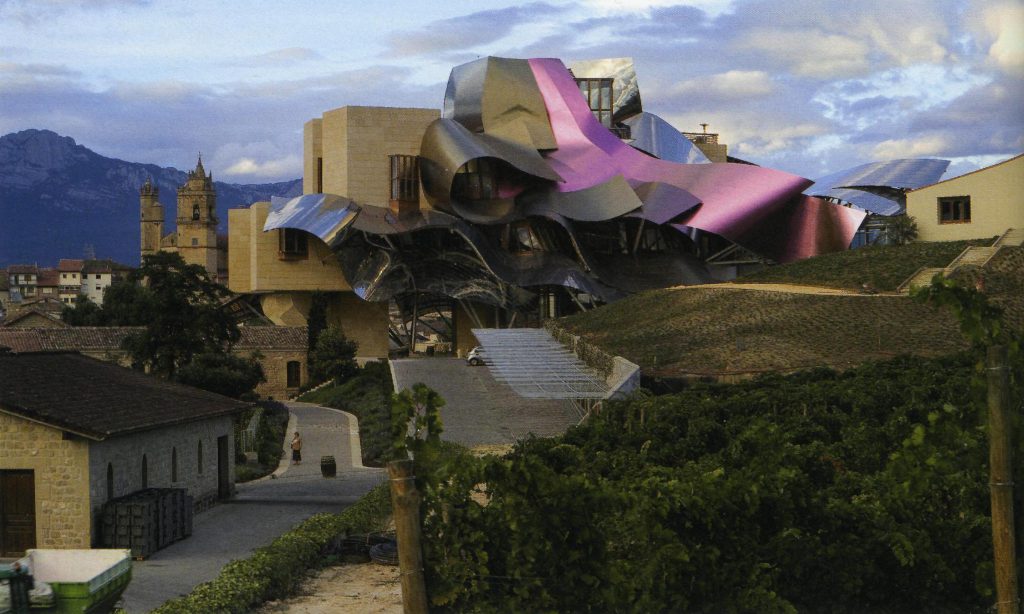
Gehry presents an innovative and avant-garde, in keeping with the spirit of Marques de Riscal. The explosion of color and shapes creates a movement through the forms flees from the building that foundation for its rise and mixed at high ambient and look at the surrounding landscape.
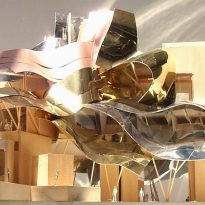
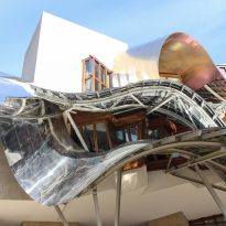
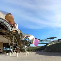
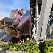
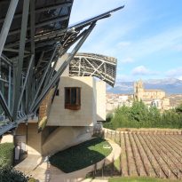
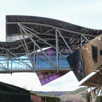
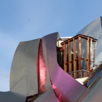
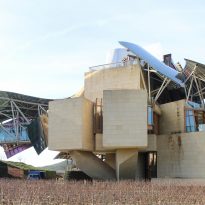
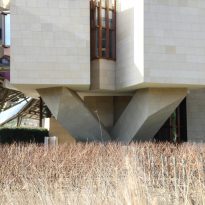
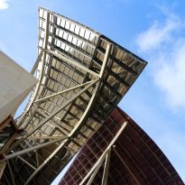
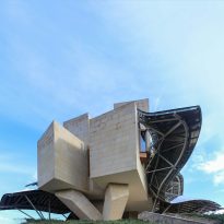
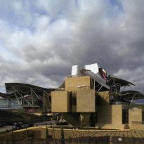
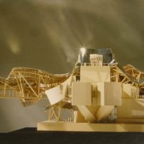
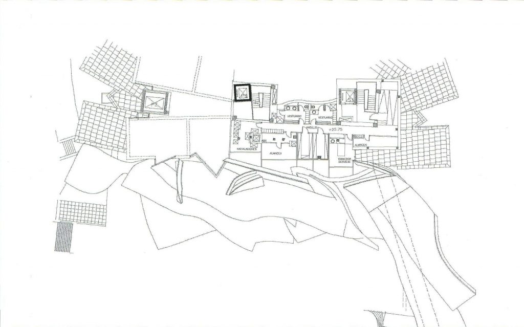
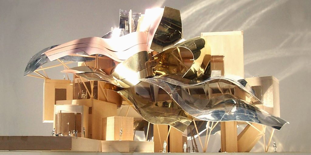
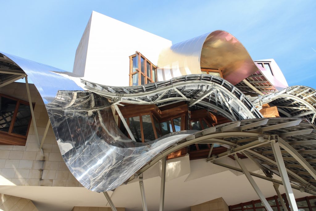
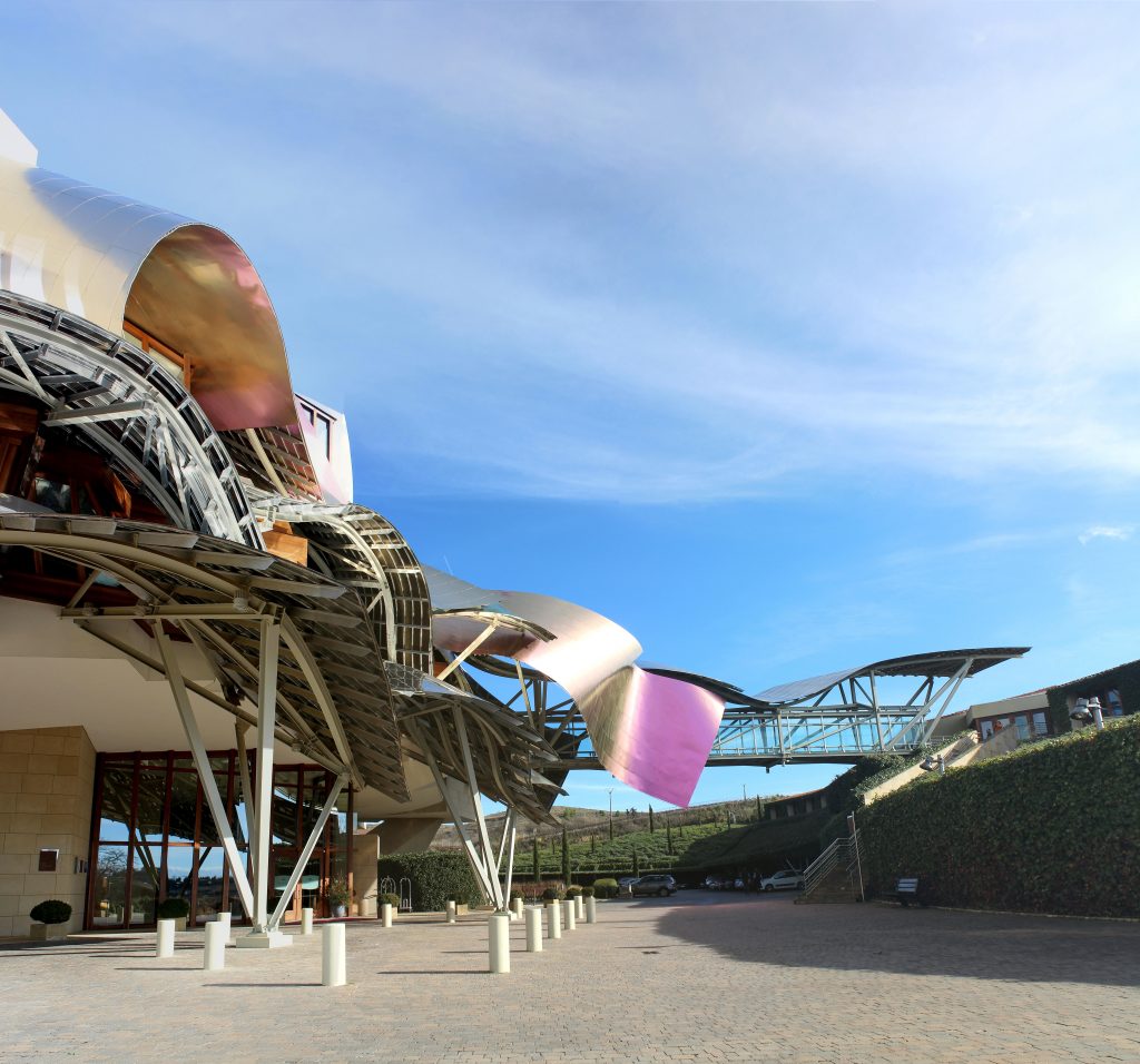
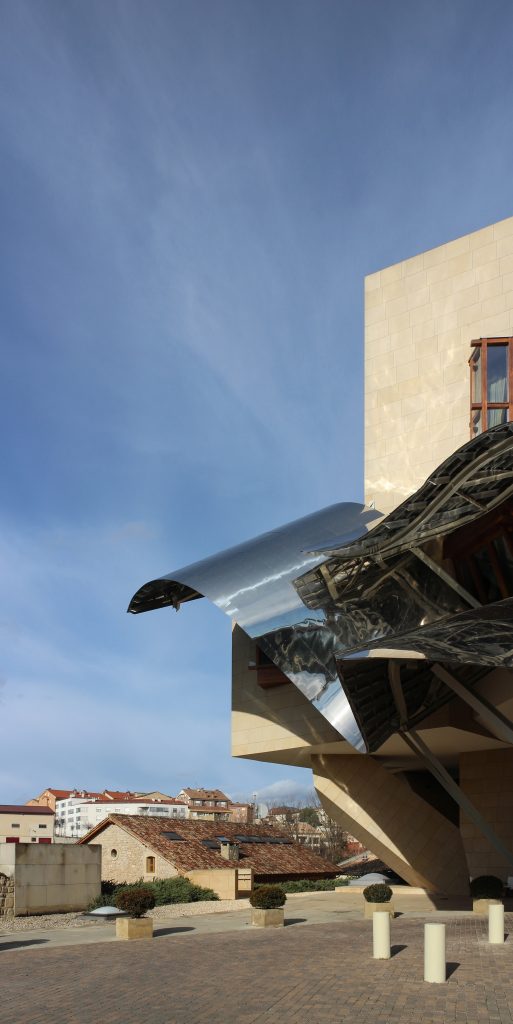
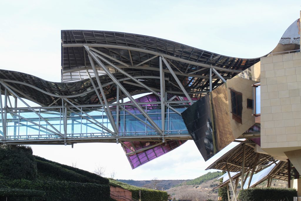
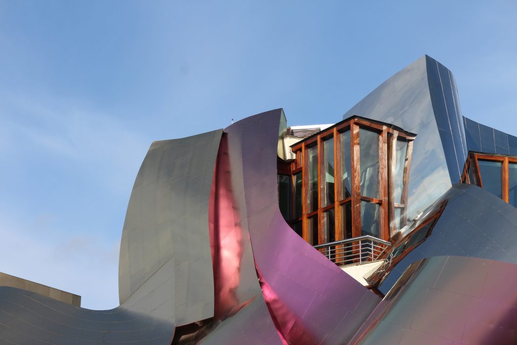
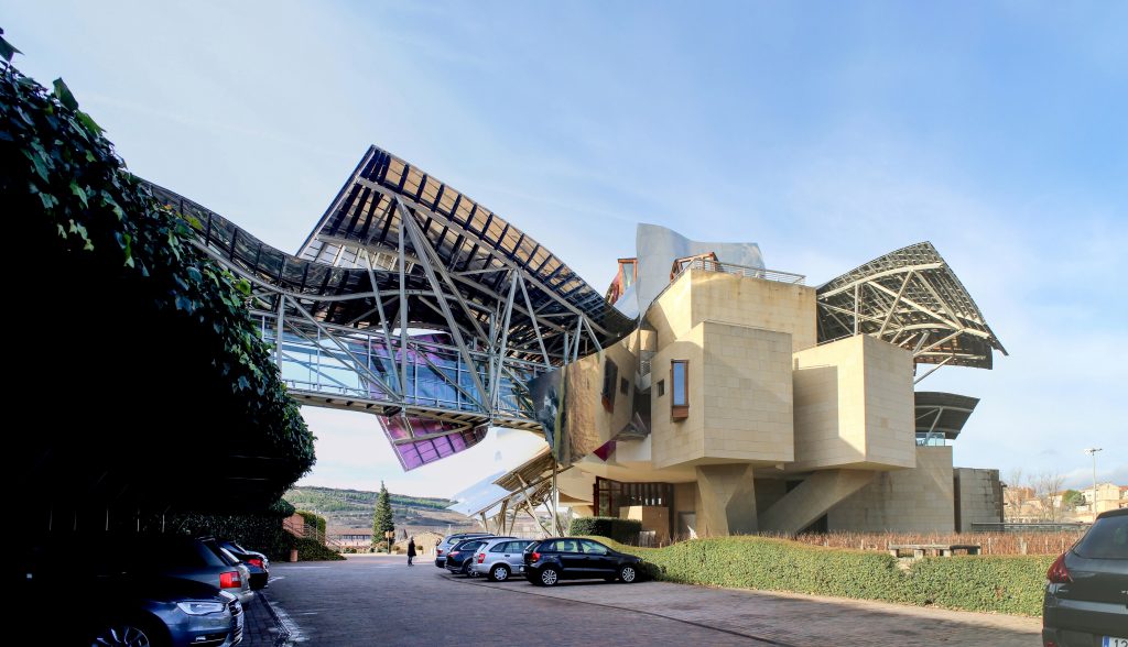
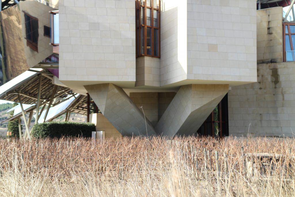
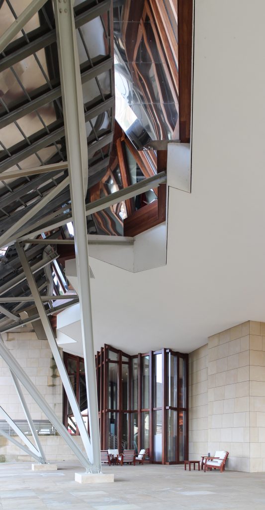
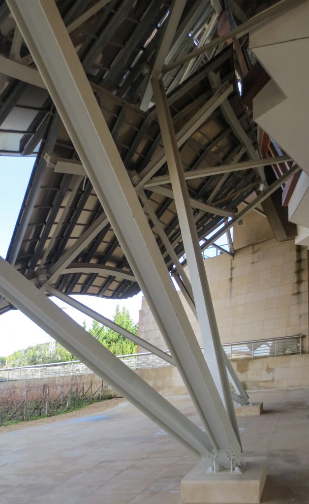
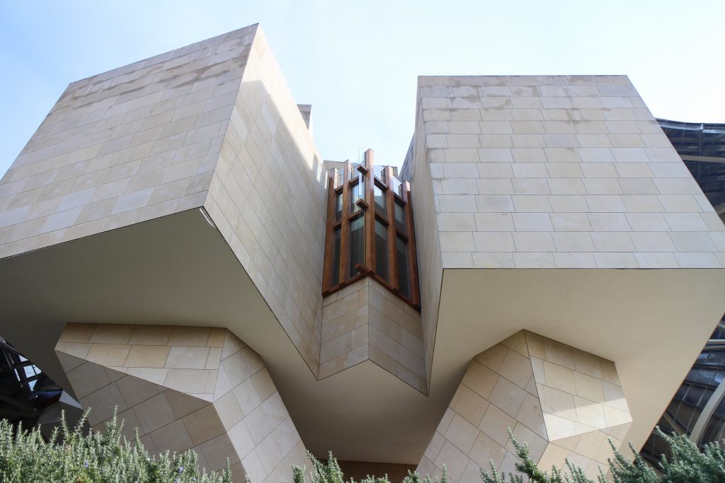
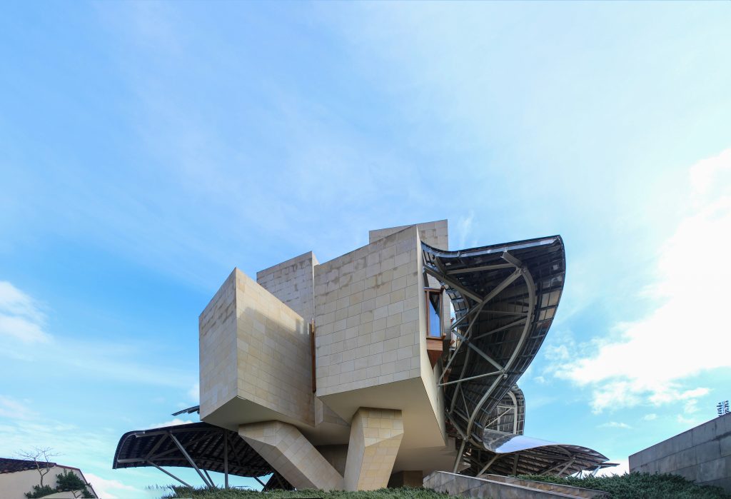
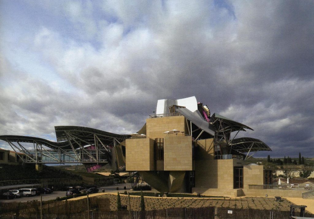
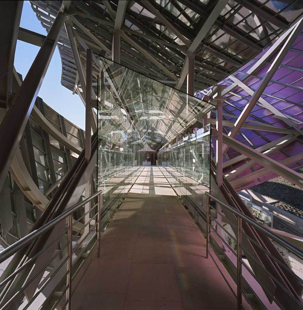
The building is a rectilinear composition of prisms that float above the ground thanks to three supercolumnas that support the entire building. Everything is wrapped in cascades titaneo (Canopies) colored.
The irregularity of canopiés forced to perform various tests and comporbaciones. On the one hand, the model was tested in a wind tunnel in Canada and subsequently by other CFD simulation program that allows a virtual tunnel eviento d, which made it possible to conduct an audit of the first test, which yielded very similar results.
The selection process operator
The hotel we are planning a “chateau” among the vineyards of the place, but without knowing who was going to manage and hence the risk of knowing they could be subject to change. Until the building has not completed its concrete structure is not known who will operate it. Riscal select Starwood after a competition among several potential managers of the facilities. Starwood is a chain that operates with eight different masrcas to standards and criteria of comfort. Sheraton, W, among others, and Luxury Collection as the highest range.
This hotel is included within the latter brand and the chain requires changes in the program. The most significant expansion of the number of rooms that initially was only 14 resulting in a new building attached.
Concept
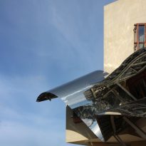
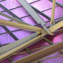
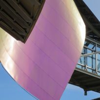
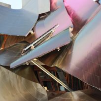
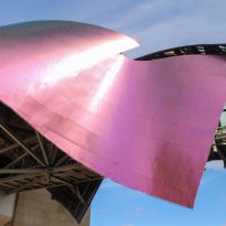
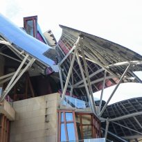
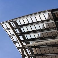
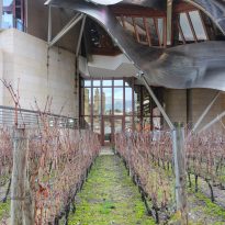
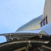
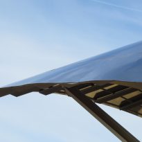
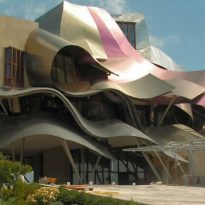
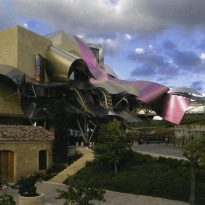
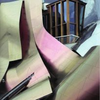
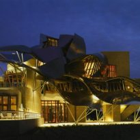
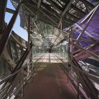
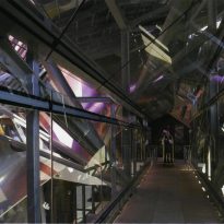
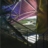
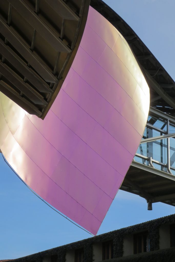
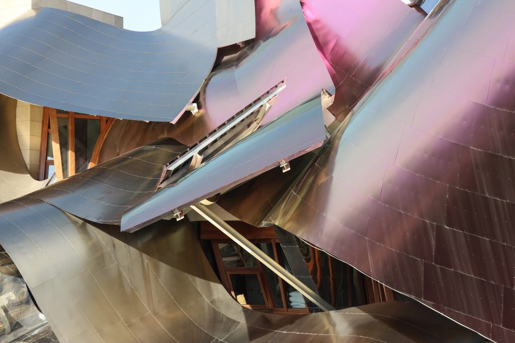
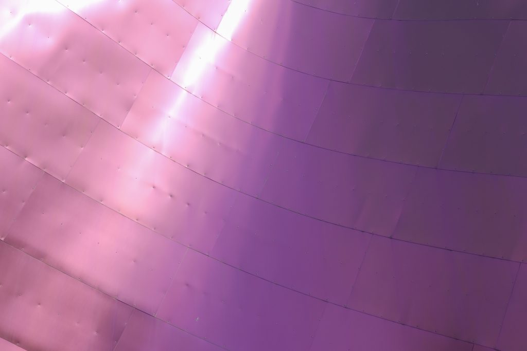
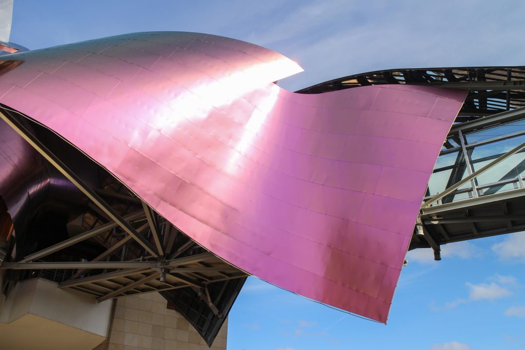
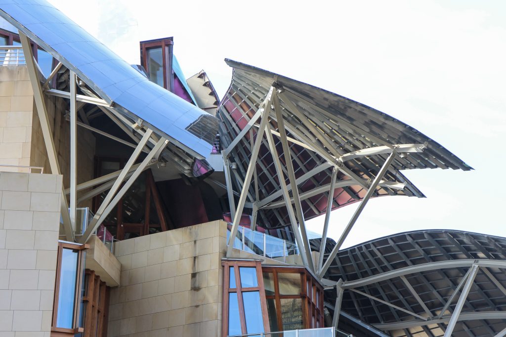
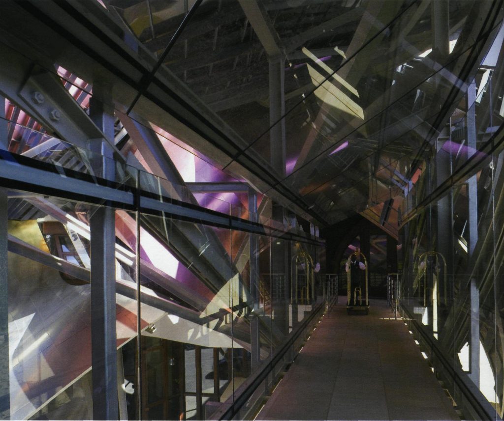
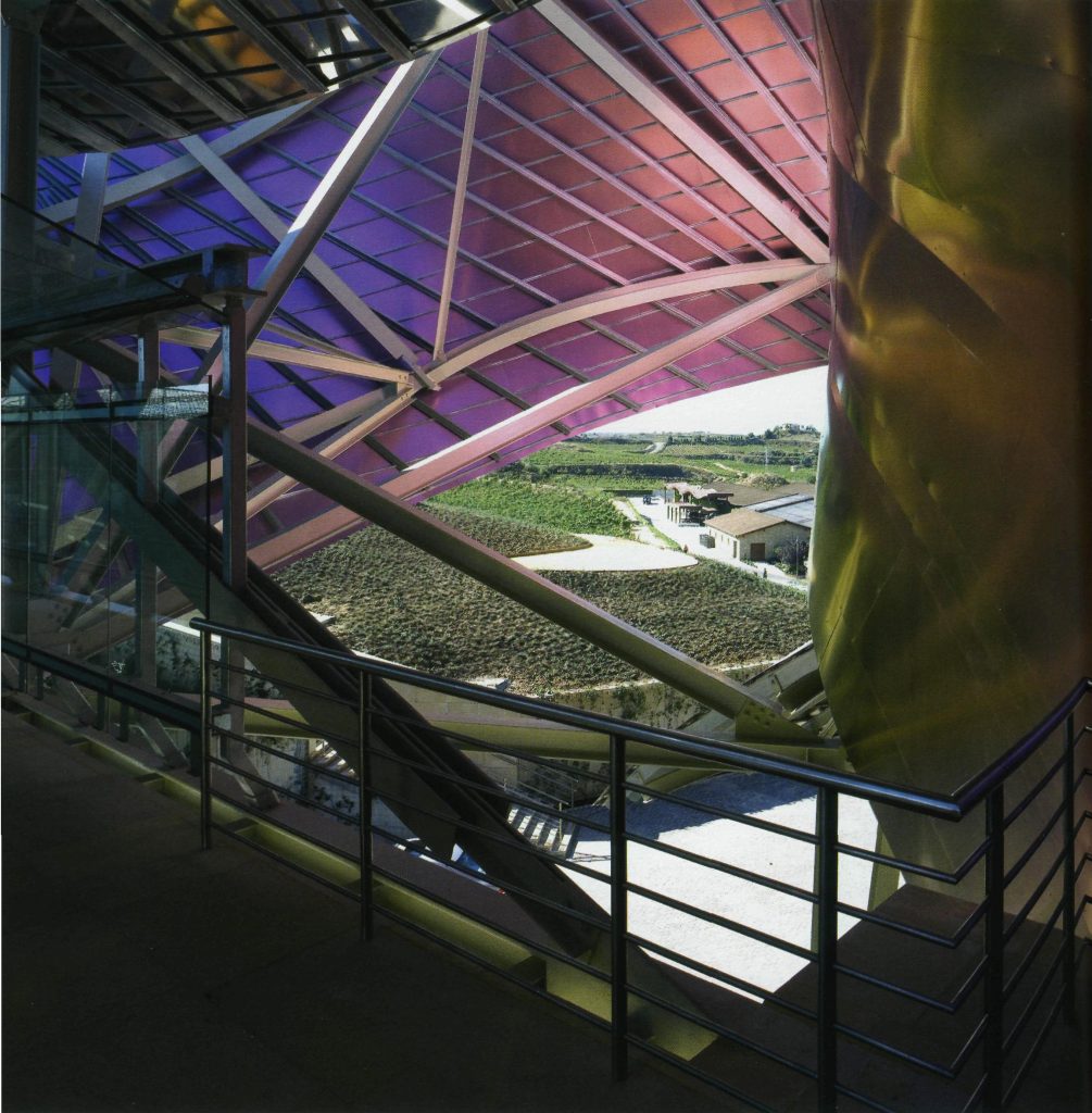
Everything is wrapped in cascades of titanium (Canopies) colored in pink, gold and silver in the light of day in their curves reflects the red hues of red wine, golden and silver mesh of the capsule on the bottle of wine Marques de Riscal.
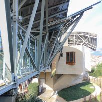
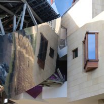
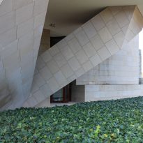
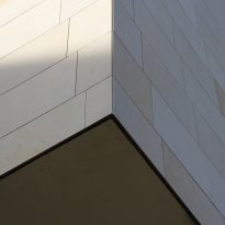
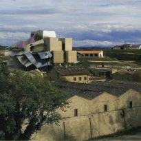
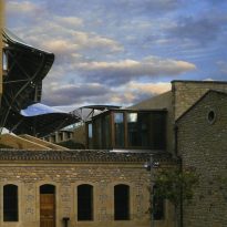
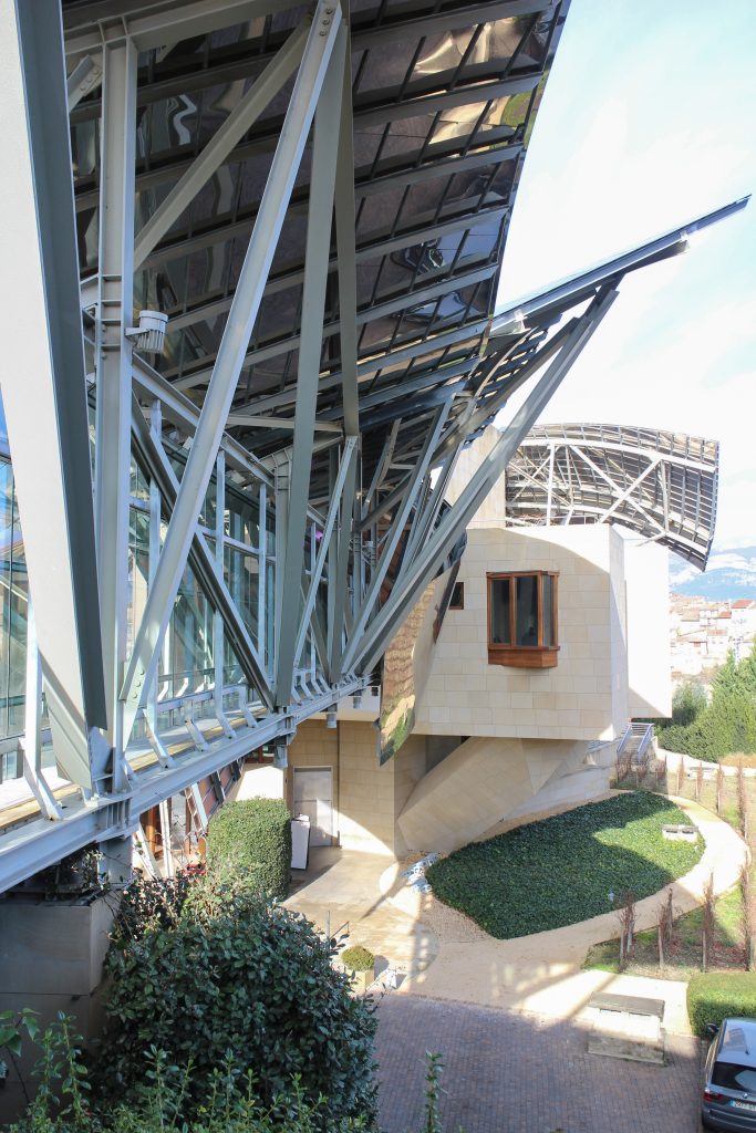
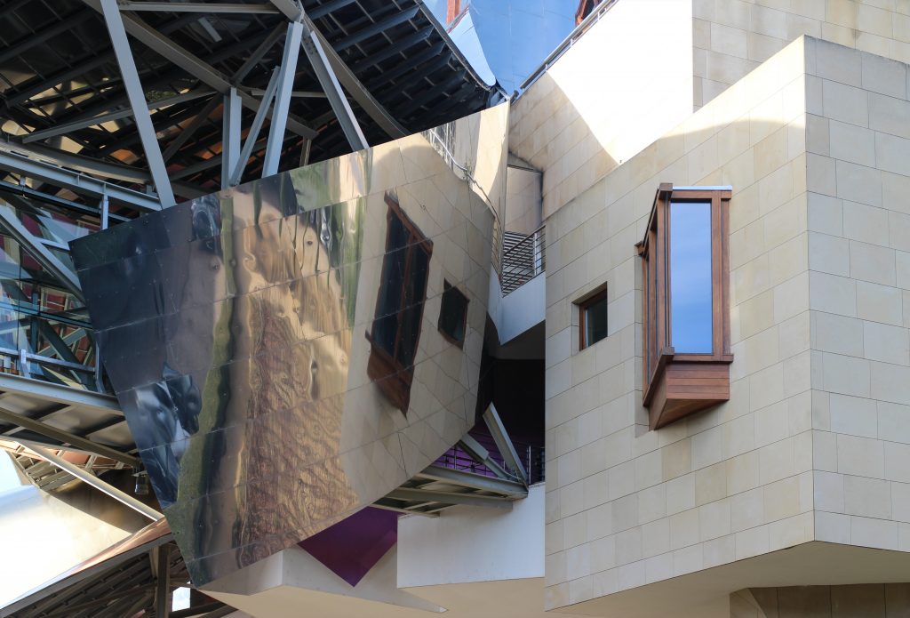
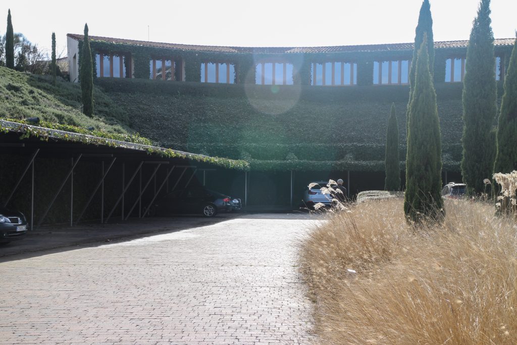
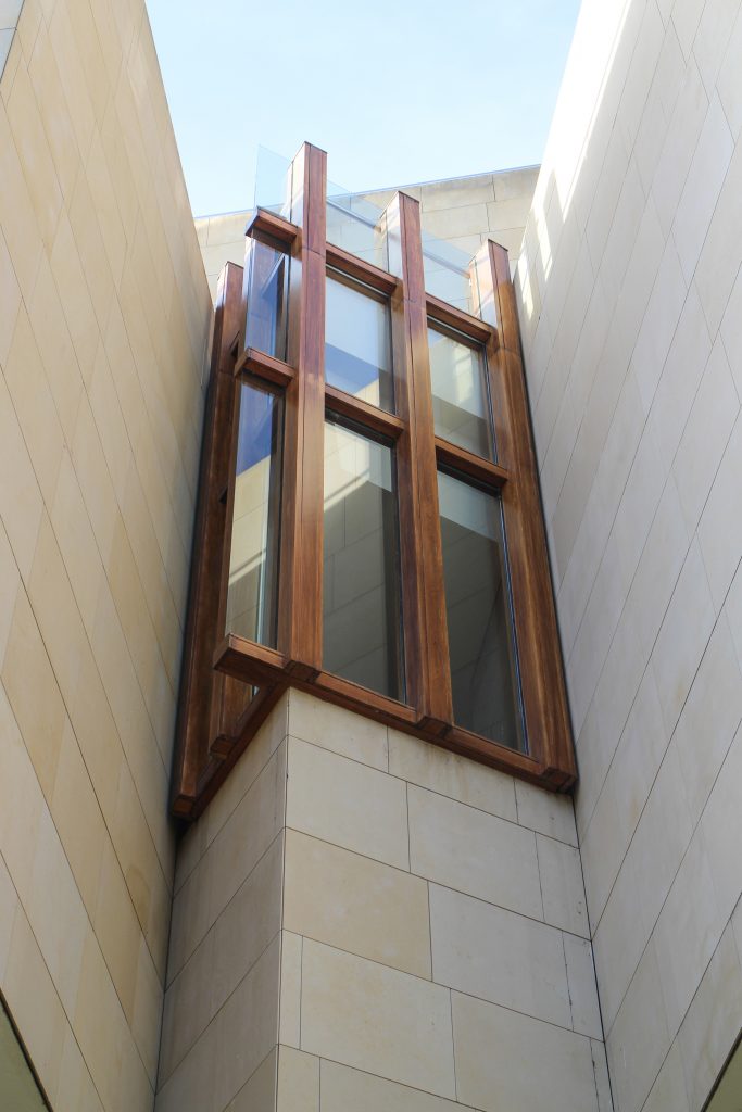
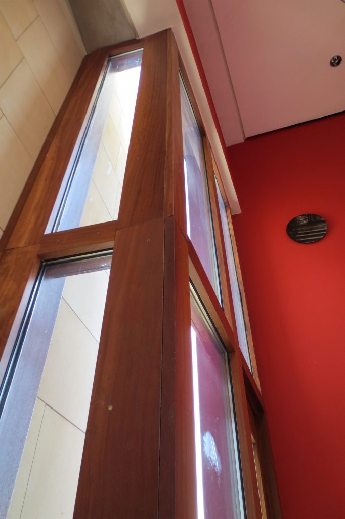
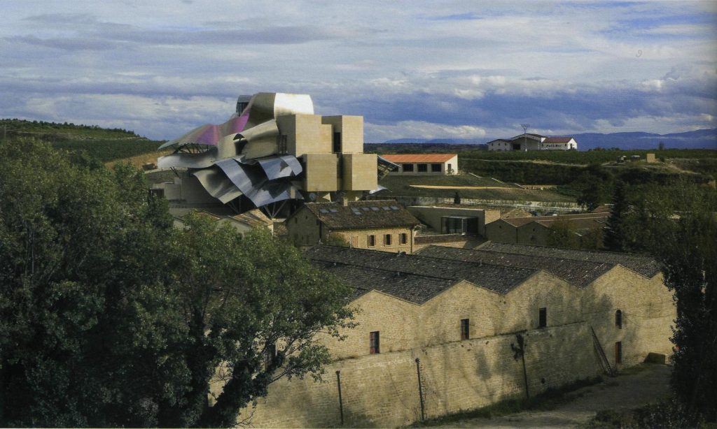
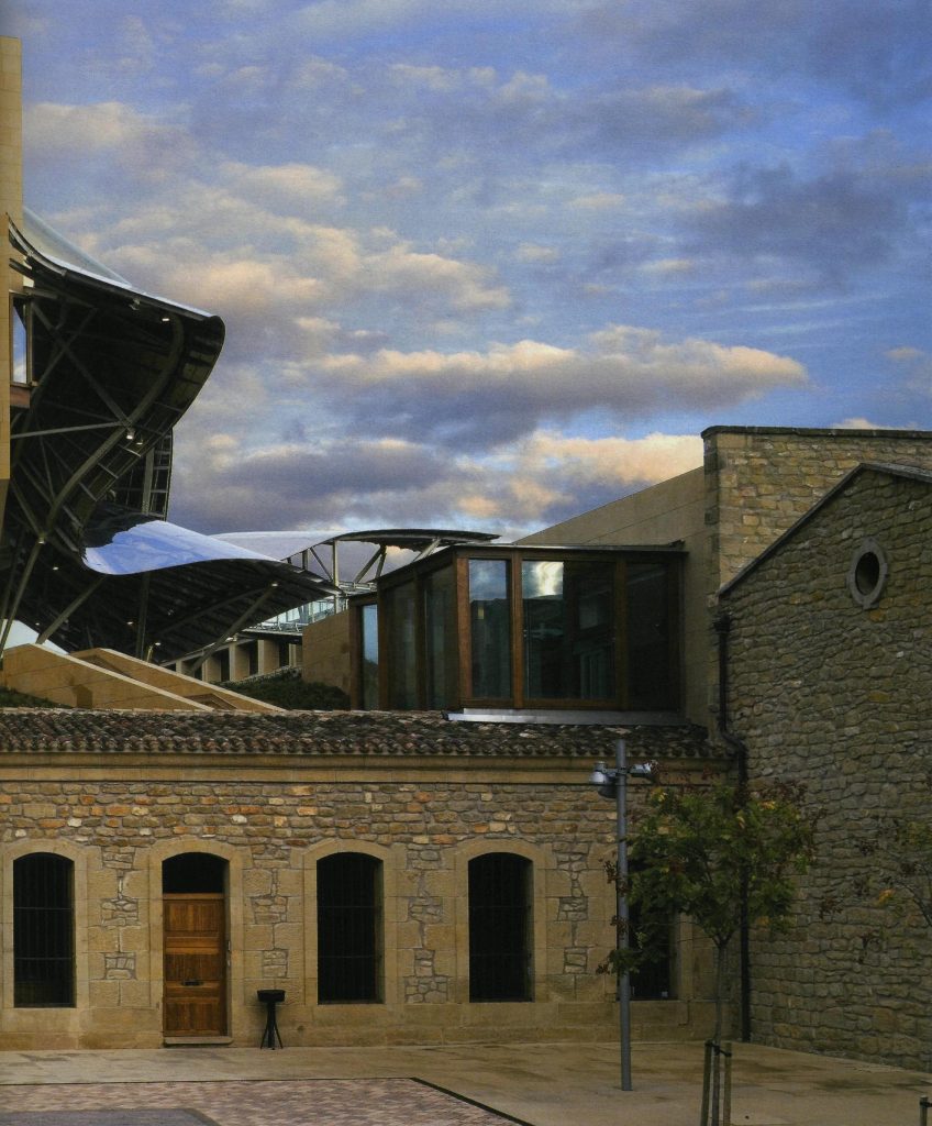
The facades of stone and wood windows down dialogues and contrasts with the traditional buildings of the nineteenth century environment, using a sandstone with the same tone of the traditional arquuitectura in that area.
Spaces
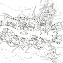
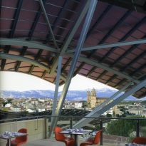
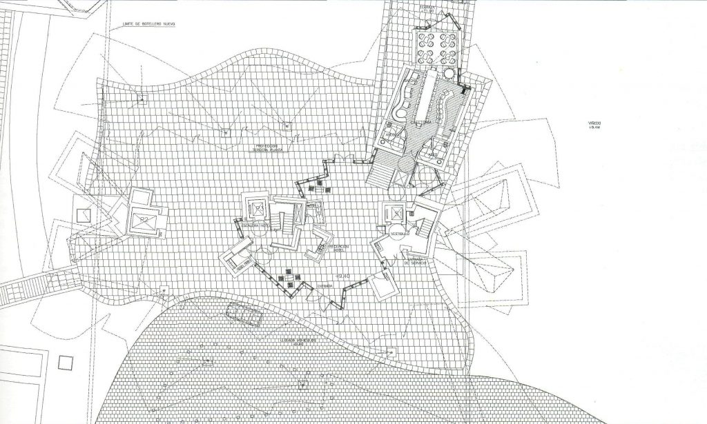
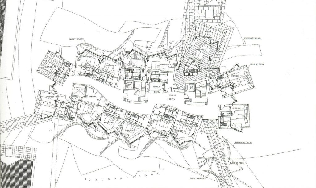
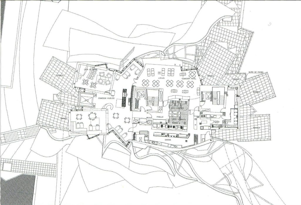
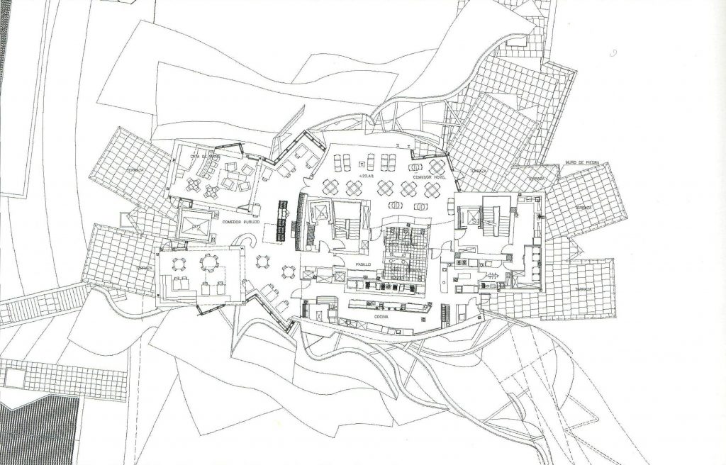
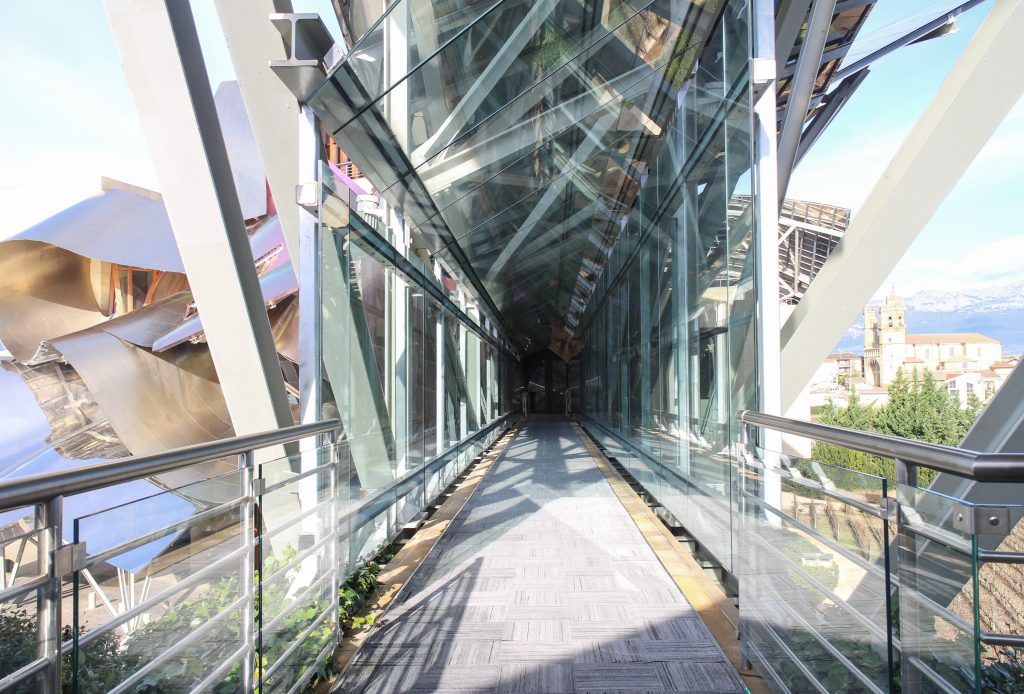
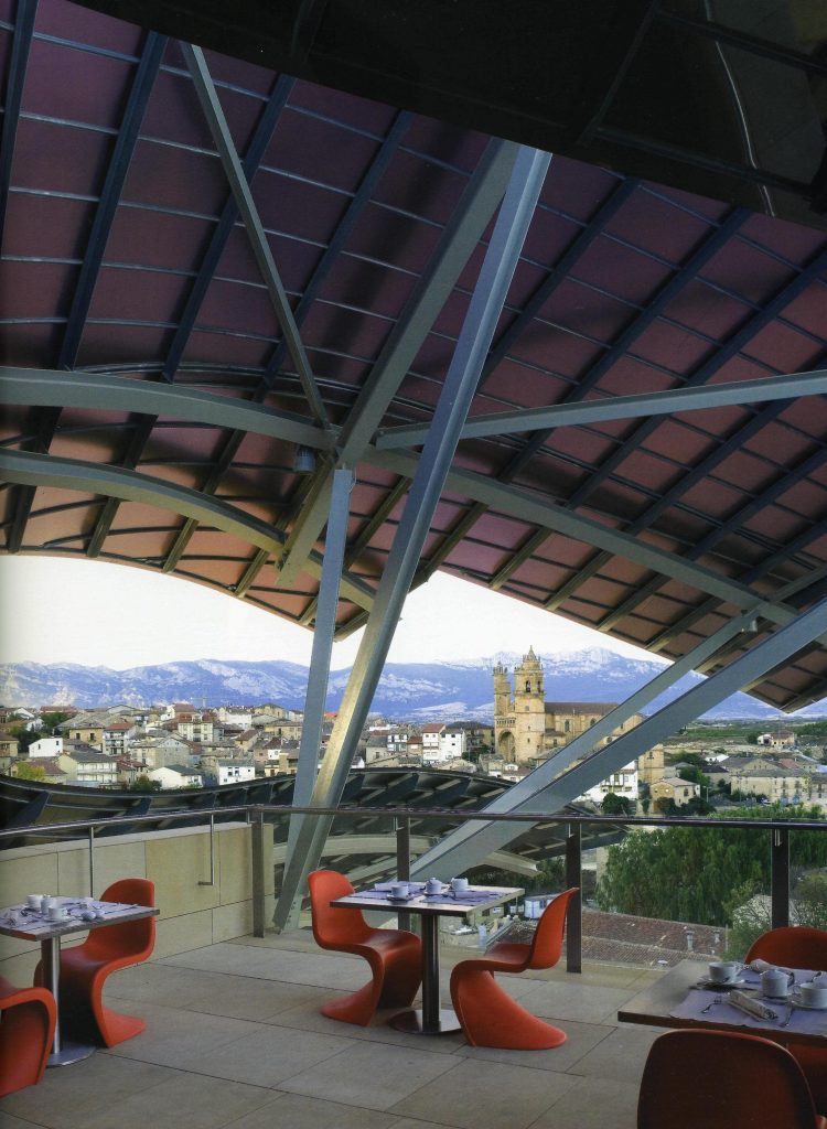
Each plant is different and highly irregular, and diminishes in size as it rises vertically. The elevation of the building, thanks to three super columns starting nine meters below the access to the hotel and cross the big bin of Marques de Riscal, allows spectacular views in all plants, both in the vineyards, as of Elciego, And the church with the mountains of the Sierra de Cantabria as a magnificent backdrop.
On the first floor, where bedrooms are located all of the hotel, is another plant in addition to the restaurant, a mezzanine for service and a top floor with a lounge for hotel guests. The complex structure of the Canopies gives voice to a sharp dialogue between the vineyards and building. These forms of exercise screen to qualify the intense sun of La Rioja, which frame the perspectives from all windows of the building.
Structure
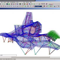
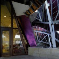
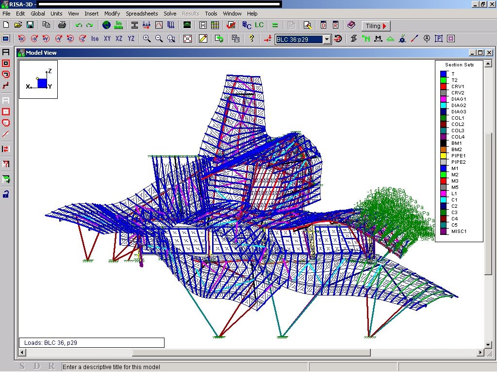
The structural solution of this building is a hybrid that combines steel, hormgión armed and systems of concrete postensado. The steel mainly focuses on Canopies, all of whose main structure is basically done in concrete. Once the design of the building has been modeled in Catia, it is divided into two to streamline the process of structural design: on the one hand, the design of Canopies and, secondly, the support structure of concrete, which are both considered according to different processes of design and computation. The Hotel Marques de Riscal has been the first such project in many aspects. The conventional structural principles have been reconsidered from the viewpoint of stability, organization, regularity and repetition. The challenge was to achieve a structural system organized to respect the basic concept of an irregular architecture.
For the subsequent calculation of the entire structure is used different programs, including RISA for the metal structure and ANSYS for the concrete structure.
The structure of concrete
The building is shaped through a series of structural bases. The three super columns that are home to the stairs and elevators in the building, are the only three pillars of the building, and not only lead to the vertical loads foundation but also give lateral stability and resistance to horizontal loads.
The forged on the first floor access and three super columns, reaching a depth varying from 0.45 meters at the outer edge of the slab, with a very irregular perimeter that corresponds to turn a large overhang, to a maximum of 1.3 meters in the center on the three core areas. Postensado a system has been introduced in the sense as crosscutting reinforcement of the structure. This board collects charges from the other floors of the building, they materialize mediente successive slabs armed. To absorb the loads of wind of the building is necessary to provide continuity to the nuclei in height and join them in a different way monolithic slabs of concrete.
This fact creates a problem for concrete, which should reduce the values shrink to 1 / 3 of the usual. to achieve this magnitude, it acts on the strength of the concrete and putting in work in phases.
The structure Metals
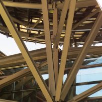
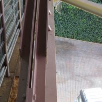
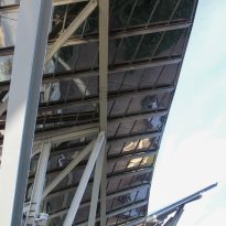
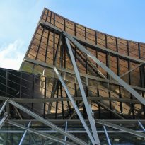
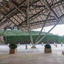
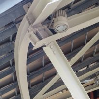
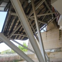
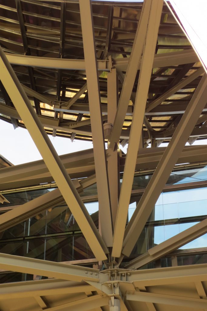
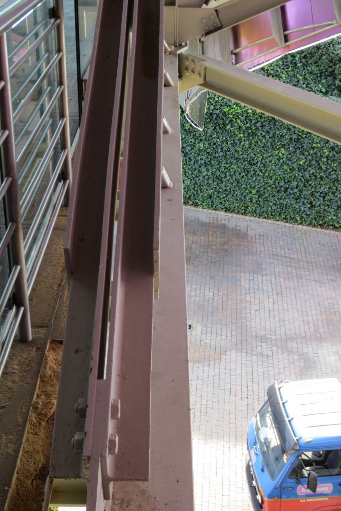
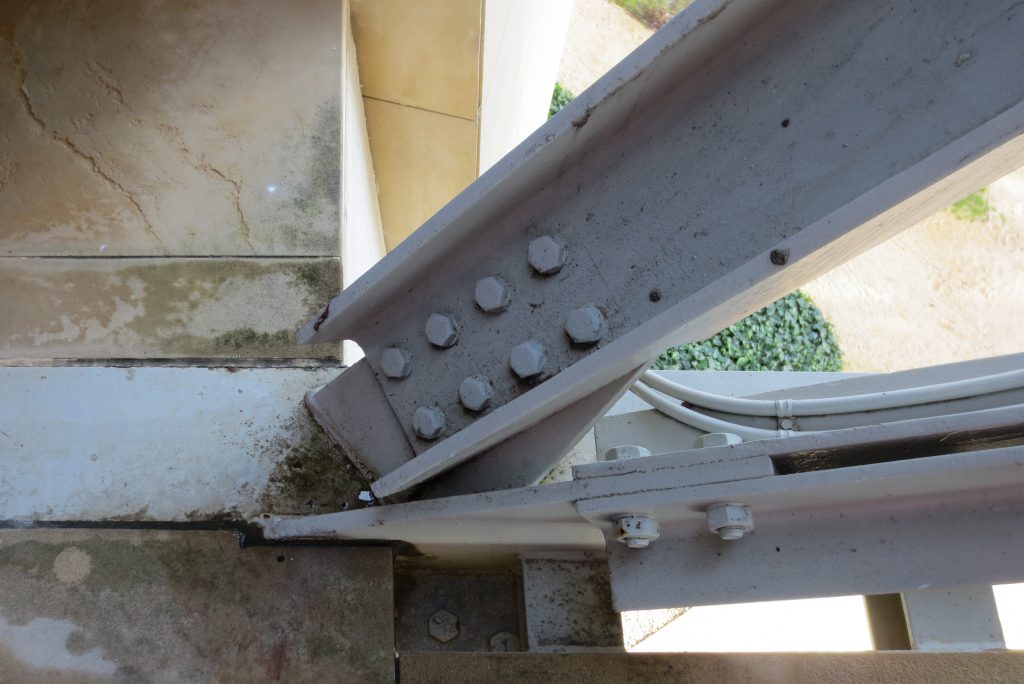
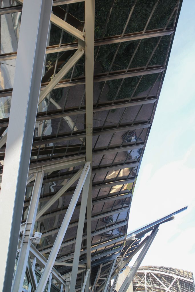
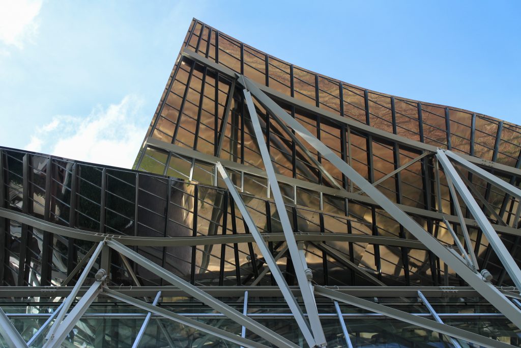
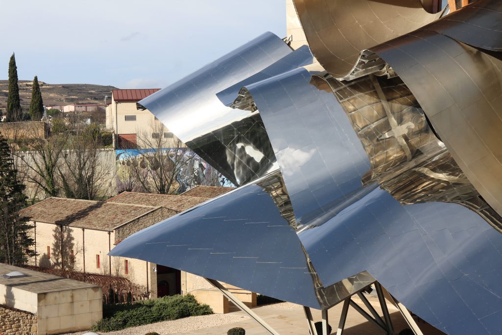
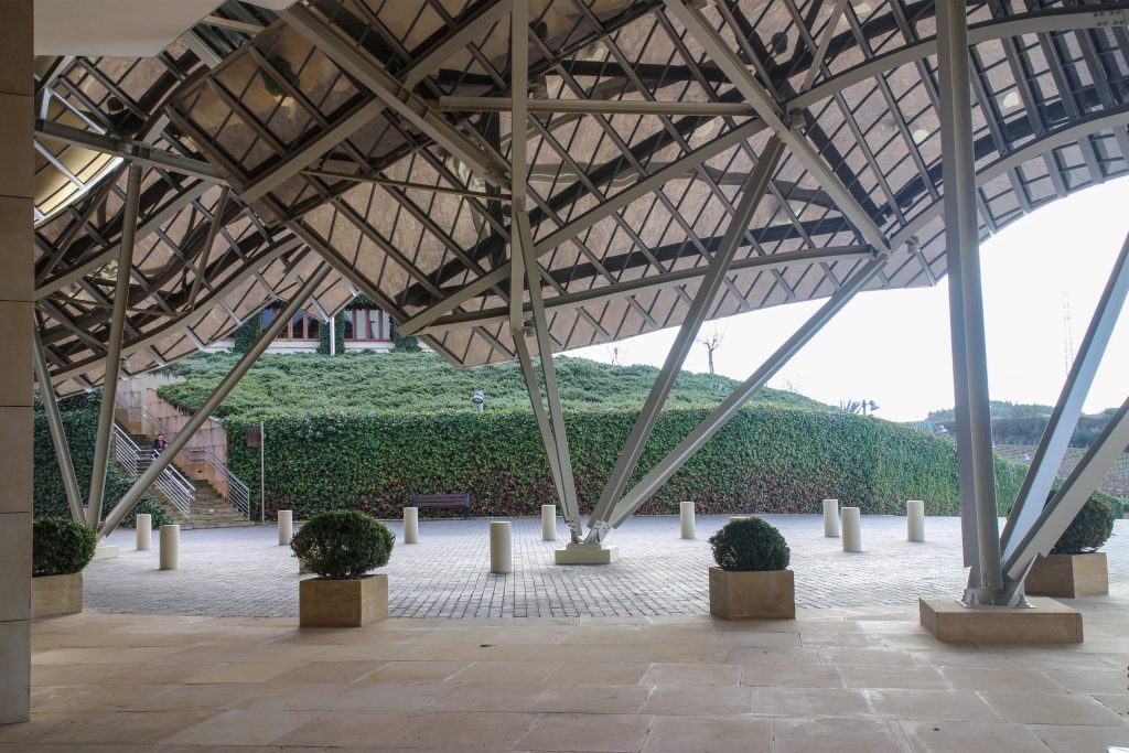
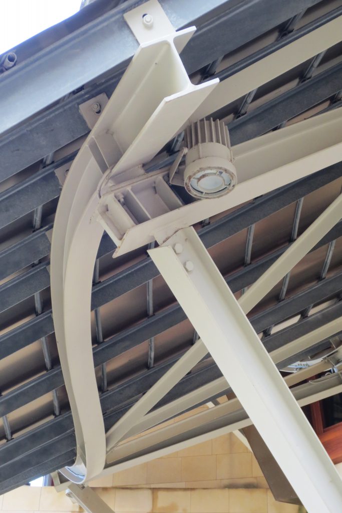
Although Canopies do not have a significant burden with the rest of the building, due to its complicated forms can lead to the effect sailing, concentrating the wind in very specific areas. These charges are transferred to the main structure through the profiles of steel that anchor, either one of the floors of the building or directly to the field. Continuous curved metal beams can be redistributed through the structure to ensure that no point reaches the critical situation inside the package. Thanks to the triangulation of geometry, most of the connections only supports efforts axial and cutting, to avoid virtually all moemntos. The main structure is made up of media straight born, as was discussed earlier, both the perimeter of the plant as the level of access, resting on the beams type HEA / HEB curved in a single direction.
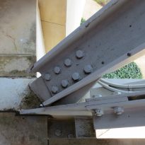
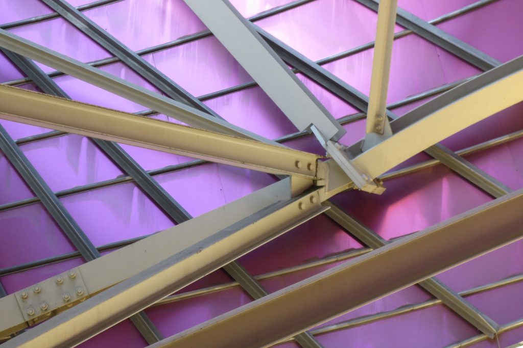
The secondary structure consists of profiles T galvanized, straight for the most part, they are “rules” to create the final surface. All these profiles are joined to each other by high-strength bolts. They are preparing curved tubes galvanizaods thirty millimeters in diameter, fifty centimeters separated from one another, that define the final and sueprficie curve on which are placed around platabandas riveting allowing some slack to plates of stainless steel or titanium-colored, without causing on the same hole as if it could proudcirse conduct directametne on the tube.
Canopies of the coating
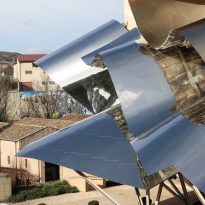
The Canopies are lined with stainless steel, titanium and mirror colors. About three thousand four hundred thousand square meters spread between titanium tone in gold, seven hundred and titanium in pink and the rest of inoxicable steel mirror polished finish, broken into something more than twenty different Canopies that form the bulk of the lining of the building.
The titanium has been supplied from Japan, which incorporates a layer of oxidation that is transmitting the color. to get that color by dipping the titanium plate in a natural acid which is applied electric current is called electolítico process. This process produces an oxidation at the plate, depending on their thickness that defines the final color of the plate.
After obtaining the color, apply a hardener colorless layer that protects this layer of oxidation and claim a total stability in the final finish of the layers of titanium. The placement of titanium and stainless steel at mediatne Canopies is a square of foil and two one millimeter thick, which overlap in the form of flakes attached to the tubes through stainless steel rivets. To avoid the formation of pairs between the galvanic plantabandas of galvanized steel and reversing titanium or stainless steel provides a tape, both among the stainless steel rivet with the galvanized steel and titanium, which is necessary to install a sleeve of nylon between each rivet.
An additional difficulty is the vision we have Canopies, since most of which both sides are visible, so that any defect which has the structure that supports them or the material itself in that it completely visible.
The facades Foreign
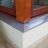
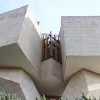
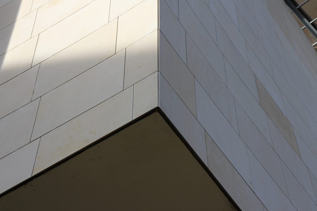
The building is of stone in their facades straight, and titanium and stainless steel in the corners, opening large windows especially among successive Canopies.
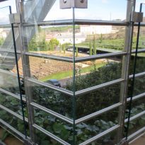
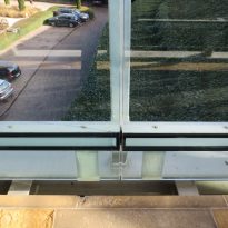
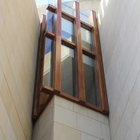
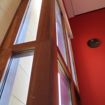
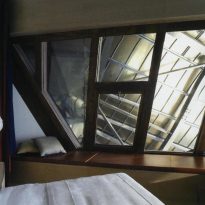
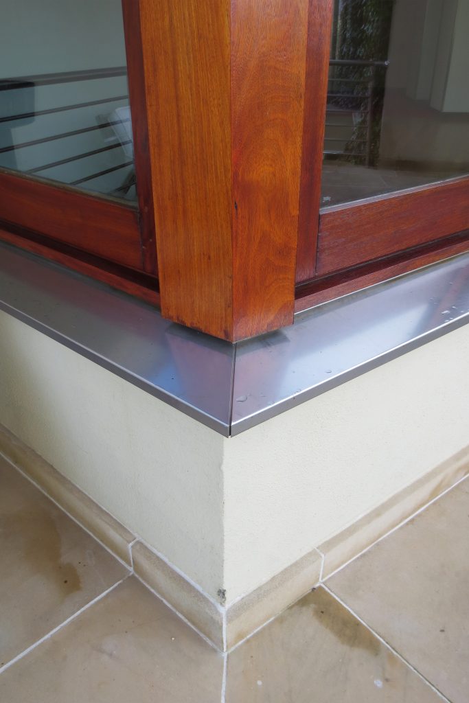
More than one thousand square meters of glass, all different from each other, rectangular, triangular, trapezoidal and diamond, and many of them with complex guidelines, which open the building to the landscape of vineyards and mountains sieving the light outside. Windows framed in a carpentry Mizta with the soul of galvanized steel, aluminum frames, all lined wooden Blonde a minimum thickness of four centimeters.
The curved walls are built using a structure like that of Canopies, which, among profiles T i tubes provides a skin of galvanized sheet which is within six inches of rock wool felt reinforced with aluminum and was waterproofing the outside with a strip of rubberized asphalt polie.tileno and self-healing and self. On the tubes and plantabandas, as in the rest d Elos Canopies, are placed plates of titanium or stainless steel rivets through.
The sandstone provides the system Facade ventilated factory bloc composed of five dentímetros polyurethane 50kg/m.3 density it provides, in addition to the thermal insulation required, a guarantee in the waterproofing of the facades. Each stone is held by four-point anchors.
The Interior
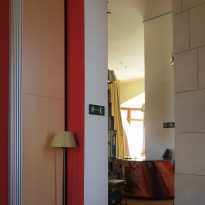
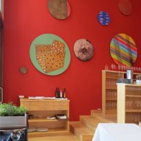
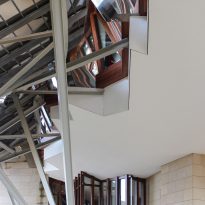
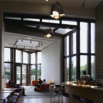
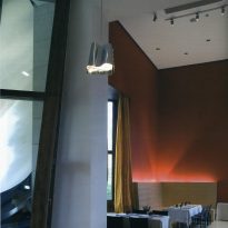
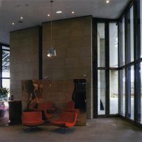
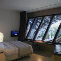
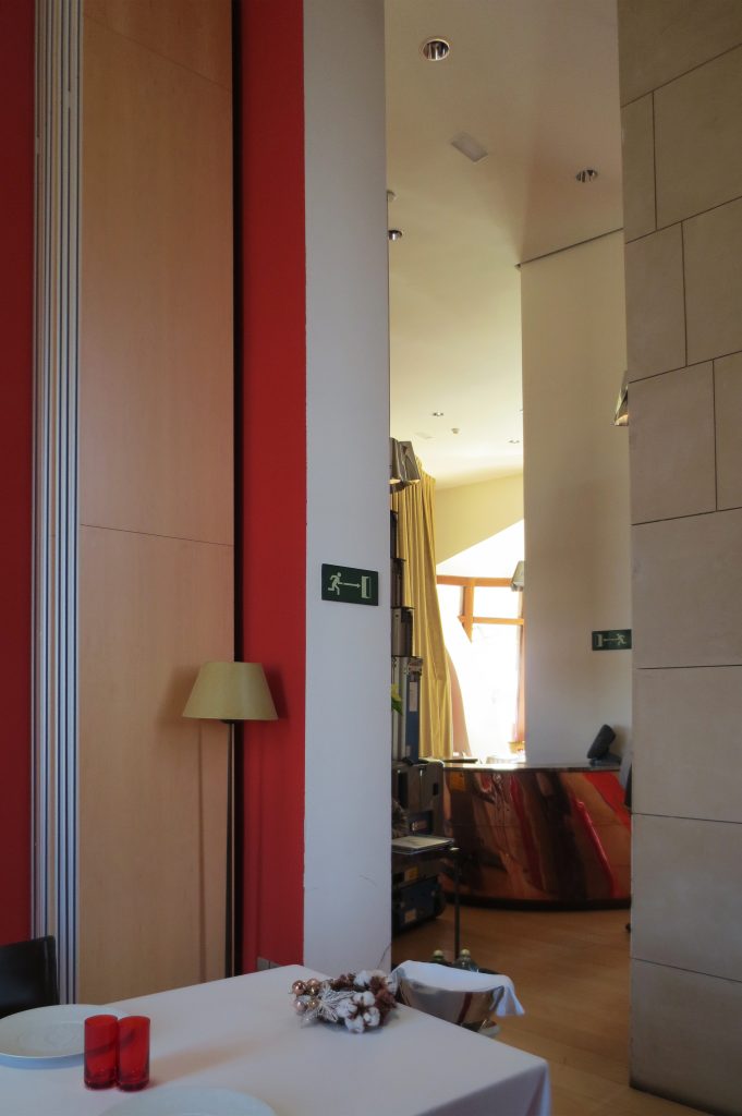
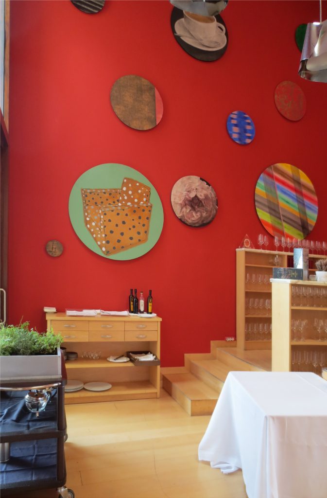
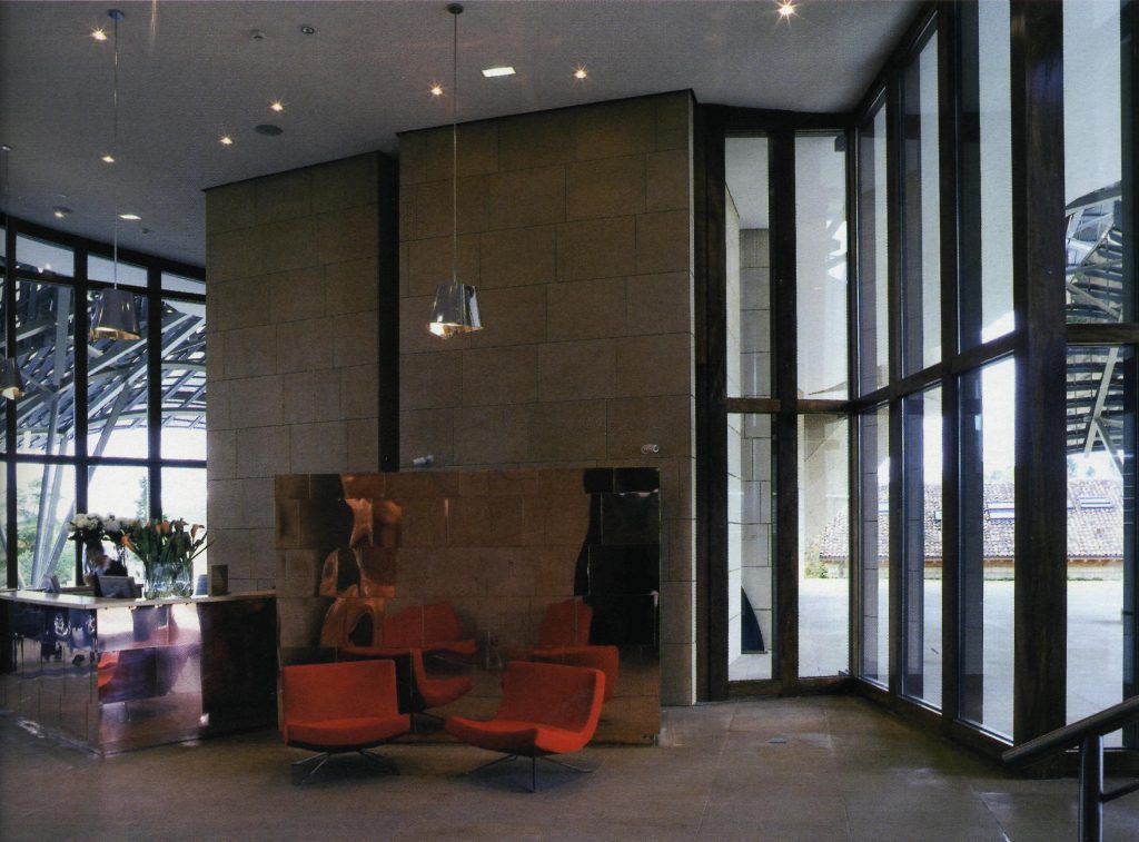
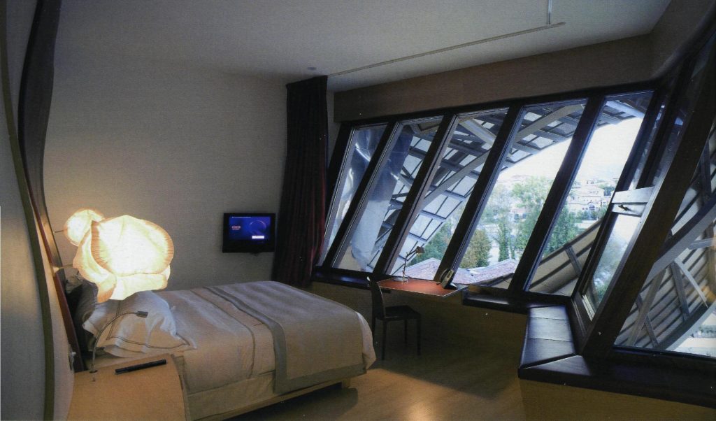
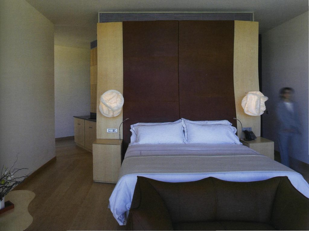
The entire interior of the building was also designed by Gehry Partners and developed by IDOM, from the distribution of all indoors until the curtains, head of the bedrooms and lighting fixtures. The interior spaces are designed for simple and elegant to leave his role forms curves, sloping walls and the landscape that fits behind each window and leaves in the background to Canopies that screened and play in turn with the penetration of light and color of it.
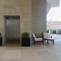
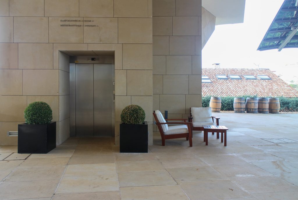
In general, throughout the interior of eidificio, the wooden floors are maple, the facades and interior walls and ceiling are painted plaster cardboard-RAL in 9010. Only zones punctual in this material is modified to fit the space, as an example are the spaces that have continuity from the outside, which maintains the sandstone tatno vertically as in paviementos.
The items of furniture that have not been designed by Gehry signature have also been chosen by himself, defined for each space. Among the most unique interior elements designed for this building are the head of rooms and fixtures.
The head of the bed

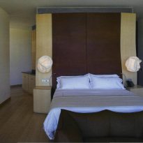
The head is an element that is the whole surface of the wall space it occupies, which has been developed with the program since Catia is a complex curved surface in two directions. The company responsible for carpentry for its implementation had therefore to work on this program, and from there make their drawings of details.
The finish is the head of maple wood on the sides of the bed like the bedside tables that incorporate the same curvature and the rest are in the areas below. The central part is covered with fluffy agreements with a foam interior to achieve the maximum comfort of the user.
The Luminaires
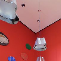
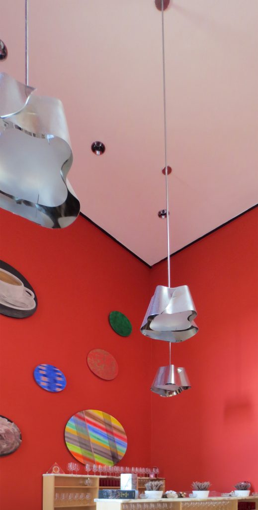
The two luminaries who are in much of the interior spaces sehna manufactured with a stainless steel finish.
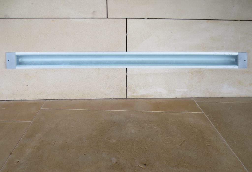
One of them is placed on the walls and because of its shape and location of lamps achieves both provide indirect light that sweeps the wall as direct light.
The other is a fitting ubucada in large spaces such as reception and restaurant, which is suspended from the ceiling with a suggestive way that contributes to finish dressing space in which it finds itself.
