Seattle Public Library
Introduction
The Seattle Public Library was opened in May 2004. The design of the architect ‘s career clinched Rem Koolhaas because it is an impressive building that combines futuristic lines with the functionality of a library.
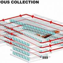
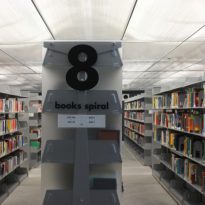
Before completing the design of the building, Koolhaas met with representatives of Microsoft, Amazon and other organizations to discuss the future of books and the library. In a modern world dominated by the Internet and digital media, conventional book seemed headed for oblivion. However, after many months of investigation concluded that the “book” was very far from being a thing of the past. Therefore, ” spiral “, was a new way of delivering books to customers within a library system. Instead of books on different shelves and floors, the spiral inclined allowed a continuous row of books that make them ” easy to navigate “.
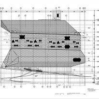
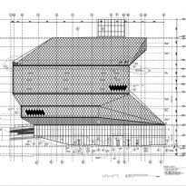
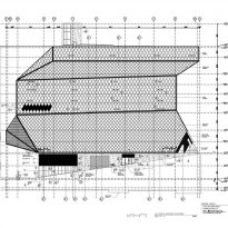
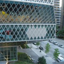
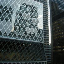
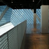
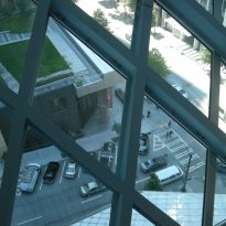
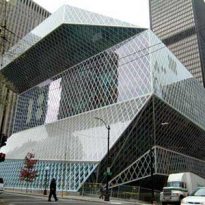
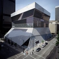
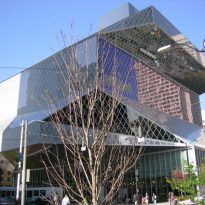
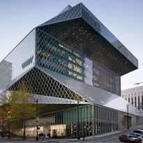
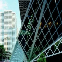
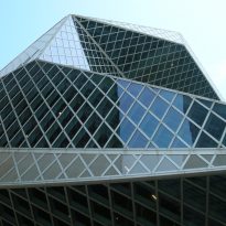
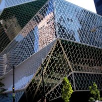
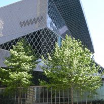
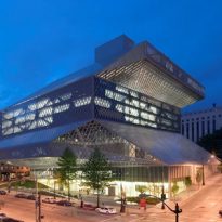
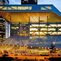
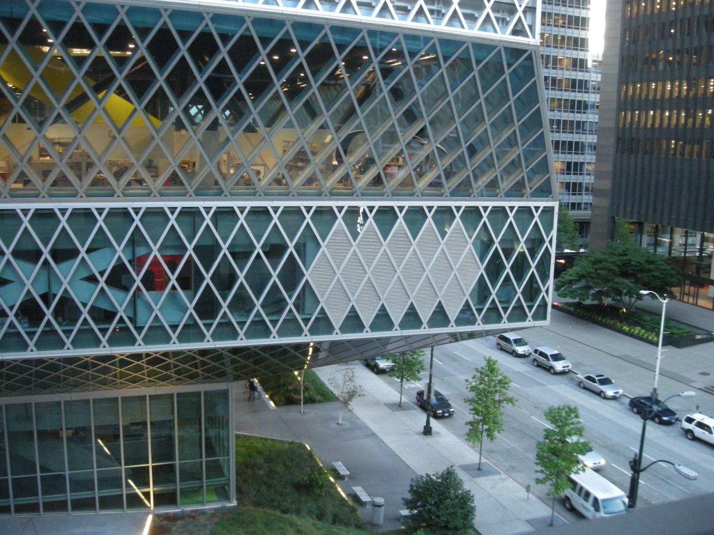
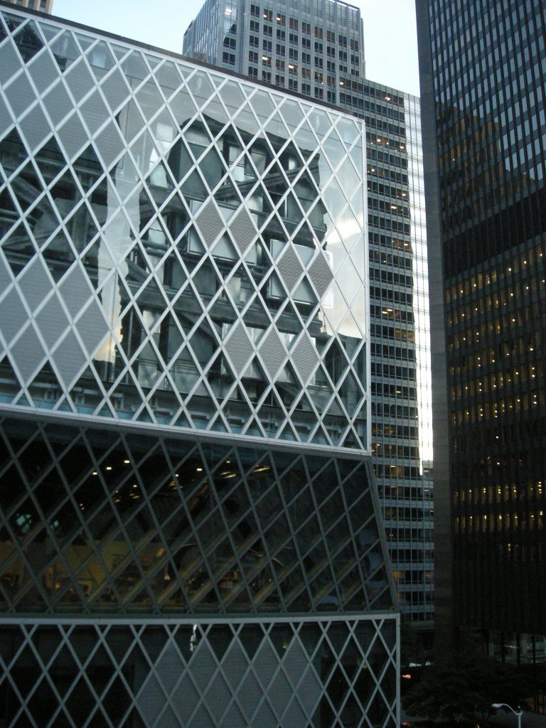
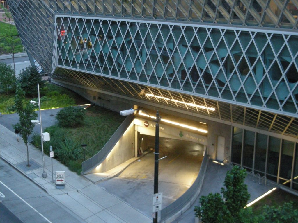
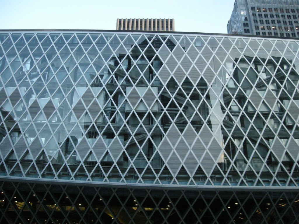
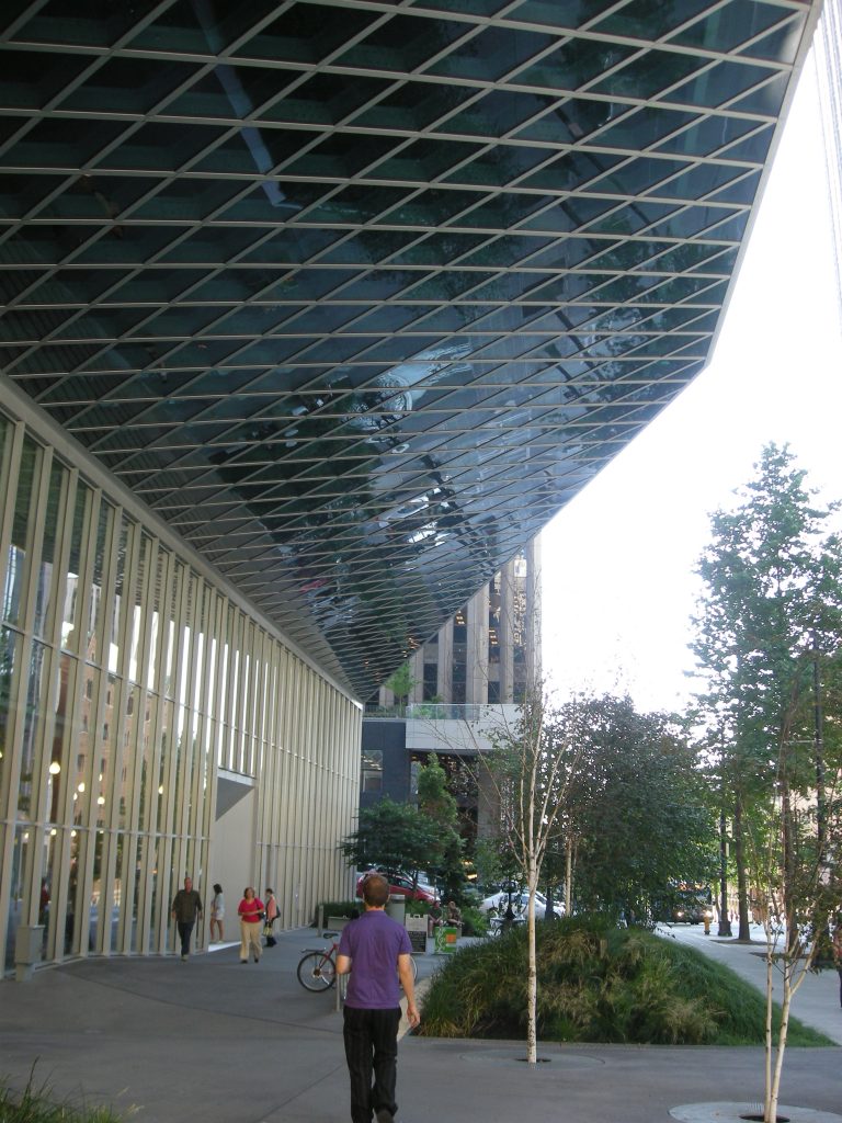
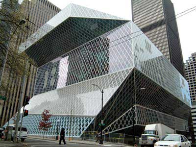
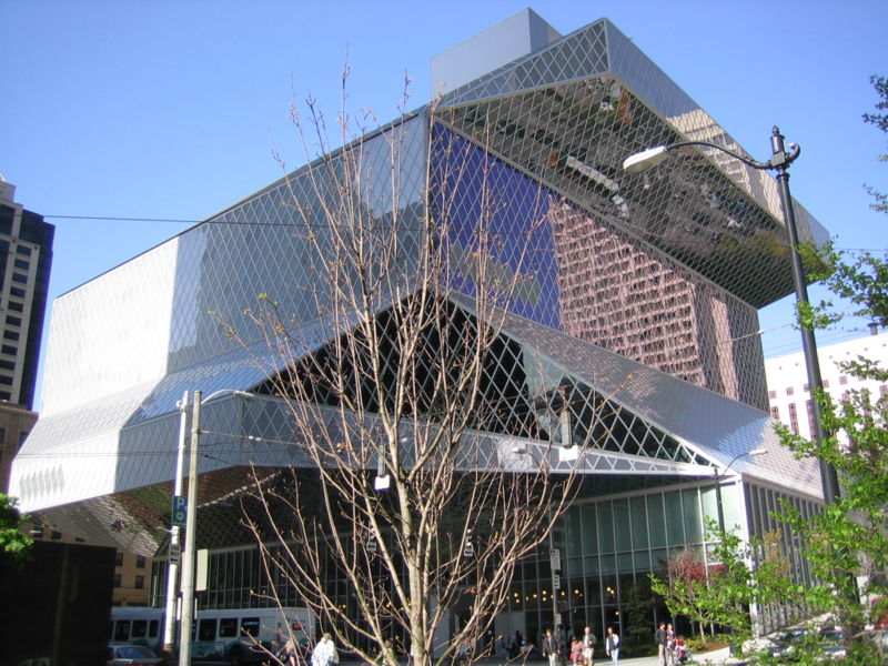
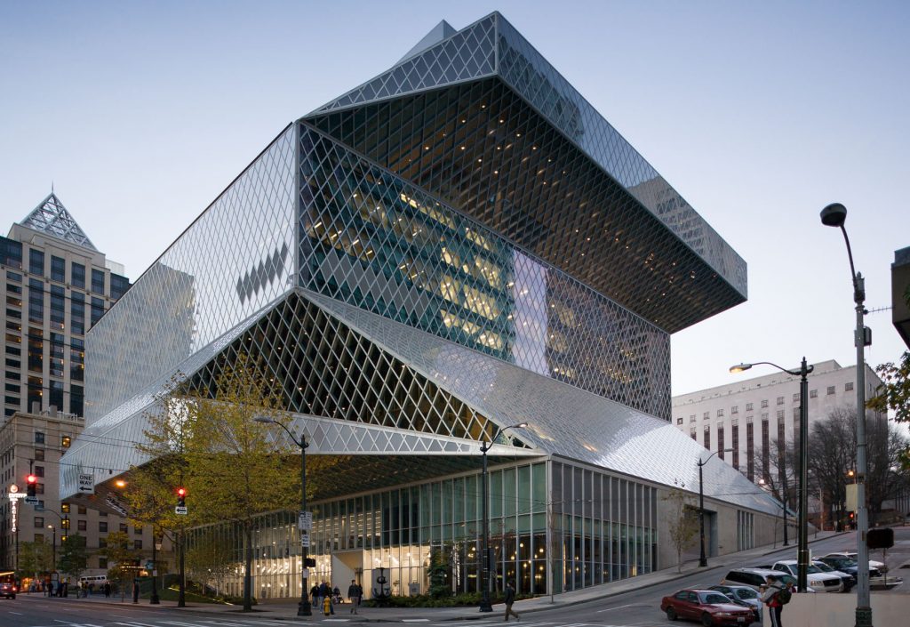
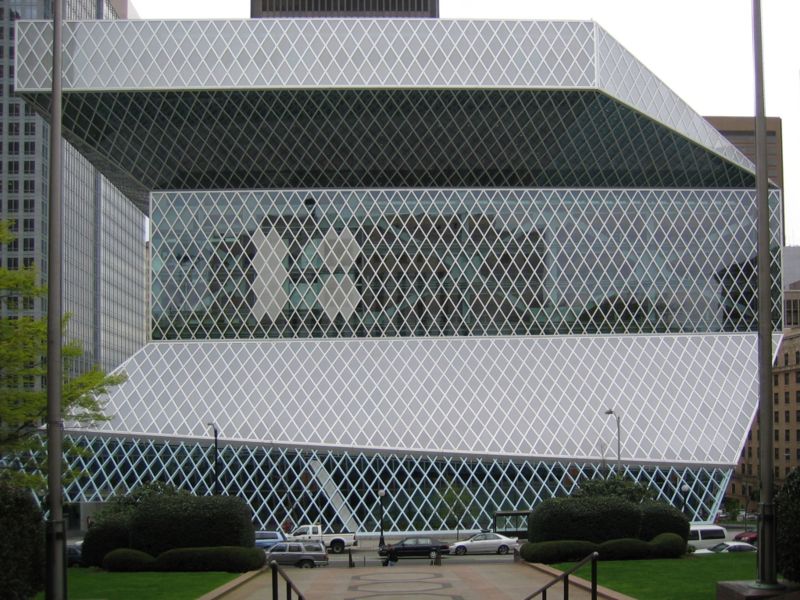
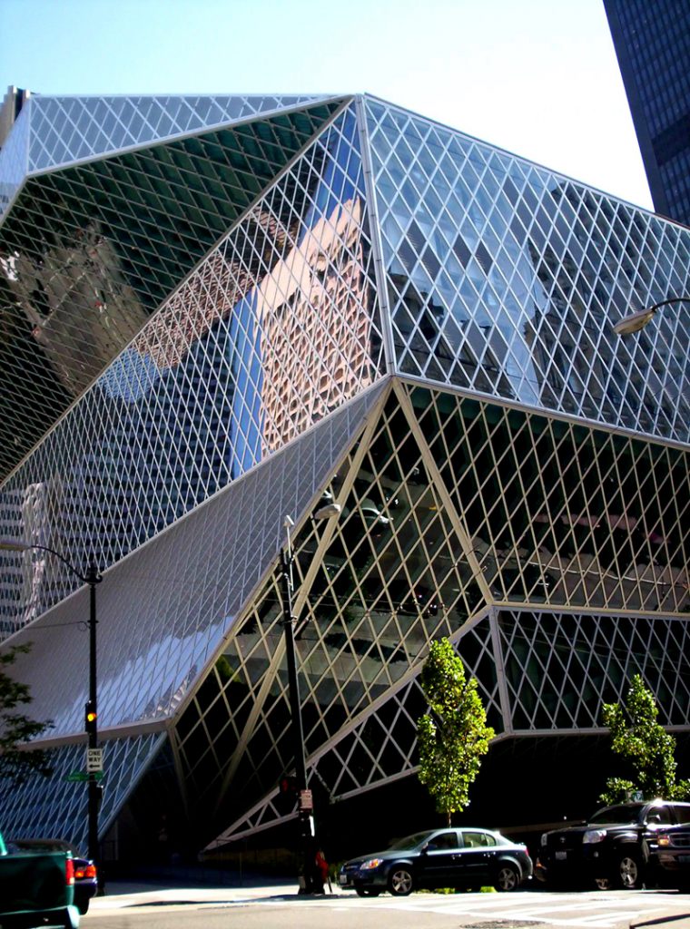
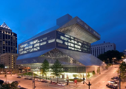
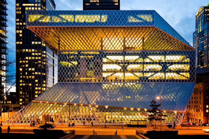
From the outside, you can see a large glass building, straight lines that intersect. It is articulated by large blocks at different levels corresponding to the library premises. It is a building that is in harmony with the skyline of Seattle and the townscape of the city.
The library has been a great success for the city, helping to attract new economic activities, much of which comes from tourism. In its first year, the library received 2.3 million visitors. Paul Goldberger, The New Yorker has said the building “… is the most important new library to be built in a generation, and the most exciting… ” The construction has gone on to win numerous awards including the Platinum Award from ACEC and the AIA National Architecture Award 2005.
Location
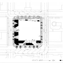
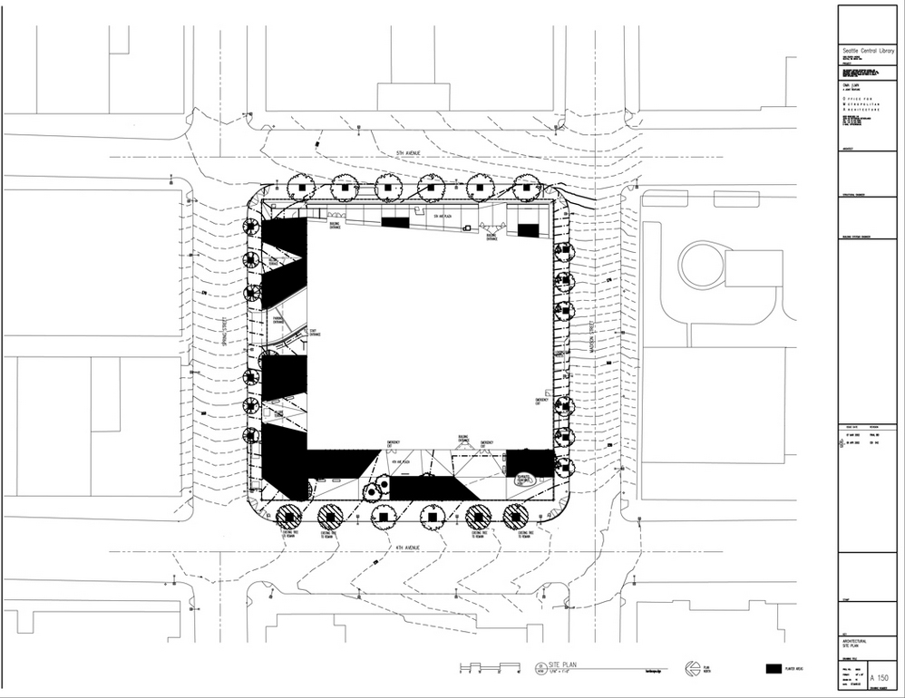
The Library is located on Fourth Avenue in downtown Seattle, United States.
Concept
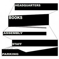
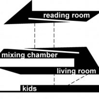
The concept involves the reinvention of the library as an access point to information presented in a variety of media. “The new library does not reinvent or modernize traditional, they are just packaged in a new way ,” explain in the OMA study. To realize this, Koolhaas applied its interpretation of the feature set and architecture for the project that the building would be flexible for future expansions, with the possibility of grouping of spaces according to the needs of the building and the platforms connected to the study would provide open spaces, work and social interaction.
The Seattle Central Library redefines the library as an institution no longer exclusively dedicated to the book, but as an information store where all potent media, new or old forms, are presented equally and legibly. In an age where information can be accessed anywhere, is the simultaneity of all media and, more importantly, the curatorship of their content that will make a vital library.
Flexibility in contemporary libraries is conceived as the creation of generic floors on which almost any activity can be developed. Programs are not separated, rooms or individual spaces not given unique characters. In practice, this means that bookcases define generous, though harmless, reading areas on the opening day, but through the relentless expansion of the collection inevitably come to encroach on the public space. In short, this form of flexibility, the library strangles the very attractions that differentiate it from other information resources.
Instead of its current ambiguous flexibility, the library could cultivate a more refined approach in organizing spatial compartments, each dedicated to… and equipped for specific services. Flexible within each compartment, but without the threat of one section hindering the other adaptations.
Spaces

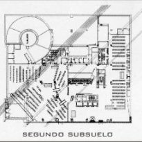
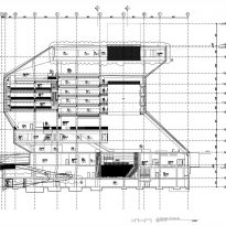
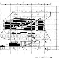
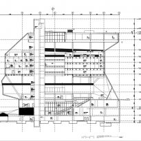
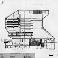
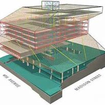
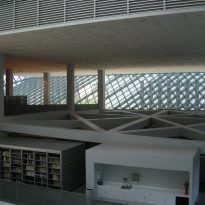
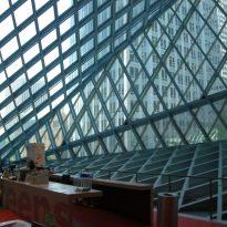
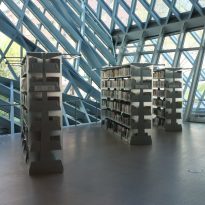
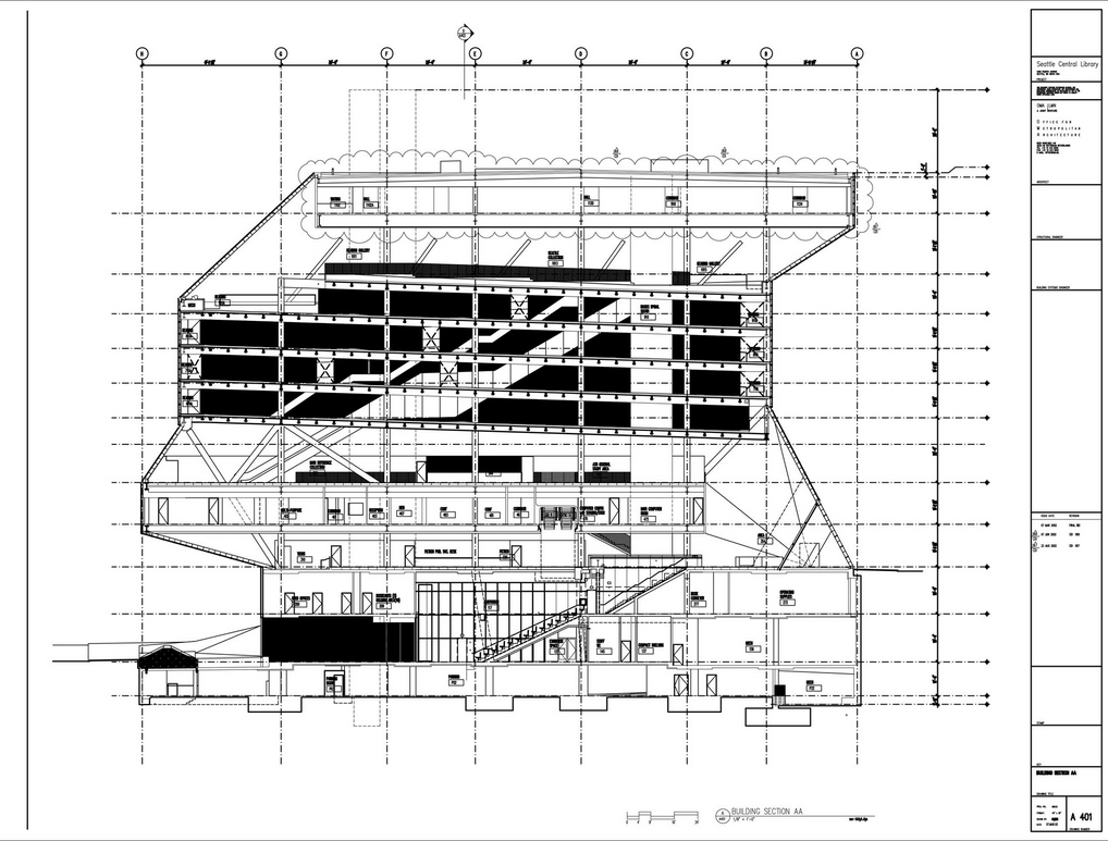
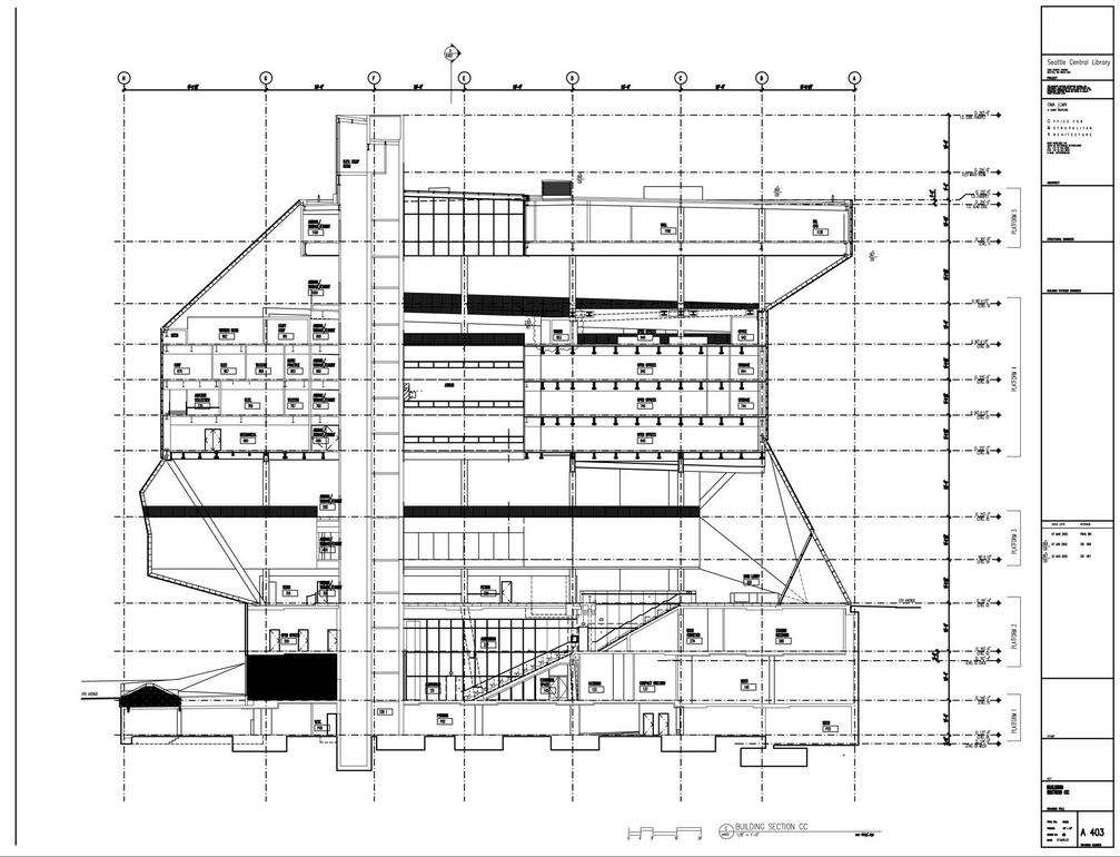
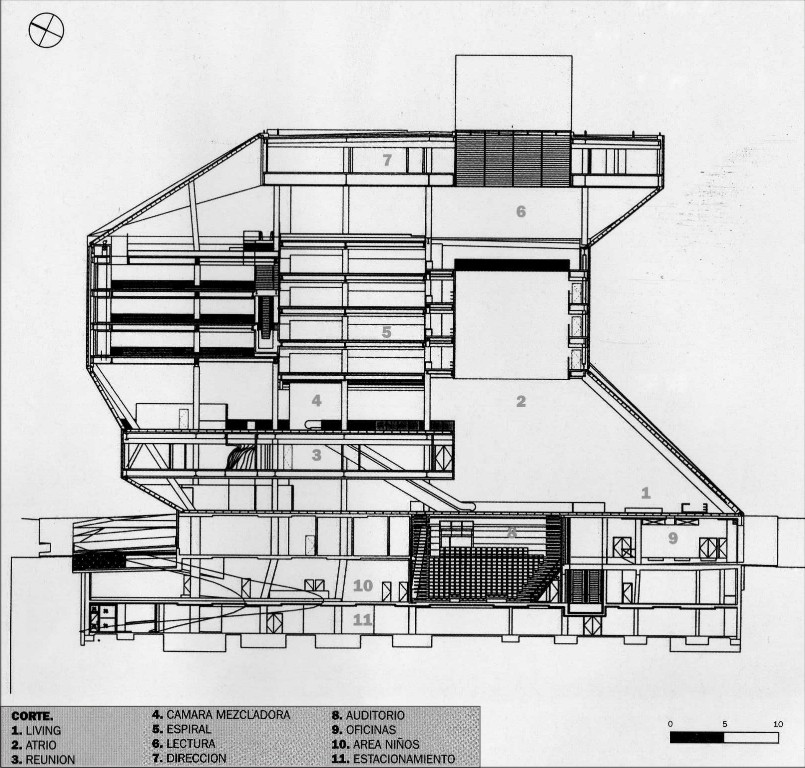
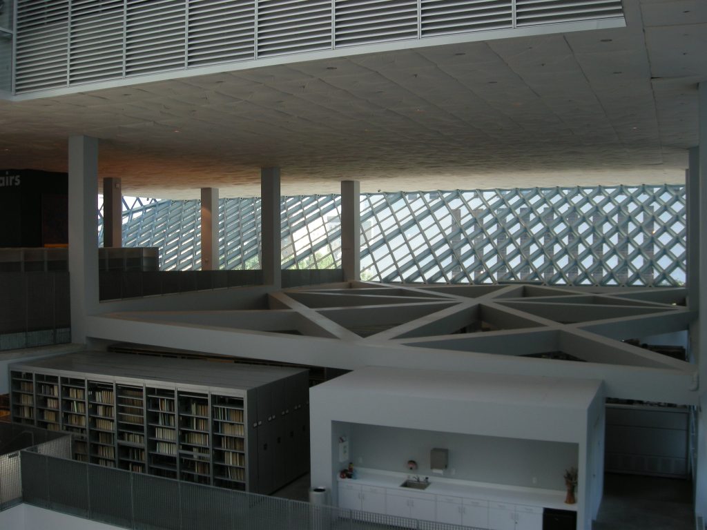
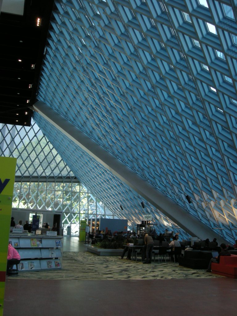
Inside the building, a spiral structure provides a continuous surface with coated side shelves that offer different themed collections. This spiral that rises four floors, has required the creation of a system of zigzag ramps accessible to all ages and needs. These ramps are supported on slender columns constructed economically.
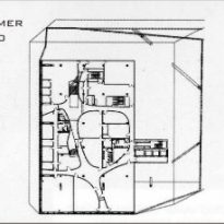
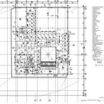
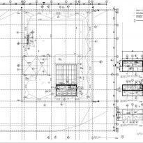
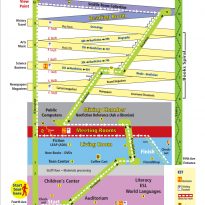
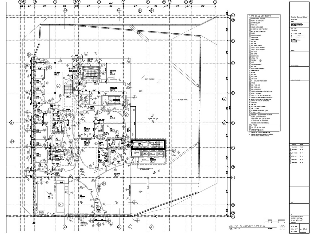
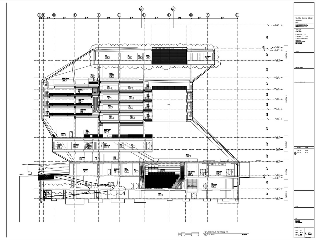
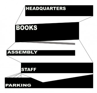
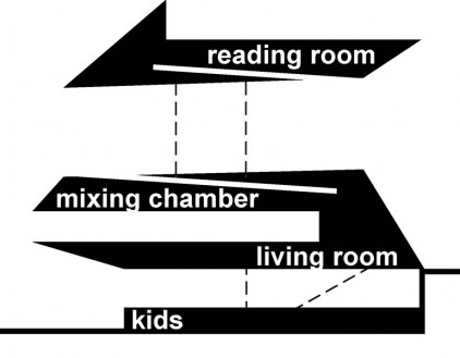
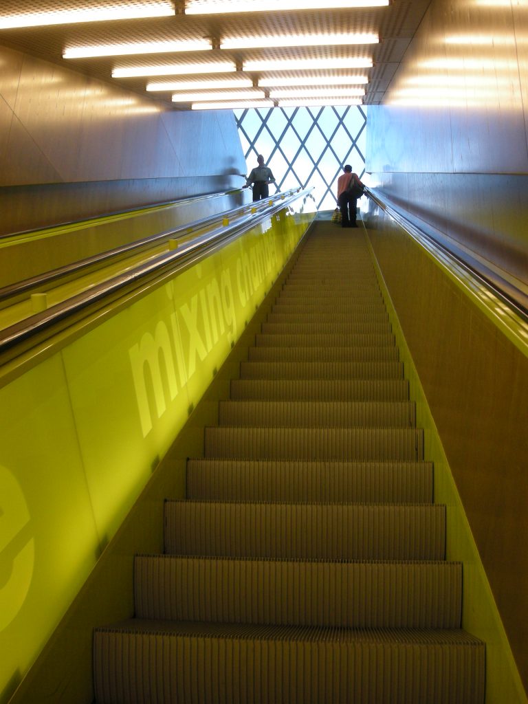
The interior is divided into 5 distinguishable blocks from the outside : the parking area, public reading area and café deployed in the large atrium and main library space, area information, collections and reading rooms and administration, all them culminates in a terrace on the roof. The third floor of the library is called “living room “. The library does not consistently use traditional names that help make your stay exciting. The location of the book series is called ” spiral ” and computing space is called ” mixing chamber “. Shelves have the panels in extreme indicators that help in the organization.
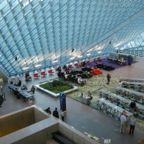
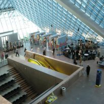
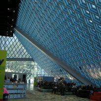
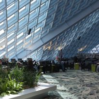
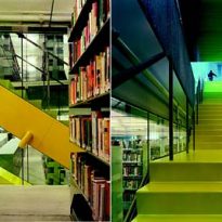
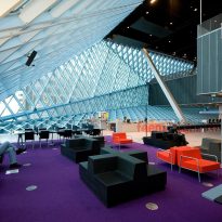
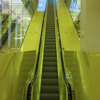
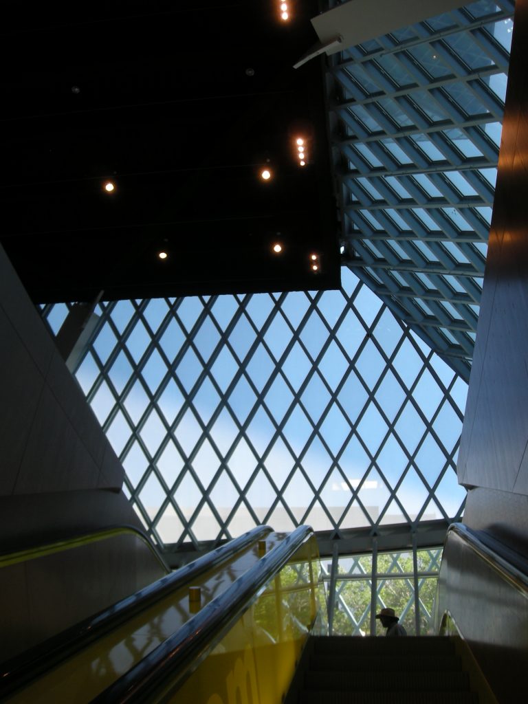
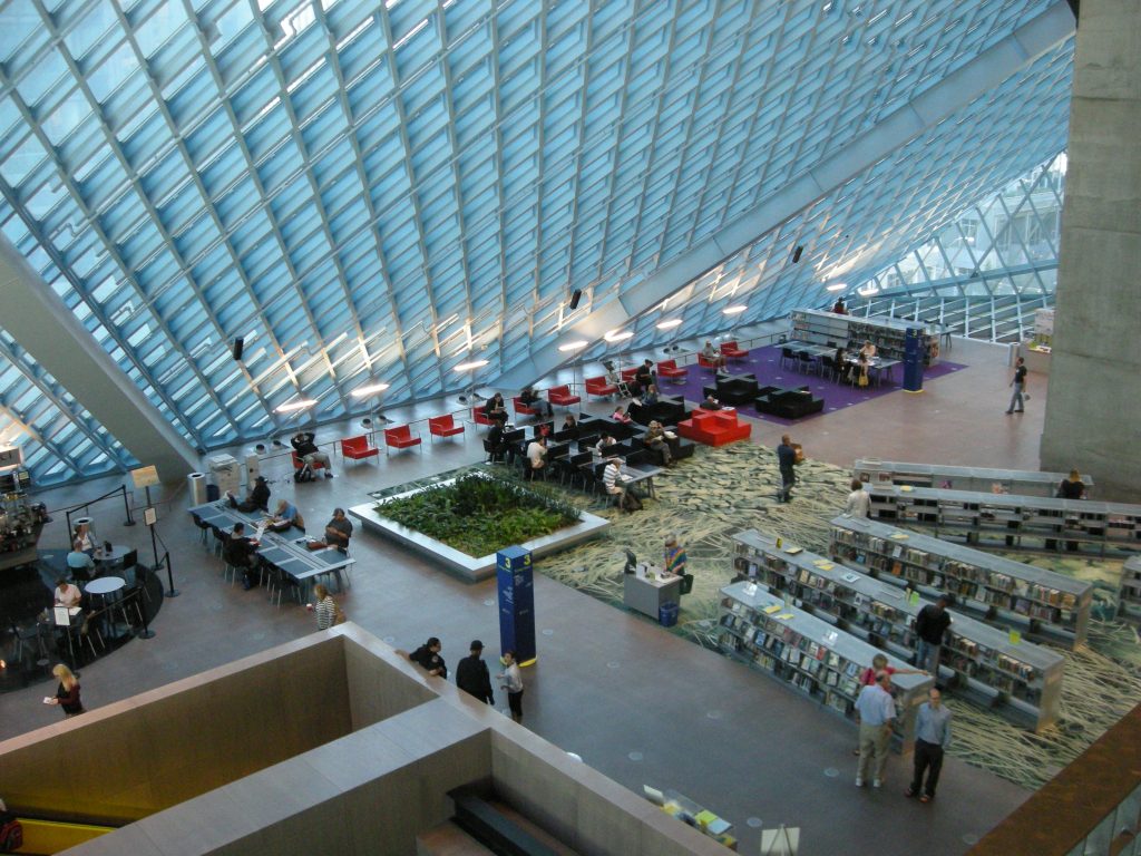
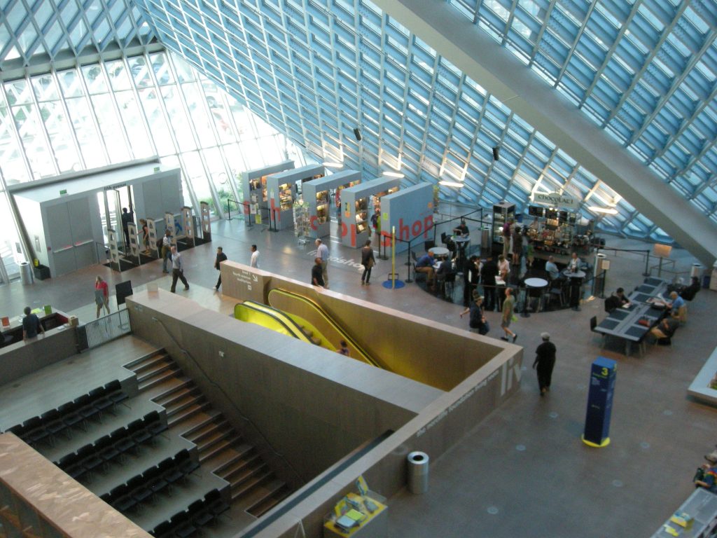
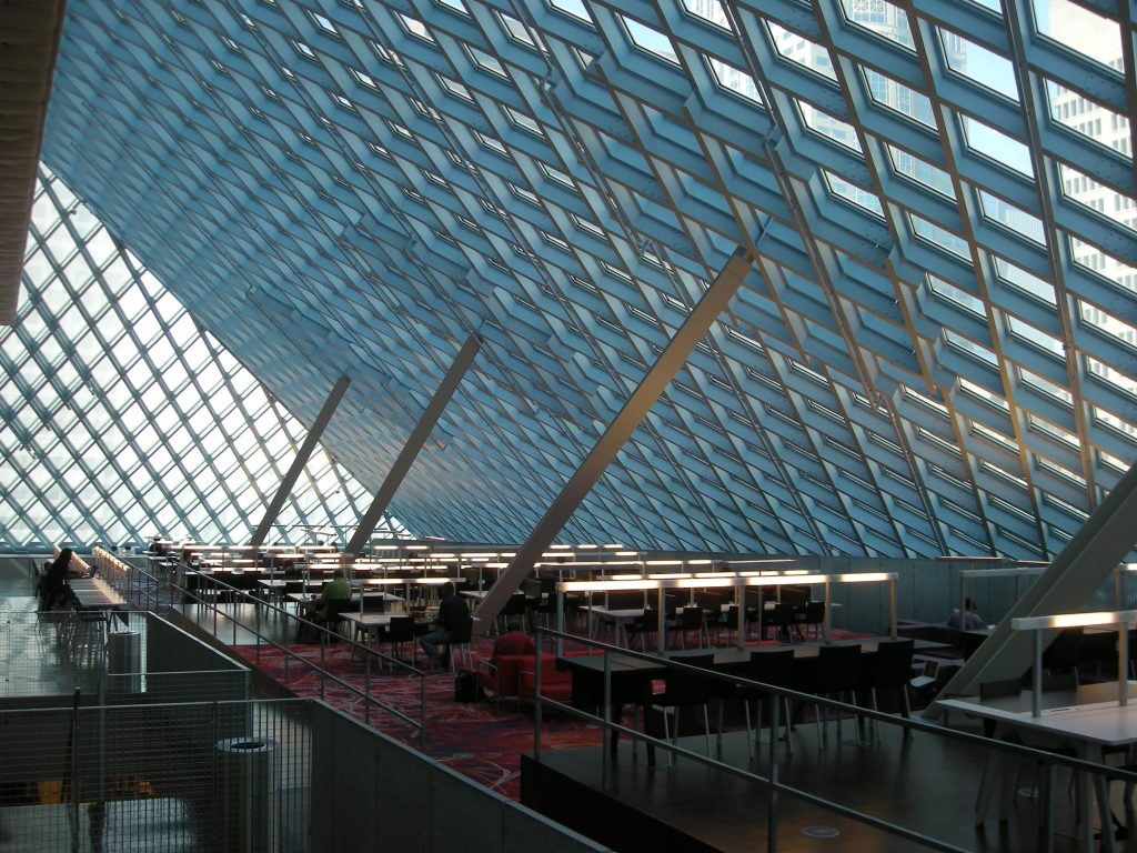
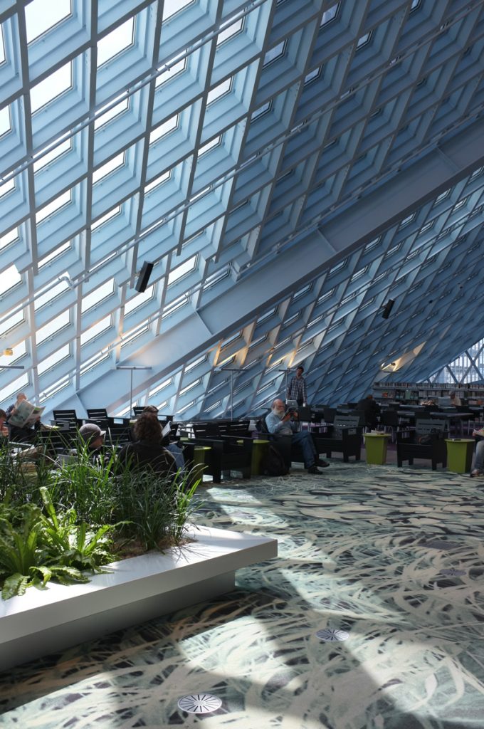
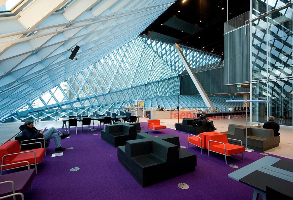
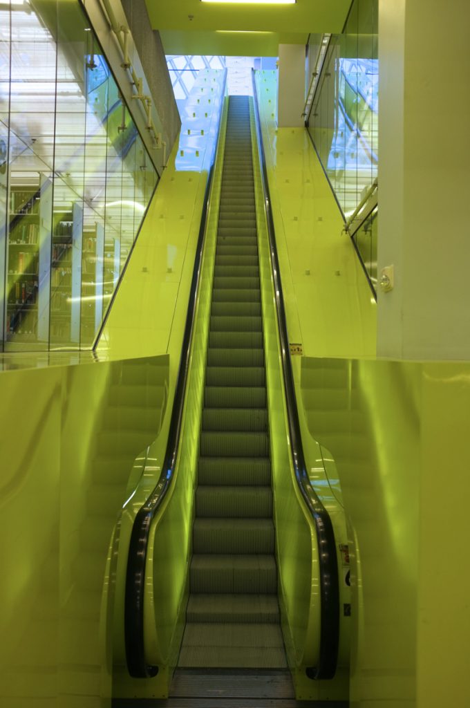
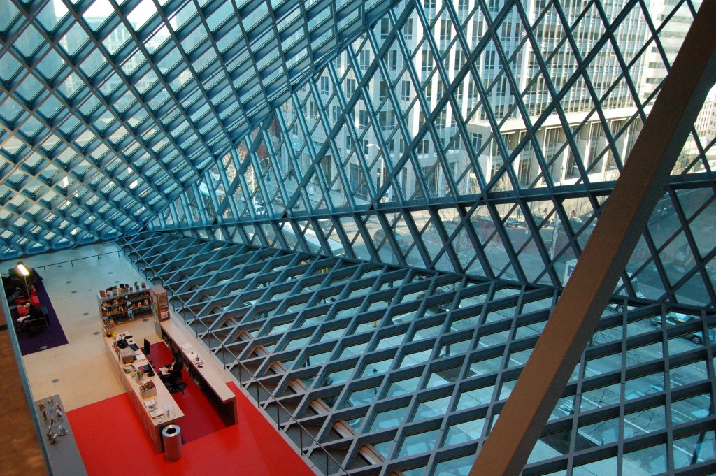
The main feature of the interior is its large public spaces and leisure reading, illuminated with natural light coming through the glass walls. Also noteworthy plants collections, consisting of a ramp that goes over 4 floors. All Areas bind with brightly colored escalators (except collections ), and the furniture and objects are modern and colorful design.
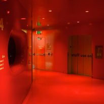
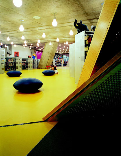
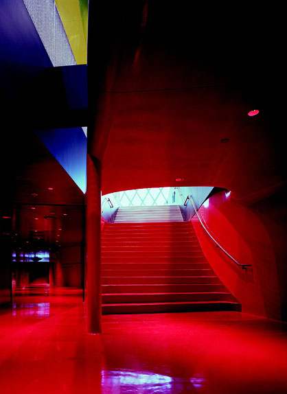
The library provides a “meeting level” with curved walls painted red and a children’s area with playful inclined columns.
Levels
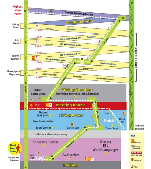
- Level 0
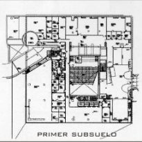
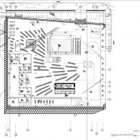
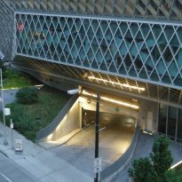
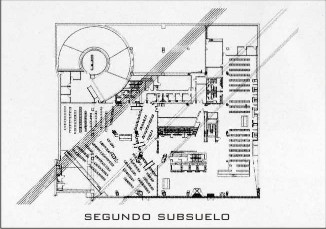
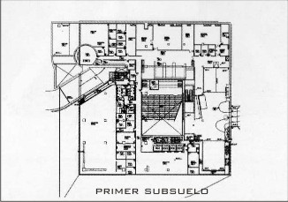
At level 0 the garage that can be reached from Spring Street is located, has 143 seats.
- Level 1
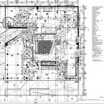
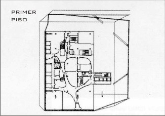
Accessible via Fourth Avenue at this level is the large hall of 1200m2 public computer section, a front desk, public phones and playground.
- Playground
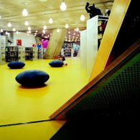
Children have their own library within the library. The seats are blue, the floors are bamboo with large circles in pink rubber strong and yellow acid. Children naturally have their own space for computing, as well as an area of green mossy stories under a diagonal support beam. Depending on your point of view, resembles a bunker or a uterus.
The area has 22 computers, a family bathroom, toilets for children, and parking space for strollers.
- Auditorium
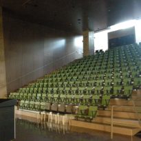
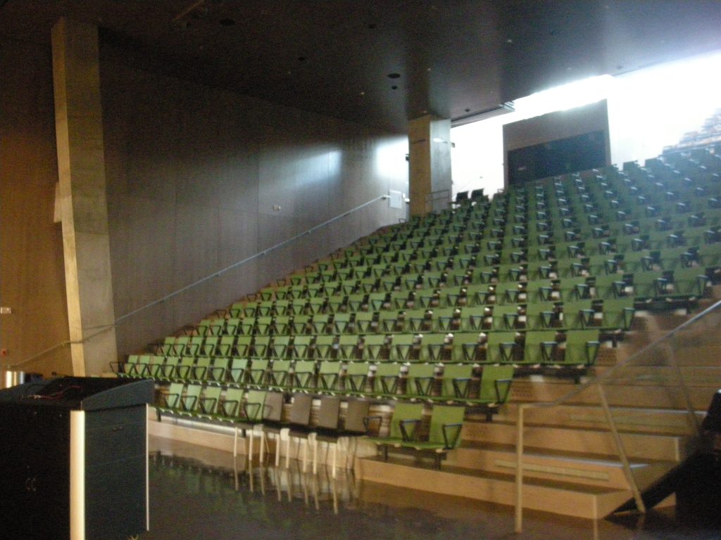
On this floor is also the Microsoft Auditorium with 275 seats. The back of the enclosure can be expanded, adding 150 additional seats for older programs.
- Idioms Section

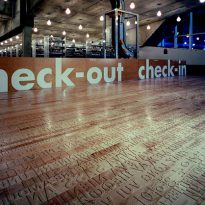
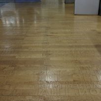
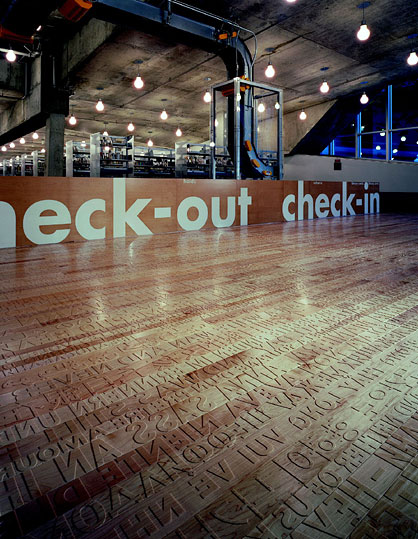
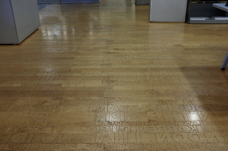
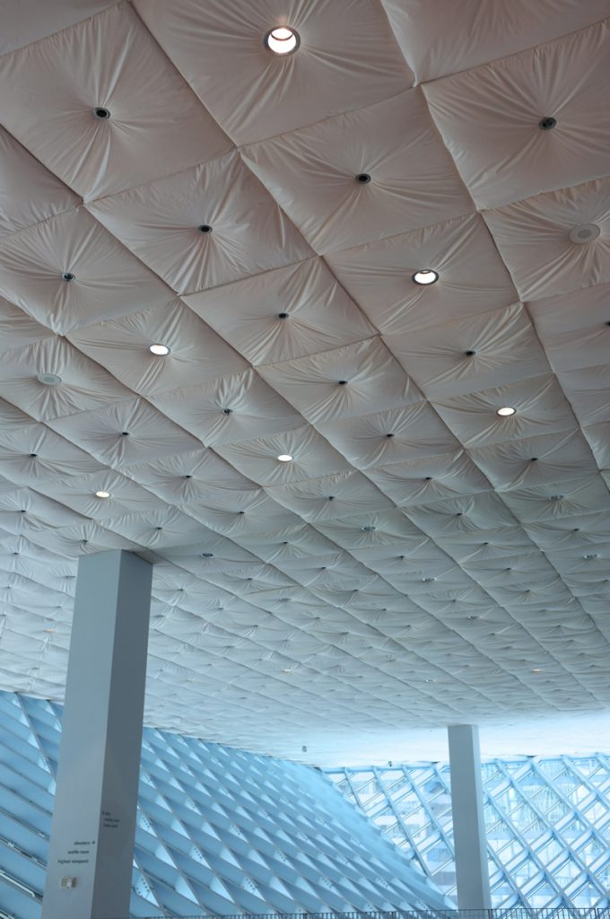
The Learning Center Evelyn W. Foster, with his section of literacy and languages of the world is also located on this floor. It has a flat visual artist Ann Hamilton is a party Language : 11 different alphabets marked in the wood. Along the wall of sound booths for language learning are distributed, with a padded upholstered high that acts as a permanent background screen. This area has workstations language learning with audio, video and language learning programs by computer, and a technology lab that provides access to adaptation technologies.
- Level 2
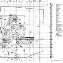
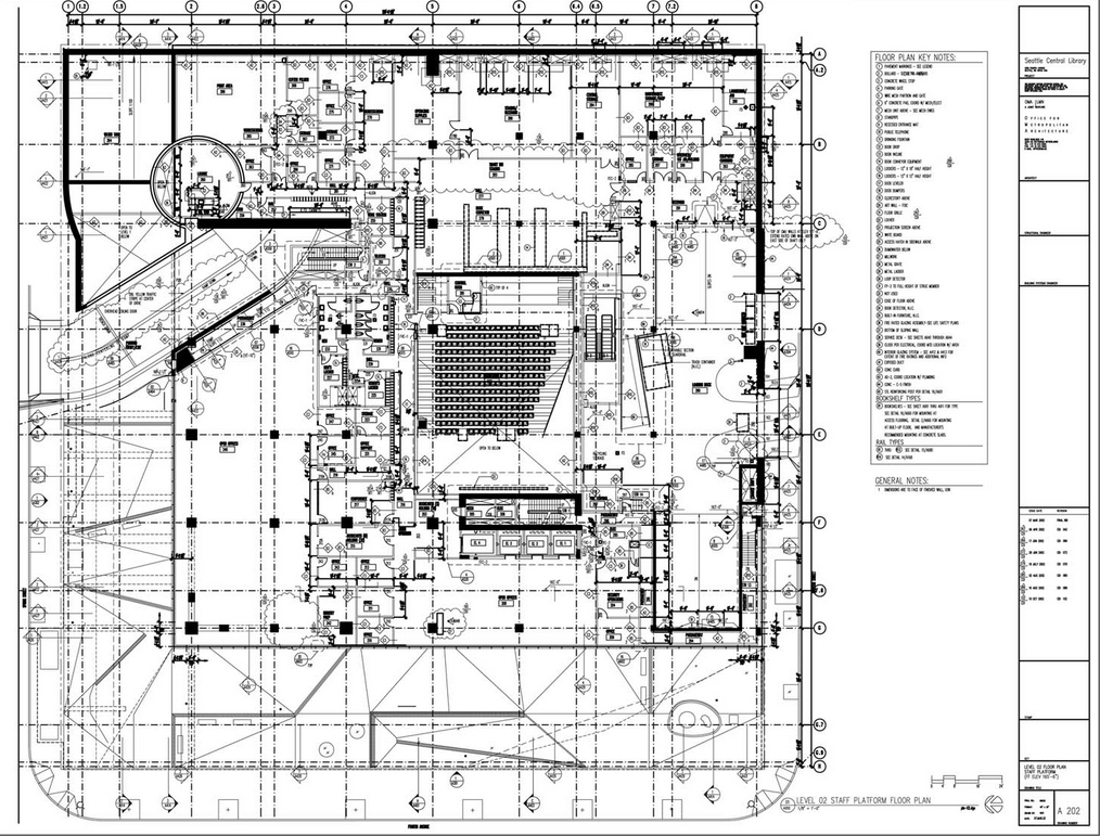
Level 2 is for staff and is not open to the public. From this level the sending, receiving, sorting and technical services of books and collections are performed.
- Level 3
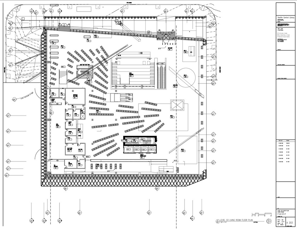
The living area of this level is called “living room ” ( Living Room), and includes areas of reading or meditation. It is a spacious and airy space, with a maximum height of 15m. The patterns correspond to bright outdoor rugs plantations located at the entrance to the library on Fifth Avenue.
In this plant, also found the receipt or delivery of books, gift shop, cafe, collection of videos and DVD collections, new books, magazines and popular newspapers and public payphones.
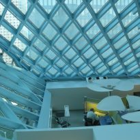
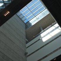
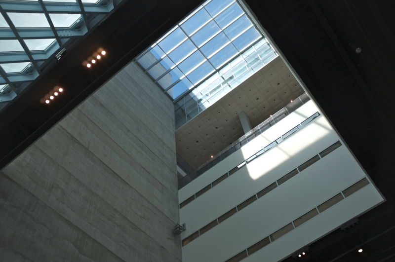
The base of the atrium is located on this level. The dramatic space allows visitors to look up to see the meeting rooms on level 4, and the Charles Simonyi Mixing Chamber at level 5.
- Level 4
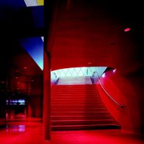
Level 4 has four large meeting rooms. The hallway walls, floors and ceiling are painted in deep shades of red and pink, while meeting in appeasing colors and neutral tones like brown and gray. Two laboratories Technology Training Centres Boening are used for public and personal computer instruction.
- Level 5
A House Mixes, 1811.61 m2, visitors flock to for help in general and research issues. In this plant the largest computer lab, the Employment Resource Centre, workbooks and study, scanners and image editing, updated telephone directories, encyclopedias, bulletin board community, and public review documents are located tax, Legrady Installation Art, ” Making the invisible visible ” and study tables.
The space character is silver and high technology, the roof is black and aluminum floor. This plant also has the highest concentration of technology library, 140 computers, and is the gateway to the area known as ” book spiral ”
- ‘Level 6-9 ‘ books Spiral ” ‘
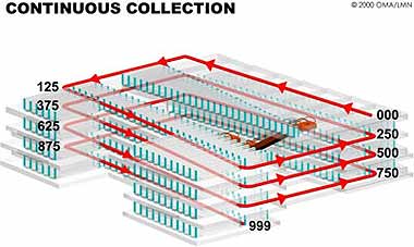
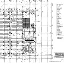
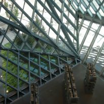
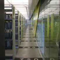
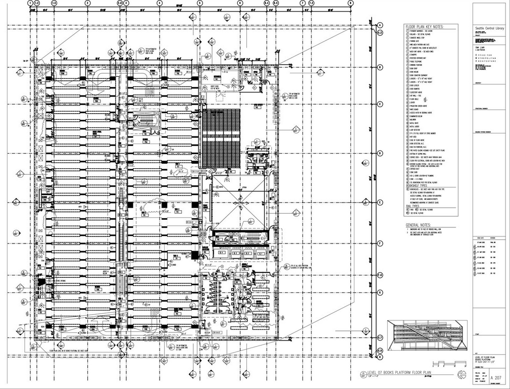
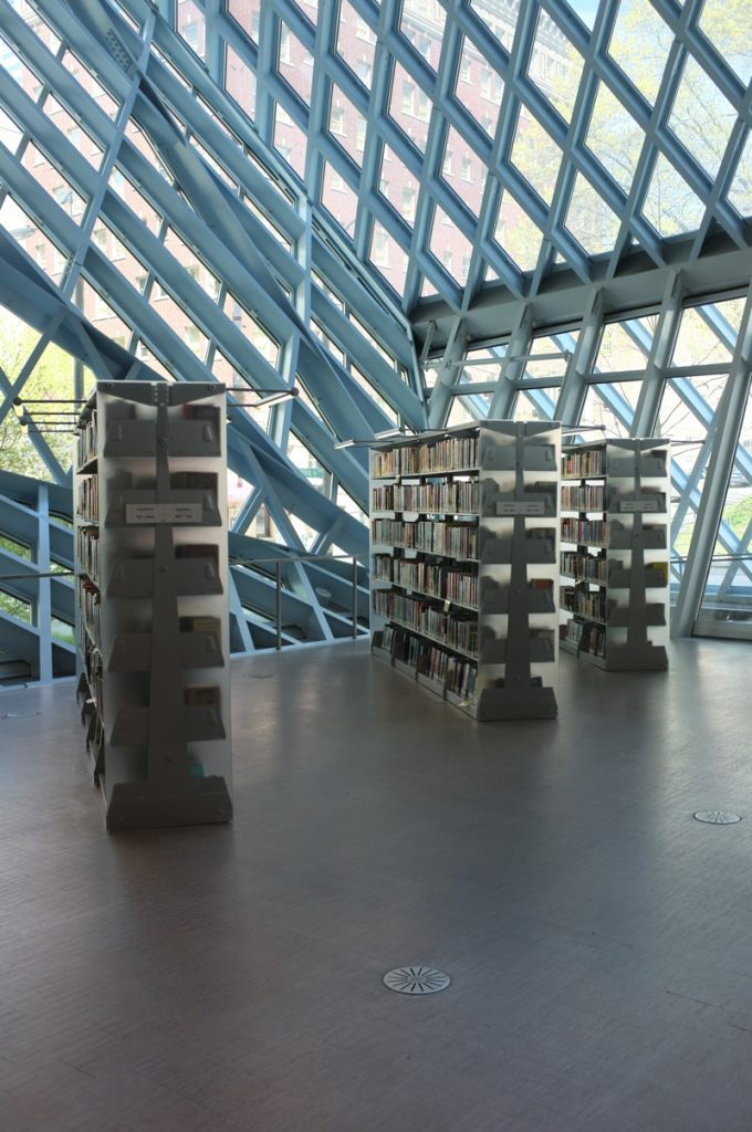
Occupying the 4 levels of shelves ” spiral books ” are connected by gentle ramps. The spiral allows all customers, including people with disabilities, to move along the entire collection without relying on escalators or elevators stairs. The stairs and elevator stops are labeled with numbers Dewey Decimal System, to help people find items on each floor.
- Level 10
The atrium which rises in level 4 light filled the room 1114.84m2 Betty Jane Narver Reading, with 400 seats, a roof 12.19m high and overlooking Elliott Bay. The Hugh and Jane Ferguson Seattle Room rooms are also on this level overlooking the reading room. It is accessed via escalator or elevator.
- Level 11
The Level 11 has administrative offices, including the office of the City Librarian, Virginia Burnside Board Room, Human Resources and the staff cafeteria.
At night, the Seattle Public Library lights highlighting among other buildings. It is an amazing and functional building of one of the most important architects in the world.
Structure
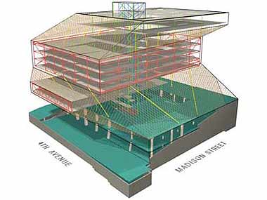
In this elegant study of the “form ” followed by the “function” was performed. Project Architects organized the program requirements of the library into five independent platforms, although connected, stacked vertically allowing optimization of surrounding views, wrapped in a skin of steel and glass.
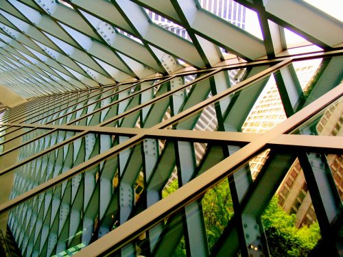
This transparent package was submitted to structural engineers with a set of requests : do not use any columns in the corners, do not place any vertical column, and in a word using the fewest number of columns in general. In essence, the success of the project depended on making a glass building with 12 floors, which seem to float without support, in an area of seismic qualified UBC Zone 3.
The solution MKS engineers, in collaboration with Arup, was to use two different structural systems, layered, with a central block of concrete that provides much of the structural rigidity.
Structural systems
First System
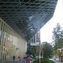
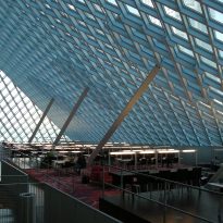
In the first system, the platform perimeter truss, comprising a multistory profundad support gravity loads of the building. The trusses are supported by inclined columns and carefully positioned to increase opportunities counterweight, cantilevered platforms 1.32 m
Second System
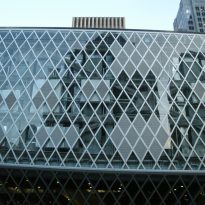
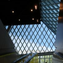
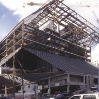
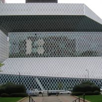
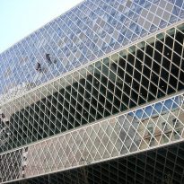
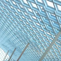
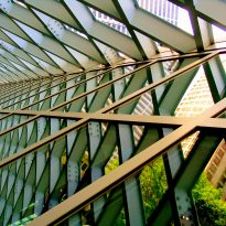
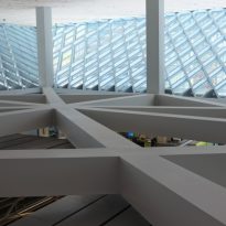
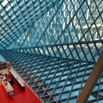
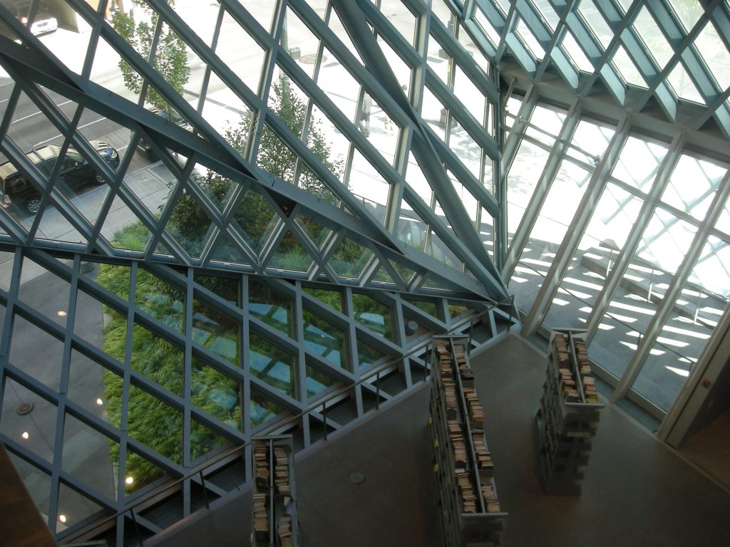
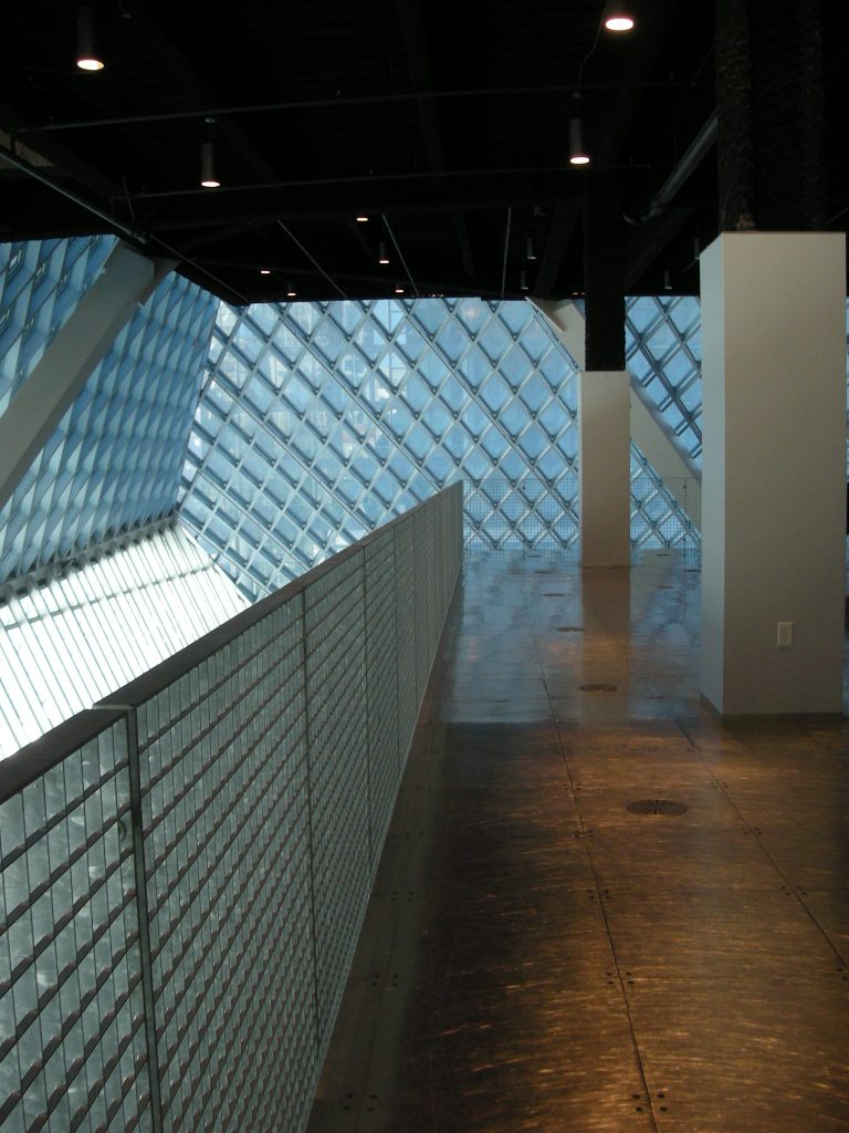
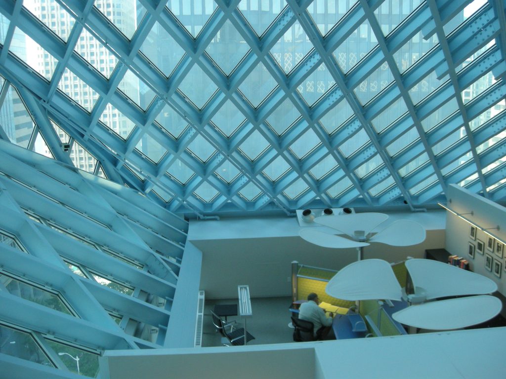
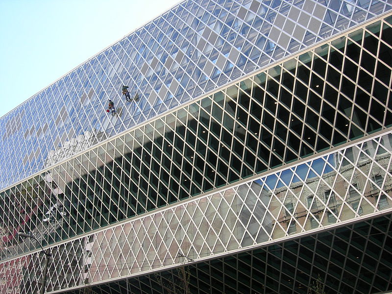
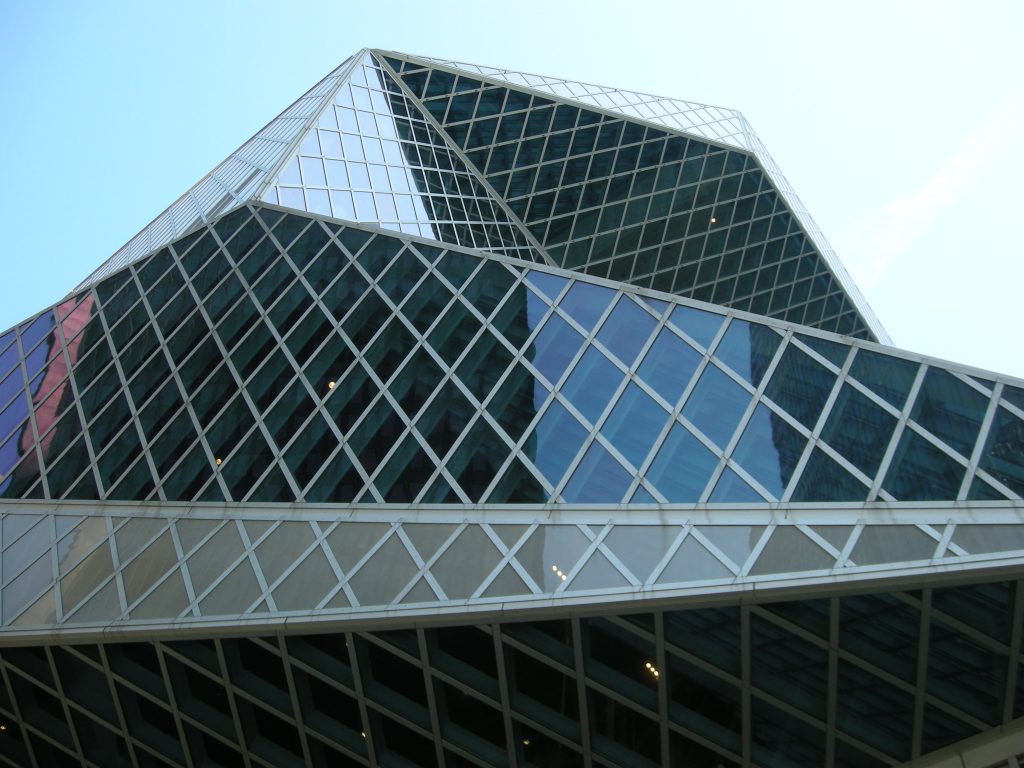
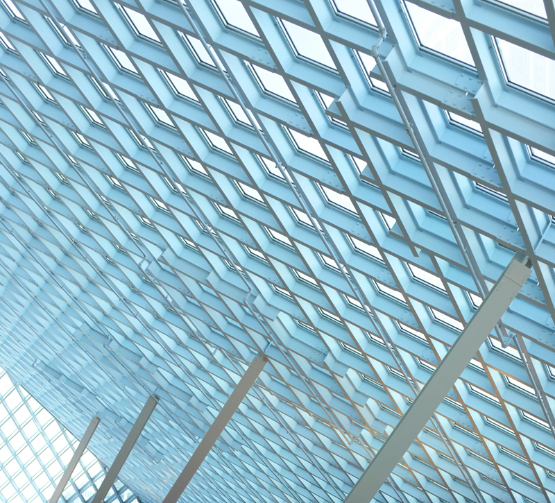
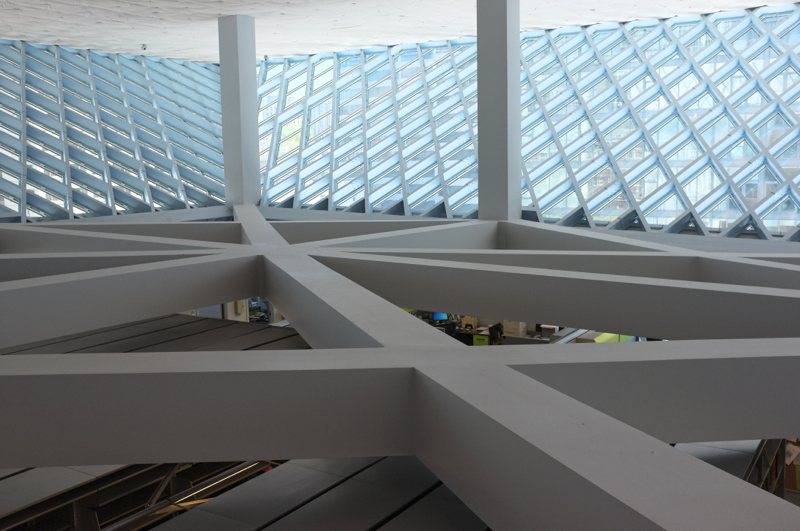
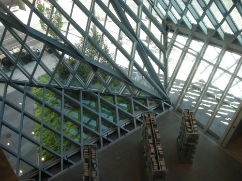
The second system, the grid of diamond-shaped steel, the building form the exoskeleton. Steel grid provides the lateral system of the building, roof trusses interconnected platforms serves as architectural interior finish, and supports the glass covering curtain construction.
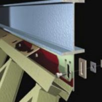
Connects specially designed sliding laterally attached to the steel grid reinforcement of the platforms. The connections both structural systems fused while preventing the transfer of gravity loads steel grille. The system maintains the thin grid without fire protection, and most importantly, with the desired aesthetic. Models were made full-scale connections, molded in 3 -D, to test and verify the results.
Exoskeleton
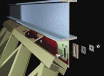
The exoskeleton was designed so that they could use common steel grids whose size W12x22, may be interspersed in the structures. The diamond shape and size have been optimized to 10.16cm on a side and a base height of 17.78cm as flat glass plates market seeking more efficient manufacturing and trying to eliminate the need for secondary uprights. The use of standard parts provided prefabrication of structural steel grill at scales up to 2.16m high, greatly simplifying construction.
Reinforcements
Three solutions wings par interior areas requiring reinforcements were developed:
- Steel grille is reinforced with an additional layer as reflecting the pattern and location of stress.
- There was a lack of inclusion of transverse angles in columns intervention, allowing carry loads more directly from the points of maximum stress to the nearest support columns.
- Gravity columns were used in slope, in line with the plane of seismic cudrícula.
Materials
The building is covered by a striking glass and steel structure.
Construction costs were lower than those of most new libraries constructed in major cities. Designed taking into account the function and aesthetics, the building has incorporated many elements supporting sustainability, so it has been awarded the “Silver ” Certification granted by US.Green Building Council, becoming one of the largest buildings in receiving certification for Leadership in energy and Development.
Koolhaas is known for its creative and economical use of mundane materials. Each of the 11 floors deserve a detailed study. There are aluminum floors pay homage to Carl Andre minimalist grid floors. The recycled wood pieces from the ends chipped and stained in a variety of solid colors. Most carpets are made with metal wires directly to clean them with water. Then there are the homes in which concrete is poured covered with thick layers of colored polyurethane.
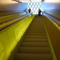
Koolhaas loves bright colors. The stairs and entrances to public meeting areas are painted in red and lime yellow. Inside the metal structure is painted baby blue.
In the area dedicated to language learning 669m2 floor is maple wood with decorative visual artist Ann Hamilton.
The bright white pillars with bases have high finishes in black, the fire insulation are sprinkled with glitter. Only in areas of the public square in carpet level rises, with photographs of Petra Blaisse plant material on screen printed on the fabric of the carpet, creating a biology lab effect.
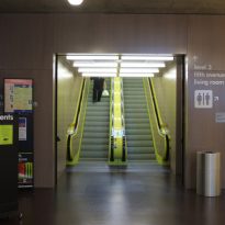
The escalators are finished in fluorescent lime color, lined with backlit panels. They only go up stairs, down elevator being due or escalators.
In addition to the asymmetries and color, Koolhaas makes a terrific use of concrete. Huge slabs of reinforced concrete, with small cracks binding and flooded with tonal variation seem to draw a kind of geological time.
In its construction were used:
- 18.400m3 of concrete
- rebar 2.050tn
- 4.644tn Steel Outdoor
- 9,994 pieces of glass exterior curtain 126.767m2. Approximately half of the panels are glass construction of three layers with a mesh of expanded metal trapped between the two outer layers. The mesh, an aluminum sheet is cut and stretched, reducing heat and glare. Most of the glass is cleaned twice a year, and more often for areas that require it.
Video
