The Rock

Introduction
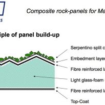
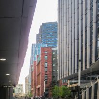
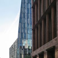
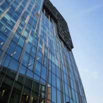
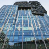
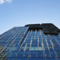
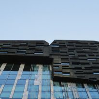
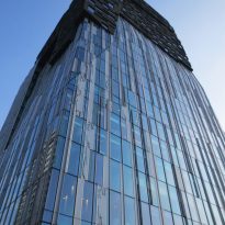
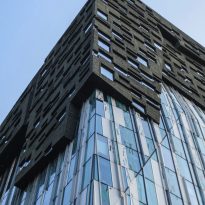
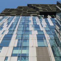
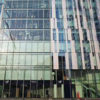
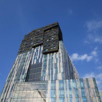
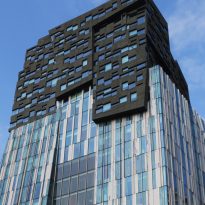
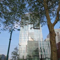
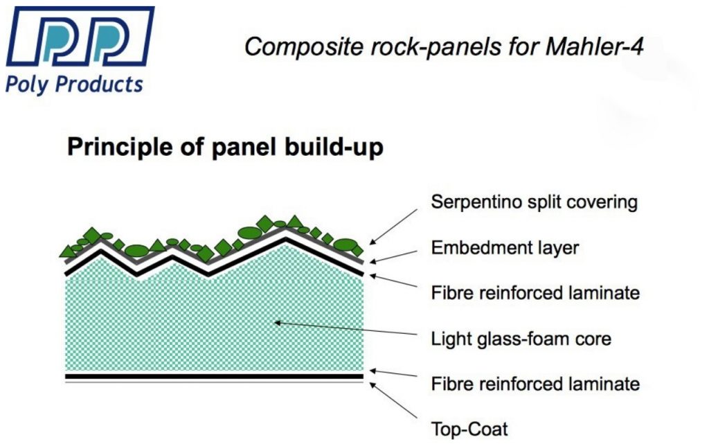
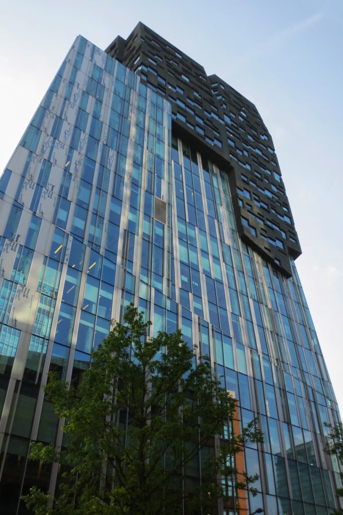
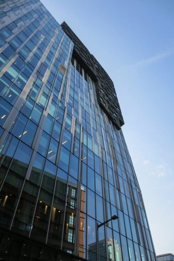
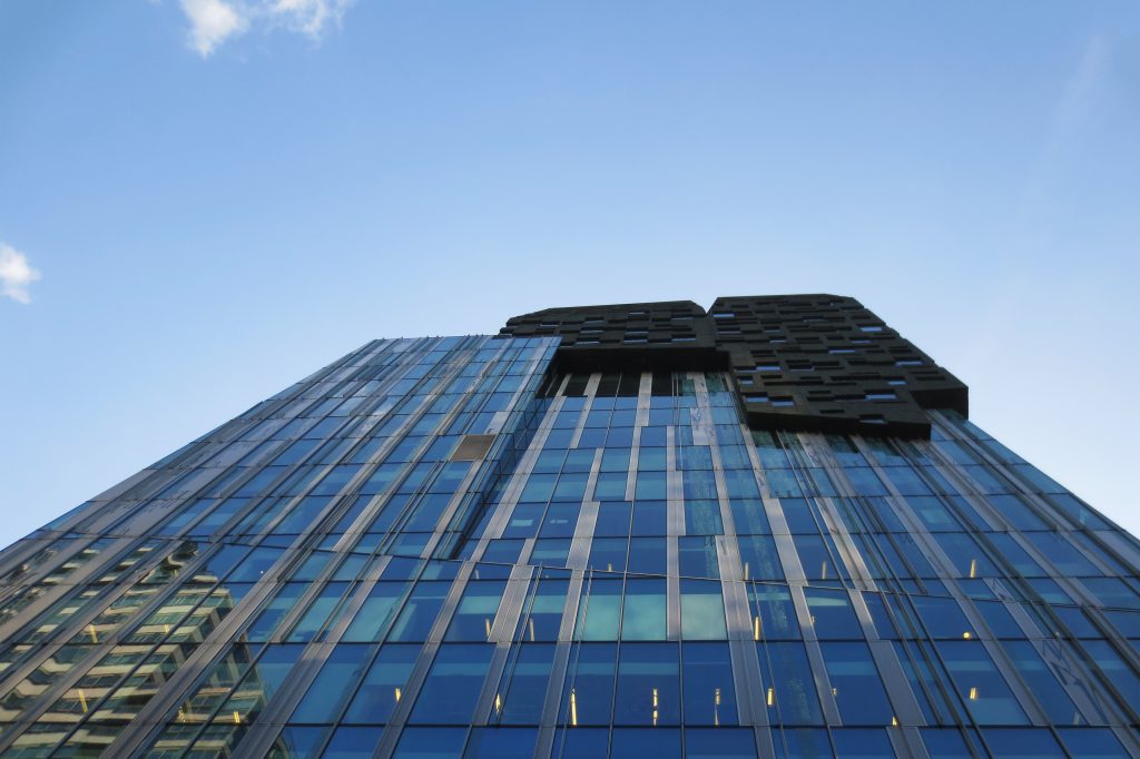
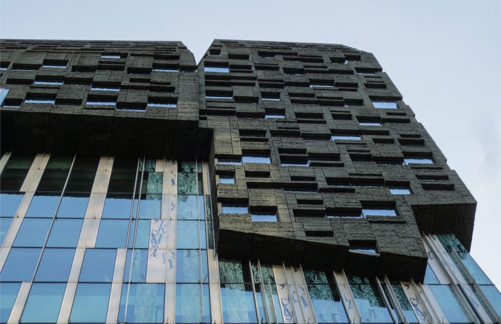
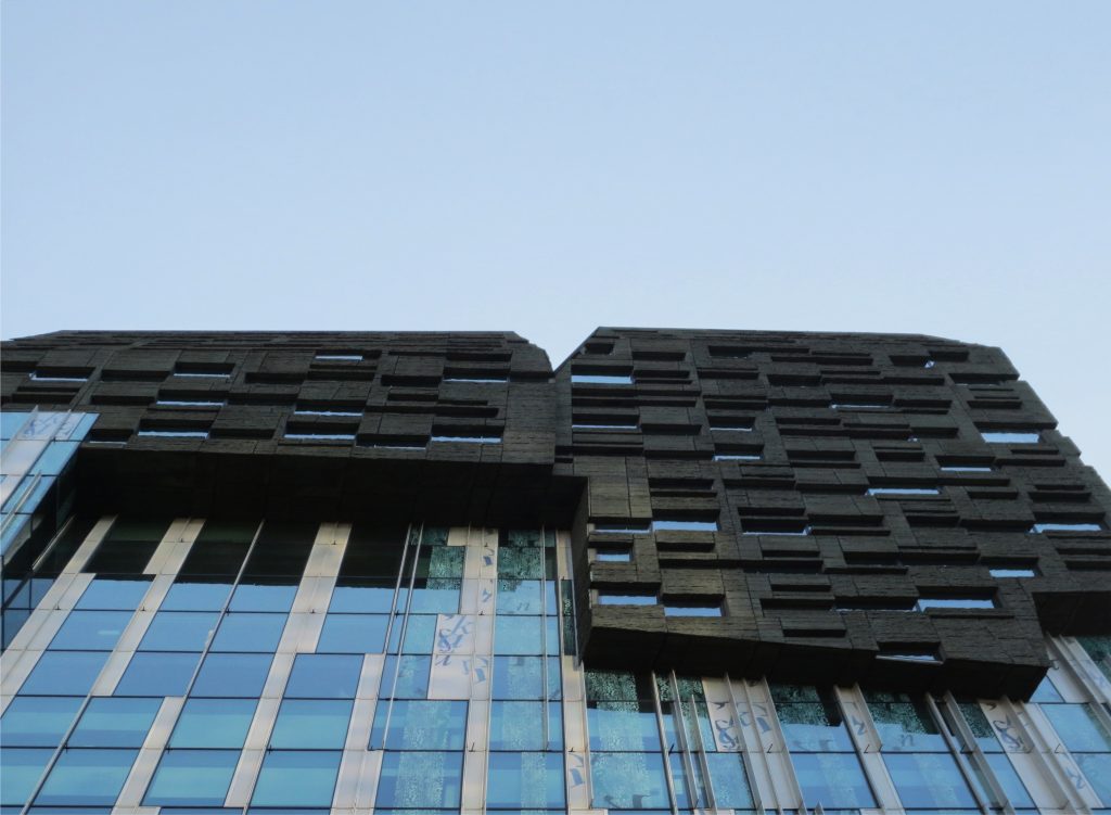
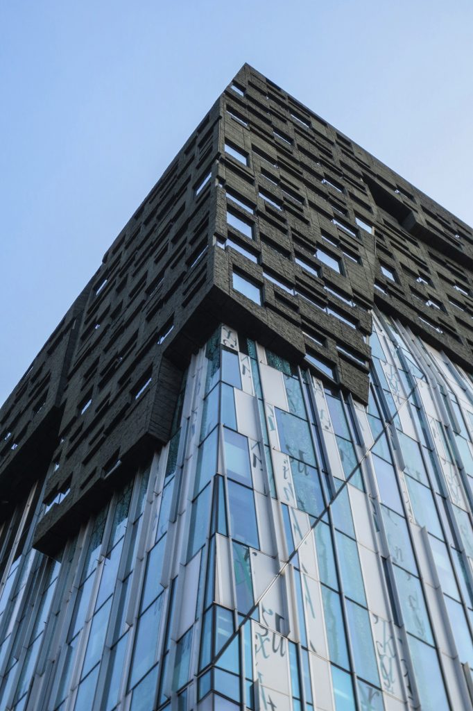
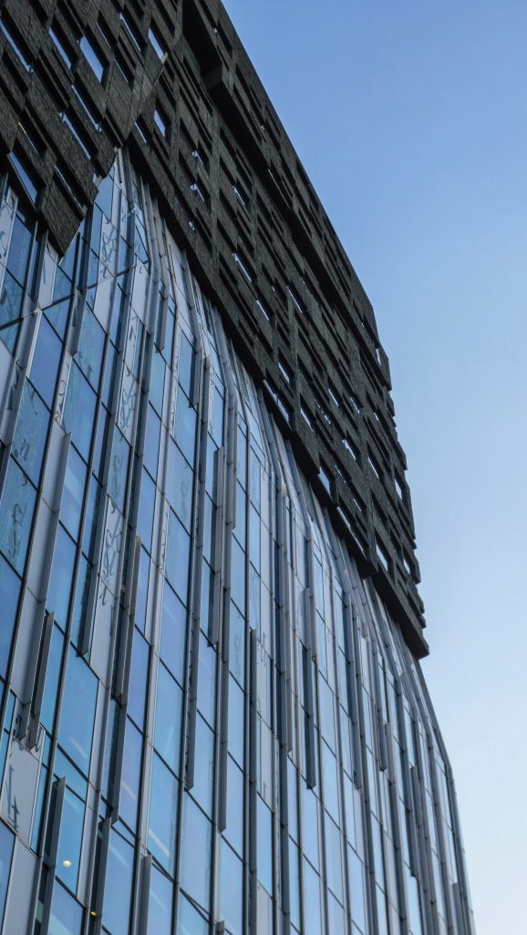
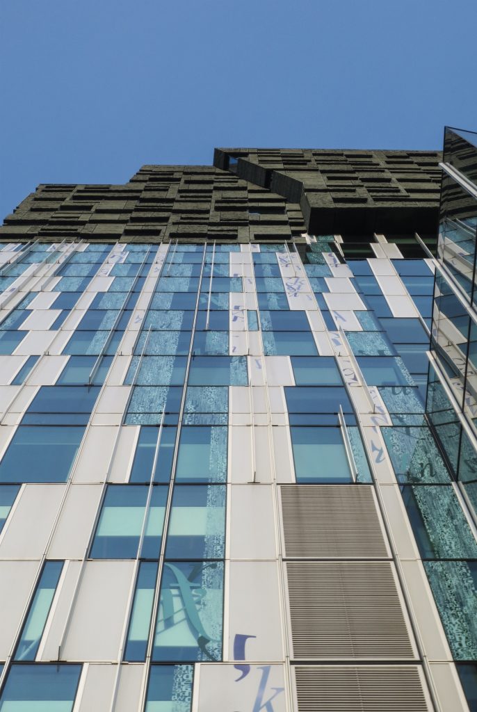
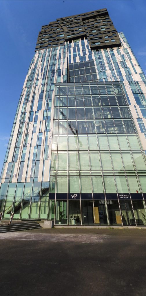
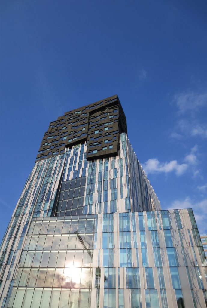
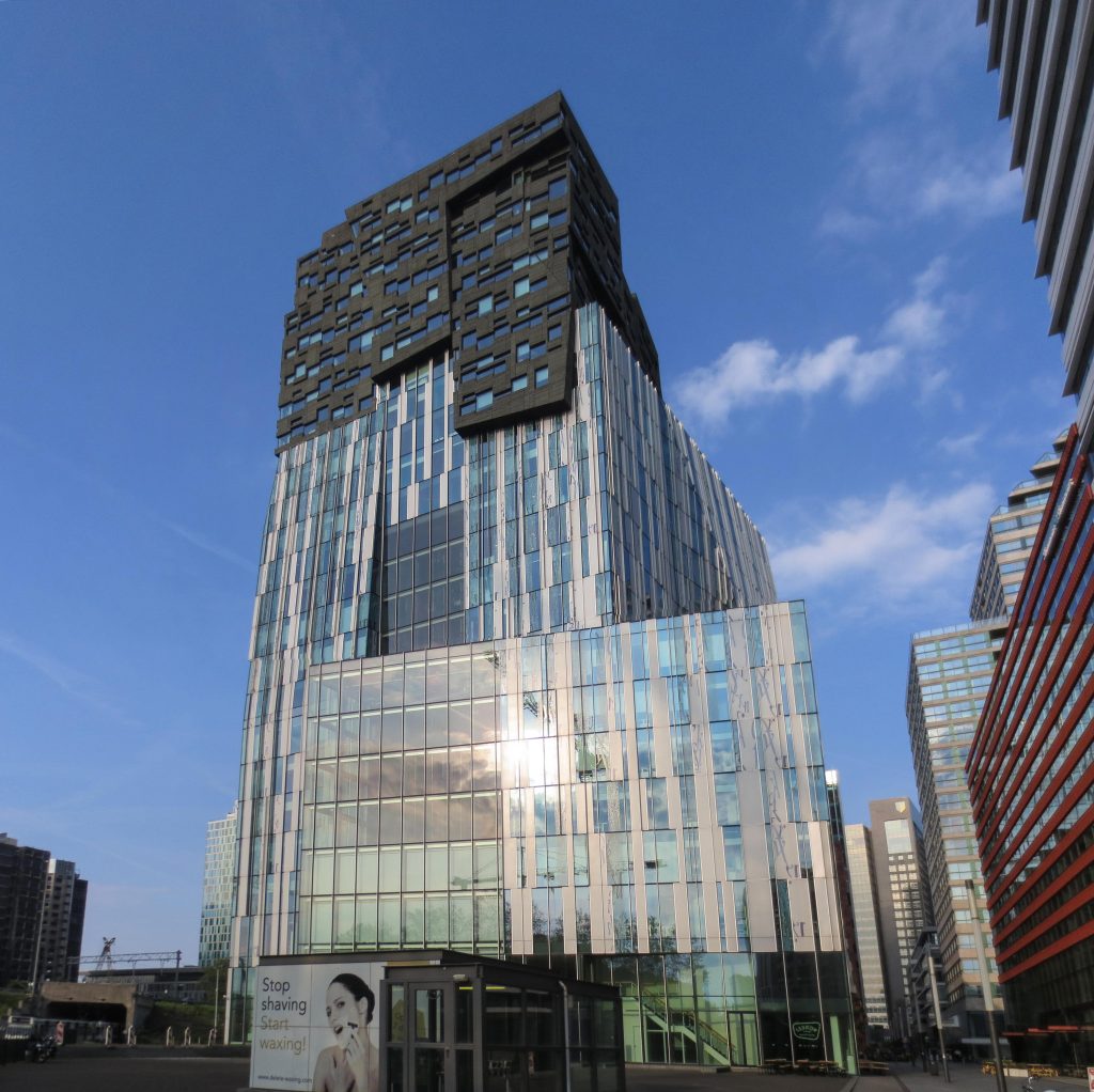
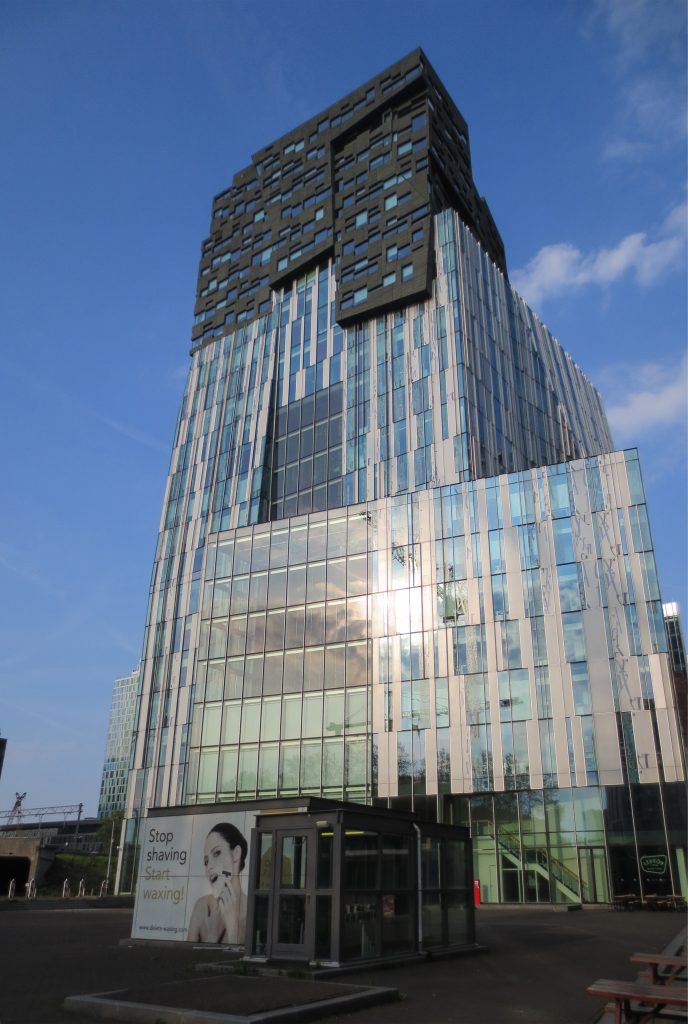
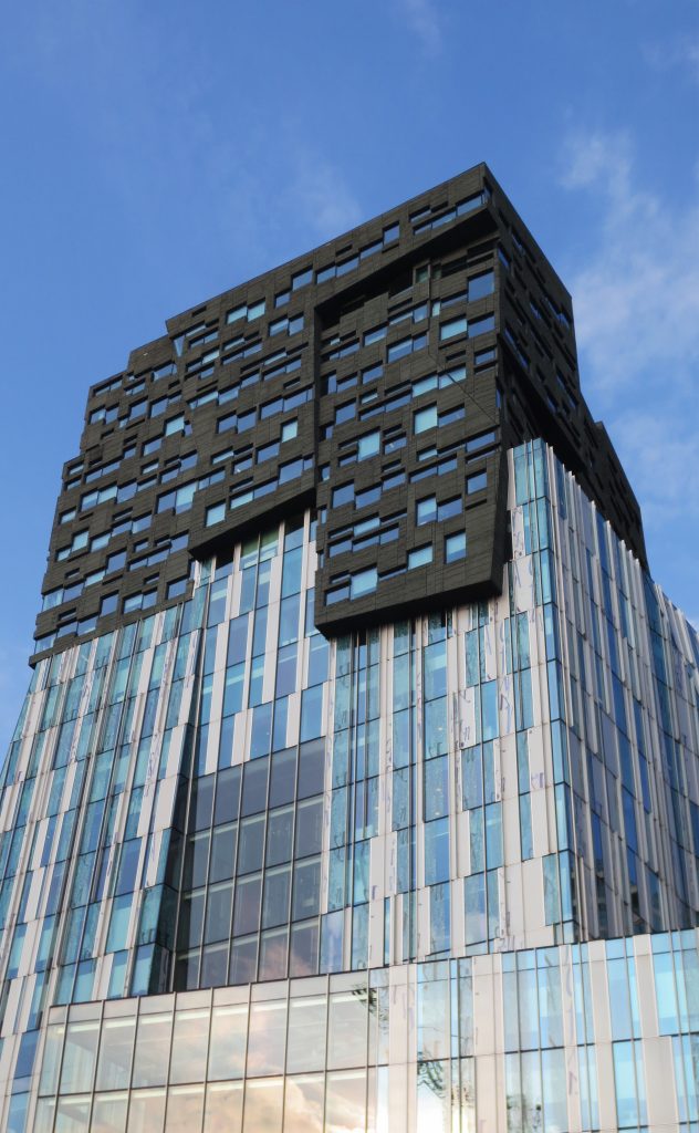
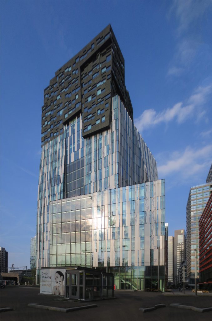
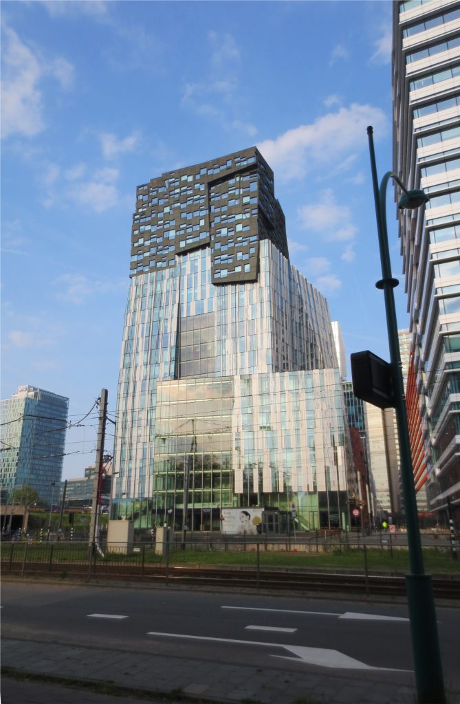
With the intention that the ground floors, up to the 15th floor, receive as much natural light as possible, the architect Erick van Egeraat turns around a fundamental law that states that the heavy bodies are placed underneath and the light ones above. In the Rock Building, the heavier stone covers the facade at the top with 7500 m² and the glass appears below. Despite the heavy visual effect, this arrangement forced the stone surface to be covered by thin irregular plates of Green Serpentine, from Italy, applied on a base of glass foam with various materials to reach the stone, lightening its weight, 30 kg / m², and fulfilling various functions, including resistance to cold, wind and fire.
Location
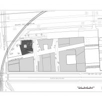
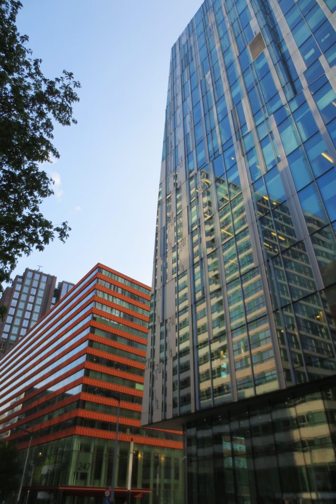
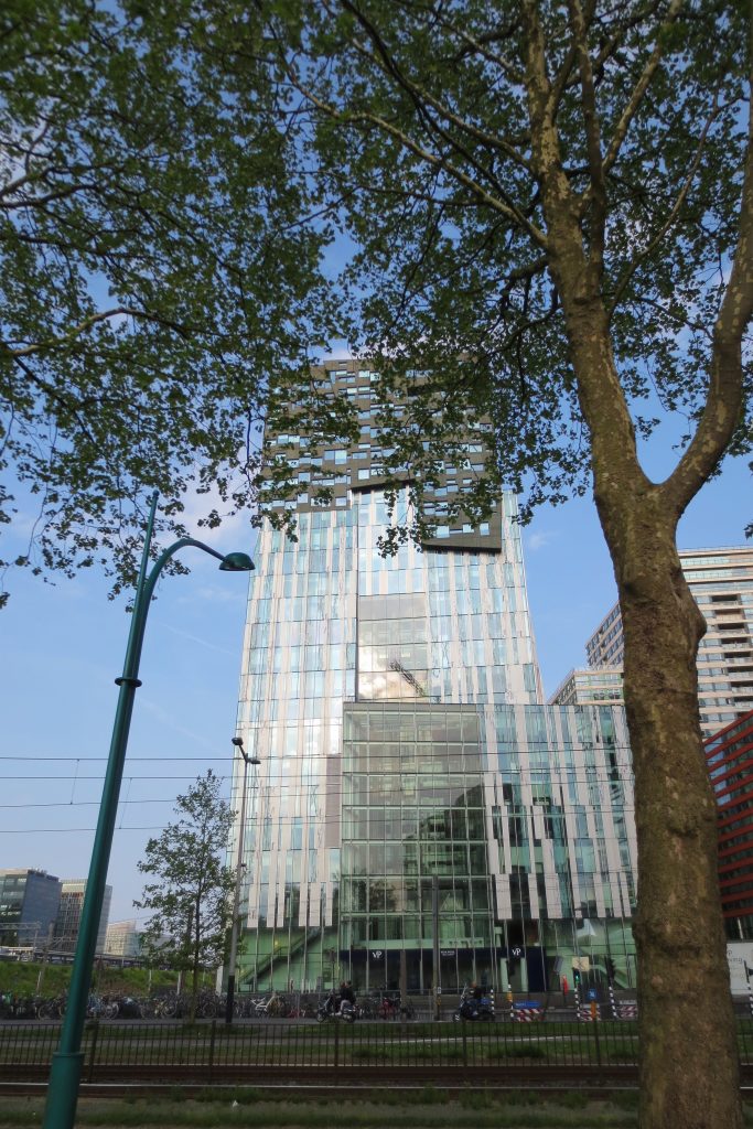
The office tower designed by Erick van Egeraat, known as The Rock, is part of an expressive high-rise urban development in the south of Amsterdam, Netherlands, Claude Debussylaan 80, in a new area called Zuidas, also known as the “financial mile” that lies between the Amstel and Schinkel rivers, next to the A10 ring road. Located in the vicinity of the city center and with direct access to the urban network of public transport and highways, the project incorporates the potential of this unique location. The ambitious programming of a lively and high-density mix of offices, homes, retail stores and public spaces, designed by nine international architects, contributes to an exceptional development of metropolitan scale.
Concept
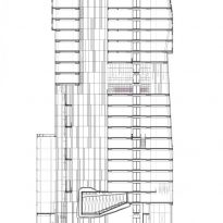
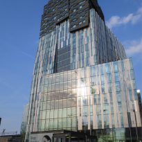
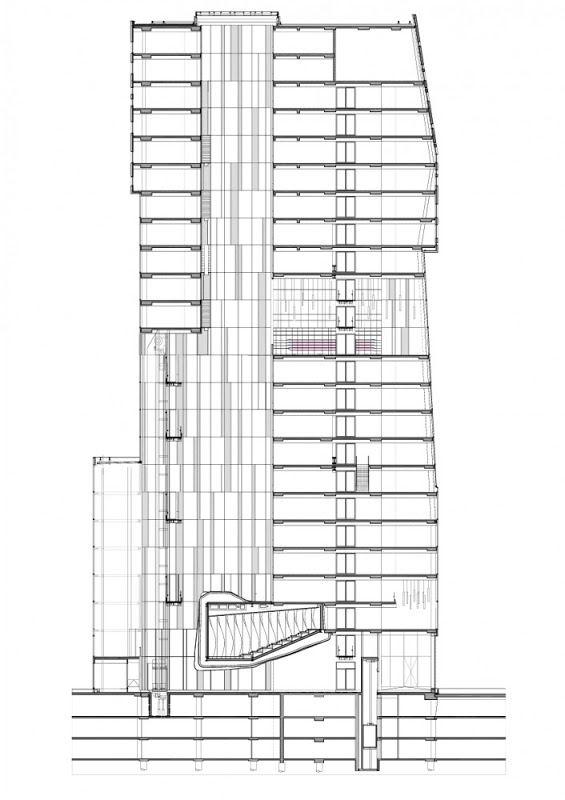
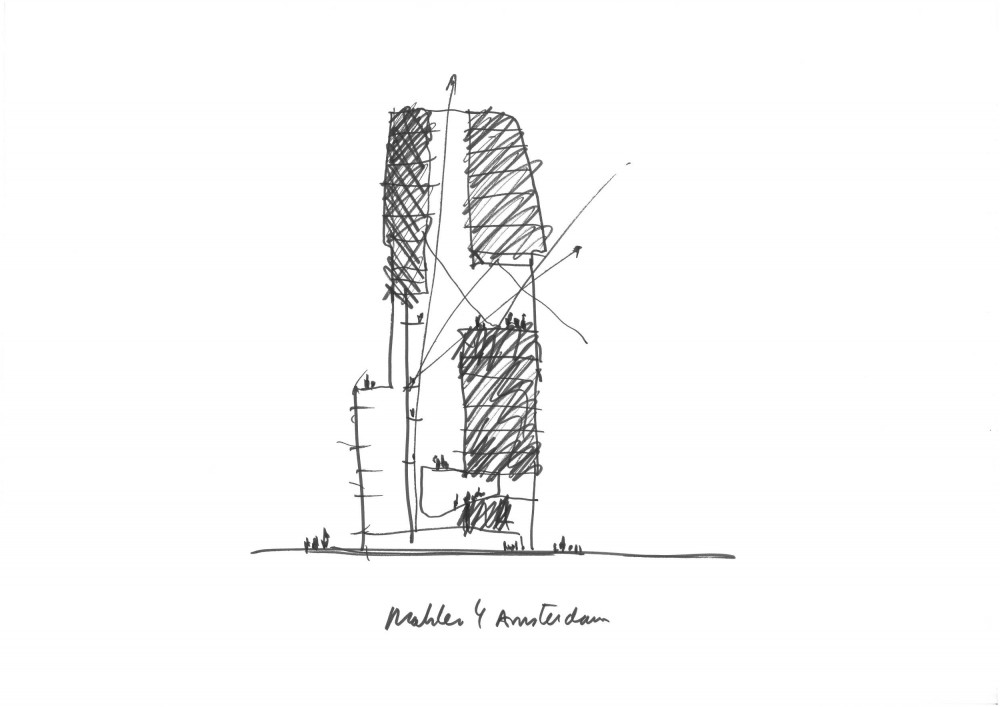
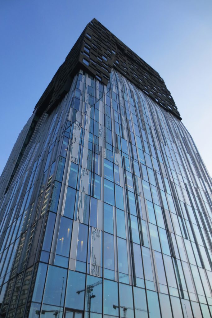
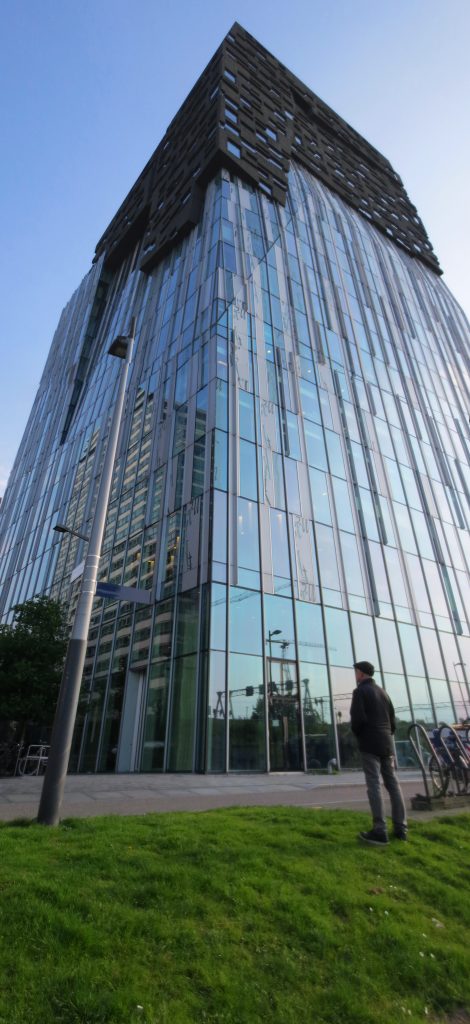
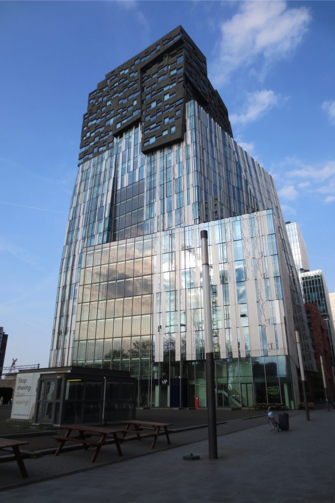
With his design the architect proposes to create an explicit tactile and emotional experience from the structure of stacked blocks. The three vertical parts of the building have their own character and appearance, partly due to the use of various materials on the facade. Both an innovative composition of displaced volumes and a transformation from a light to a heavy materialization creates an expressive reference point that seems different from all angles. Each of the three sections of the building reveals its own character and material expression and offers adequate space for potentially different tenant requirements.
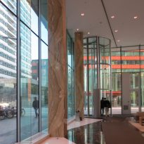
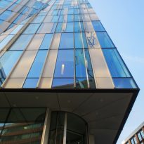
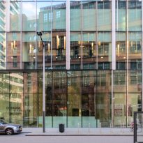
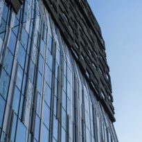
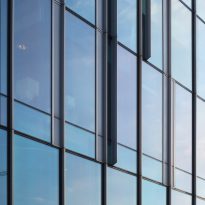
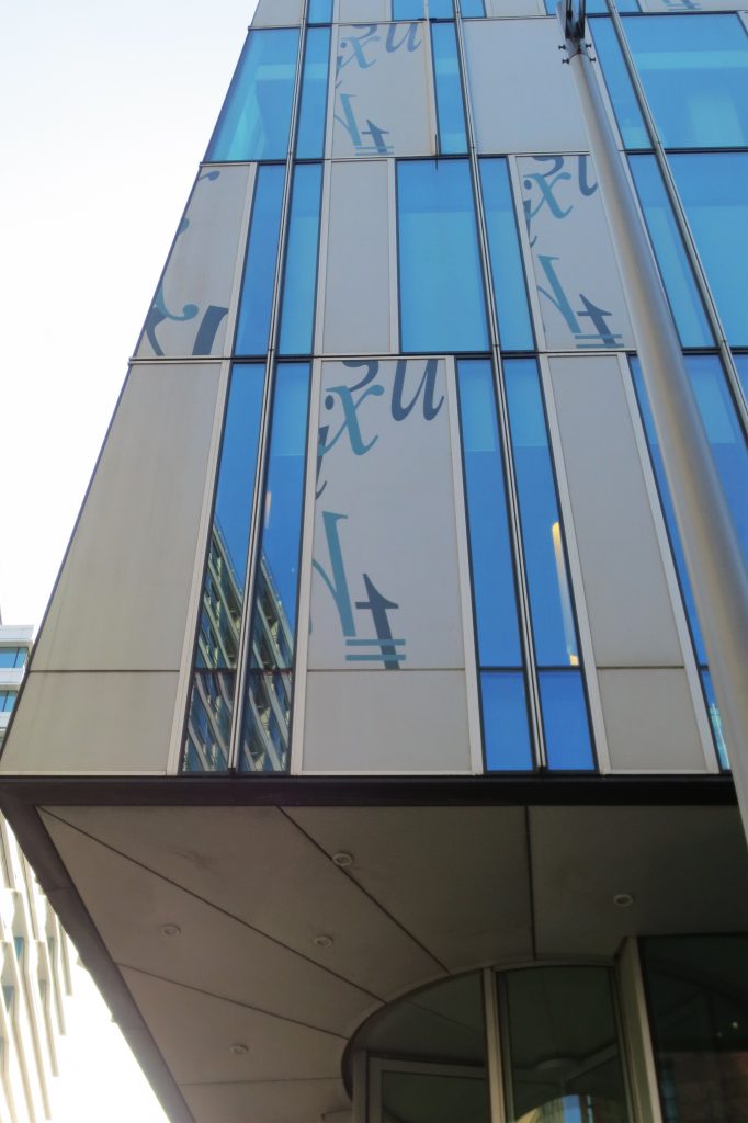
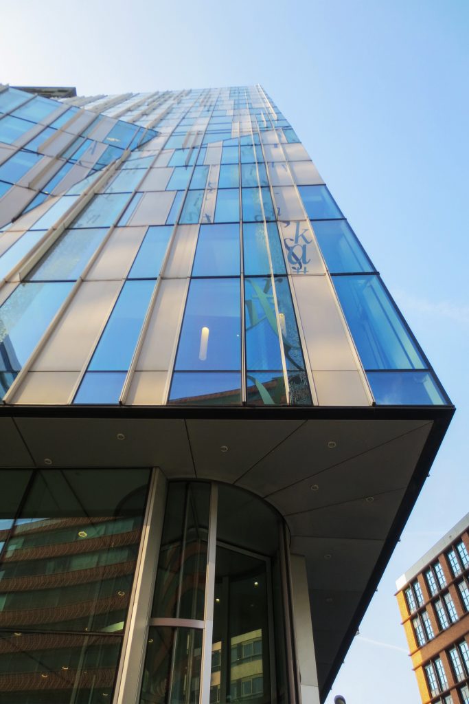
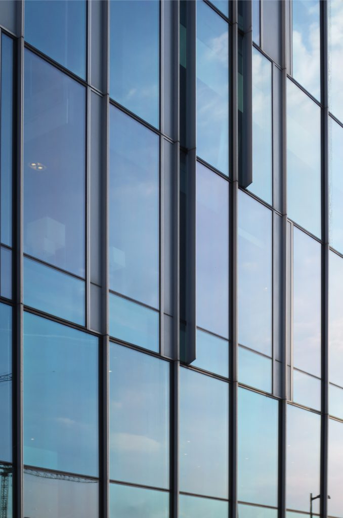
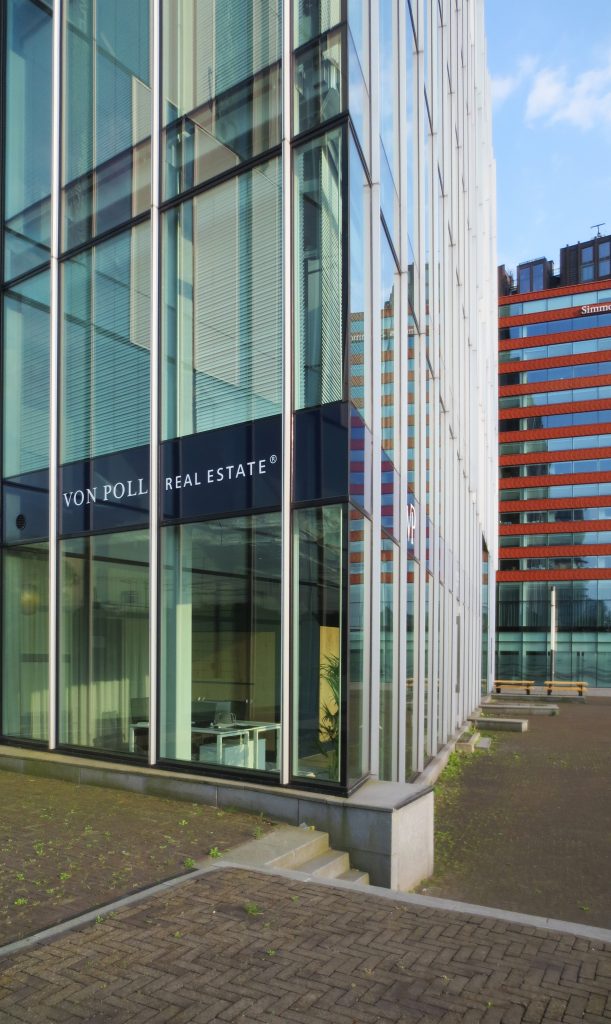
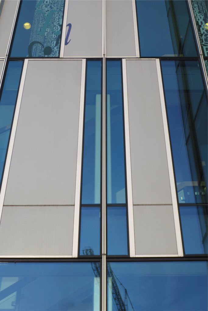
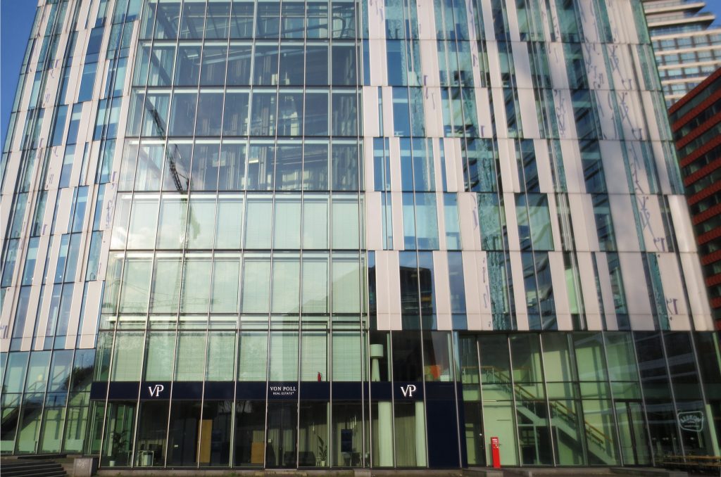
The lower part is transparent to allow light to enter the building and stimulate interaction with the direct environment. The upper part is characterized by layers of natural stone composed of a facade pattern that creates a variety of openings and panoramic views. Both parts are connected by a combination of transparent and printed glass elements and aluminum panels, forming a subtle transition between the two.
Description
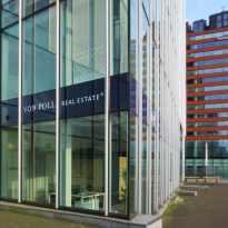
The hard-looking building like a “rock”, with a heavier image in its upper part than in the lower areas, is distinguished by being one of the tallest in the new Zuidas area and its striking facades with curved glass elements , aluminum, stone and concrete.
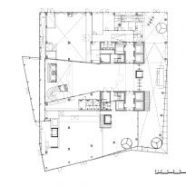
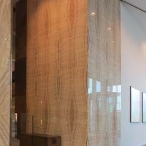
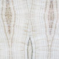
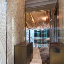
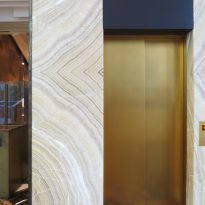
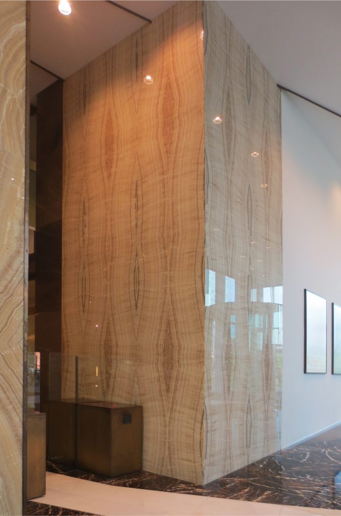
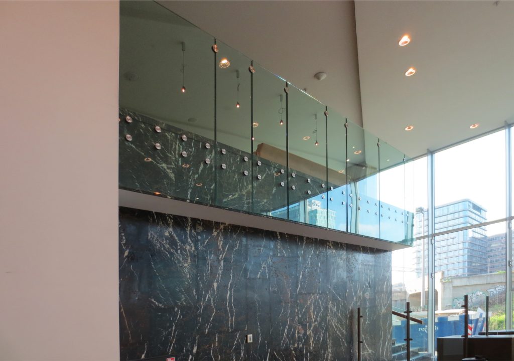
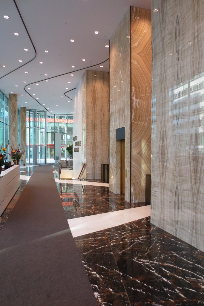
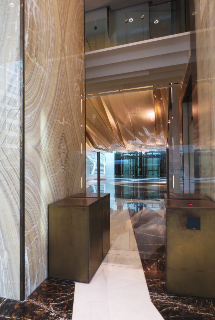
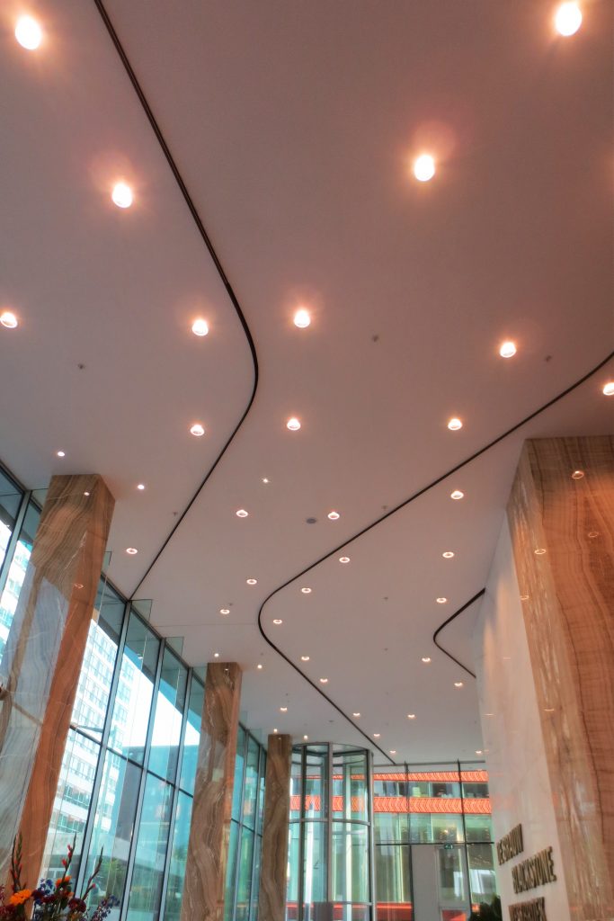
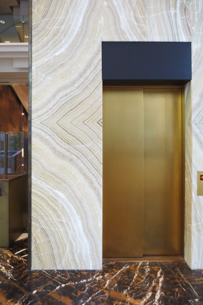
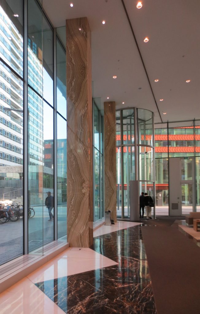
Because De Brauw Blackstone Westbroek became the only tenant of the building, the interior, also designed by Erick van Egeraat, was able to adapt perfectly to the wishes and needs of the law firm. The office should have a warm, comfortable and representative character. This is expressed, for example, in the use of materials such as natural stone, wood and bronze. Although the offices are equipped with high quality furniture, its finish has remained relatively simple. Because of this, and due to the flexible layout of the building, with a grid size of 1.8 meters and fixed heights of free floors of 2.8 meters, the office space can be rented to different users with relatively simple interventions.
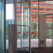
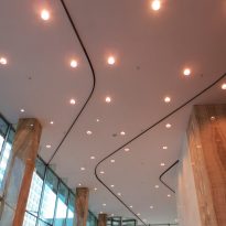
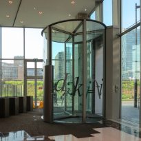
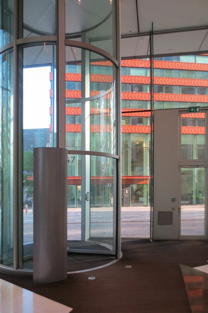
Although most of the building is characterized by straight edges and elegant shapes, the entrance has more rounded shapes and smooth transitions.
Revolving doors
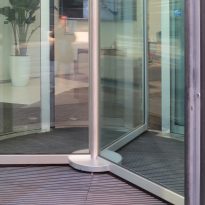
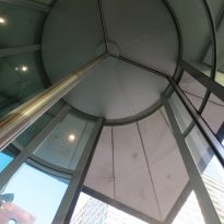
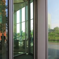
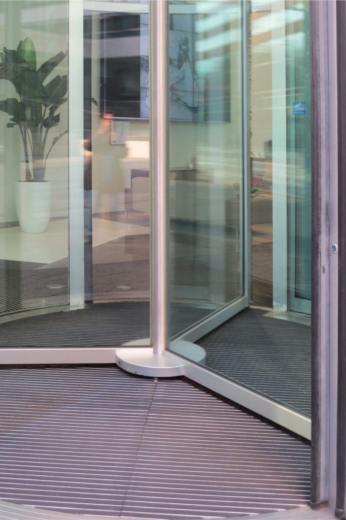
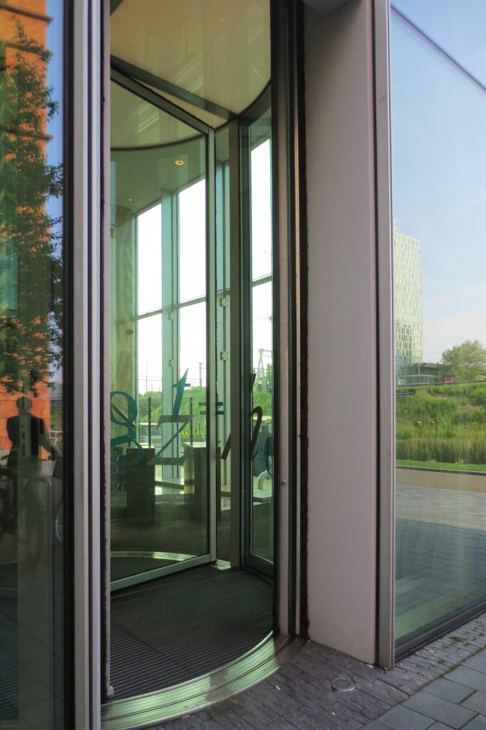
The revolving doors of the entrance have an unusual height of 7.10m and are made entirely of glass with metal frames. These entrances are heated with devices placed on the floor. During the night the building is safely closed by night gates of the same height and also fully automatic curvilinear.
Stairs
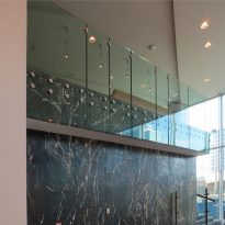
The staircase, at the main entrance, won a “Ladder of the Year” award in 2012. Designed by architect Erick van Egeraat, it complements a dark American walnut wooden railing with white stone steps, a combination that is extremely elegant . The curved tempered glass is also used in the rounded design of the staircase, which contrasts with the straight shapes and acute angles throughout the rest of the interior of the building.
