Carson, Pirie, Scott Store – Sullivan Center

Introduction
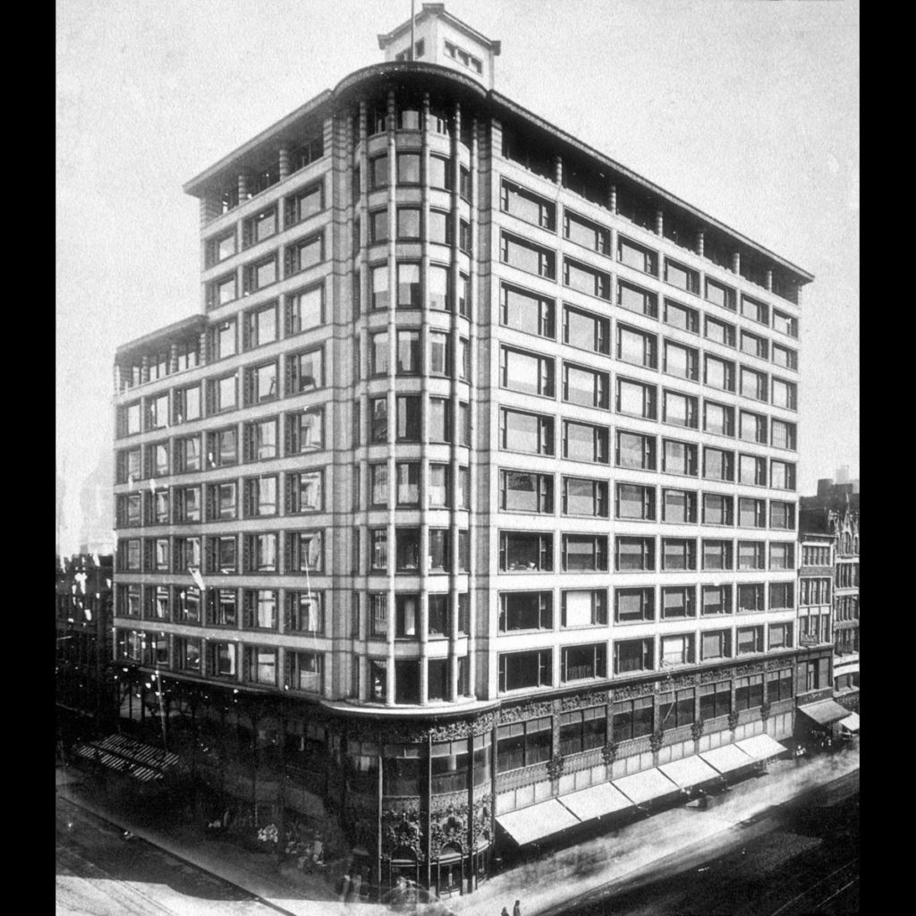
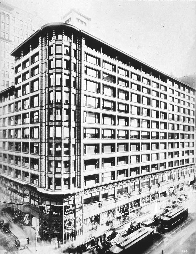
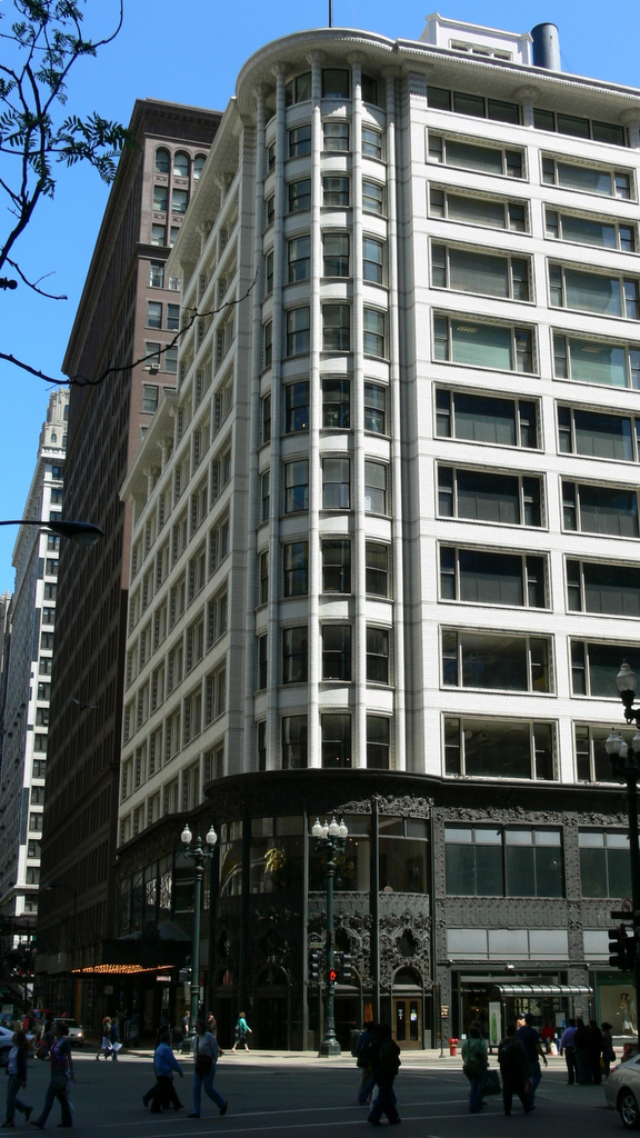
The Sullivan Center better known as the former home of the Carson Pirie Scott store, is one of the most representative works of the famous Chicago School and one of the most important in the history of tall buildings. Built between 1899-1903, it has been used for retail trade throughout its life and was declared a milestone of Chicago in 1975.
History
At the end of 1890, Louis Sullivan received a commission to carry out what would be his last great project and culmination of his entire career.
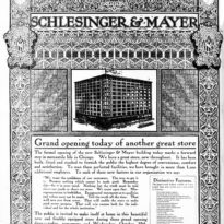
In 1981 the retail firm Schlesinger & Mayer moved to the then new and thriving State Street shopping street, occupying a property on the busy corner of State and Madison in Chicago, an 1873 building called Bowen. To keep up with the stores on that street, they contacted the architecture studio Adler & Sullivan in order to carry out a remodeling of the existing structures. In the opinion of the architects, who considered this option inadequate, it was decided to create a new building by Louis Sullivan, who at that time was no longer associated with Adler.
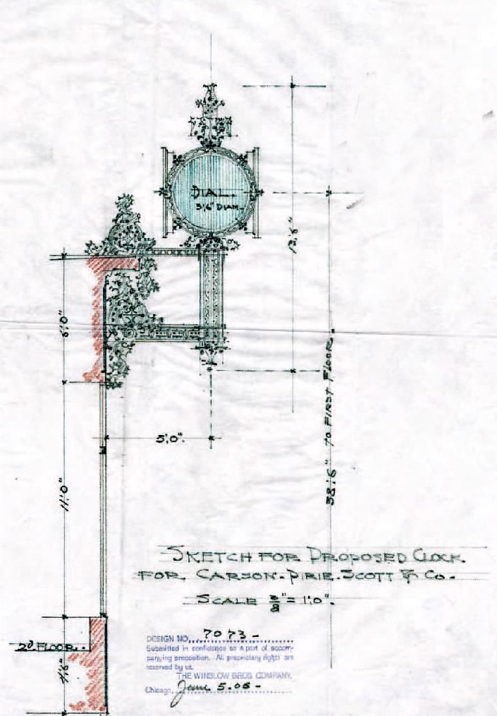
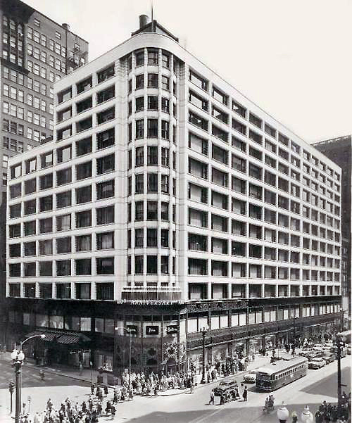
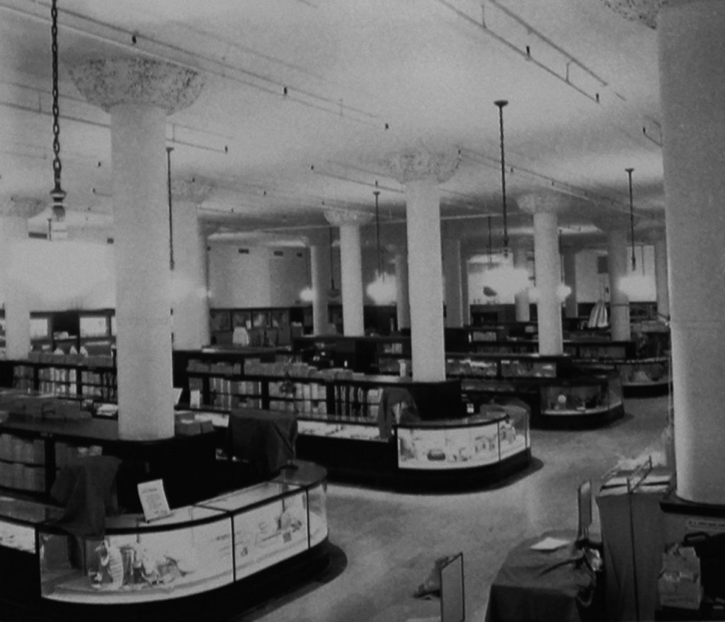
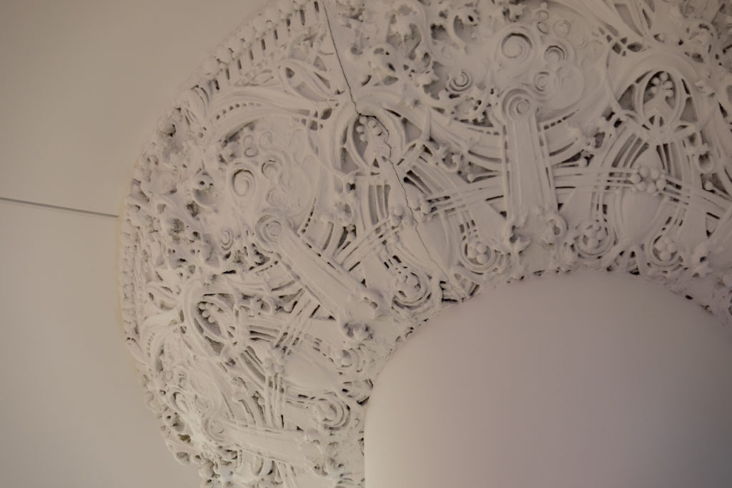
From 1904 the building changed owners, being Carson, Pirie Scott & Co who occupied it until 2007. During that century, different reforms were made to adapt it to new styles, such as the removal of the cornice in 1948 or the elimination of the ornamental details of Sullivan both inside and outside the building. In 1960 the firm hired Holabird & Root to extend the building to the south side and in 1975 it was designated as a National Historic Landmark, so Carson hired John Vinci’s studio to restore the Sullivan facades and the main entrance. The restoration was carried out between 1978-1980.
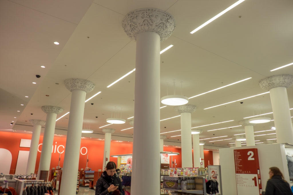
The Carson Pirie Scott stores closed their flagship store in the building in 2007 and after a major restoration in 2012 a new well-known brand store has been opened and as always retail.
Location
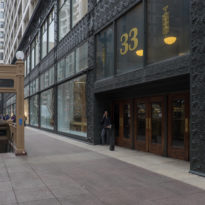
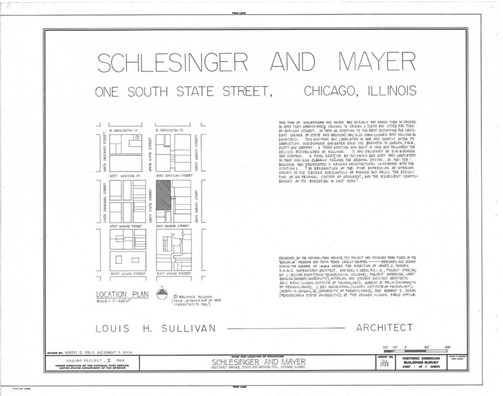
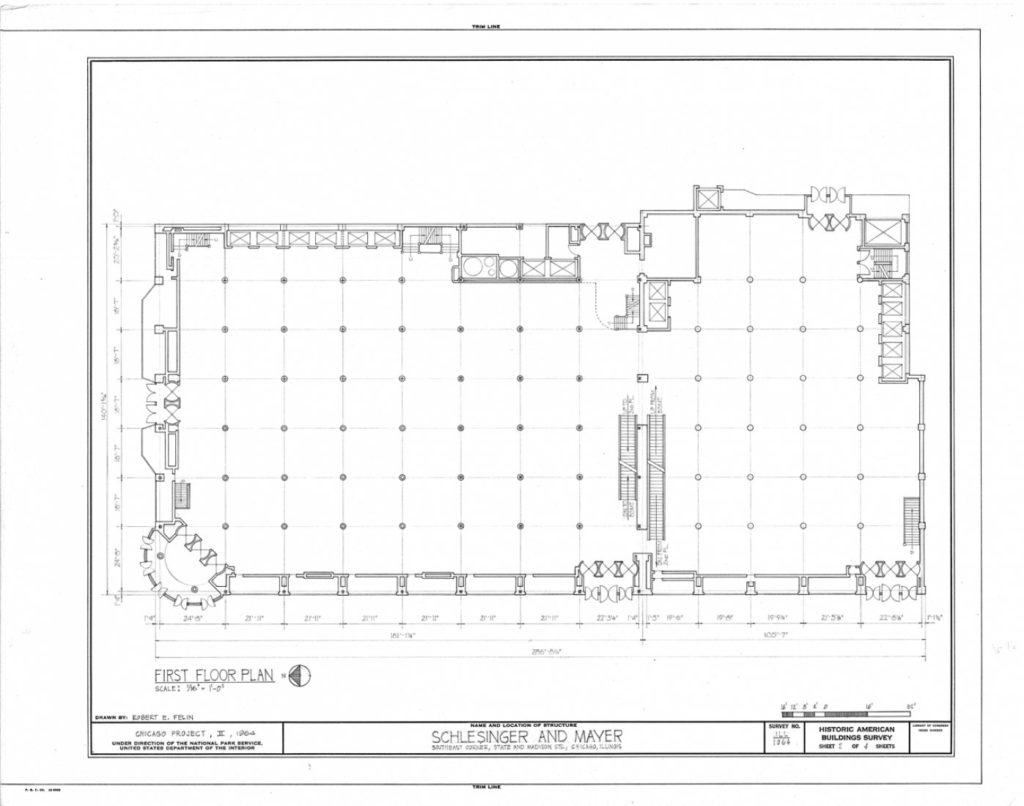
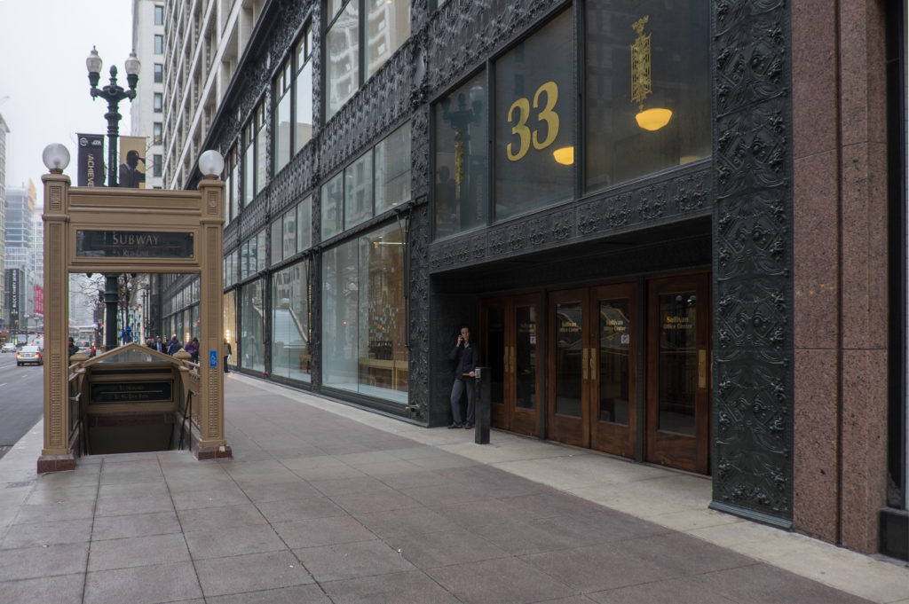
The Sullivan Center, also known as the Carson Pirie Scott & Co. Building, is located on the corner of State St and Madison, occupying most of this city block and connected inside several buildings to the east, at along Wabash Av. Its main entrance is at 1 S. State St.
State Street was the commercial heart of The Loop area of Chicago, United States, for many years and the birthplace of US department stores. Today, The Loop, one of the 77 designated community areas in Chicago, is the central business district in the city center, home of City Hall and Cook County headquarters.
At the beginning of the 20th century, more than half a dozen large retailers lined the street, competing for shoppers with luxurious exhibits and striking architecture. The corner of State and Madison was promoted as the busiest in the world highlighting within this area considered the center of architecture. The fire of 1872, the Great Incense of Chicago, destroyed most of the area, but was quickly rebuilt. In 1885 the Home Insurance Building was carried out, generally considered the world’s first skyscraper, the Rookery Building in 1888, the Monadnock Building in 1891 and the Sullivan Center started in 1899.
Concept
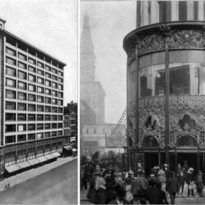
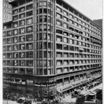
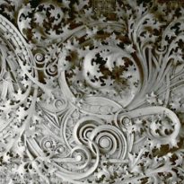
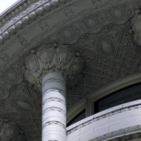
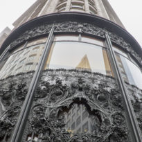
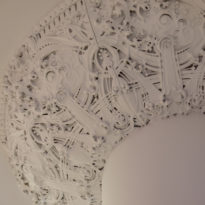
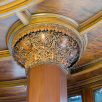
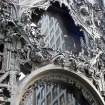
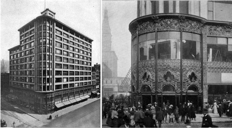
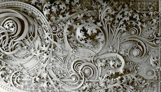
In this project Sullivan managed to create a dramatically animated structure that fused beauty and function in a way never seen before. It is one of the first skyscrapers that became famous, with a very advanced geometry and design for the time. The latter, elegant and modern, is reinforced by the intricate ornamentation of Louis Sullivan around the windows and covering the first floors where it peaks at the rounded entrance. It is a style related to Art Nouveau, with geometric shapes similar to plants.
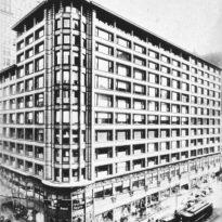
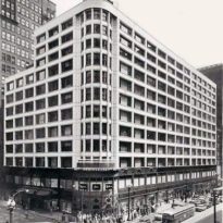
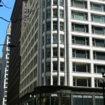
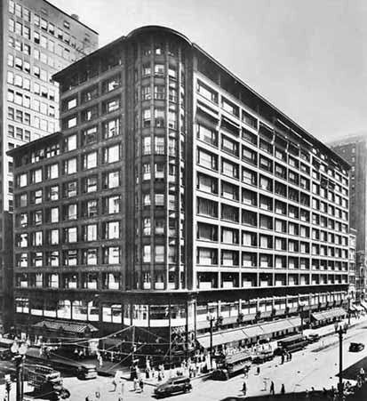
The lines of the building are strongly horizontal, except in the rounded corner where they become sharply vertical.
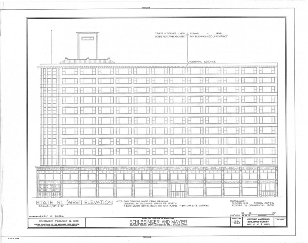
The architect’s design for the Schlesinger & Mayer store was different from everything he had designed so far. Although Sullivan used solutions that he had already used in his projects for large office skyscrapers, such as the totally steel structural framework or the organization in three parts of the skyscrapers: base, middle section and ledge, this building is not a skyscraper very high, the horizontal dimension being powerfully emphasized through the long series of Chicago windows.
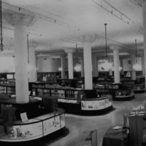
The wide extensions that the steel-frame construction made possible and the increased lighting thanks to flat glass made modern American department stores a completely new and exciting experience.
Spaces
Louis Sullivan divided the project into three parts:
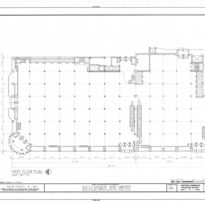
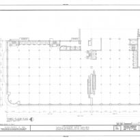
- The first, in 1899, would rise along Madison Street, with three bays wide and 9 stories high.
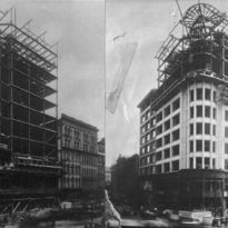
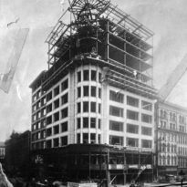
- Between 1903-04 the well-known corner section was built that rose 12 floors.
- The Schlesinger & Mayer store opened in October 1903. But the company was struggling with a growing debt and in 1904 Mayer decided to retire. They sold their building and merchandise to Henry Selfridge, who in turn sold it to the Carson retail company, Pirie Scott & Co. who had lost his lease in another building. Carson was not interested in bringing back the famous and difficult Sullivan, so they hired Daniel Burnham to complete the last addition in 1906, three bays on State St, following Sullivan’s plans.
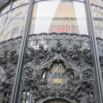
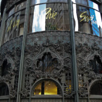
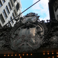
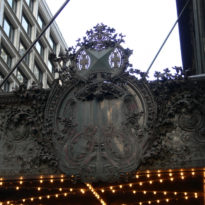
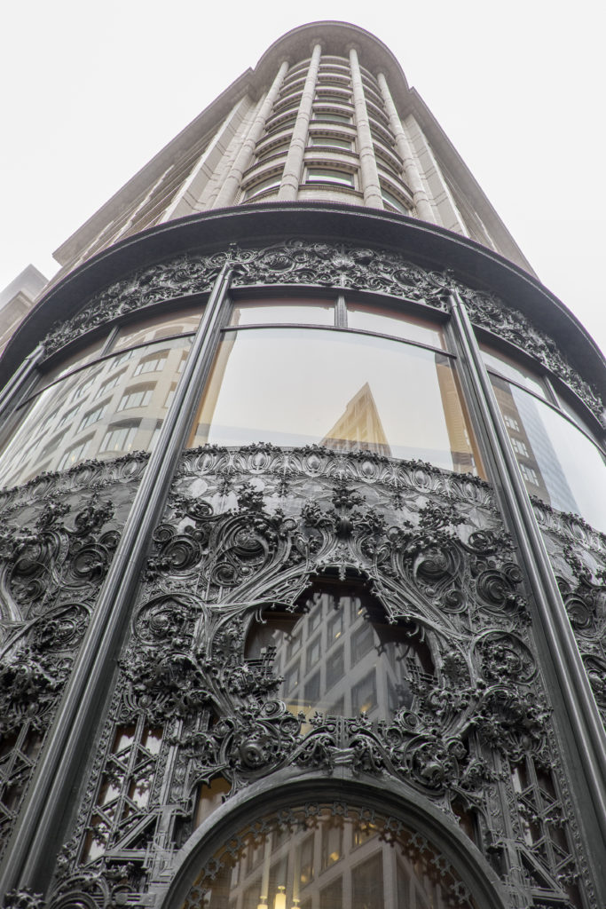
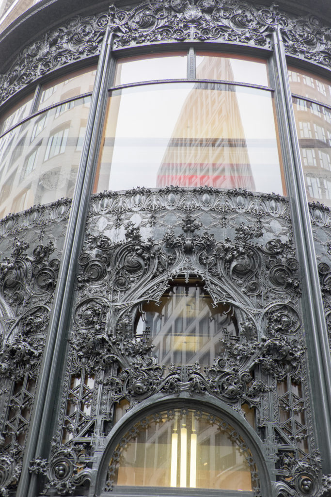
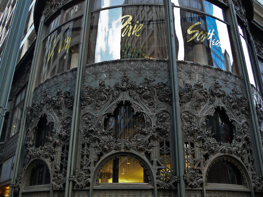
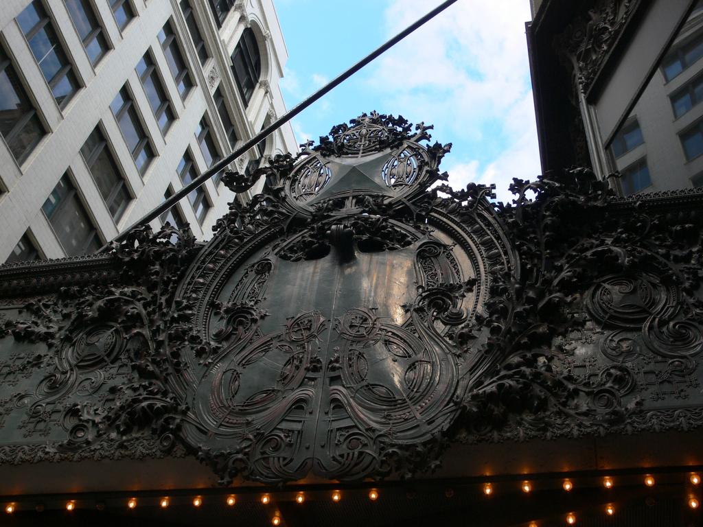
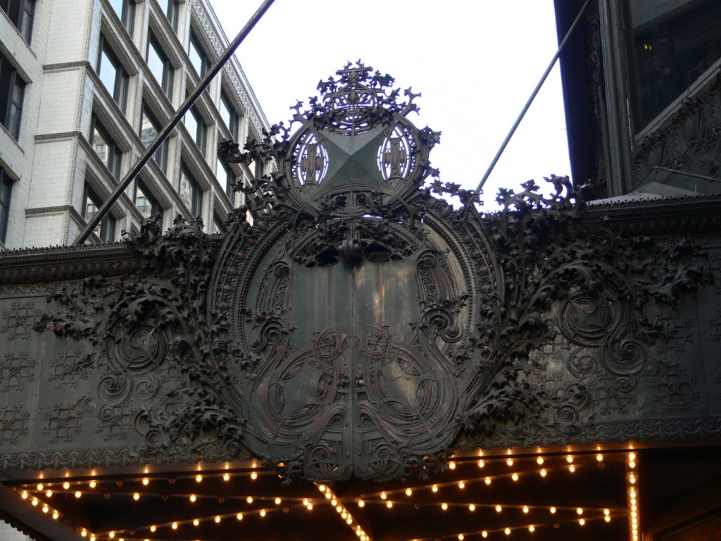
The corner entrance with an attractive ornamentation that could be seen from the two streets, Madison and State St, was designed by Sullivan with the intention that it be attractive and elegant and attract potential customers, creating an important competitiveness with the stores neighbors That facade was restored in 1978 by a team led by John Vinci. Subsequently, the missing ledge was recreated and Gunny Harboe led another restoration, replacing rusty irons. It was then that the cast iron was painted an opaque and flatter green color.
The building is one of the classic structures of the Chicago School. The way this technique was used on the lower floors of the building was so elaborate that it used natural lighting and shadows to seem almost as if it were floating magically on the ground.
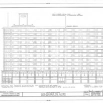
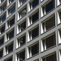
Sullivan’s design for the third to twelfth floors was quite modern at the beginning of the last century. The architects of the Chicago School had left the steel grid visible under the facade for years, but Sullivan succeeds in a terracotta with no ornaments, clean, white glass and the uniform use of Chicago’s windows. These upper floors are very modular, almost mechanical.
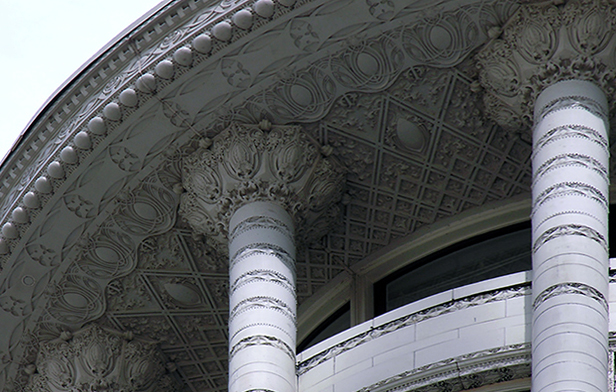
In the first two parts built by Sullivan between 1899 and 1904, the last floor was retracted to create a narrow loggia topped by an intricately detailed cornice that projected beyond the facade. In 1948 this cornice was removed and the 12th floor was redesigned to fit the rest of the building.
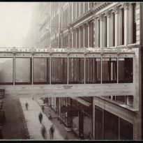
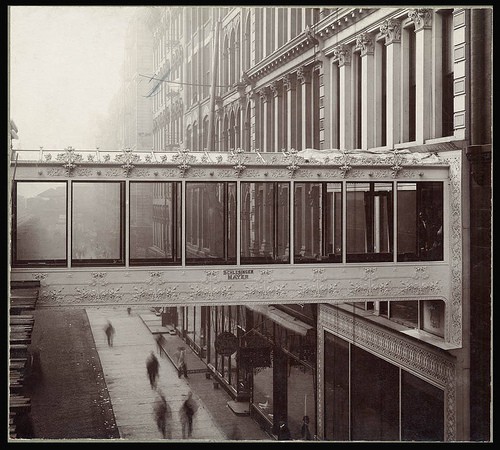
In the first years of its construction a pedestrian bridge communicated the second floor of the store at the back with the train station. This bridge was a distinctive detail that allowed the warehouses to be recognized from afar while its metal structure provided a special entrance feeling for those who used it.
Structure
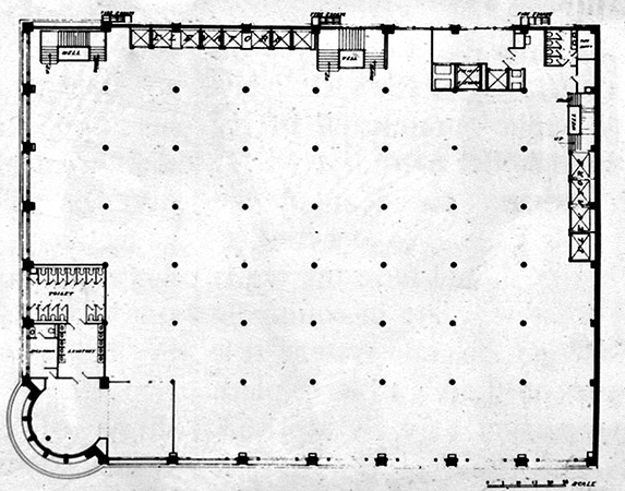
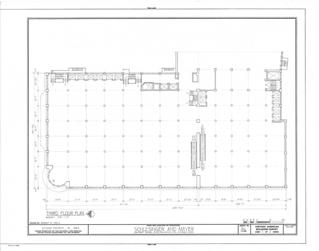
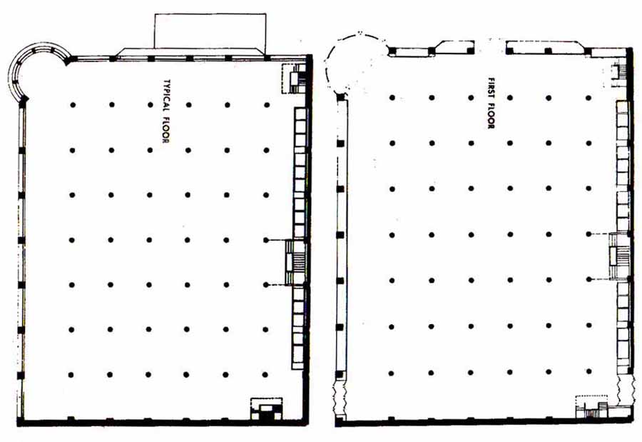
One of the characteristics that made the construction of this building very novel for the time were its large windows that allowed the abundant entry of natural light into the interiors. This was possible thanks to the use of a steel and cast iron frame for its structure that uses the post and lintel technique providing a sturdy, lightweight and flame retardant skeleton. This technique is evident in the outer grid of pillars and eardrums.
It was in this building that those that would later be known as the “Chicago windows” were used for the first time, windows that occupy the entire width of a panel and are divided with a large fixed strip, flanked by a narrow mobile frame on each side . Over the years they would become a classic of the city’s architecture.
At street level, these large glass windows allowed a much wider area of exposure to the street, creating the idea of the showcase. Its grid of pillars and eardrums not only expressed the underlying framework, but also facilitated expansion without interruptions.
Despite its firm horizontality, Sullivan achieved with this building something difficult to achieve, a balance between horizontal and vertical. The rounded corner tower acts as a giant hinge of the two horizontal facades while producing a marked skyscraper effect.
Materials
The structure is made of steel and the facades are revoked with white terracotta bands showing a tripartite division, saving costs and weight by replacing the white marble thought at first.
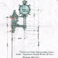
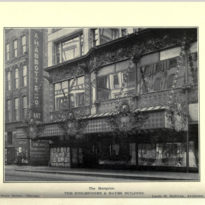
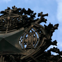
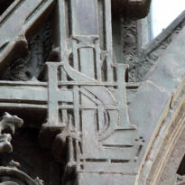
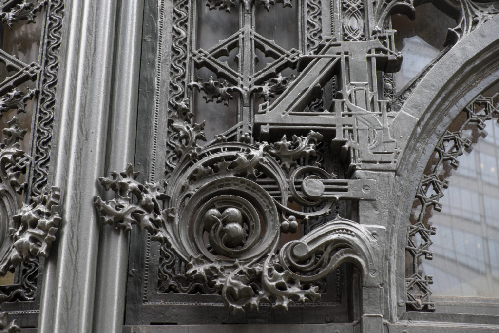
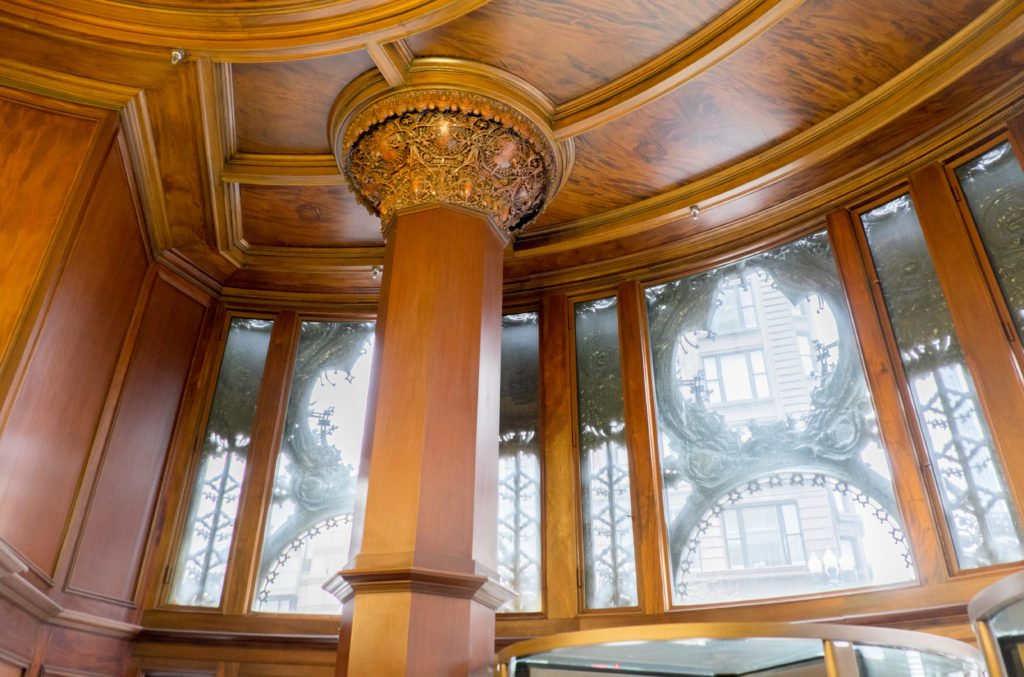
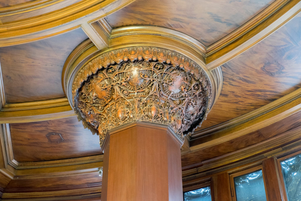
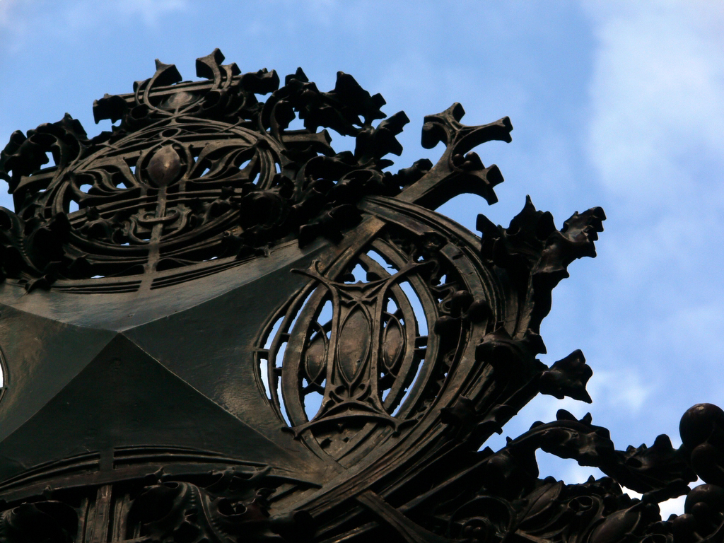
The design featured ornamental works of bronze plated cast iron on the rounded tower. It is an organic ornament included by Sullivan and whose inspiration came from the native plants of the Midwest prairie. This ornament was not only an applied beauty, but in it philosophical ideas were introduced by the architect, such as the strength of the universe, nature and man. Sullivan expressed it as “… a garment of poetic images …” with intentions of raising the spirit using nature to compensate for commercialism. With this ornament that should be an integral part of the Sullivan structure, he was doing more than attracting ladies to buy, he was showing his virtuosity up close for all to see. He proudly included his initials in the design at the corner entrance, LHS by Louis Henry Sullivan and although more difficult to distinguish from S&M by Schlesinger and Mayer, the original occupant.
At first the facade was going to be bronze, but then it was changed to cast iron, mainly to save money. The frame was hand molded and Sullivan took all building materials to a new limit. He stretched the cast iron as if it were plastic until it almost reached the breaking point.
In the lower floors a cast iron coating painted dark green and softened by elaborate foliated patterns was used. Additional ornaments and an outstanding decorative cornice were added at the entrance roundabout. Originally the facade was undulating but due to public problems of right of way Sullivan was in need of smoothing it.
The project also included a fire sprinkler system inside, supplied from a 12 m high water tower located on the roof


