Maison de Verre

Introduction
In 1928 the Dalsace marriage bought an old building in Paris with the intention of demolishing it and building a new construction in which their home and the gynecological clinic of Dr. Dalsace would be located. This project was modified by the position of a former owner of the second floor who refused to sell her apartment.
The design was a collaboration between architect Pierre Chareau, furniture and interior designer, Dutch architect Bernard Bijvoet and metalworker Louis Dalbet. Much of the intricate mobile scene of the house was designed on site as the project developed.
Dr. Dalsace was a member of the French Communist Party that played an important role in both anti-fascist and cultural affairs. In the mid-1930s, the “salle de séjour”, (living room), of the Glass House was transformed into a hall regularly frequented by marxist intellectuals such as Walter Benjamin, as well as by surrealist poets and artists such as Louis Aragon , Paul Éluard, Pablo Picasso, Max Ernst, Jacques Lipchitz, Jean Cocteau, Yves Tanguy, Joan Miró and Max Jacob. In 1992 the Glass House was listed as a historical monument.
When the Germans occupied Paris in World War II, the Dalsace and the Chareaus fled to America. La Maison de Verre was stripped of its furniture, which were hidden by a relative in a barn of the rural France. History says that the Germans tried to requisition the house, but they gave up when they realized they could not heat it or turn it on. After the war, the Dalsaces returned and the house remained in the family until 2006, when it was sold to Robert Rubin, an American collector and architect who became an investor. Rubin has meticulously restored and lives there with his French wife and children allowing a limited number of visits. Pierre Chareau stayed in America and built only two more projects in his life, none of which remains today. La Maison de Verre is a testament to the genius of its creator and his legacy as a hipster creator in the canon of modern architecture.
Location
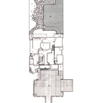
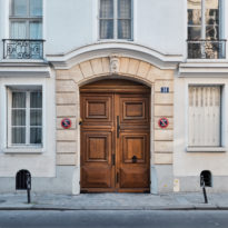
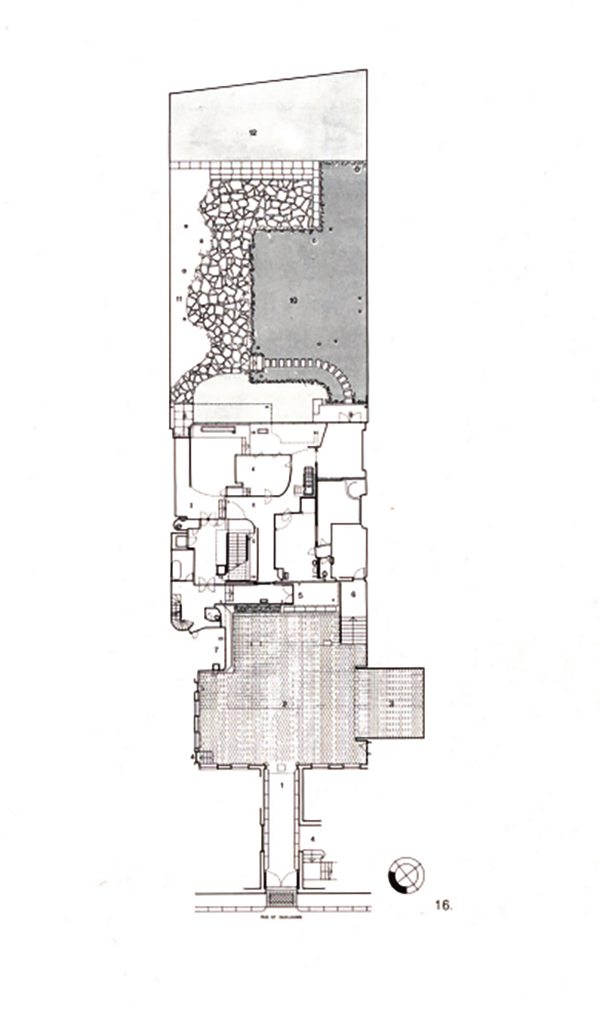
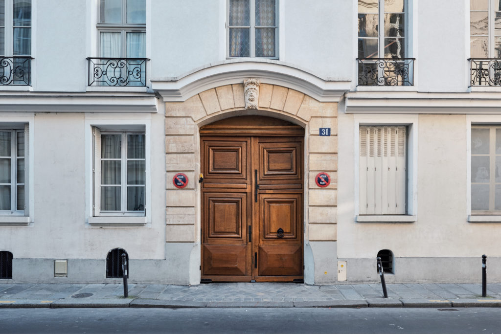
The building is located inside a block which is accessed by a narrow passage, between two courtyards that define its volumetry, at 31 Saint-Guillaume Street, seventh district of Paris, France.
Concept
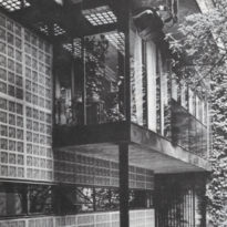
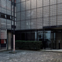
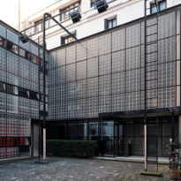
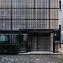
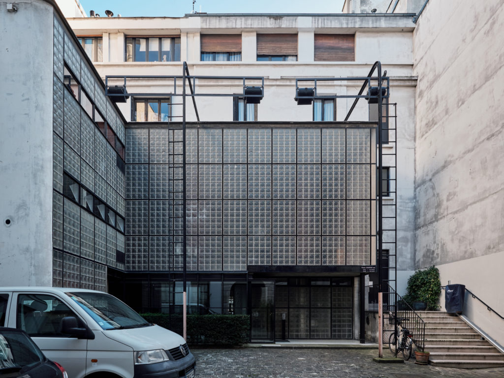
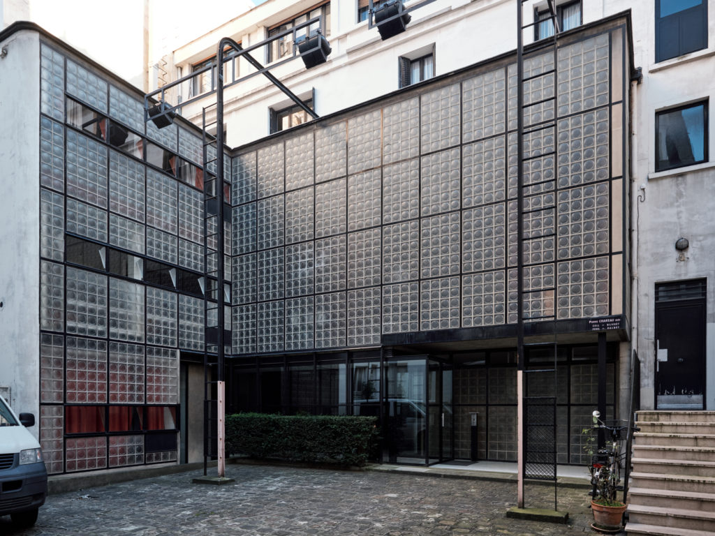
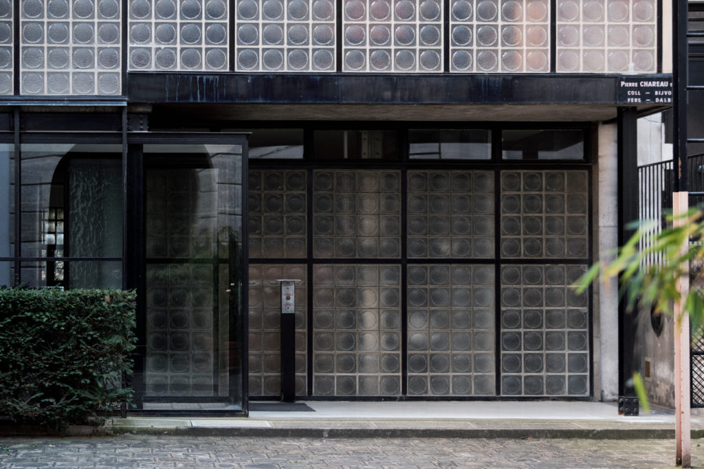
In the Maison Verre the spatial limits are blurred by a constructive complexity in their partitions. The external shape is defined by translucent glass block walls, with selected areas of transparent glazing. Internally, the spatial division is variable with the use of sliding, folding or rotating screens of either glass, sheet or perforated metal, or a combination of all of them.
The Crystal House was built between 1928 – 1932 in a timeless style in the history of architecture, the result of the complexity of the finishes and the mobile elements that compose it, moving it away from the basic principles of the modern movement, although It fits into that style, and bringing it closer to an aesthetic that would not become popular until the 50s.
The design of the house emphasized three main features: honesty of the materials, variable transparency of the forms and juxtaposition of “industrial” materials and accessories with a more traditional style of home decoration.
Spaces
By including a doctor’s office for Dr. Jean Delsace on the ground floor, facing the back garden, the program was designed in an unconventional way.
Ground floor
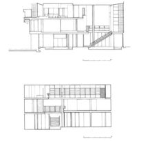
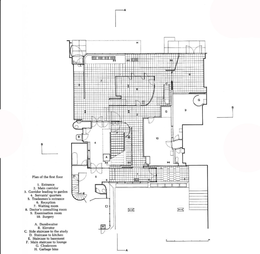
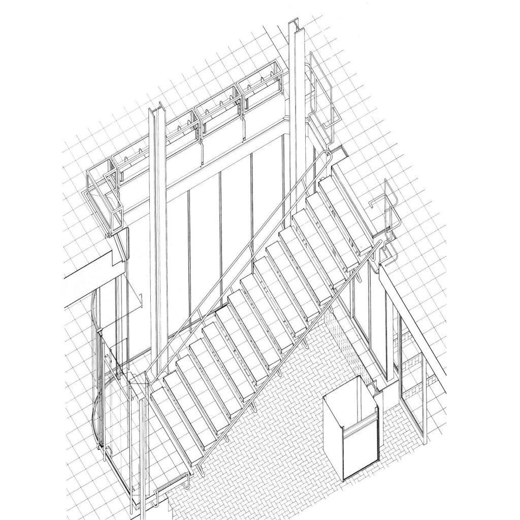
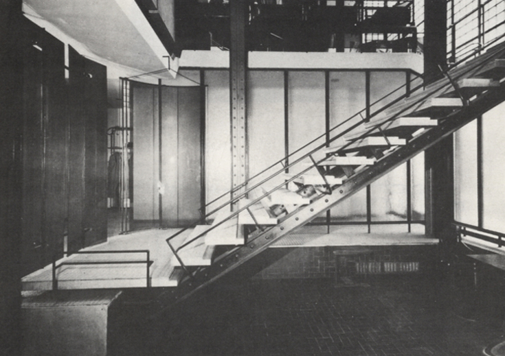
The variable circulation pattern for the house and the consultation, with a shared entrance, was solved with a screen of translucent rotating panels that concealed during the day, facing the patients who accessed the reception of the clinic, the stairs that gave access to the private area, but that framed them at night.
First level
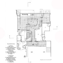
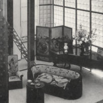
Going up the stairs you access the main space of the house where public functions are performed: a living room with double height in which the interior effect of the glass facade is fully perceived and with sufficient capacity to hold small domestic concerts. The north face, with a constant natural light shows all the intentions of Pierre Chareau‘s design for the Maison de Verre, a structural sincerity that exposes the metal profiles and an ornamentation based on the combination of a complex system of partitions and furniture mobiles, mainly made of wood and reminiscent of the Art Nouveau style.
On this first floor the dining room is also located with a cabin that contains the telephone, other rooms, the kitchen, a pantry and in the back facing the back garden a greenhouse and a small private lounge, which has direct access to the bedroom by a folding ladder.
Second level
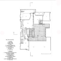
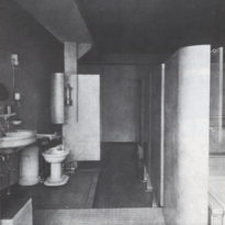
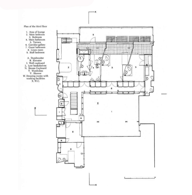
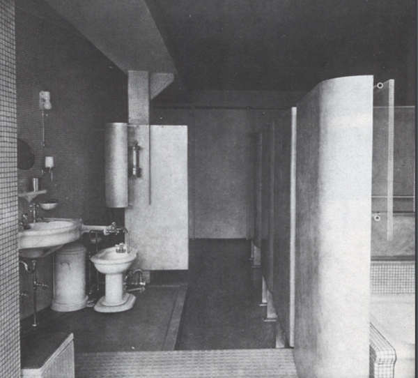
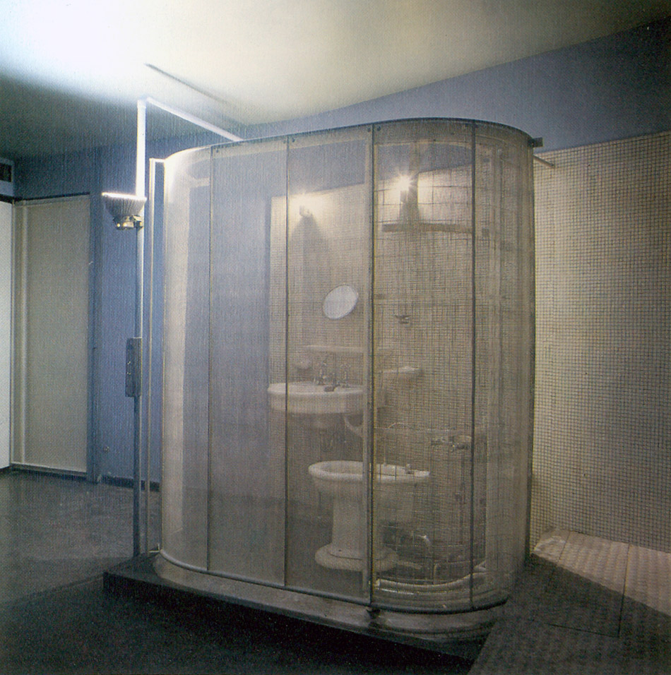
On the second floor there are the bedrooms that face the back garden, a living room, the main bathroom, the guest bathroom, an ironing room, the service units and a terrace. The access, both to the bedrooms and to the services was made through a gallery turned over the double height of the main hall whose railings were designed to perform the functions of a library.
Structure
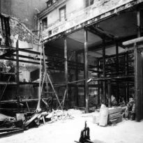
In order to move forward with the project, architects Pierre Chareau and Bernard Bijvoet resolve to shore up the second floor of the hotel through a new metal structure and demolish the lower floors. As a result they obtain a new construction of 3 levels, with double heights in some places, keeping in sight the beams and metal columns that offer a vision of the structure and the materials used.
Metal frame
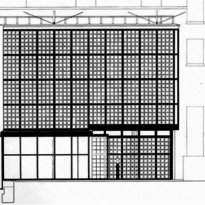
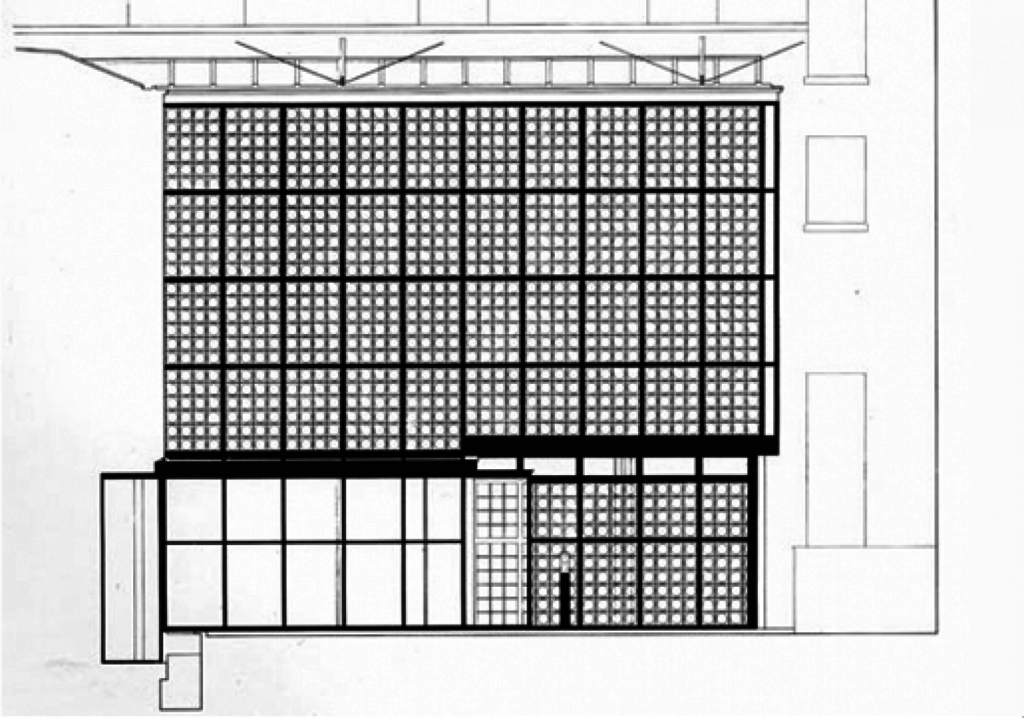
A steel grid supports the glass blocks mainly from the base, creating panels of 4 or 6 elements and using them according to the construction needs, and giving solidity to the areas where doors or windows were placed on the two facades. This structural framework was made with vertical uprights formed by two 30×15 mm U profiles welded to a 100×9 mm flat steel sheet designed to stiffen the facade. Two other horizontal U-sections identical to the first complete the frame that supports the glass blocks. In 1930 Chareau covered this steel frame with a mortar to materialize a surface without apparent joints, without visible skeleton, as if it were an unlimited transparent plane. However, in the 60s an intervention was carried out that affected the main façade, where this continuous coating was removed to place metal parts that enhanced the internal substructure by moving it outside.
The floors of the main floor of the house are arranged in a cantilever on both the front and back façades. In all cases, the line of pillars immediately adjacent to the overhang is aligned parallel to the facades, that is, at a right angle to the relative position of the interior supports. Consequently, this produces space slots immediately behind the facades that accentuate, naturally, the transverse plane, inducing a reading of equivalent stratified layers, which covers all the remaining space.
Interiors
Inside, the house is organized by a series of vertical planes or spatial layers from the previous patio to the garden. The treatment and arrangement of the supports and structural axes suggest that this was an initial intention of the project.
While the rooms are isolated by wooden or metal closet doors, which slide or turn, the structure of steel beams, pipes and ducts remain visible and participate in the architecture, transforming the utilitarian elements of the house into decorative elements. Glass slabs or bricks have also been used to separate the spaces. Sometimes, the facades are scored in contrast to the concrete, resulting from a game of geometry with Japanese influences, formal repetitions and a rhythmic frame.
Materials
The main materials used for the construction of the Maison de Verre were steel, glass and glass blocks. Although all these materials belonged to the new architectural avant-garde impregnated with industrial potential, the construction of a prototype house like this required very particular construction techniques and methods, moving away from the typical industrial construction. Chareau himself confirmed it with the following comment: “… the house is a model made by artisans with claims of standardization …”. The consequence of this situation caused that the costs were enormous and that its realization was delayed during 4 years.
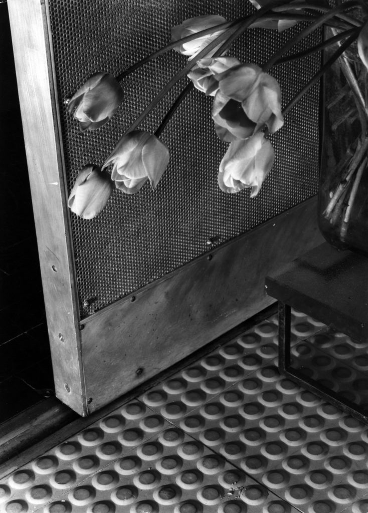
Although Chareau made elegant custom-made furniture for the house, the interior was filled with mass-produced industrial materials adapted to the new construction and exposed, rubber floors, perforated metal doors, exposed pipes, industrial and mechanical lighting fixtures . Esther da Costa Meyer, professor of architecture at Princeton University comments: “… If the exterior of the house was unusual for the time, the interior was completely another world …”.
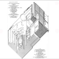
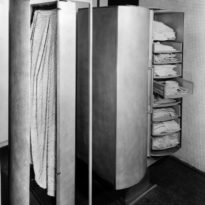
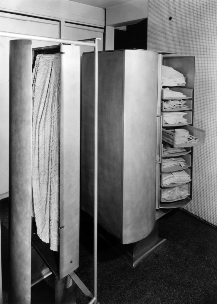
Mechanical accessories include a lift cart from the kitchen to the dining room, a retractable ladder from the private living room to Mrs. Dalsace’s bedroom and the closets and complex bathroom accessories.
Inside the Maison de Verre there is a feeling of joy and fun with a special charisma and charm in every detail, from the telephone booth with a light under the feet to the mustache-shaped aluminum hangers or the red button on the entrance that illuminates the house with a timer giving enough time to get from the entrance door to the bedrooms. Despite its unusual and ingenious character, the house also has considerable intimacy and domestic comfort. Chareau balanced the use of industrial materials with natural ones. Pirelli rubber floors and metal grating stairs are softened in other places with wood, slate and polished lacquer. The surfaces are soft to the touch and the hard edges have been rounded. There is an amazing blue carpet in the so-called “blue room”. The upholstery screens and the embroidered upholstery of Jean Lurçat, friend of Jean Dalsace’s school, provide warmth.
Dalbet made all the metal pieces by hand: the vents in the living room, the retractable stairs in Madame Dalsace’s bedroom, and the incredible elements of the bathrooms, explains Costa Meyer. Mobile aluminum panels like the wings of an airplane separate Jean’s shower space from Annie’s bathroom.
Glass blocks
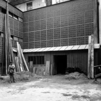
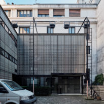
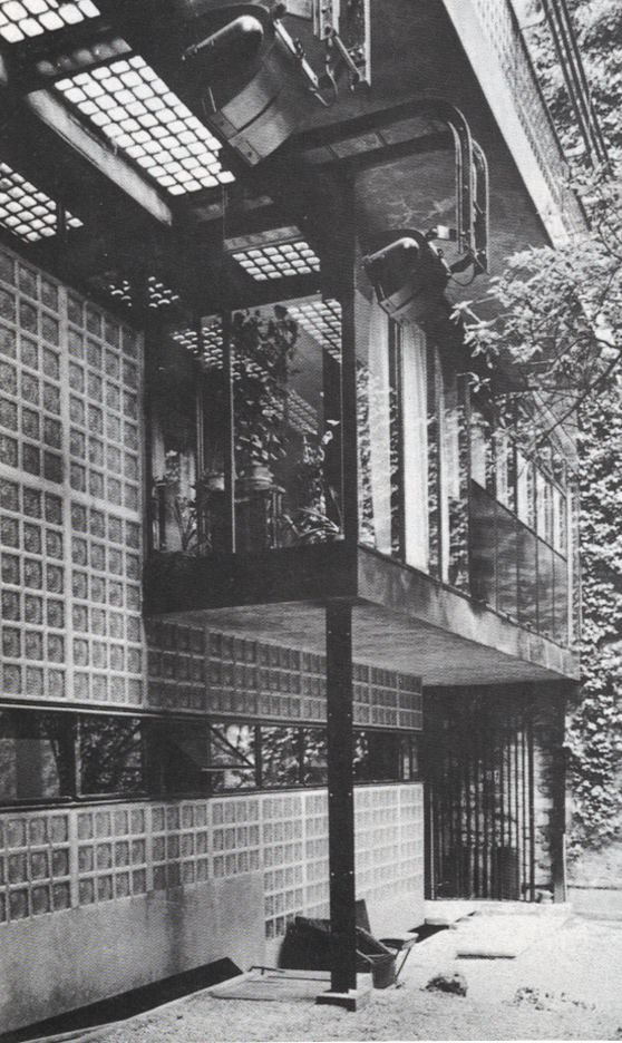
In its two main facades, the north and the south, its walls are built with translucent glass blocks, with transparent windows in certain places. The use of these blocks allows the entry of a sifted light regardless of the landscape on the other side, either the access patio or the back garden. It is said that the architect wanted the house to be “a light box”.
On the ground floor and first level of the rear facade the same blocks were used as in the main facade, but on the second floor, in the area of the small private room and the greenhouse another type of panel created with a glass filling was used transparent mounted dry on a steel frame that allowed to fit and fix the piece of glass. These pieces had leather seals together to ensure tightness and some of them were practicable.
Video
https://www.youtube.com/watch?v=rZjbpiVaG6M
