University Museum for Contemporary Art – MUAC

Introduction
The UNAM University Museum of Contemporary Art is the first museum created specifically for contemporary art throughout Mexico.
In 2004, the university council held a contest by invitation to present projects for the realization of the museum, the one presented by the Mexican architect Teodoro Gonzales de León was chosen. The works began in 2006 and on November 27, 2008 it was inaugurated. Since that date, MUAC has received and exhibited some of the most important works of art in the world. Designed by Teodoro González de León and built in collaboration with an interdisciplinary team, the building offers space for a lively debate and critical experimentation in which the very axis of museum studies focuses directly on the individual visitor.
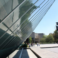
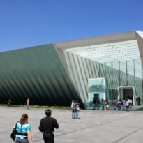
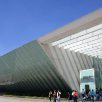
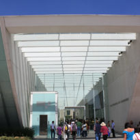
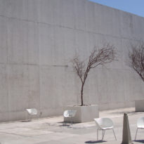
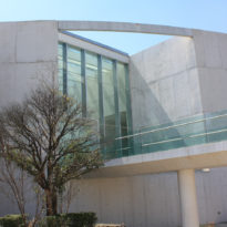
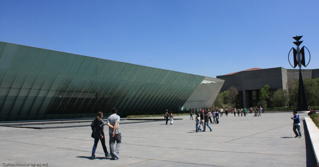
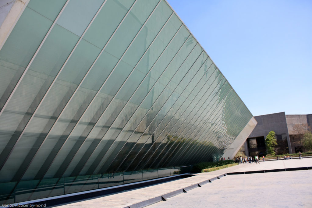
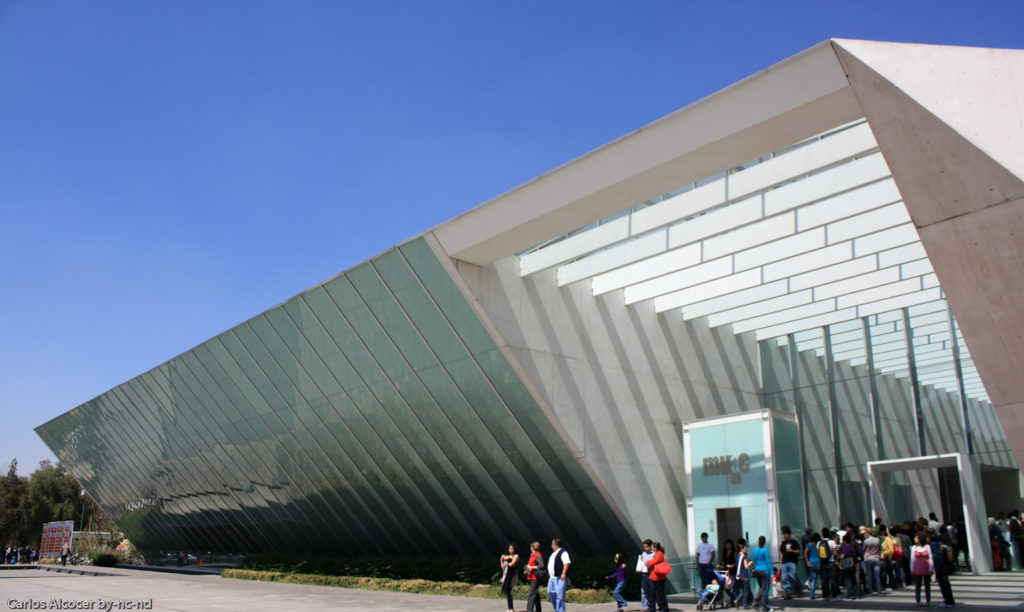
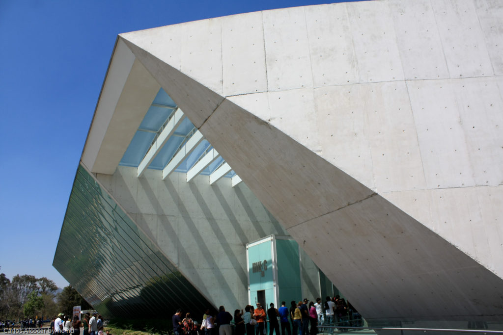
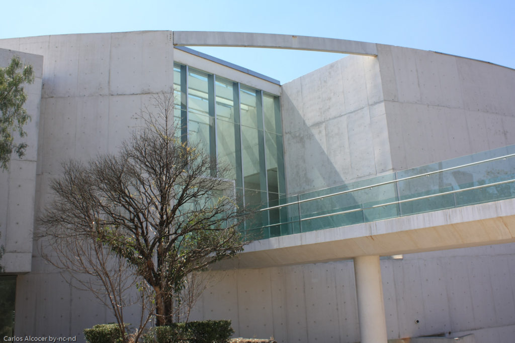
The window tilted in the front announces the modernity of the project, in contrast to much of the campus, but outdoor patios both inside and outside the building place it within the architectural traditions of Mexico, both indigenous and colonial.
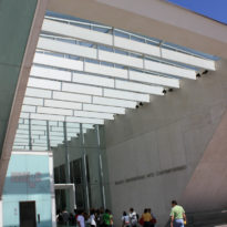
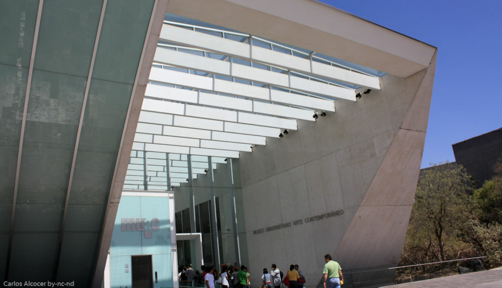
The Cultural Center, where the museum is located, distributes its volumetry according to orientation. The large portico inclined and glazed towards the square, to the east a curved volume accompanies the broken module of the Concert Hall and to the west the white volumes with different heights corresponding to the Museum.
Location
The museum is located in the middle of the extensive UNAM campus, Av. Insurgentes Sur 3000, Universidad Autónoma de México, Coyoacán, C.P. 4510, Mexico City, Mexico. The building was built on the side of a square that serves as an entrance to the University Cultural Center and was formerly occupied by a relocated parking lot under the new main square. In this square the sculpture of Rufino Tamayo called La Espiga was placed.
With this location of the MUAC the trees of the square were almost not affected by the construction and the university managed to have an entrance that gives access to all the enclosures. People who arrive by car access the underground parking through a ramp, but those who arrive by foot or bus can access through the pedestrian entrance located in the square.
Concept
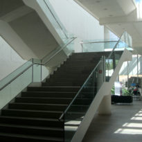
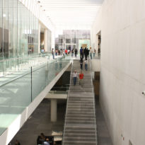
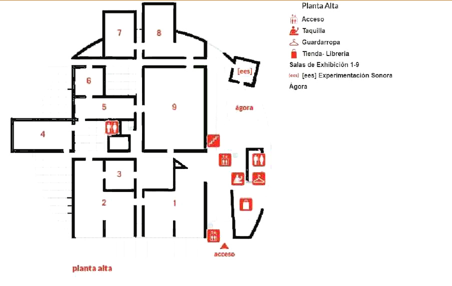
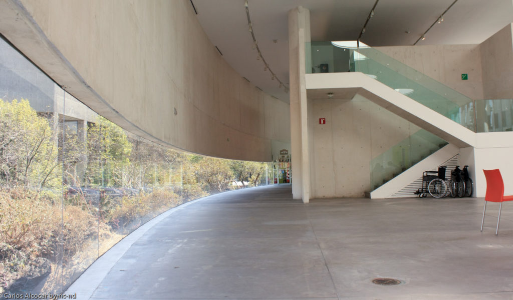
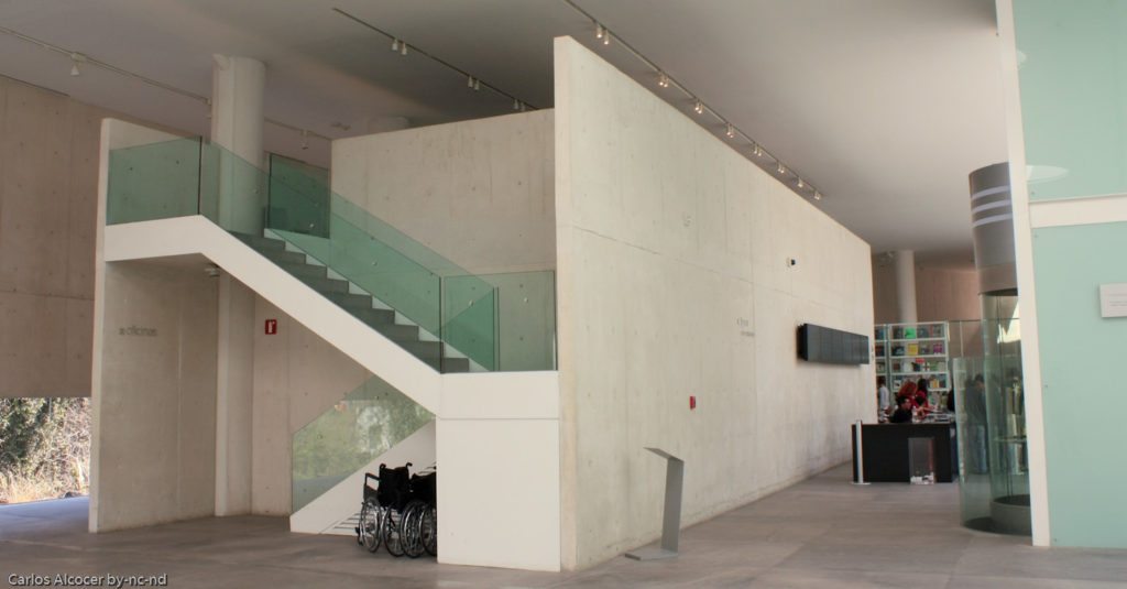
The Contemporary Art University Museum is the first museum conceived in Mexico specifically to exhibit modern art. From the architectural project, the institutional management and the museology and interpretation was thought in an integral way for the function for which it was created. This concept is reflected in the proposed route to visitors, a free and fluid tour in a comfortable and penetrable museum in which all the exhibition halls are on the same level and articulated by wide corridors. If the visitor wishes to access the other services offered on the lower floor, there is an elevator.
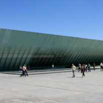
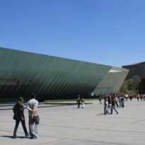
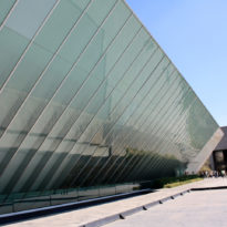
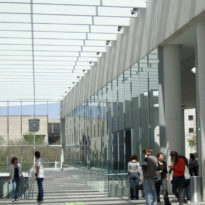
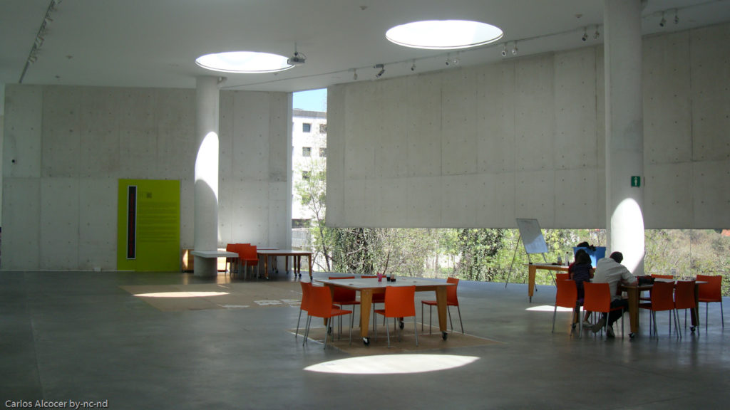
The MUAC is surrounded by a group of zenithically illuminated white concrete cubes that are structured on a north-south axis that is the backbone of the entire project, together with the new square that articulates access to the museum and the concert hall of the center through 70m of the inclined glass plane.
Spaces
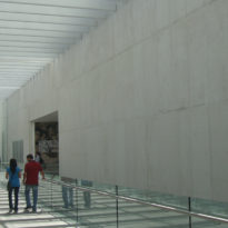
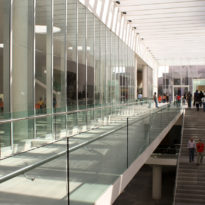
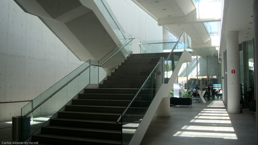
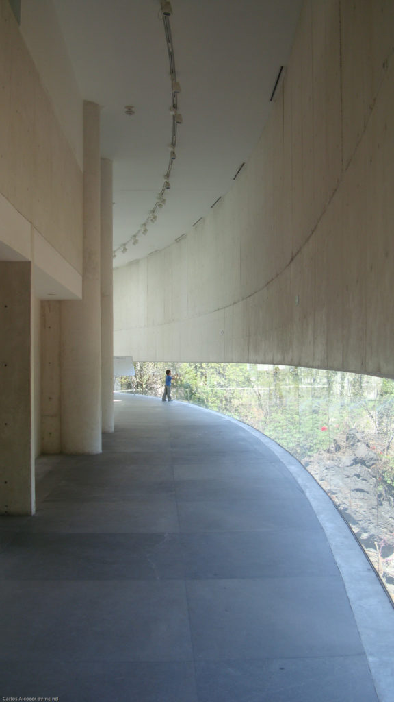
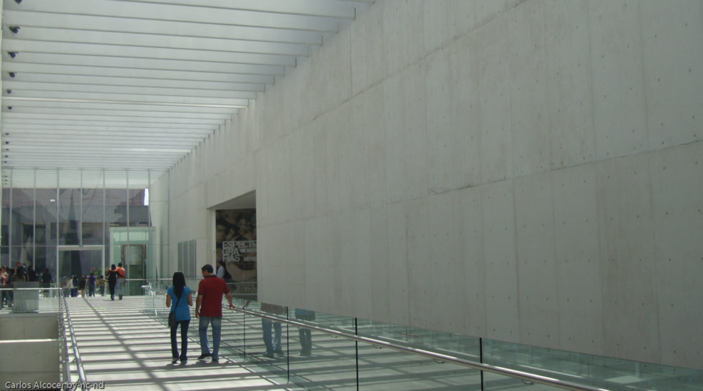
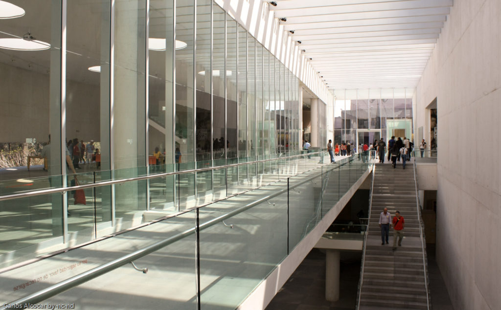
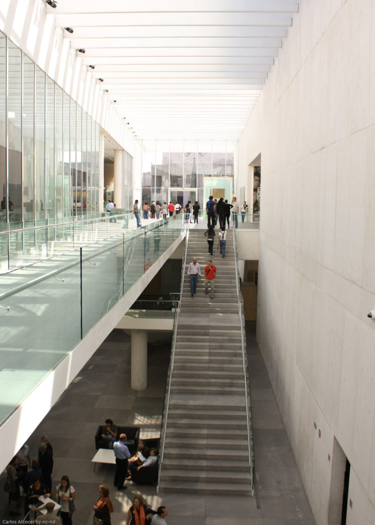
The Museum is part of the University Cultural Center, a space where other buildings dedicated to music and dance shows, theater, cinema and a library are located. Its glass facade of minimalist style, on a 45º slope, contrasts with the surrounding buildings of the 1970s and also serves as access to the Concert Hall and the theaters of the Center through a large double-height lobby. This lobby crosses the entire building.
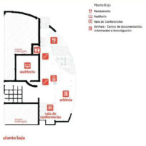
In addition to the exhibition halls the museum has a multimedia library, a photo library, a conference room, an auditorium, workshops, warehouses, information centers and a restaurant, among other public services
Floors
Top floor
The museum has two floors of which 3,300m2 correspond to exhibition spaces. On the upper floor, at the level of the square, there are the exhibition halls, as well as the reception, the bookstore, the store and the educational area. In total it has 14 rooms with high ceilings designed with a module 12m wide and different lengths and heights that vary between 6, 9 and 12m.
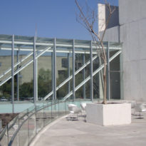
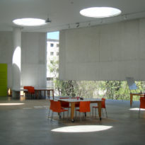
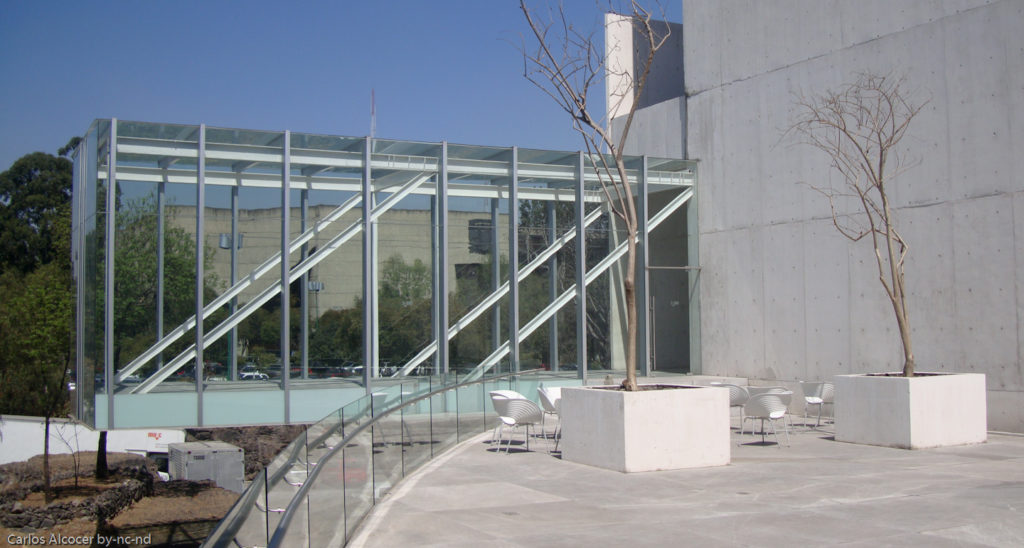
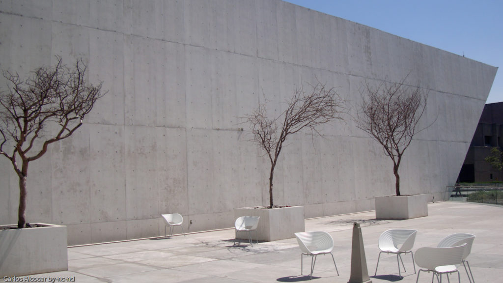
In these rooms, works of the different Mexican artistic movements are presented, as well as avant-garde temporary exhibitions that occupy nine of its spacious rooms. The rooms are divided into four sections that each function as a small museum and are connected by three interior streets that receive light from three courtyards and two terraces. These streets, together with the courtyards, define the position of the rooms.The square also acts as an exhibition space.
In this plant there are also free workshops for all the public, a space where dialogue and reflection on contemporary art is encouraged and the space for sound experimentation where the production of artistic manifestations with sound is encouraged.
Lower floor
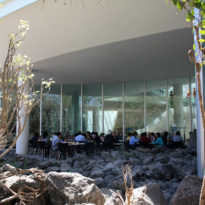
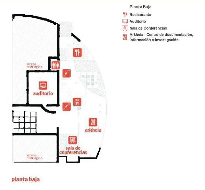
In this plant partially excavated on the rock is the Conference Room, the Auditorium, a restaurant, the media library or research center dedicated documentation of contemporary art and the support areas of the museum, restoration laboratory, administrative offices, museology and wineries .
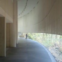
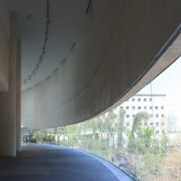
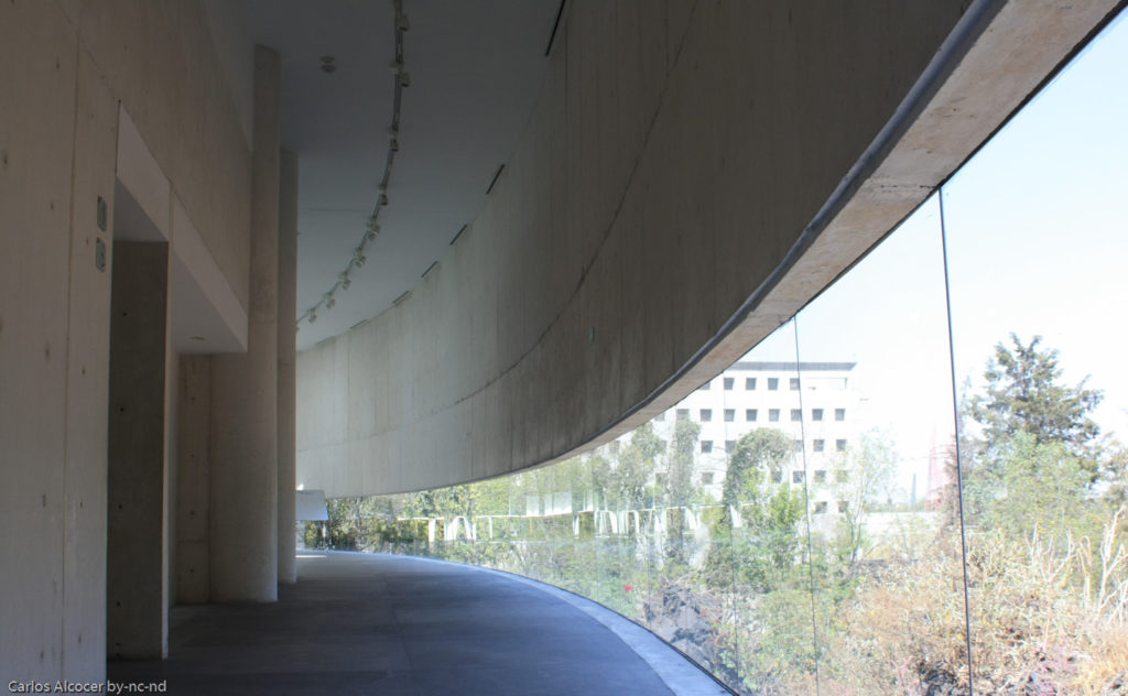
Both in the media library and in the restaurant, a large curved window establishes the relationship between the place and the volcanic landscape, contrasting the black volcanic rocks with the white of the walls.
Illumination
The natural lighting that the rooms receive is filtered by a ceiling that transforms it into an enveloping light without shadows. This ceiling lamp has operable curtains that allow to completely obscure the space if necessary, in addition to hiding the installations of electric light and air conditioning.
Structure and Materials
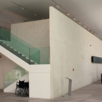
The main materials used in the construction of the museum were white and gray concrete, steel, glass and aluminum. White concrete was mainly used in public areas.
The entire vertical structure of the building is concrete with insulated footings for all columns and continuous footings on the walls that leave the ground floor. For the mezzanines lightened slabs were used. The roof structure was erected with reinforcements and structural steel sheets. In the transparent parts 12mm tempered glass was used. The glass used in the inclined plane of the entrance hall is blurred, allowing to see the square from the inside, but at the same time protecting the lobby from the sun.
The front façade of the museum is mostly white concrete, which was used as an apparent finish, and glass with aluminum frames and protective filters to take care of the art inside. In the pergolas and balconies its placed steel beams.
In private spaces, gray concrete prevails. The floors of the museum are polished concrete.
Drawings
Photos

