The Hive – NTU Learning Hub

Introduction
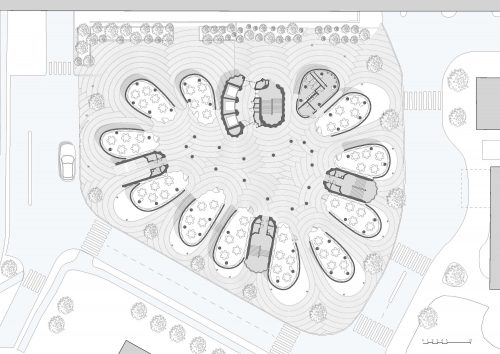
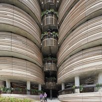
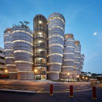
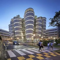
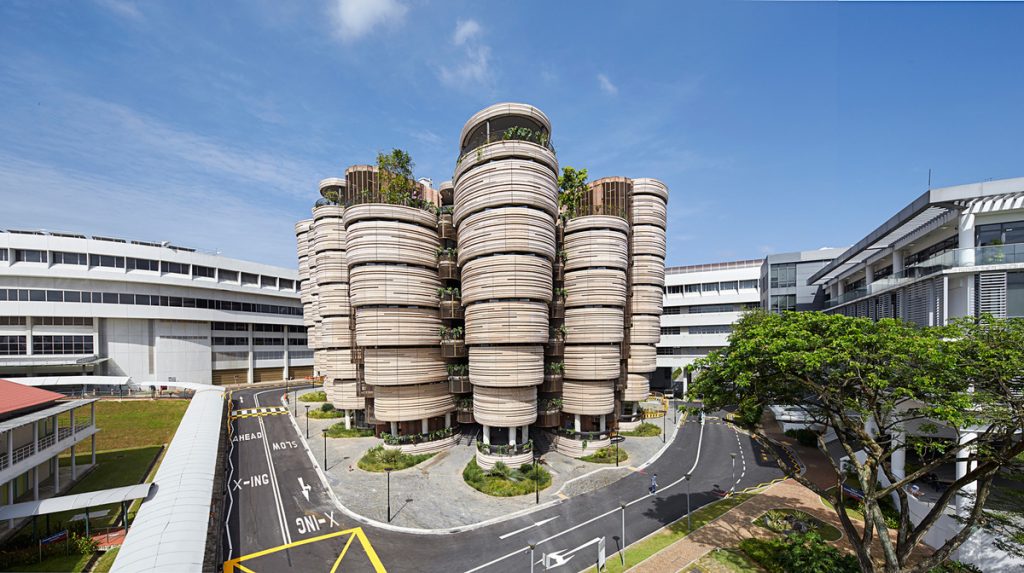
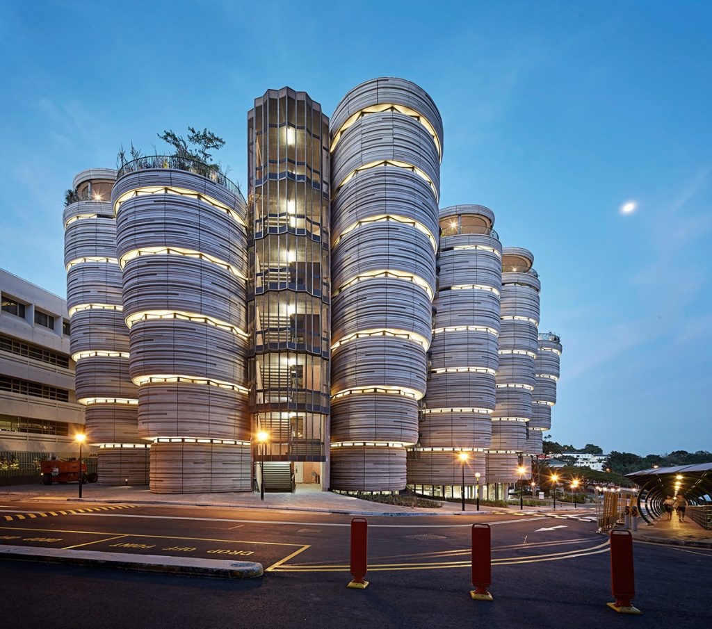
Thomas Heatherwick of Heatherwick Studio, in collaboration with CPG Consultants, is responsible for the new project at Nanyang Technological University. The Hive Formed by 12 towers of 8 plants began on October 12, 2012 and is one of 14 new physical developments that are being built in the NTU under the Master Plan of the University campus that it plans to transform In the term of 3 years the place in a “univer-city”. The new Learning Hub comes from a simple idea: that people learn better, that they learn from each other. By bringing students together in a common college setting, they can collaborate to develop their thoughts faster than would be possible if they did so on their own.
The Heatherwick Study won a competition to design the University Learning Center which was completed in March 2015 and is part of a £ 360m budget for the refurbishment of Nanyang University of Technology, the first of its Campus In twenty years.
In 2013 the Learning Center was awarded the BCA Green Mark Platinum Award by the Singapore government. The award is a benchmarking scheme that incorporates internationally recognized best practices in environmental design and performance.
Location
The main campus of Nanyang Technological University covers 200 hectares of land, making it the largest university campus in Singapore. The main campus grounds are located in the western part of the city, along 50 Nanyang Avenue, Singapore 639798.
Concept
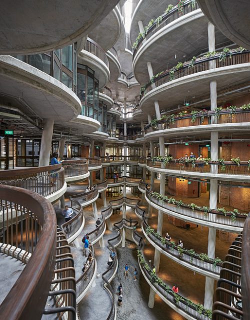
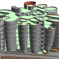
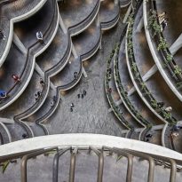
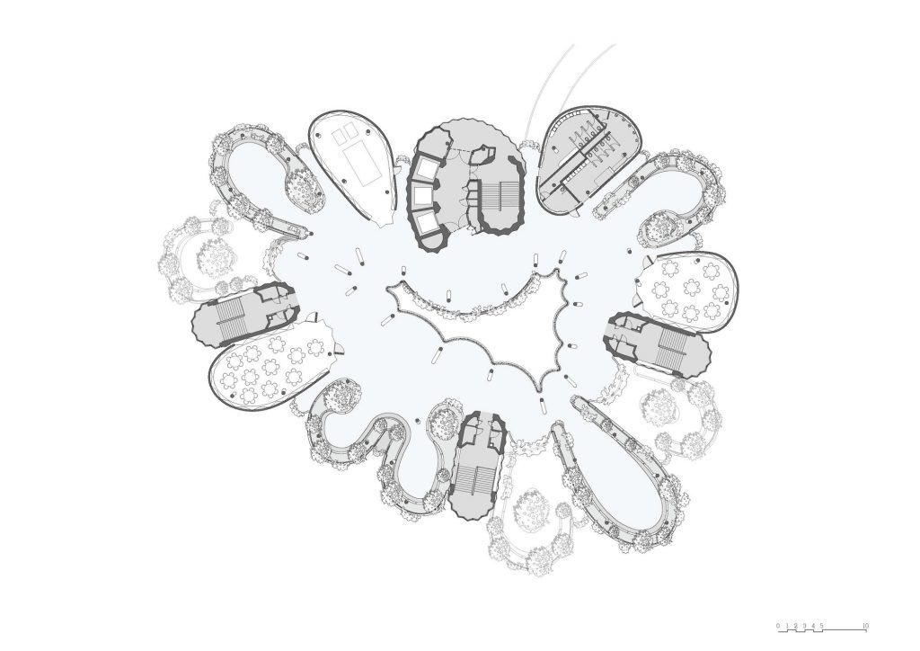
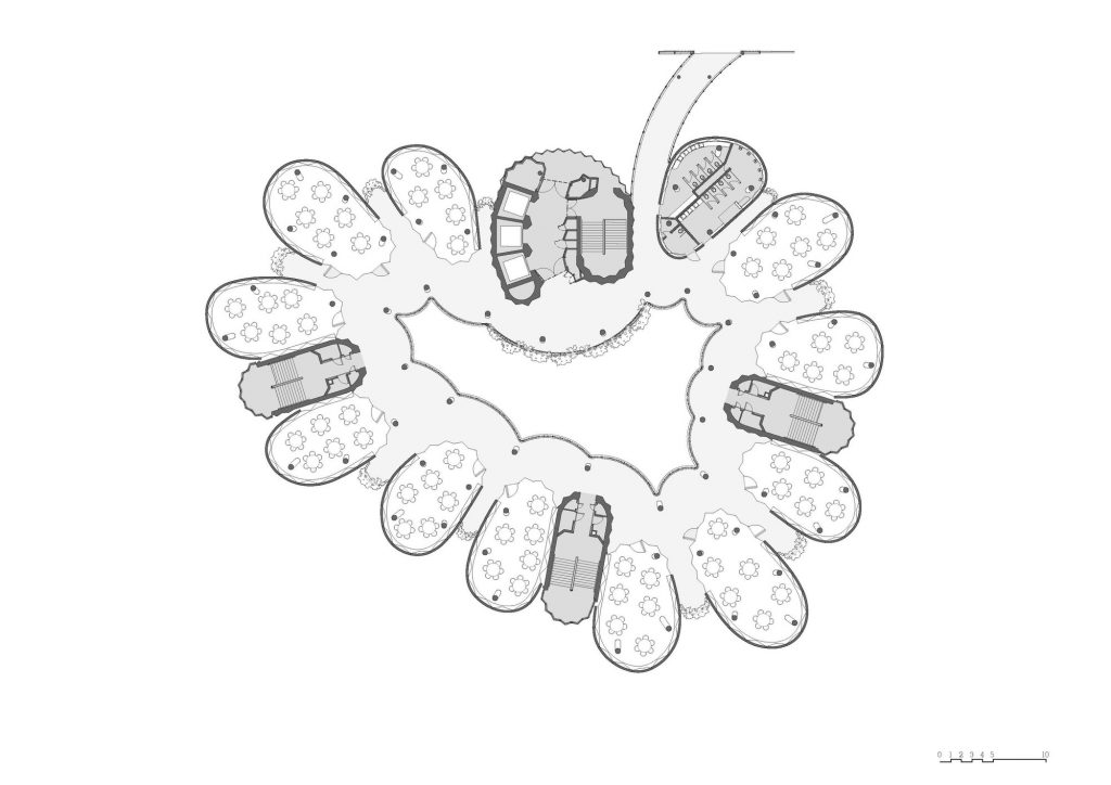
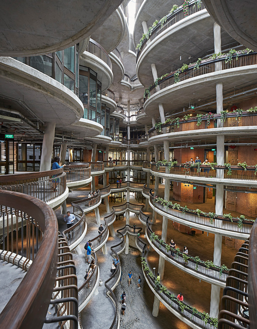
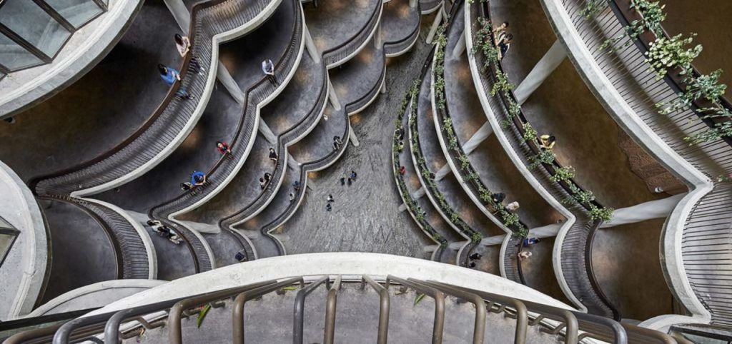
To avoid creating kilometers of corridors linking conference rooms and classrooms, the building was designed as a group of conical towers that surround a large atrium. The idea was to combine learning facilities with social spaces, including balconies, gardens and outdoor aisles, to encourage as many opportunities for interaction between staff and students as possible.
The architects commented: “… Since the advent of the Internet and low-cost computers has changed the way students approach the educational facilities. University buildings are no longer the only place where students are able to obtain educational texts and have become unattractive spaces with endless corridors, without natural light and only hints of the presence of other people … ”
The focus of the study was to redefine the aspiration of a university building and, once again, make it an essential part of the tertiary education experience. Within this new context, the purpose of a university is to foster coexistence and sociability, so that students can meet with their peers, businessmen, scientists or other students, in a space that encourages collaboration.
Another source of inspiration for the center was the desire to break with the traditional square classrooms, with a clear orientation and hierarchy to the front and move to a space without corners where teachers and students mingle, on more equal bases.
Spaces
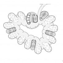
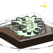
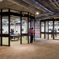
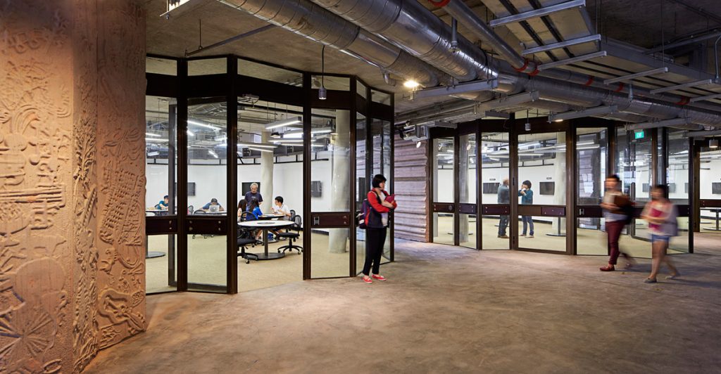
The shape of the building is dictated by its function and gathers 56 tutoring rooms in a structure without conventional corridors. The learning center is porous, students can enter from 360 degrees, a large central space gathers and serves as a loop to all the towers.
Towers
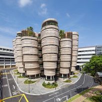
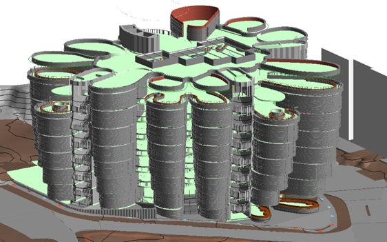
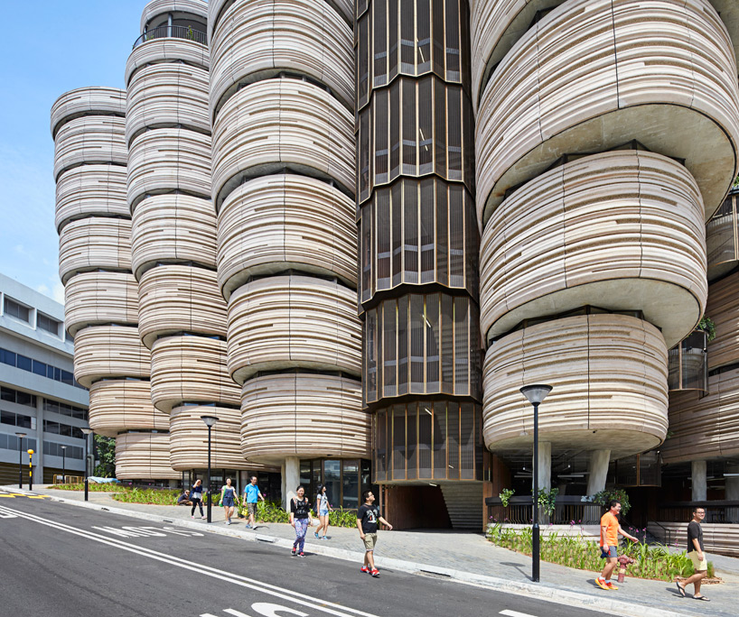
The 12 towers, each of which are narrowed towards the base, accommodate a total of 56 oval classrooms that are “stacked” gradually, with gardens in some of their plants.
Each of these tutoring rooms faces the large central shared space, which allows students to feel continuously connected to all other activities that take place in the building. According to the designers, the non-hierarchical round shape, with no corners or obvious fronts or backs, will stimulate more collaborative learning.
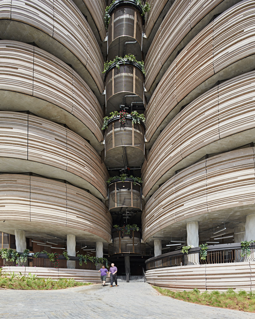
The balconies extend around the inner atrium of the towers and reach greater surface as they rise towards the coronation, offering views of the central atrium. This space not only acts as a visual connector between the classrooms, circulation nucleus and meeting space, but when airing naturally allows air to circulate through the tower. This strategy is important in a region with annual temperatures of between 25-30 degrees.
Structure
The only vertical structural elements of building are the cores of the 4 elevators and the walls of the staircase, with concrete pigmented in the rest of structural elements. The skeleton is formed by angular columns, screen walls and concrete slabs.
Ventilation
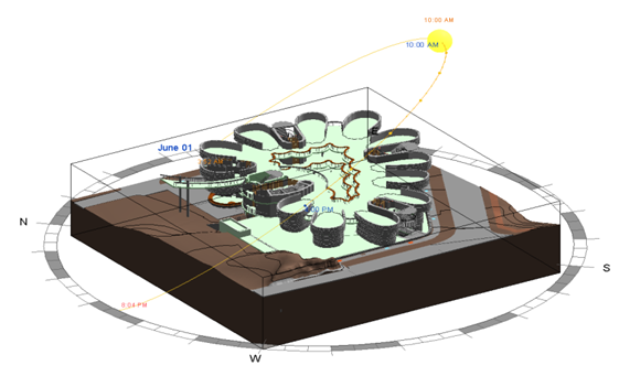
The slabs of the different levels extend cantilevered outwards as the height of the building increases to provide automatic shading to the lower floors. Meanwhile, the induction units placed under the windows passively ventilate the classrooms. The round bronze mesh of the balconies in the wing of each classroom sucks the air and redirects it to the patio, producing a cross breeze regardless of the direction of the wind.
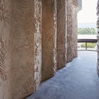
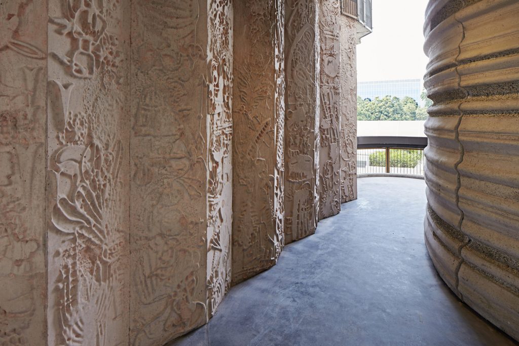
There are no beams to support the overhang, instead the columns are tilted to form arches that transfer the load down. The columns are not just columns and the walls are not only walls in this project. The structural elements are animated with slits and 700 drawings that join and form part of the concrete, a difficult effect to obtain on this material without appearing a superficial aggregate. Rubber molds were used to align the formwork and create 3D patterns. The angled concrete columns have a distinctive corrugation texture developed especially for the project. Curved facade panels are molded in a unique horizontal pattern made with 12 adjustable silicone molds to create a complex three-dimensional texture.
For the structural design the engineers made use of the BIM system which allowed them to model and make decisions. One of the most complex, was to calculate the columns, because each plant is growing as the floors increase. Finally, 61 columns were obtained that were opened and had up to 30 ° of inclination. To provide rigidity and lateral stability, partitions were used around the stairs and elevators, reinforced with a system of flat slabs.
Structural system
The structure with a column-free frame system with lateral stability is achieved thanks to the four lifting cores, ladders and elevators.
The system consists of reinforced concrete (RC), with steel structures for the roof and mechanical and electrical enclosures. The bases of the towers are a system of perforated piles of varied sizes ranging from piles of 600 to 1,100 mm in diameter, with a wall of contiguous piles of 600 mm of diameter as a system of retention of floor in the semi-basement, located In one of the corners of the building. This system was selected due to the good characteristics of the soil at the site and the methodology minimized the noise impacts during the foundation works.
A flat plate system on each floor acts as a horizontal diaphragm joining the vertical elements to provide rigidity and stability to the building. The sidewall resistant side walls are arranged in such a way that the lateral stiffness of the whole building is equally distributed in any direction. The building’s footprint grows asymmetrically outward as it rises in height. As a result, each layout of the floor is different from that of the top and bottom.
Materials
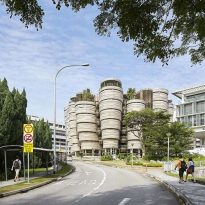
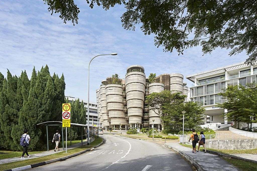
The outer enclosure is built with concrete slabs. For each tower and floor the enclosure is independent, in this way, as it goes up, each surface is larger than the previous one. Coated with these curved concrete panels, the towers feature horizontal and irregular stripes that were created with 10 adjustable silicone molds. This texture gives each tower the appearance of a large plant root, “giant parsnips”, although the designers compare the appearance with the hand-worked wet clay. The prefabricated concrete components of the facade included more than 1000 panels with 10 curvatures and unique surface patterns. To rationalize the highly organic form, the designers also used 11 column angles, 4 window sizes and 1 width for the glass panel in unlimited combinations.
concrete walls have more than 700 embedded drawings
To minimize solar gain, Heatherwick Studio introduced narrow glazing bands around the perimeter of each classroom. Having rejected the curved glass for being too expensive, but wishing to avoid a faceted appearance, the architects combined the flat crystals in a zigzag pattern. Tall windows connect the classrooms with the atrium.
This is the first pigmented concrete project in Singapore. To obtain approval from the Singapore Building Authority, international case studies were presented and the German standards were translated into English.
The stairwell that looks outward has been delimited by glass panels with bronze frames combined with the concrete walls that have embedded 700 drawings specially commissioned to the illustrator Sara Fanelli and that refer to subjects ranging from the sciences to Literature, and art. These overlapping images are ambiguous thought triggers created to make room for the imagination.
Video
