Red Apple Residencial Building
 Some parts of this article have been translated using Google’s translation engine. We understand the quality of this translation is not excellent and we are working to replace these with high quality human translations.

Introduction
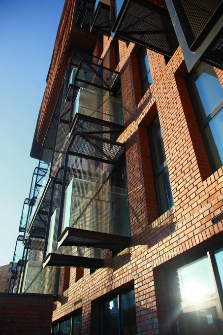
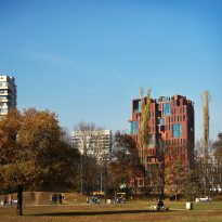
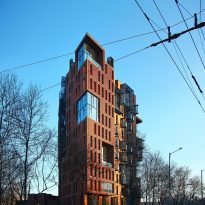
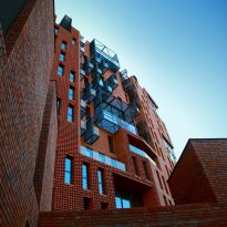
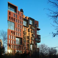
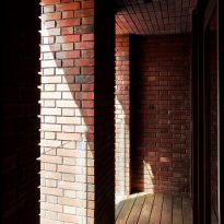
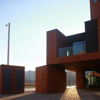
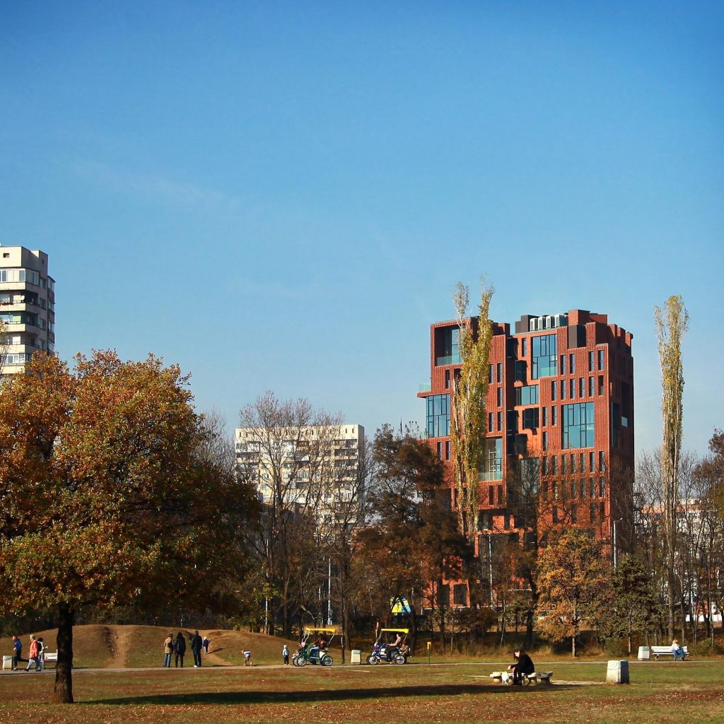
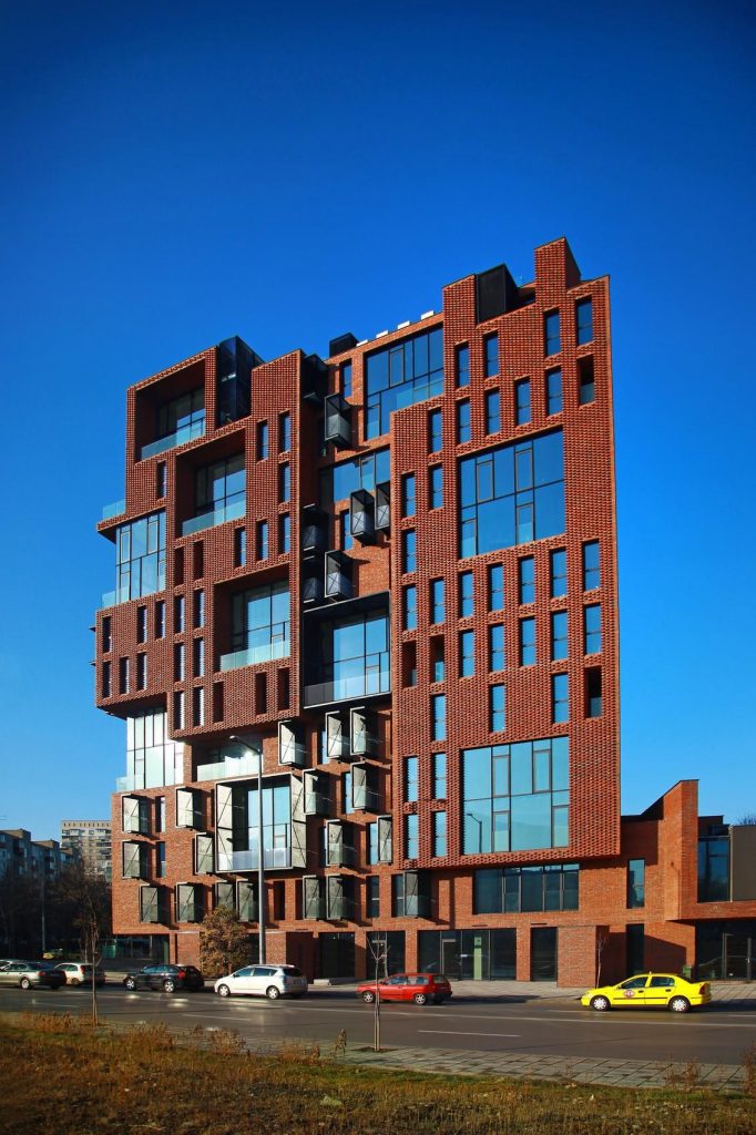
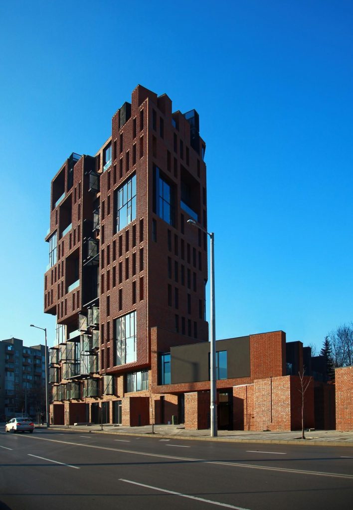
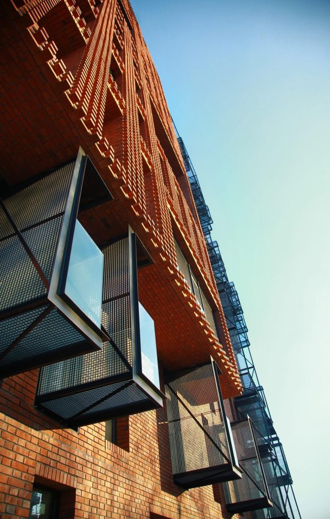
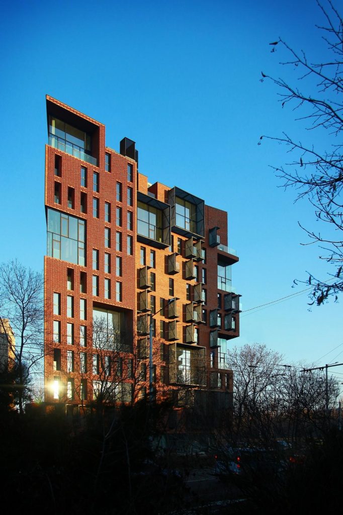
This building and its modern structures breaks with the traditional architecture of the city. It is characterized by the red bricks of the facade, the galleries, the balconies and the green spaces in the roofs.
Red Apple reflects the contradictory need for maximum personal individualization and the need for a more homogenous urban fabric. Through its limits of dissolution the building is in close interaction with its surroundings. It is an entire organism embedded in the neighborhood. All its elements are subordinate to the whole. Therefore, it is a continuous urban fabric firmly connected with what exists. The building connects the past and the present through the brick, a forgotten material in Sofia.
The project was part of a competition held in April 2010 in Sofia. Its construction period was between June 2011 and December 2012 and inaugurated in early 2013. It was awarded in the category Architecture, Construction and Design 2014-2015.
Location
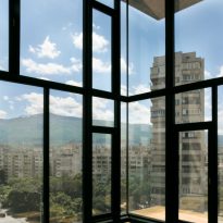
The surrounding neighborhood consists mainly of apartment blocks dating back to the 70’s, South Park, Ivan Vazov Quarter. Large buildings surrounded by vegetation and separated from each other. Because the whole area is built in a relatively short period of time and not long ago, it lacks the typical historical layers of the city center. Here the connection with nature is direct enough and access to all the amenities of the city fast enough and easy enough to make it a pleasant place to live. As a counterpart, it lacks the atmosphere and history of the past that surrounds Sofia, the capital of Bulgaria.
The atmosphere in the city is the result of two very important factors. On the one hand the connection with nature, on the other hand, the feeling of the past, the traces of people who have been here before us, the feeling of human community not only here and now but also in time. The footprint of the past is usually shaped by the constructions that have survived.
Regulations
Construction regulations are specific to this parcel. The maximum permissible volume is approximately one-sixth greater than the maximum permissible area if the building is 3 meters high. This discrepancy is resolved without losing any area or volume, creating 22 double-height rooms in the building. Its area is considered only on the ground floor and not in the vacuum above, so the design meets the maximum of the regulations incorporating them to the concept.
Concept
Aedes Studio explains: “… We have set ourselves the difficult task of designing a new” old building “, a contemporary building with a past, a building containing opposites. We wanted to enrich the neighborhood with an atmosphere of another time, to create something that makes us a flâneur (personage of Baudelaire – carriola in Paris) within the city.
The architects approached this project as if they had to revitalize an old and abandoned part of the city, taking care to preserve the charm of the past and combine it with the contemporary comforts.
“… We imagine as a starting point an abandoned factory building, which after renovation becomes a place of luxury and desired to be inhabited. In Sofia such potential could be met by the old “Sugar Factory …”, but since we did not have a factory to start, we had to create it. This is how our “living factory” emerged, characterized by many opposing ideas related to the terms “old” and “new …”.
Spaces
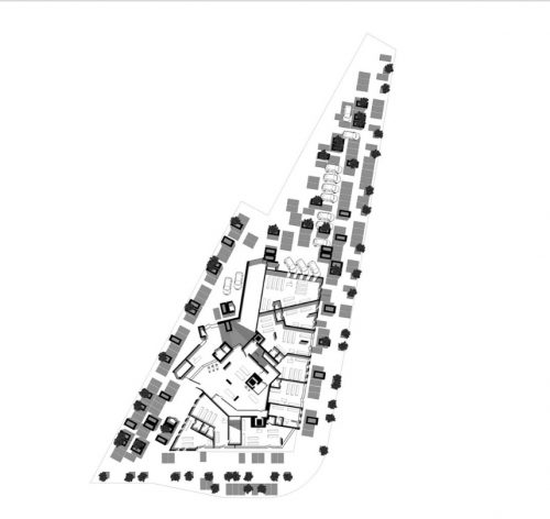
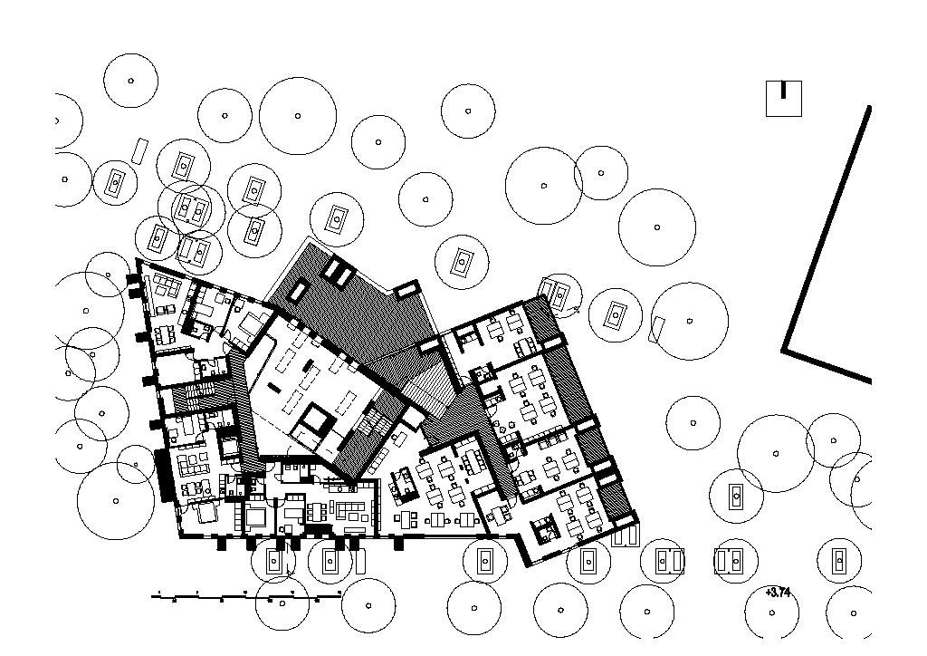
In plan the building is almost a triangle 30×30 meters, with a third longest side. The height is about 44 meters.
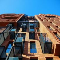
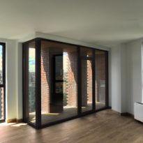
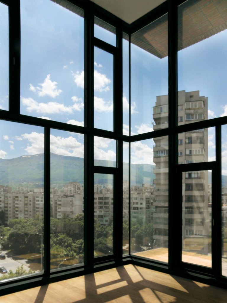
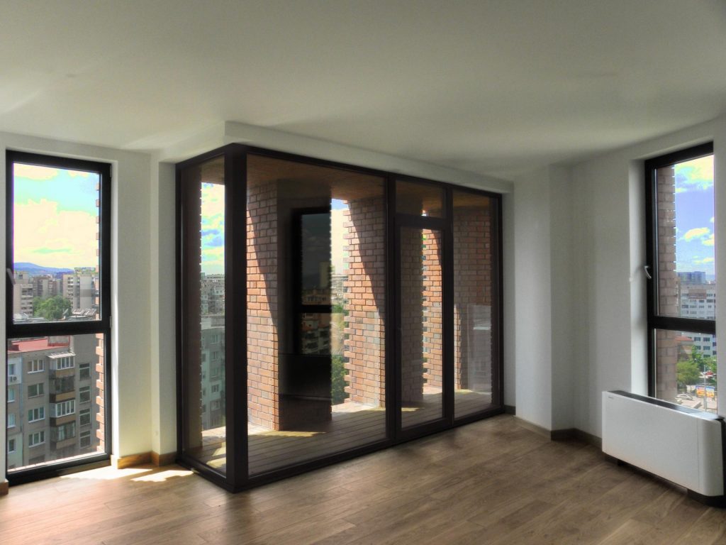
The spaces of the 61 apartments, 22 of them with 6m of height, move away from the facade allowing its occupants to enjoy the rhythm of the openings from the interior of the same.
The double-height living rooms refer to the lofts of New York. Its large scale both from the inside and the form that it presents on the outside is deliberate, in order to accentuate the sensation of the changes of function from industrial to residential.
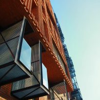
On the second floor stands a sports space made with the same treatment of metal cantilevered balconies, but like the stairway very hyperbolized.
The “old”, “abandoned” and newly recovered space of the factory as housing is a rich environment in many aspects. It unifies the advantages of both contemporaneity and the past. In this way, the building not only fits in with its surroundings, but also offers what the neighborhood lack, history, past and memories.
In and out
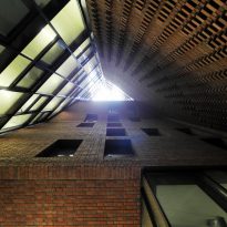
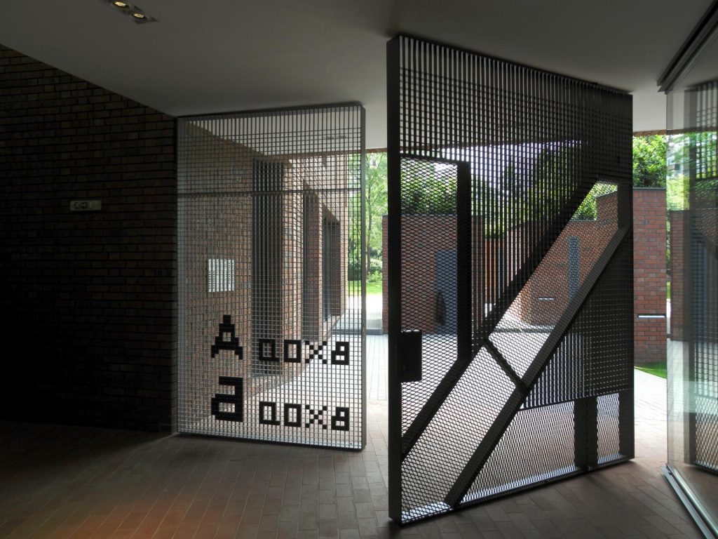
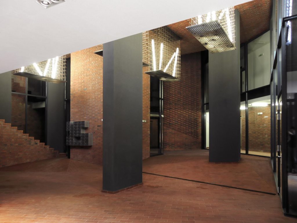
The vacuum in the middle of the structure is another exaggerated space that changes the concept of the interior – exterior. Volumes and trees create an intermediate zone where the inlet – outlet boundaries become permeable. At ground level this is a suitable public space ..
Structure
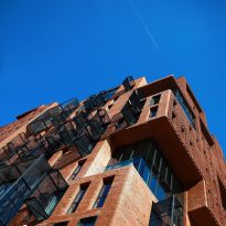
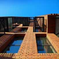
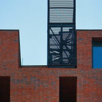
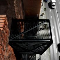
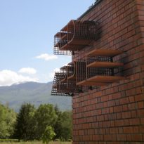
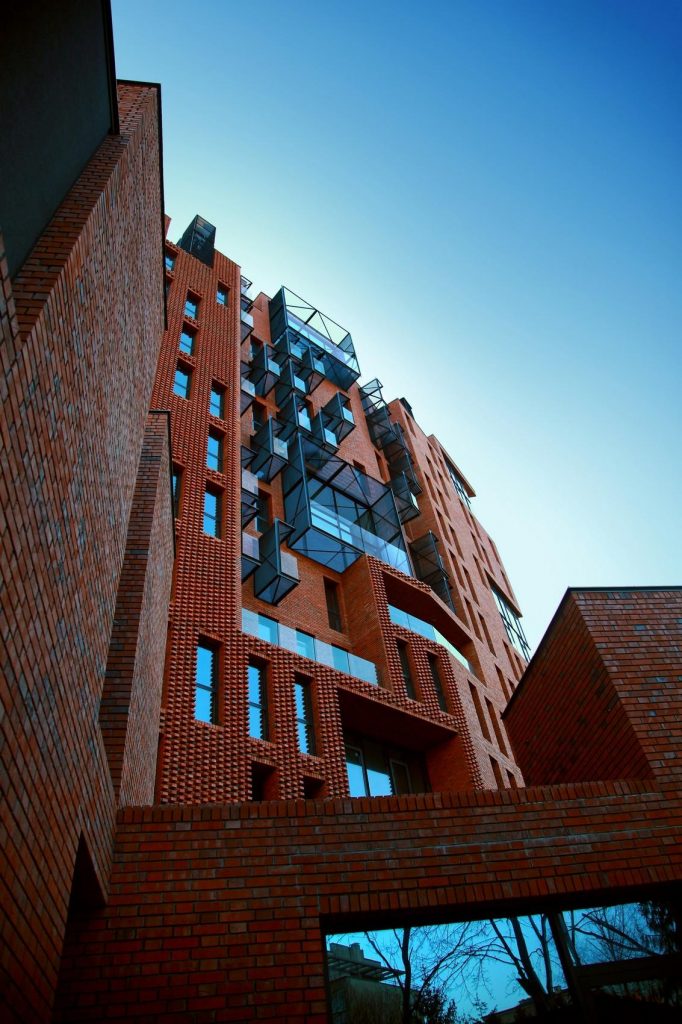
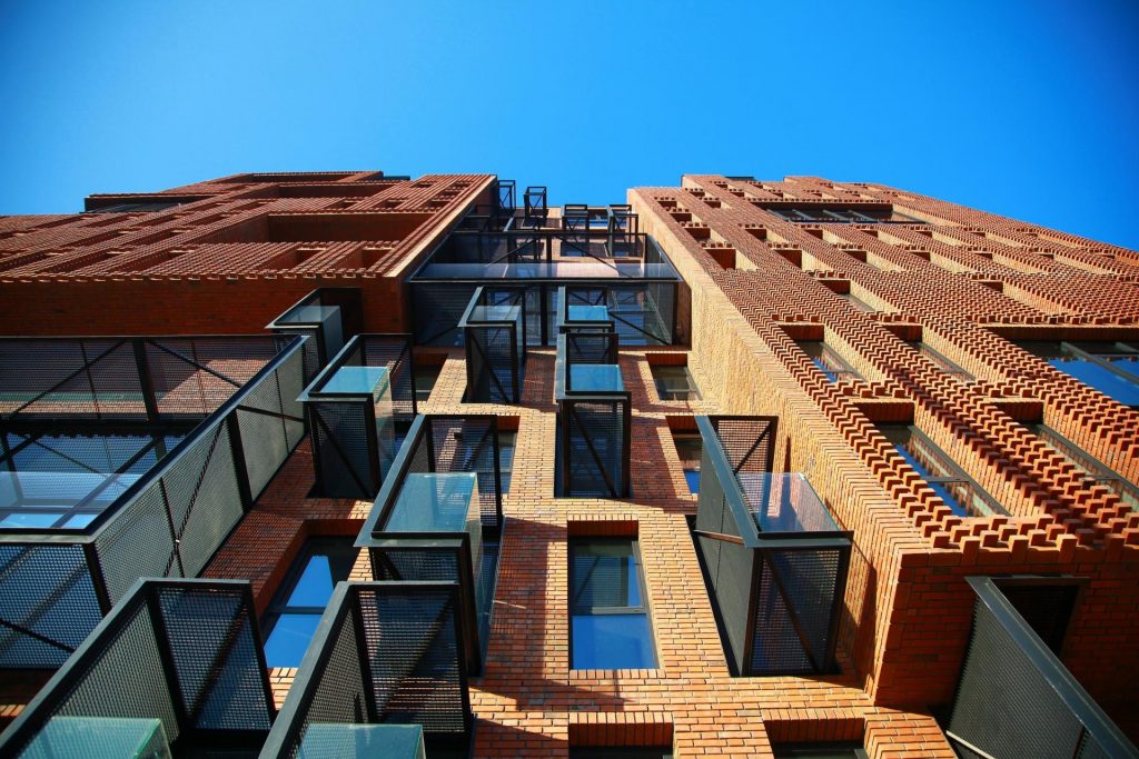
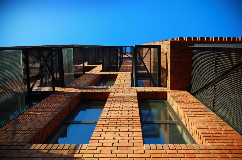
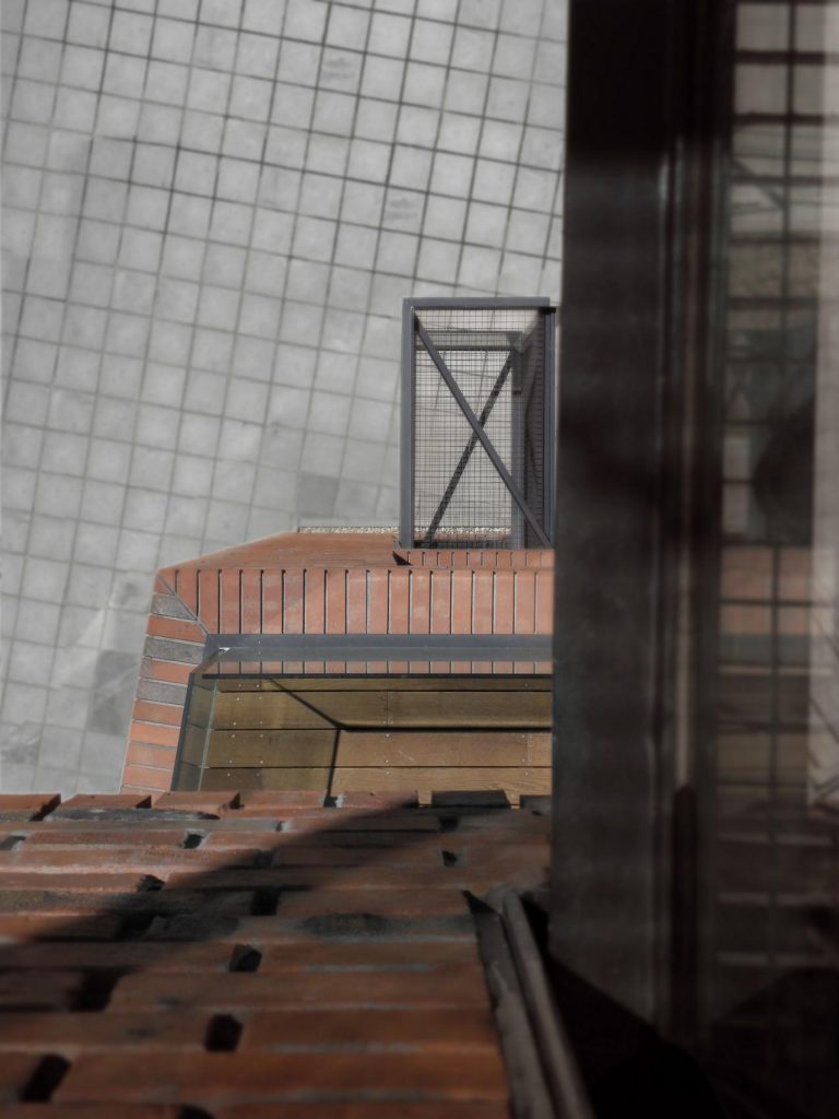
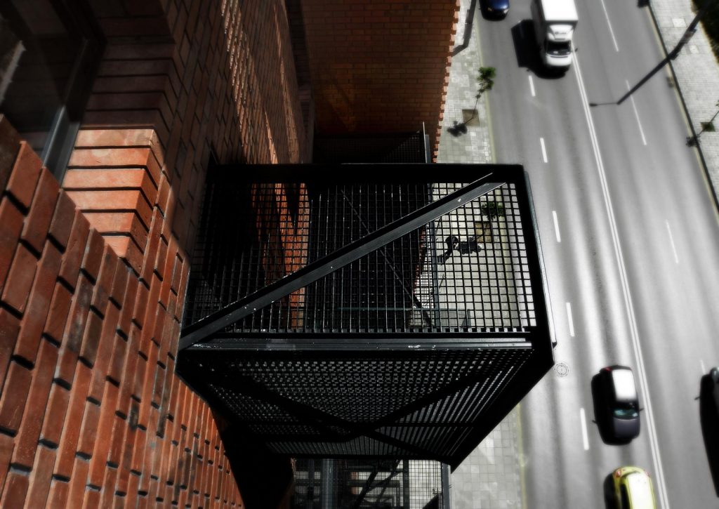
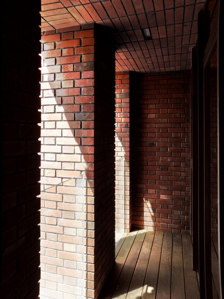
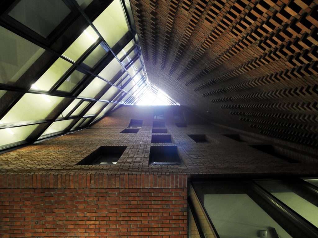
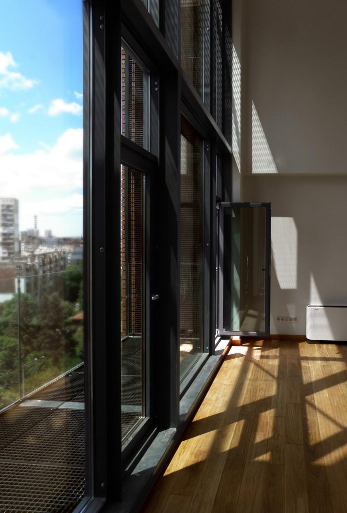
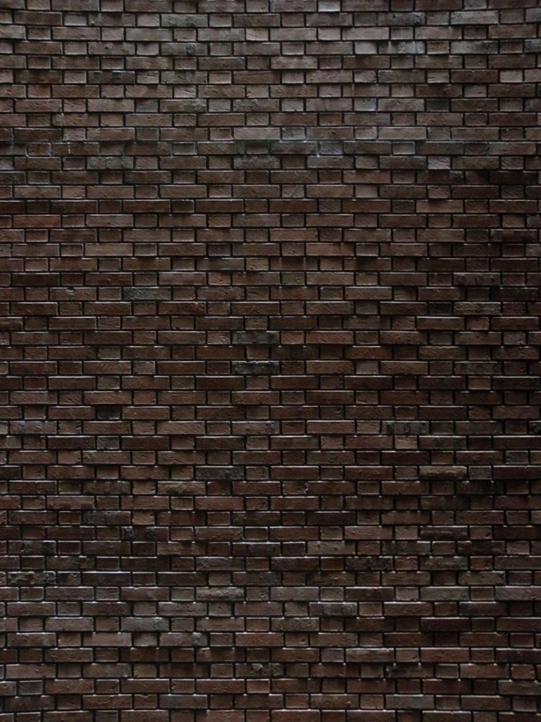
The building code consists of a perforated brick shell. Its outer line deliberately follows the irregularities of the site, creating acute angles that enhance the perspective and establish a significant character. The openings are completely similar, following the strict order that gives rise to the grid grid of the brick, although in random places are missing or are replaced by large breakers, windows that cover two floors. In some places the smooth brick wall changes structure, with a certain flamenco air, every second brick is embedded halfway to the surface of the wall creating a cantilever with three-dimensional effect of shadows. Similar impressions form the balconies, in this case metallic and closed with a grid on three sides. The balconies with their metal grilles appear slightly unfinished recalling a structure with untapped growth potential. Through their proportion they refer to the flamenco link (this time highly hyperbolized).
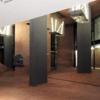
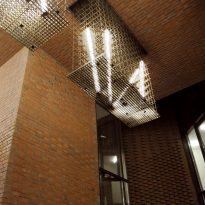
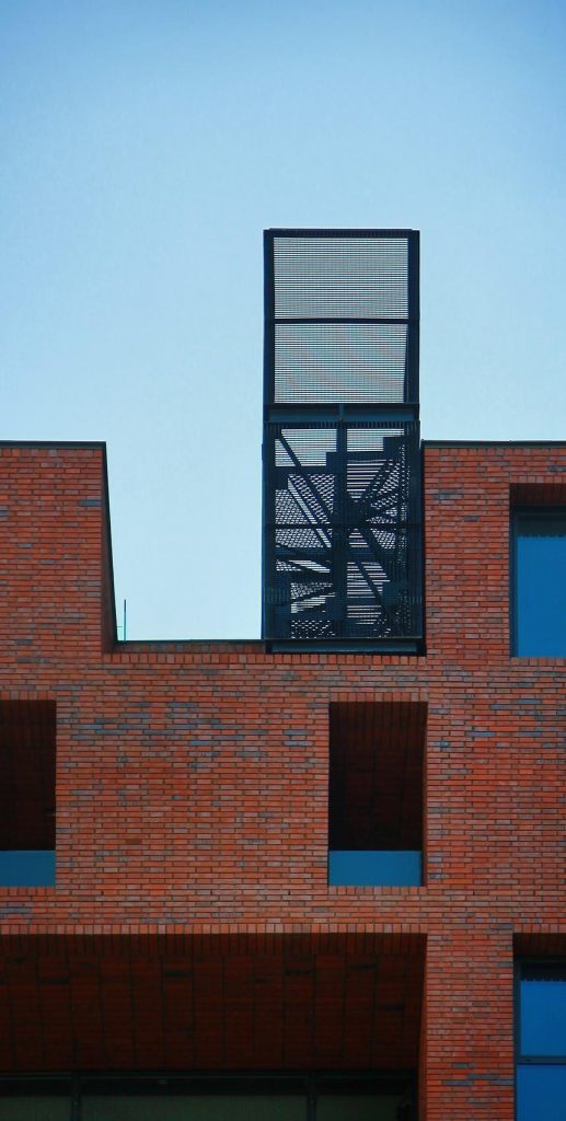
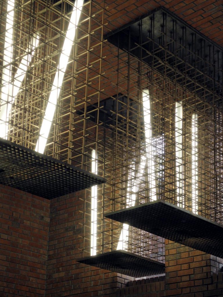
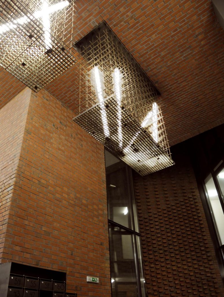
Like any ordinary “factory”, this one also has many chimneys in the part superior, they are used like axes of light or like pots for trees. On the ground floor these elements also appear, breaking the line between the interior and exterior space, with a surface very similar to the detail of the facades of bricks half embedded, but on a larger scale. This difference in scale also appears in the relationship between double-height windows that illuminate classrooms and ordinary openings.
Stairs
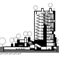
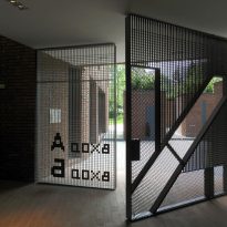
The staircase is the most hyperbolized space in the building. It represents an enormous well of light, around which the slabs of the houses unfold. Its structure is created with the same perforated pattern of bricks that has been used in the facade and as in the exterior surfaces, the inner brick walls evolve towards a smooth surface. This effect, as well as the light axis and the planters create the sensation that the floor is a potential source of the building material.
Materials
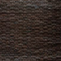
The backbone of the concept is the brick, the material that brings together the idea of the old and the new. Due to the many images that relate to him through the centuries, the brick itself displays a rich presence, bringing together the warmth of being made of clay, cooked in fire and built by hand.
This material is largely forgotten in the Bulgarian constructions so there was not enough knowledge about its use and reintroduction according to local seismic conditions. The 13-storey building, along with its brick facade is designed to overcome a 9th earthquake on the Richter scale.
Sustainability
The open and high space of the interior, the galleries, the volumes and the trees at the top create intermediate temperature zones that protect against overheating. Due to the solstice, headboard bricks and metal grid balconies function as sunscreens in summer, but they do not prevent winter heating. Garages are naturally ventilated.

