University Campus in Tortosa

Introduction
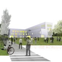
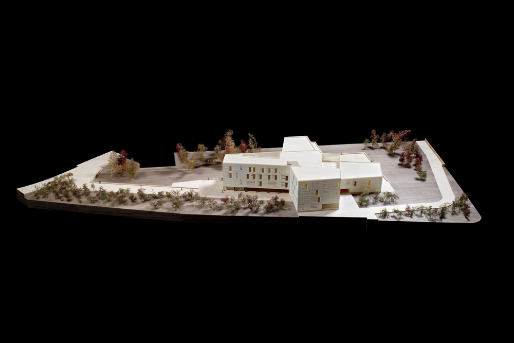
The project comes from participation in a restricted competition where the team of architects Bramon between Josep Ferrando, Pere Joan and Carme Ribas Ravetlla won first prize for the construction of Campus Universitario del Ebre.
The land where the campus will be built, 10,000 square meters and located on Avenue Remolins, have been donated by the city of Tortosa and the project to build the new campus will have 15 million euros in budget.
Location
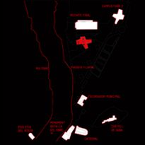
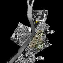
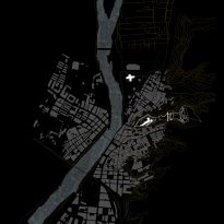
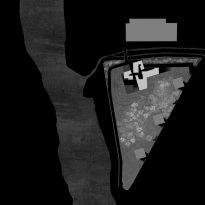
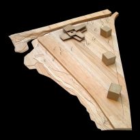
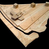
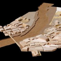
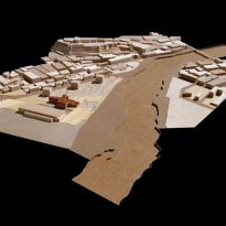
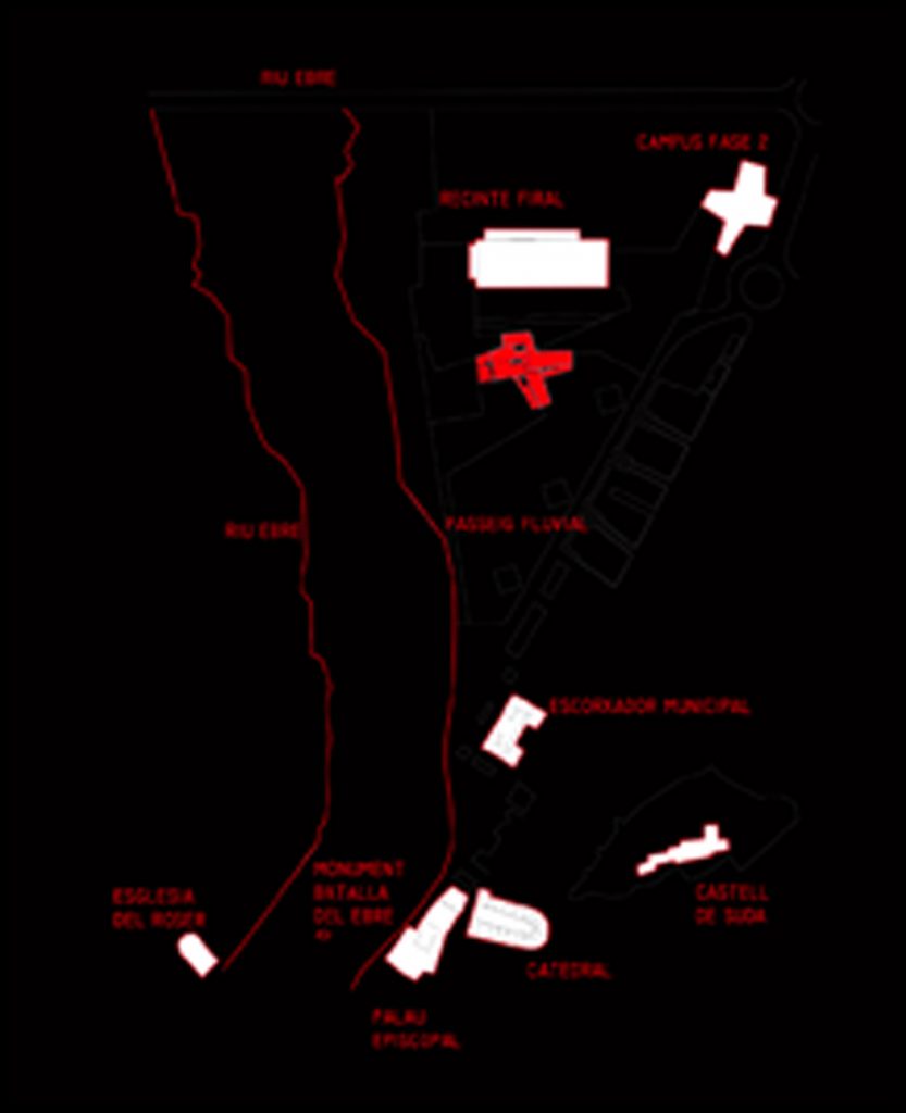
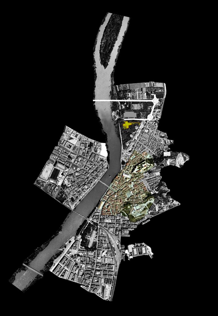
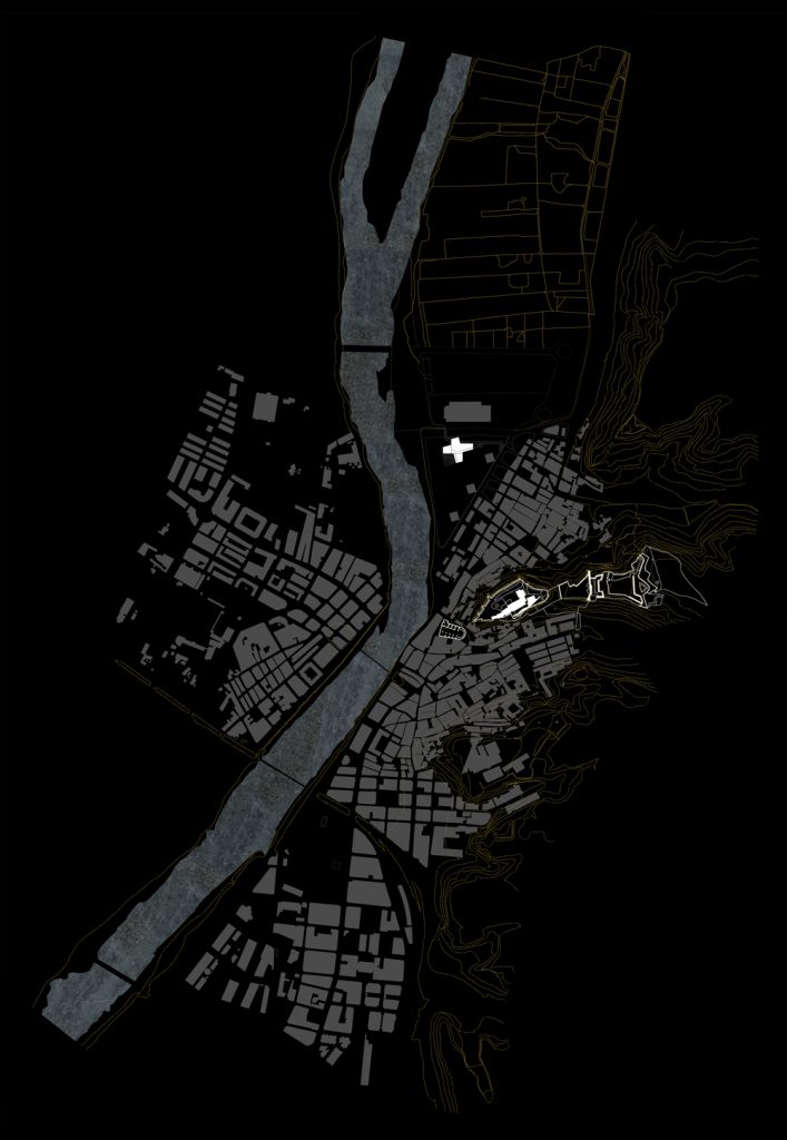
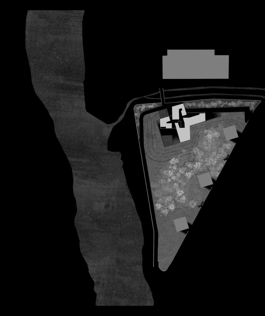
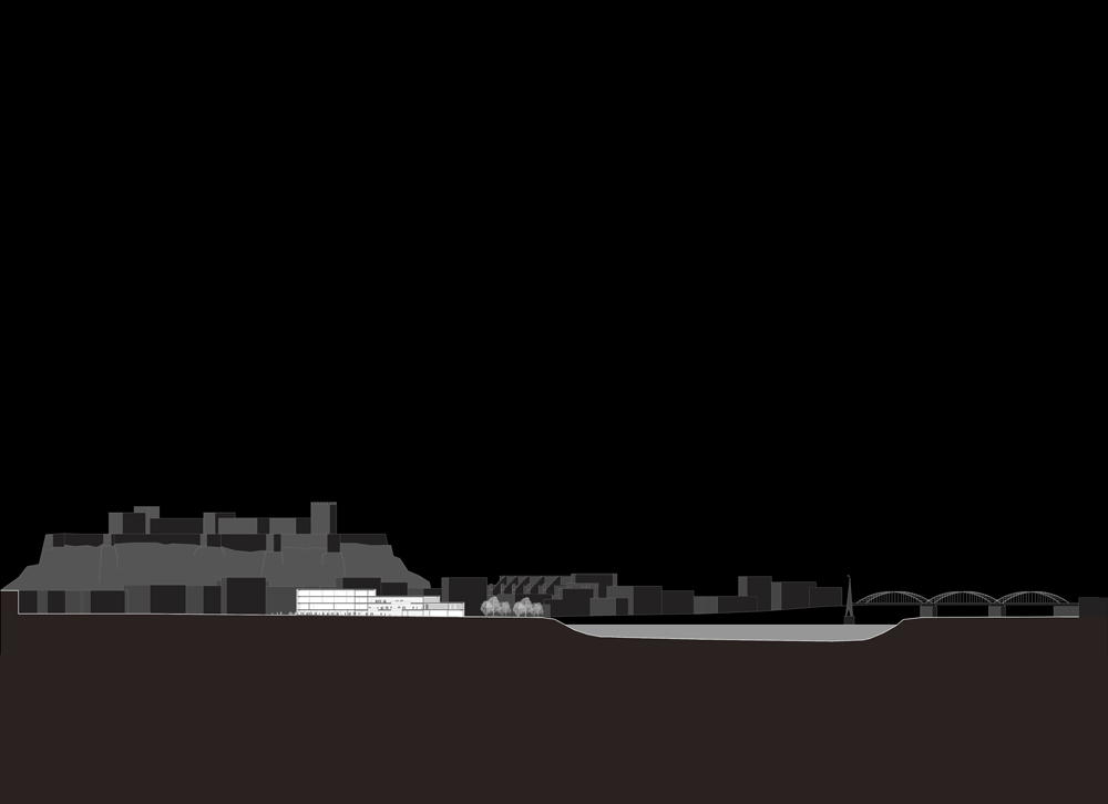
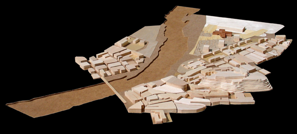
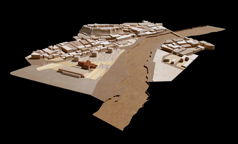
The project is located between the natural elements of landscape and city of Tortosa, the main avenue that leads out of town and the river, the congress hall and park.
Tortosa is the capital of the Bajo Ebro in Tarragona province, Catalonia, Spain.
Concept
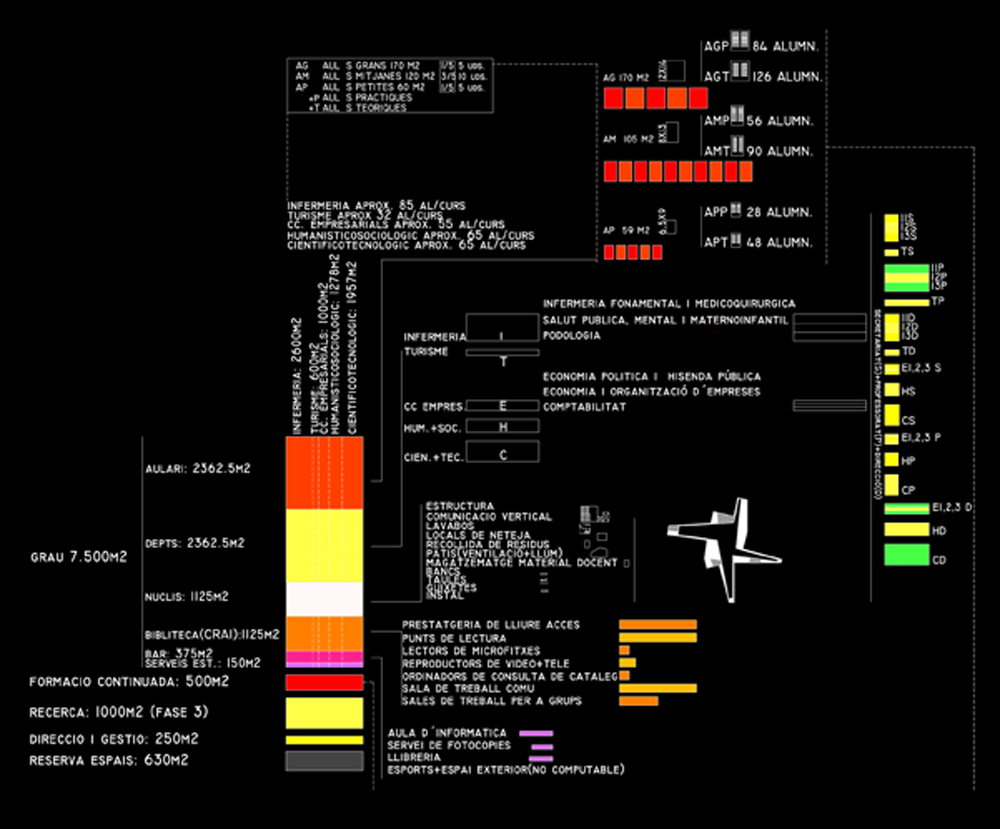
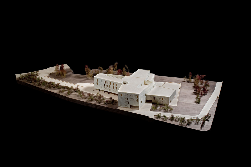
In order to achieve greater density, and convert the building at the gateway between the city and surrounding area set out to gather in one building, the four powers that compose it.
• Project
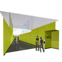
The project avoids the traditional format of the corridors and classrooms in succession, since there is often a disproportion between the size of them and their use. They are too narrow to perform common activities or socialization while too wide to be used only for circulation. In these formats are concerned, the facade occupying these corridors as they occupy the same classroom.
These common areas are one of the most important spaces in universities and that much of social activity undertaken by students occurs outside the classroom.
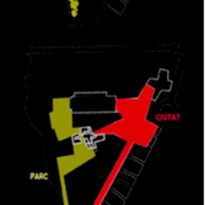
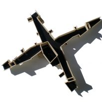
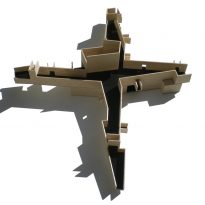
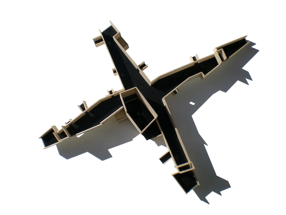
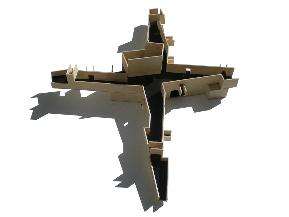
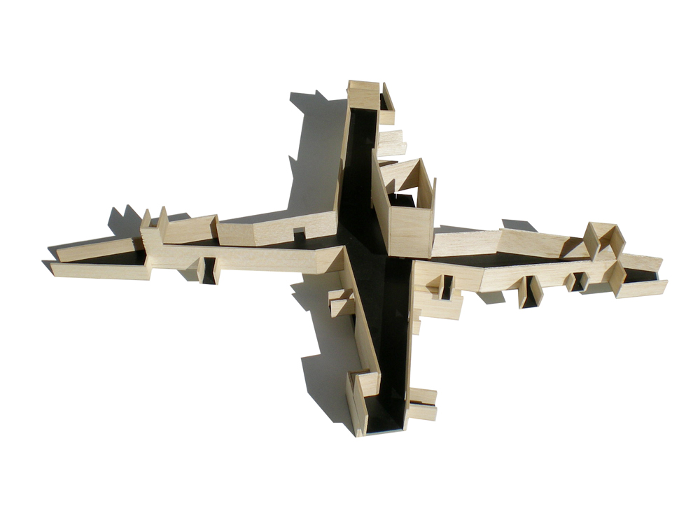
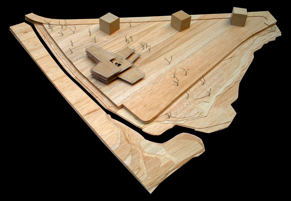
Therefore, we developed the concept of “square”, like a wheel in which the hub is the center of the whole system. However, a circular form as a gateway fail because the distance a person would have to travel along routes under construction would always be the longest.
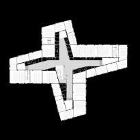
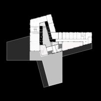
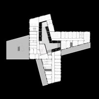
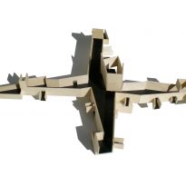
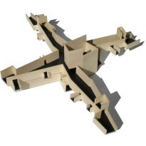
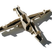
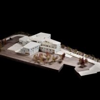
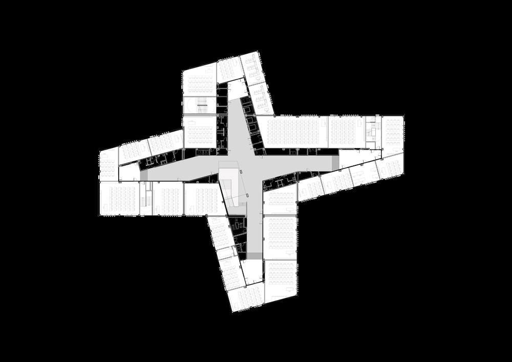
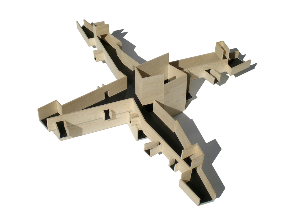
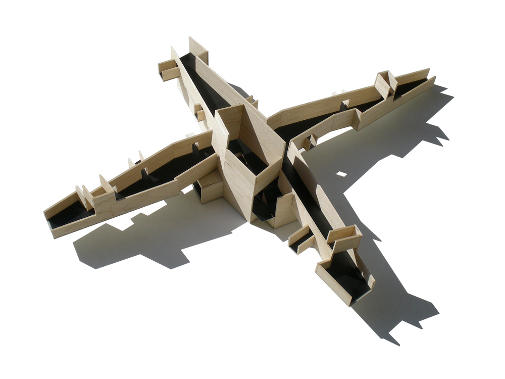
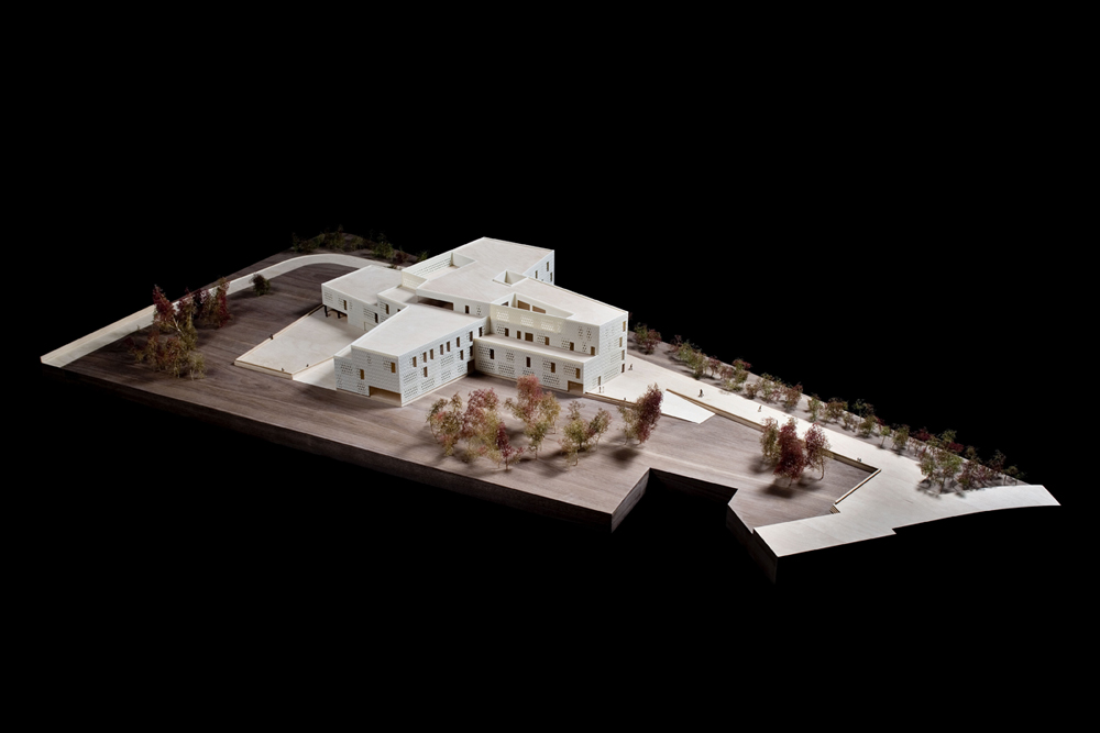
The geometry of the heart is transformed from a circular shape to form a cross, whose center remains a hub and gateway and the distance traveled to cross minimized.
Relationship to environment
The route connecting the University campus and conference center, sharing some of their facilities. The Convention Center has an auditorium, but there is no cafeteria, and the Campus of the University has a bar, but not with an audience.
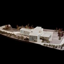
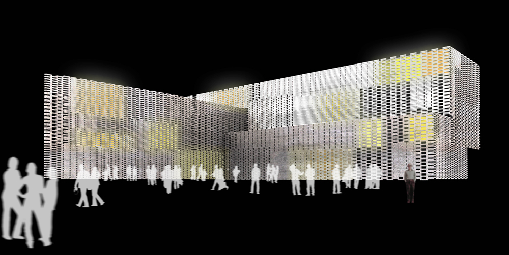
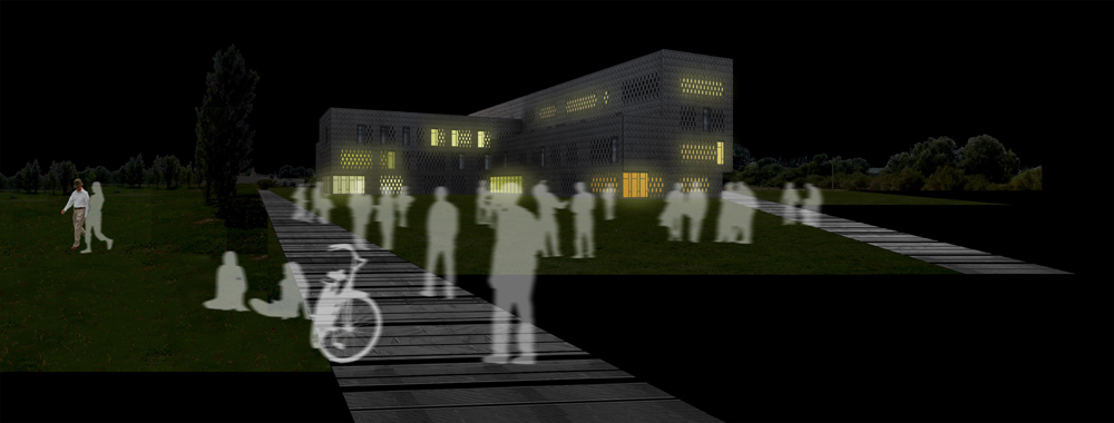
It creates a kind of dialogue not only between the uses of the two buildings but also in the material and geometry of the two volumes. The Convention Center is a prism made of U-Glass, while the University campus is a more fragmented volume, made of concrete.
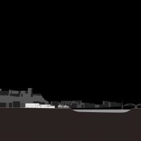
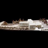
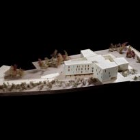
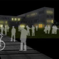
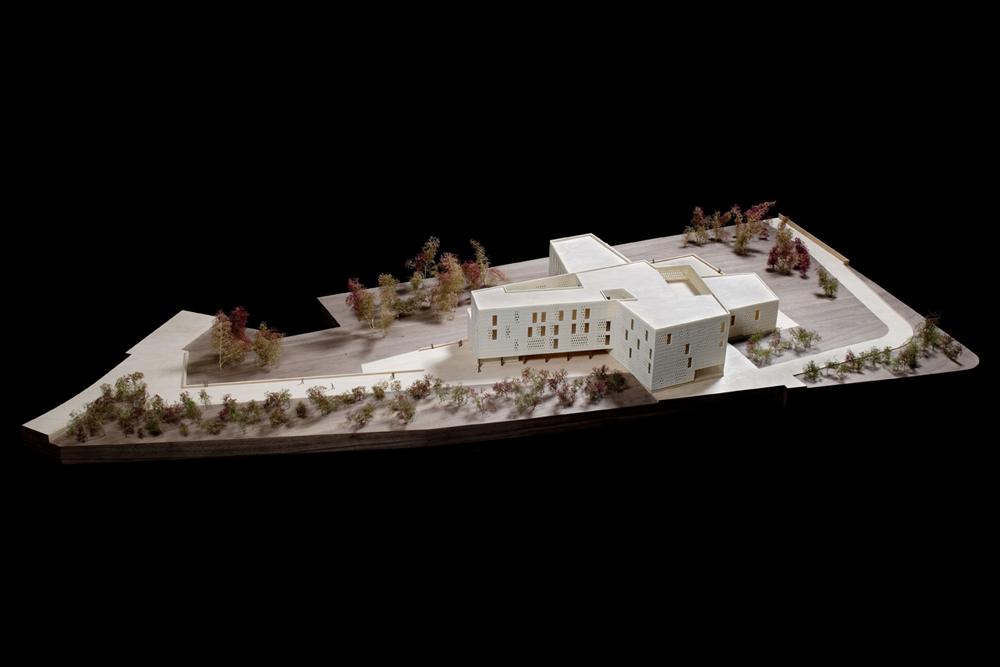
This geometry echoes the historic buildings surrounding the castle on top of the hill and an old church. The project is related to natural and historical contexts. The lines of the geometry of the volume are parallel to those of Congress and the blocks of nearby houses.
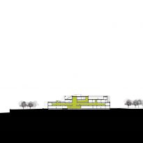
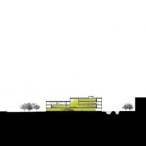
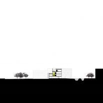
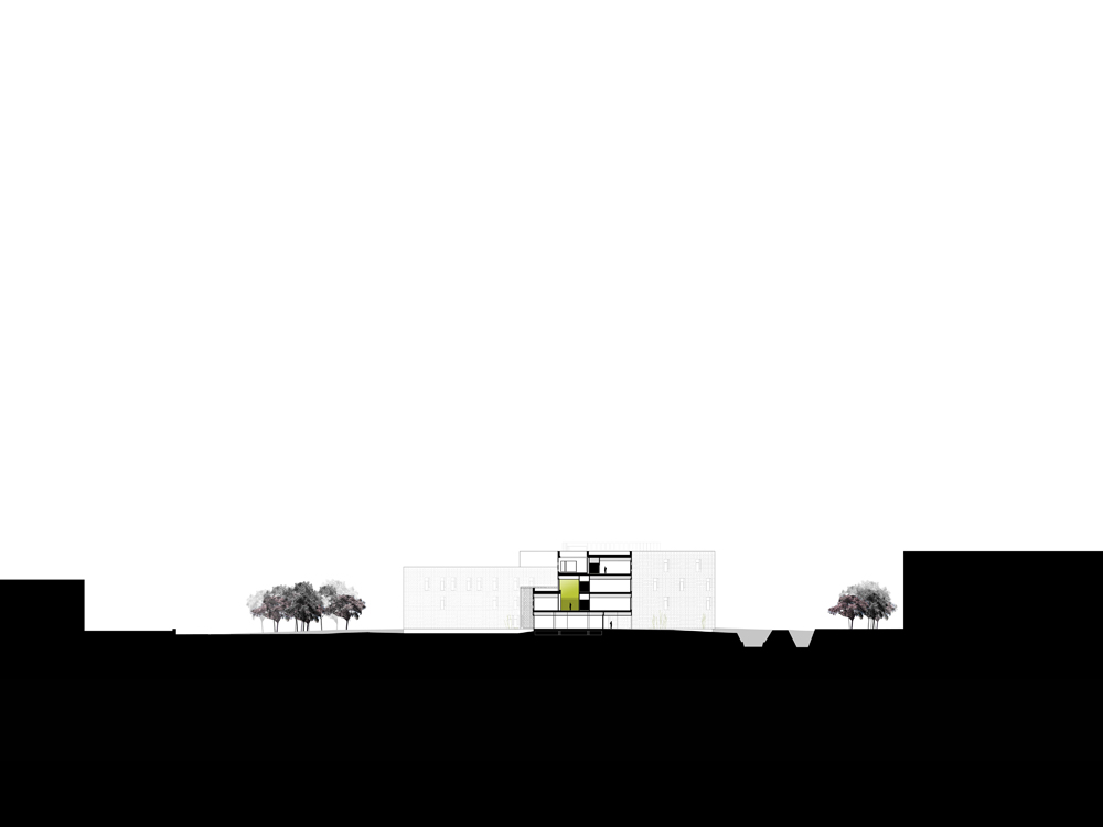
The building reflects the scale of the elements that surround it. In the back height is recognized Congress and on the front is reduced to meet the park and river.
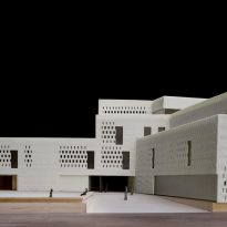
The back is more vertical and difficult to relate to the city and its urban elements. A longitudinal gap indicates the entrance.
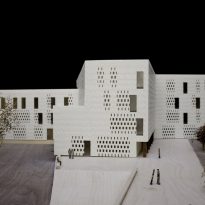
In the front, down integrates fragmented forms the building with the river and park. A cross marks the entry empty.
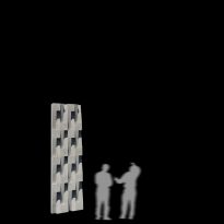
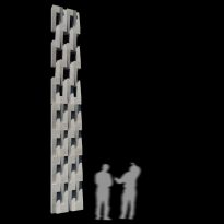
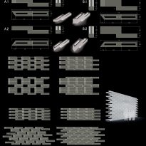
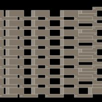
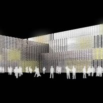
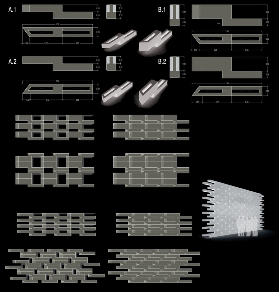
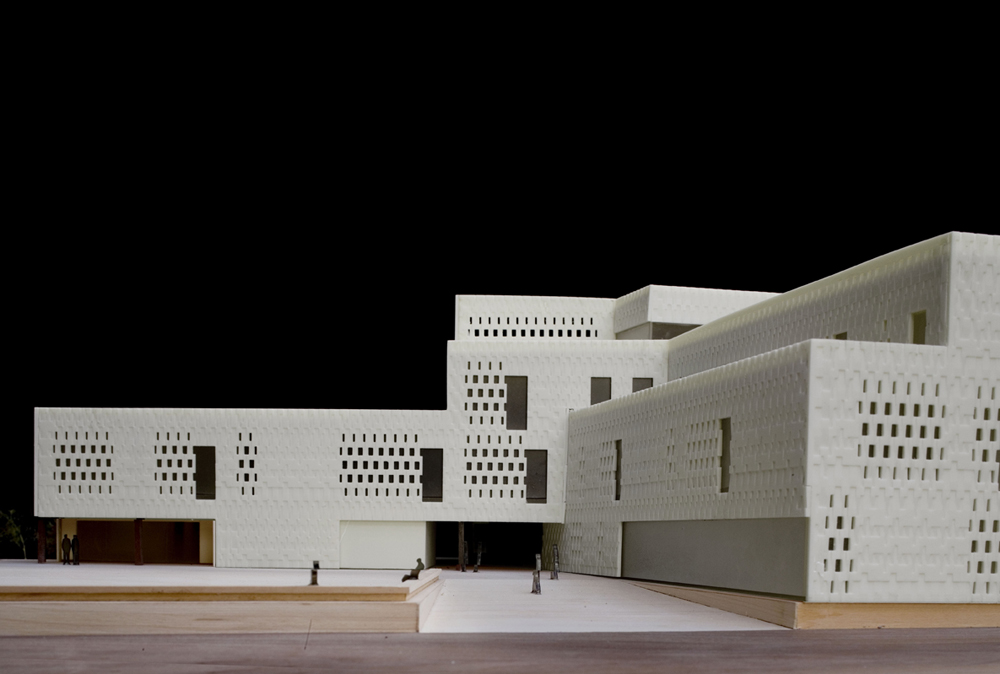
The relationship of the building to its surroundings made him reconsider the typical facade with windows and led to the development of a skin that seems made of wicker. This texture was used in recognition of the traditional trade zone dedicated to the manufacture of wicker baskets and the surrounding fields that grow the product.
In areas that allow light to enter, simply spread the texture of wicker basket to make it less dense.
The whole facade is made of concrete and carried out in two molds. The rough side of the panel, only without the texture of wicker, polished to resemble the terrazzo and thus relates to the pavement placed inside the building.
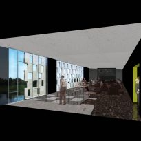
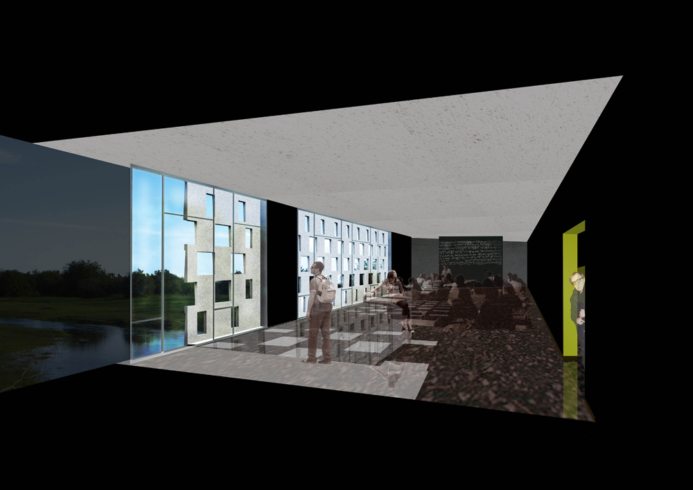
In the placement of the panels of the facade, it ignores the last one in each room, allowing a wide view of the surroundings and the back wall of each classroom to become a panel that reflects light.
Spaces
• Main Entrance
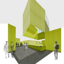
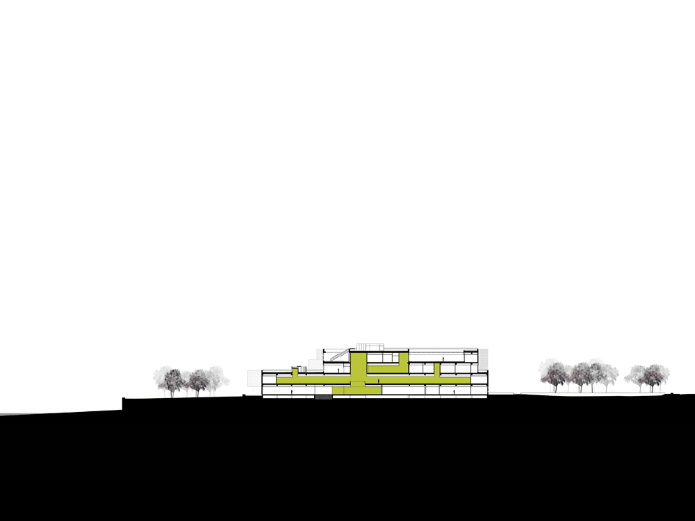
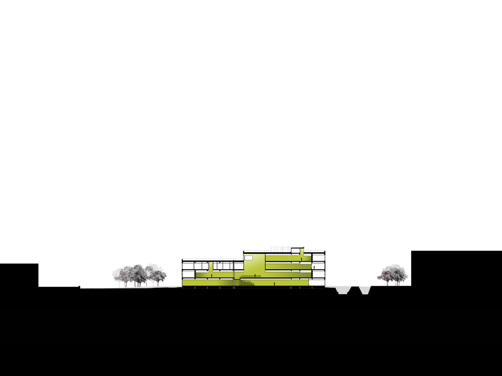
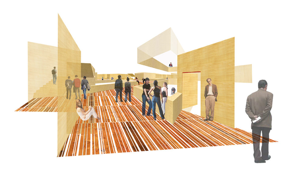
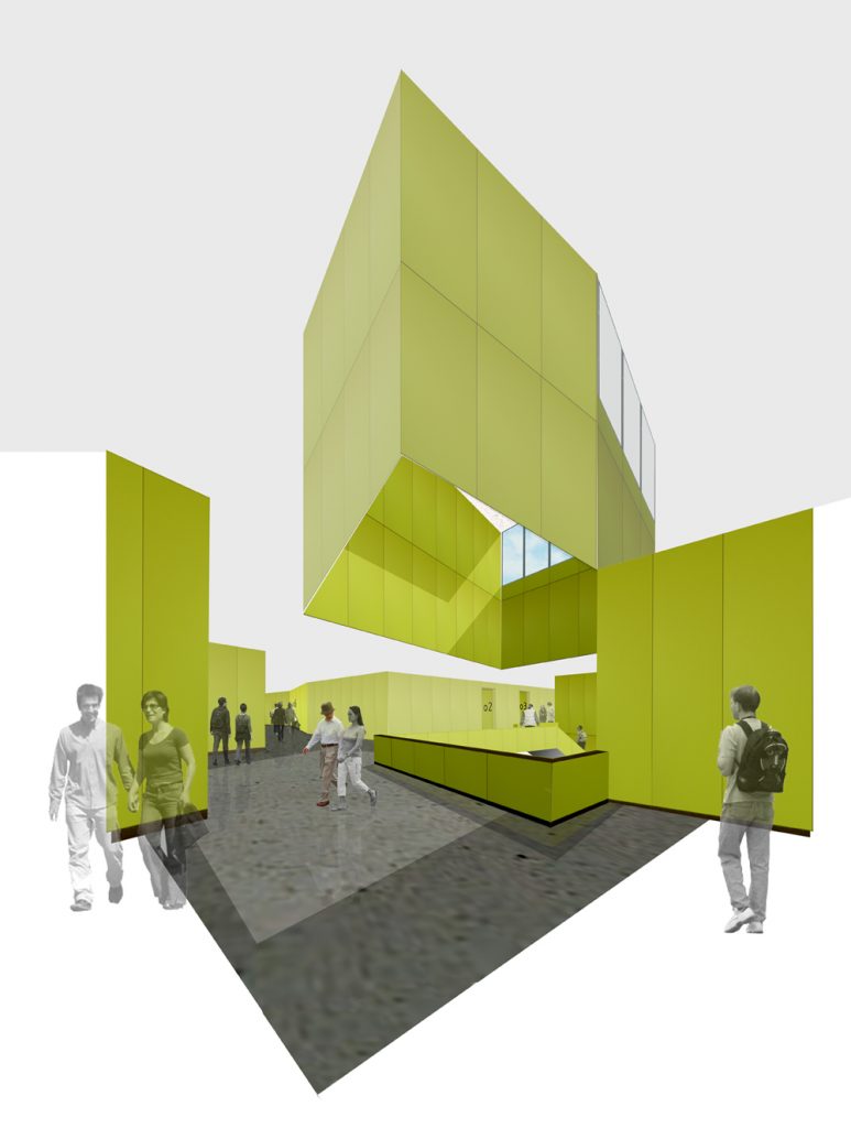
Upon entering the building a large central vertical space then becomes the park, offering views diagonals and relating the different heights.
A grand staircase connects the ground floor, which houses the common areas with the first floor where are all the classrooms.
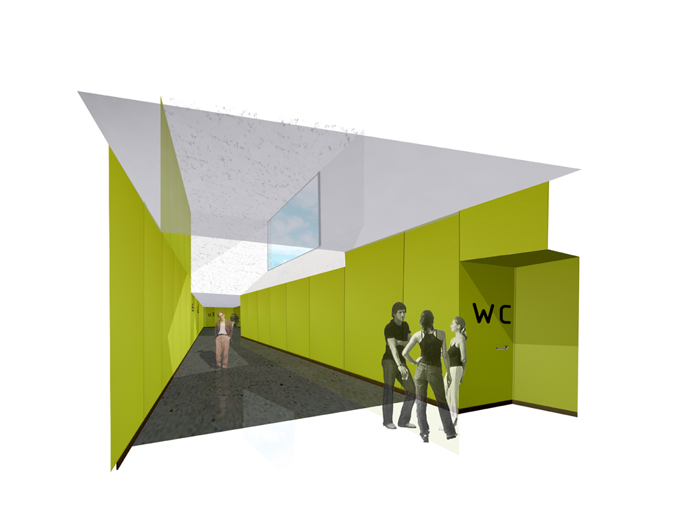
The park continues, albeit artificial, within the building through the green material lining the walls.
• First floor
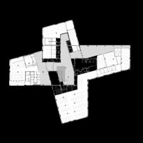
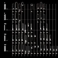
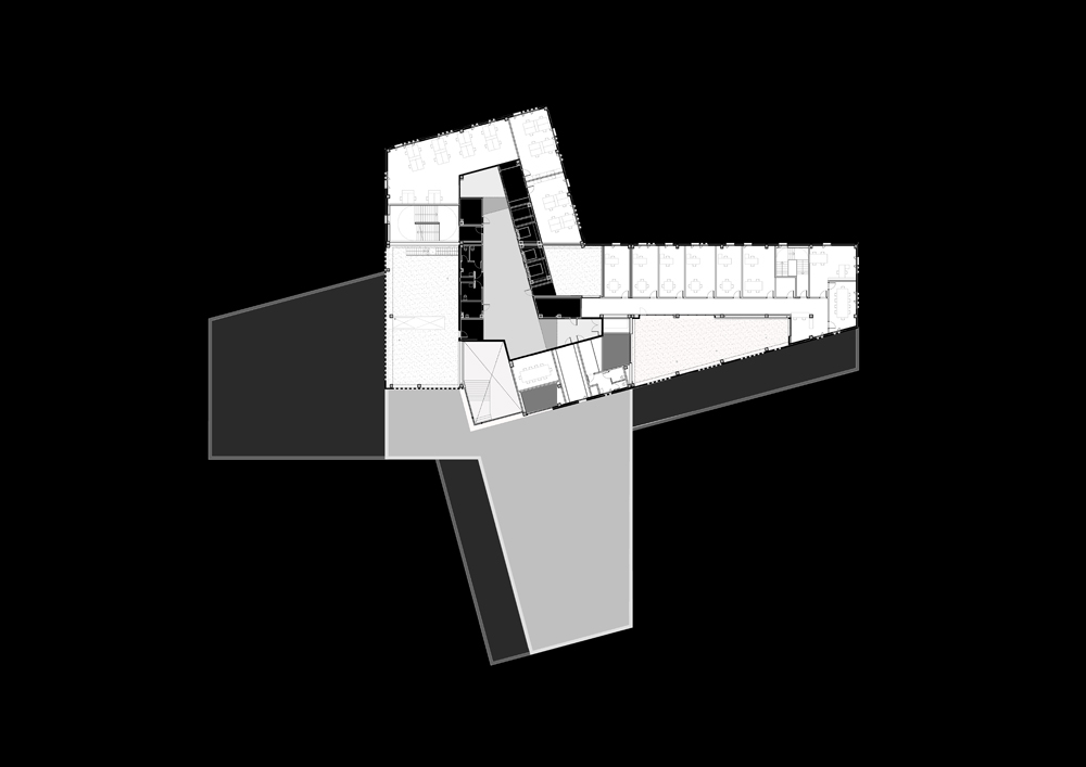
The first floor has the edge as possible, as it follows the shape of a cross of the whole structure.
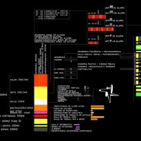
Each section of this cross has rooms large and small to rationalize the organizational structure of the whole plant.
All services are located in a “technical band” that serves both as an acoustic filter and the threshold between the public areas of the classroom.
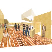
Are walkways and spaces where people congregate, are located in this double axis for creating spaces that look like streets and public squares, instead of the usual aisles.
The variable height of the roof helps create the feeling of being in a street. They exploit high jumps and gaps, in turn allowing the entry of light.
The section is broken up as they approached the park and the facades above match the interior walls of the lower floor, which allows natural light into the ends of the interior streets thereby strengthening the sense offered by different ceiling levels.
This level is what defines the whole structure of the building and that is where students spend their time either in class or meeting at the rest periods.
• Second floor
As they move up the building, the uses are becoming more private offices and rooms for meetings or seminars are on the second floor.
• Third floor
The space devoted to administration and services are on the third floor.
In this plant the front coincides with a large central space that serves as the entry of light to illuminate the main staircase.
As the building rises its volume is reduced, such as taking a step back and thus allowing a greater amount of natural light to flow into the heart of the building.
