Lake Shore Drive Apartments

Introduction
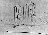
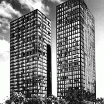
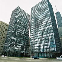
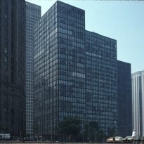
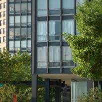
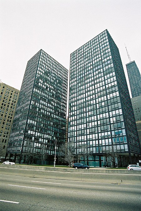
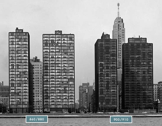
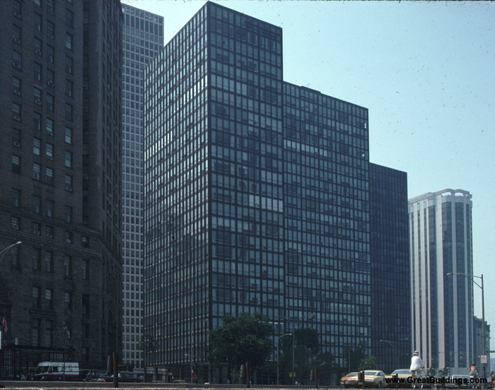
The two towers of glass and steel designed by the architect Mies van der Rohe and completed in 1951. Paradigmatic for its time, the two apartment towers clearly reflect the International Style. Trend, its design, as well as the structural resolution, was translated and imitated throughout the world in the years after its construction.
Recognition
The towers, despite the modest scale of its functional units and criticism for his picture in the beginning, were a commercial success. In addition, they were recognized in numerous publications and were winners of several awards. Finally, in 1996, were recognized as “Chicago Landmarks”.
Location
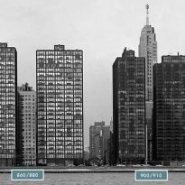
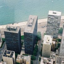
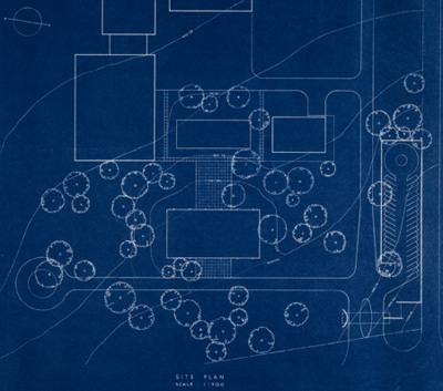
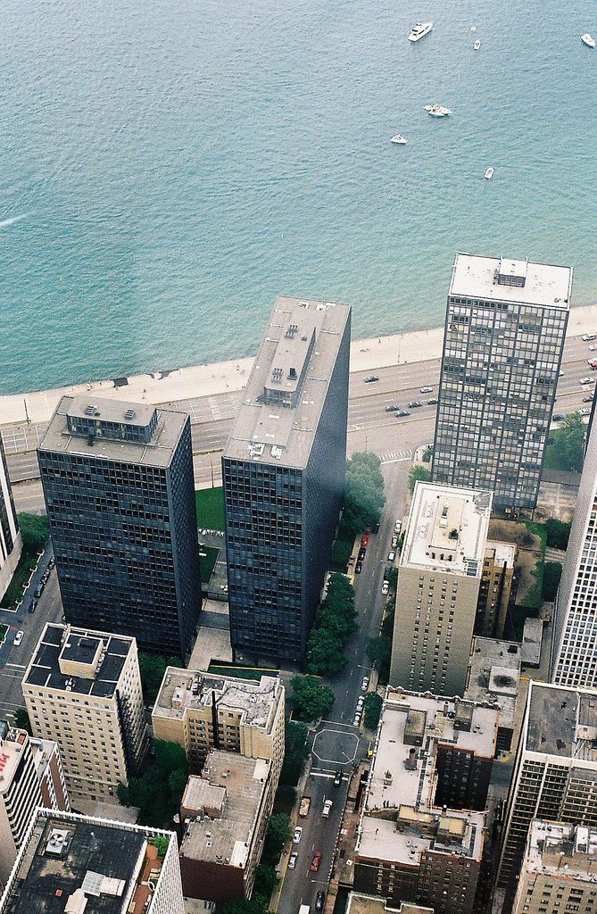
The two towers are located rectangular base of a perpendicular to the other, a block from the city of Chicago, Illinois. Both have strong views on Lake Michigan, and provide the ground floor to the relationship with public space.
Definition
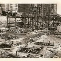
After the fire in 1871 destroyed much of Chicago, the architects and engineers faced a new dilemma. First, they had to rebuild a major U.S. city, and secondly, they must find a solution to the growing population demand that megacities were having, making sure that another fire could wipe out the city again. All this resulted in what is today Chicago today. A city with large towers and buildings in height, characterized by the presence of strong and resilient structures.
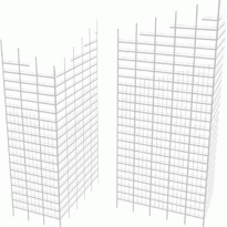
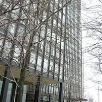
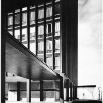
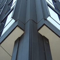
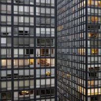
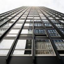
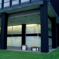
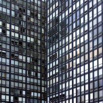
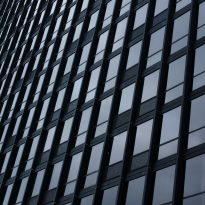
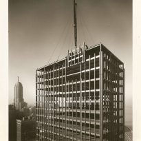
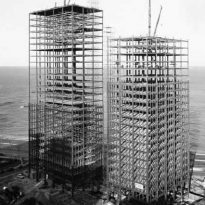
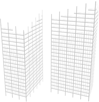
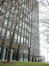
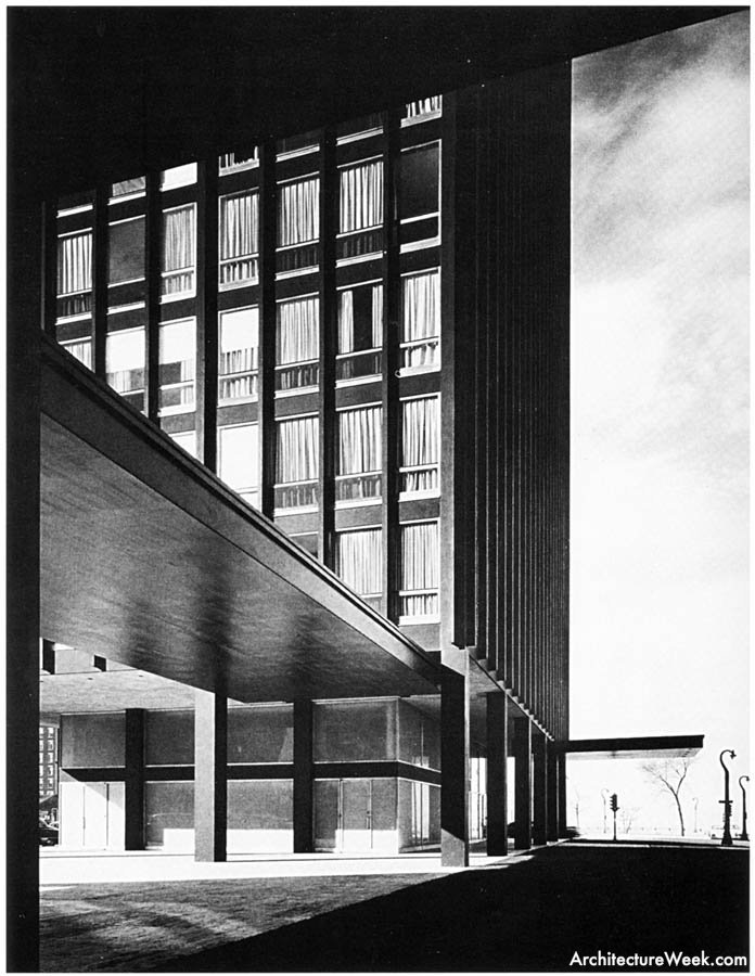
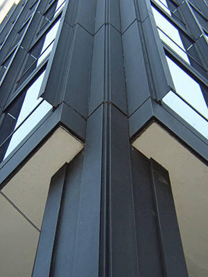
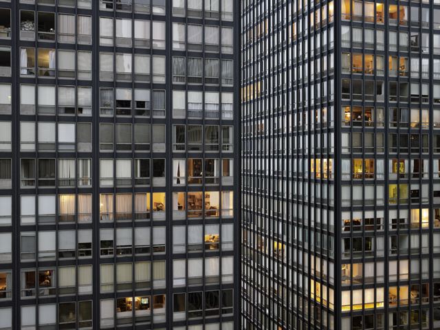
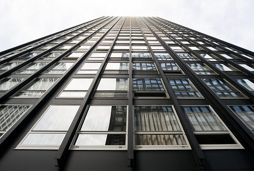
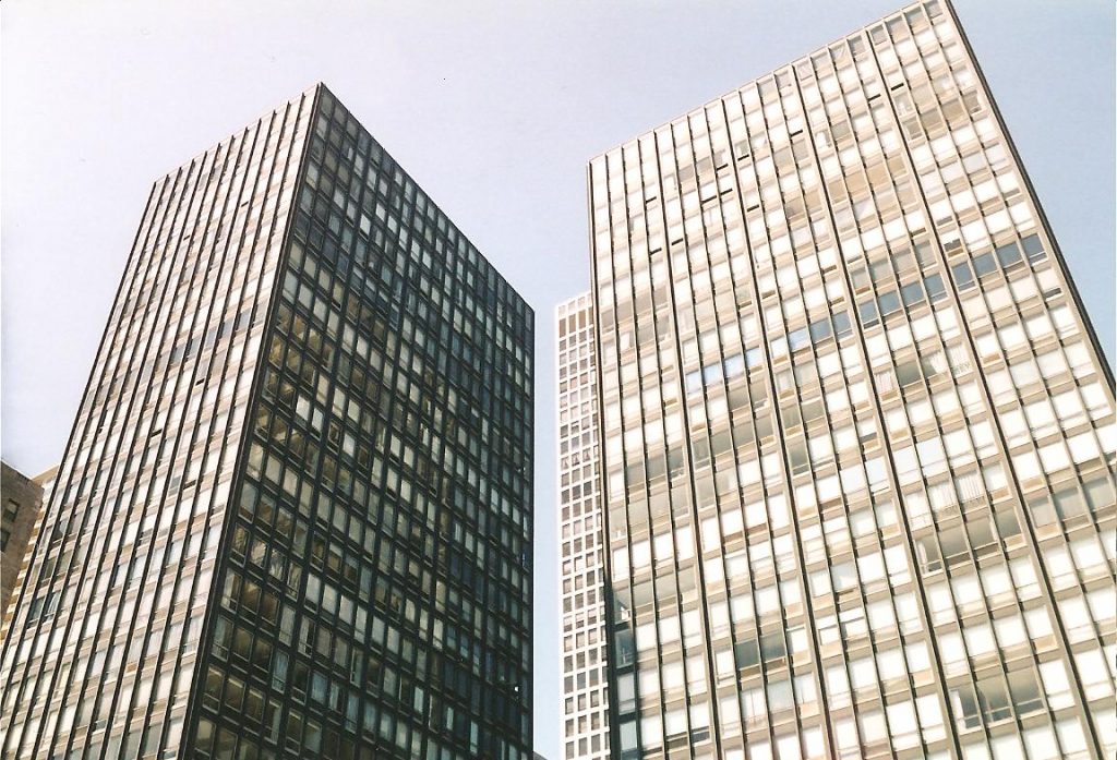
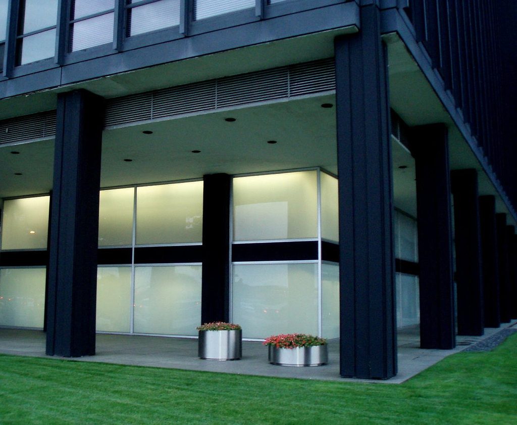
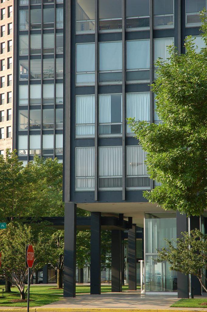
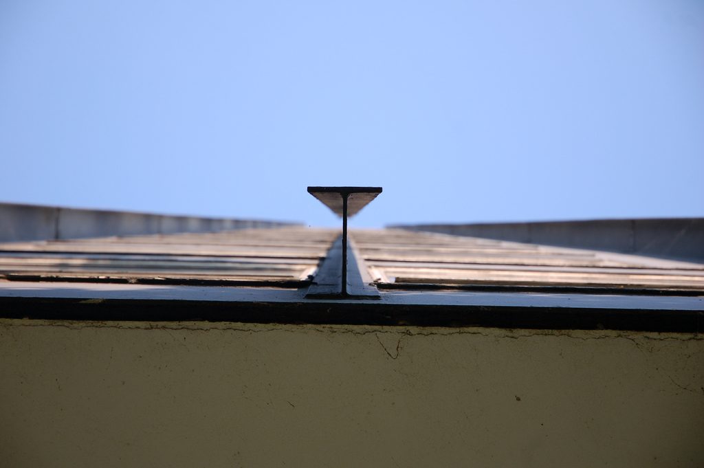
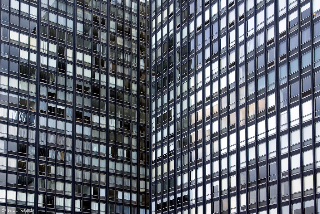
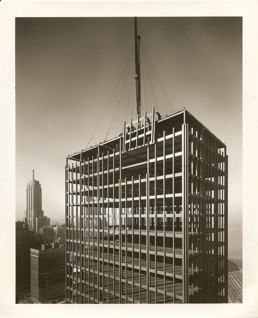
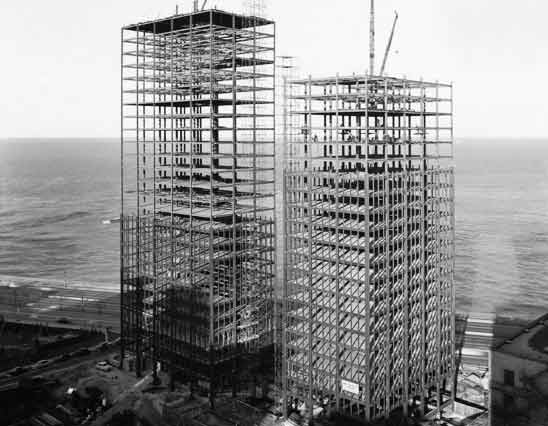
The towers, identical in design volume, rising from the floor by black steel columns that are part of a grid. The main concept, clear and synthetic, is part of the so-called “skin and bone”, in which steel is used as a visible structure and joints, while the glass is who fills the empty spaces on the walls. These early precursors are those we see today in the skyscraper curtain wall (curtain wall).
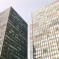
Importantly, all the faces of these towers are the same, without preference or visual directions.
Spaces
The project is distinguished by the synthetic and functional ideas that Mies developed throughout life. These towers are a new way of looking at housing, and that what he was recognized as their location, visual, and above all, certain utilities group.
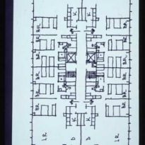
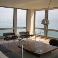
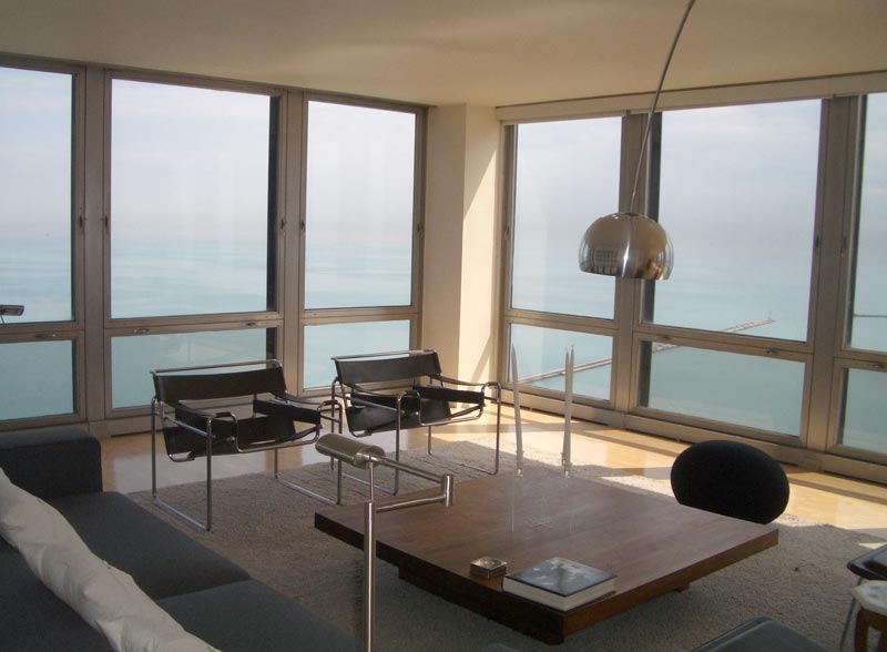
In pursuit of the use of space and avoid waste of square meters, the architect designed washhouses common, reducing the space for bathrooms and kitchens. Also integrated into everyday dining with living room, creating a larger common space. In addition, benefited from the design of its facade, all space inside the apartment with a large entry of natural light.
Materials
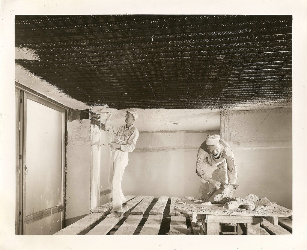
As in the German Pavilion of Barcelona and the Farnsworth House, Mies again using common materials and leads to its maximum expression. In contrast to the concrete and brick buildings common in the city, he adopts a resolution technique for the time. In this case, the steel used to create a structure resistant and suitable for building height. And instead of hiding the structure, used to make up its facade, and she plays with the glass, to establish a dialogue between the conformation of the plant as a reticular pattern, and the facade of the same.
And while the image of the towers is rather austere and devoid of ornamentation characteristic of much of the buildings in Chicago, Mies that he managed to give them the material character and prominence to these buildings.
