White U

Introduction
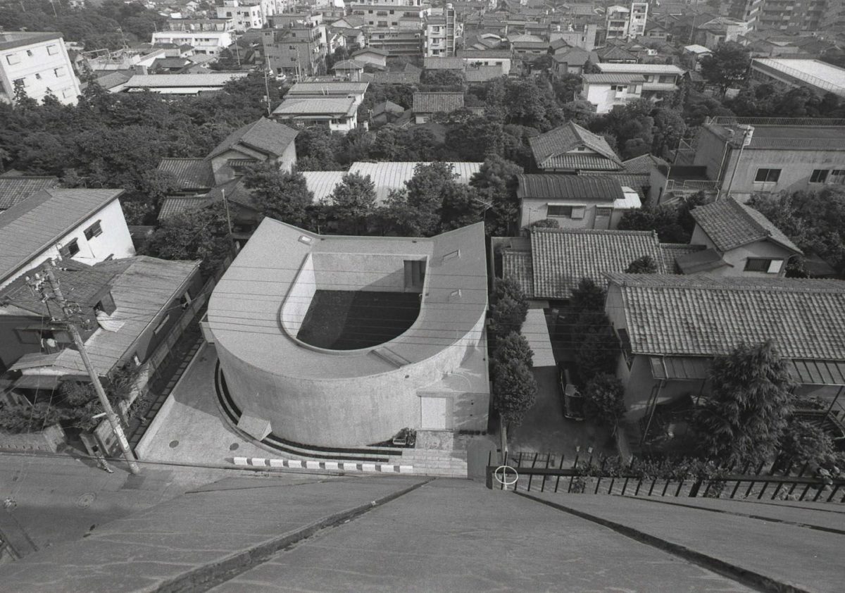
White U, also known as House in Nakano, is one of the most respected architect Toyo Ito.
It was designed for older sister, who had just lost her husband to cancer. The client and his family lived until then in a skyscraper in the city. After the death of her husband, the widow requested that the architect built a house for herself and her young daughters where they could enjoy the contact with the soil and nature. He also suggested that the house had the form of L so that family members may have visual contact between them. Coincidentally, the site next to the architect’s house was for sale, this being the place where the widow had lived before marrying. It was there where he built the house.
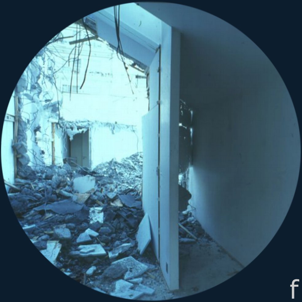
Twenty years later, the family was willing to establish their links with the outside world, leaving the house. In 1997, was demolished in the eyes of Toyo Ito.
Location
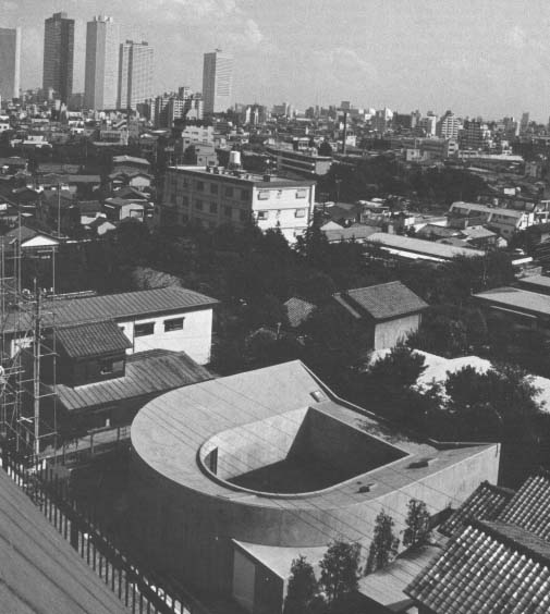
The house was located in the suburb of Nakano, Tokyo, on a site between medians.
Concept
This book distinguishes the symbolic value of Japanese architecture.
White U is not only a house is a house for mourners.
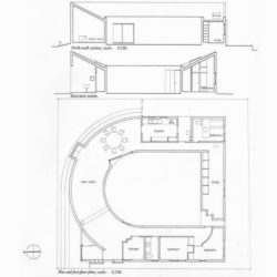
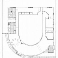
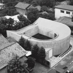
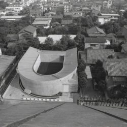
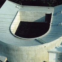
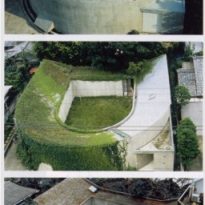
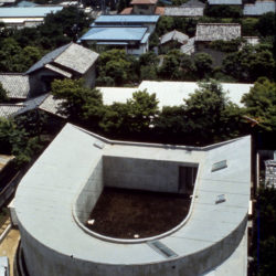
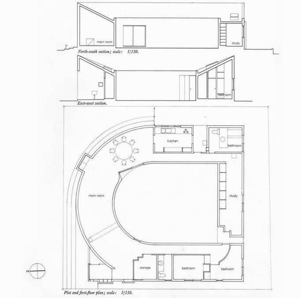
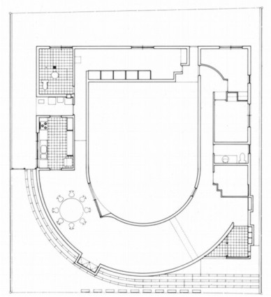
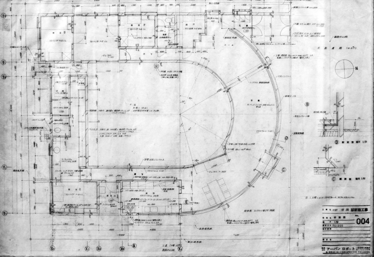
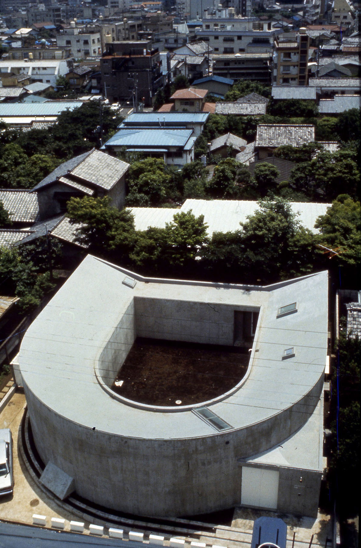
In talks with the architect’s widow, the emphasis on the organization of functional spaces began to disappear and instead turned more towards the symbolic value of space. So, the house changed its original form of L to become a U-shaped building, an approach that would create greater effects of light and a stronger relationship between the inhabitants.
Spaces
The project involved the use of underground space. The lighting is different from what is traditionally conceived, being featured in the current generated in the spaces.
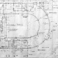
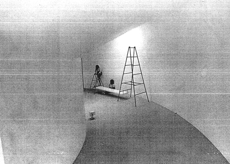
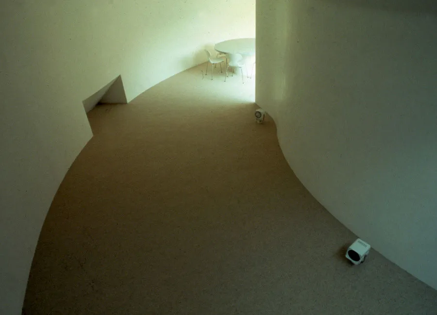
The organization was established in U-shaped with two large movements. One led to the bedrooms of daughters and the other, through the kitchen and bathroom, the bedroom of the mother.
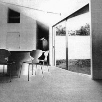
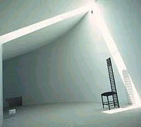
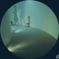
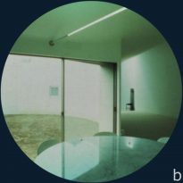
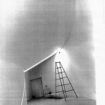
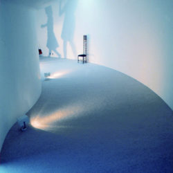
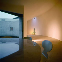
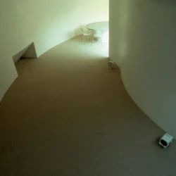
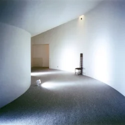
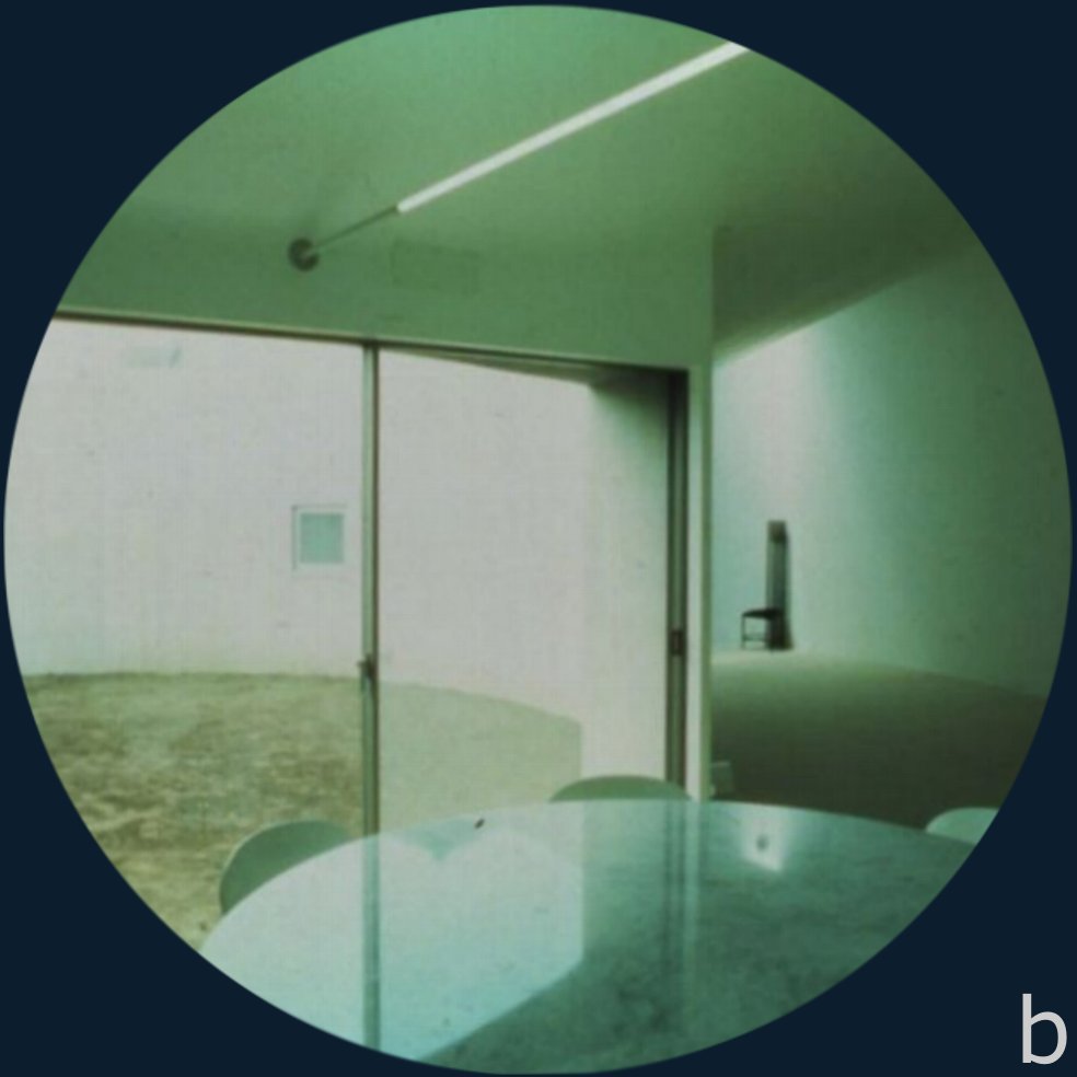
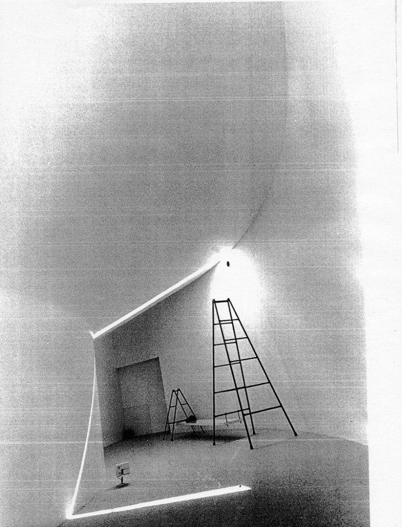
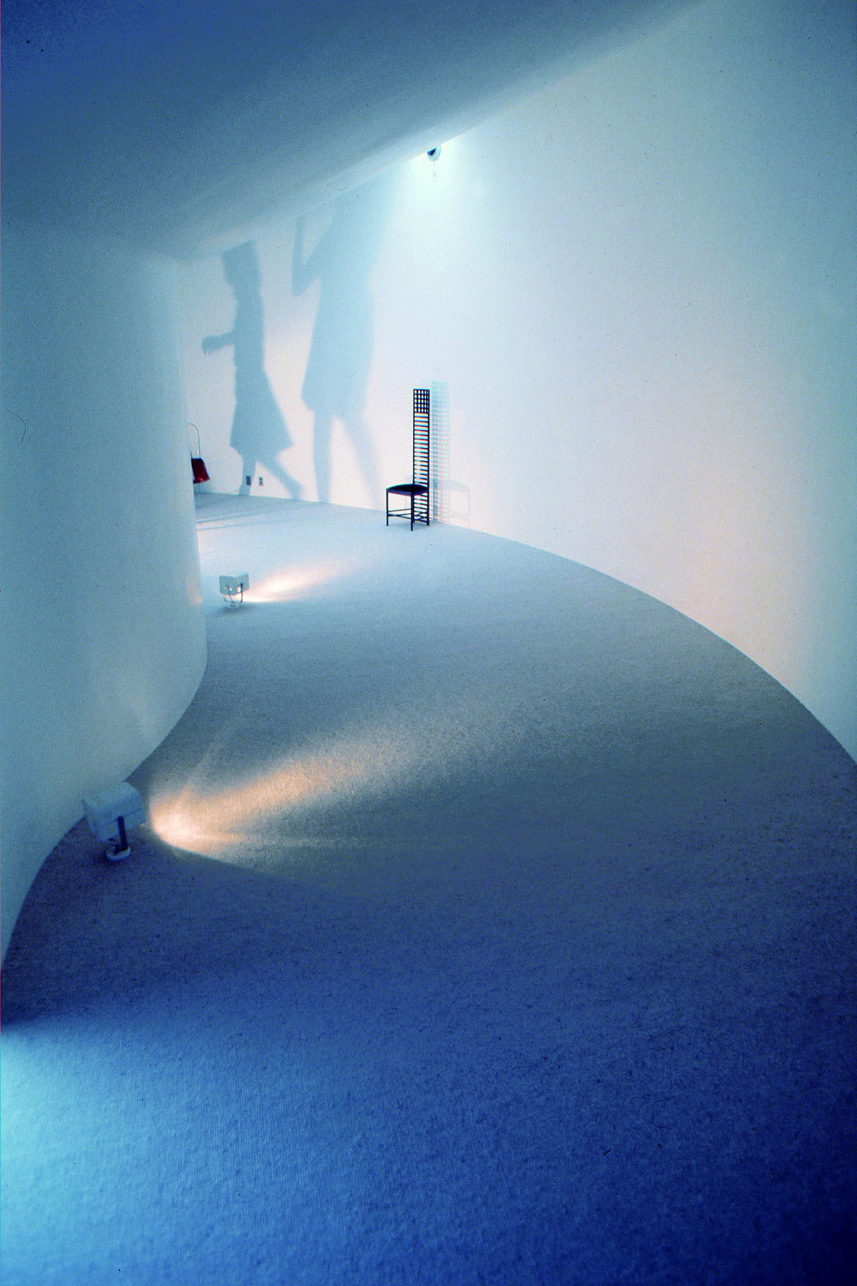
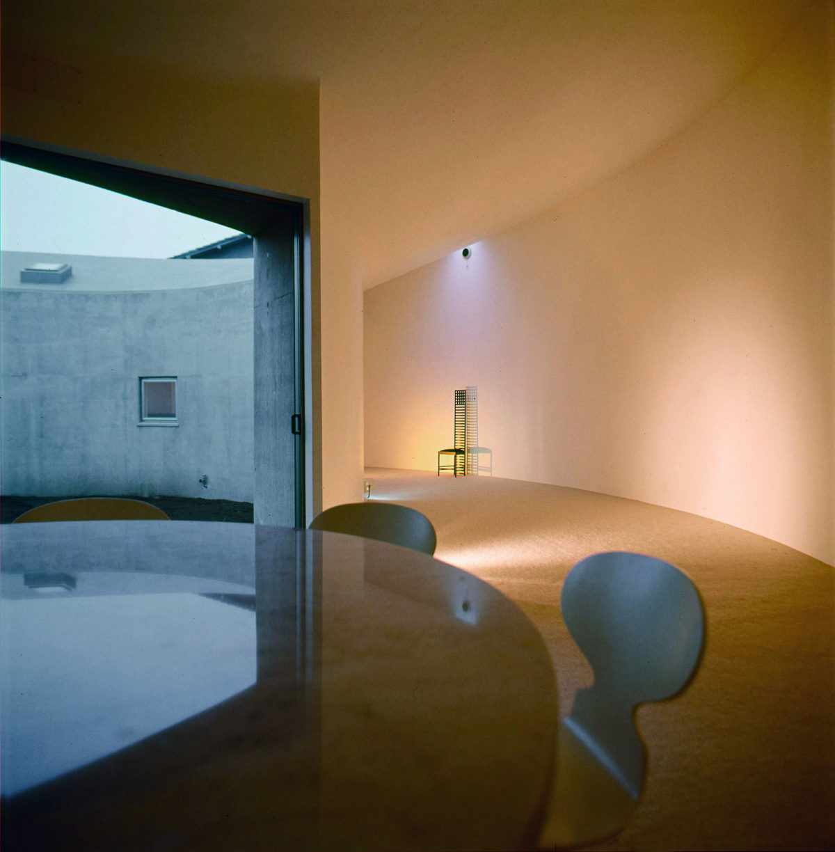
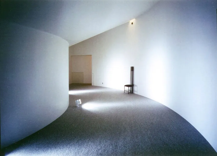
The circulations were dark and directed towards a common space bright. This multipurpose space used for play, eat and meditate, had its walls, ceiling and floors (with rugs) white.
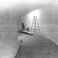
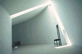
The rest of the house lit up with cracks in the ceiling, directing light in a straight diagonal line. The light gave the space a smooth texture, enhanced by the whiteness of the interior, which looks flat and three-dimensional, like a screen where images and shadows of people projected.
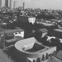
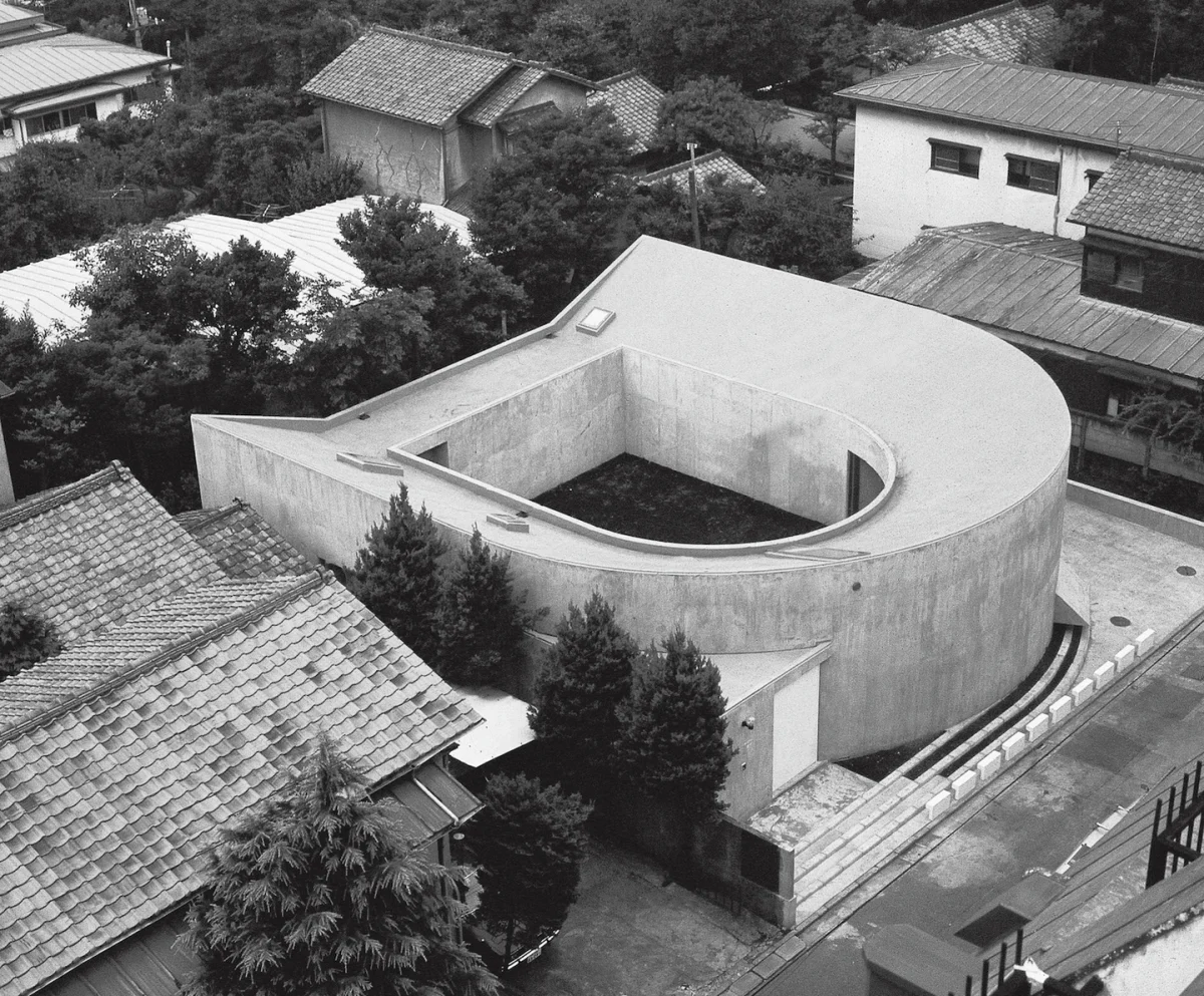
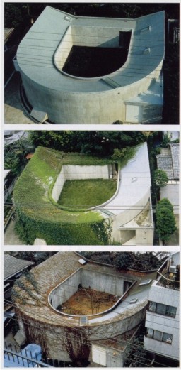
From U-shaped part, generated a central courtyard, an important part of the relationship with nature sought in this work.
Materials
Reinforced concrete was used as main material
