Villa Giulia

Introduction
Villa Giulia was commissioned by Pope Julius III. This gave the initial design of the building to Giacomo Barozzi da Vignola in 1551-1553, but the garden and other elements were designed by Bartolomeo Ammanati, all under the supervision of Giorgio Vasari. Pope Julius III had a great interest in this construction and spent huge amounts of money for the completion of the town.
It was built as a resting place for the pope and was conceived as a place of entertainment rather than as permanent home.
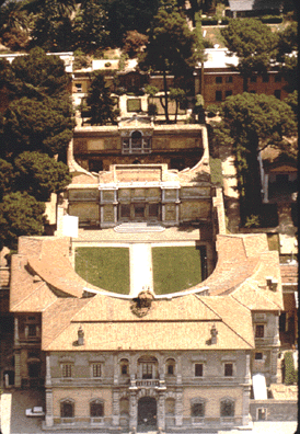
The village as it was common, was a main entrance (on the Roman Via Flaminia) and an entry for the garden. This building was itself a threshold between two worlds, that of the city and the countryside.
After Pope Julius III, Paul IV, confiscated all the properties that had gathered, then the town was divided. The main building and part of the gardens became the property of the Apostolic Camera. The building was reserved for the use of the nephews of the new pope.
He was later restored in 1769 on the initiative of Pope Clement XIV, confiscated by the state of Italy in 1870, and became the National Etruscan Museum at the beginning of the twentieth century.
Situation
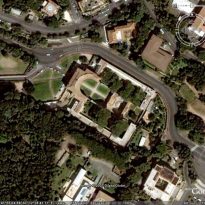
The villa was built in an area of Rome known as the ‘Vigna Vecchia’ which is on the slopes of Monte Parioli.
The site has two main entrances, which ends in a grand entrance that serves as a prelude to the work. This in turn is surrounded by two sets of high urban density.
In addition, the building is located in an area of great cultural interest in their surroundings as they are both the School of Architecture at the Villa Giulia National Gallery of Art.
Concept
In Italy quinticento appear in a new palace, the Villa Suburban. It was a type of residence away from the city to the richest stratum of society. This kind of classification is still being defined in general as the palaces of the Renaissance, “an enclosed rectangular volume, focusing on a patio.”
Spaces
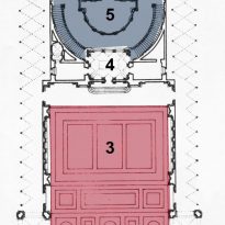
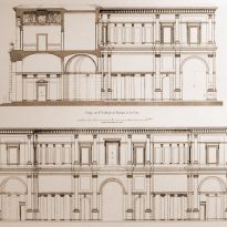
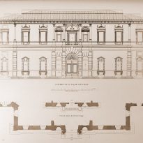
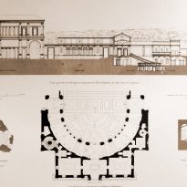
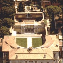
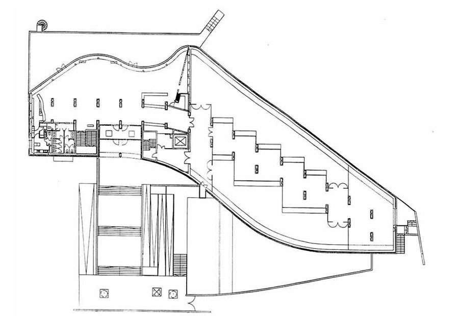
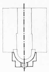
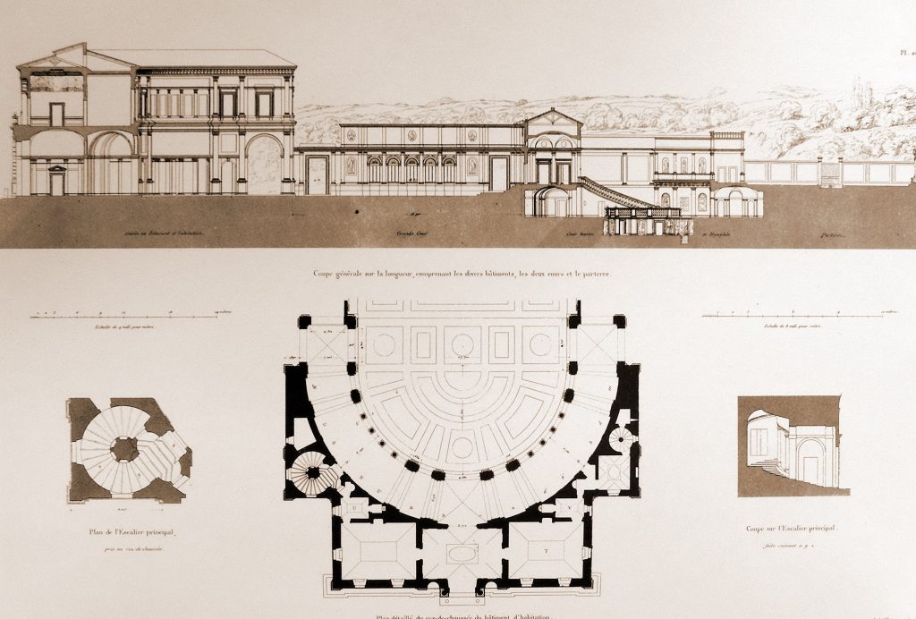
As for the general plant presents a strong longitudinal axis of symmetry and a large space (courtyard) from which to develop the other areas. This axis is in coincidence with the entry, checking whether one of the possible routes, and increasing attention on the main screen of the patio. Thus, ‘the‘ is organized as follows:
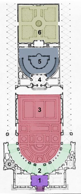
- Main‘Acceso ‘
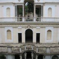
- ‘Vestibulo: ‘This is a well-defined space that serves as a transition to the large patio. Is in line with the axis of symmetry. Here the visitor is invited to move to the main garden, as it is a darker place flooded by light from the previous one.
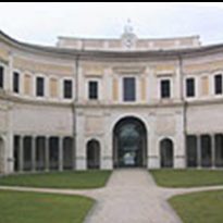
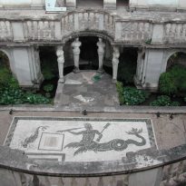
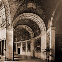
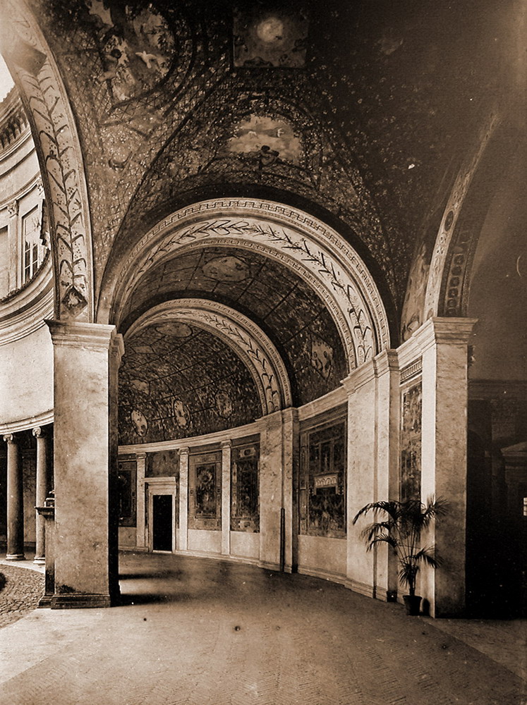
- ‘Galeria semicircular: ‘This precedes the lobby, offering two types of main entrance to the garden, one directly, where the observer sees all the space directly from a single glance, as a unit; and another, where the observer is invited to visit this gallery and access to space laterally.
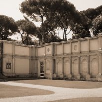
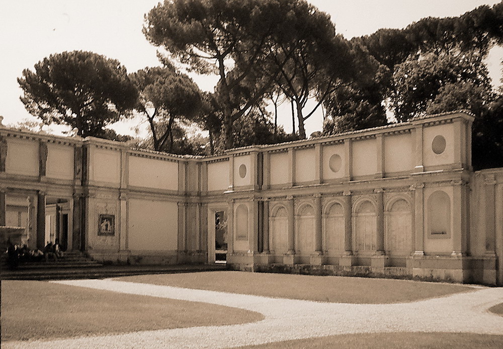
- ‘Jardín leader: ‘Based on this structure is the other areas. This place is defined by three straight and a semicircular screens (the gallery) that contain and give a great monuments. This perception helps the fact that here there are no elements that stand in the observer’s visual, so this will have a clear awareness of the limits.
Its sides are the garden side, which had come from the lateral semicircular gallery. They have another kind of relationship with the central space through two openings in one wall, where you can “spy” the monumentality of the first. - ‘Ninfeo: ‘This is a semicircular space multiplicity of perceptions, because the observer can do this from a vision of infinite angles.
- ‘Jardín private: ‘This is the shot of the composition regard to the longitudinal axis of Villa Giulia. Its structure is similar to the garden side is that this element involved to privacy in this space are the vegetation of the place itself.
Ornamentation
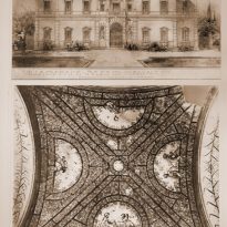
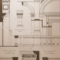
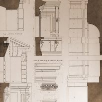
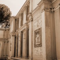
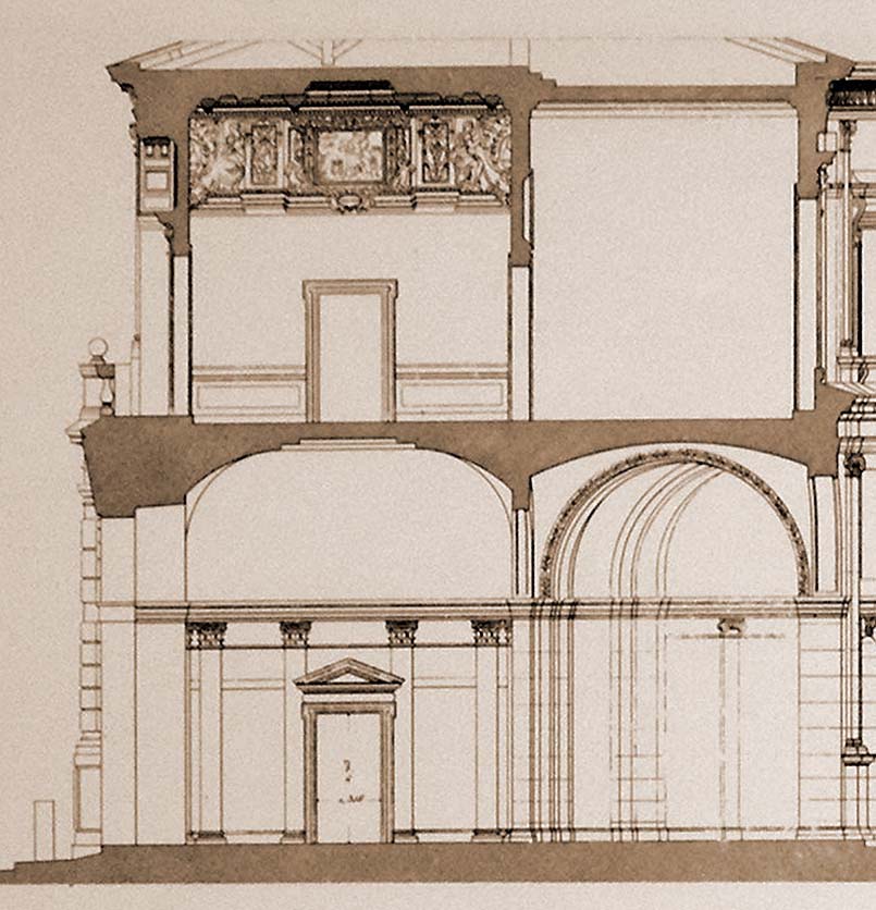
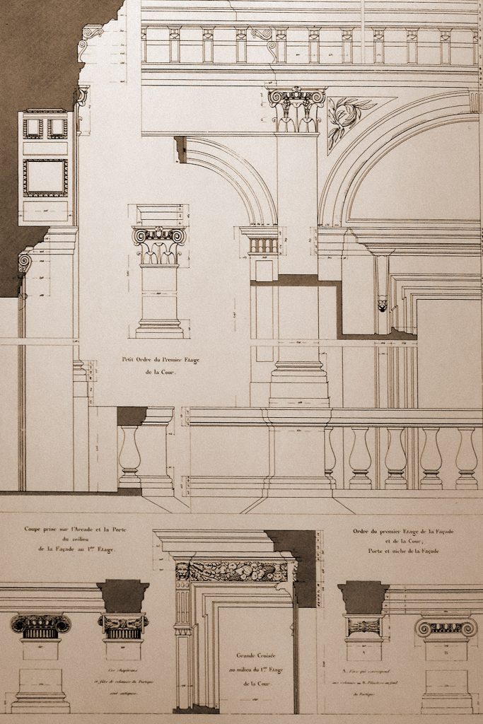
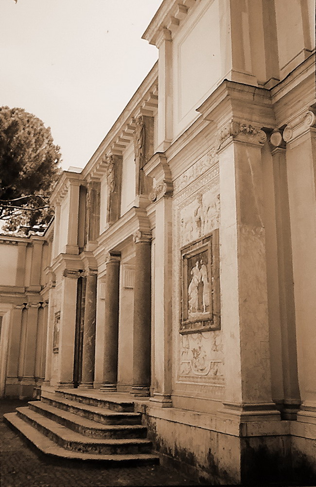
In the interior of the book combines both the Ionic and Corinthian in to places like framing gallery semicircular or decorations screens main courtyard.
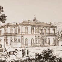
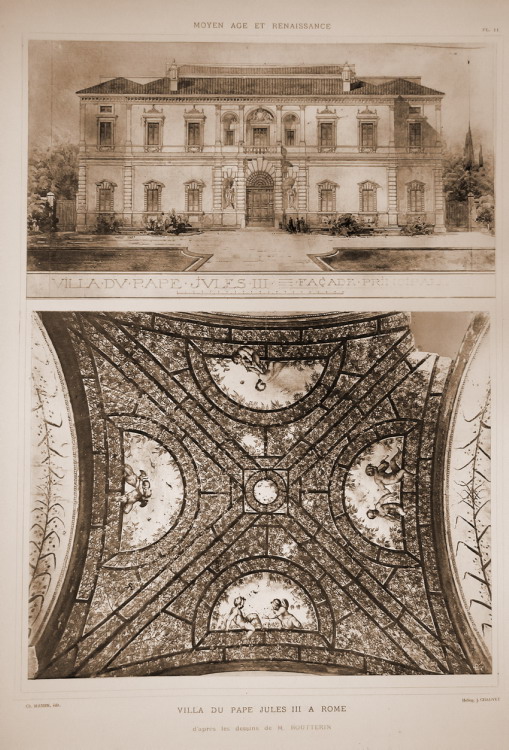
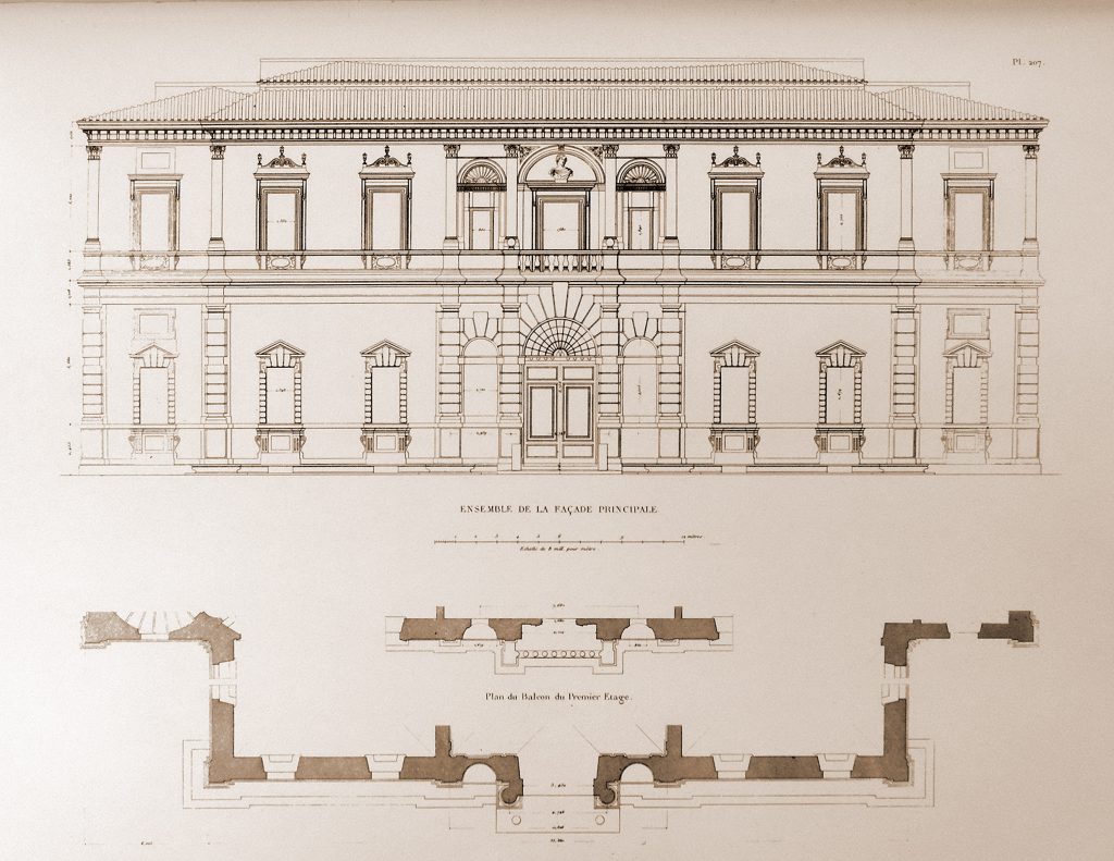
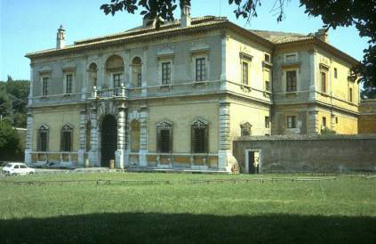
Also also continue to use elements of the Renaissance as the half-point arc in the interior and in the last fachada.Esta was organized by both vertical and horizontal axes, which are evidenced by the cornices horizontally and vertically in columns.
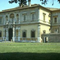
The same vertical axis and organize outbound entries in the facade. In the case of Villa Giulia used Ionic columns and Corinthian also overlapping and attached to the wall, as Mannerism orders are still using the classic Renaissance.
Another important point to note is the padding (rustico treatment from the Renaissance), which is the facade. The same happens to be reduced to put Villa Giulia in contrast to the smooth surfaces predominate.
