Serpentine Gallery Pavilion 2015

Introduction
Over the past 15 years, the Serpentine Pavilion has become an international event for architectural experimentation, presenting temporary structures result of inspiration from some of the best architects in the world. This long-awaited milestone in London every summer, is one of the ten exhibitions of architecture and design most visited in the world. Pavilion 2015 was carried out by Spanish architects José Selgas and Lucía Cano, being the first in his country to build one of these temporary structures in the English capital, and the first to study in that city.
Hall opens to the public on June 25, 2015 and will run until October 18, 2015.
Location
Hall was located, as every year, in the garden of the Serpentine Gallery, Kensington Gardens opposite to its east wing, London, England, UK.
Concept
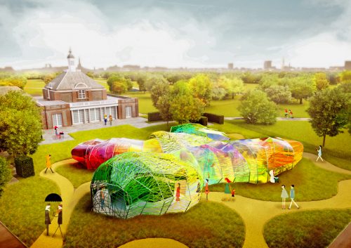
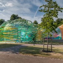
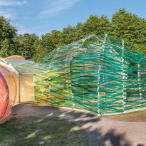
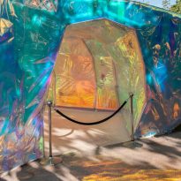
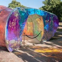
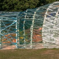
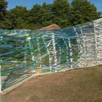
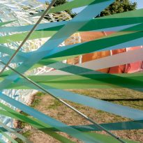
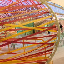
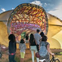
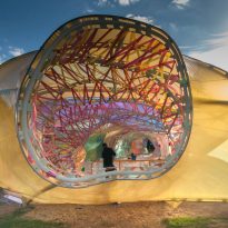
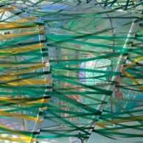
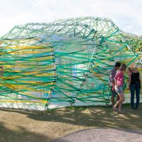
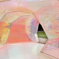
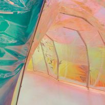
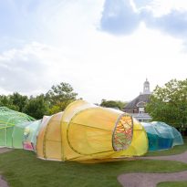
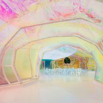
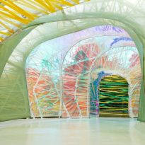
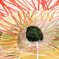
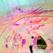
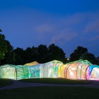
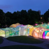
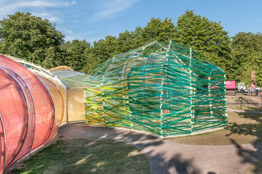
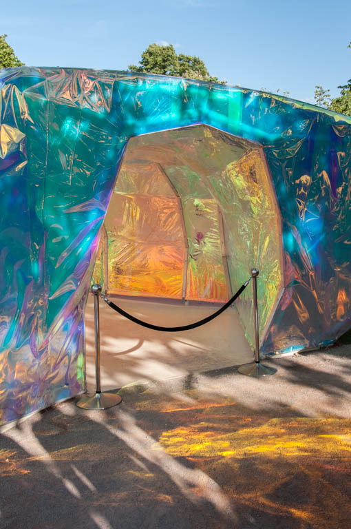
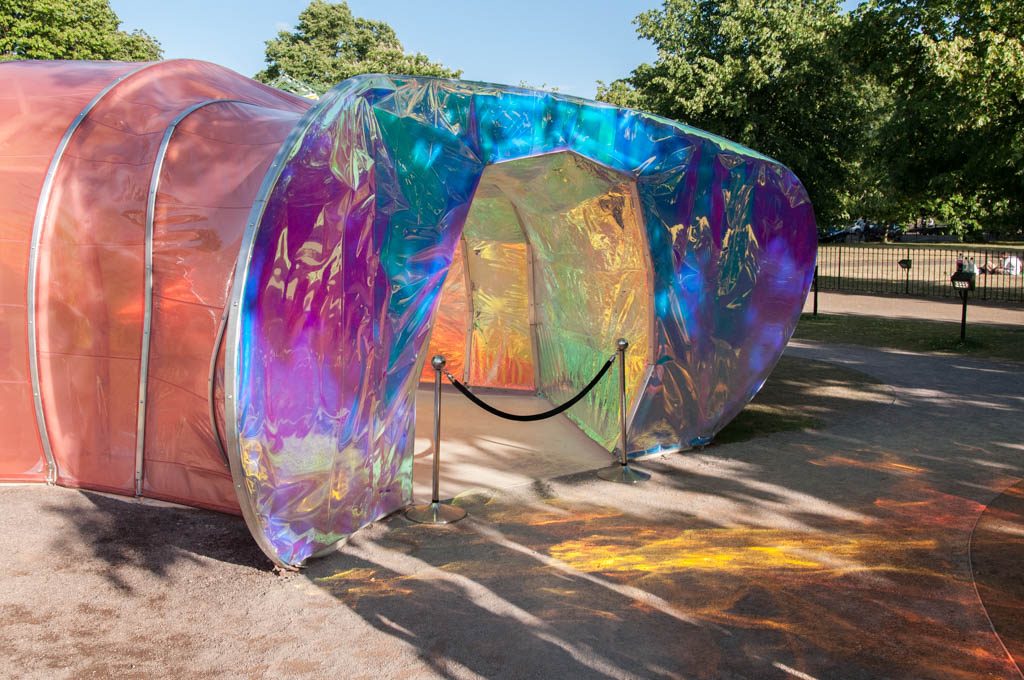
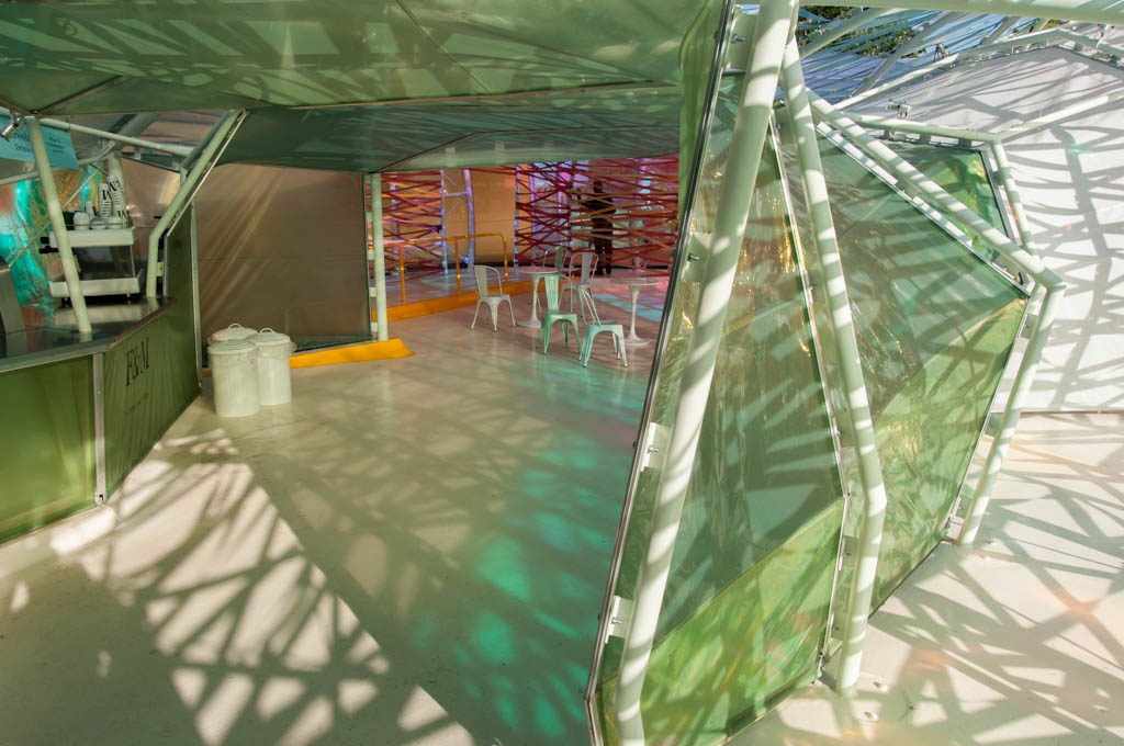
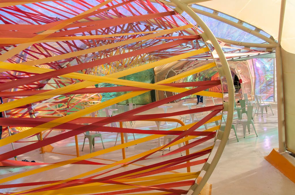
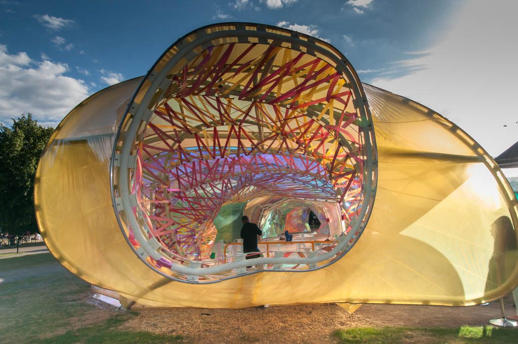
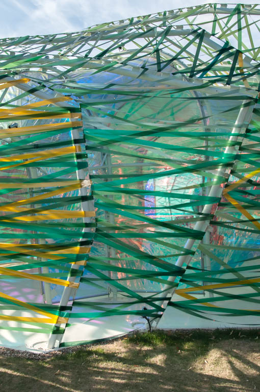
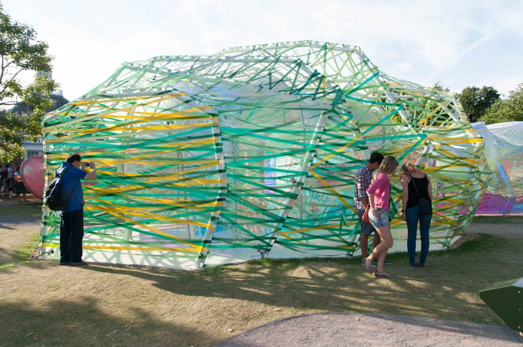
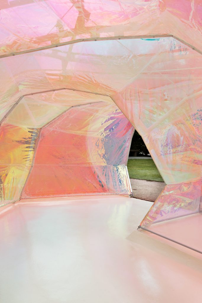
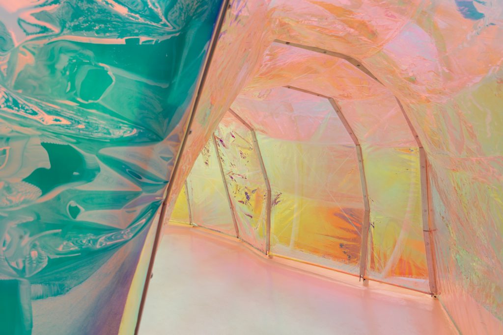
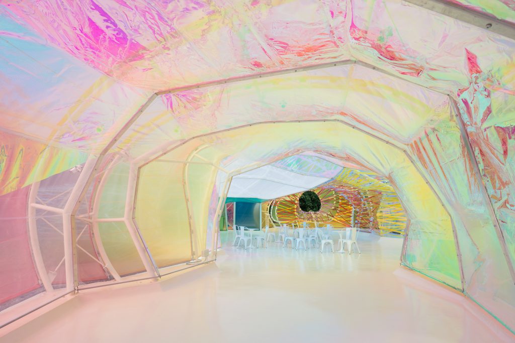
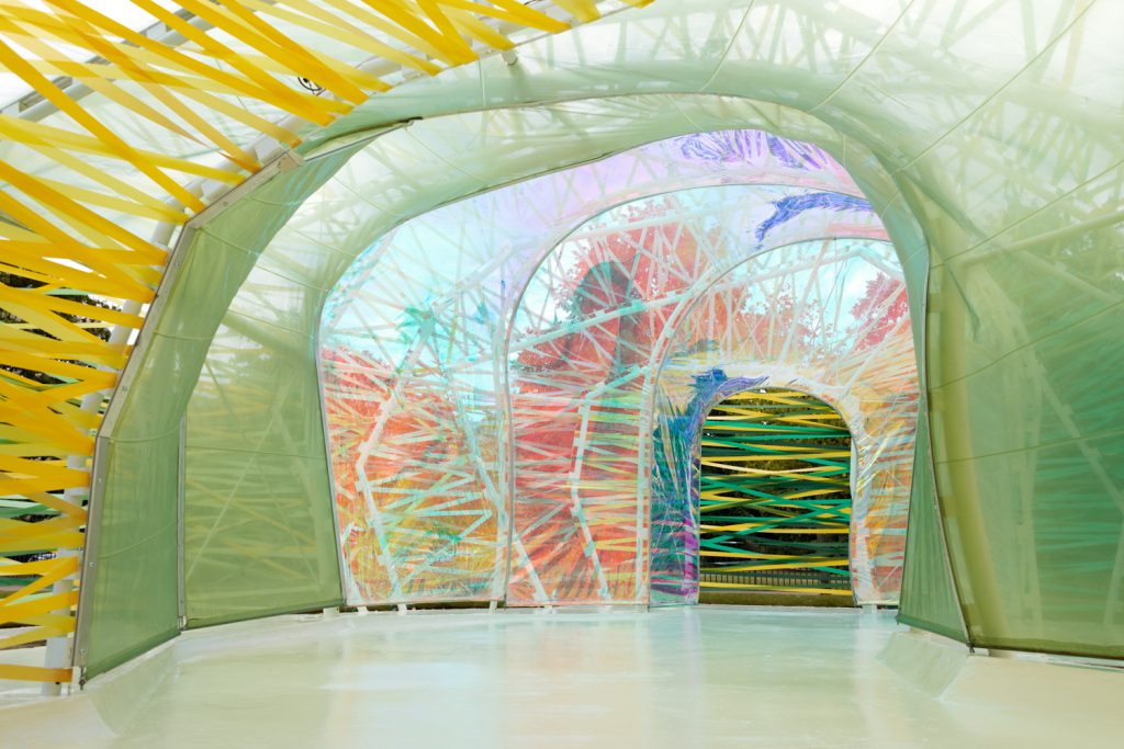
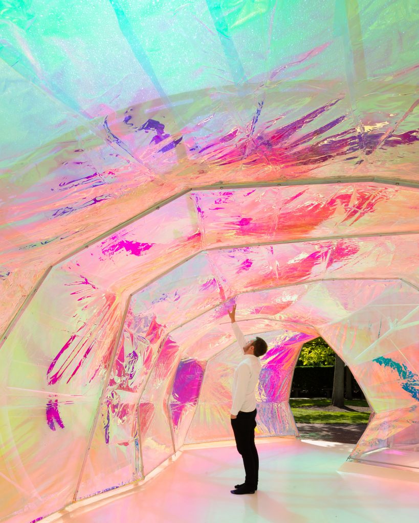
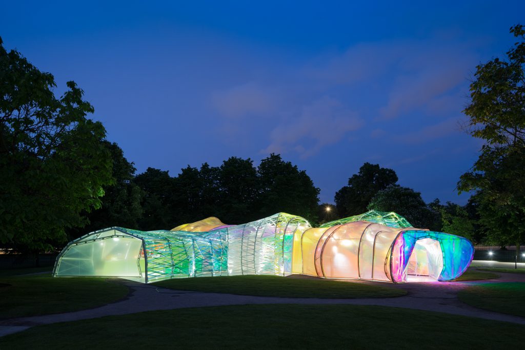
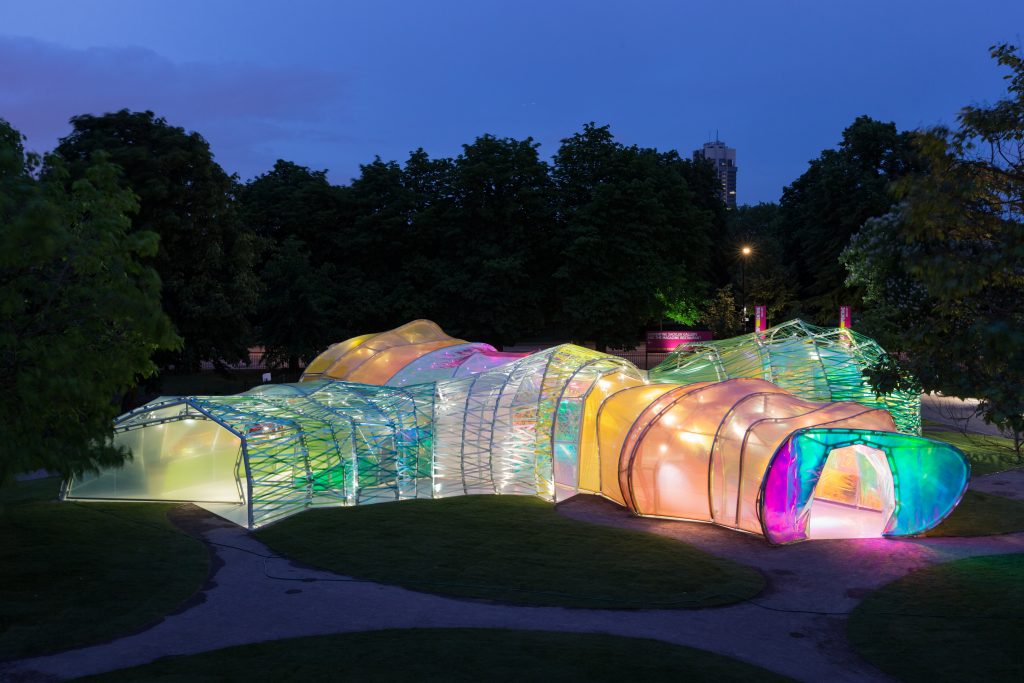
The design shows an amorphous structure, double skin, a polygonal structure formed by transparent panels, based on a tissue of multicolor fluorescent polymer (ETFE), strapped quickly been baptized by audiences and critics as “the psychedelic chrysalis “. Visitors can enter and leave the flag at different points, passing through a “secret passage” between the exterior and interior of the structure layer and inside the Pavilion with its glowing stained glass effect.
Description of architects
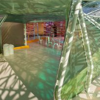
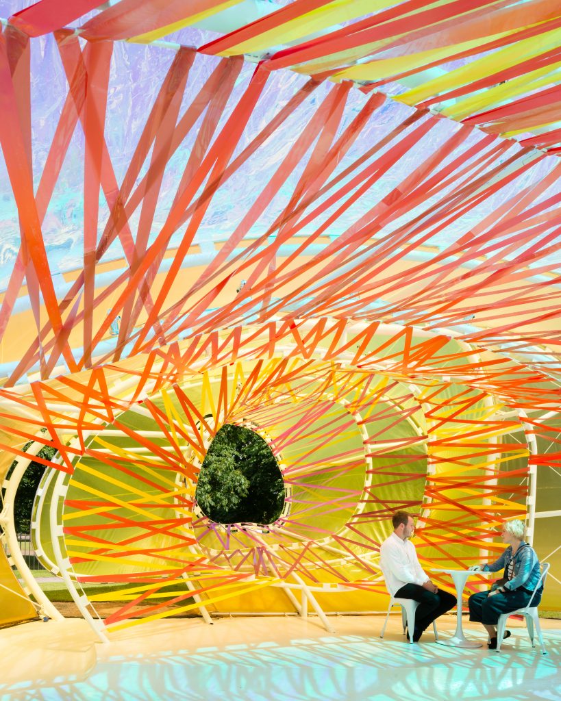
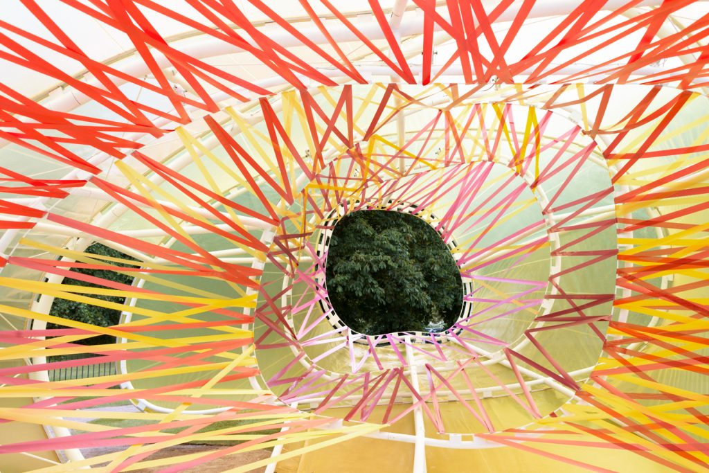
“… When the Serpentine invited us to design the pavilion, we started thinking that I needed to provide the structure and what materials should be used in the Royal Park of London. These questions, mixed with our own architectural interest and the knowledge that the design has to connect with nature and feel part of the landscape, provided a pure-based visitor experience concept. A way for the public to experience the architecture through simple elements sought: the structure, light, transparency, shadows, lightness, shape, sensitivity, contrast, surprise, color and materials. Therefore, we have designed a pavilion that incorporates all these elements. The spatial qualities Pavilion unfold only when accessing the structure and immersed in it. Each entry allows a specific trip through space, characterized by the color, light and irregular shapes with amazing volumes. This is accomplished by creating a double layer shell made of plastic opaque and translucent fluorine (ETFE) in a variety of colors. The heart of the pavilion is open both to meet for coffee and space.
We have also taken into account in our design the 15th anniversary of the Pavilion. Therefore the structure had to be, without previous flags resemble a tribute to them and a tribute to all the stories that are told within these designs… ”
Description
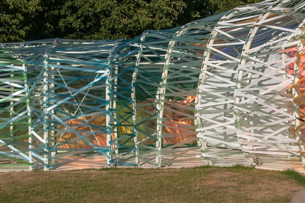
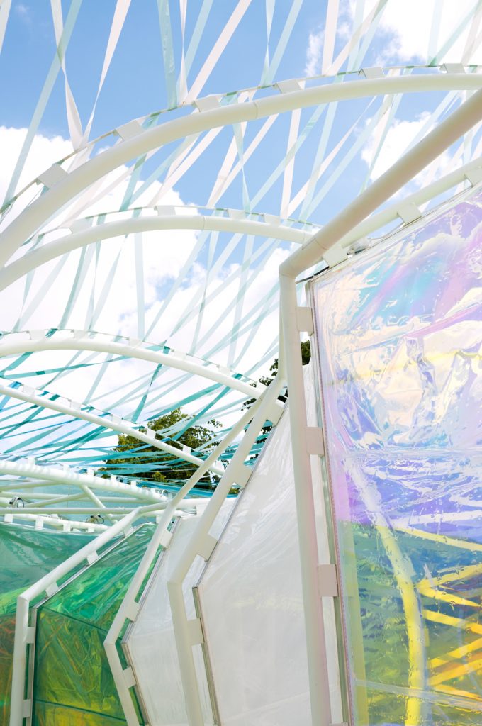
The main structure with a maximum width of 27m and an external height of 4.6m in its 2m-4m minimum inside peak, maximum, has been made with structural steel and coated with a structural fabric specially manufactured, based on panels colored and transparent polymers. In soils reinforced concrete slabs were placed.
Access is via four entrances leading directly to your inner journey and also you function as outputs.
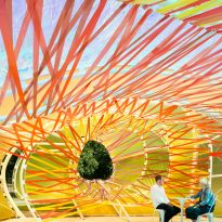
During the day inside it is used as a public space with a cafe located inside, and at night is used as a forum for learning, discussion and entertainment. To this end it has been decorated with steel chairs and tables painted white.
Structure
El Pabellón gira en torno a los extremos y los opuestos. Es una construcción con contrastes agradables y contradicciones tentadoras. Los ingenieros recurrieron a una estructura minimalista de acero que resultara flexible y dinámica en el momento de ser cubierta con el colorido revestimiento, pero que a la vez mostrara la rigidez necesaria para permitir los correctos acabados. Esta yuxtaposición de ingravidez y solidez es uno de los contrastes del Pabellón.
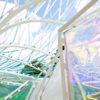
To achieve a sense of light and space, an innovative technique that minimizes the number of structural measures was adopted. Every centimeter of the frame has a structural purpose, nothing is superfluous. No beams or columns to undermine the sense of space and light. Creativity in designing structural form reduces the density in space. The darkness of the steel structure contrasts with the bright and multicolored cladding panels created with 19 colors and fluorescent translucent plastic called Ethylene tetrafluoroethylene (ETFE).
