Headquarters of Prosecutors office Vilnius
Introduction
While in the Lithuanian cities have begun to build architectural landmarks financed by private capital in the public sector this activity is much less active. The city intends to develop infrastructure and public spaces forcing private investors to include such “public service” in their plans.
Location
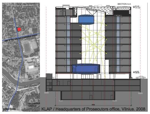
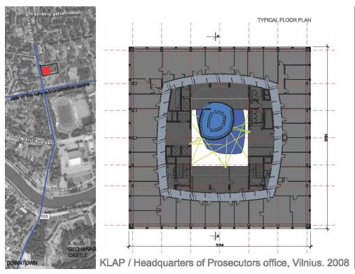
The neighborhood where the headquarters of the Office was constructed corresponds to typical buildings of the Soviet period in the center of Vilnius, Lithuania, 1km from the historic city center. The plot is located on the continuation of the long axis of the new administrative center, near the Neris River in Rinktinės gatve 5th. Because of its location it was necessary to note that the new building is harmoniously adapted to the existing environment, preserving the character of its surroundings.
Concept
The architectural concept and nature as plastic idea gives a sense of order, stability, strength and rigor. It’s the way that best reflects the specific features of the object and creates an exceptionally suggestive image of the institution he represents, focusing on public policy.
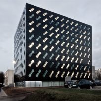
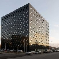
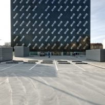
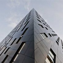
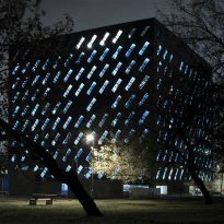
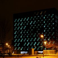
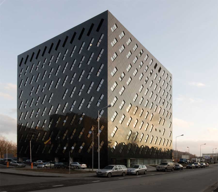
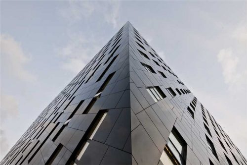
One of the key elements in the formation of the image is the use of black color, polished granite that lines the outside of the building, covering it with the necessary level of robustness that requires one of the key institutions in the system of law enforcement at home. The concept of color takes on the architectural work of Kęstutis Lupeikis a prominent role, as it is known not only for its architecture but also for its artistic work as a painter. Conceptually the application of black color in the Head Prosecutor of Vilnius, contributes to the overall resolution of the building, any other color would be, in this case, a formal aestheticization, simple, a search of “beauty” incompatible with the specifications object.
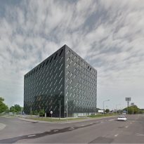
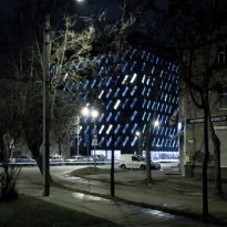
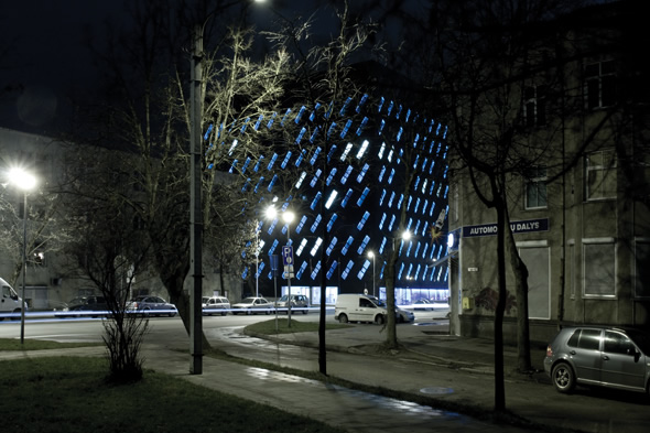
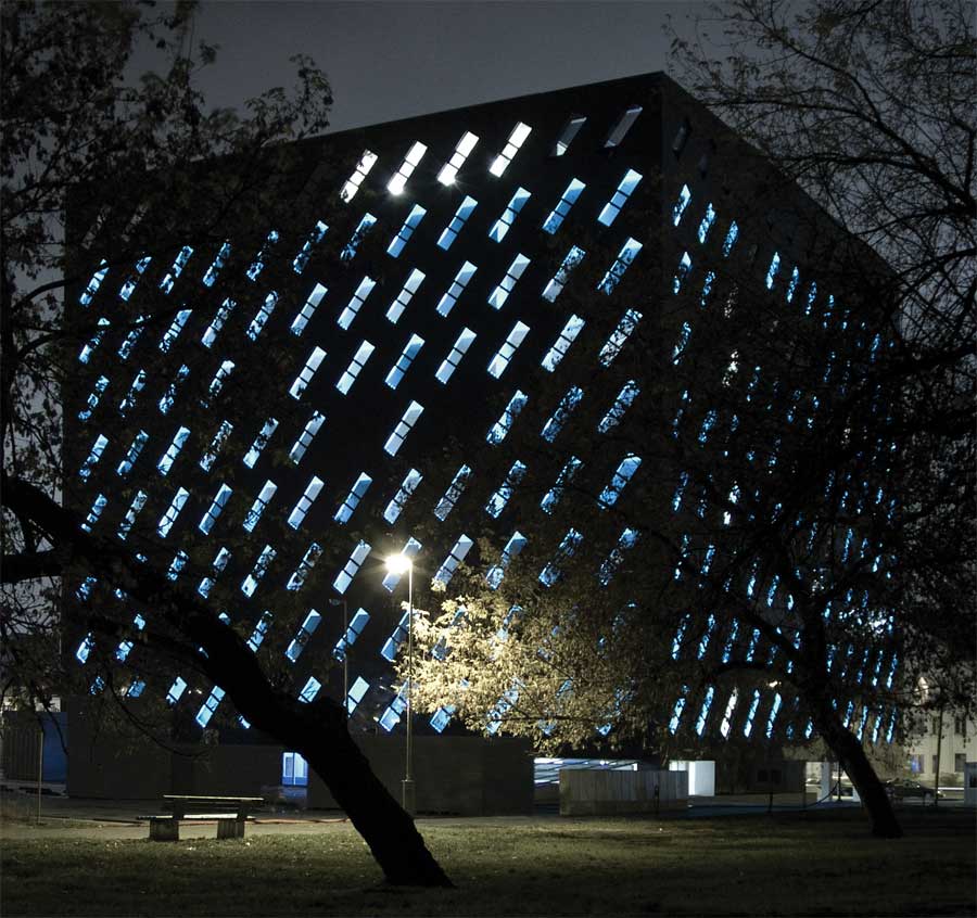
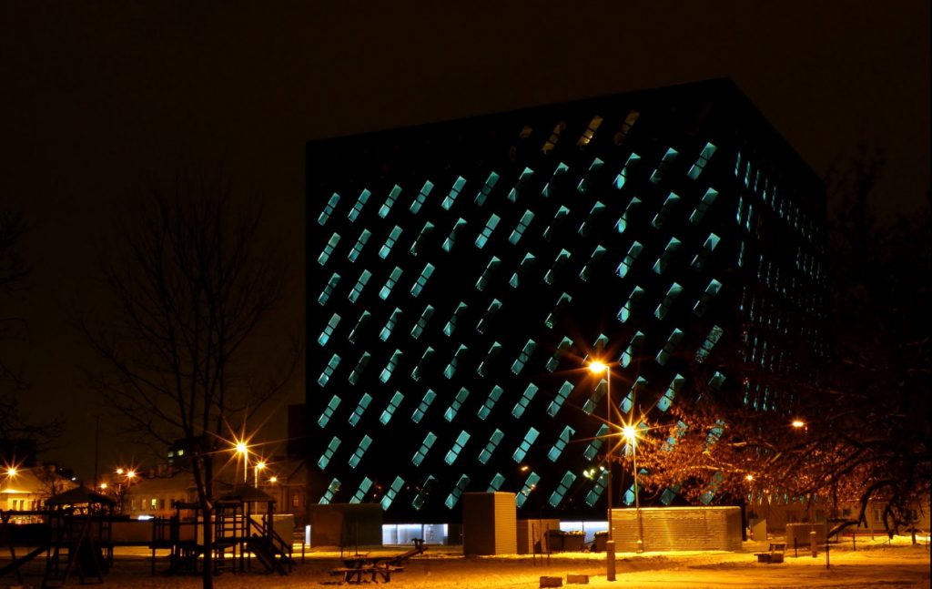
The use of black in the cube which forms the building is conceptually complete with a rate of oblique windows that give unity and dynamism to the static character of the building, give a visual impression of movement, change and a fourth dimension, adding a few atypical qualities static form, converting the activated a “hyper surface”. In this case “hyper” refers to a new concept describing a complex condition of architectural surfaces.
Objective
The aim was to find a high quality result with conceptual art not to give up the environment and dissolve into the background. The “Black Cube” seems to express the desire to be seen and not mixed with the gray buildings that surround it, but to “set” a new tone, a melody for the territory while paused, a black spot that embodies search of silence amidst the noise of the city.
Spaces
Project development was influenced by the intended use for the building and its role in the socio-political context of the country. Should express the specific character of the prosecution as an institution, but also the purity of the architectural idea, shape, clarity, perfection in the proportions and responsiveness.
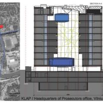
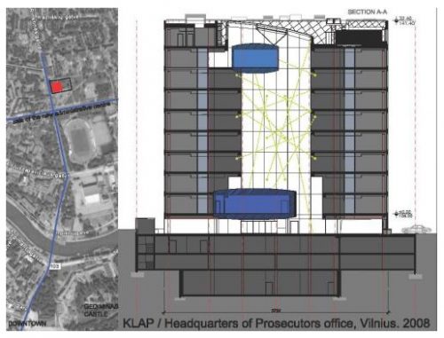
Its 18.800m2 are distributed in 13 floors, 10 on the ground level and 3 underground.
• Underground floors
The technical installations, archives and parking for 134 vehicles are in the underground floors.
• Ground floor
The main entrance has a low apparent height, although provided, so that subconsciously creates the feeling of having to stoop to enter, making visitors experience a sense of respect. This feeling is enhanced by the application of psychological impact elements such as the structure itself, a massive black cube “supported” in a clear glass base.
All building entrances, lobby, reception, safety input of staff, staff rooms, and cafeteria are located on the ground floor.
• Higher plants
The prosecution offices occupy the upper floors.
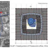
Above the hall on the ground floor, an internal space that connects all floors, an atrium from which “hang” conference and meeting rooms. This space is the “heart” and “brain” of the building. The rooms have a primary geometrical shape transform domed double curvature at the top and bottom.
Materials
Common and minimal materials were used to achieve maximum suggestibility and expressiveness, perhaps emulating the “Less is more” of Mies. There is a mix of rigor, simplicity and restraint in this work.
Common elements in their construction, reinforced concrete, stone, wood, glass and metal were used. The interior follows the trend, turning to the internal finishes to simple and easy to use materials that would ensure a good aesthetic.
