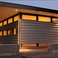
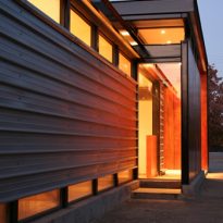
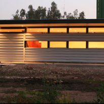
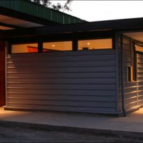
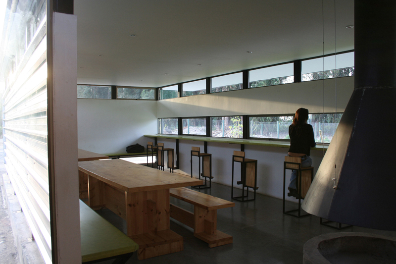
Dining room for workers within the Community of San Francisco de Mostazal

Introduction
It was needed a dining room for agricultural workers in the vineyard Camino Real SA, in the commune of Saint Francis of Mostazal.
The building had to be done quickly and cheaply. It was finally completed in less than two months with a final cost of $USD 32,000 ($CLP 18,000,000).
The idea from the beginning was to give workers a space where, in addition to lunch, they could take shelter during the working nights in which cold gets worse.
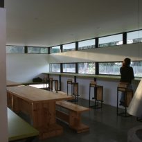
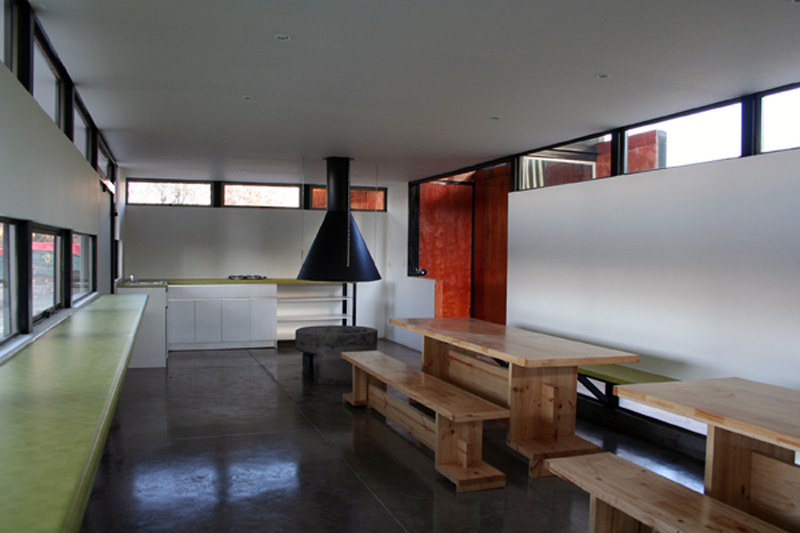
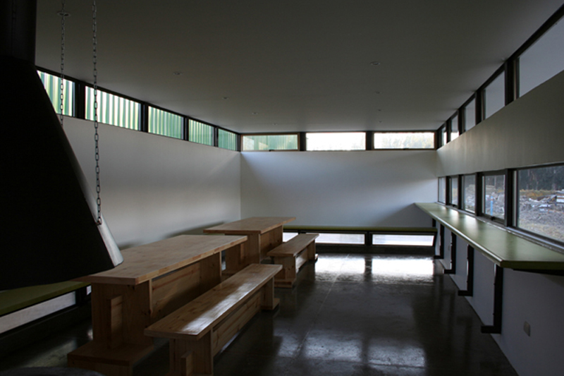
The architects thought about a clean volume and a unique space for 30 workers, specially fitted with a light shell because it is located north of a large shed. This lead to a single area where there could be a fire and that it could eventually be used for the meeting of working squads.
Location
The project is located in the commune of Saint Francis of Mostazal about 65 miles south of the capital, Santiago, Chile.
Concept & Space
In this construction the architects made clear that there is no need to face a large project or a complex program to develop a good architectural discourse. A dining room for 30 people, a refuge, almost a work shed, something for which most people wouldn’t have spent too much time, becomes a work meticulously planned and executed.
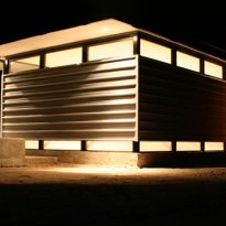
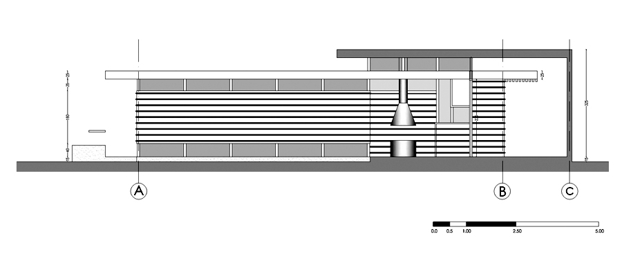
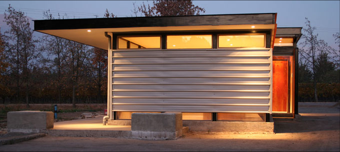
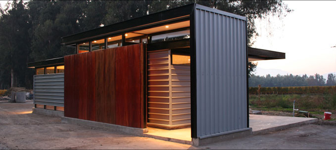
It starts as a parallelepiped from which with a series of operations of addition and subtraction it ends with its final shape and openings.
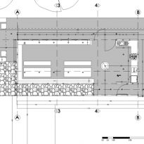
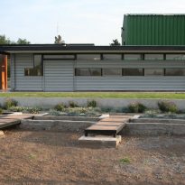
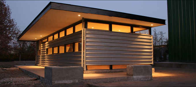
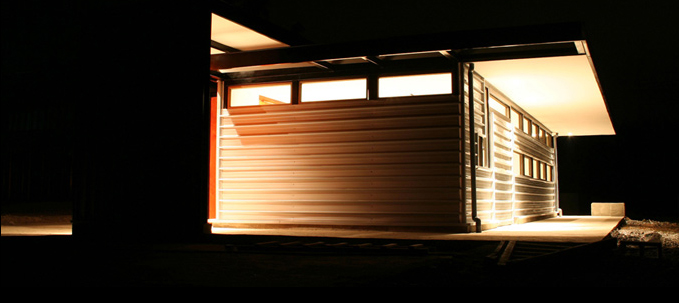
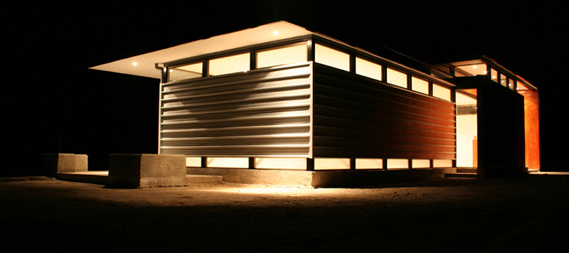
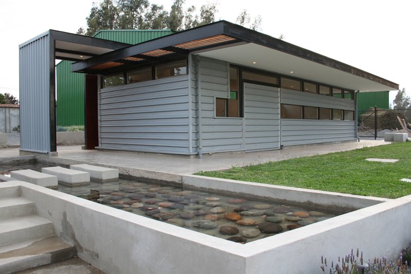
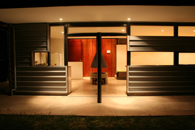
In its plan the volume expands incorporating different outdoor spaces distinctly paved, some of them under the protection of the corbel that the main space has on three of its sides.
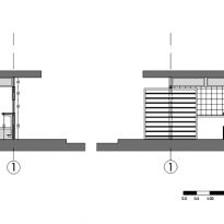
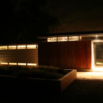
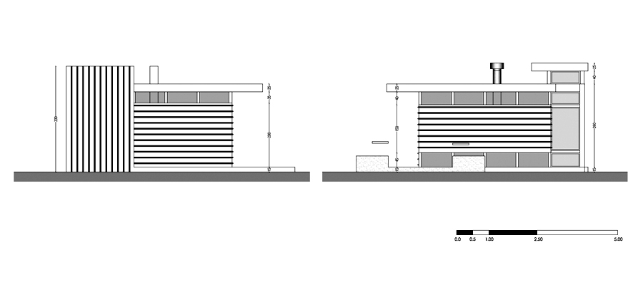
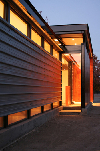
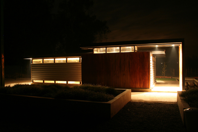
On the side where the main deck does not cantiliever we find the access, protected by two planes which fold over themselves making a form of “L”, one in plan and another in section. The plane with section in “L” is also slightly higher than the rest of the building, highlighting the entry as the space to which the user has to go as he approaches the building.
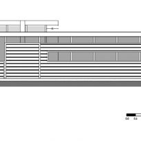
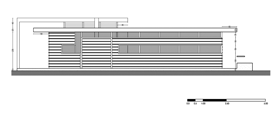
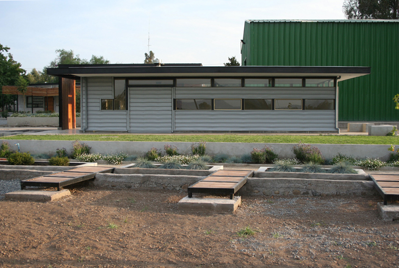
The openings in the facade are another critical element in defining the character of the building.
Remember that it is a refuge, a place to feel protected and also it is a lightweight construction, concepts often considered opposites or even incompatible.
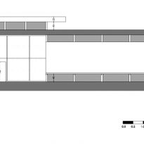
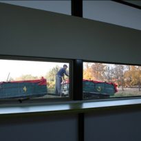
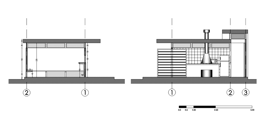
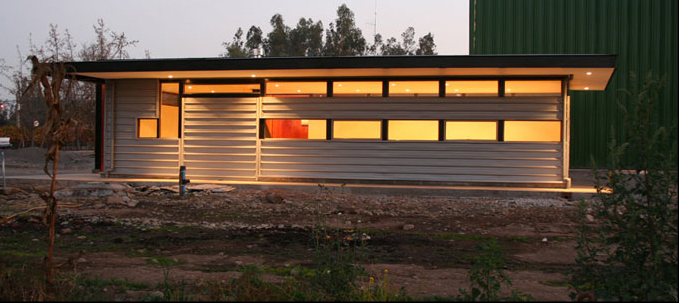
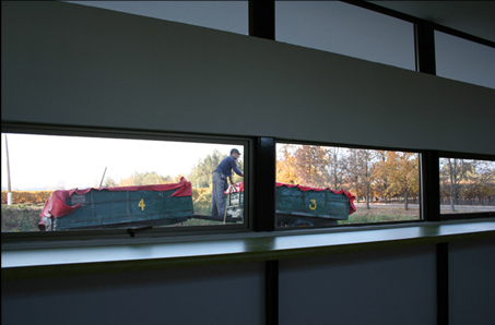
To achieve a successful compromise between these two situations a basic fact of human psychology was used. Our dependence on the eyesight above the rest of our senses. Humans get 80% of the information they recieve from what they see and therefore blocking the visual relationship between the interior and exterior gives a very high sense of safety or refuge, no matter how light the building is. For this reason, and without losing sight of the importance of natural lighting, windows were placed just above the worktops which are 90cm in height, so that a person of normal height has no visual relationship with the outside while standing or working on the counter.
A step further was even taken by placing another row of windows. This time at the height of the ledge and along the perimeter, emphasizing the sense of lightness, since it seems that the cover is not linked to walls and could fly at any time. But without losing the concept of blocking the visual relationships between interior and exterior and promoting natural lighting.
Structure and Materials
As it is a lightweight construction it was not necessary to dig the foundation and they were able to use a simple concrete base on the ground instead.
The building structure is formed by steel girders coated with ZINCALUM plates.
The entry volume was coated with wood to emphasize again that point among the set.
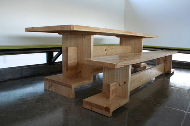
Inside, a smoothed down cement floor was used, while the walls and ceiling were painted white.
