Lou Ruvo Center for Brain Health

Introduction
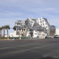
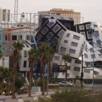
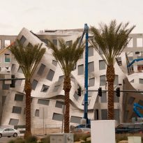
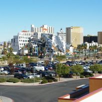
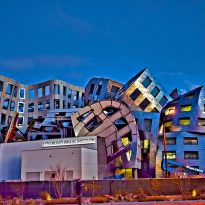
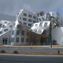
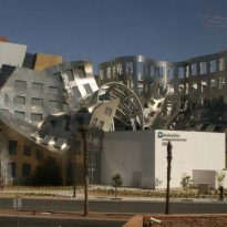
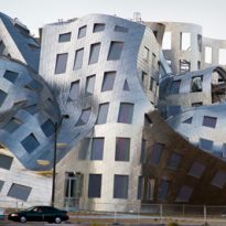
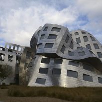
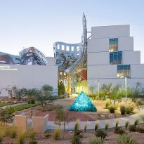
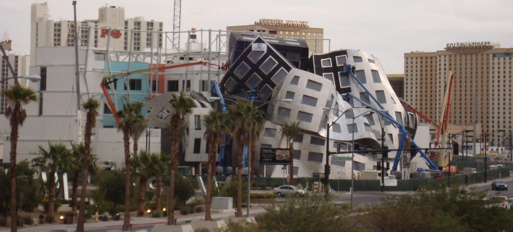
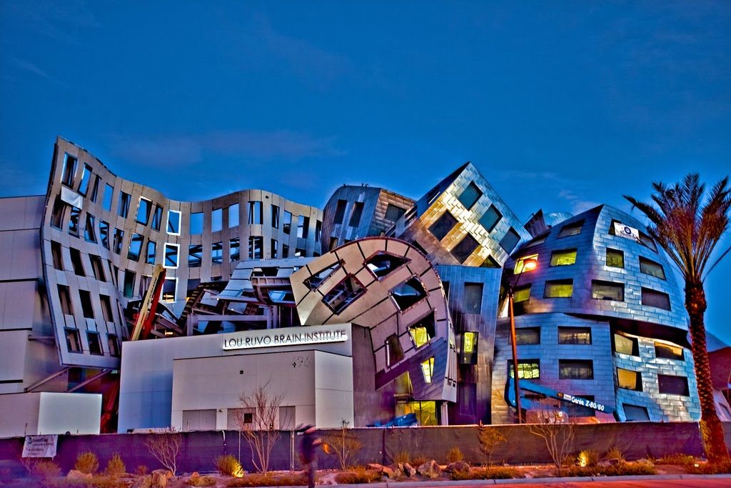
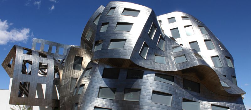
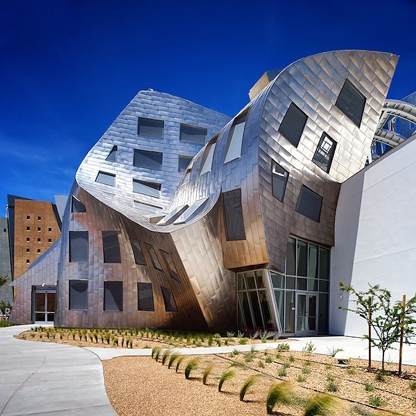
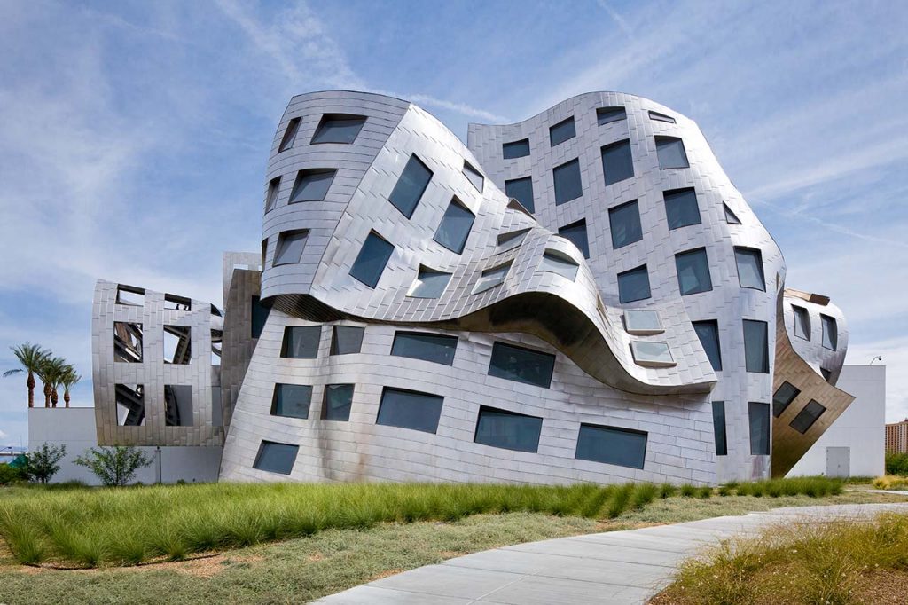
Cleveland Clinic Lou Ruvo Center so nominated from the resort extended its offer to reach an agreement with the Cleveland Clinic health center of multidisciplinary research and treatment Ohio, is an iconic landmark architectural Las Vegas. It was realized by Frank Gehry architect, its unique design and cozy atmosphere are a tribute to patients, families and staff who attends the center.
Gehry wanted to create a place that was memorable:”… The mantra is Keep Memory Alive… “he pointed. “…I’m trying to make a building that people want to visit, remember, speak, and enjoy, and ultimately partner with us in the center to help cure brain diseases…”
Many were the deals that made Las Vegas moguls with Frank Gehry to design one of the famous casinos of the place, but it was not until he met Larry Ruvo, distributor of liquor in the city and who started a research center for diseases neurological after witnessing his father’s struggle with Alzheimer’s, the architect found ready to leave their distinctive mark on the area.
Meanwhile, Gehry lived near one of the consequences of these diseases, Huntington’s disease affecting the wife and three of his sisters friend and analyst whose request Milto Wexler and served on the board of the Hereditary Disease Foundation for 30 years. To include this disease in the list of those that would be treated and investigated was the only condition that Gehry Ruvo demanded to carry out the project.
Location
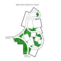
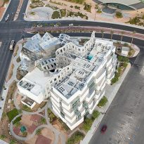
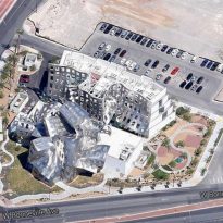
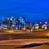
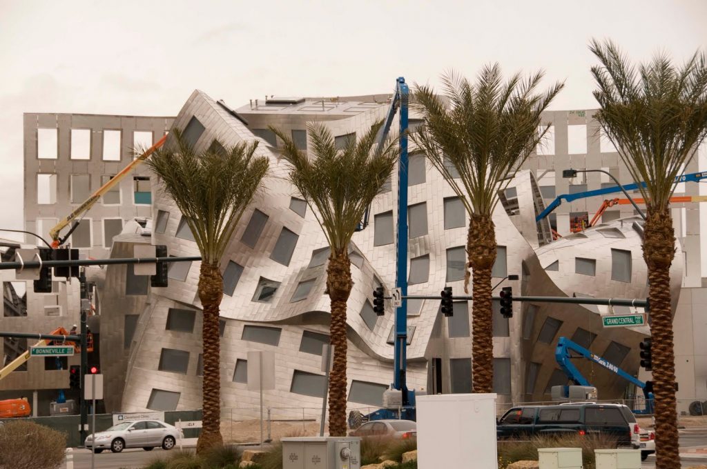
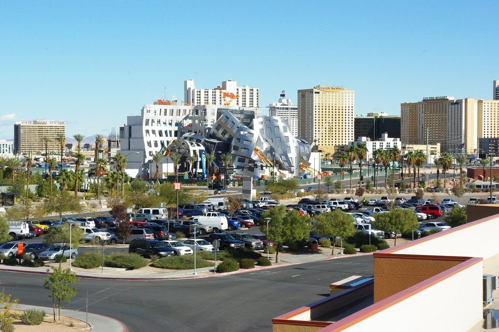
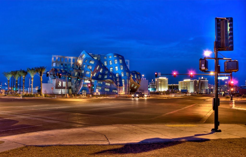
The Ruvo Center stands on the limited plot poor Bonneville Av, Promenade Place, W.Clark Av and Grand Central Pkwy, with its main entrance on 888 West Bonneville Avenue in downtown Las Vegas, approximately 1.5km from the huge casinos in Nevada,USA.
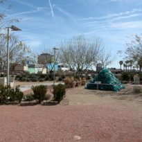
The Center designed by Gehry will be the focal point of the new Symphony Park development of Arts and Sciences, in downtown.
Concept
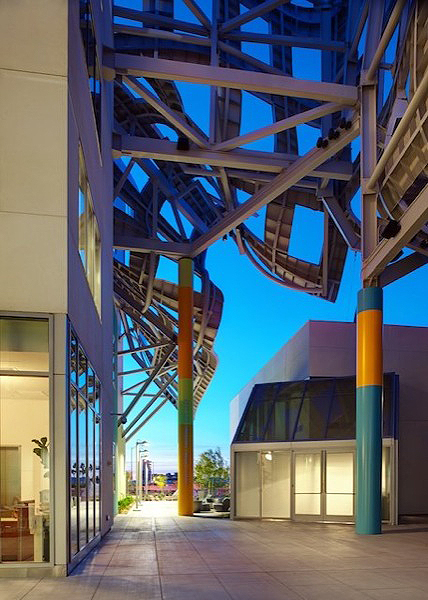
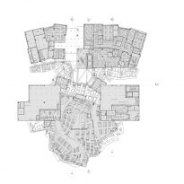
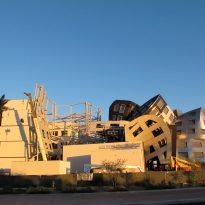
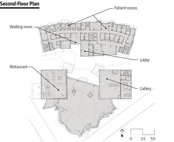
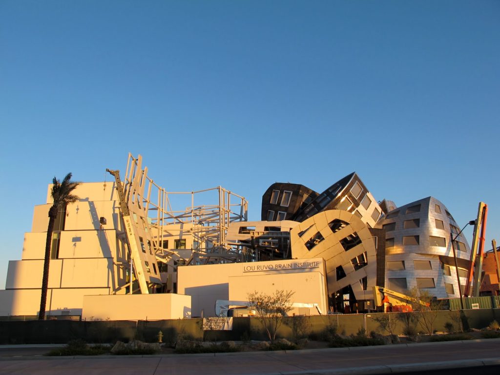
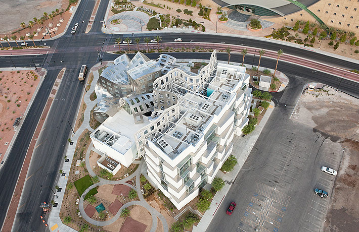
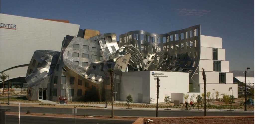
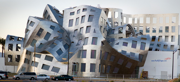
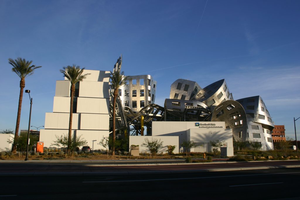
The two main areas of the building, separated by a corridor that marks the opposition of one another, bring to mind the classic dichotomy of the cerebral hemispheres, the medical and research wing more rational and contained and de events hall, more free and fantastic..
This gap also seems to allude to the divided loyalties of architects in their work should pay equal attention to practicality and creative, order and desire. Gehry, in particular designed based on an approach that varies between analytic and completely intuitive.
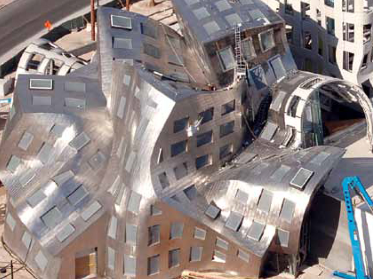
However, the success of the project lies in the relationship section of the two components, as a piece seems to “affect” the other. This relationship between the two separate wings gives the design its surprising emotional impact. Simple physical connections between buildings, in a metaphorical level, representing the movement that patients are slowly releasing.
The writer and architecture critic Christopher Hawthorne says : “… The movement unobstructed, informal, which promotes the design from one wing to another suggests the way we use our brains every day, flowing from the left brain to the right brain thinking, and back again without noticing the difference…”
Surely for some it may seem crazy, but in this building we hat to give Gehry the benefit of the doubt on the significance he wanted to give the building. The architect may be using a familiar aesthetic, but something seems different. Tectonic talks over the creation of a sense of decay, possibly an architectural position on the damage the disease can inflict on a person, or possibly architecture is even broader than the aging issue.
Spaces
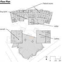
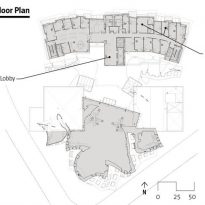
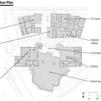
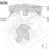
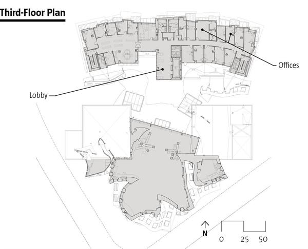
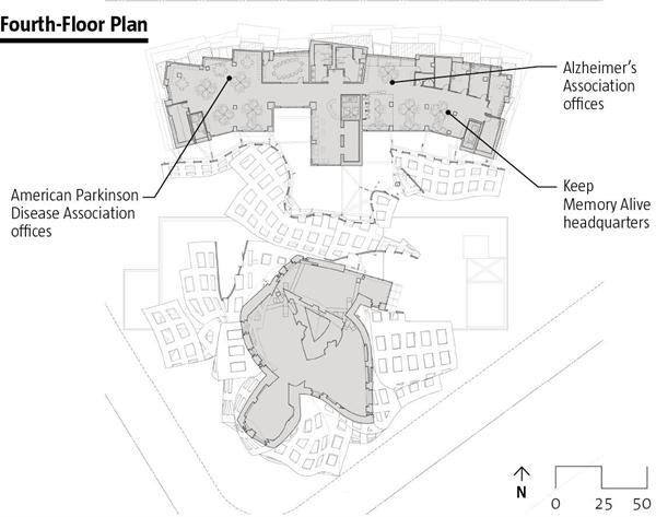
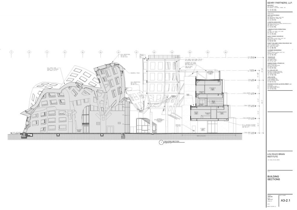
The building of 5.574m2 is divided into 4 floors, with 13 rooms for medical consultations, 27 single rooms for patients, research areas, an auditorium and a Museum of Mind.
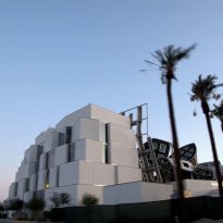
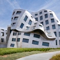
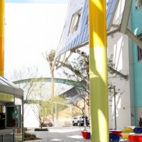
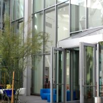
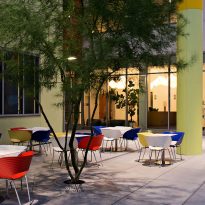
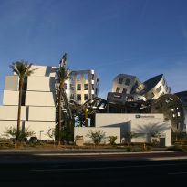
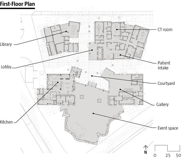
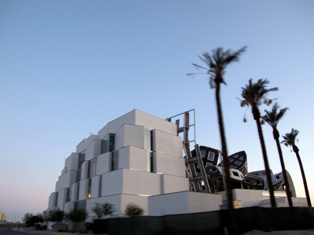
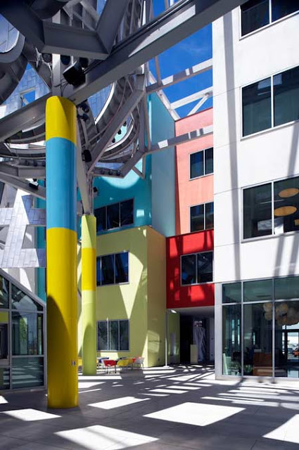
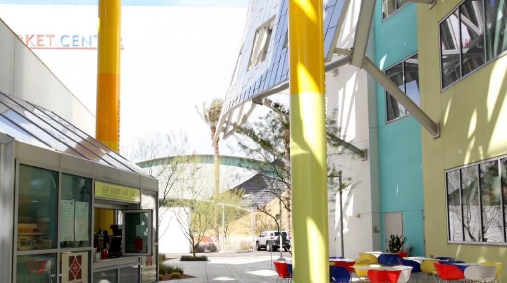
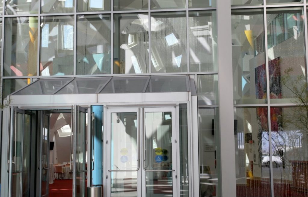
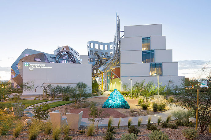
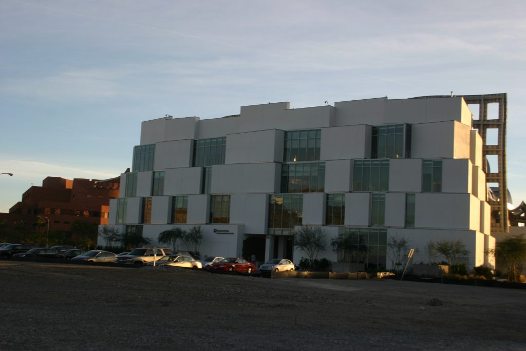
Guests and patients parked outside the clinic, with its stepped angular facade glass cubes and white stucco. A corridor on the ground floor of the clinic leads to the entrance and exits to patio, connecting to the Activity Center and whether to continue with the Garden of Reflection.
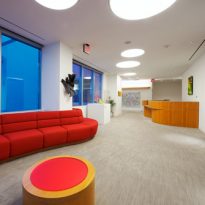
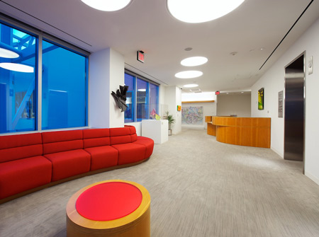
Inside the clinic, Gehry worked to create an environment that evokes a medical setting. He made sure that all doors, frames and furniture were built with rich Douglas fir, honey-colored. This is the same wood used with great effect, in the Walt Disney Concert Hall at Los Angeles , there to create a psychological connection with the instruments, here is a calming presence. Create curved passages carefully tailored sight lines that limit interaction between patients in different stages of the disease.

Sections
The design architect Frank Gehry is divided into two different wings representing logical and creative aspects of brain function.
North Wing
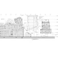
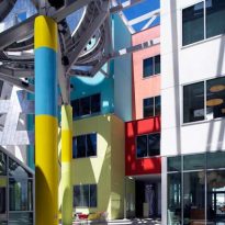
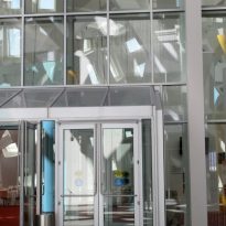
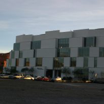
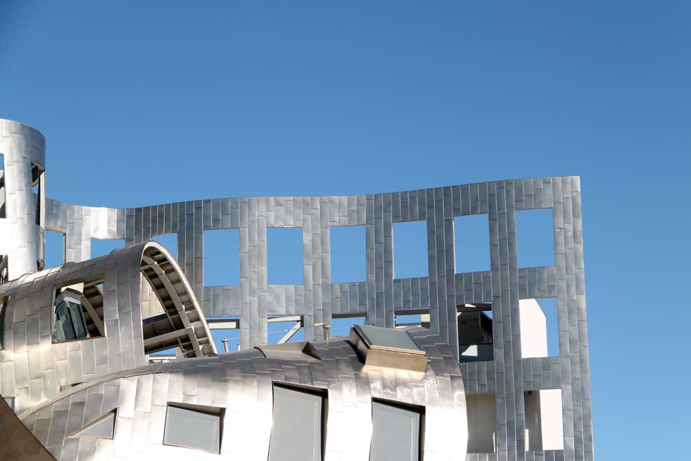
The north wing, four-story structure, houses the “logical” aspect of the building, clinical research, facilities for the care of patients with Alzheimer’s or other mental illnesses and suites neuroimaging. This area is designed functional and simple, a conical stack of rectangular boxes with white stucco interior and beveled glass.
South Wing
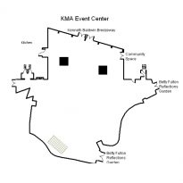
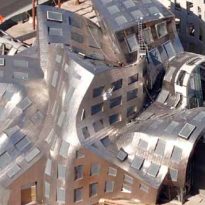
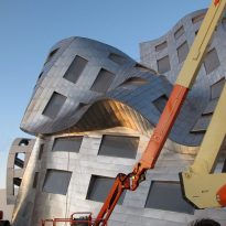
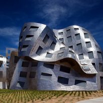
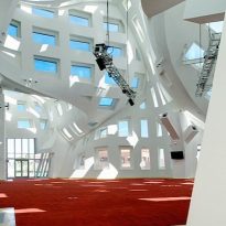
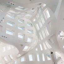
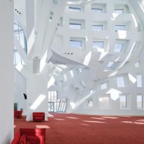
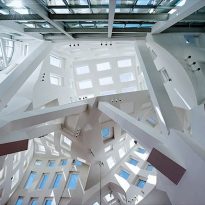
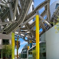
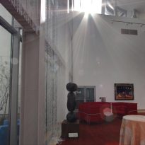
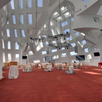
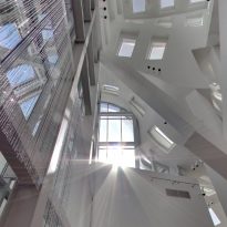
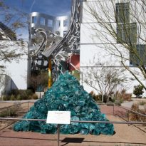
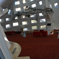
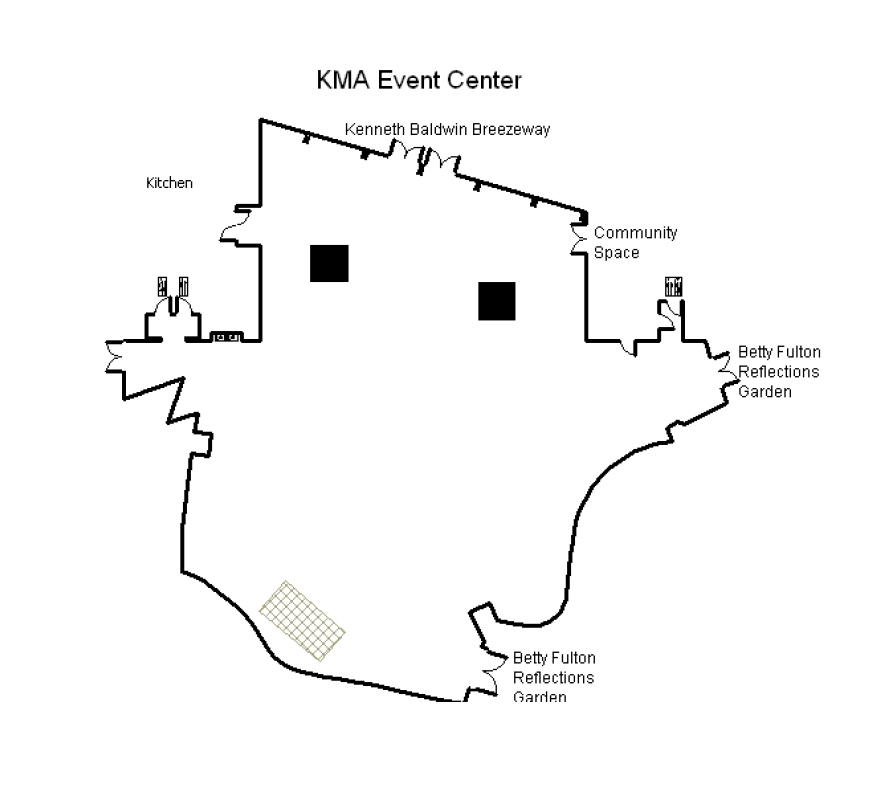
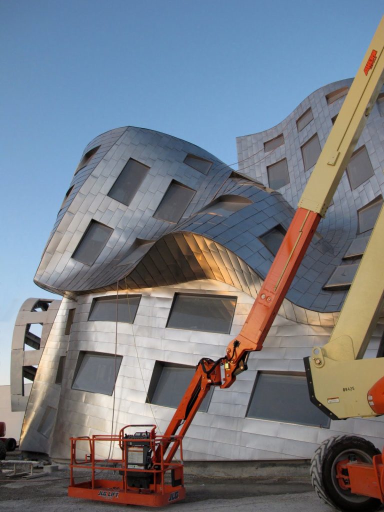
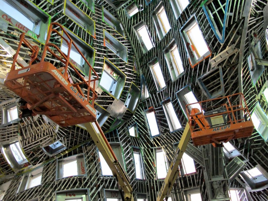
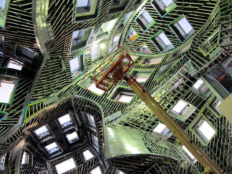
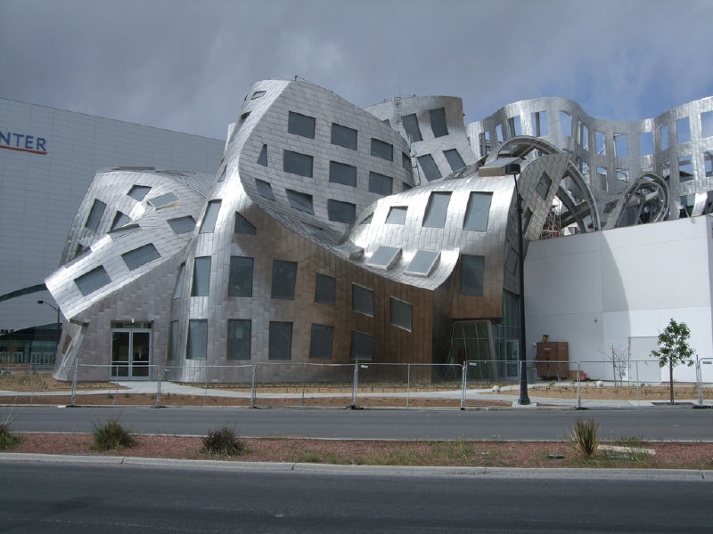
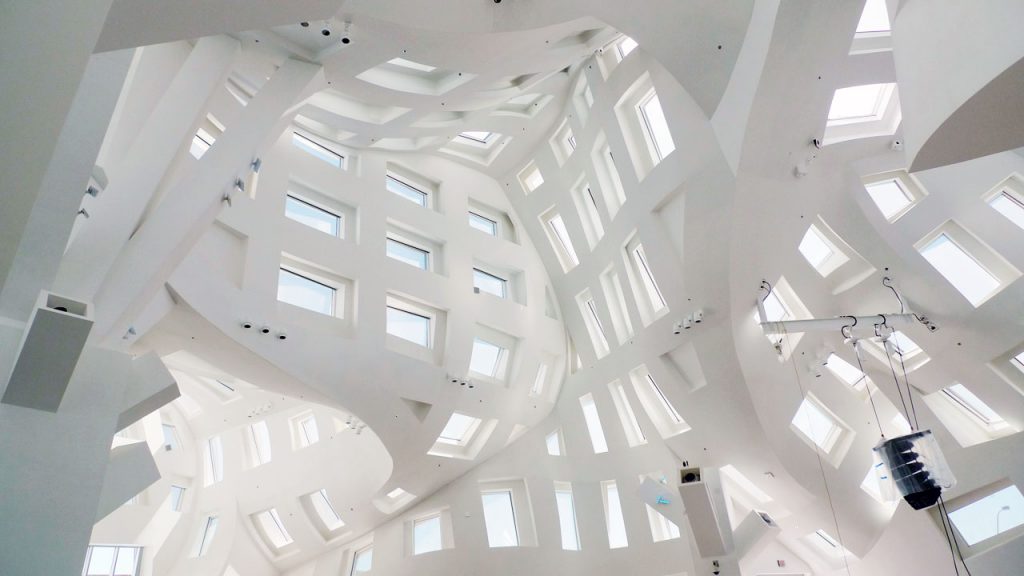
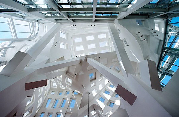
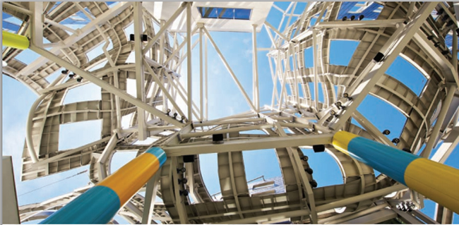
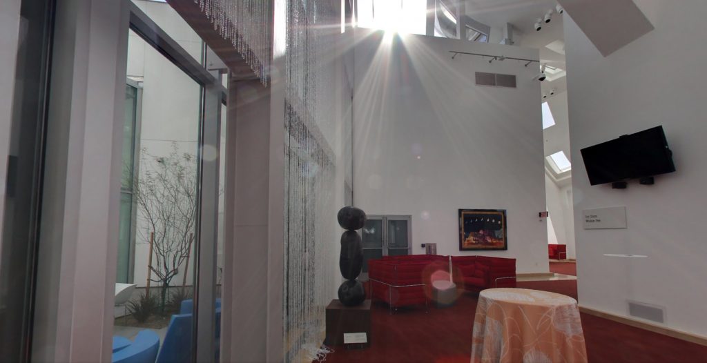
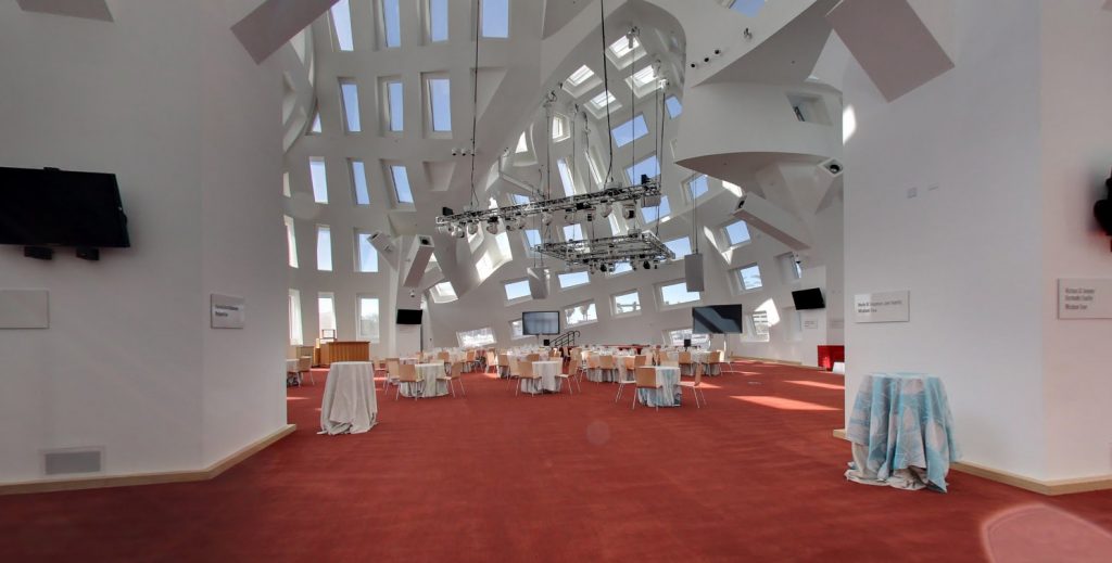
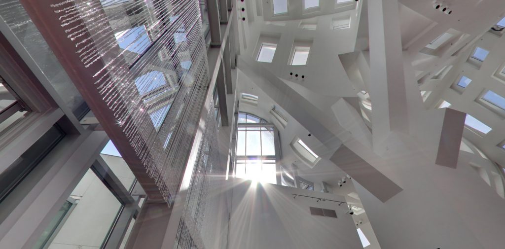
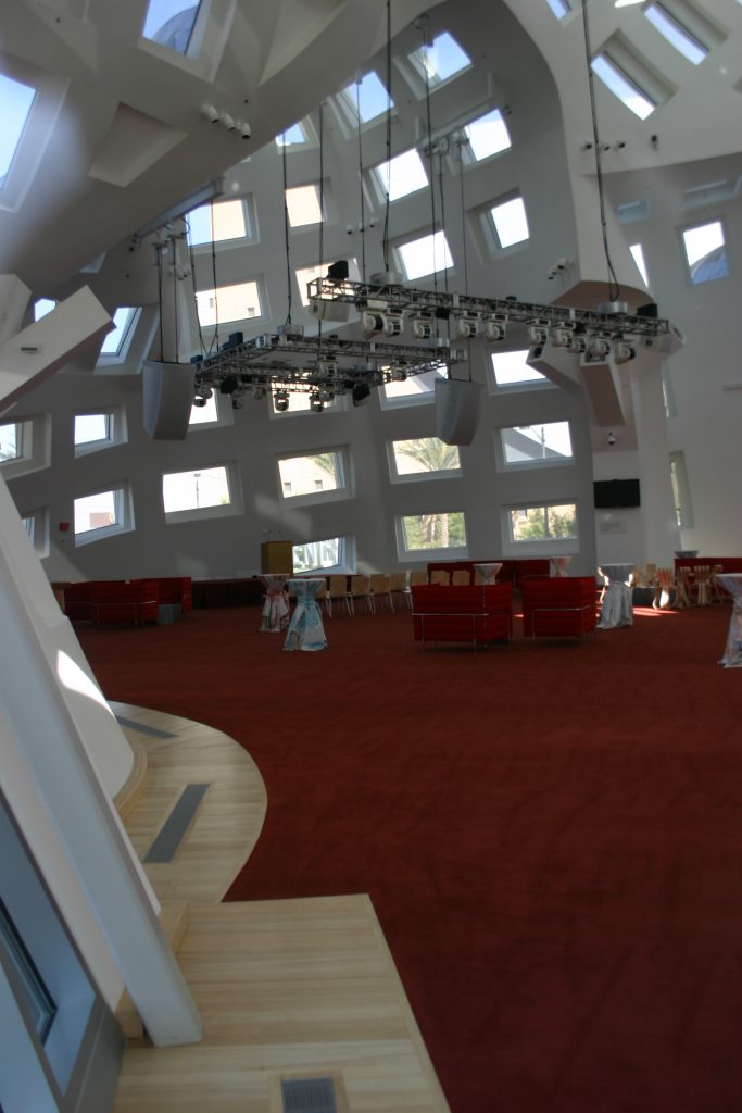
This second sector reflects creative thinking. Located in the south wing is visually spectacular. It is a steel and glass structure of one room sheltered by an impressive ceiling height and a wild ripple. This great court, Keep Memory Alive Event Center, is intended to fundraisers and public education. Critics have labeled the area as “one of the most impressive interiors designed by the architect firm, Gehry Partners, from the Disney Hall.
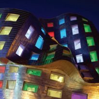
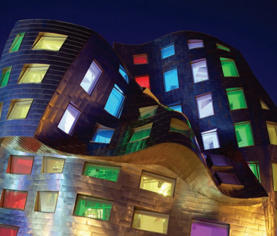
The LAC, The Life Activity Center, is simply an event space with no access to patients, designed to accommodate all types of events and occasions. The profits help fund further research into the medical building. The interior features normal lighting and also with LED lights that can provide dramatic lighting both indoors and those who observe the building from the outside, at the crossroads of Las Vegas.
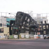
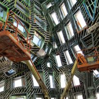
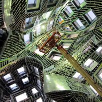
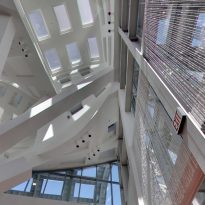
The interior design of Gehry’s work forges new territory. The architect usually surrounds their buildings in a skin, but in this case separates the backing from the lower structure to create an independent structure surrounding a dome, cathedral space with lines that plunge deep paneled windows, especially successful in one place as Las Vegas where architecture is considered entertainment and authenticity is generally irrelevant.
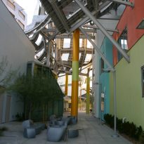
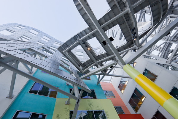
After removing the wrapper striking the main structure of the clinic, Gehry’s joined by a courtyard with a slouchy environment. The side views show the clinic remains a closed form shell resists. Neither party invades the other.
Third Sector
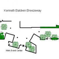
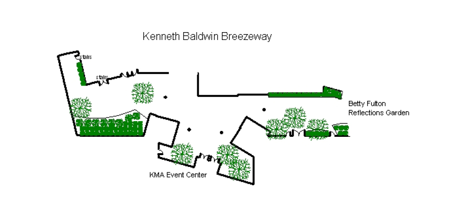
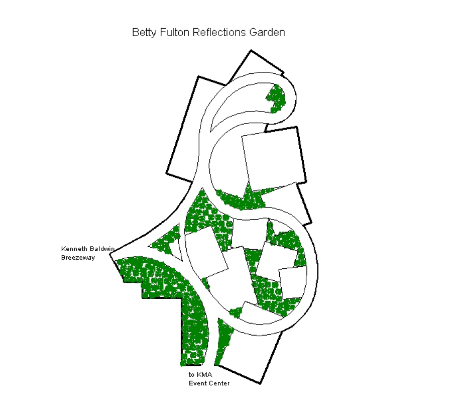
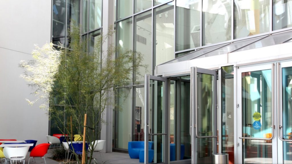
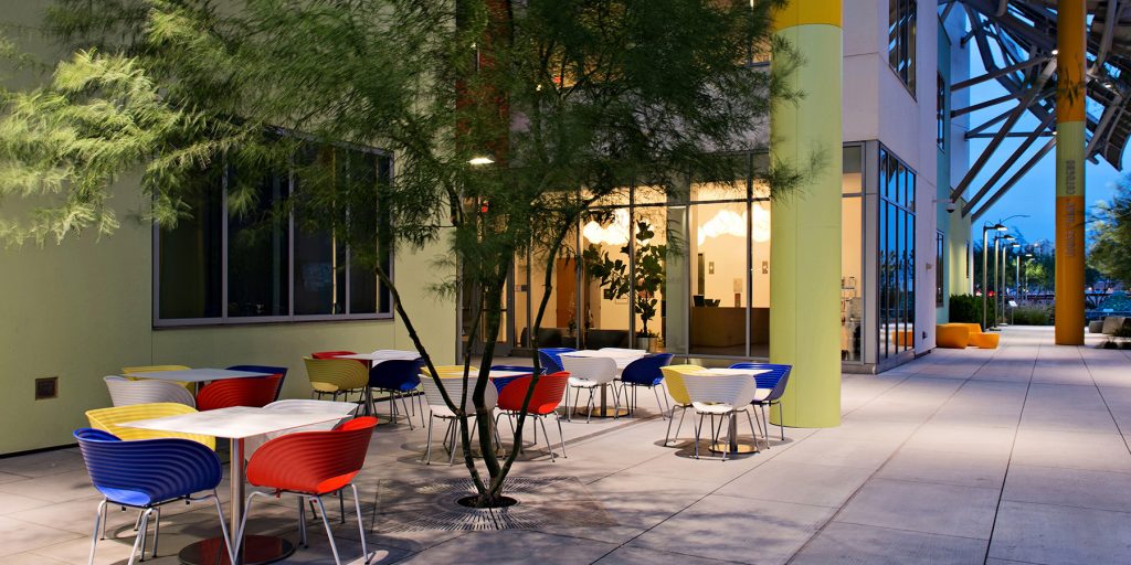
The third sector tour greenery separates the above two. Designed as a space for conversation and relaxation for medical staff, it has a café, which through a system of shading, avoiding direct sunlight and ventilation, so the staff can enjoy the climate of Las Vegas and see the Garden of Reflection which opens to the this.
Structure
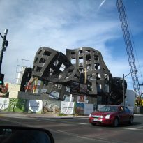
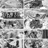
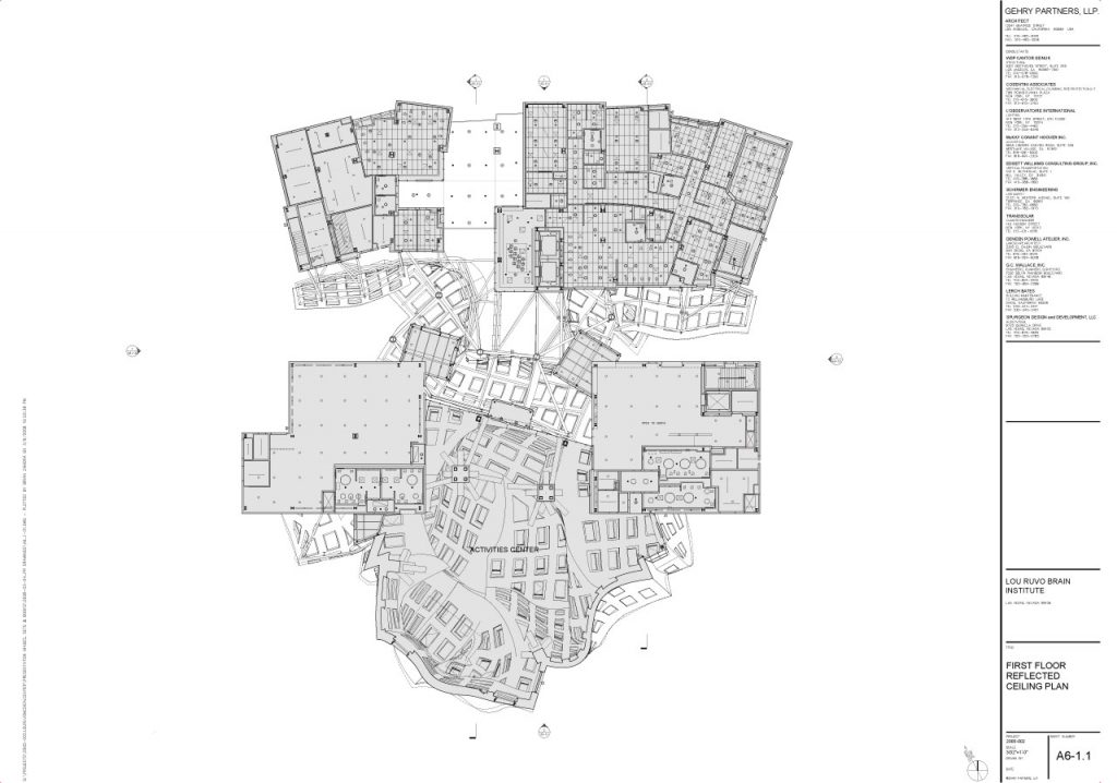
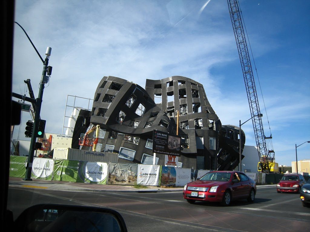
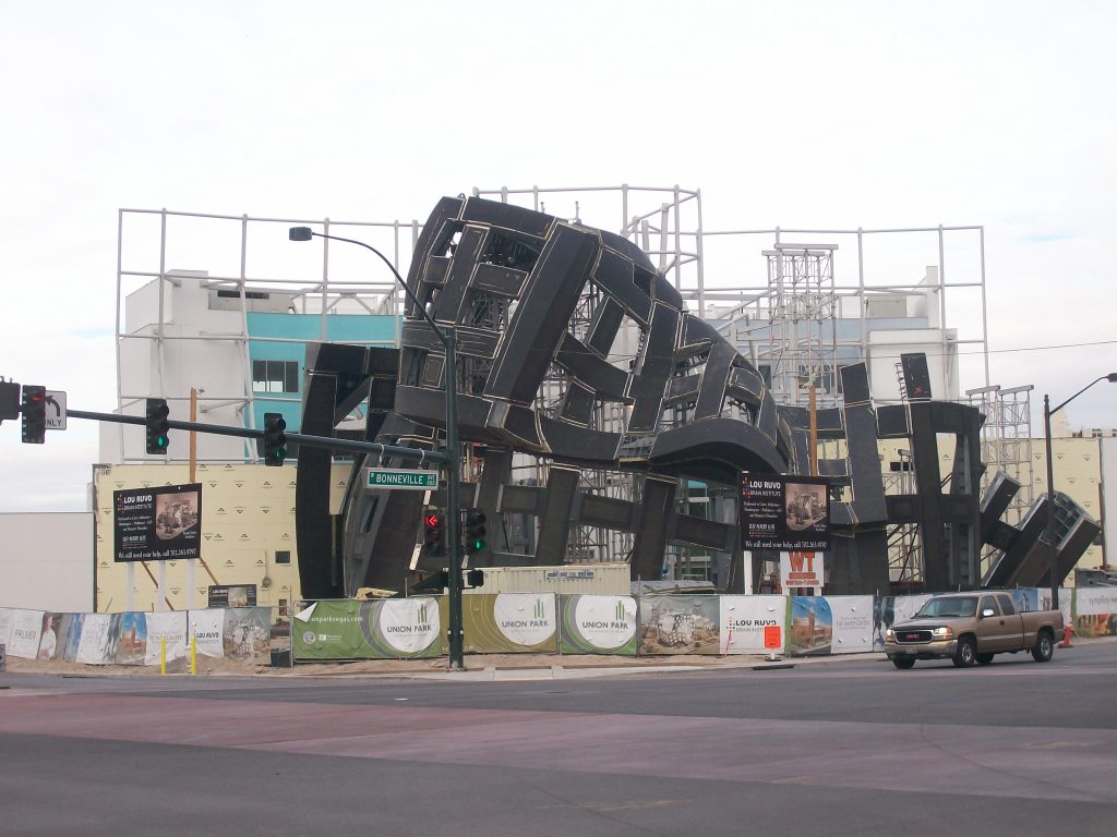
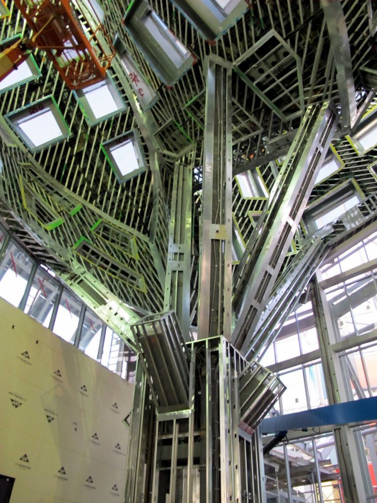
The three-dimensional nature of the building and the lattice structure requiring all trades to work without the benefit of flat printed. Manufacturing tolerances for the lattice structure and panels required by engineers and architects close collaboration to successfully reach the end of each stage of construction. All lattice panels and support were made in Germany and assembled in situ. Others components were manufactured in China.
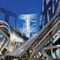
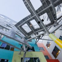
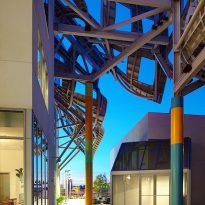
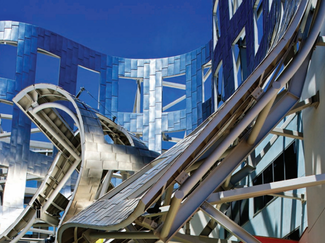
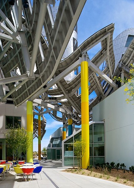
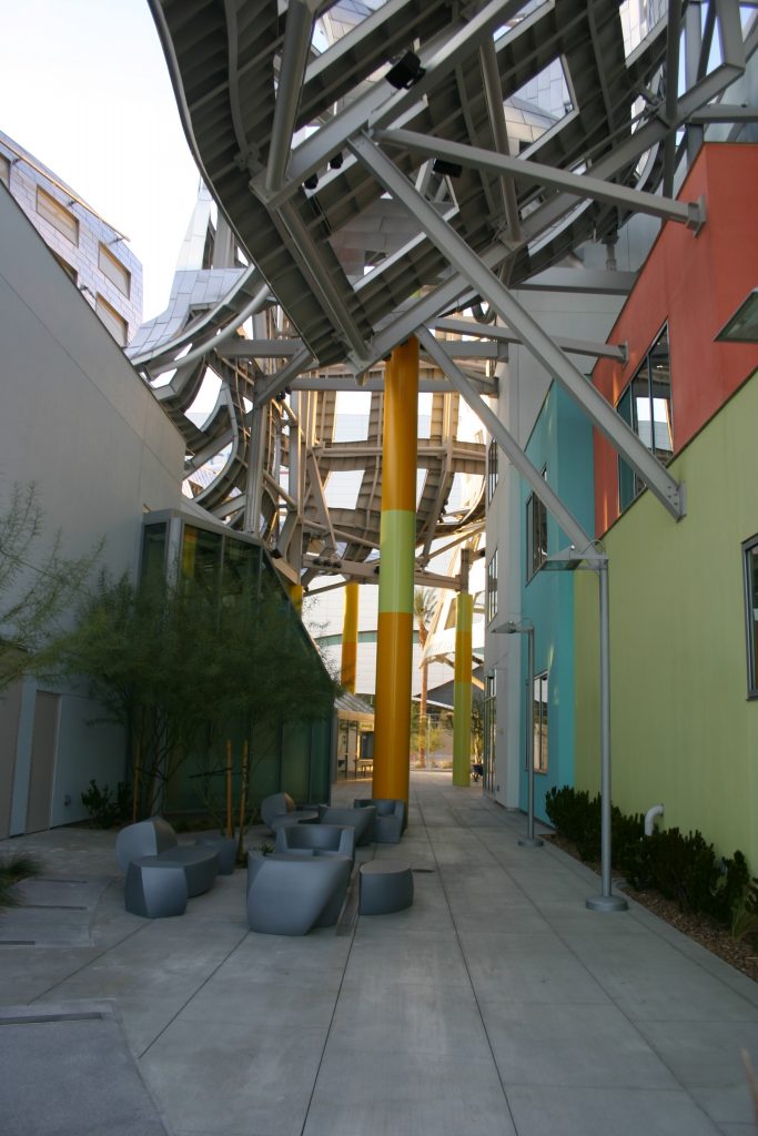
The clinic building has a structural steel frame and composite concrete metal deck floors, while a distinctive curved trellis overhanging stands on its southern façade, a particular breezeway marks the transition between the two buildings of the complex.
Structural system
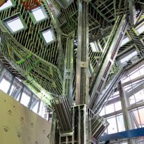
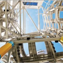
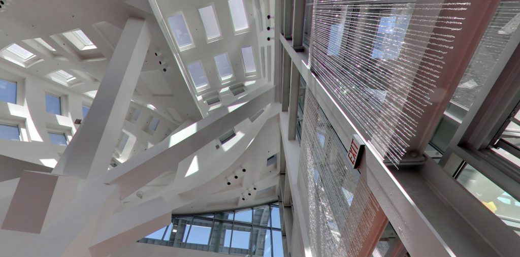
The structural system of the south wing “The Life Activity Center” ( Event Center to keep alive the memory ), consists of a prefabricated structural steel casing, a grid system with steel panels, complemented by two internal columns of type “tree” with steel plates and a height of 19m. Entire system is largely self-supporting, making possible the large open space off columns that form the inner court.
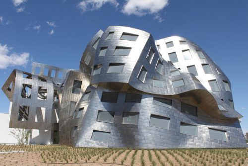
Architectural and engineering coordination in the design for the building development was one of the essential requirements to carry out the complex structure. WSP engineers used 3D BIM technology for Digital Project and to design structural steel elements that fit the complex geometry of the different parts of the project. Due to the irregular elevation of the north front of the clinic, the precise details of the steel structure and coordination with the architectural requirements was crucial.
The cantilevered support structure of the curved grating created significant challenges and analysis as they had to accommodate considering lateral seismic and wind forces. Eventually all steel connections, most of which were atypical, had to be designed and manufactured individually.

- Complexity
It is one of the most complex designs of the architect. Steel curvatures form a self-supporting structure covered despite window openings and hatches incorporated in its design, which openings are inherently a source of weakness. The magical contrast between the outer swirling and soaring interior space reflect this complexity.
Each piece of steel contains between 60 and 100 bolts bind together smaller components. The more connection points, less tolerance for error. Indeed, parts of the lattice of the lattice was necessary to adjust between 2.50/4.0 cm from each other. Any error would have required a complete disassembly and reconstruction of 544 steel elements and 30,000 screws used.
- Barcode Tracking
During manufacture, the engineering team determined a unique barcode for each piece of steel, which then facilitate identification.
With the installation of each module in Las Vegas, surveyors arrived at the site to scan bar codes, which information was transmitted to the engineering team in Germany for verification. This system allowed engineers to examine each piece individually, taking into account its relationship to adjacent parts, represent and calculate whether any adjustments to land was necessary before placement.
- Stainless Steel tilings
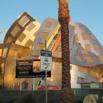
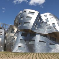
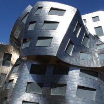
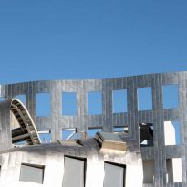
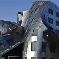
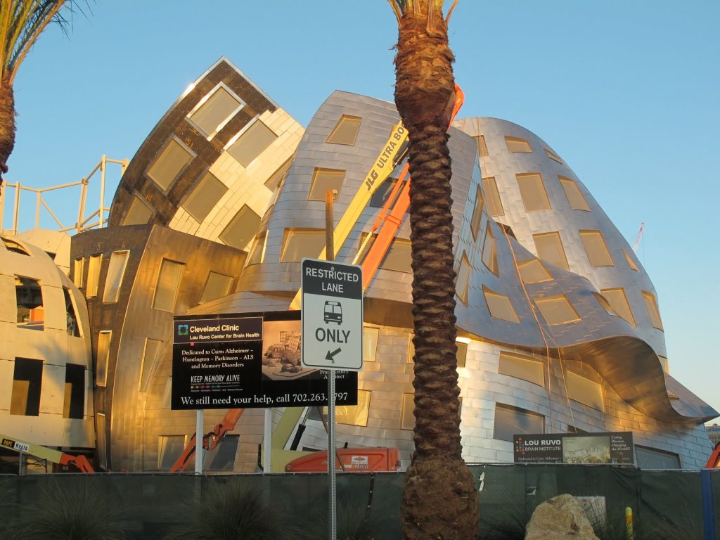
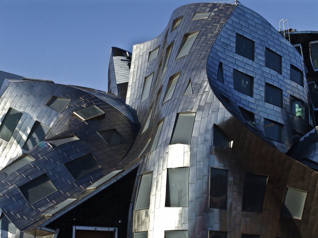
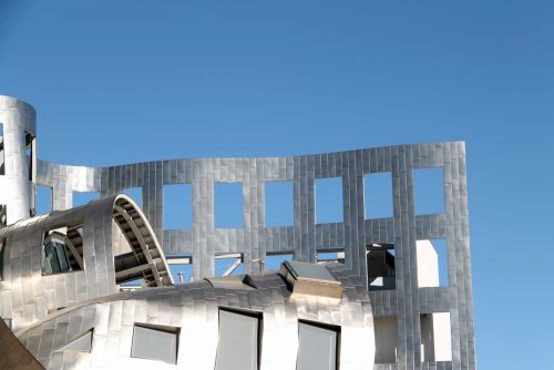
Before giving final shape, stainless steel sheets were placed in the outer surface of the building, which had been marked with a grid of white lines. The steel was measured, manufactured and adapted to overlie or lock edges to be installed. By machinery was given a termination “angel hair”, a non-directional finish, random, diffusing sunlight without glare.
- Acoustic
Due to the uniqueness and complexity of the roof, the acoustics of the room was modeled computationally events during the planning stages and subsequently verified and refined in place.
In coating walls pumice type absorbing sounds BASWAphone, settled on glass fiber, which in turn was covered with a false wall. The BASWAphone is an absorbent material that looks painted plaster panels that was applied to all concave surfaces that can create an uncomfortable “focus” of sounds and all surfaces that said additional acoustic engineer.
- Waterproofing
The building was coated with a layer of black rubber to keep it tight. But pierce waterproofing with rivets for hanging steel shingles leak occurred almost impossible to detect due to the complexity of the cover. It was expensive and required a scrupulous analysis, section by section in an attempt to identify and repair leaks before installation of the metal roof.
Construction reports

In the construction were used:
- 199 windows, none of them equal
- 18,000 stainless steel tiles, each cut with unique measurements.
- 875 shades of steel shingles
- 30,000 steel screws
- 544 special steel parts were manufactured, with a weight ranging between 900 and 4500kg.
- 65,000 hours of engineering work
- 2 continents, sea and desert crossing had components made in China to get to Las Vegas.
- 3 years, 3 months and 13 days: time since beginning the February 9, 2007 until the official opening day, May 21, 2010.
- 910m2 of event space for up to 400 seated and 700 standing attendees
Windows
The size, shape and plane is diffent in each of the 199 windows. Their forms are the result of computer studies which should be determined for each location and thereby optimize the conservation of heat or air conditioning.
The cleaning system of the window is a challenge because they are located in different planes, in a ward with many curves. However, most of the windows are accessible by lift. In the highest part of the roof system ” all arrest”, which makes the process safer maintenance and washing was installed. The cleaning solution is to use water that has been processed through reverse osmosis, thus eliminating spots during the drying process.
Longevity and sustainability
The building has been designed for posterity, with features that will help to withstand the desert climate.
- There is no concrete wall at the base of the building, being waterproofed and covered with steel.
- Throughout the building, the areas not covered by steel or glass have been protected with a system of 3 layers of stucco of 1 “thick each.
- The “curtain wall” or north-facing glass and aluminum entry to the Event Center, is 19.20m high at its highest point. Due to the extreme temperatures in Las Vegas, spacers in the aluminum support system have been installed so that permit expansion of 5.5cm above the vertical 19.20m.
The building has many environmentally sensitive features, including:
- Motion sensors in all light switches in the medical building.
- Climate control in the occupied only the lower 4.50m Event Center.
- Light sensors that track the sun throughout the day and react as needed to keep the heat or air conditioning.
- Energy-efficient windows with glass in a semi-opaque component and four-layer tear resistant material sandwiched in between.
- The medical building has most of the glass facade facing north. The structure of the courtyard cover, acts as an umbrella, “brise soleil” sifting southern light inside the building.
