South District Municipal Center

Introduction
The Southern District Municipal Center Ziperovich Rosa was created as part of a high-impact urban operation in a city like Rosario extensive territory; a process of decentralization and municipal modernization that aims to promote citizen participation and governance closer to the interests and needs of the residents, building cores development, transformation and comfort for the population. This is one of the six venues created by Rosario municipality to realize the above process.
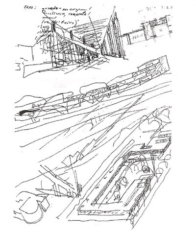
For the project, the municipality summoned the renowned architect Alvaro Siza. This is the first work of the Portuguese in South America. It is easily recognizable style, with a sober design aesthetic purity and formal synthesis.
The building is named in honor of the Outstanding Citizen Rosa Ziperovich who fought for public education and human rights.
Situation
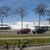
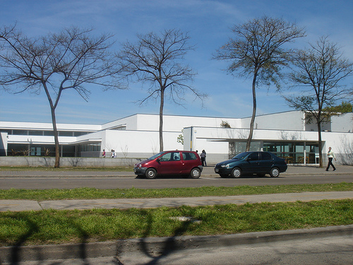
The location of each Center has been designed as a generator of new urban centers, with good accessibility and with features that allow them to be related to the areas in which they operate. The Southern District Centre is located in an area always postponed city, on an area of 8200 square meters. The surrounding land are occupied by low houses, with a predominant height of six meters, with lines of trees on sidewalks, forming a continuous urban landscape.
Concept
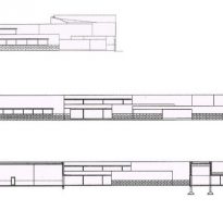
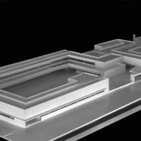
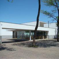
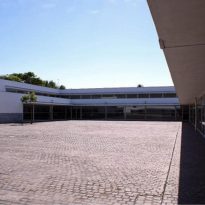
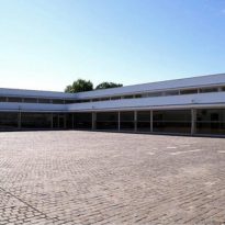
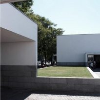
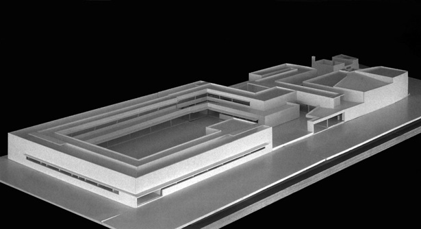
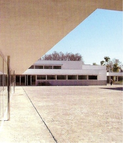
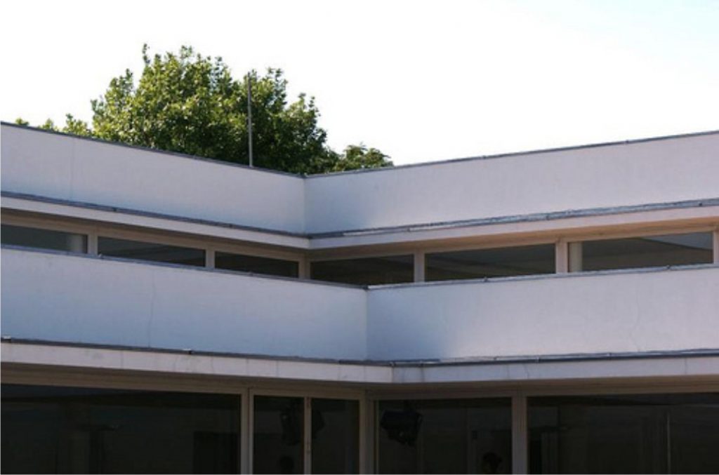
The building is inserted into the cityscape without altering it, as if it had always been part of it. Upon recognition of the environment, Siza respected its horizontality and continuity and developed the work on one floor, with a geometry that is identified with the grid of the city. Thus, he avoided making a monumental building but without sacrificing role of a public building.
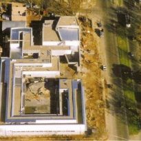
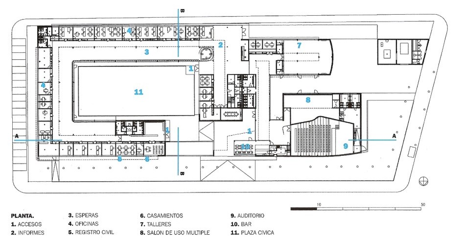
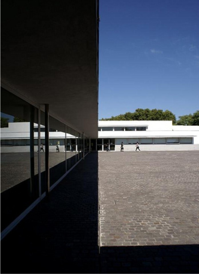
The work is located on the ground hugging its edges and open at one point invited to join the vast civic plaza that is discovered. The functional scheme is simple to facilitate recognition of spaces for those working in or visiting the building.
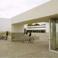
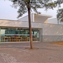
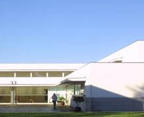
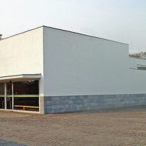
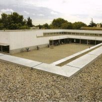
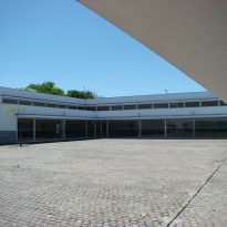
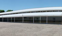
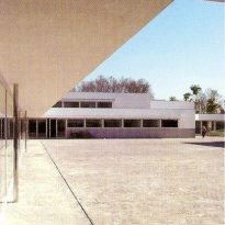
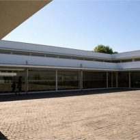
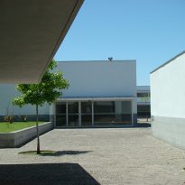
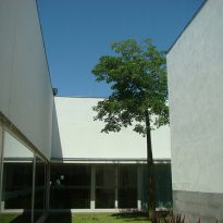
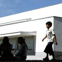
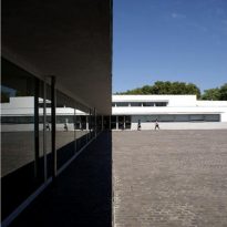
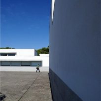
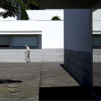
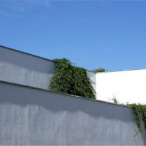
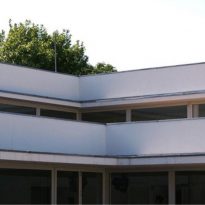
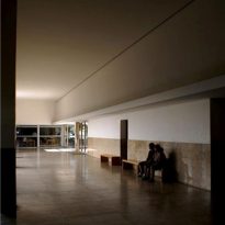
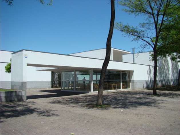
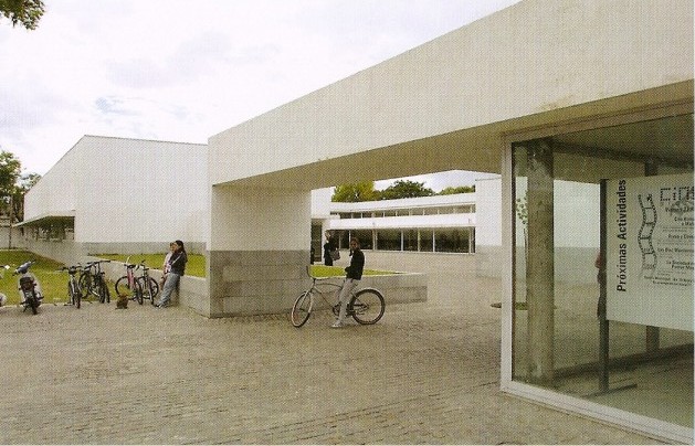
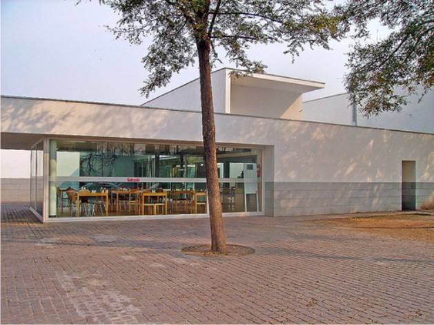
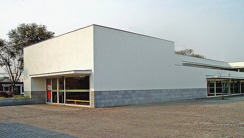
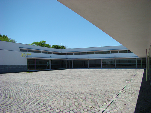
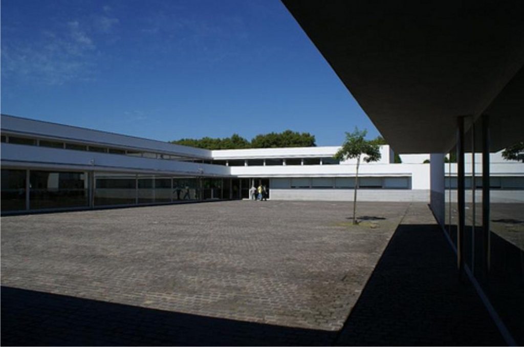
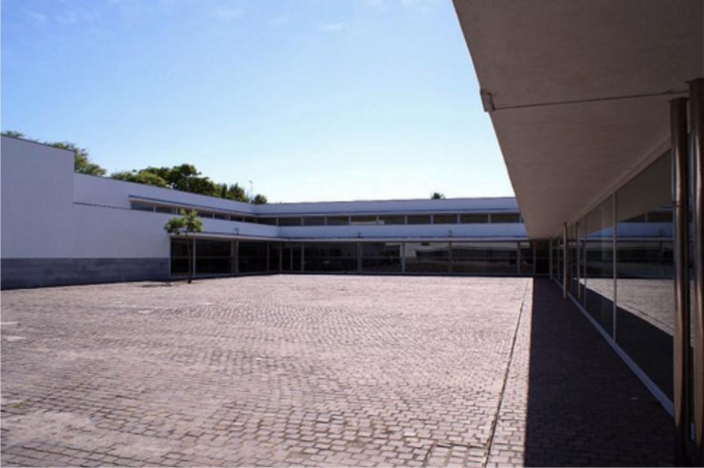
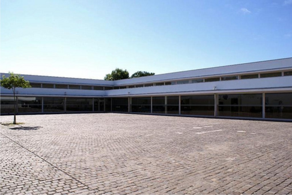
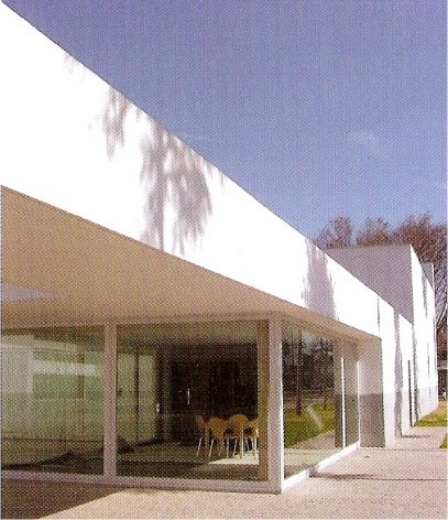
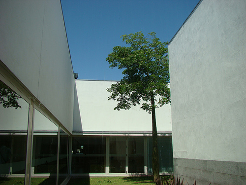
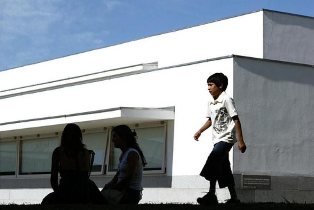
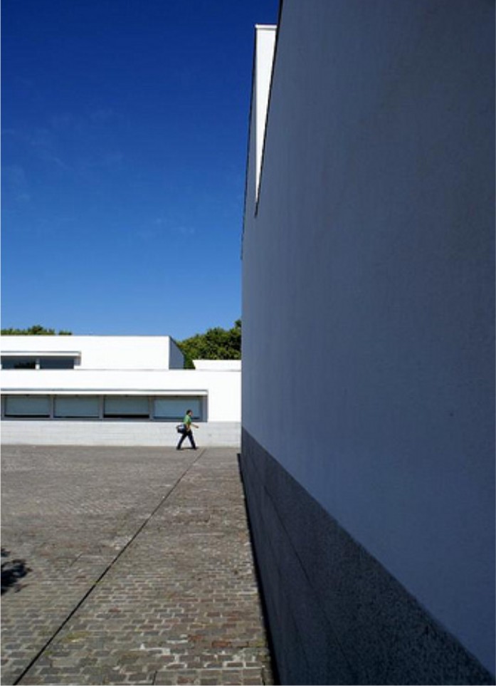
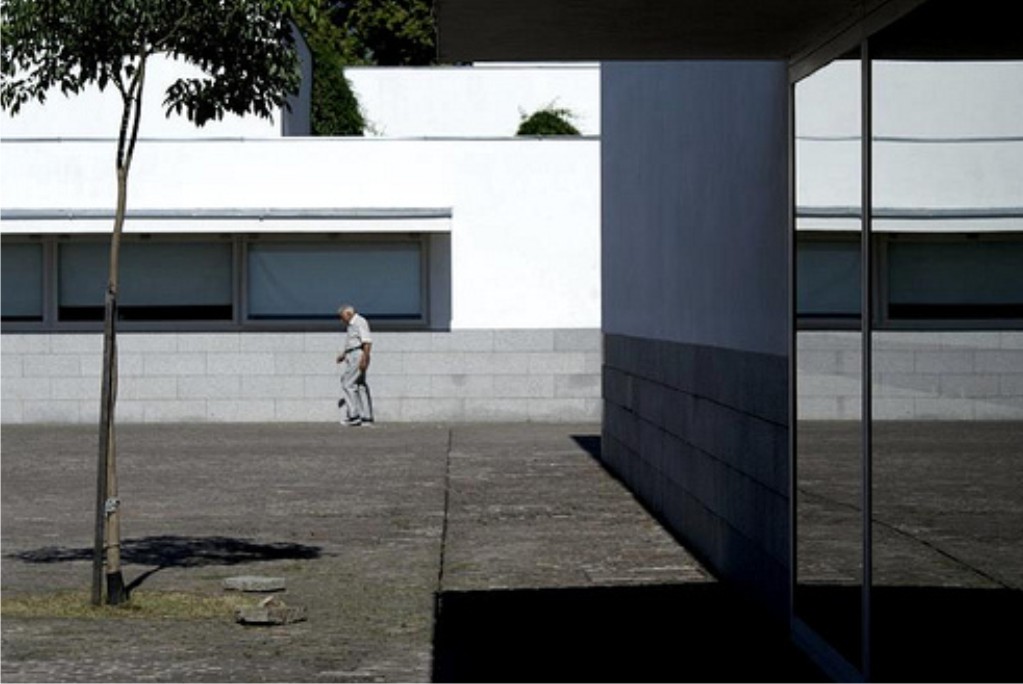
The Centre takes a serene image, characterized by long straight lines, white walls with a gray stone base and large windows.
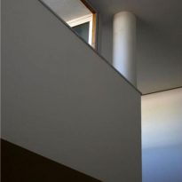
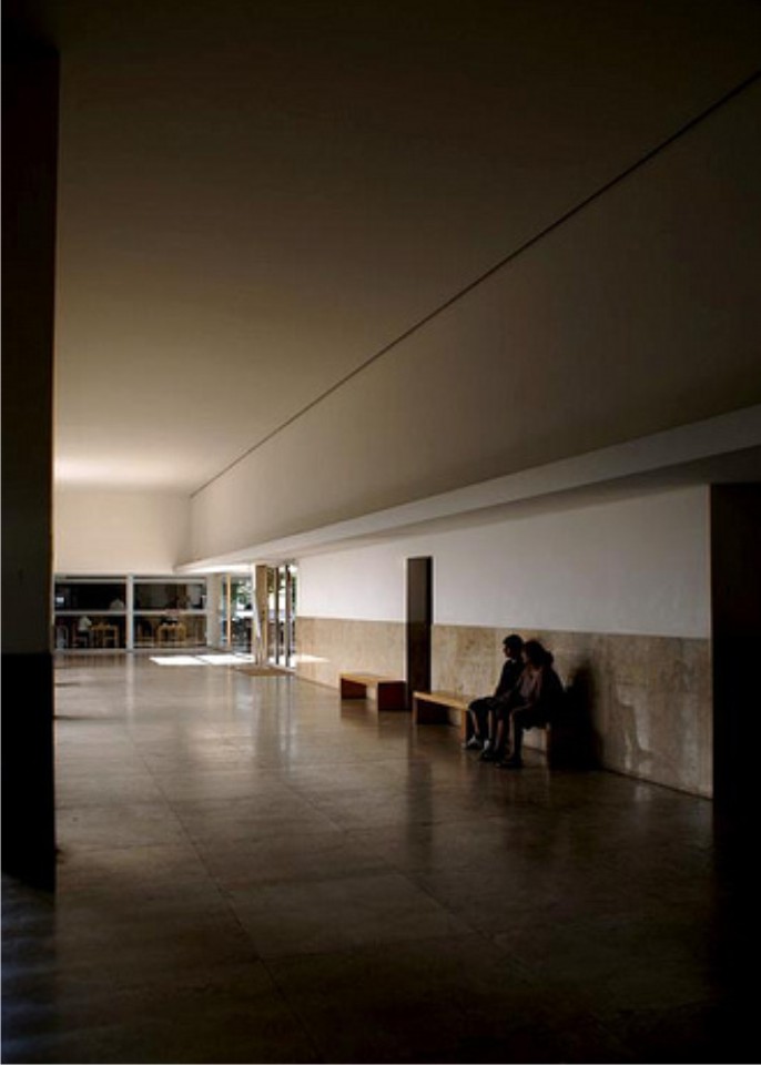
True to his signature style, Siza took special care in natural lighting and extension of space. Furthermore, in its obsession with detail designed each part of the project, including the furnishing.
Spaces
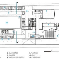
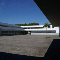
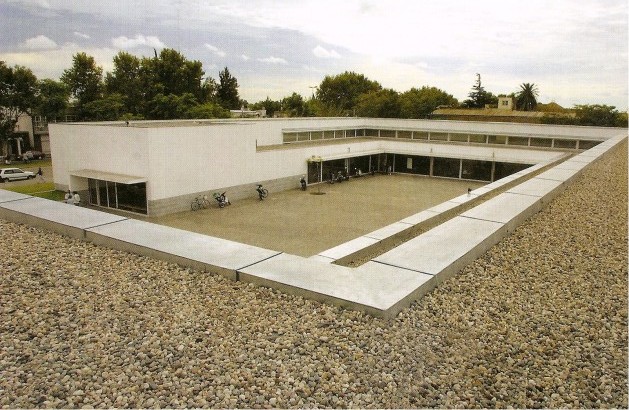
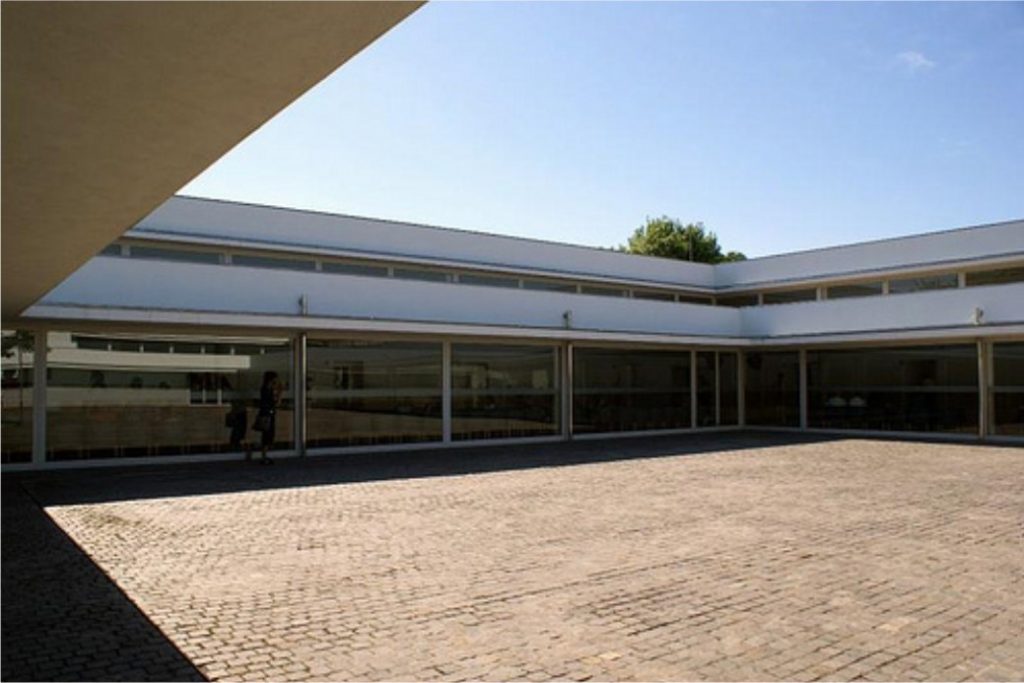
The building is developed around a civic square, with a clear and simple block diagram, divided into two areas: administrative and other sociocultural. The link between spaces and activities are facilitated by the development of the entire program on one floor.
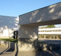
A large entrance portico leads to the central square, where neighbors have cultural activities outdoors.
The cultural sector covered an auditorium for 200 people fully equipped, multipurpose rooms and workshop area.
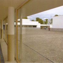
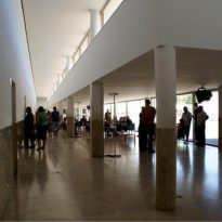
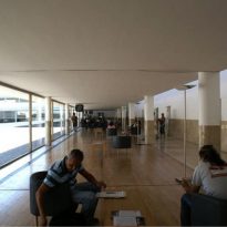
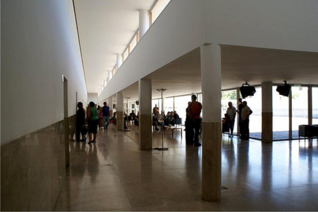
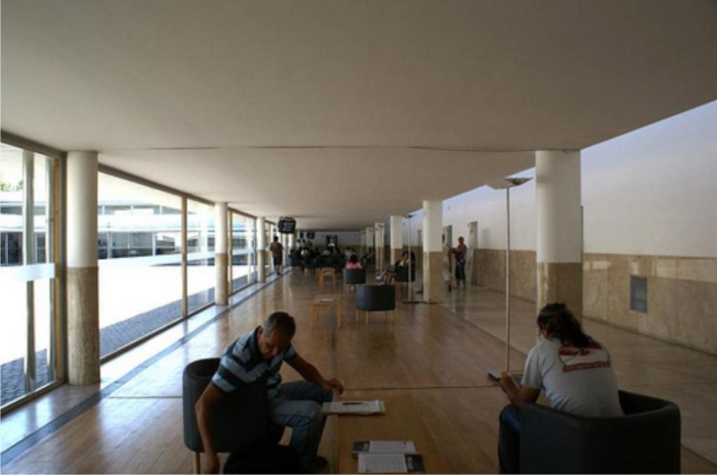
The administrative sector almost completely surrounds the square and is accessed by. The facades to the plaza are large windows, linking the interior with the exterior. Alongside the windows are waiting areas, bounded by a light wood floor and lower ceiling. Beside the circulation develops, attached to a strip of offices and marked by a line of columns and marble flooring.
Natural light is maximized in the building. A continuous line of traffic lights windows above the roof covering the waiting areas, in addition to glass fronts toward the square. The offices have windows side by side and receive light through its glass doors that connect to each other and give the movement.
