Introduction
Levi Leiter and Marshall Field had been co-founders of Field, Palmer, and Leiter, the 1864 successor to Potter Palmer’s Chicago drygoods business. The partnership had thrived until Field unilaterally decided to force Leiter out of the company in 1881, leaving Leiter bitter and seeking revenge wherever he could find it. One of Leiter’s vengeful moves was to build a store purposefully larger than Field’s brand-new wholesale store designed by the late H.H. Richardson. In April 1889, Chicago’s press announced Leiter’s intention to build a huge new department store on the east side of State Street, covering the entire block between Van Buren and Congress.
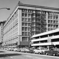
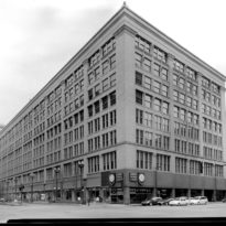
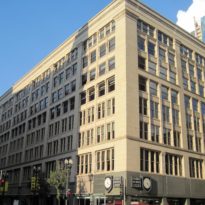
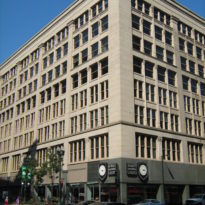
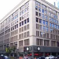
Not only was Leiter’s new building (now commonly referred to as the Second Leiter Building to distinguish it from his earlier building, known as the First Leiter Building, designed by Jenney in 1879) going to be 20% larger than Field’s (and three feet taller!), but it was also being designed as the most modern building in Chicago, said “to be as complete and perfect in all its appointments as the resources of modern art and science can make it.” Leiter’s intent was quite transparent, he was attempting to steal all of the publicity surrounding his former partner’s new Wholesale Store, while implying that it was already a dinosaur.
The contrast between the two buildings couldn’t have been starker, yet there were less than four years separating the two designs. The Leiter Store still stands today as a testament to the owner’s faith in new technology; the Field Store had to be demolished in 1930 primarily because its architect had still not learned the lessons of modern foundations. Truly, Leiter would take great pleasure in his new building for more than one reason.
Location
Chicago: East side of State Street, between Van Buren and Congress.
Concept
The Field Store was a rough-hewn medieval fortress while the Leiter Store was an open, light-filled cage of smooth-faced, light gray Maine granite, due to its iron skeleton frame construction. In essence, Jenney would take its cubic, Renaissance palazzo form and structural-based elevations to the next, logical evolutionary step.
Spaces
Jenney followed the lead of the Field Store by maximizing the site by lining its three street fronts with its eight floors in a shallow u-plan, like the Field Store. Leiter had simply followed the economical lead of Field in not wanting to pay the extra cost of a multistory atrium to light the interior of his store. There were also no walls whatsoever in the interior.
Materials
Rather than just simply covering the metal frame with a minimum of fireproof material as had Holabird & Roche done with the exterior of the Tacoma Building, Jenney preferred to compose a lyrical elevation that still employed the conventional motif of a rhythm that expressed a compositional hierarchy. The final result was a well-balanced weaving of horizontals and verticals, but with the nostalgic arch relegated to the dustbin of history. This was a truly rational, modern elevation based upon the underlying rectangular grid of the structural metal framework.
- First, Jenney designed the elevation as a dominantly horizontal tripartite scheme of a two-story base, six-story body, and an appropriately scaled cornice, using the cornice and a continuous frieze line at the third floor to articulate the horizontal layers.
- Second, he placed heavy colossal order pilasters at the each of the corners to frame each elevation (and to cover the extra thickness of the intersecting exterior wall).
- Third, in the long elevations he used a range of eight, six-story pilasters that broke the elevation into nine equal bays.
One of the few unfortunate design errors occurred where these pilasters were joined with the continuous frieze that Jenney used to break the six-story body into two three-story layers. Instead of allowing the pilasters to be dominant by recessing this horizontal behind the vertical thrust of the pilasters, Jenney kept the horizontal in the same plane as that of the pilaster, implying that the elevation was not a line of pilasters but a smooth plane into which the windows were carved. This resulted in an awkward hermaphroditic quality when Jenney applied capitals at the top of the pilasters, which was only reinforced by the design of the joints in the granite that implied the frieze was dominant over the pilasters because the vertical joint of these blocks consciously were not aligned with the edges of the pilaster. Was the elevation a colonnade or a wall? Jenney had naively tried to do both, but of course, this was inherently impossible.
Each of the nine bays was broken into an upper three-story zone, and a lower three-story zone, which were detailed with a subtle and sure-handed difference. The large horizontal distance between each pilaster was a result of Jenney’s use of a steel beam to span this distance, in which he easily arranged four equal windows, with the exception of the top floor, in which he placed six. This was done to work in conjunction with the cornice to cap-off the building very effectively. Rather than matter-of-factly just repeating the same window four times in each bay, Jenney’s lyrical intent arranged these in a geometric hierarchy by first dividing each bay in half with a secondary pier that contained two engaged colonettes, and then divided the opening on either side of this with a tertiary pier of one engaged colonette. He repeated these details in the upper zone except in the top floor where he had put the six windows. Obviously, this spacing forced him to stop the tertiary piers one floor shorter than in the lower zone, and here he made a second, minor, but still visible error. Instead of allowing the spandrel at the eighth floor to span continuously from the primary to the secondary piers, that he implied with the location of the capitals of the tertiary colonettes, he placed a vertical extension on top of this capital that extended to the sillcourse of the window above, which broke the spandrel into two halves. He had located the capital of the tertiary pier in the correct location to support the lintels in the spandrel; it was the vertical extension block that simply confused the clarity of the otherwise exquisite structurally expressive hierarchy of the elevation.
Structure
He structured the volume with the metal skeleton frame (cast iron columns and steel beams), inside and out, except for the back wall where he employed a less expensive masonry wall, punctured with a grid of windows to maximize the penetration of daylight, again similar to Richardson’s solution in the Field Store. This may be somewhat misleading, however, for although there were no “walls” on the exterior, Jenney had once again placed the iron columns inside the granite piers. The piers at various locations comprised of five and half feet widths of granite that supported its weight to the ground. The weight and inertia of the granite piers would have assisted greatly in resisting wind loads.
Drawings
Photos


")
")
")
")
")